Appriss
This case study is still being polished. Please check back later. We can’t wait to share it with you.
Back to our workAppriss
Overview
- Visual Creative
What We Did
The Outcome
Create motion assets that reflect an enterprise's specialties and areas of expertise.
With Productive Machine, Therum created three motion-graphic assets for Appriss' business units, Safety, Retail, and Health, each with a distinct visual style, and delivered two versions of each (with and without text) for different communication needs. Appriss Safety centered on data and its security. In a blue palette, expanding lines spread across the frame, a nod to a fence or bars, symbolizing the protection around data and storage.
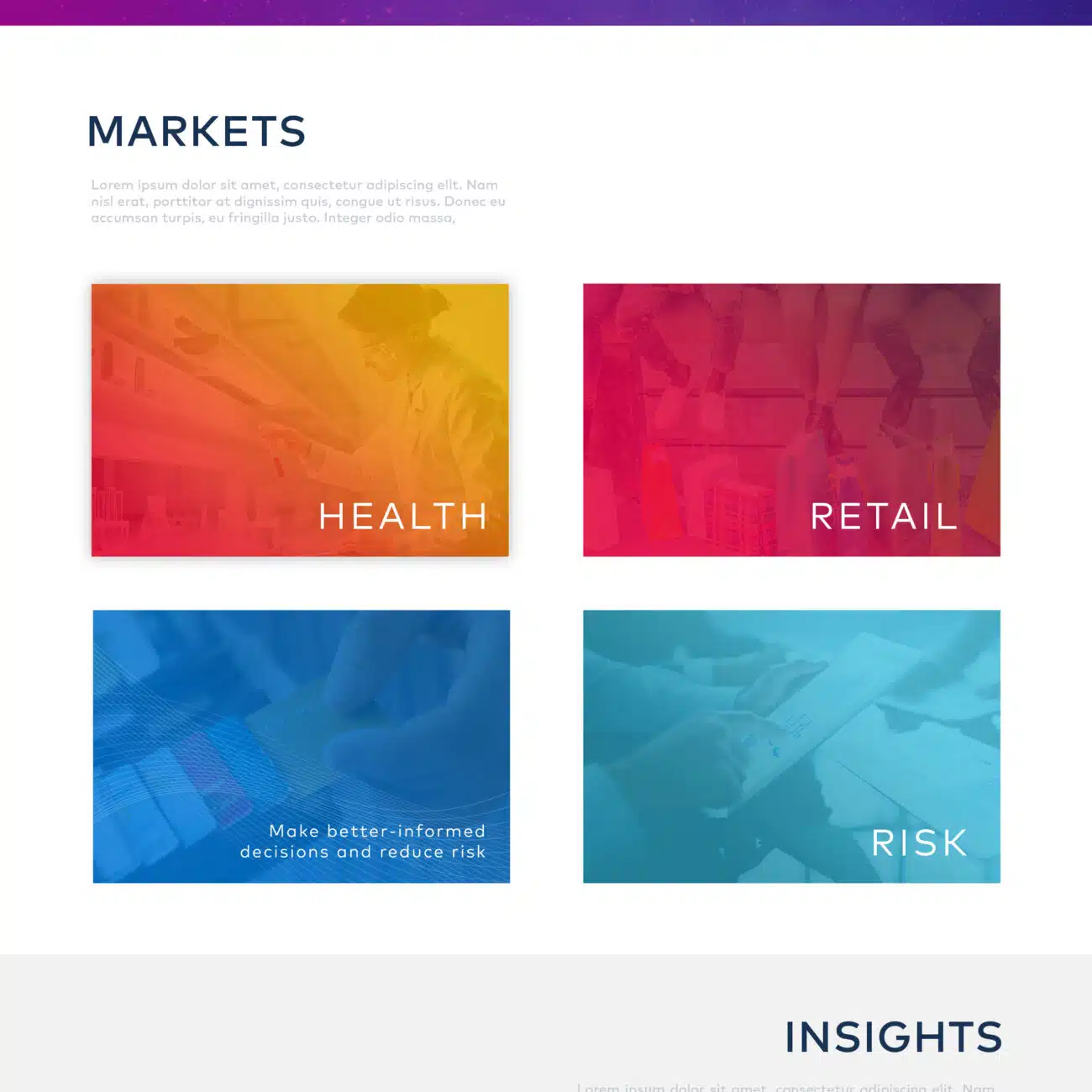
Productive Machine brought us in to give three business units each a distinct visual style
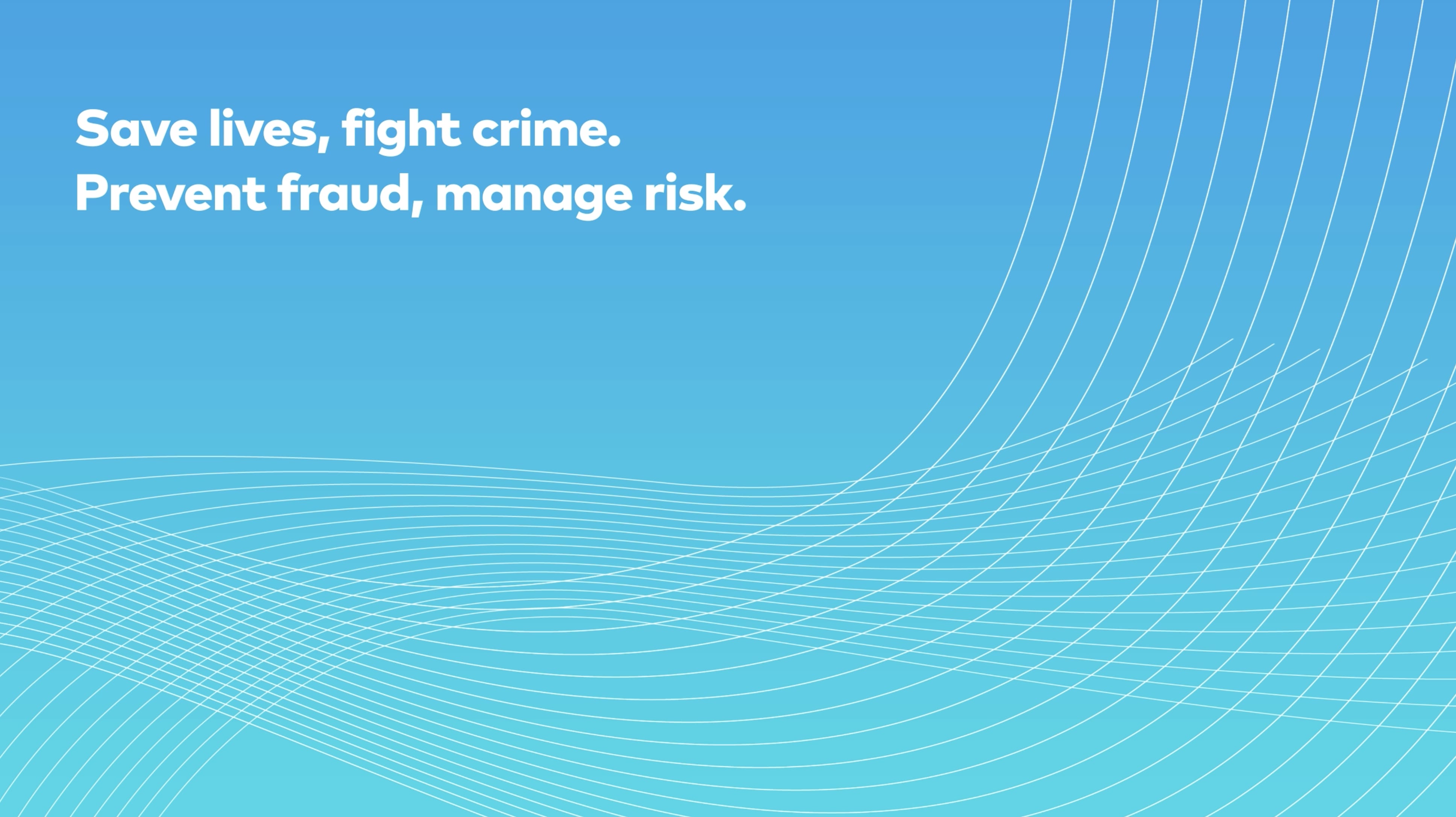
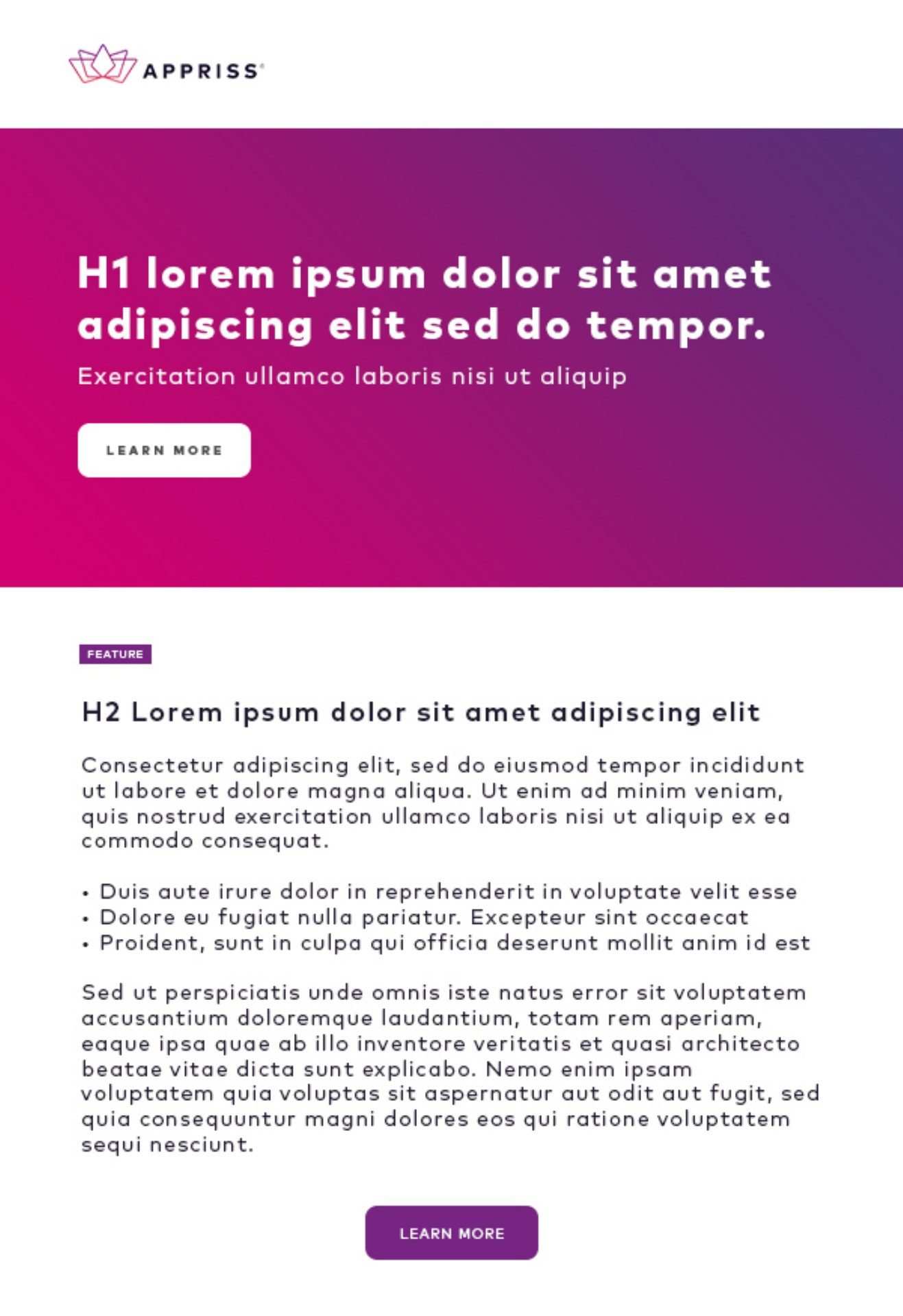
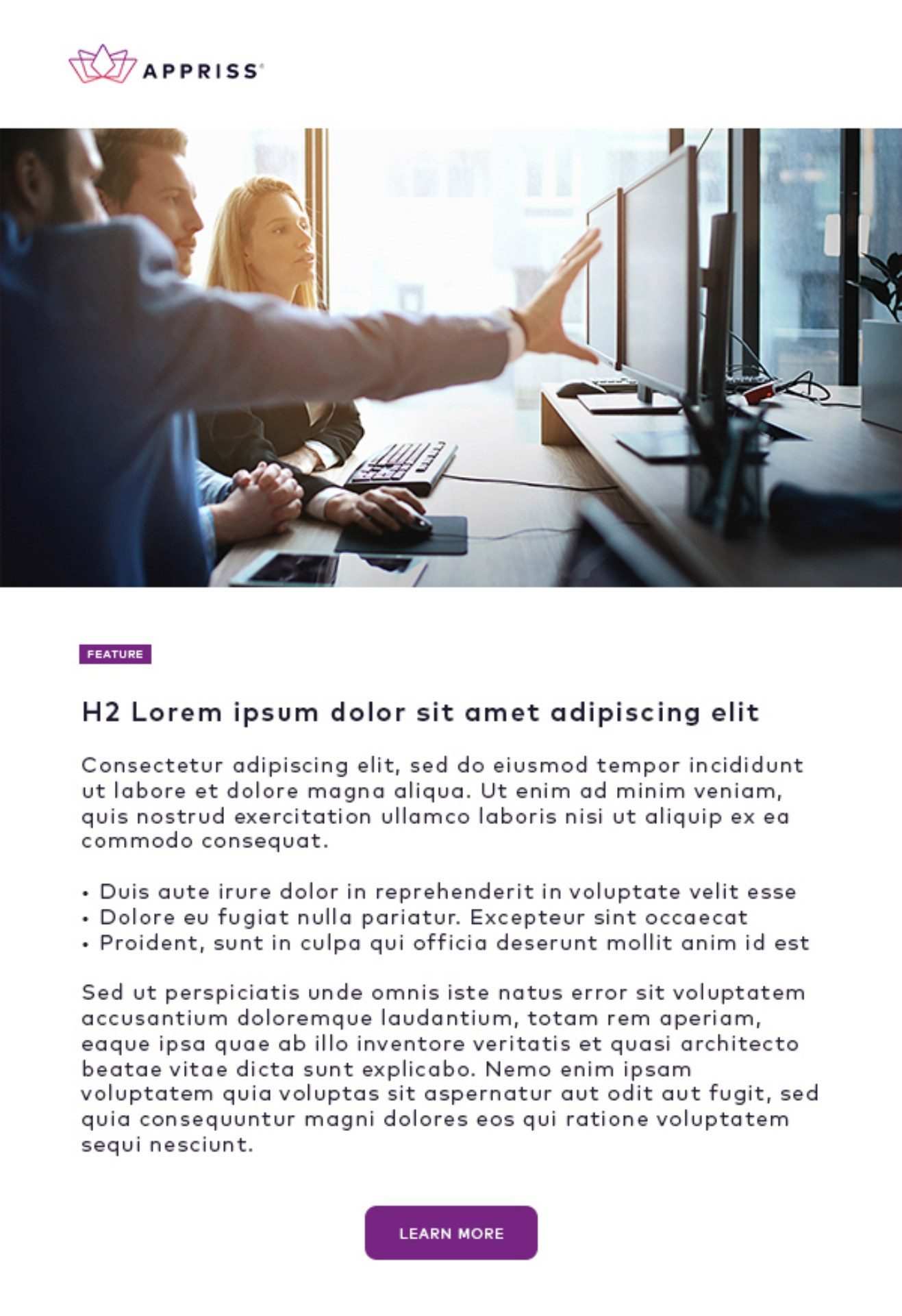
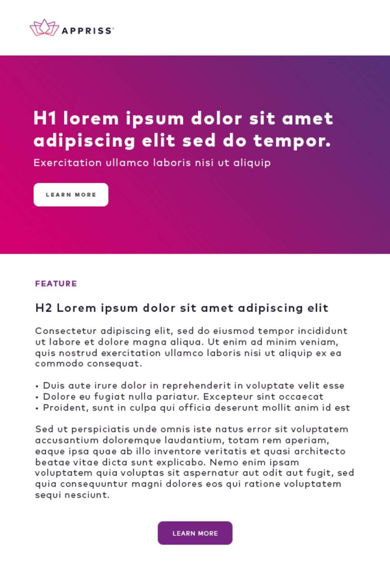
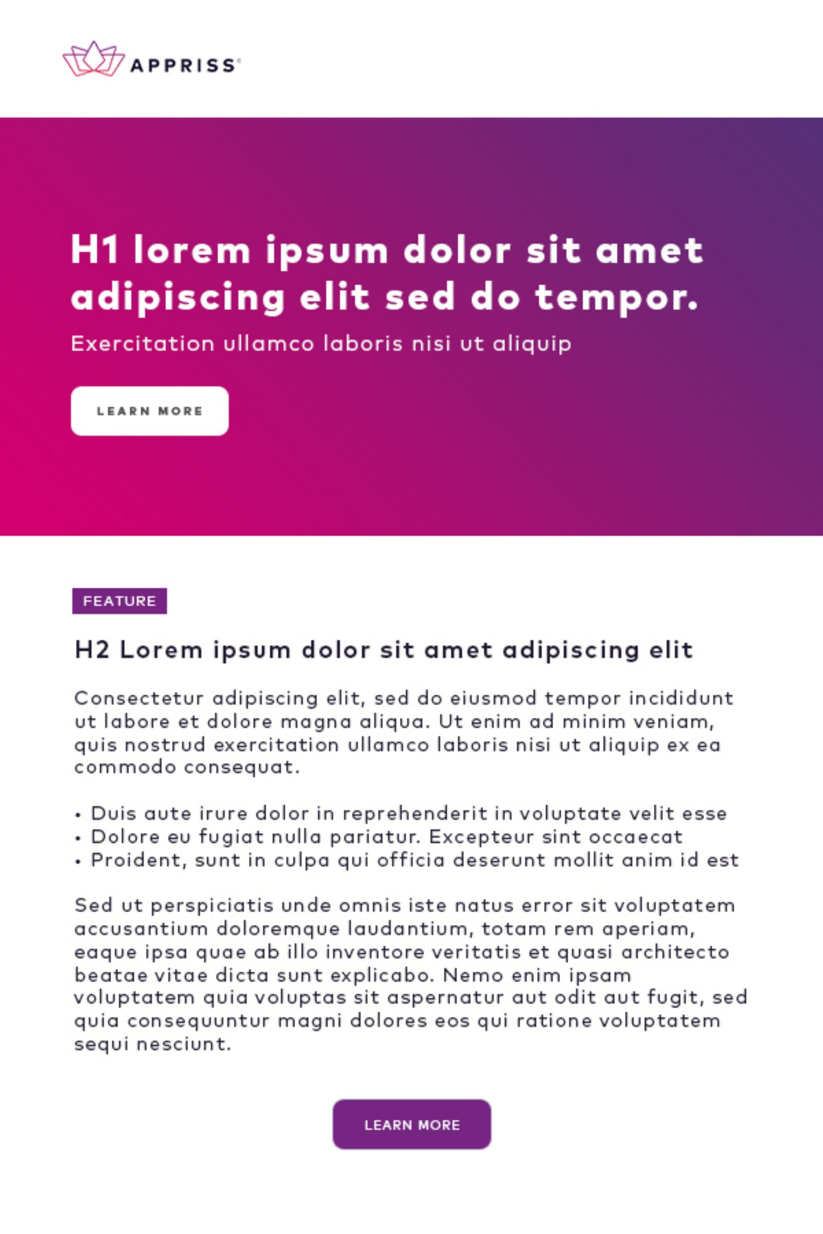
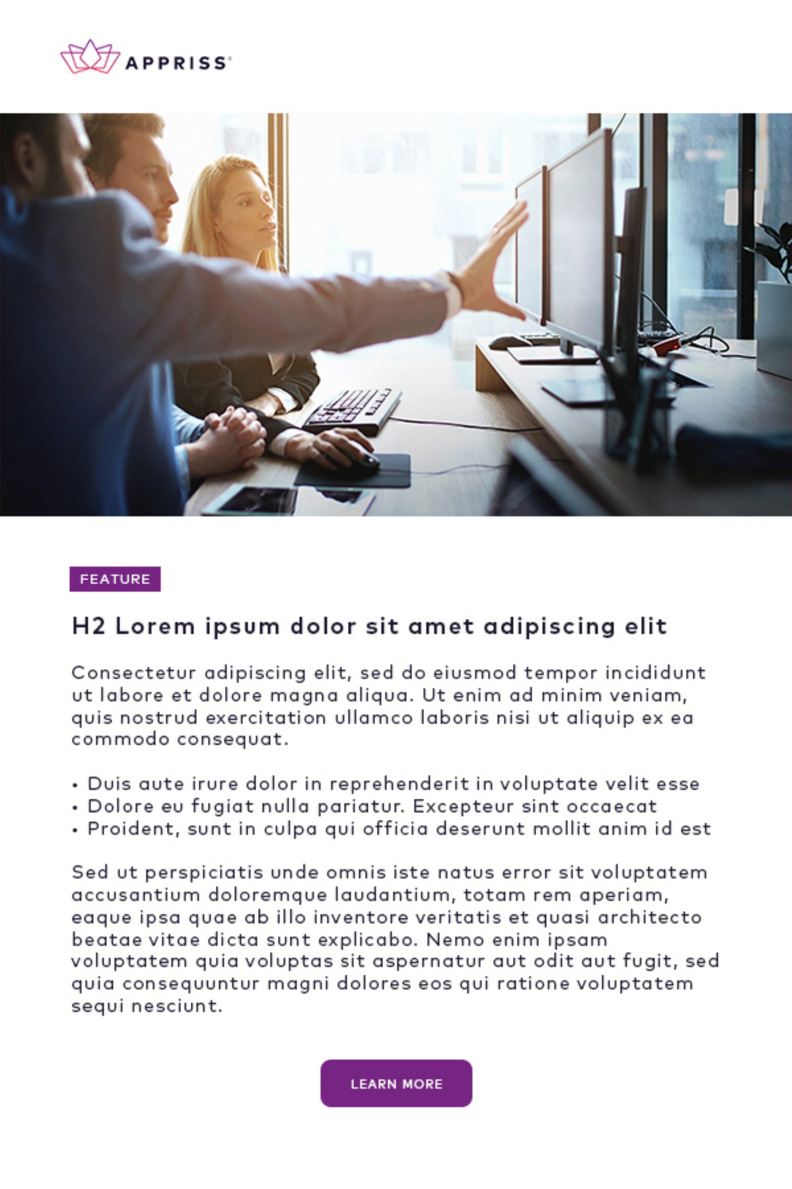
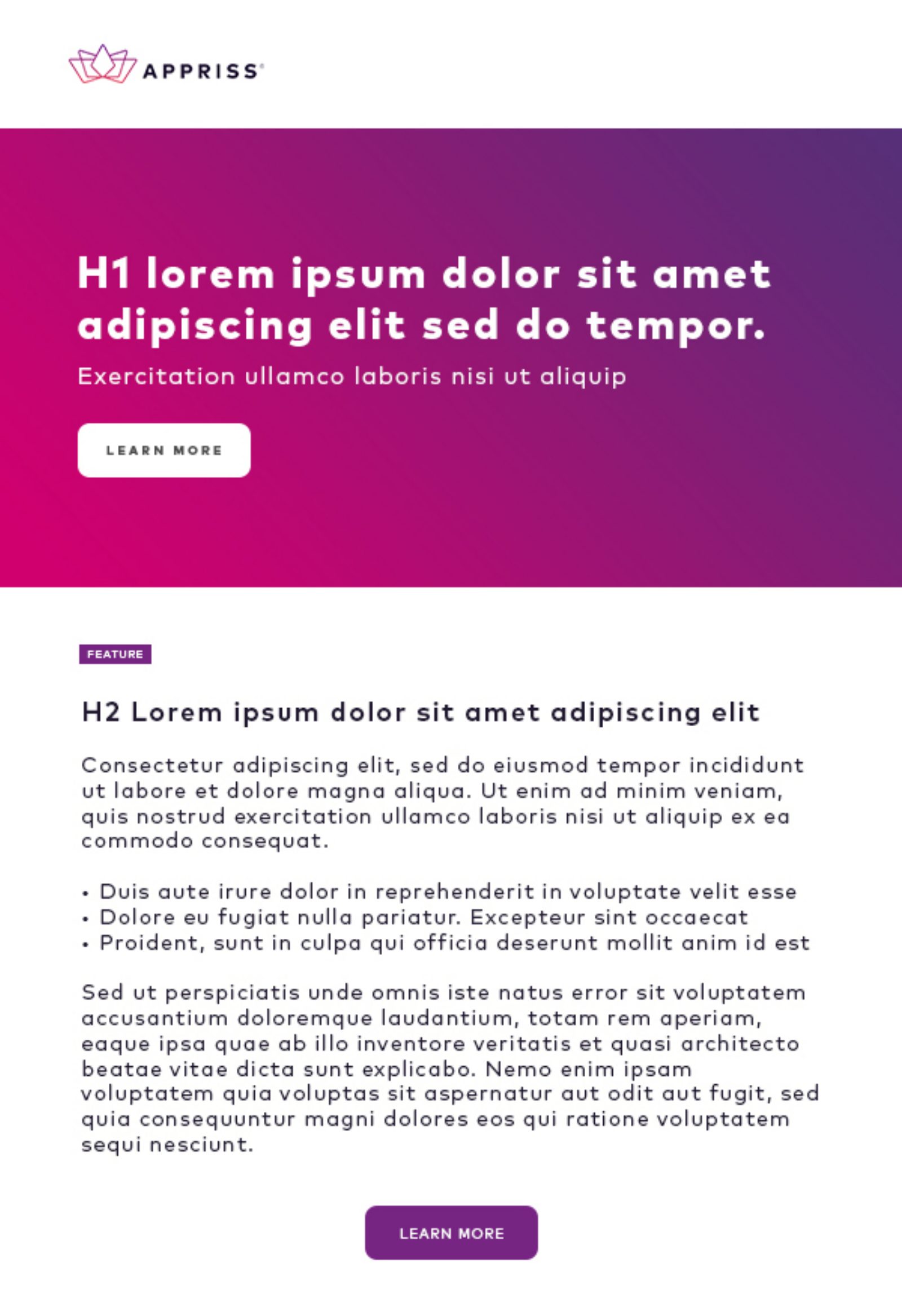
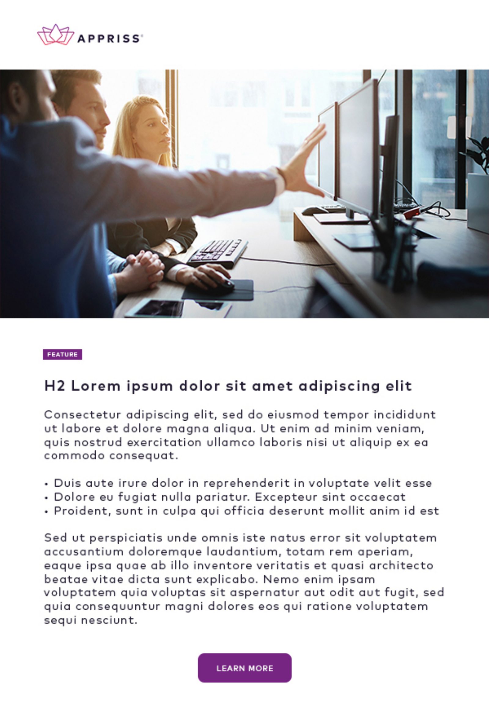
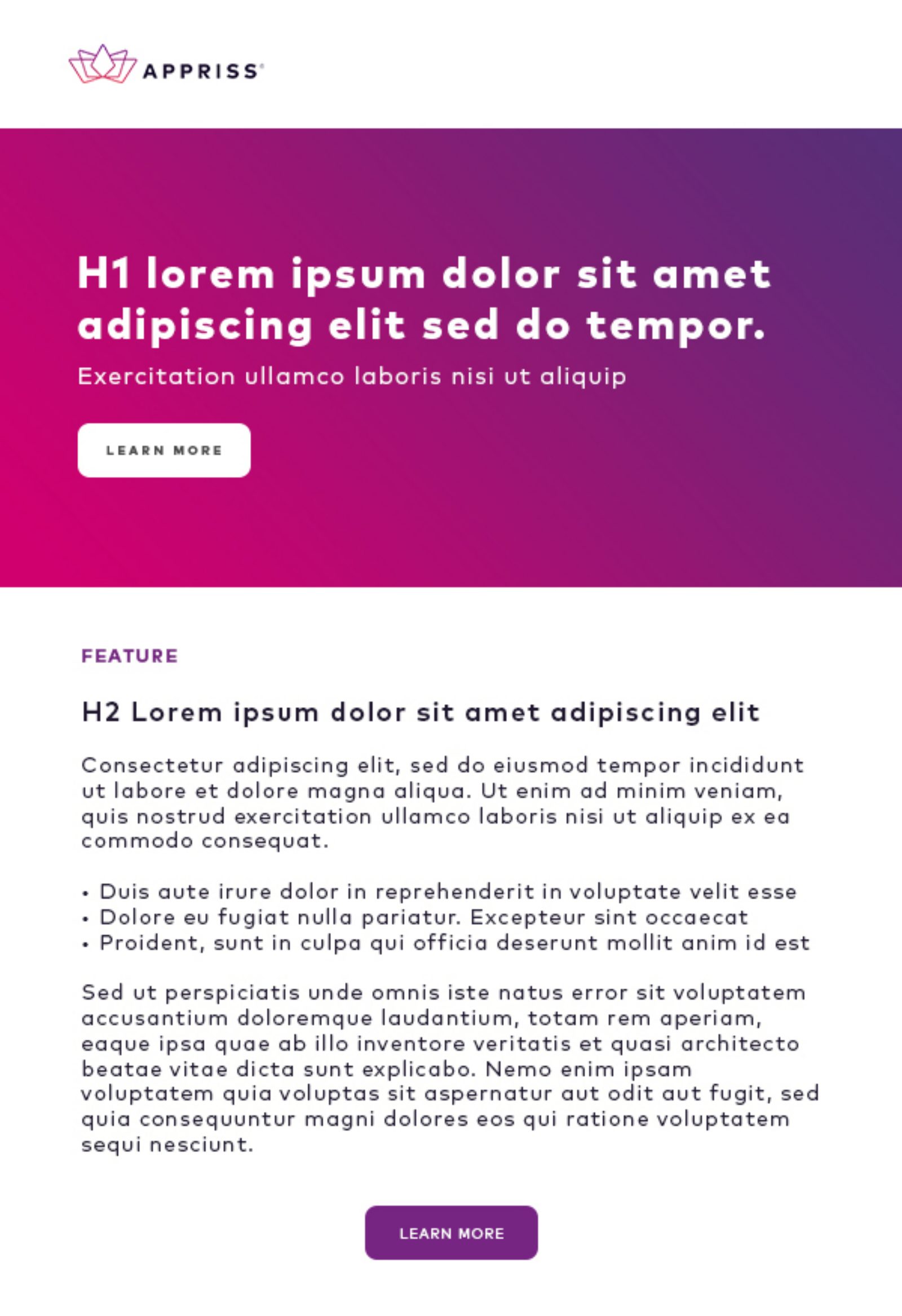
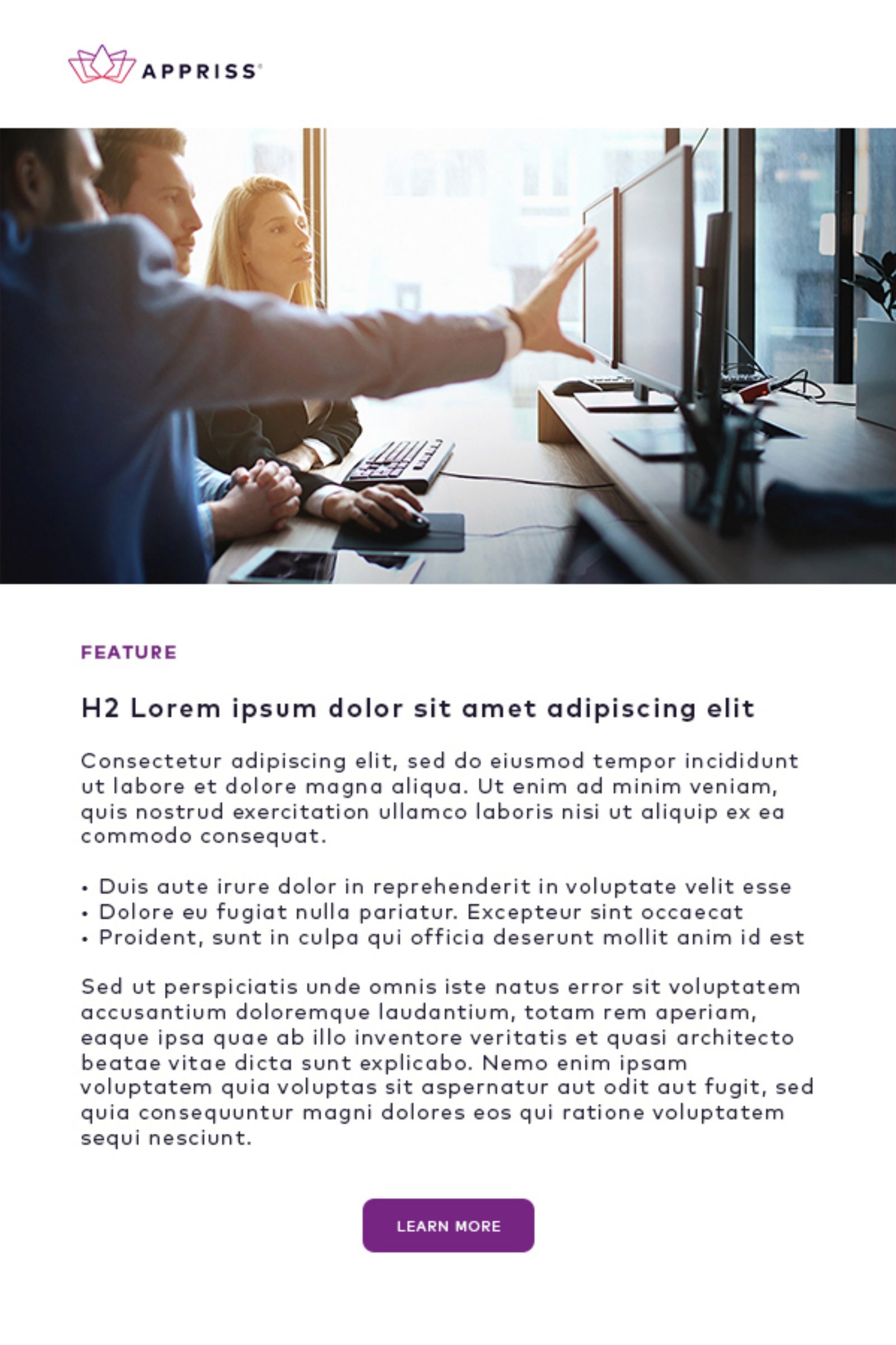
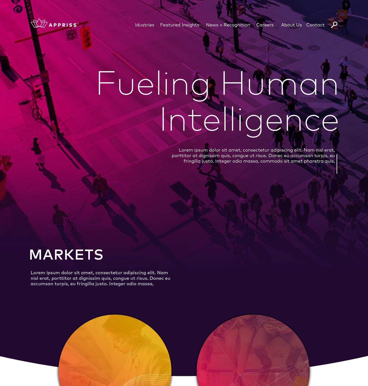
Appriss runs separate businesses in safety, retail and health, and each one needed a motion asset of its own. Productive Machine brought us in and we took the motion design end to end: the idea for each unit, the animation, the type treatment and two cuts of every piece, one carrying the on screen copy and one clean. The same set holds email and landing page layouts built on the Appriss magenta to purple gradient.
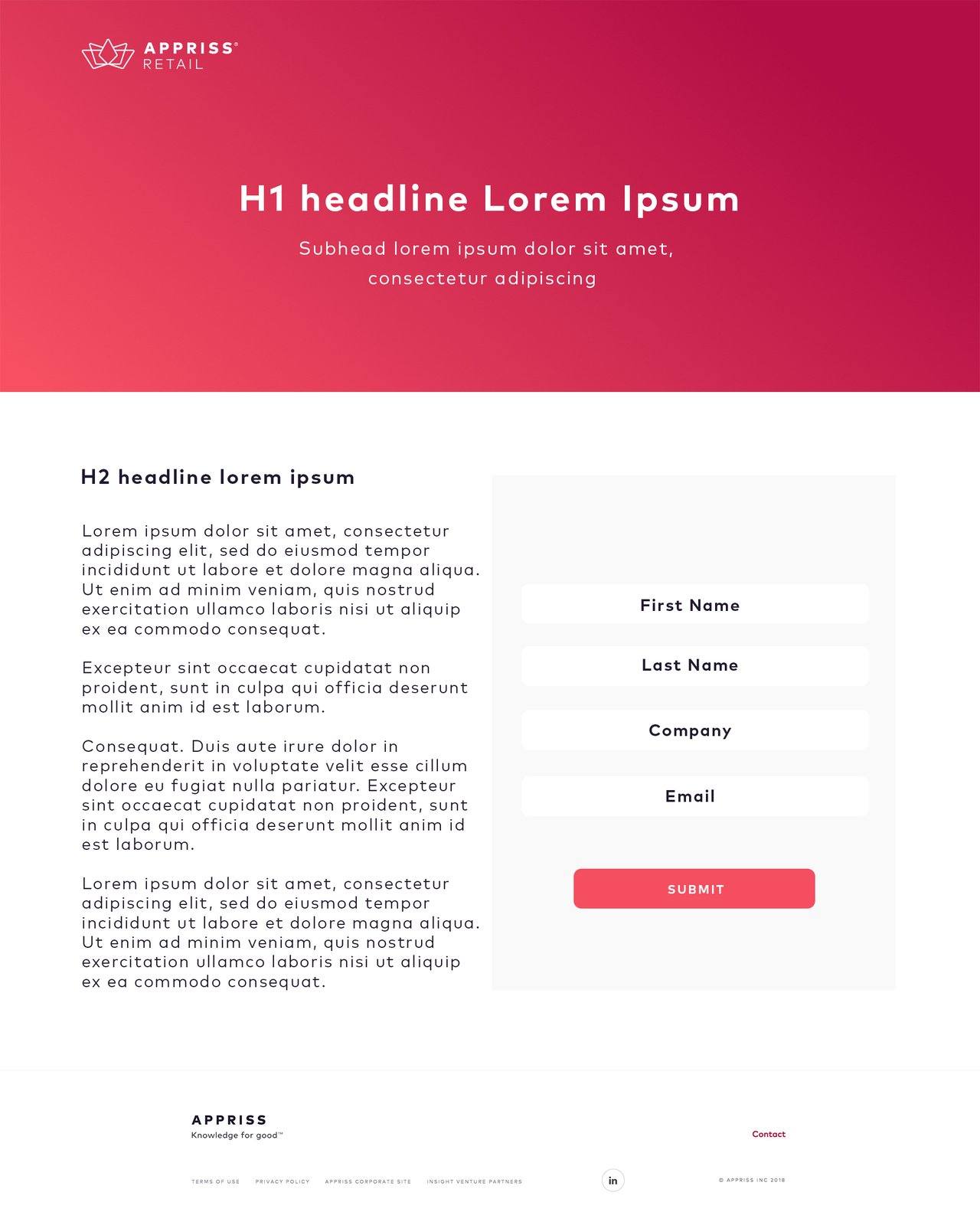
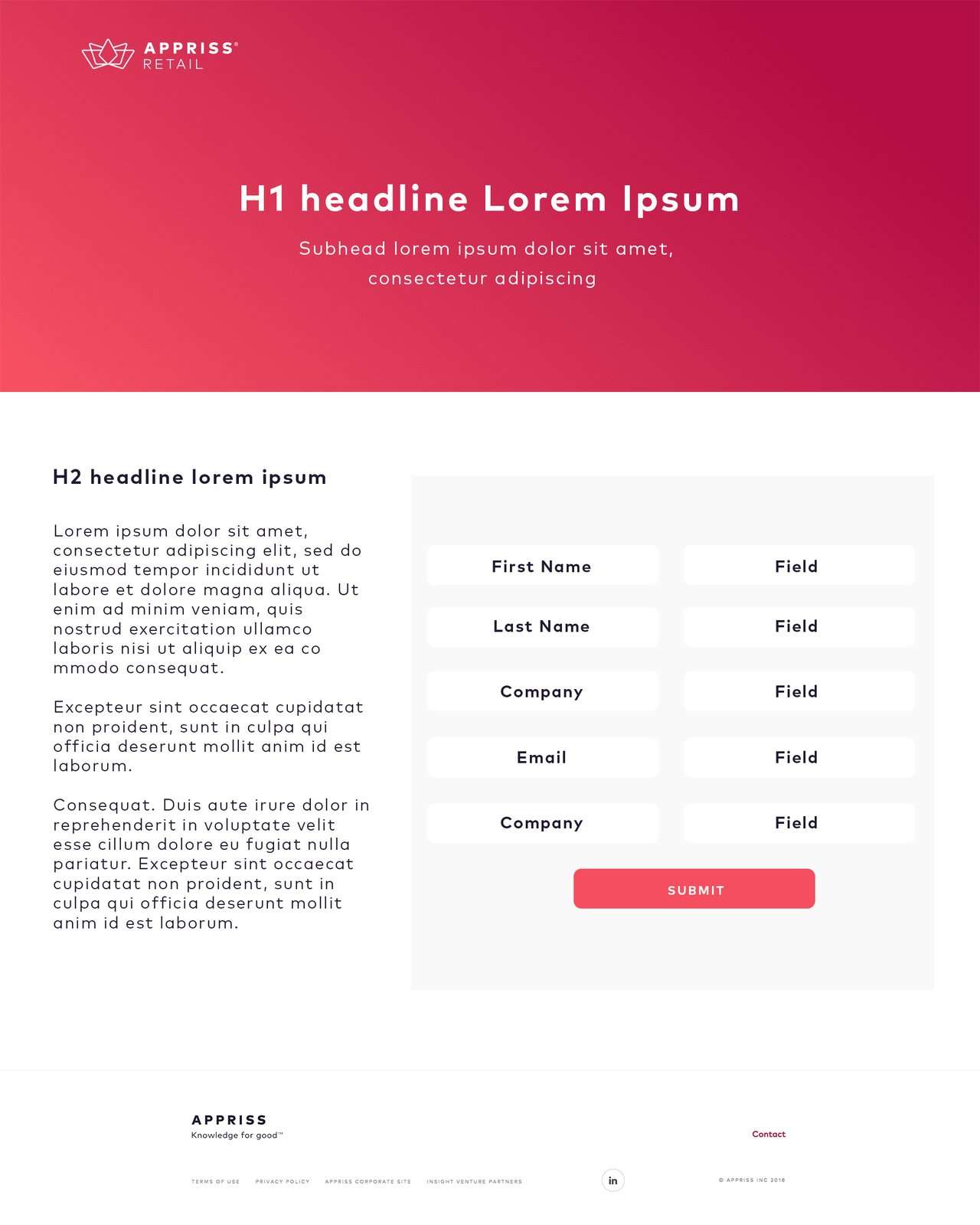
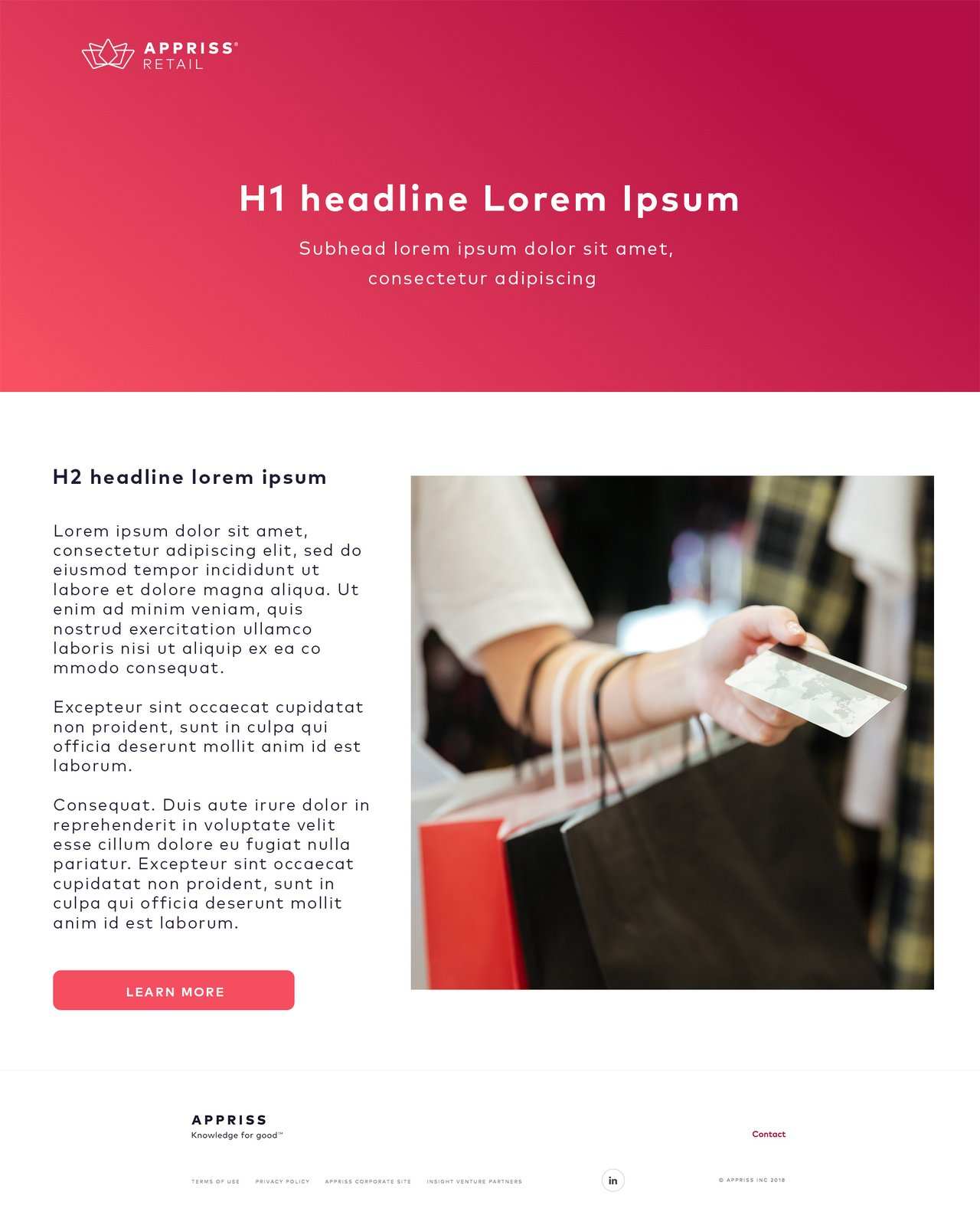
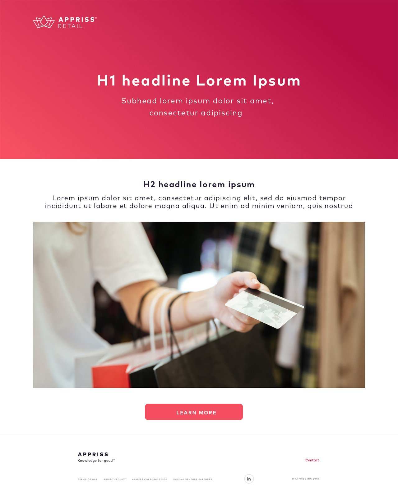
Same grammar, different colour
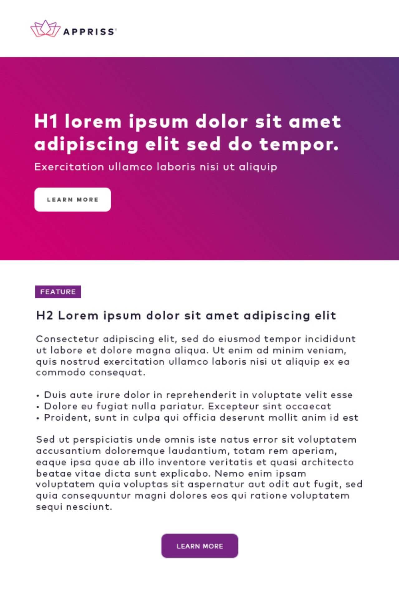
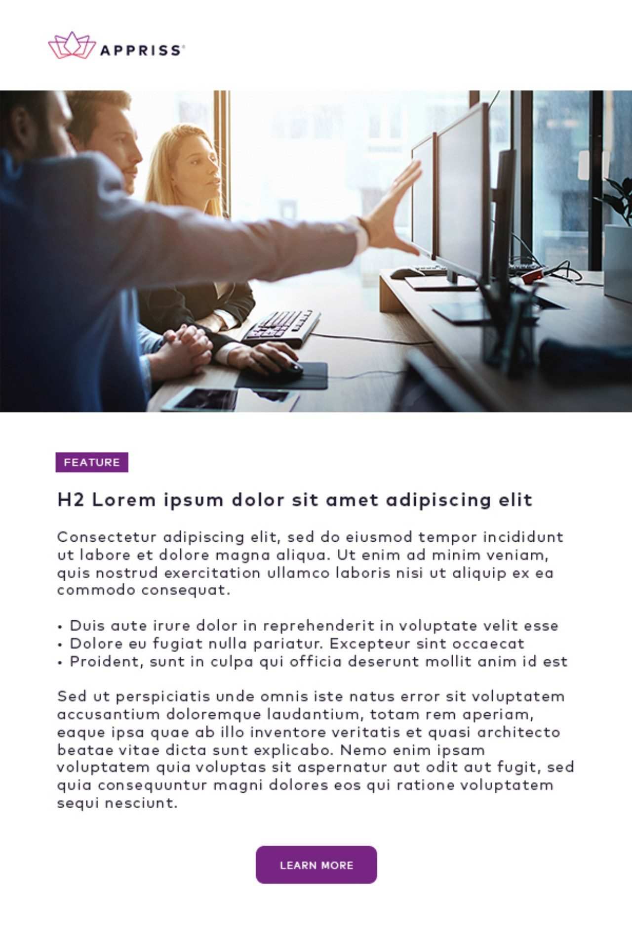
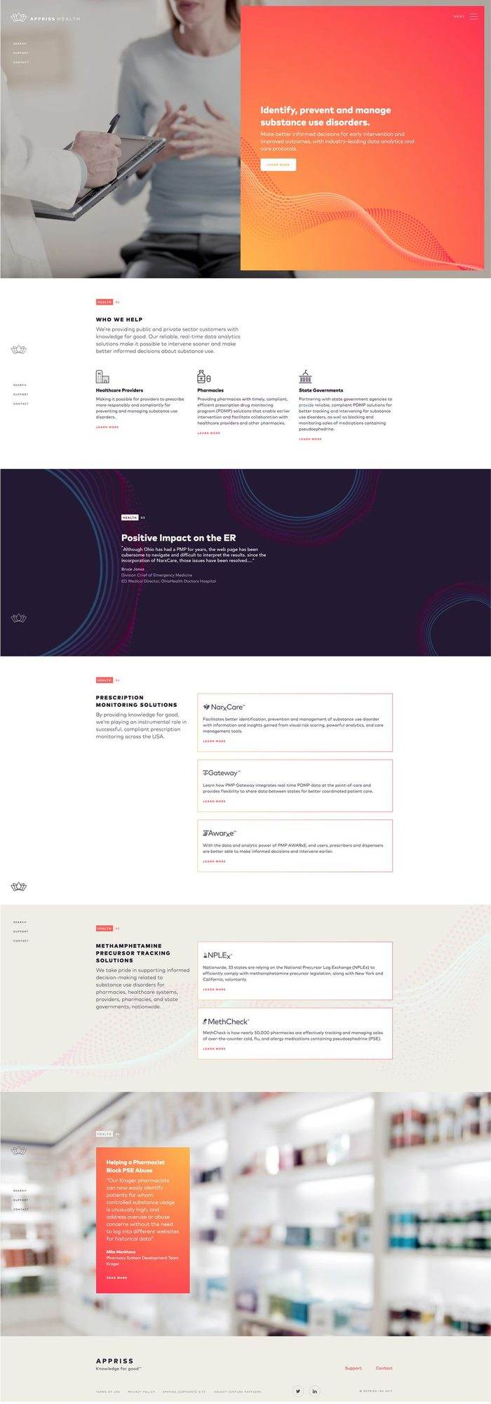
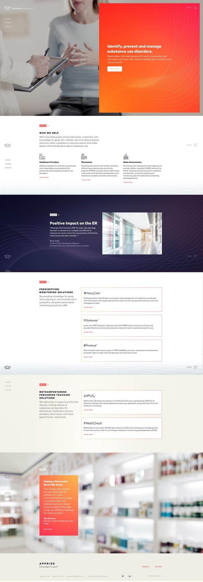
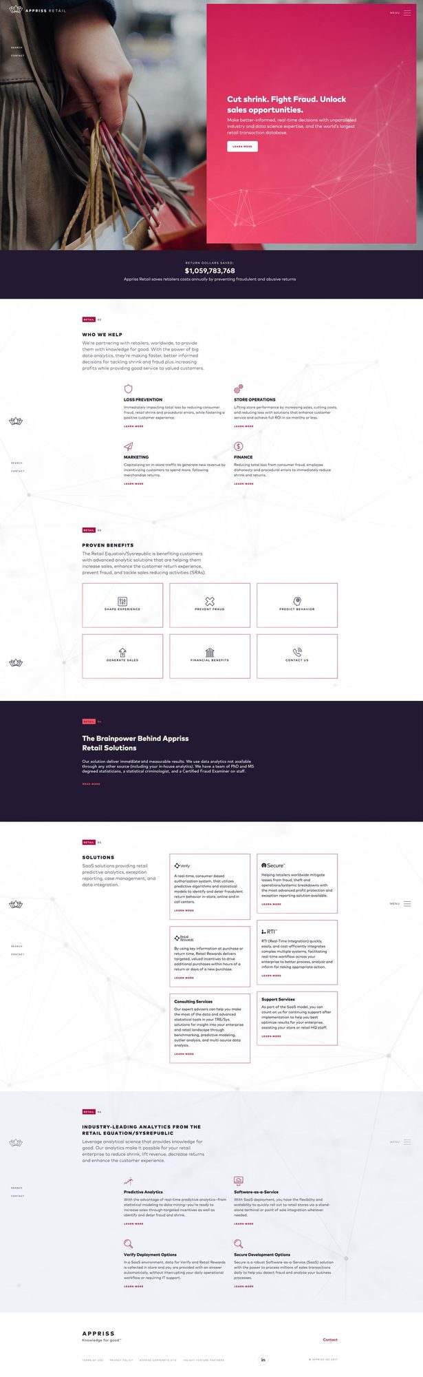
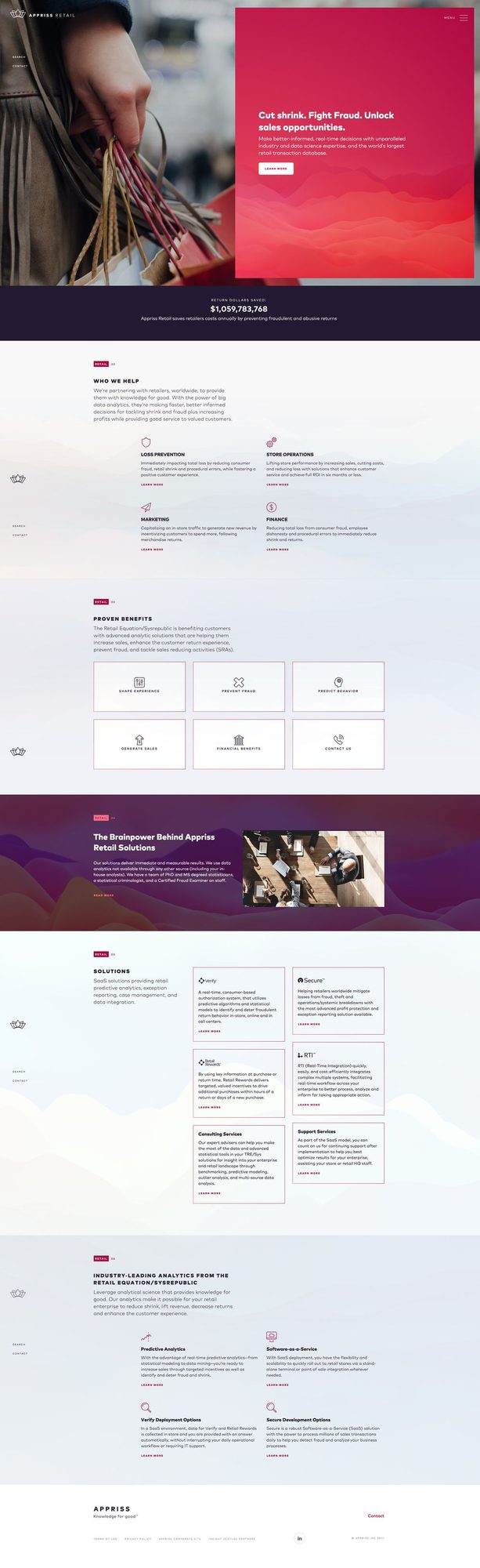
Each unit got one visual idea and one palette, and nothing else moved. Safety runs through a cyan and blue field crossed by fine white lines. Retail sits in deep wine red with a white network of points and connecting lines. Health warms to orange and coral with a dotted wave that rises and falls. The headline and its supporting line land in the same place at the same pace every time, so three pieces read as one company.
Three unit films, each in two cuts
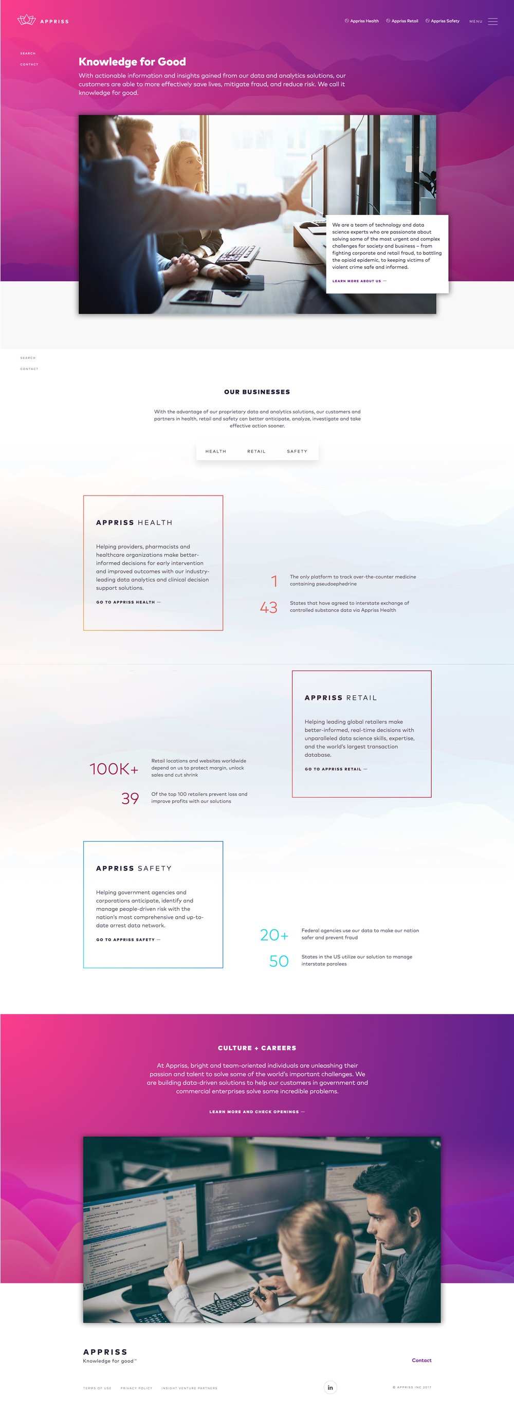
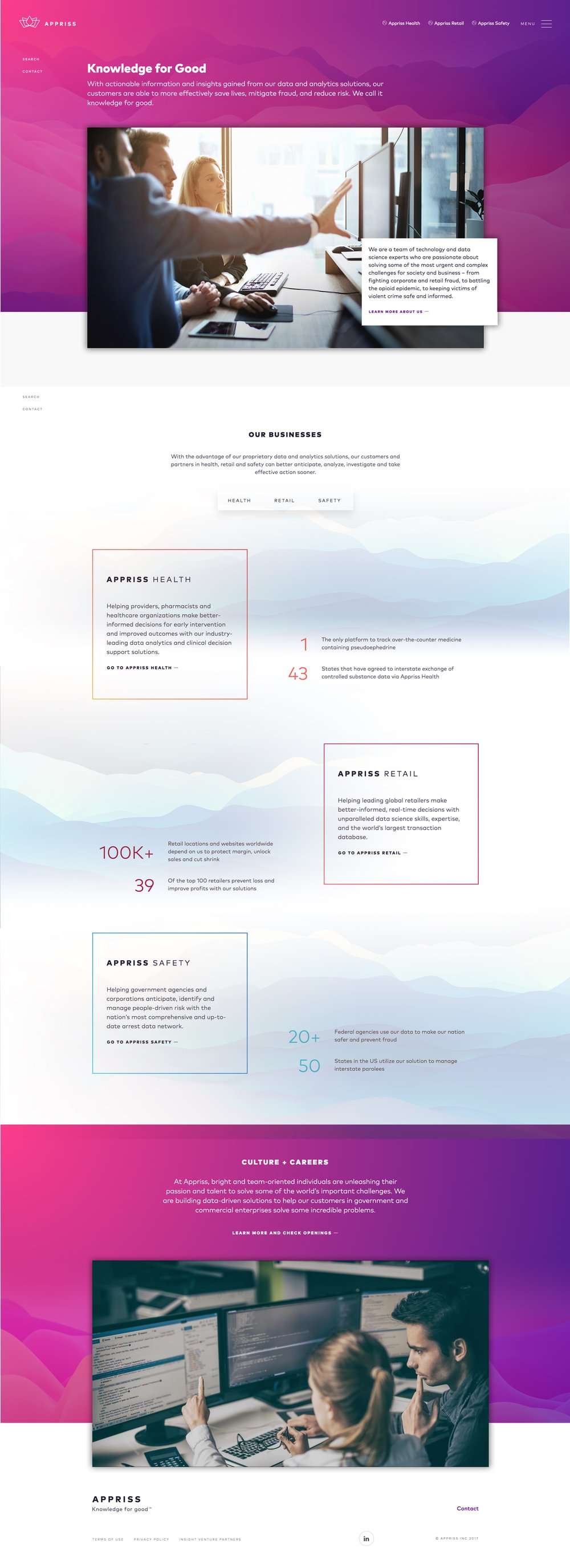
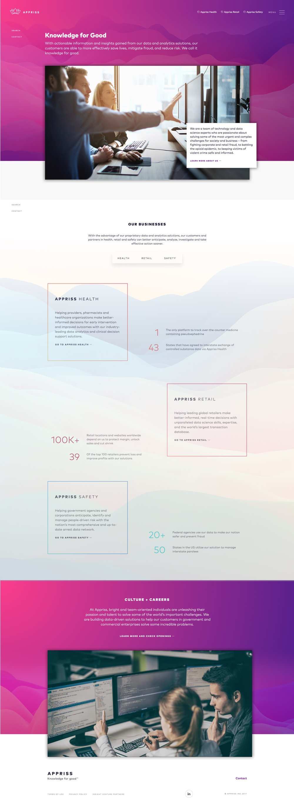
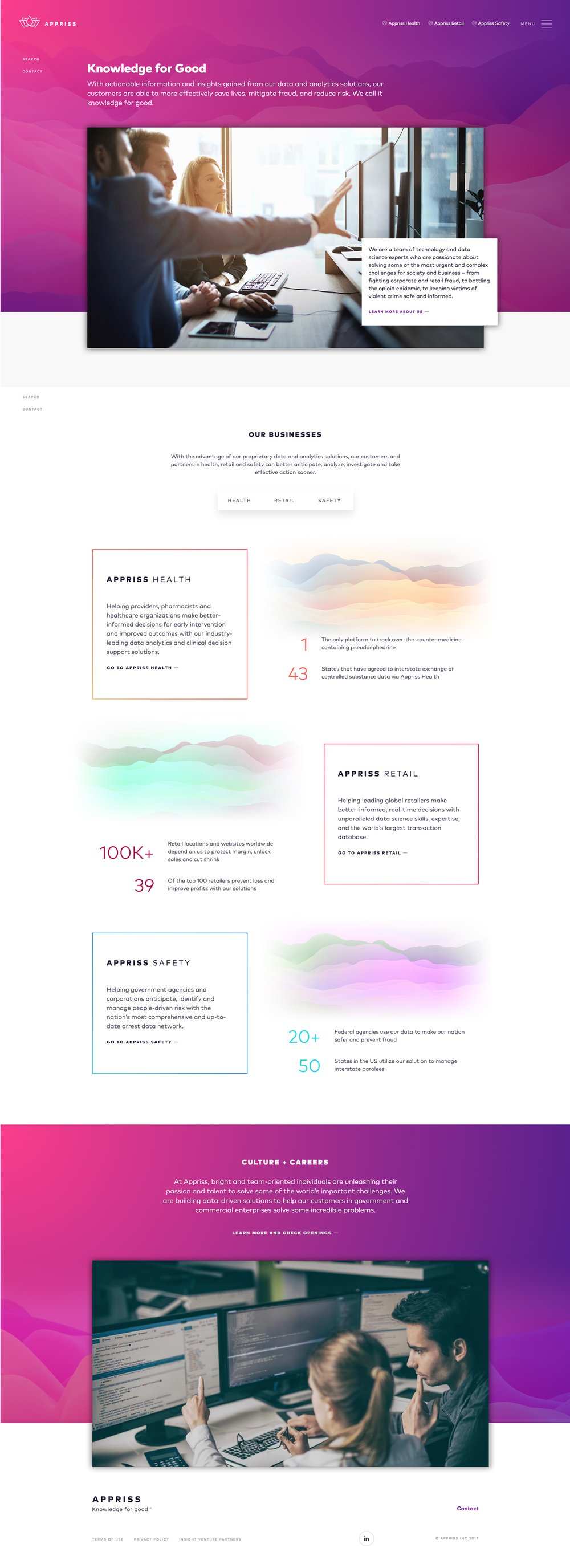
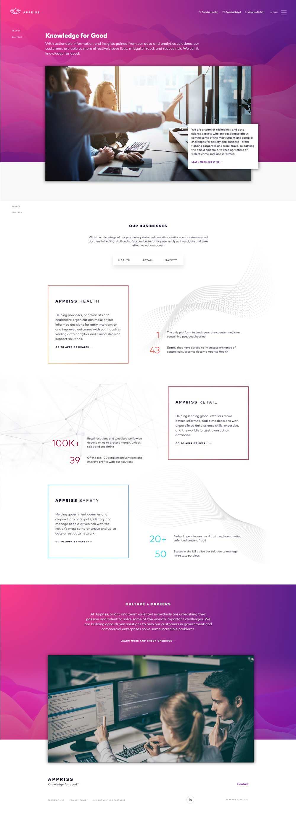
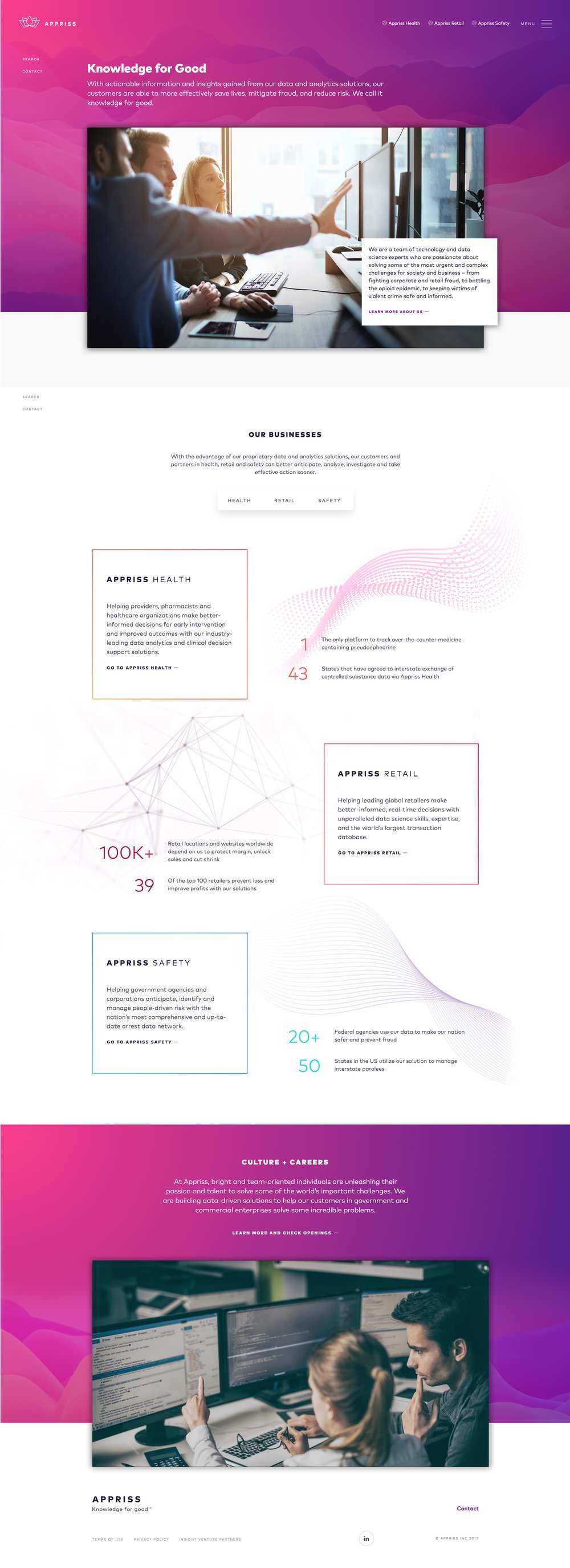
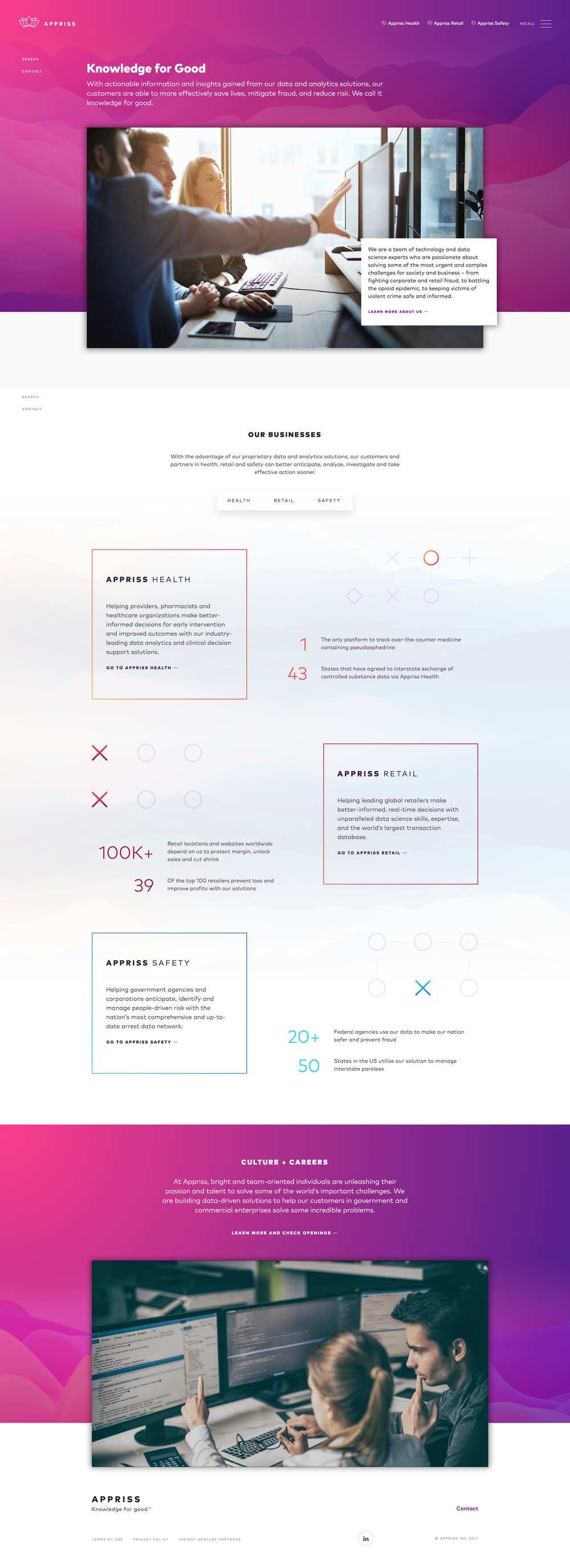
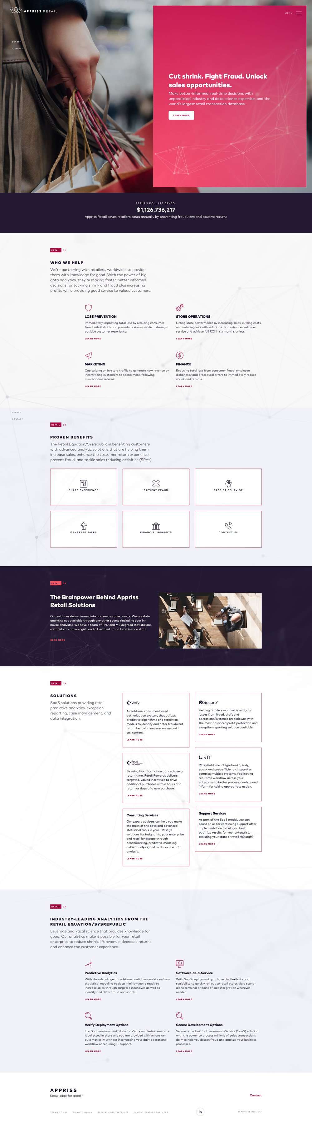
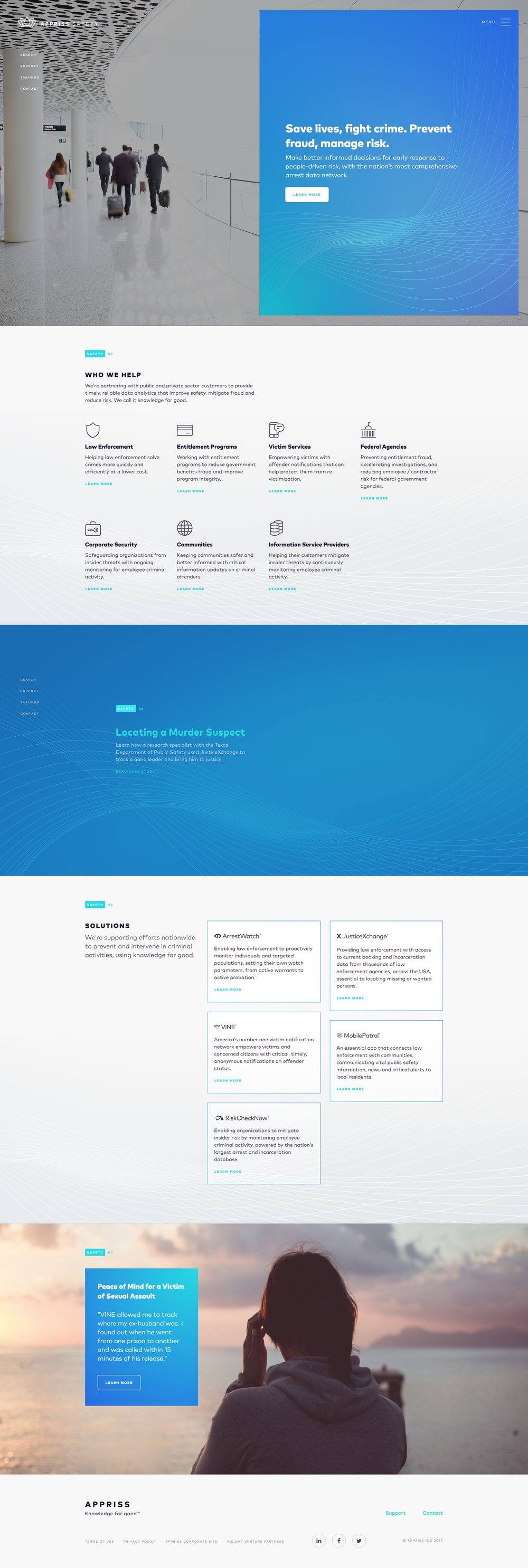
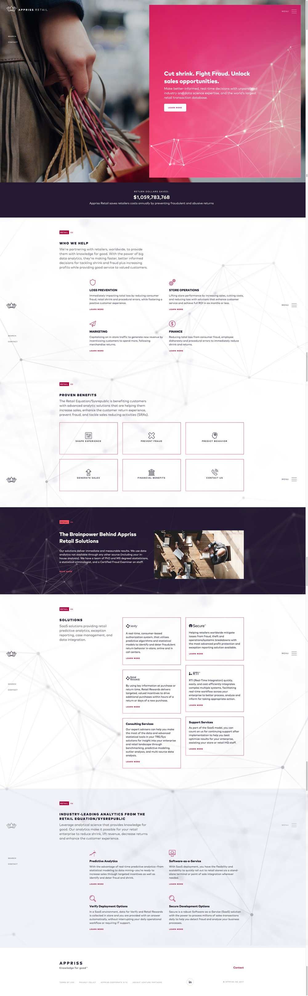
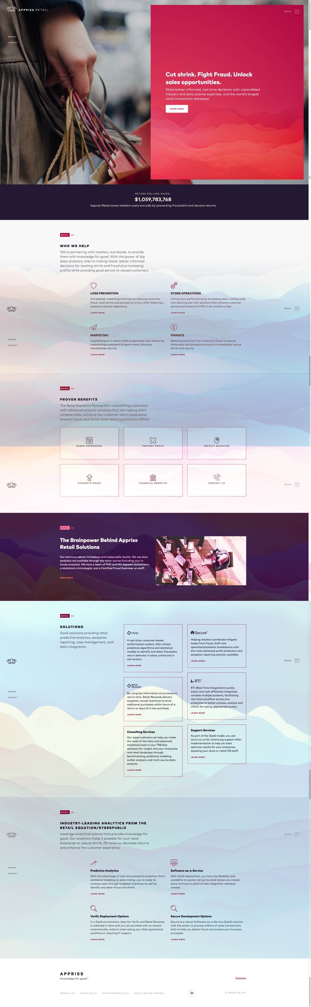
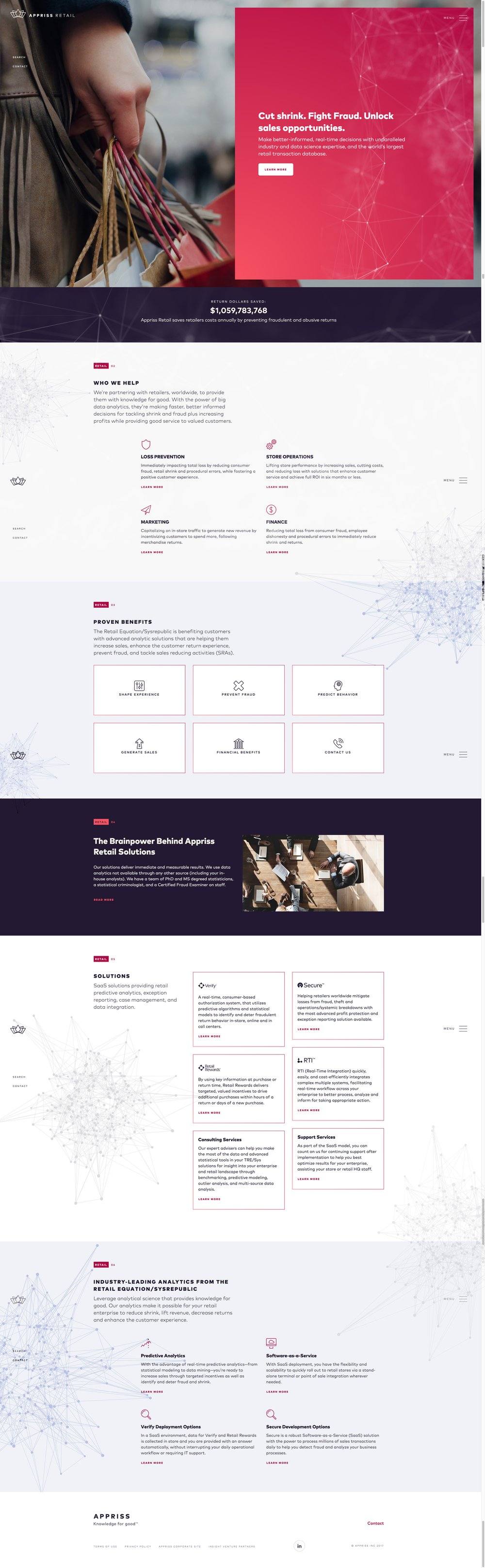
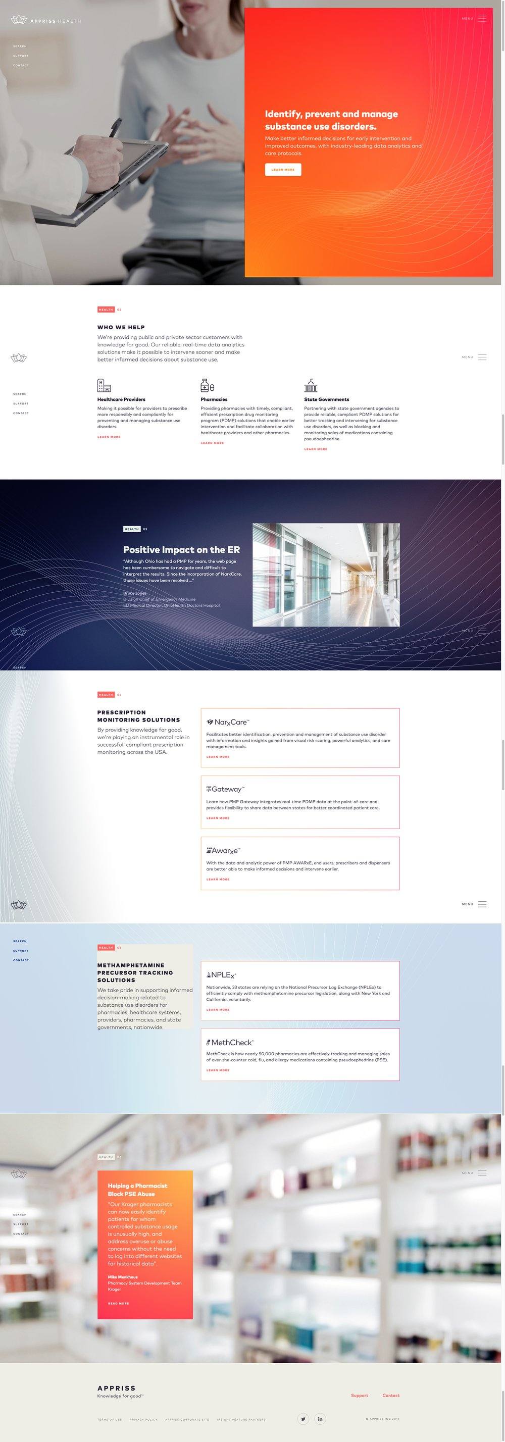
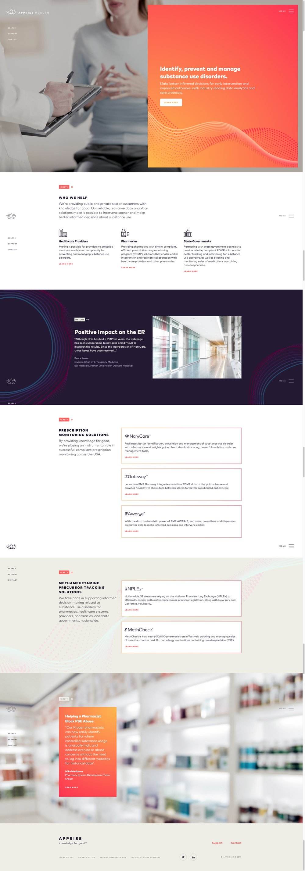
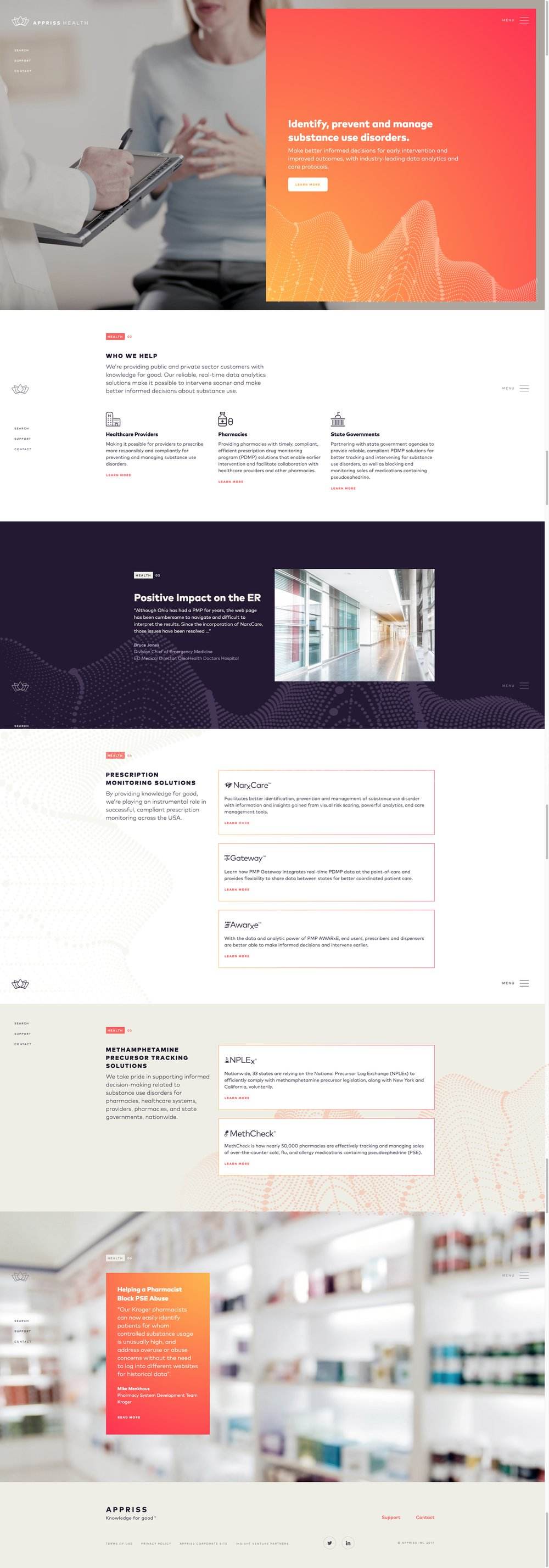
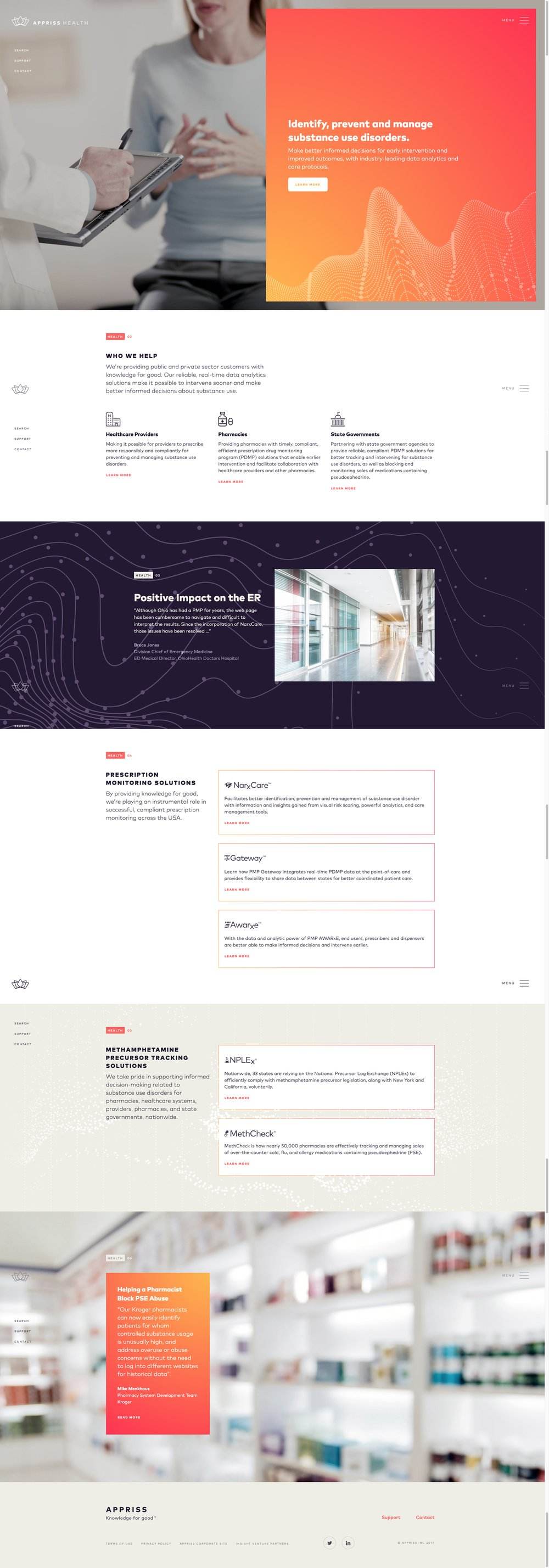
Appriss Retail focused on financial transactions and the security of personal information. In a wine palette, lines and dots combined to symbolize transactions and connectivity, the interconnectedness of finance and the need to safeguard personal data. Appriss Health, dedicated to well-being, used an orange palette and a wave-like animation that faded in and out, resembling breathing or circulation, emphasizing the dynamic nature of health.
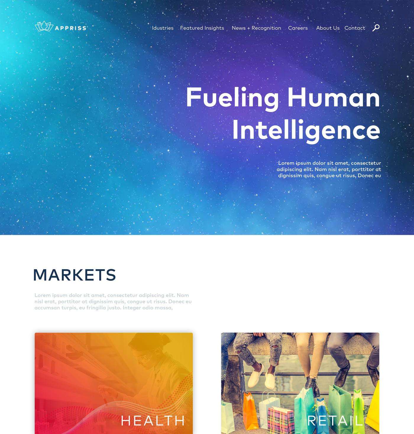
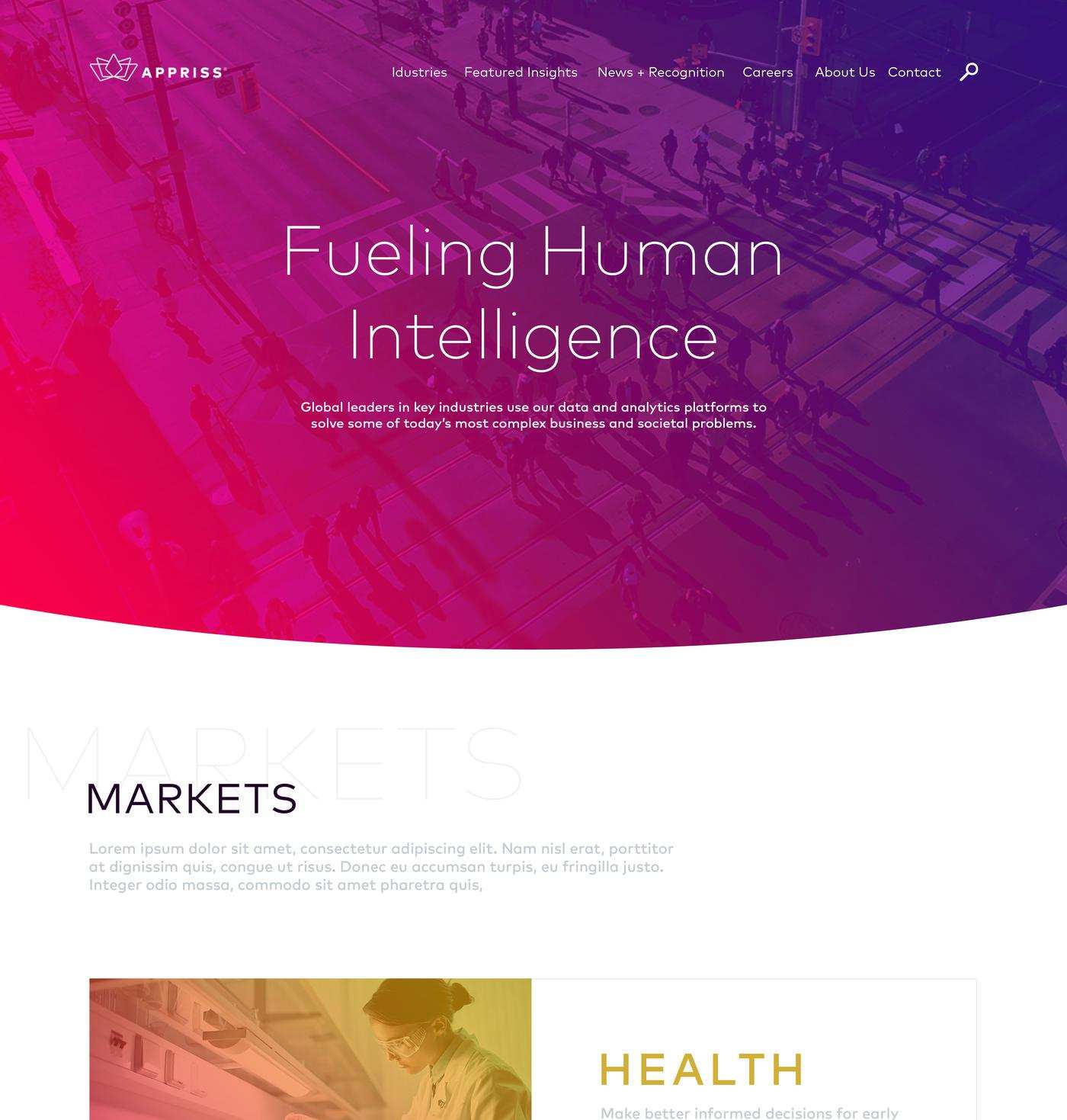
website renders for each business unit
Six masters shipped, two cuts for each unit
Safety, retail and health were each delivered twice, once with the headline and supporting line and once as clean background motion with no type at all. In every text cut the copy holds long enough to read, then fades and leaves the pattern running.
Change only what needs to change
We fixed the structure first and let only colour and pattern move between the units. That restraint is what lets separate films read as one company.