Visa
Overview
What We Did
Visa needed to bring its refreshed brand identity into the real world through a focused Out-of-Home campaign. The goal was to reimagine the “Tap to Pay” message using a new visual system that could scale across environments, formats, and audiences. Therum was brought in to help translate the updated branding into a creative rollout that felt modern, clear, and unmistakably Visa.
Overview
Visa and CannonballSF tapped us to reimagine a full-scale Out-of-Home campaign that could bring their refreshed identity to life after earlier concepts missed the mark.
What We Did
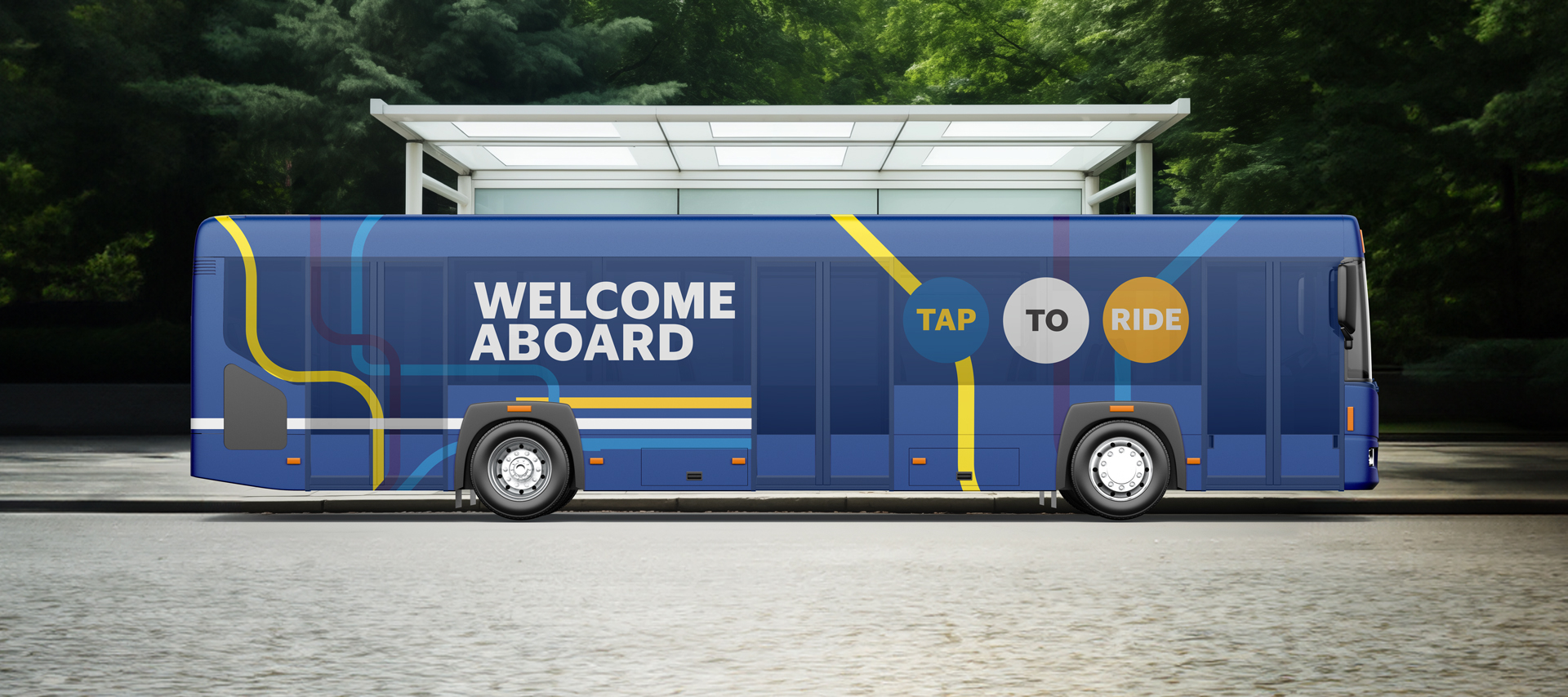
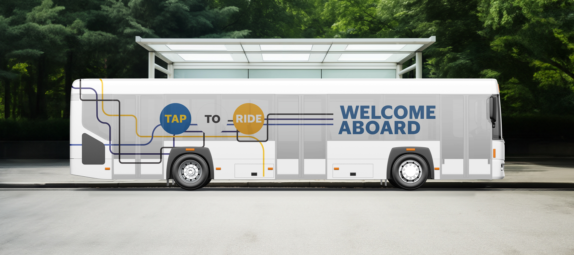
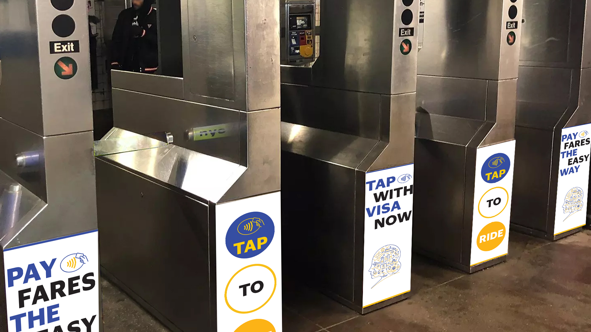
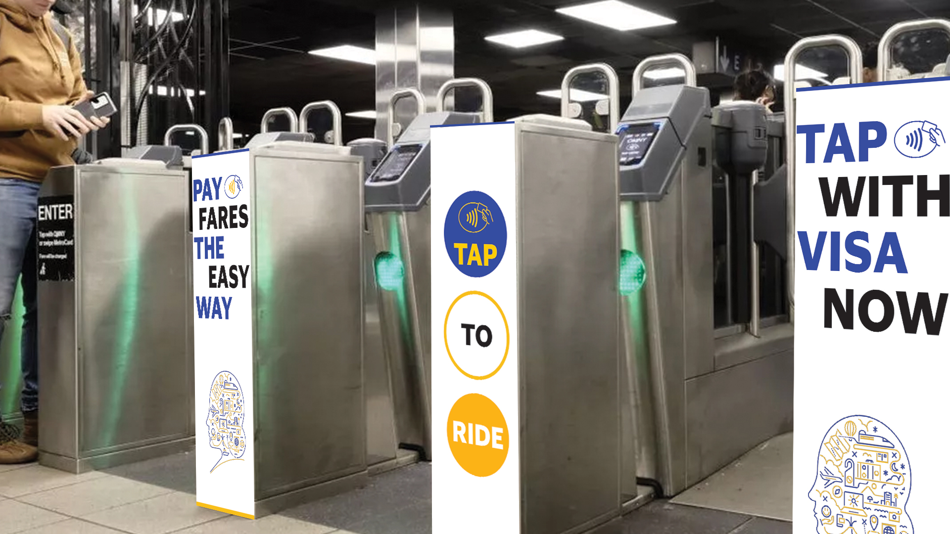
Therum translated Visa’s refreshed identity into a full Out-of-Home campaign system — reimagining the Tap to Pay message across bus, tram, rail, and street.
The Outcome
Visa embraced the concepts, and CannonballSF expanded the direction into a full production pipeline across Visa’s Out-of-Home placements.
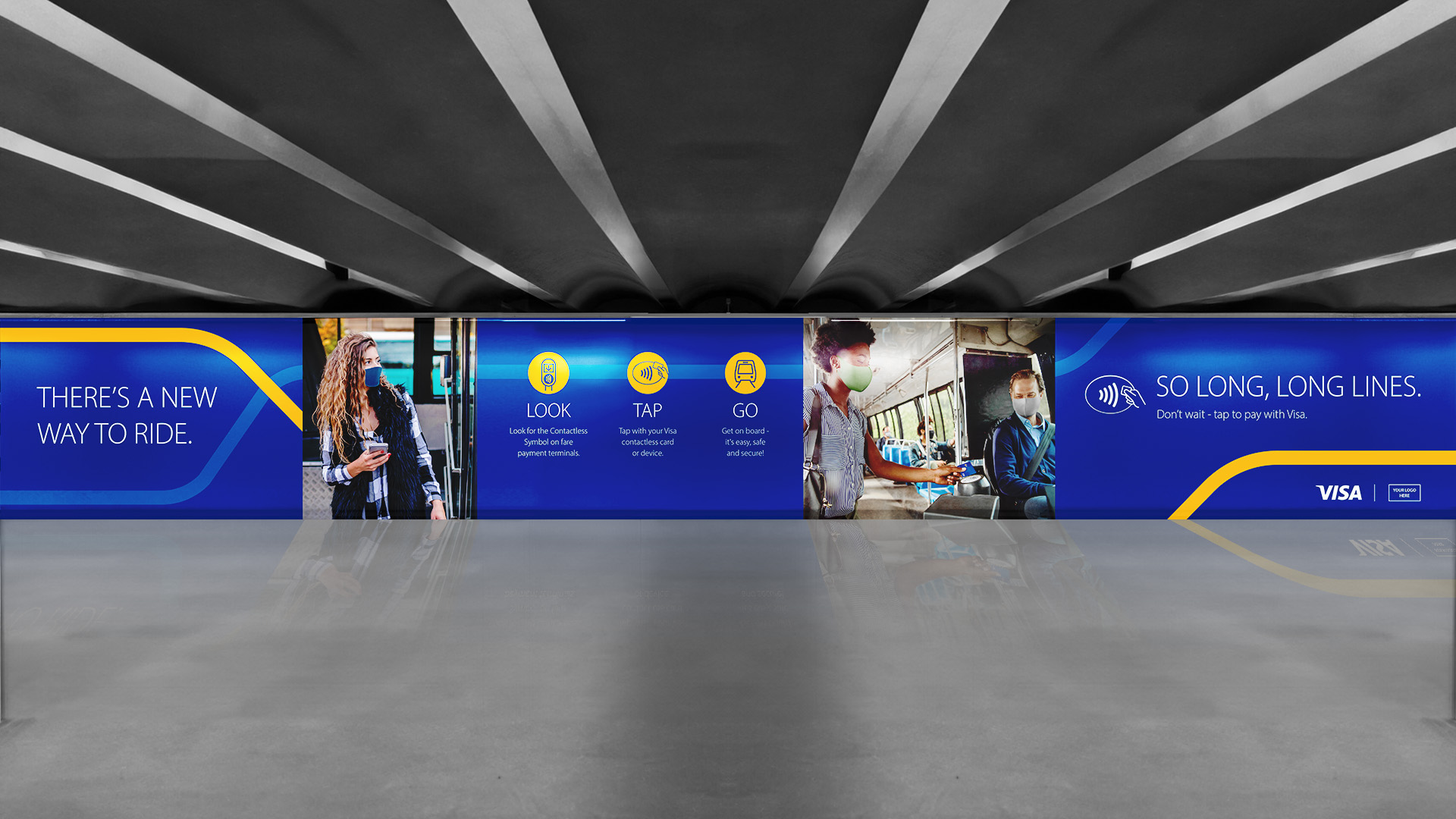
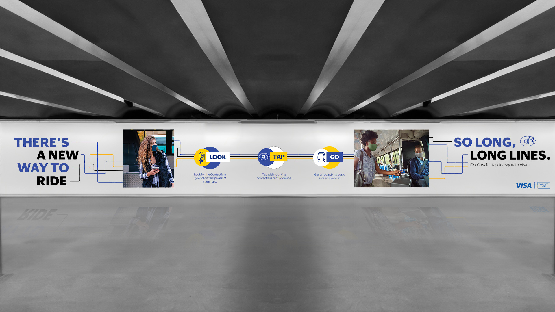
Visa gave us full creative control — a rare opportunity to rethink how the brand could live in public space. Earlier concepts hadn’t landed, so we weren’t following a direction. We were defining one.
We turned to the NYC subway map system — not just for its design, but for its clarity, structure, and ability to guide people at scale. We built a design system inspired by transit maps to tell the Tap to Pay story through motion, connection, and accessibility — designed across three levels of zoom: Macro (full environmental layouts), Base (clean visuals rooted in Visa’s refreshed identity), and Micro (close-up graphics highlighting transaction moments). The system wasn’t just inspired by wayfinding. It was designed to become part of it.
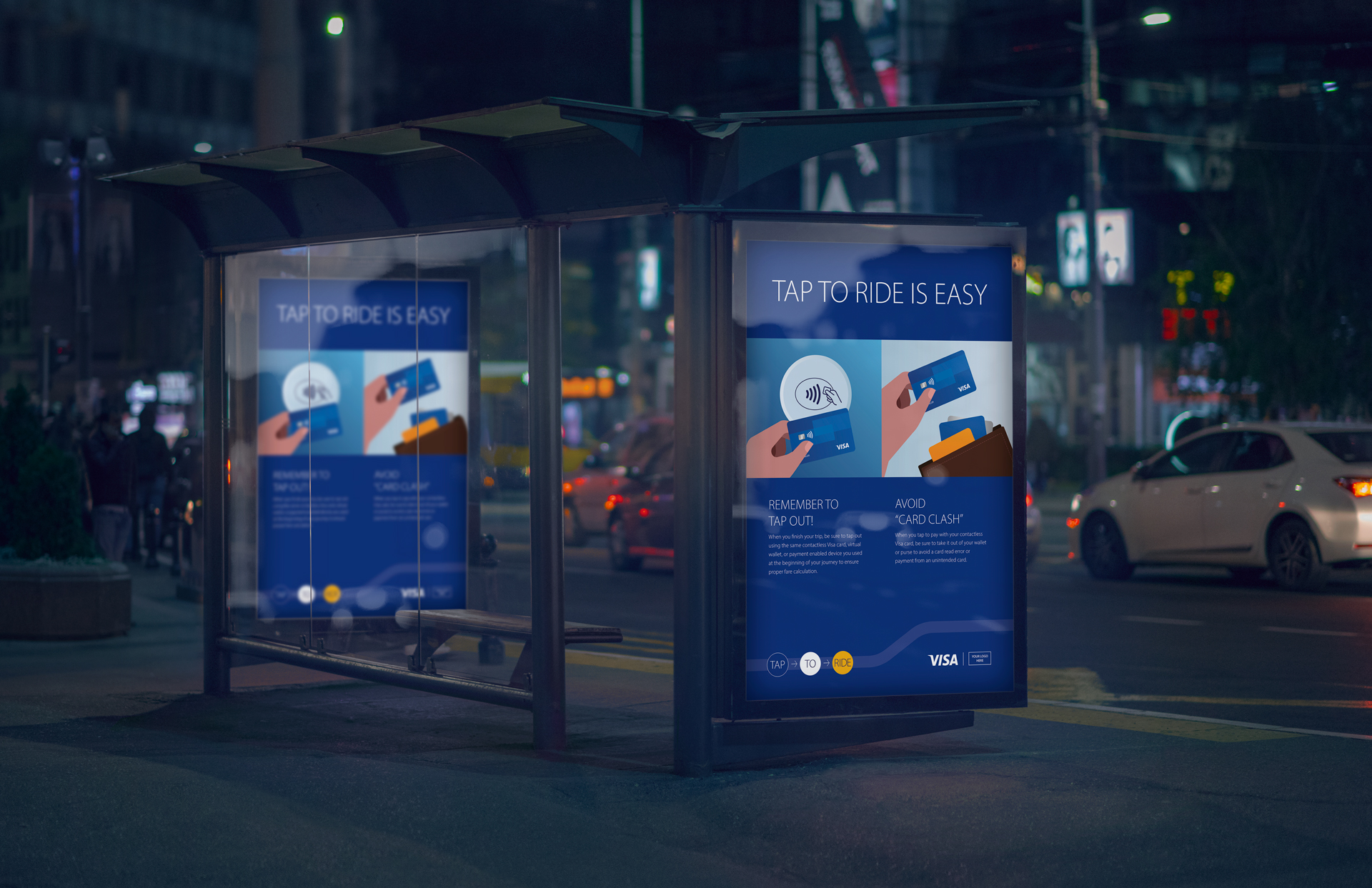
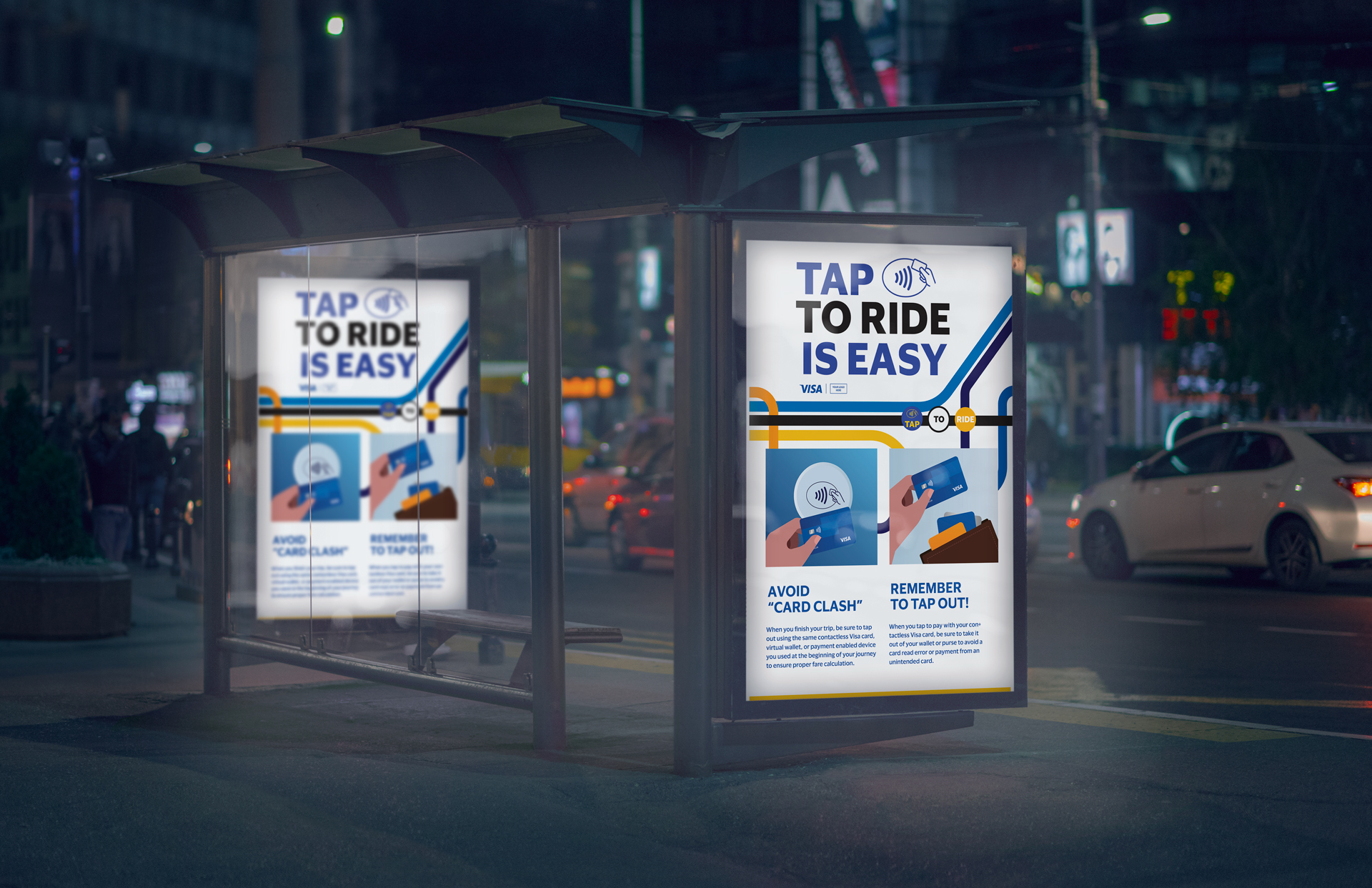
A full suite of campaign assets crafted for movement, repetition, and impact across environments: bus shelter graphics, bus wraps, tram wraps, large-format banners, turnstile graphics, motion-based digital posters, and hallway and corridor takeovers.
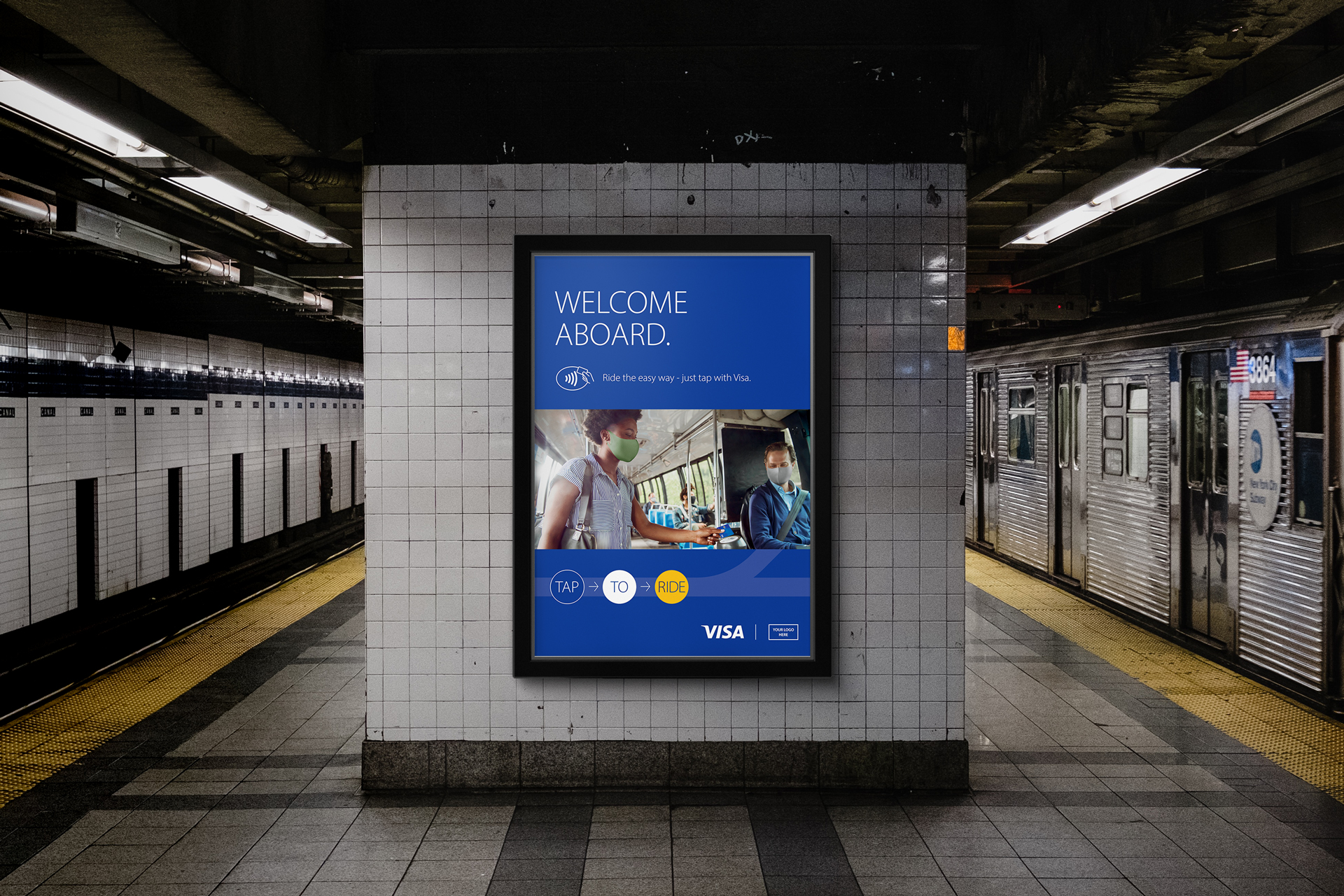
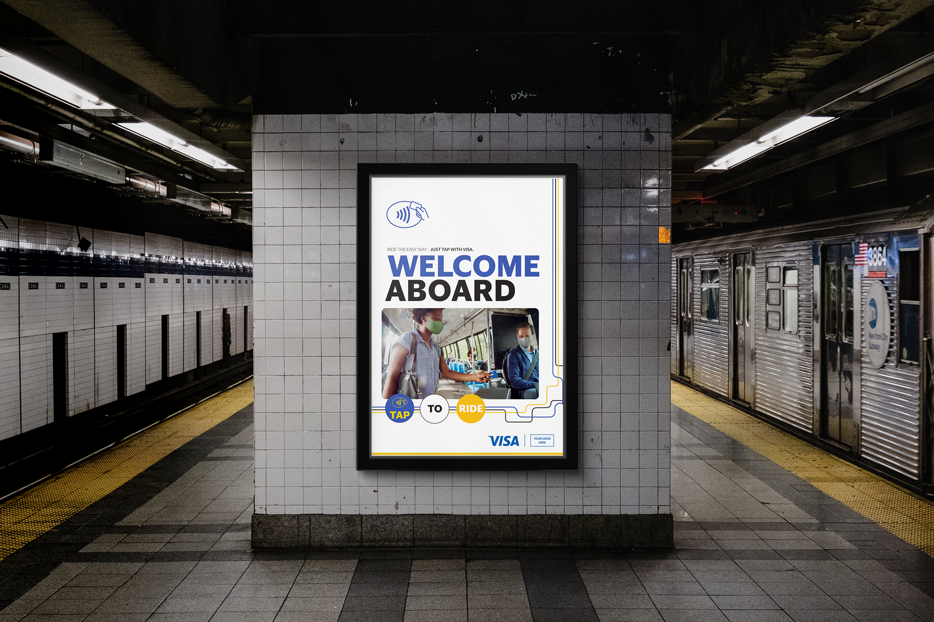
Visa embraced the concepts we delivered, marking a shift in how the brand communicates movement, access, and everyday transactions. Our work laid the visual and strategic foundation for a larger campaign rollout — from there, CannonballSF expanded the direction into a full production pipeline, delivering final assets across Visa’s Out-of-Home placements.