Timberland.
A two-tier enterprise design system, built across the VF Corp brands, Timberland, Vans, The North Face. A twelve-designer studio, a year of two-week sprints. The deliverable wasn't a website. It was the system every VF Corp e-commerce surface gets to inherit from.
Visit timberland.com ↗The pertinent details, what was built, what shipped, what it took.
Timberland · VF Corp
A two-tier enterprise design system built across VF Corp brands, Timberland, Vans, The North Face. Lead AD and product designer on Timberland, inside a twelve-designer cross-brand studio.
timberland.com ↗Lead Art Director + Product Designer
- E-commerce designs
- Design system
- Component library
- Documentation
- Art direction
- Design systems
- E-commerce
The Premise
One system. Three brands. Every e-commerce surface inside an entire VF Corp portfolio.
VF Corp owns Timberland, Vans, The North Face, and the rest of an outdoor/lifestyle apparel portfolio that sells through a dozen separate brand websites. Each one has its own identity, its own visual language, its own customer. None of them, left alone, were going to converge on a shared web experience without a system underneath them telling them how.
That's the work. Build the system every brand inherits from. Make it strict enough to standardize cart, account, search, product detail, navigation, the surfaces where consistency saves the company money and the customer time. Make it loose enough that Timberland still looks like Timberland and Vans still looks like Vans on top of it.
The broader cross-brand studio ran up to twelve designers depending on the sprint, split across Timberland, Vans, and The North Face. I was the Lead Art Director and product designer on the Timberland workstream, starting alongside one other designer and then carrying it solo, owning every Timberland surface end to end.
Two Systems, Built in Sprints
The work was structured as two layered systems, each one feeding the next.
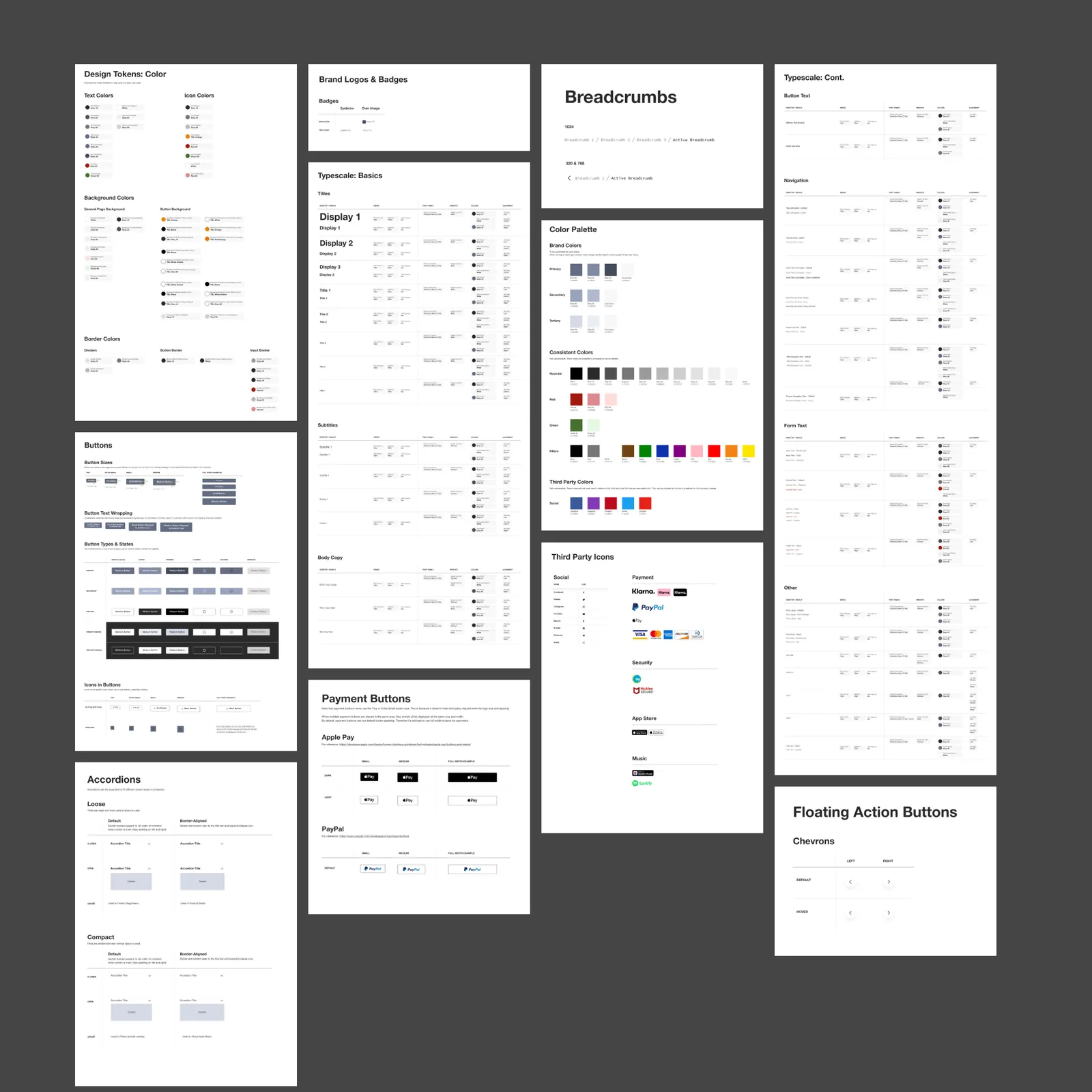
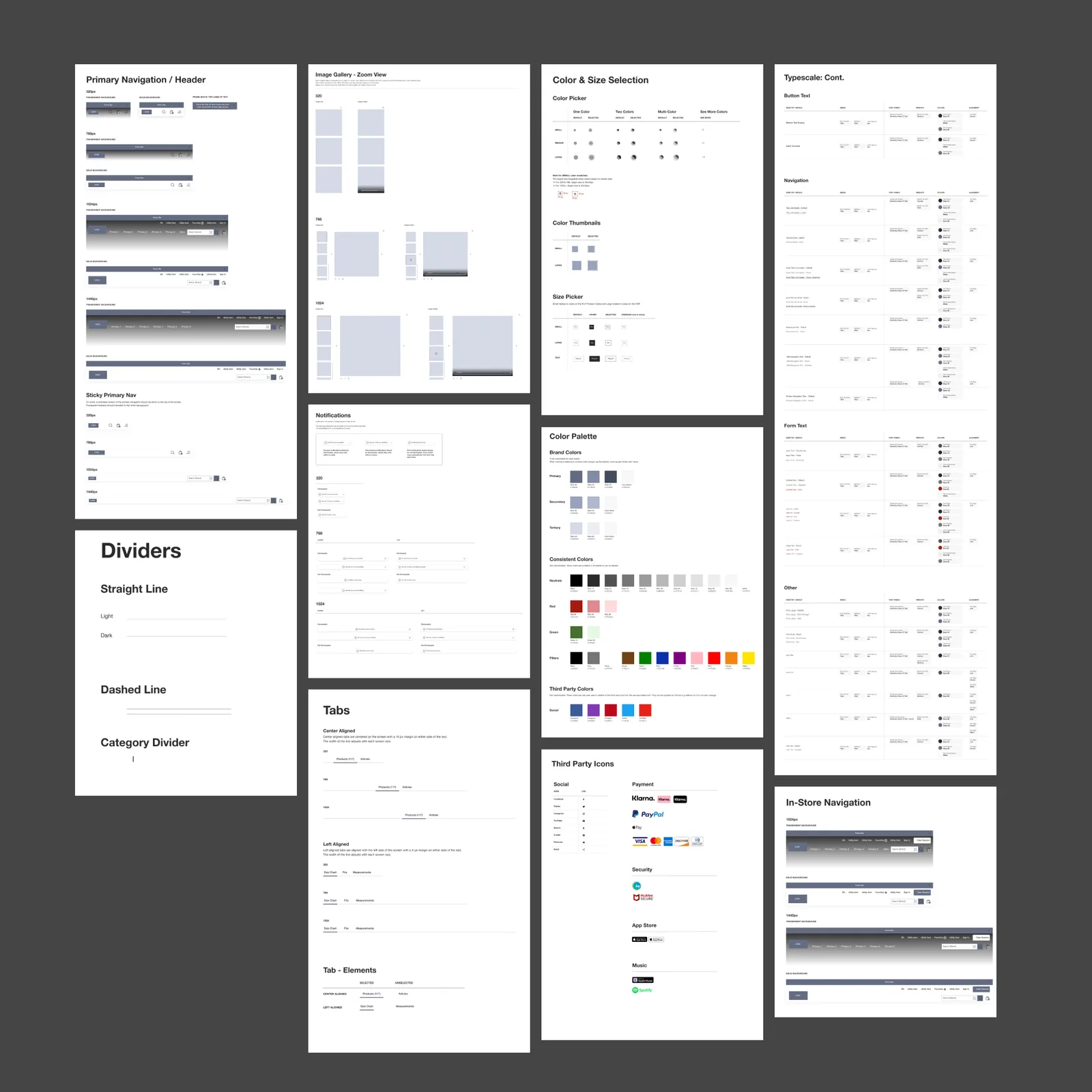
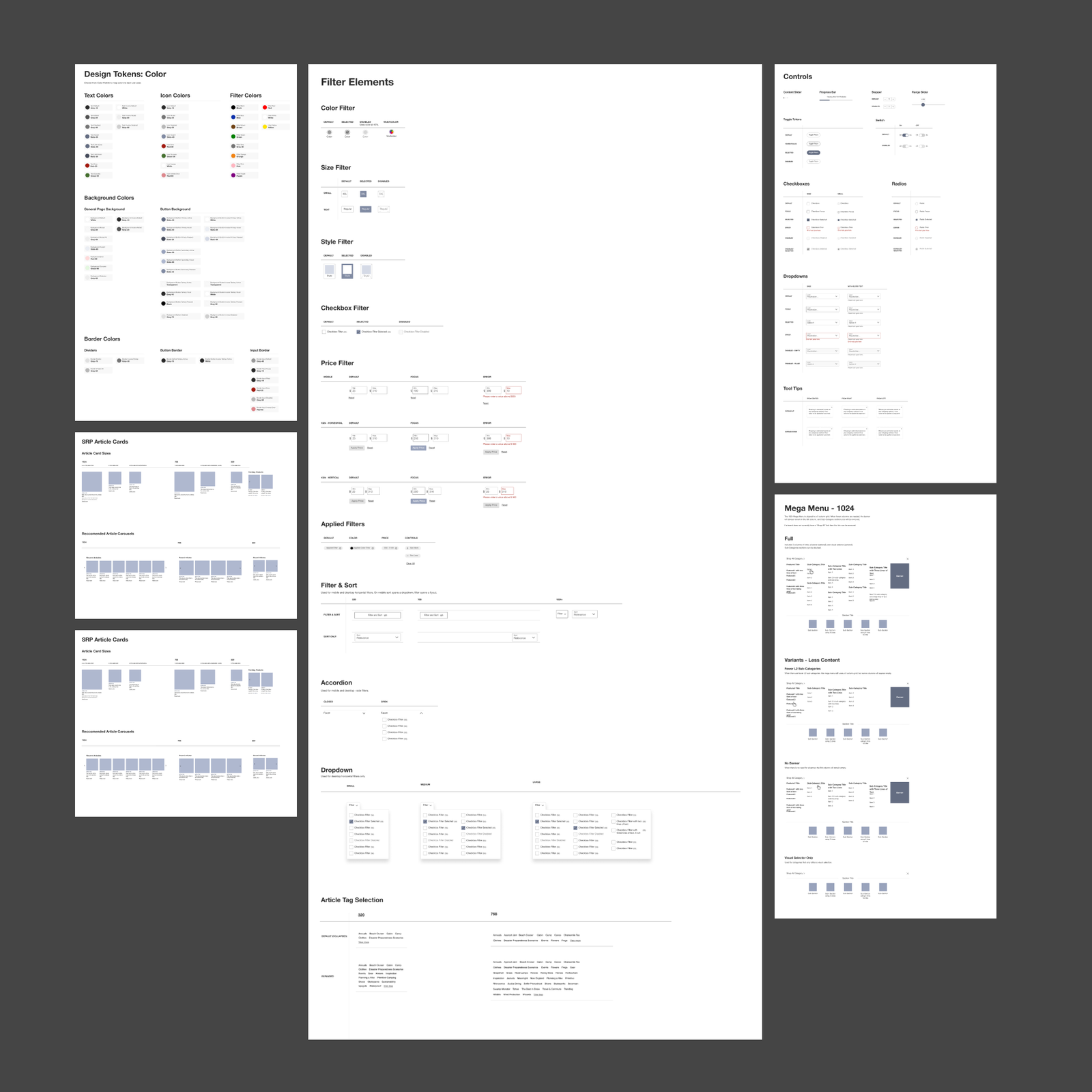
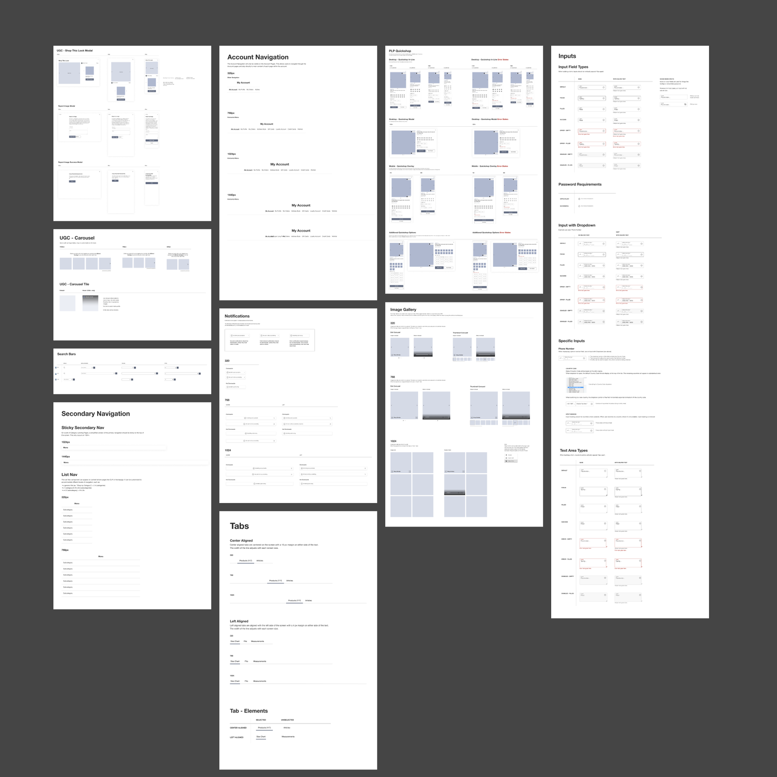
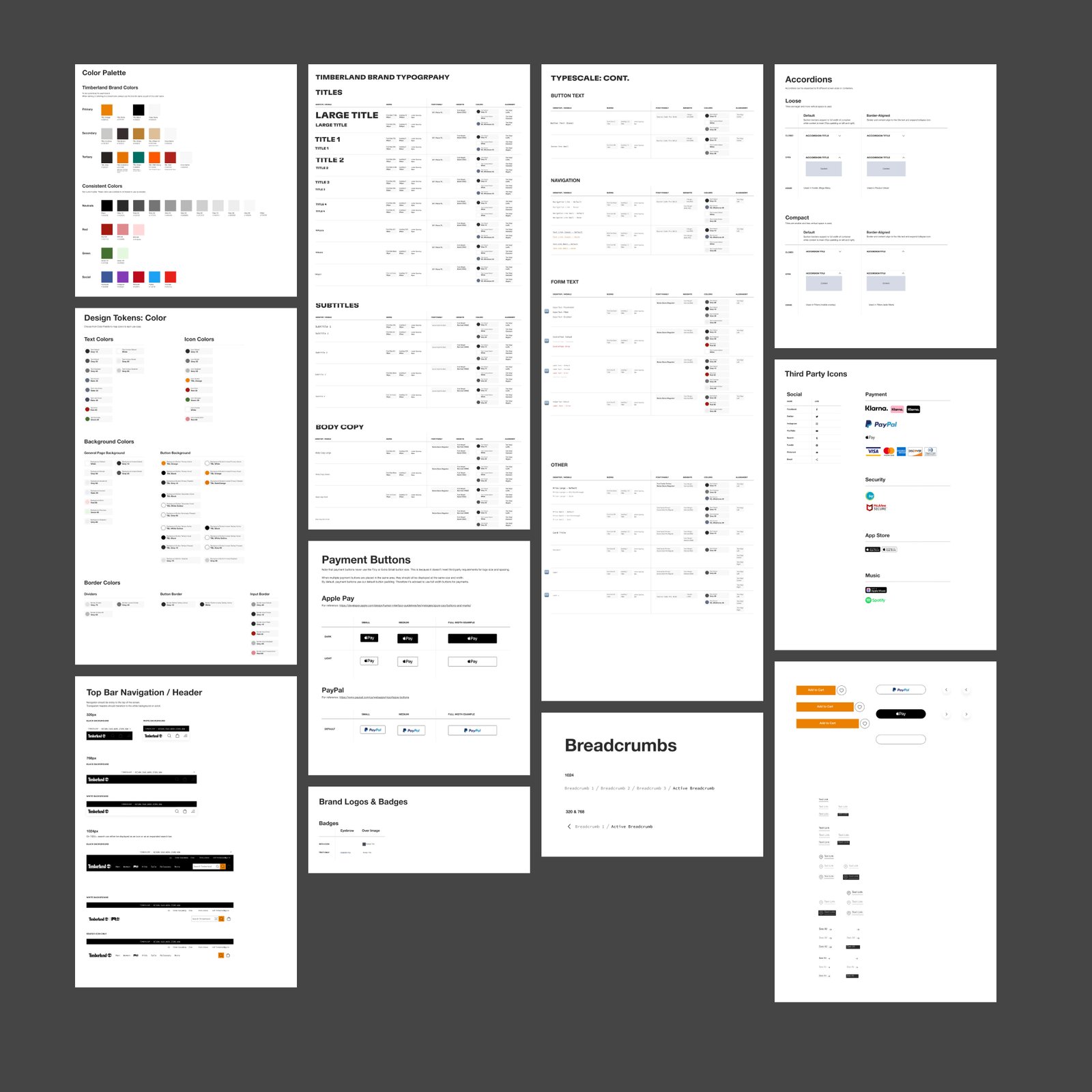
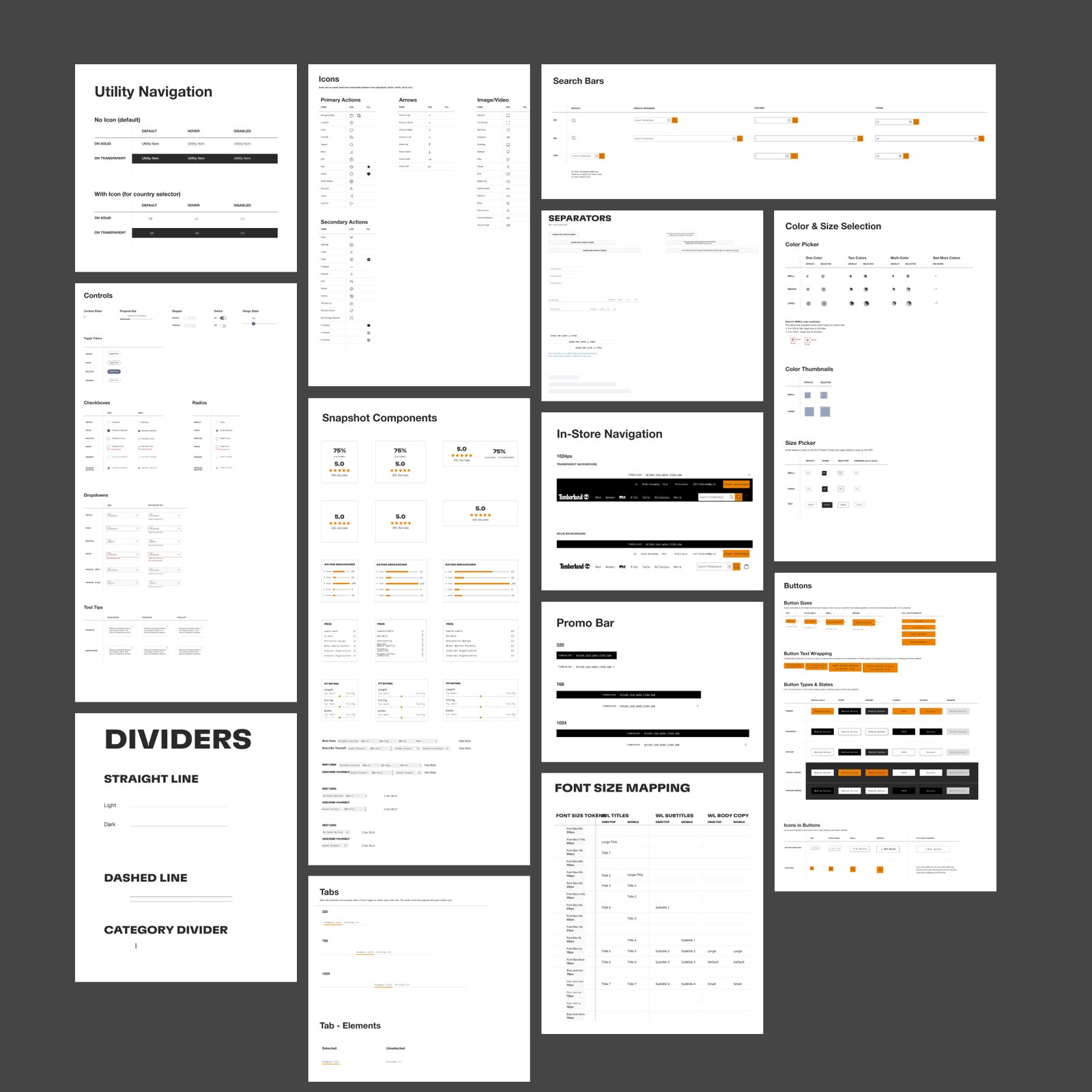
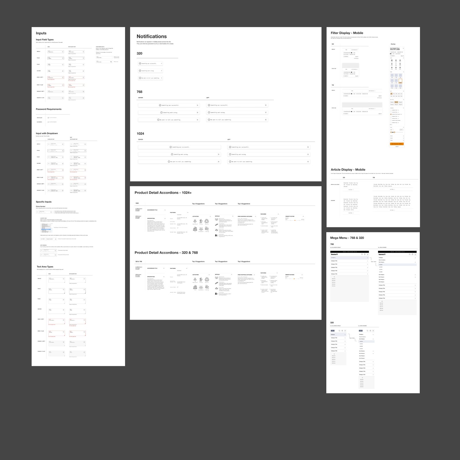
- Tier one: UX components. The atoms. Navigation menus, product carousels, filtering, payment buttons, accordions, typescale, color tokens. Built once, themed everywhere. The cohesive baseline the entire VF Corp web ecosystem inherits from.
- Tier two: page templates. The molecules. Cart, account, product landing, search results, sign-in, the high-traffic surfaces where consistency shows up in conversion. Built on top of tier one, then themed per brand.
- Tier three: brand customization. The skins. Once components and templates were locked, each brand's UI guidelines got applied: Timberland's orange CTA against black header; Vans' checkerboard accents; The North Face's red against neutral grays. Same skeleton, three voices.
Two-week sprints, repeated for roughly a year, got the components and templates done. Then a dedicated four-week documentation sprint (sizing, behavior, edge cases, dev hand-off rules) so engineering could build the system the same way at scale. Documentation is the part nobody photographs and nobody can launch without.
The Design System
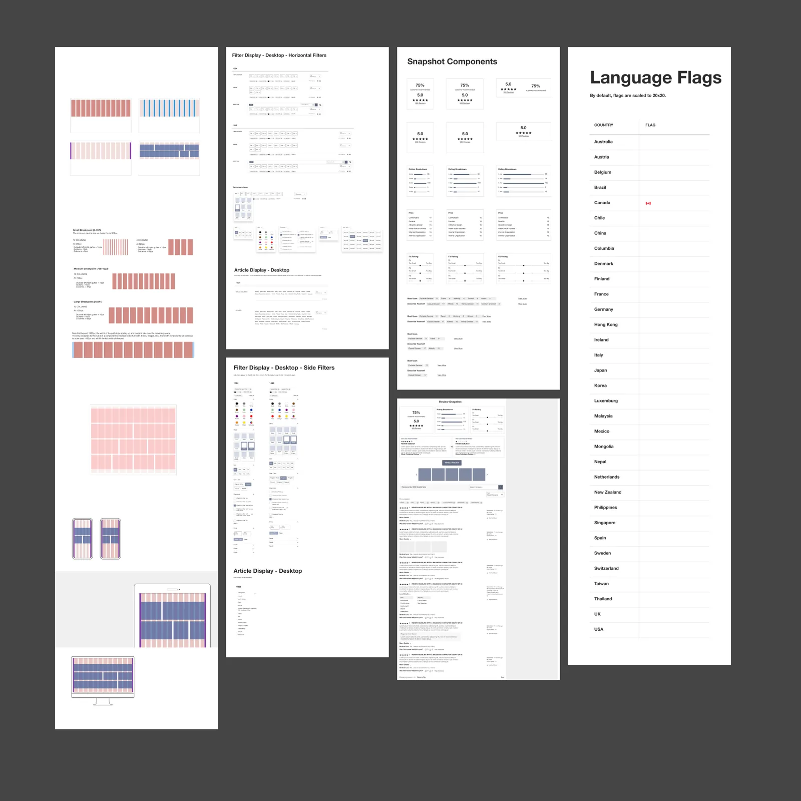
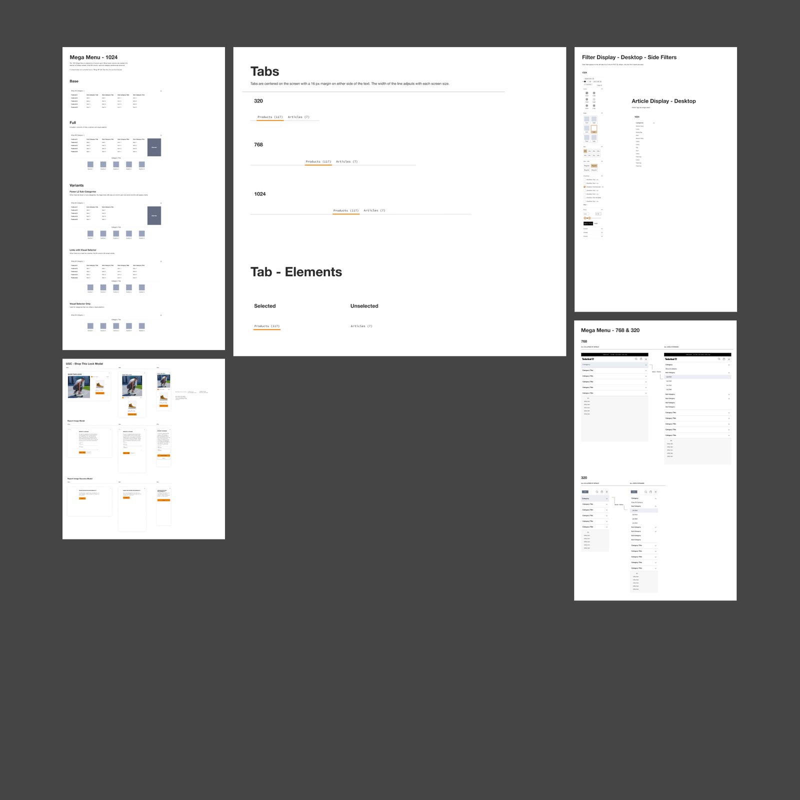
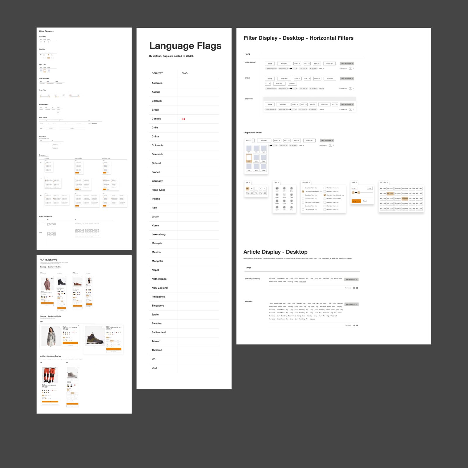
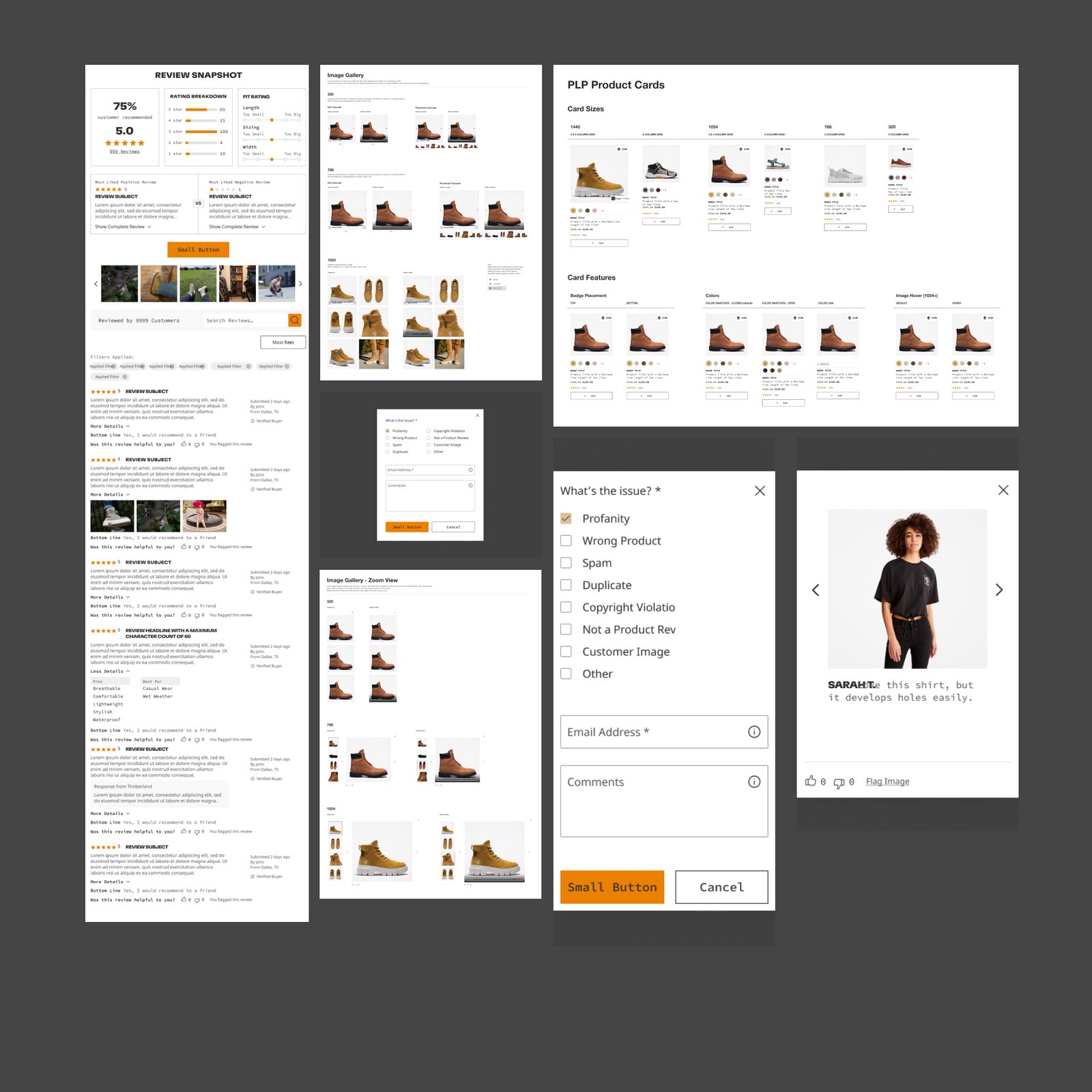
Tier one was the cross-brand foundation, UX components: navigation, product carousels, filtering, cards, forms, the typescale and color tokens, all built once as the cohesive system the entire VF Corp web ecosystem inherits from. Tier two themed those same components into Timberland's own language. Same parts, two finishes. Swipe through both sets, tap any frame to open it full-size.
Canvas, the cross-brand foundation
Timberland, themed on top

System → Theme
Same skeleton, different finish. On the left: the page template as wireframe, built from UX components, before any brand touches it. On the right: the same template themed for Timberland, black header, orange accent, brand typography, real photography. Five page templates, paired.
Drag the handle left to reveal the wireframe, right to reveal the Timberland theme. Five page templates.
What I Owned
The cross-brand system was a team build. The Timberland implementation of it was mine.
- Lead AD + product designer on Timberland. Production, design, and development oversight for the brand's full UI/UX e-commerce experience, both the EMEA and the NORA market sites. Started with one other designer, then ran it solo.
- Owned the brand theming. Took the cross-brand UX components and page templates and applied Timberland's UI guidelines (type, color, photography, tone) to every shipped surface. The right side of every pair above is my hand on top of the team's foundation.
- Held the line on a shared system. Kept the Timberland build aligned to the cross-brand system the wider studio (Timberland, Vans, The North Face) was building from, so the brand inherited the foundation without losing what made it Timberland.
- Asset development for both markets. EMEA and NORA have different product mixes, different photography sets, different copy registers. Kept the system honest across both without duplicating the work.
Why Two Tiers
Components below, brand on top. The system that ships ten brand sites without ten brand fights.
Enterprise design systems live or die on the shape of the layering. A single system that tries to be every brand at once flattens all of them. A separate system per brand multiplies the work and burns the consistency. The two-tier model (cross-brand bones below, brand-specific finish above) is the one that lets a portfolio company ship at scale without the brands losing what makes them themselves.
That's what this work was: the foundation, the templates, the documentation, the brand application, all running on the same set of rules, all shippable, all in production. The Timberland side was my hand. The system itself belongs to the team.