The Sidemoney Company.
Brand-as-system on WordPress. The theme handles the plumbing, Sidemoney is everything the customer sees. Live at sidemoney.co, shipping since 2019, now powering the Foot Locker City Series.
Visit sidemoney.co ↗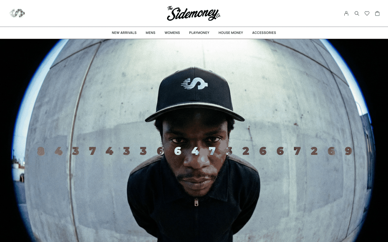
The pertinent details, what was built, what shipped, what it took.
The Sidemoney Company
End-to-end product design, brand system, and WordPress commerce build. Founded 2019, refiled 2025 for retail trademarks. Fulfilling orders since day one.
sidemoney.co ↗Founder · Designer · Builder
- E-commerce store
- Brand system
- Product design
- Design system
- Product design
- UI/UX
- Design systems
- Brand systems
- Full-stack WordPress
The Premise
Four reasons to rebuild. None of them were “redesign.”
This case study is about sidemoney.co, the digital experience for The Sidemoney Company. Sidemoney is a never-ending conversation about society, money, and the ways the two intertwine, told through apparel, culture, and financial literacy. The brand itself (identity, photography, the City Series, PLC Detroit) is its own story. This one covers the platform that ships it.
Apparel ecommerce defaults to one of two trades: a Shopify theme out of the box, or a WooCommerce theme on WordPress and barely touched. Either way the brand inherits someone else’s assumptions about what a hero is, what a PDP looks like, and how a cart should feel. Editorial pacing dies inside theme defaults, category logic can’t reflect how the brand actually thinks, and the cart looks like every other cart. The Sidemoney rebuild took Moderno, a strong WooCommerce theme, and pushed it past what most brands ever do with a theme: custom page templates, custom commerce flow, custom components, custom hooks, until the theme is the foundation and Sidemoney is everything you see.
Four reasons drove it. None of them were “redesign”:
-
01
Replatform. The old stack was bleeding server resources; checkout was timing out under traffic. Performance had become a brand problem, every drop got punished by the platform instead of protected by it.
-
02
Rebuild for parity. Keep everything the brand had already earned, search ranking, content history, retail-partner feeds, the Foot Locker integration. Lose nothing in the move.
-
03
Make the storefront feel like the brand. The site had to read like Sidemoney (editorial first, currency as the narrative throughline) not a templated ecommerce shell wearing the logo.
-
04
Subtle rebrand of the digital experience. Same identity, evolved for what’s next, tighter type, more editorial pacing, photography that gets to lead instead of decorate.
What follows is how each of those resolved on the live site.
The Stack
Moderno is the foundation. The brand happens on top, in the templates, the cart, the editorial pacing, the photography frames.
Sidemoney runs on WordPress + WooCommerce + Moderno, but you’d never know it from the front end. Moderno is the stable base, a well-built WooCommerce theme that handles the unsexy plumbing (product schema, cart logic, checkout flow, payment integrations) the way it should be handled. On top of that base sits a layer of custom page templates, custom commerce treatments, custom hooks, custom components, the layer where the brand actually lives.
The reason for this split isn’t ideology, it’s arithmetic. Building the plumbing from scratch is a year of work for no brand-visible payoff. Buying a theme and stopping there gives away the brand to a vendor. The middle path (theme as foundation, brand as the layer customers actually see) gives you both: a battle-tested commerce engine underneath, and a storefront that looks like nothing else on top.
This is how I work in general, take a strong theme as scaffolding, use its functionality (commerce hooks, product schema, cart logic, plumbing) and almost none of its built-in design sets, then build the layouts, components, and brand surface fresh on top. Sidemoney is that approach pushed as far as it goes on WordPress before the Therum OS migration takes it further.
The next version migrates onto Therum OS, the CMS-agnostic operating layer I’m building (separate case study in this portfolio). Sidemoney becomes the first commercial deployment of Therum’s e-commerce surface. Whatever a serious apparel brand asks of the platform (performance, brand-as-system, plugin freedom, content portability) gets battle-tested here first.
-
01L1Foundation
The bedrock.
Battle-tested commerce plumbing. Boring on purpose, this layer never has to argue with the brand.
- WordPress 6
- Moderno
- Hostinger
- Cloudflare
- MySQL
- LiteSpeed
-
02L2Commerce
Cart, checkout, fulfillment, distribution.
Woo handles schema and order flow. CheckoutWC re-skinned into the brand. Printful for POD, CTX Feed pushing the catalog to Google, Foot Locker, Instagram. No generic surfaces.
- WooCommerce
- CheckoutWC
- WooPayments
- PayPal
- Printful
- Smart Coupons
- CTX Feed
-
03L3Templates
Seven page types, each designed for its job.
Home · Category · PDP · Cart · Checkout · About · Contact. Elementor templates with custom PHP and hooks layered on Moderno, each built for what the page actually does for the brand.
- Elementor templates
- Custom PHP
- Custom hooks
- Code Snippets
- WPCode
-
04L4Composition
The brand surface, where Sidemoney lives.
Customized at the CSS, hook, and component level until Moderno’s defaults are nowhere on the page. Home reads like a magazine cover. Categories read like editorials. PDPs read like product stories.
- Elementor
- Custom CSS
- Custom JS
- ACF
- Meta Box
Lean build, just a denser toolkit. A handful of these plugins are doing the heavy lifting that keeps a one-person shop shipping at this pace. The rest are commerce, SEO, and security tax, necessary, but not the story.
- Perfmatters: strips WordPress bloat at the source. Disables unused REST endpoints, drops jQuery where it isn’t needed, kills emojis and embeds, defers JS, surgical per-page script control.
- LiteSpeed Cache: page + object cache tuned per surface. Storefront pages cached hard; account, cart, checkout bypassed. First visit hits origin, everything after hits cache.
- ShortPixel: WebP every uploaded image at every responsive size, lossless on the assets that need to stay sharp. No manual export pipeline.
- WPCode + Code Snippets: site-wide PHP / JS without theme hacks or child-theme overhead. Snippets versioned in source, deployed from the dashboard, survive theme updates.
- ACF + Meta Box: custom data on any post type without bespoke schema. The brand layer can hang its own fields off products and pages without touching plugin code.
- CTX Feed: auto-pushes the catalog to Google Shopping, Foot Locker, Facebook, Instagram. Distribution surface without the manual export-CSV-and-pray loop.
Every plugin in the stack is one more thing to watch on update day, one more attack surface, one more potential hook collision. Curation is the discipline, every slot earns its place or gets pulled. Therum OS is where most of them get absorbed into the platform itself.
WordPress can be one of the fastest commerce platforms in the world or one of the slowest, the difference is whether someone is actively tuning it. Sidemoney gets tuned across four layers:
Cache. Page-level HTML cached at the server via LiteSpeed, object cache for repeat DB queries, browser cache headers set aggressively for static assets. Edge cache rules tuned per surface, storefront pages cached hard, account and cart pages never cached, checkout bypassed entirely.
Database. WordPress’s MySQL bloats if you let it. Sidemoney’s gets active management: autoload table kept lean, product meta indexed for the specific queries Woo runs at scale, post revisions limited, orphaned meta swept. A clean database means fast queries means fast pages.
Edge. Cloudflare sits in front of everything, static assets cached worldwide, Brotli compression, HTTP/3, DDoS protection, smart routing. The browser asks Cloudflare first; the origin only gets touched for dynamic content.
Code. Perfmatters strips bloat, ShortPixel compresses every image to WebP, and custom code handles the rest, conditional asset loading, critical CSS inlined for above-the-fold render, custom queries replacing Woo’s heavy product loops on pages where the full machinery isn’t needed.
The Sidemoney site is Therum OS’s proof of work. Whatever a serious apparel brand asks of the platform, this is where it gets answered first, under real traffic, with real orders, with a brand that already has its own gravity.
The Build
The build started in the apparel landscape, not in a wireframe tool. Kith treats the homepage like a magazine cover, editorial frames, big photography, copy that sounds like a stylist instead of a SKU manager. Zara runs storefronts where category IS the navigation, pick a world, then shop it. The best DTC apparel shops have learned what big-box ecommerce still resists: product grids don’t sell apparel. Mood and movement sell apparel.
Wireframes were quick layout maps (home, about, contact, shop, PDP, SRP) not a slow process gate. The site got built by collecting the layout moves that actually work for apparel and arranging them around the kind of photography I wanted to shoot. Every wireframe is a decision about where the brand lives on that page, not just where the content sits.
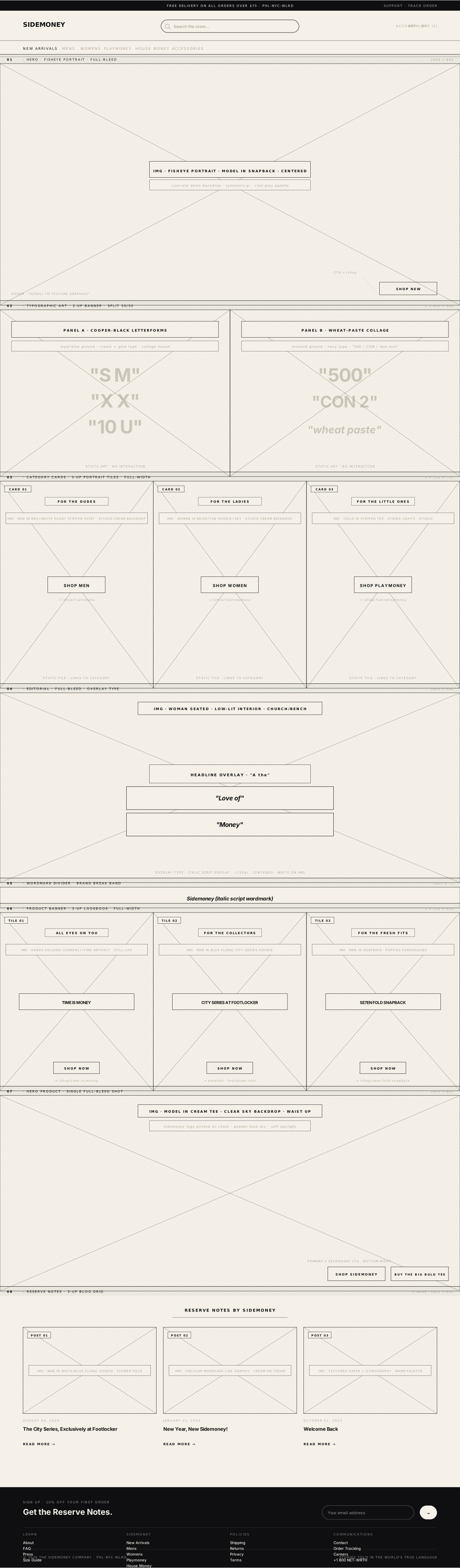
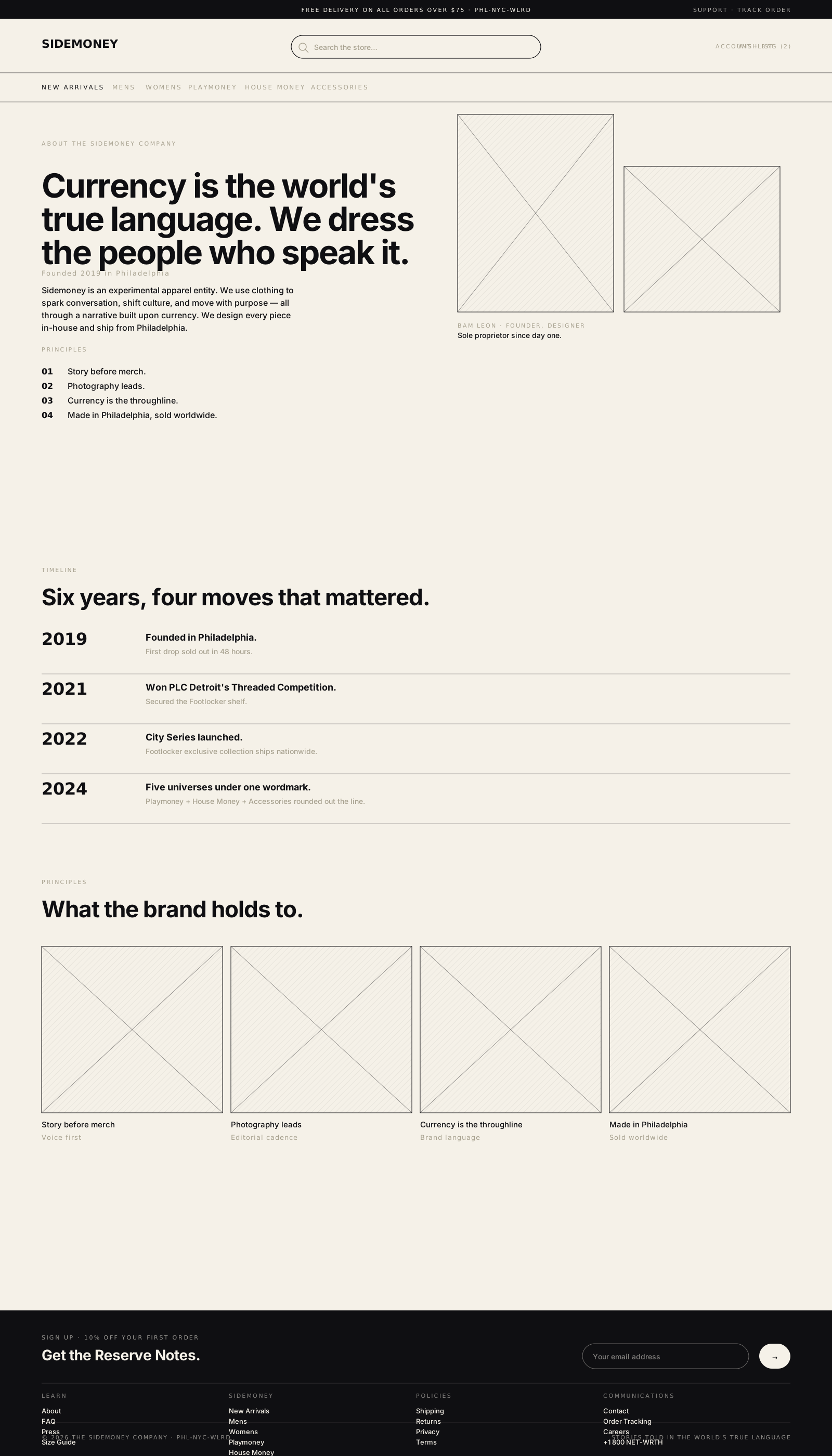
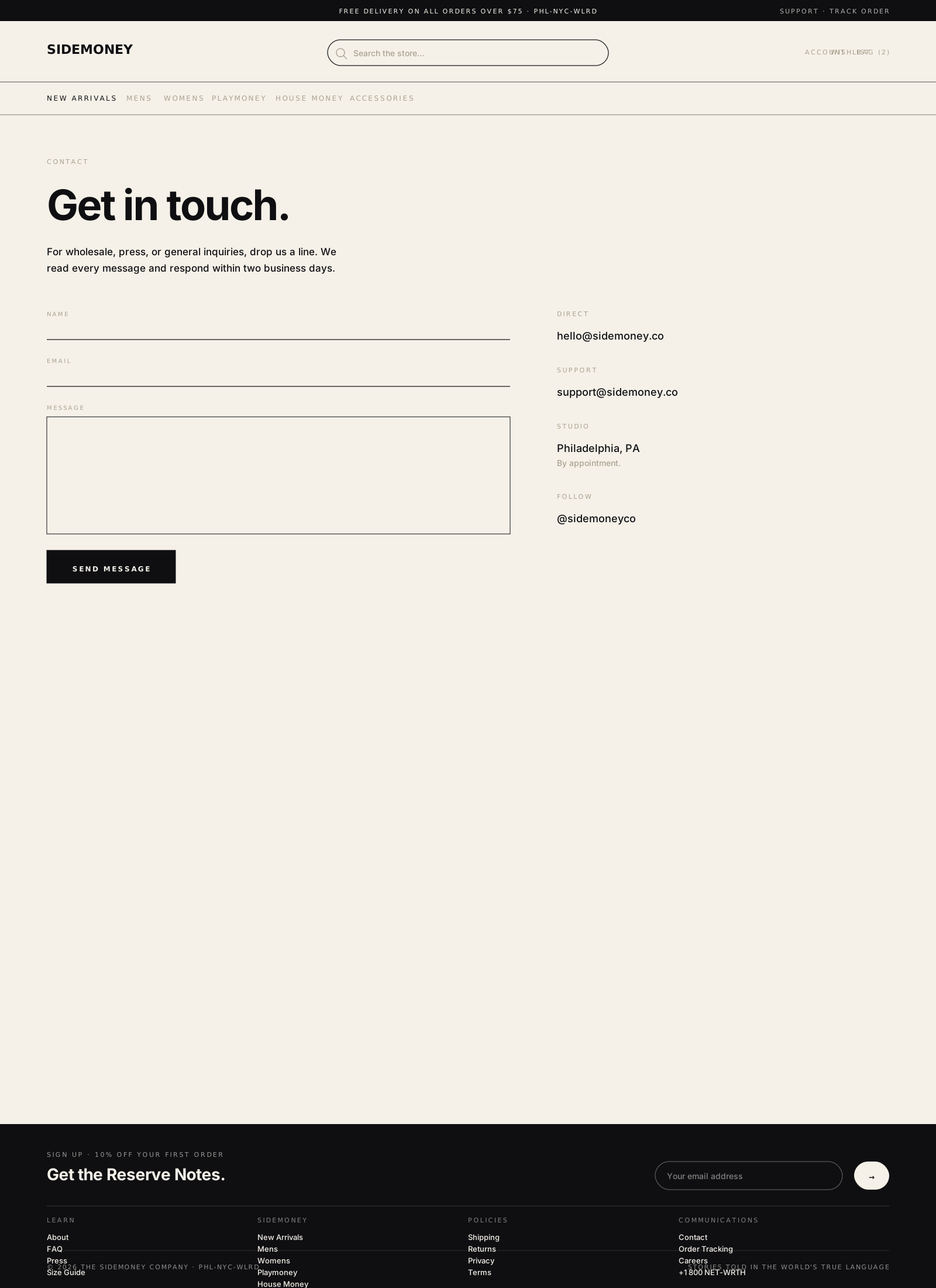
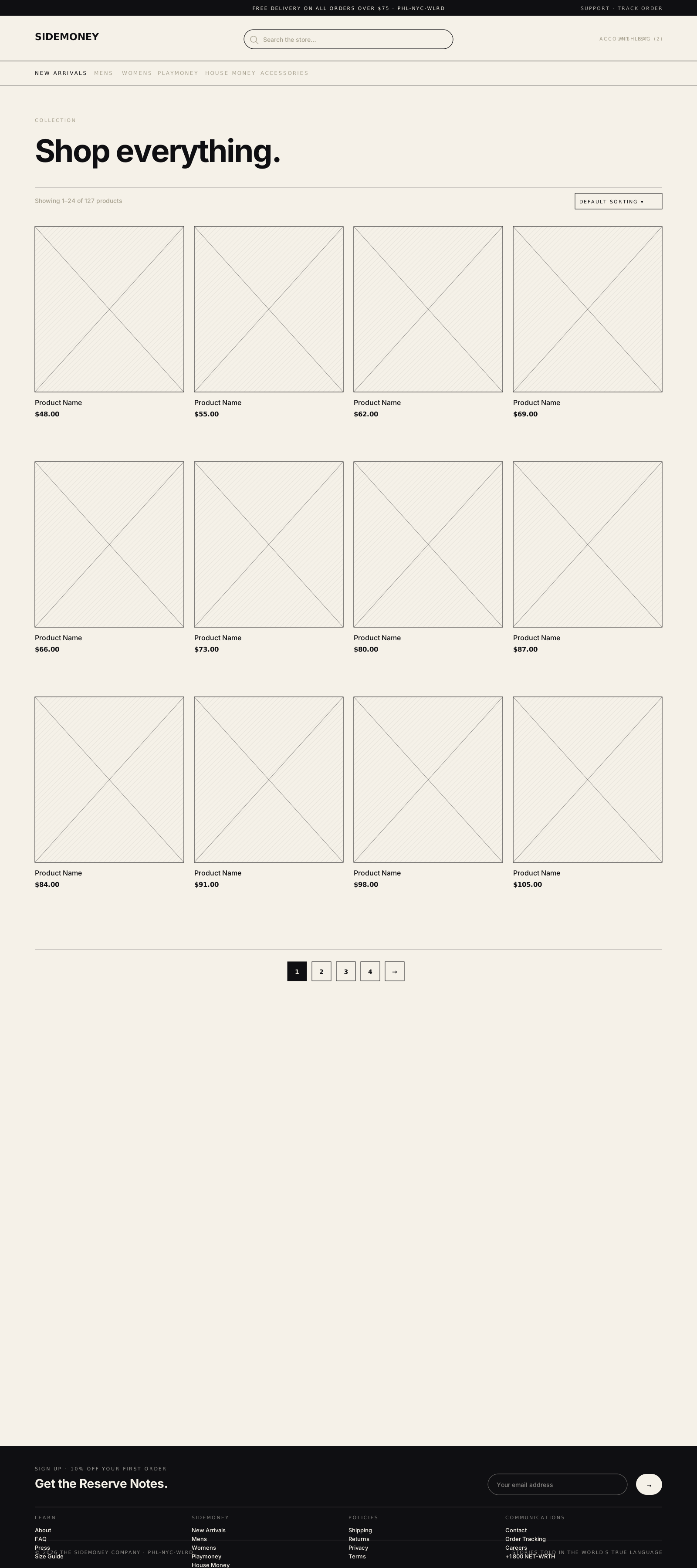
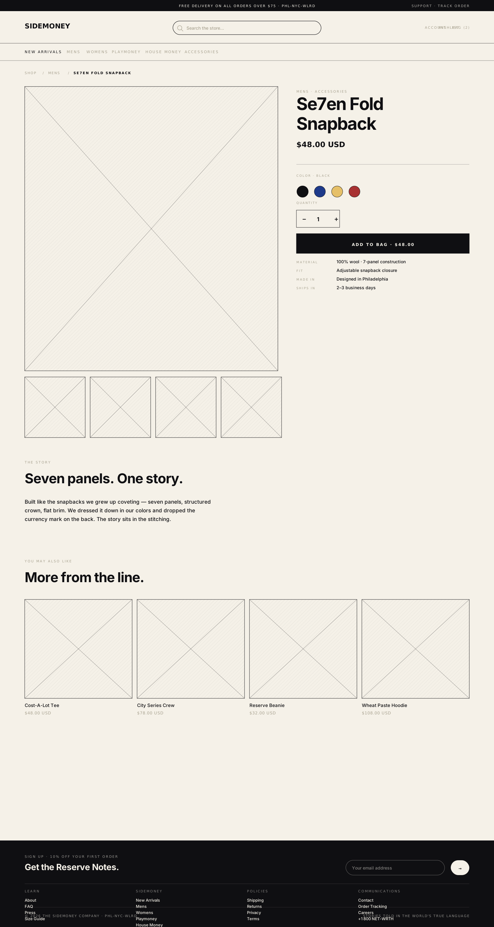
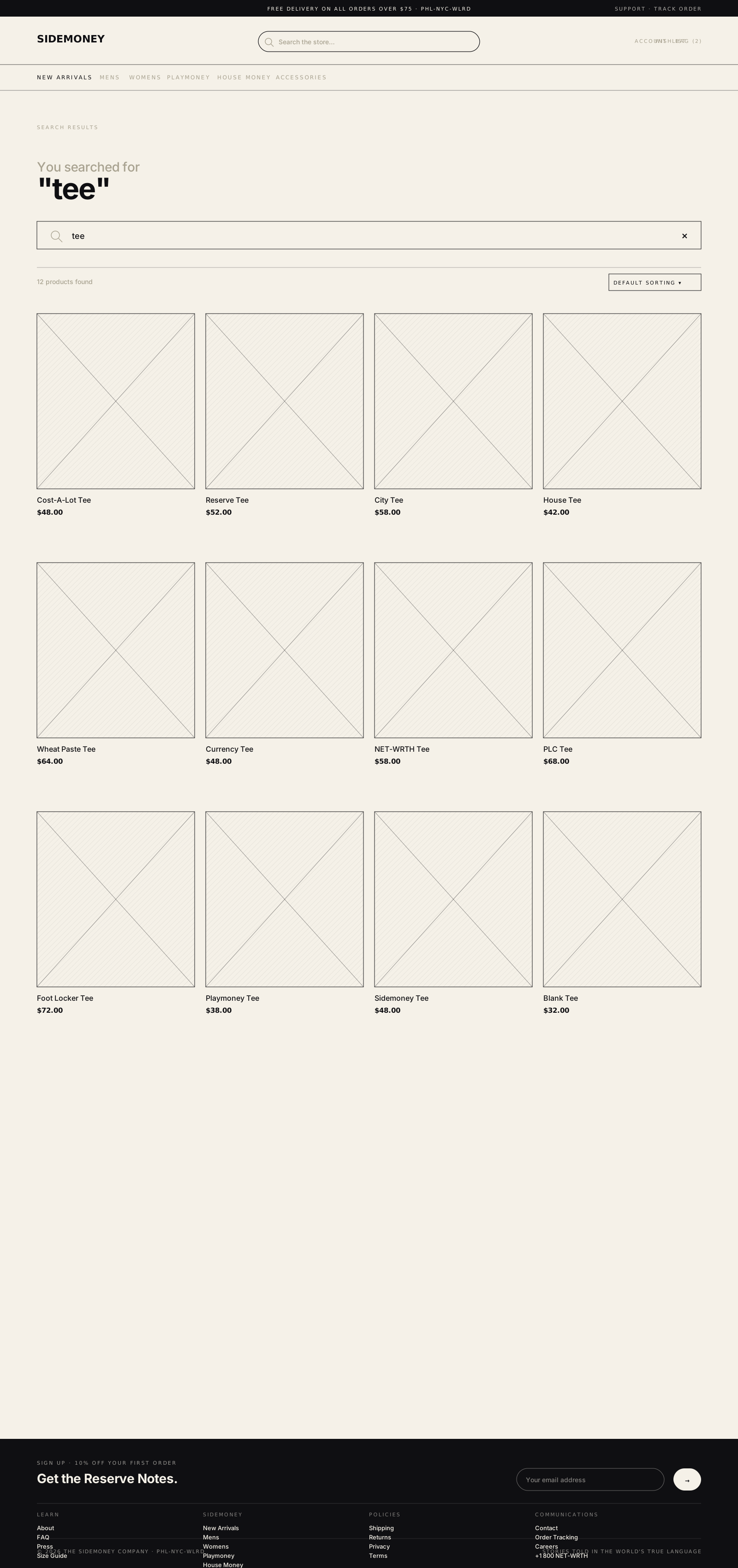
Underneath the layouts: a digital design and brand system. Color, type scale, grid, components, the rules that make the whole site behave like one piece instead of seven pages stapled together. Every page template draws from this same shelf, which is what lets the brand stay coherent across home, category, PDP, and checkout without anyone having to remember what the brand looks like on page three.
- Ink#0F0F12Headlines · primary text
- Paper#F5F1E8Default canvas
- Currency green#1F4D2BFederal Reserve note
- Banknote tan#C4A37AEngraving texture base
- Gold foil#D4A14AHero accent
- Muted#7A7A80Labels · meta
- Ease
- cubic-bezier(.32.72, 0, 1)
- Fast
- 180ms
- Slow
- 320ms
- 4
- 8
- 16
- 24
- 32
- 48
- 64
- 96
- We don’t sell stories, we document systems.
- Direct, honest, stripped of fluff. No corporate speak.
- Quiet and sharp. Philadelphia-rooted, institutional in tone.
Four ways customers actually buy from Sidemoney. The wireframes are tuned for all of them, not optimized for one and tolerating the others.
The slow path. Land on the home, drift through a category, settle on a piece, buy it. Most first-time visitors run this one, editorial home, photo-led category, story-led PDP, low-friction cart.
- Entry
- Home
- Category
- PDP
- Cart
- Checkout
Straight from an Instagram drop or newsletter link. Skip the storefront entirely, land on the PDP, quick-add, checkout. Cart and checkout are built for this: speed without losing the brand around the transaction.
- Entry
- PDP
- Quick Add
- Checkout
Came looking for something specific, City Series, Cost-A-Lot, a size restock. Skips the home, opens search. The SRP is product-first, photo-led, no filter overload, find it, click it, buy it.
- Entry
- Search
- SRP
- PDP
- Cart
- Checkout
Brand-led discovery. A lookbook frame or a Reserve Notes article leads to the piece worn in it, story first, product second. Editorial pages link tight to PDPs so the path from “I want that vibe” to “I bought that piece” is one click.
- Entry
- Editorial
- PDP
- Cart
- Checkout
Live Site
The shipped surface. Six page types live, plus the category tiles that drive the homepage. Everything below this line is in production right now at sidemoney.co, handling traffic from the Foot Locker partnership, Instagram drops, and direct search.
The pages aren’t templates with content swapped in. They’re each their own piece, the home leads with photography and editorial frames, the categories do the work of segmenting the brand into worlds, the PDPs read like product stories, the cart and checkout stay inside the brand to the last click.
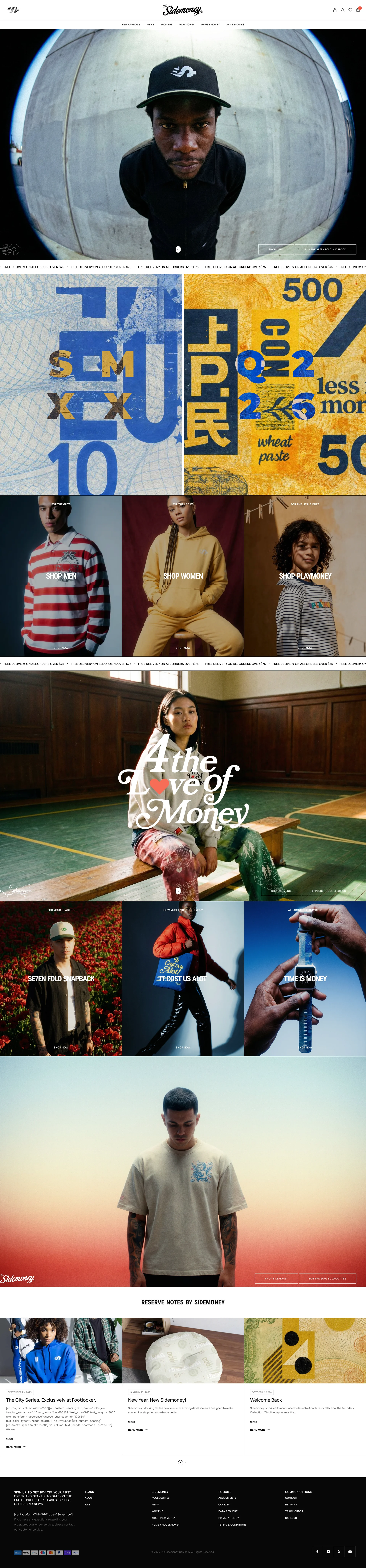
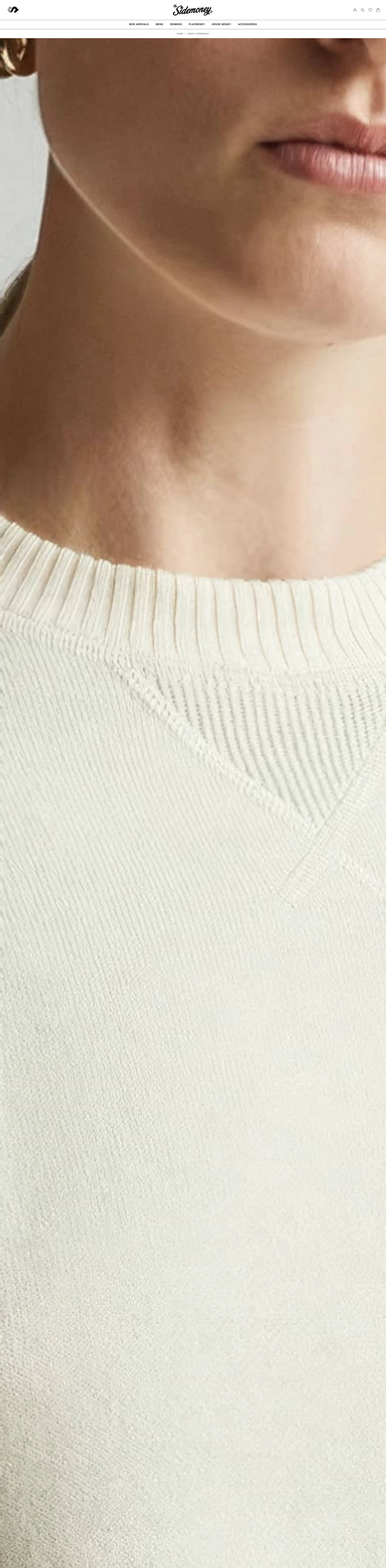
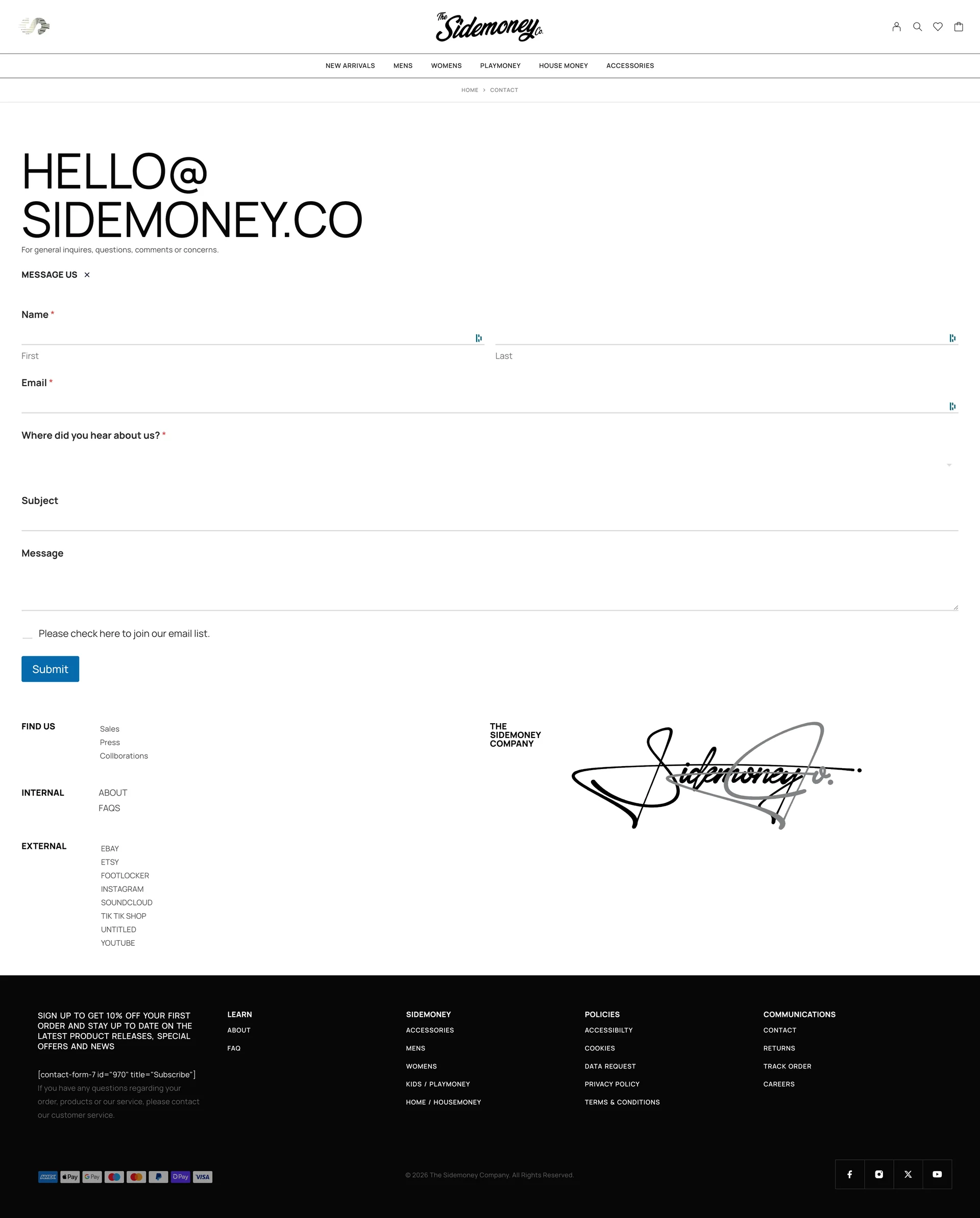
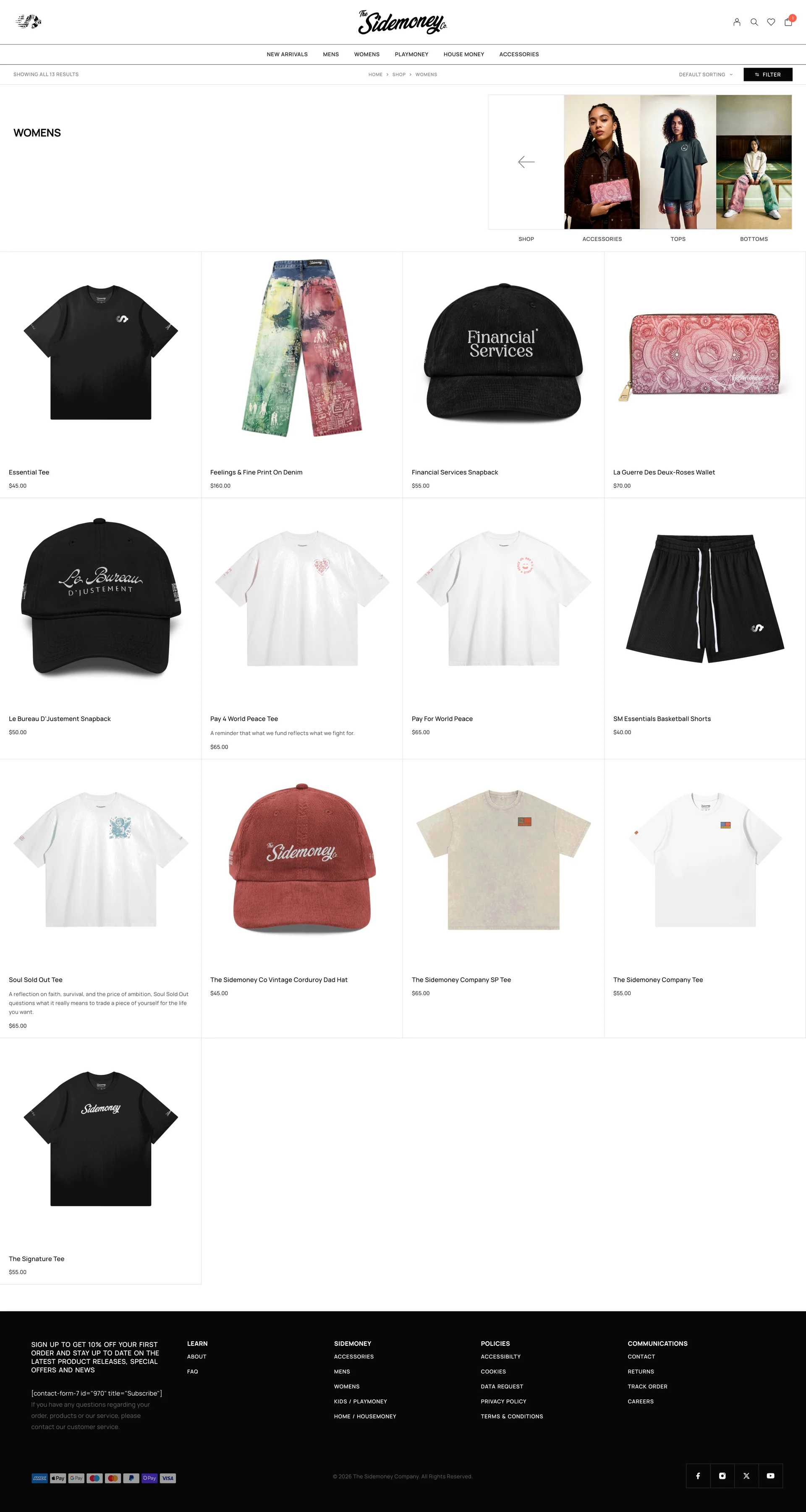
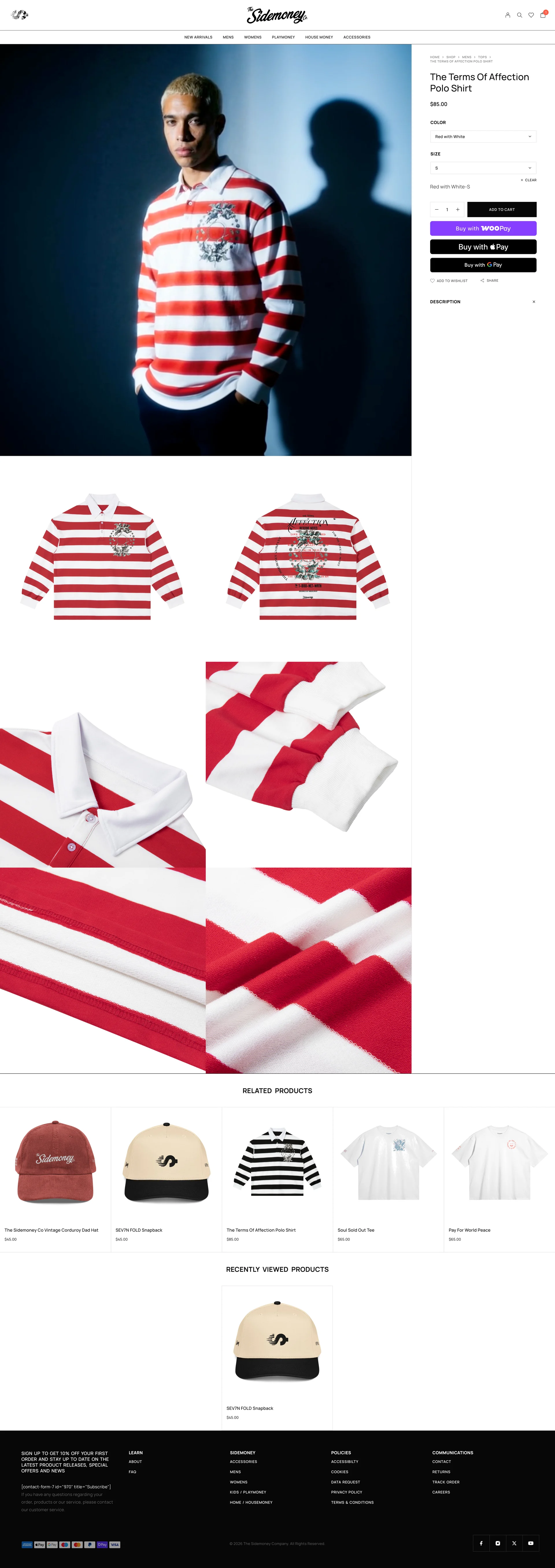
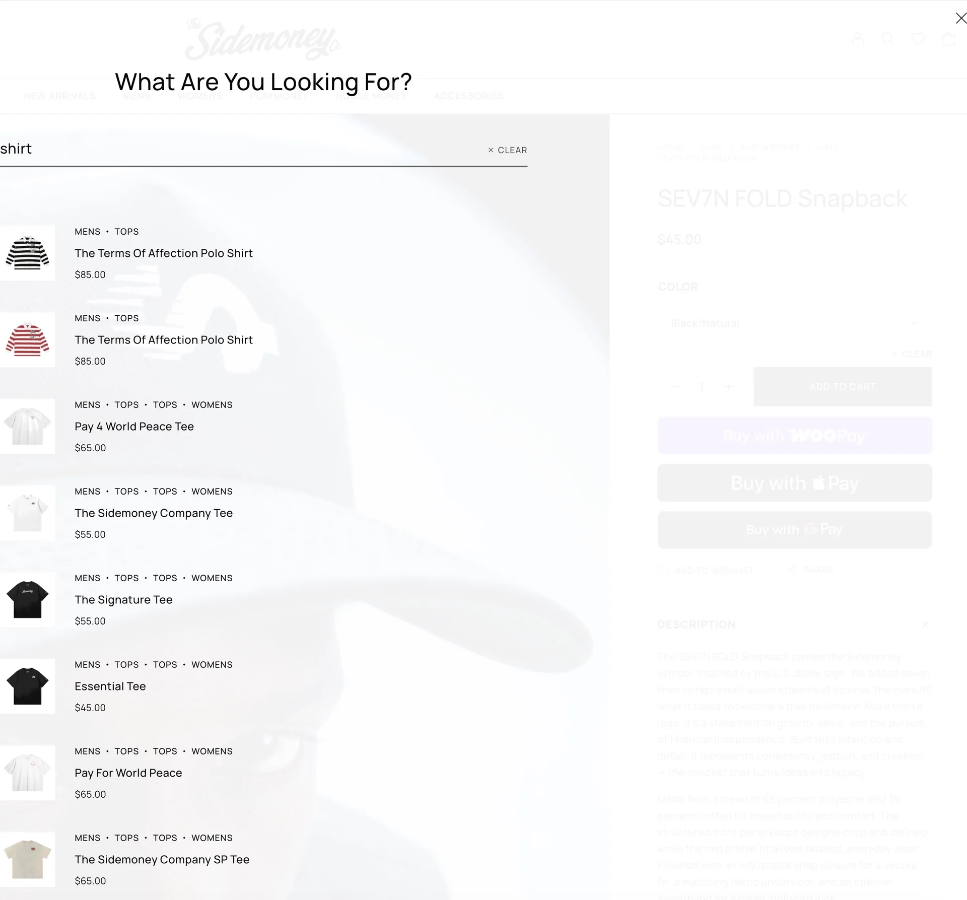


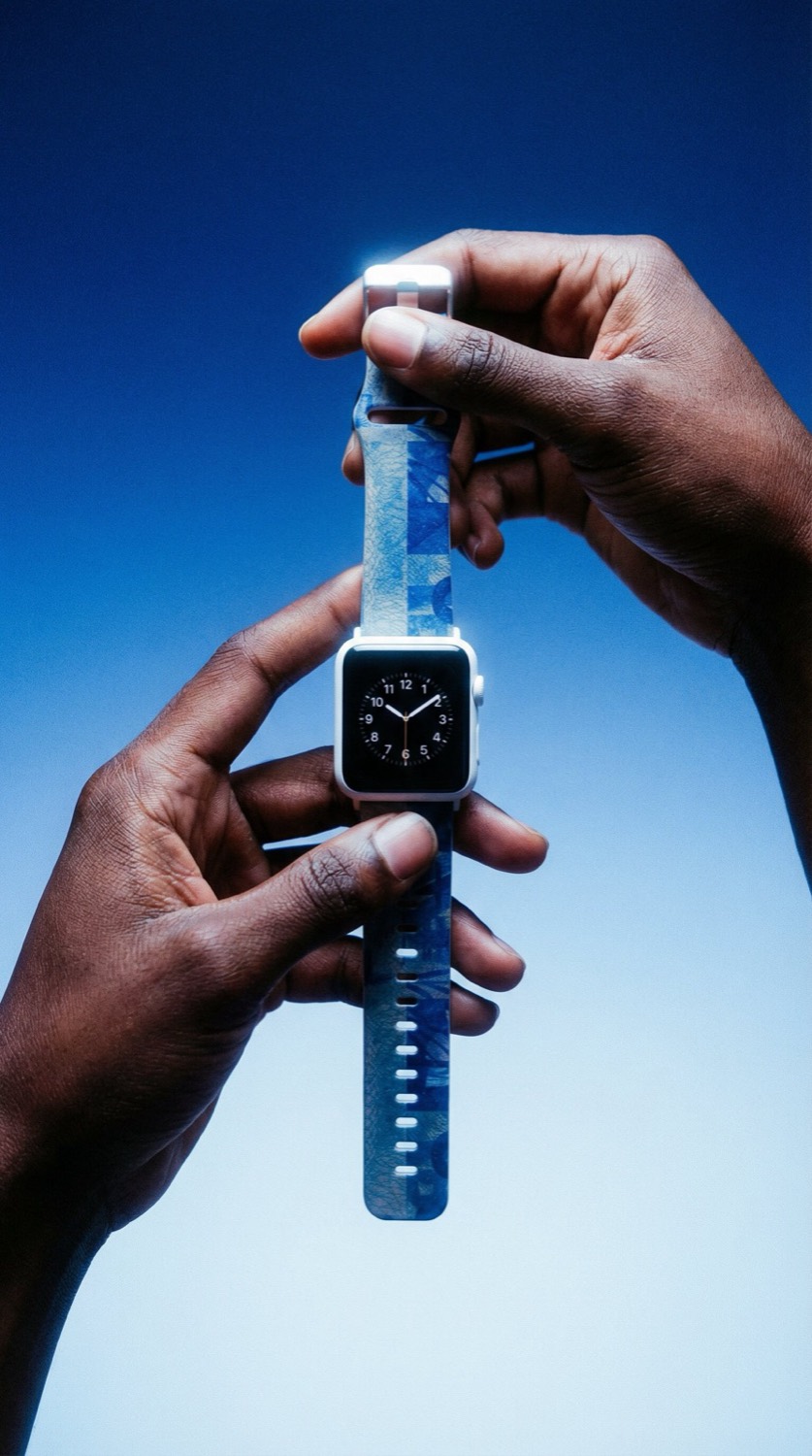
The category surface is photography-first. Each card is a single editorial frame, not a stacked product grid, because choosing what to show IS the work of editing the brand. Five universes under one wordmark: Mens and Womens (the main line, where the brand lives), Playmoney (for kids, same currency narrative, scaled down), House Money (for the home, currency moves off the body and onto the space around it), Accessories (for everything else, the small surface where the brand still has to land).


In Flight
The platform earned the retail, not the other way around.
Sidemoney 2.0 refiled on April 9, 2025, new entity, new trademarks for retail, full platform refresh. The original brand launched in 2019; the refiling cleared the path for the Foot Locker partnership and everything that follows. Same designer wrote the brief, did the build, and ships every deploy. Every layout decision is a brand decision, and the platform never negotiates with a vendor about its own voice.
What’s already proven: brand-as-system works. 58 orders fulfilled across 10 states since 2019. PLC Detroit selected the brand for Threaded Class One in January 2025, the PLC × Foot Locker LEED program for designers of color, and the City Series dropped as a Sidemoney exclusive at Foot Locker in September 2025. The Foot Locker partnership came after the platform was already shipping, not before.
What’s next: the Therum OS migration. Sidemoney is the first commercial deployment, same brand, less platform tax. Whatever a serious apparel brand asks of the operating layer gets battle-tested here first, under real traffic, with real orders.
In-depth Figma exploration of the Sidemoney digital experience, layout system, page templates, component logic.
Open in Figma ↗