The Healing Collective
Overview
What We Did
Craft Identity for a mental health practice
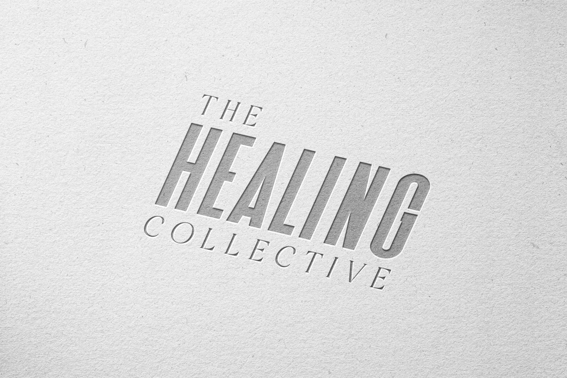
Entrusted with a text-based logo for the brand, Therum set out to embody its vision for a minimal, straightforward aesthetic — distilling the practice's essence into a simple yet impactful mark through careful typography and design.
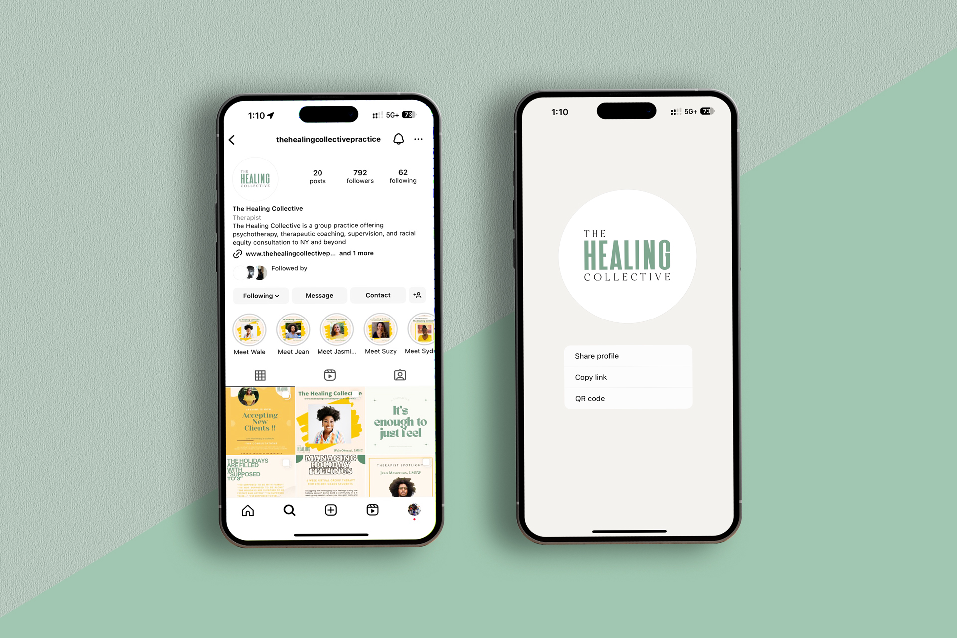
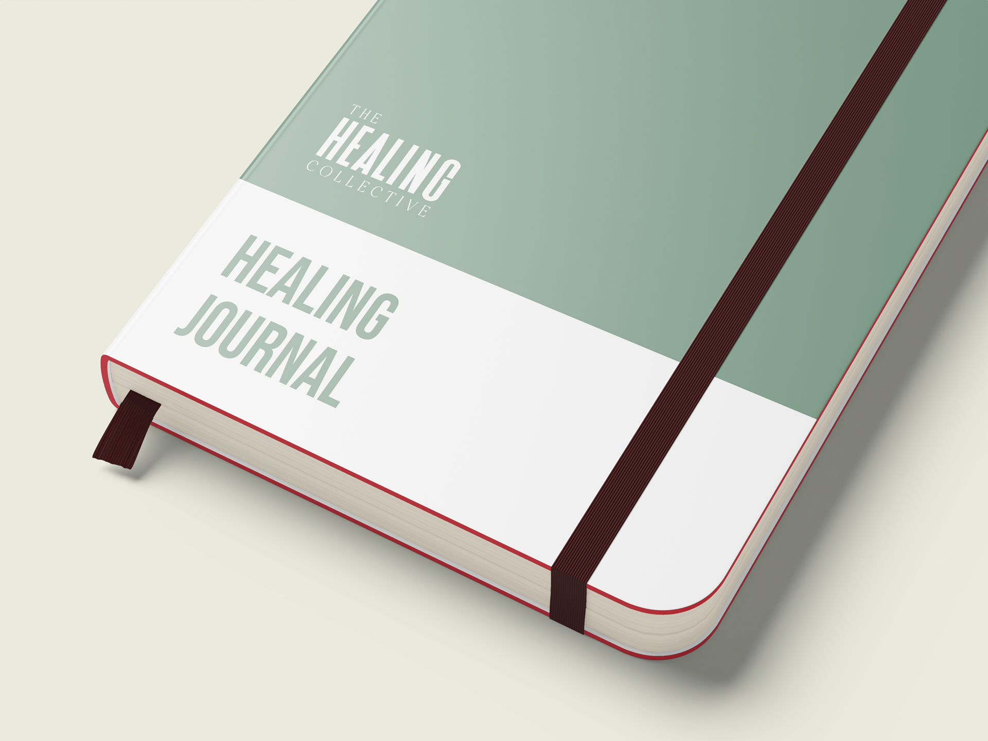
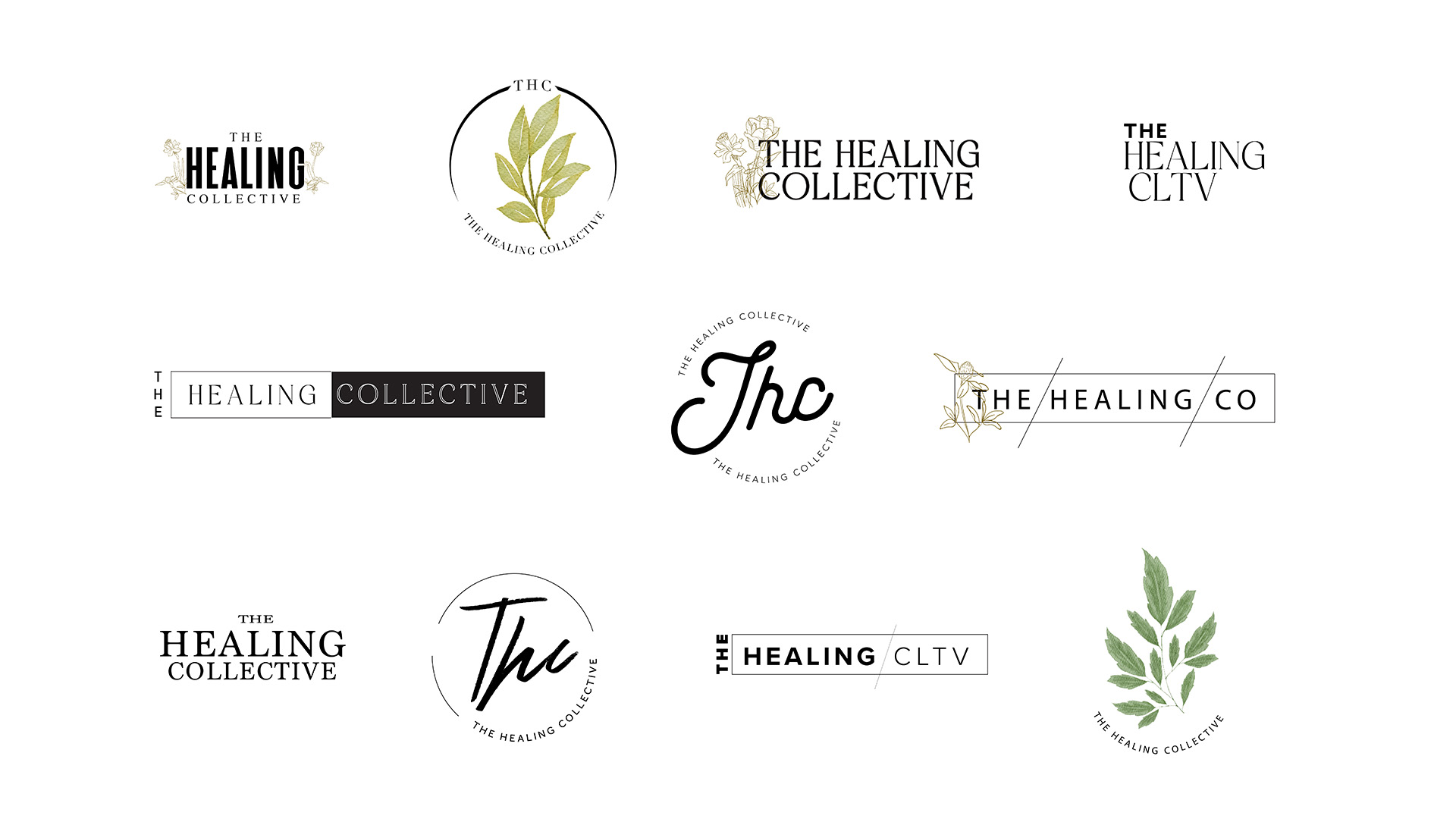
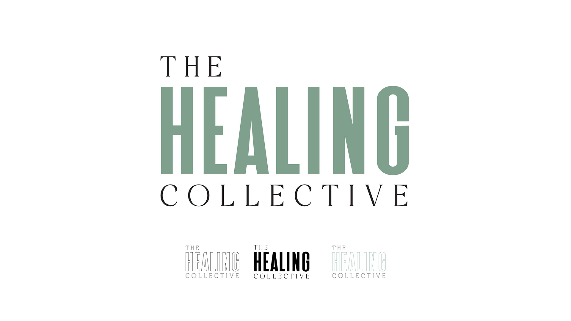
A minimal and clean Identity
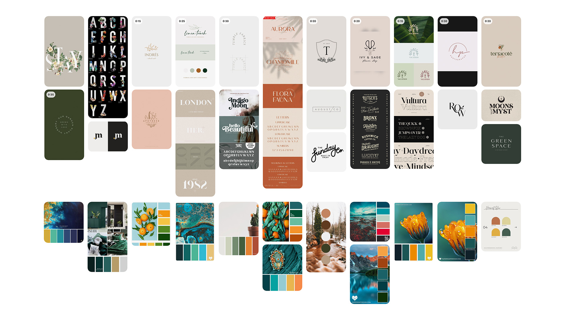
Drawing on vintage type labels and the elegance of serif fonts, and enriched with floral elements, Therum curated a color palette pulled straight from floral samples. The serif, text-centric mark reads as bold and instantly recognizable, adding a premium, high-quality feel that elevates the brand's perception.
The creation of a compelling mark for an emerging program
The identity helped The Healing Collective realize its vision, and the practice continues to thrive — a full staff now serving clients across the NYC area with essential support and care.