Comcast / Xfinity.
Two tenures, eight years apart, same surface, the largest Internet provider in the U.S., serving 31M+ broadband customers. 2017: Senior Art Director at SapientRazorfish, building the brand system and responsive templates that held every Xfinity page together across 19M+ users. 2025: UX Lead at Comcast, leading a team of seven across the sales experience, redesigning the buy flows with an accessibility-first approach, improving conversion rates, and driving design system adoption.
Visit xfinity.com ↗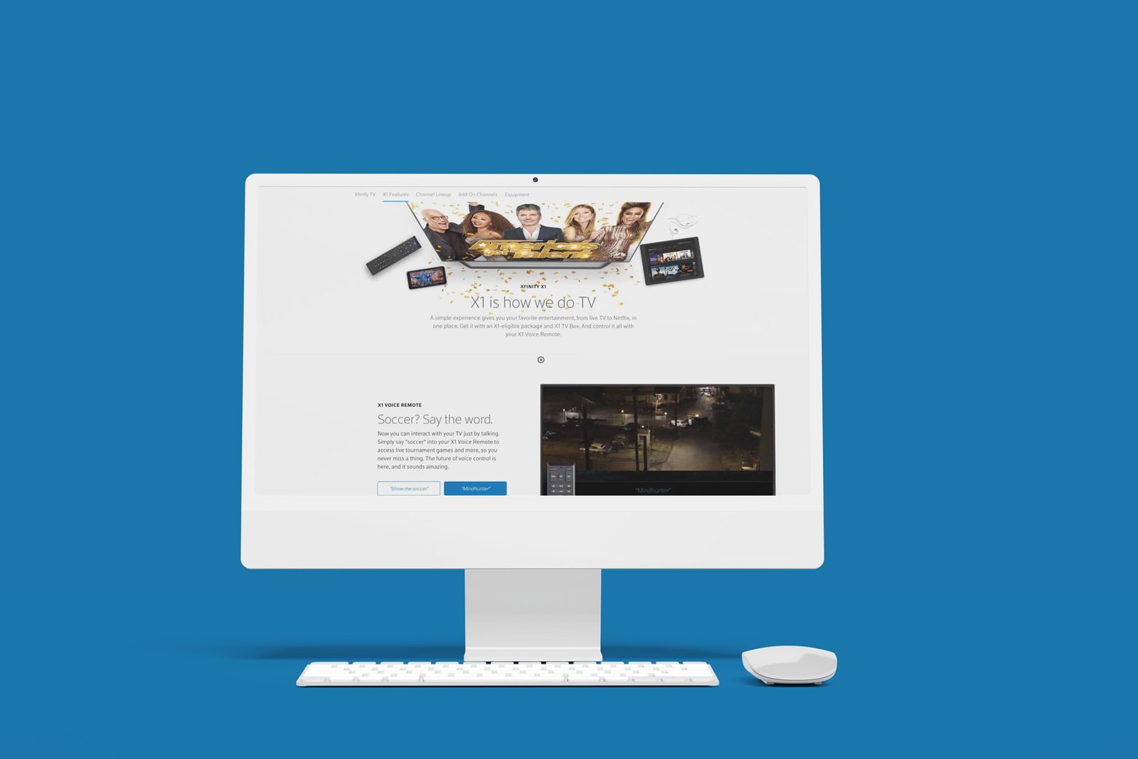
The pertinent details, what was built, what shipped, what it took.
Comcast / Xfinity
Two tenures at the largest Internet provider in the U.S., 31M+ broadband customers. The first defining how the brand system holds together, the second leading the UX of how it sells.
xfinity.com ↗Sr. Art Director (2017) · UX Lead (2025–present)
- Brand system + responsive templates
- Sales experience UX
- Regulatory flows
- Pricing surfaces
- UX leadership
- Art direction
- Design systems
- Conversion design
The Premise
The surface is the same. The seat changed. The first tenure was about how the brand looks. The second is about how it sells.
Comcast is the largest Internet provider in the United States, serving 31M+ broadband customers through the Xfinity brand. The digital surface, xfinity.com, isn’t a marketing site. It’s a transactional surface with 75M+ broadband and streaming devices running on the platform: the place where American households make real purchasing decisions about their connectivity, their streaming, their bundles, their monthly commitment.
I’ve worked on that surface twice. In 2017, as Senior Art Director at SapientRazorfish, the work was the brand system itself, refining and evolving brand standards for design systems, photography, and typography across print, digital, UX, and social platforms. Art-directing responsive web pages, partner campaigns, and the HBO and Cinemax integrations that lived on Xfinity’s pages. Researching, documenting, and optimizing customer experiences across those 19M+ users. The design decisions were about coherence: making a cable company’s digital surface feel as considered as the premium experiences customers were beginning to expect from every other screen in their lives.
Today, as UX Lead at Comcast, I run a team of seven designers across the sales experience, one of two UX Leads under the creative director. The work: redesigning critical buy flows with a user-centered and accessibility-first approach, improving conversion rates and customer satisfaction across every digital touchpoint. Streamlining design system adoption, building reusable components that scale across the platform. Click to Cancel (FTC-mandated). Next Gen Pricing. Multi-product cart logic. Streaming marketplace UX. The surface hasn’t changed. The responsibility has.
Two Tenures, Same Brand
Eight years between the two roles. The surface didn’t change, the altitude did. Side by side: what each tenure was responsible for, produced, maintained, and led.
The Work
Two tenures, two bodies of work. Use the cards above to jump between them, or scroll through both below.
2017 · Senior Art Director
Senior Art Director on the Comcast Xfinity digital ecosystem, refining design systems and enhancing the user experience for 19M+ customers. Three responsibilities stacked: evolving brand standards for design systems, photography, and typography across print, digital, UX, and social platforms; directing the design and rollout of responsive web pages, partner campaigns, and HBO/Cinemax integrations; and shipping the flagship product surfaces that defined how Xfinity sold its own offerings, backed by executive-level presentations validated with data and user research.
Xfinity responsive system
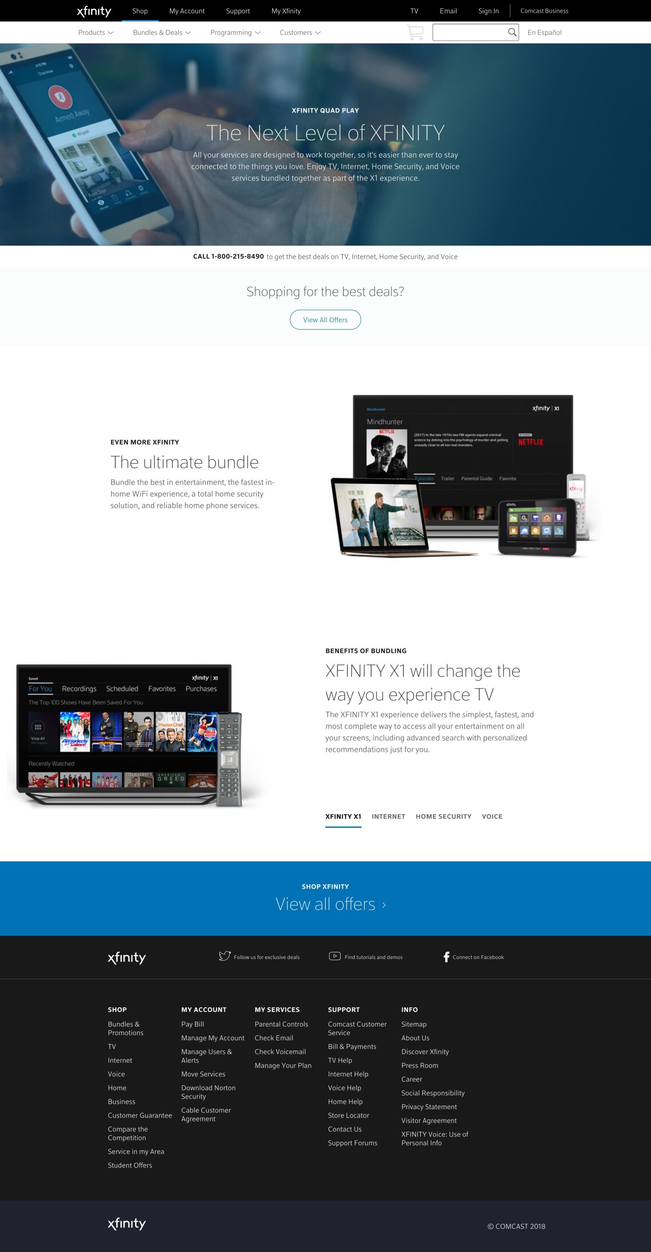
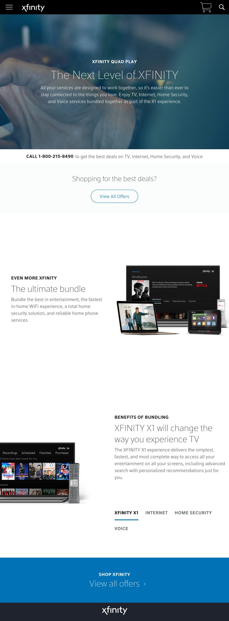
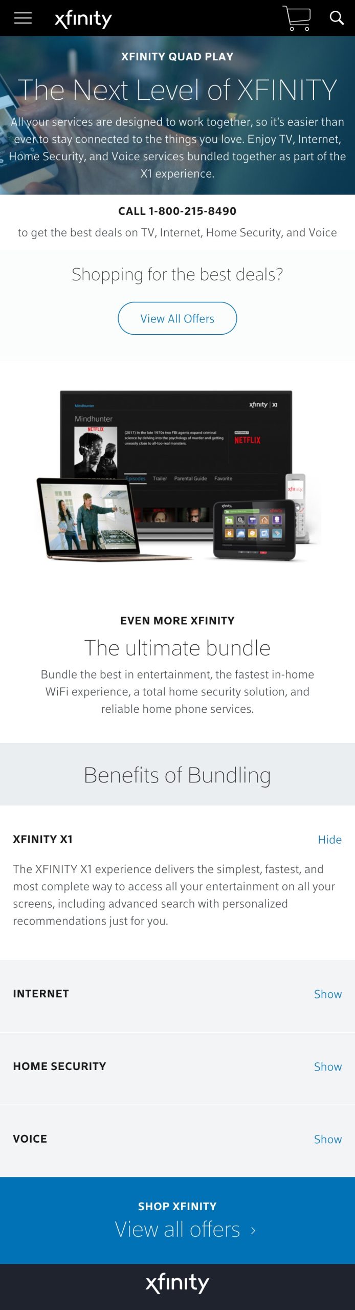
One template, three viewports. I was responsible for designing the responsive system end to end, the layout grammar that held Xfinity's storefront together across every screen the customer might land on. Below: the same page, three devices. Tap a tab; the frame morphs, the image scrolls vertically inside the device exactly as the live page would.
The work wasn't just “make the desktop reflow.” It was: decide what survives the reflow, what reorganizes, what disappears, what becomes a primary action on mobile that was a secondary on desktop. Three breakpoints, one decision tree, every Xfinity surface inherited the same logic.
Service-network header graphics · HBO + the partner stack
Premium-content partners (HBO, Cinemax, and the rest of the network) ride on Xfinity's surface but need to feel like their own brand. I produced the header graphics that did that work, the device mockups, package-information compositions, plan-tier visuals, the artwork over the fold that signaled what the page was selling before you read a word of copy.
Below: the Internet Plus Choice header, the HBO bundle surface. Mounted in the desktop frame the live page used, so the header reads against the chrome it was designed to sit inside.
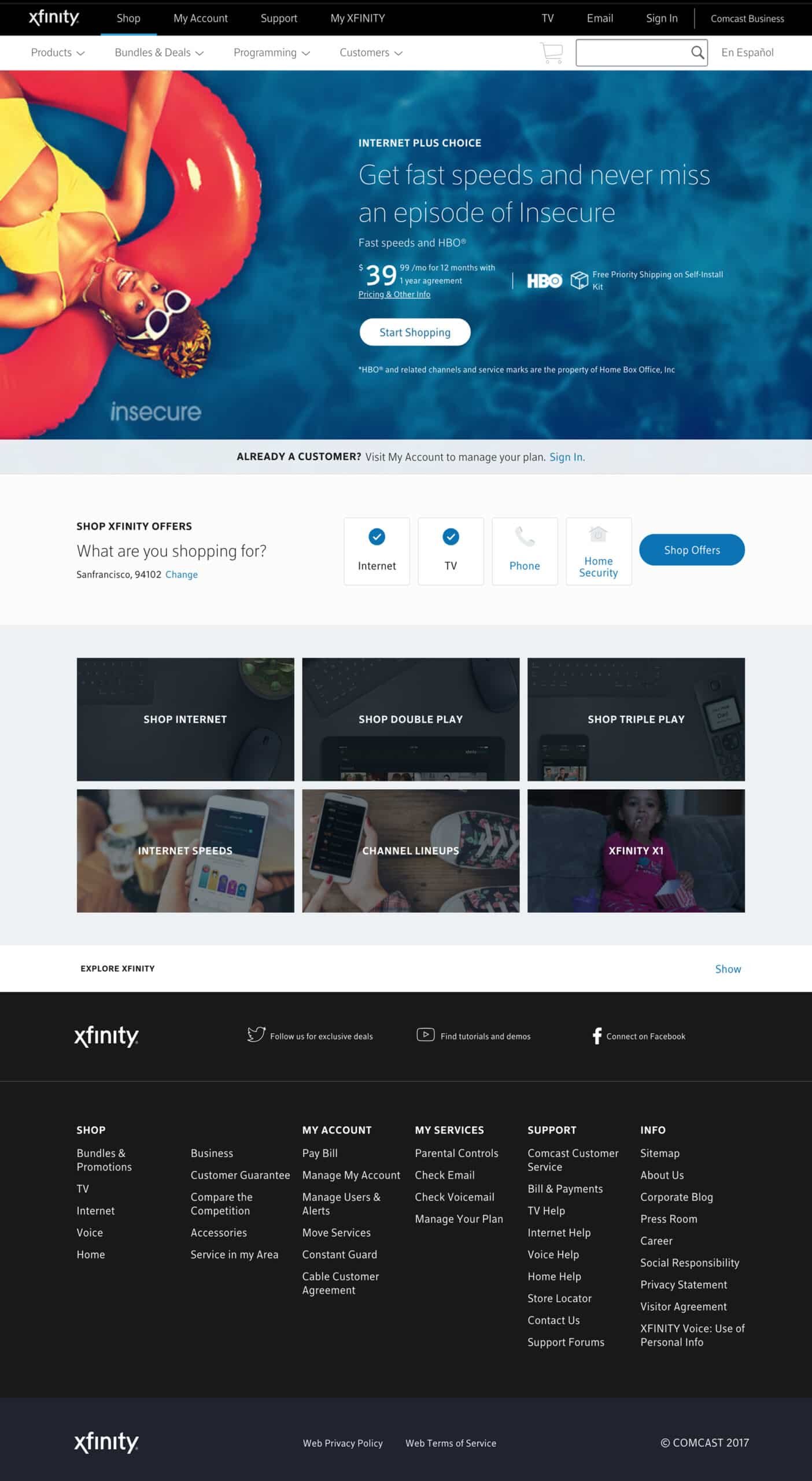
Internet Plus Choice header · HBO bundle · service-network surface
Xfinity product headers · X1, Quad Play, Best Value
Three header surfaces that each represented a different Xfinity proposition. Same template family, different rhetorical jobs, each one had to make a specific case to a specific customer. Below: each header in its own desktop frame, each with its own read on what that page was selling.
Xfinity's flagship cable+streaming experience. The header had to position X1 as a category leader, not “cable, but updated” but the platform the rest of cable was trying to copy. Device-forward, content-rich, motion-aware. The page sold a product; the header sold the posture.
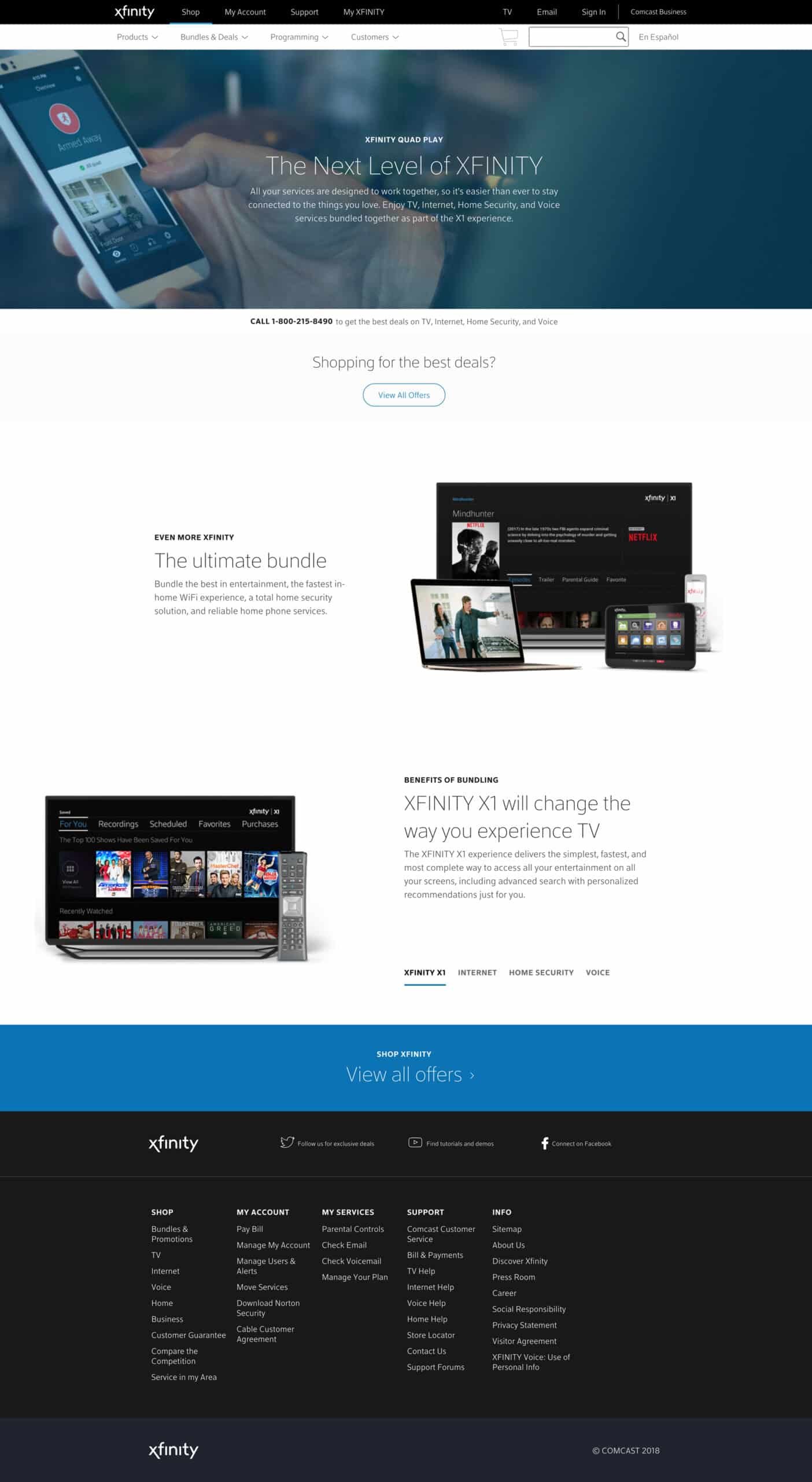
X1 header · flagship product surface
The bundle header, Internet + TV + Voice + Mobile, four services on one bill. Different design problem entirely: Quad Play had to make the bundle math feel obvious without overwhelming the customer with line items. The graphic system compressed four products into one visual story without dropping any of them. The header was the proof that the bundle wasn't a discount; it was a system.
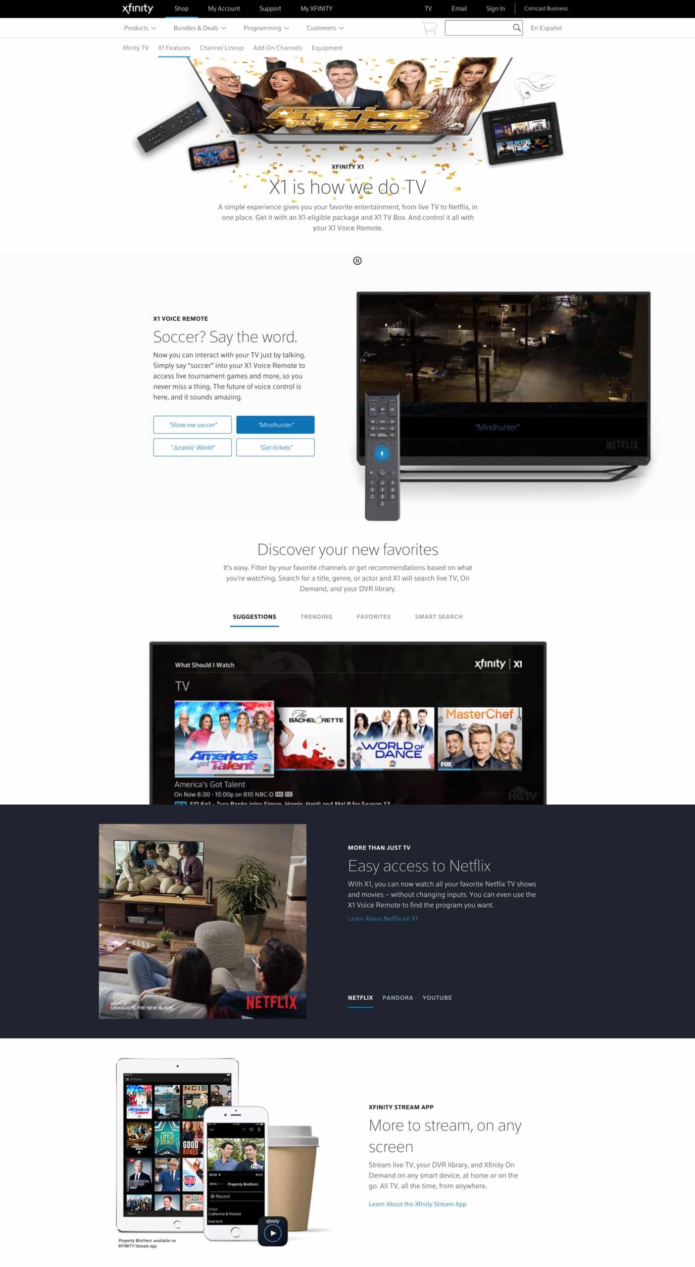
Quad Play header · four-product bundle surface
The price-led surface. Best Value's whole job was to anchor the price-conscious customer: clear plan tiers, transparent pricing, the “here's what you get for this much” argument made visual. Header graphics leaned into clarity and value signals, not feature density. Different audience, same template family, different visual register.
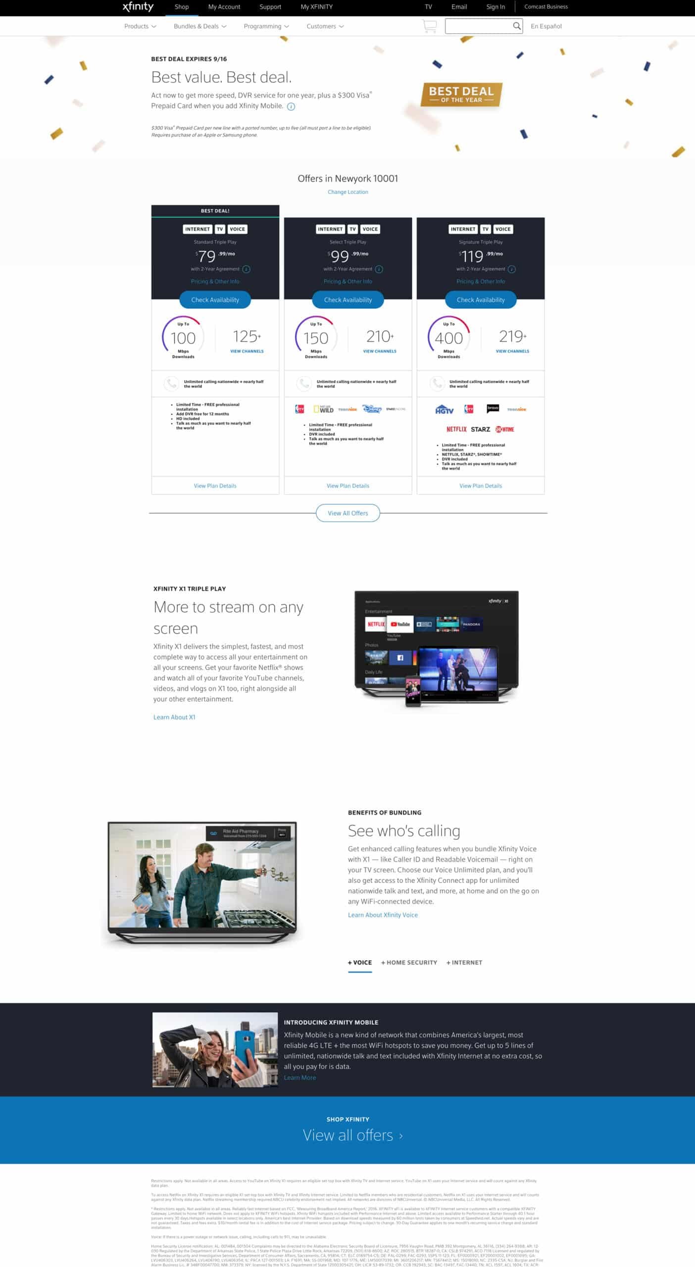
Best Value header · price-led plan tier surface
2025 to present · UX Lead, Sales Experience
Current role. Leading UX strategy and design for key online sales flows, redesigning critical buy flows with a user-centered and accessibility-first approach, improving conversion rates and customer satisfaction across digital platforms. Streamlining design system adoption by creating reusable components that enhance consistency and scalability, while maintaining and expanding core design system assets for cross-platform alignment. Five active workstreams below.
Bulk Buy Flow
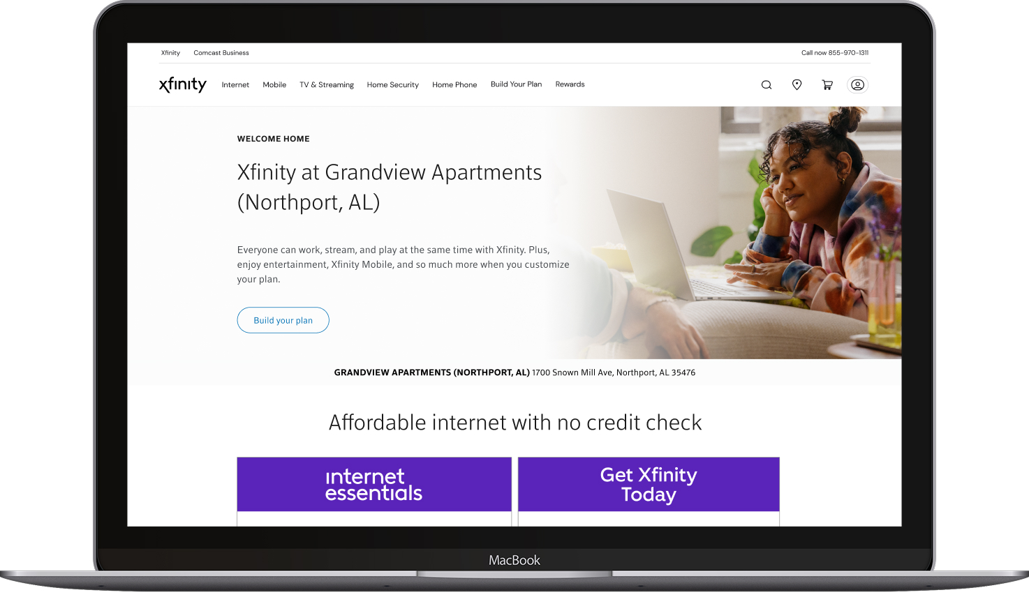
What it is, The Bulk Buy (MDU) flow, the purchasing and upgrade experience for Comcast’s 2.2M+ multi-dwelling-unit households. Property owners contract with Comcast to deliver services to entire buildings; residents activate upon move-in and upgrade from there. Today that process generates 575,000+ assisted contacts annually at $3M+ in operating costs, unreliable data integrations, suppressed upsell, customer frustration. The redesign modernizes the end-to-end flow: activation, package upgrades (HSD, video, CDV), and the self-service path that replaces phone calls with a digital surface.
What I lead, UX strategy across the bulk buy flow, from the resident activation entry point through package configuration and upgrade checkout. Reducing assisted contacts by making the upgrade path intuitive enough for less tech-savvy users to navigate without calling in. Improving attach rates and retention while cutting operational cost across the entire MDU footprint.
Next Gen Pricing
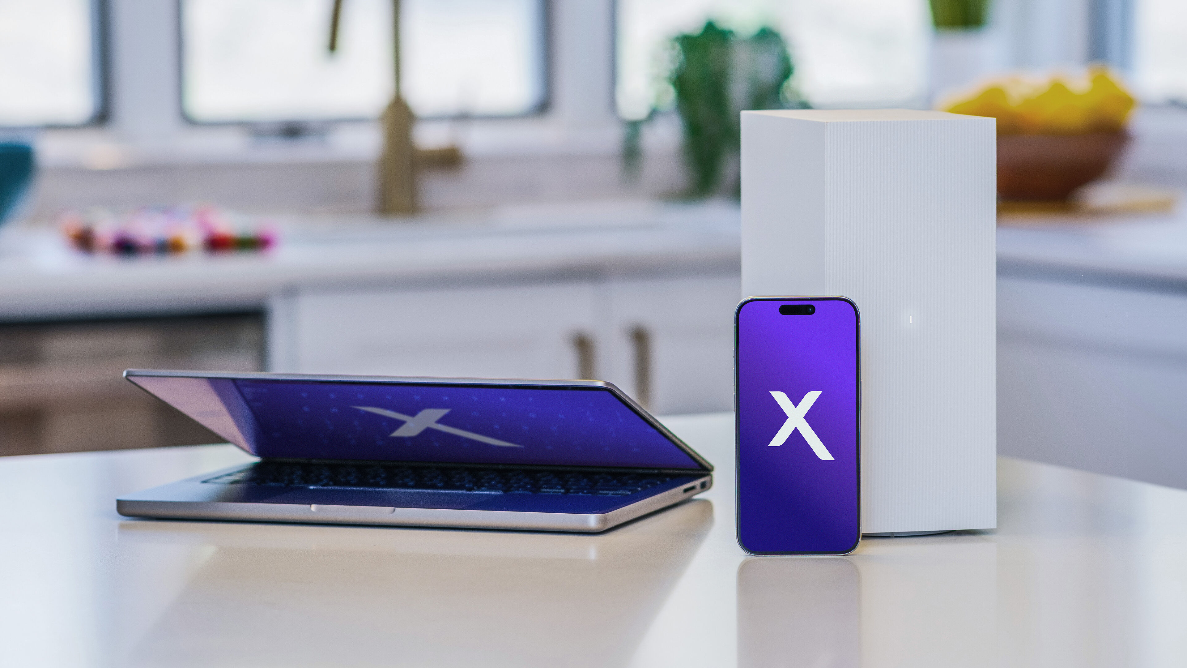
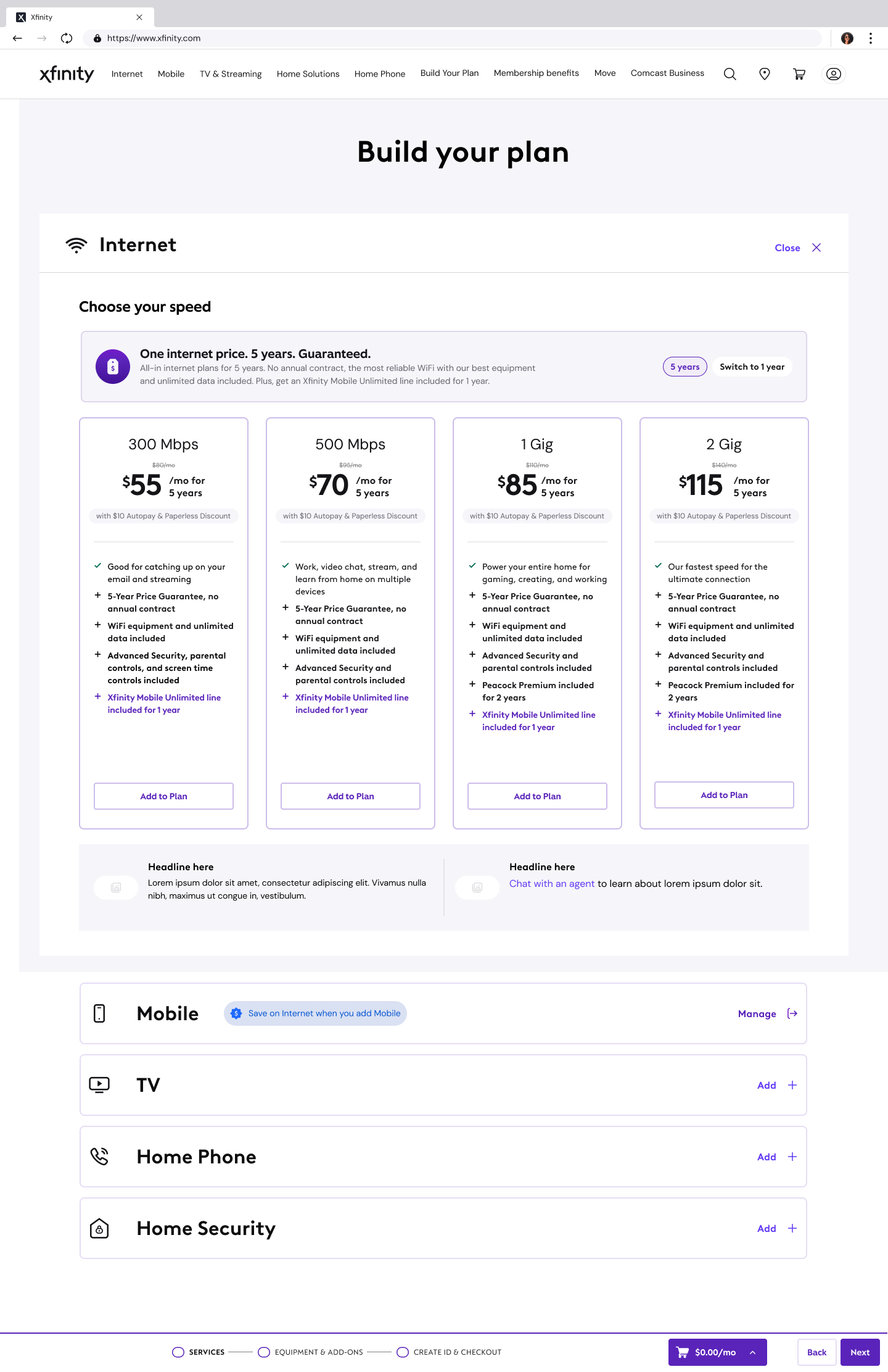
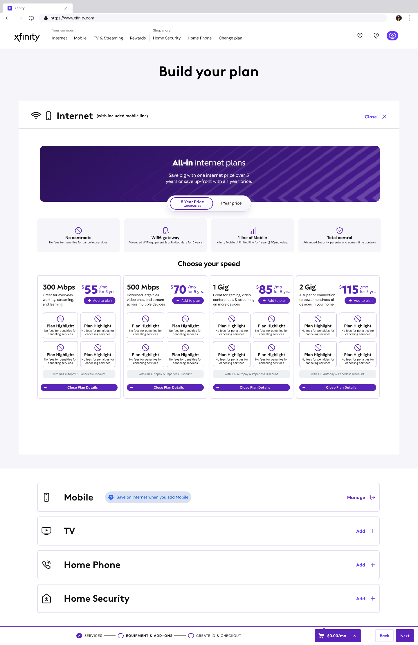
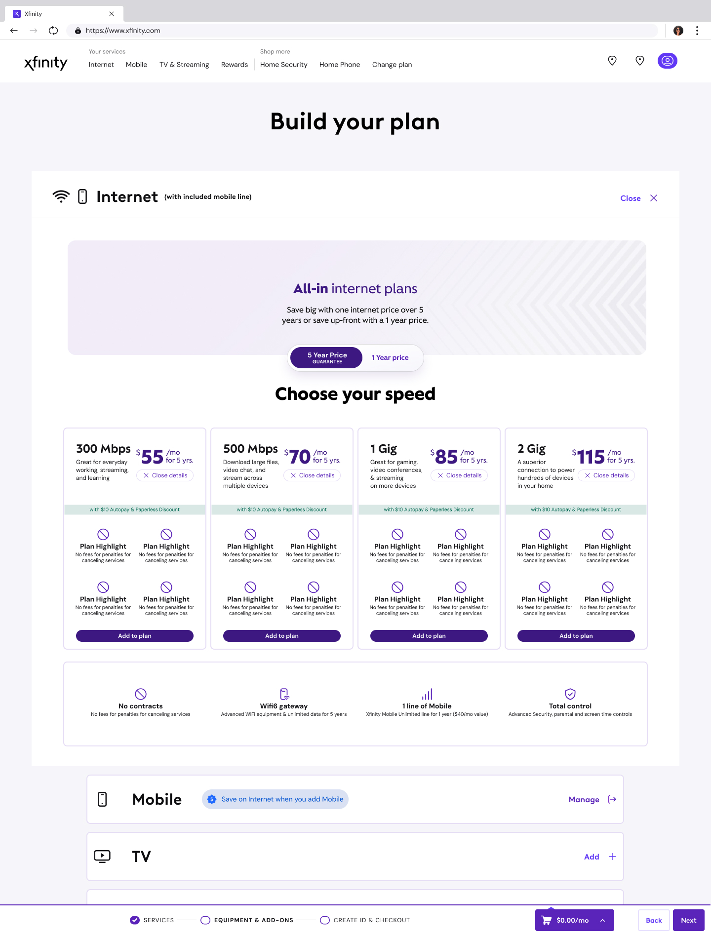
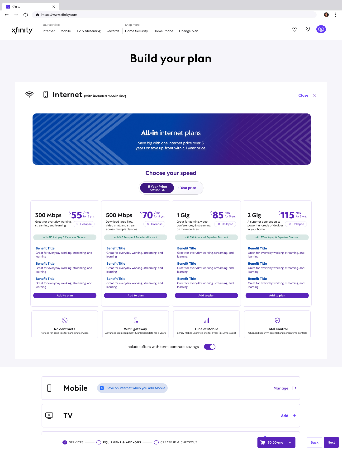
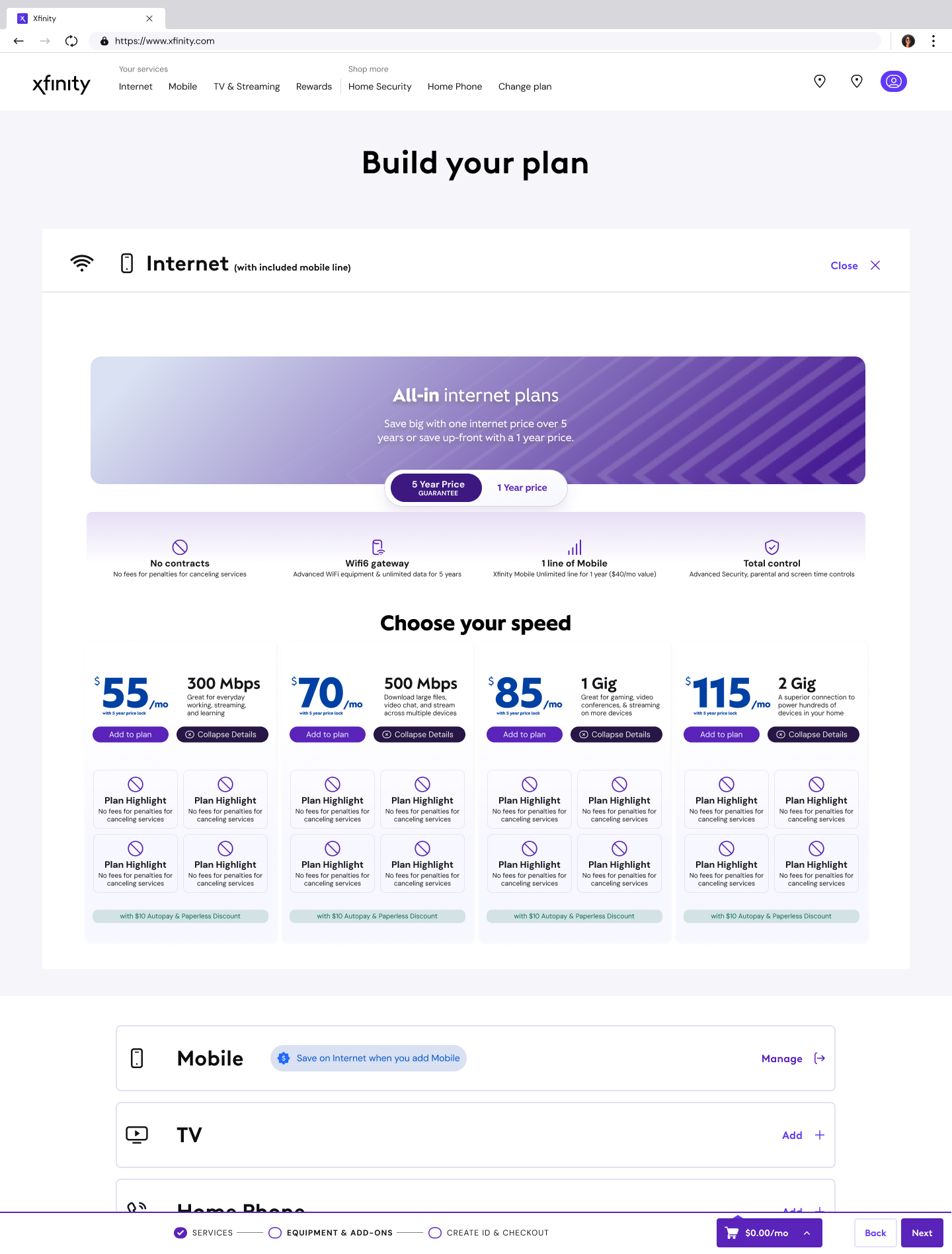
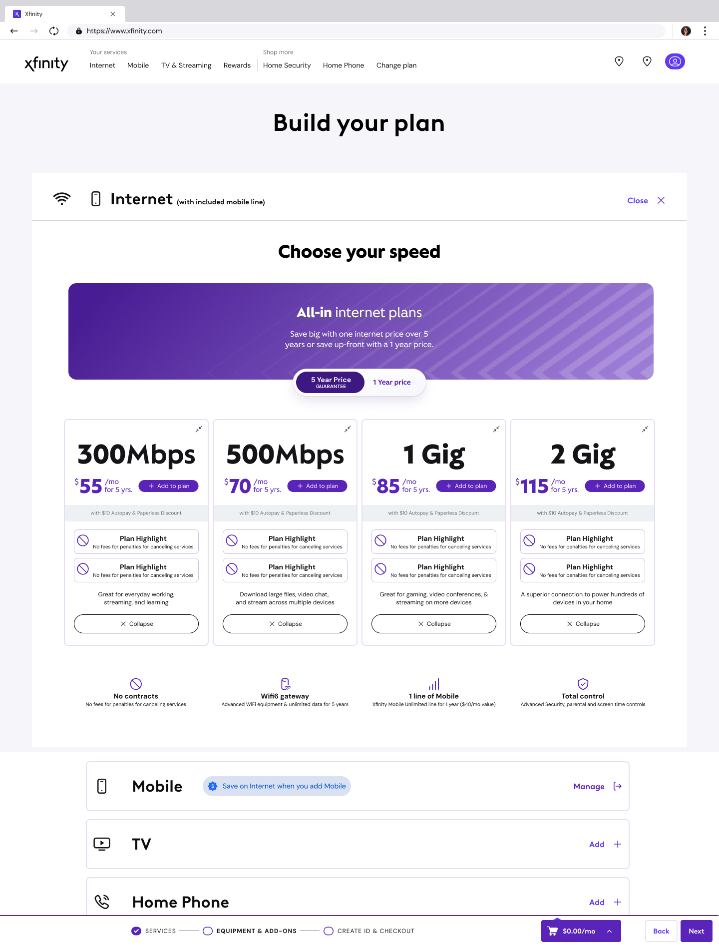
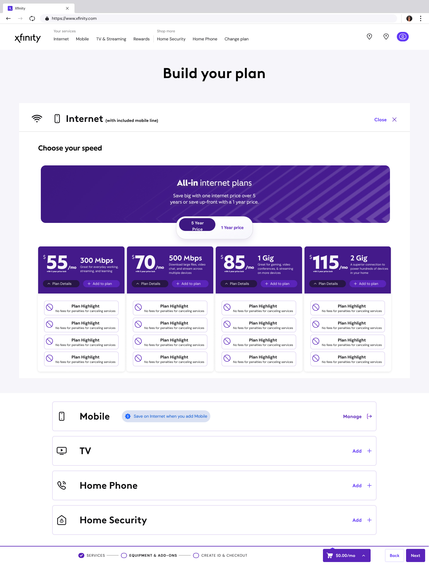
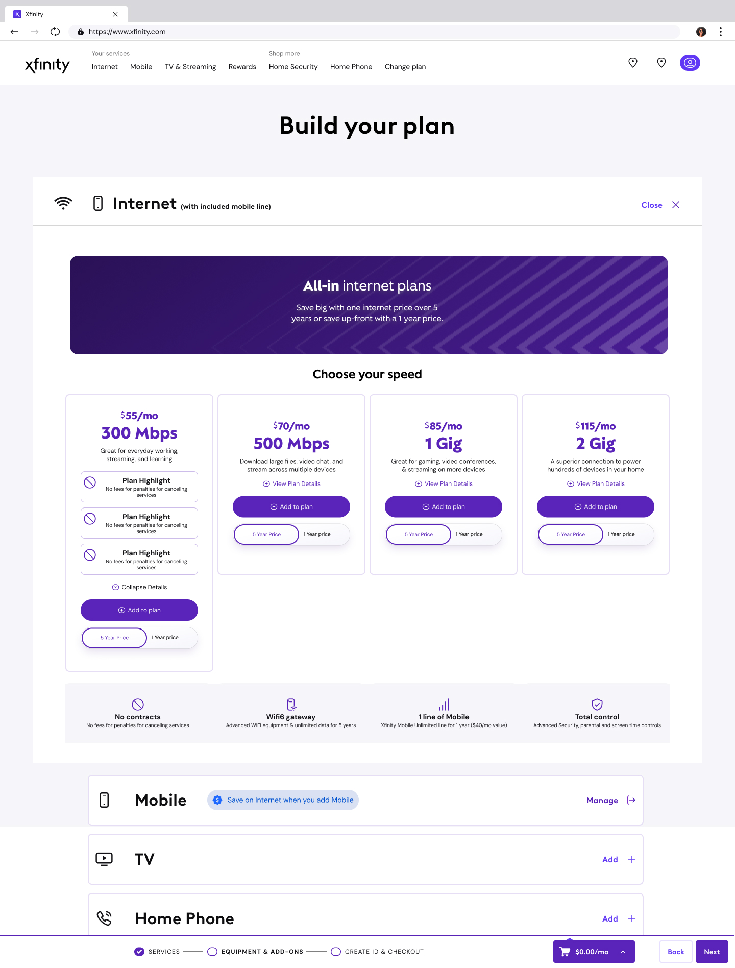
What it is, The next iteration of how Xfinity presents, explains, and sells its plans. Part of Comcast’s broader strategy to simplify pricing bundles and enhance broadband-related products as the company shifts focus toward mobile and streaming. Shipped as the Everyday Pricing (EDP) structure, four national Internet tiers with unlimited data and the Xfinity WiFi Gateway included, plus a five-year price guarantee starting at $55/month with no annual contract.
What I lead, UX strategy on the pricing experience, how plan tiers are structured visually, how add-ons surface, how the math feels transparent without overwhelming the decision. The surface where 31M+ broadband customers decide what they’re paying. Designed to convert without obscuring.
Click to Cancel
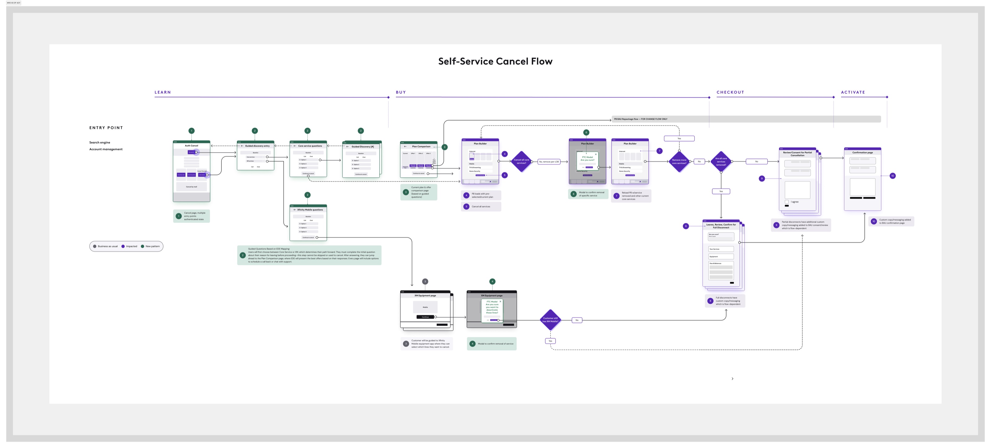
What it is, The FTC’s Click to Cancel rule, finalized October 2024, mandated that canceling a subscription must be as easy as signing up, with compliance deadlines through mid-2025. We designed and built the cancellation experience for Xfinity: flow architecture, retention-aware touchpoints, interface language that met the regulatory standard without reducing the off-ramp to a dead-end screen. Then the Eighth Circuit vacated the rule in July 2025 on procedural grounds, and the work paused. The experience sits ready. State-level auto-renewal laws in California, New York, Colorado, and D.C. continue to enforce similar obligations, the design may yet ship under a different mandate.
What I lead, End-to-end UX on the cancellation experience, cross-functional with legal, product, brand, and engineering. Defining the flow architecture, the retention touchpoints, and the interface language. Navigating a moving regulatory target: building to a federal standard, watching it get struck down, and keeping the work shipable for the state-level requirements that remain.
StreamStore
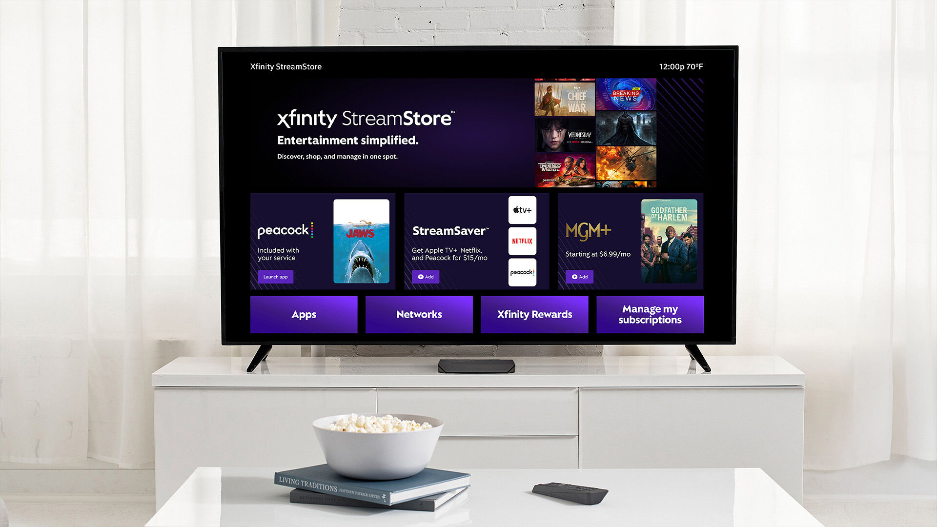
What it is, Xfinity StreamStore, shipped July 2025. A streaming-services marketplace serving Xfinity TV and Internet customers: 450+ apps and channels, 200,000+ movies and TV shows to rent or purchase, bundled packages like StreamSaver (Apple TV+ · Netflix · Peacock at $15/mo). One of the largest streaming aggregation surfaces in the market, available on xfinity.com and through the Xfinity Voice Remote. Expanded in 2026 with the largest marketplace for premium streaming bundles.
What I lead, The storefront UX, how streaming options present within the buy path, how comparison works across providers like Netflix, Disney+, HBO Max, and Apple TV+, how adding a subscription feels native to the Xfinity purchasing experience. The marketplace logic that turns a broadband provider into a streaming discovery platform.
Plan Builder / Buy Flow Explorations
What it is, The plan builder and buy flow experience on xfinity.com, the surface where customers configure their Xfinity package, choose Internet tiers, add mobile lines, select streaming bundles, and complete their purchase. The customization-first approach that replaced pre-set bundles with a build-your-own flow.
What I lead, UX explorations across the end-to-end buy flow, from the plan builder entry point through configuration, cart, and checkout. How the experience holds as customers layer Internet + mobile + streaming into one transaction. The design system components that keep the flow consistent as product offerings evolve.
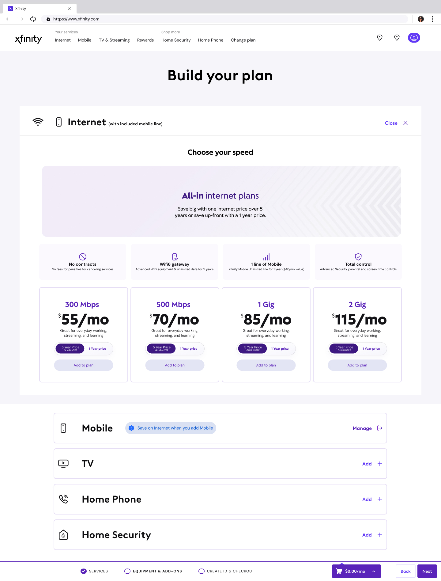
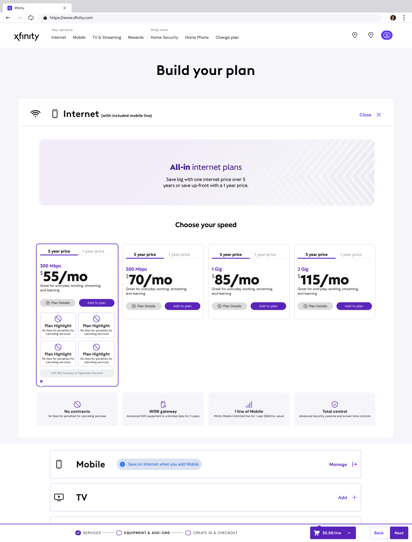
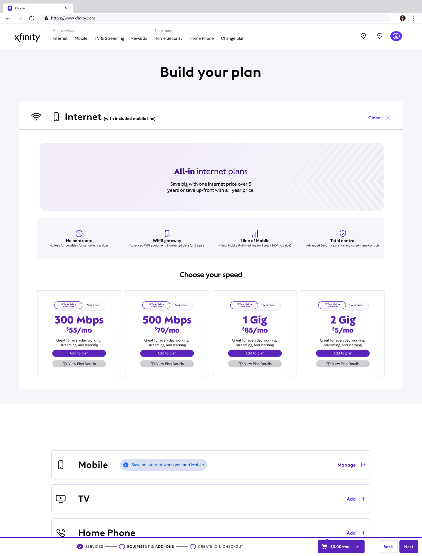
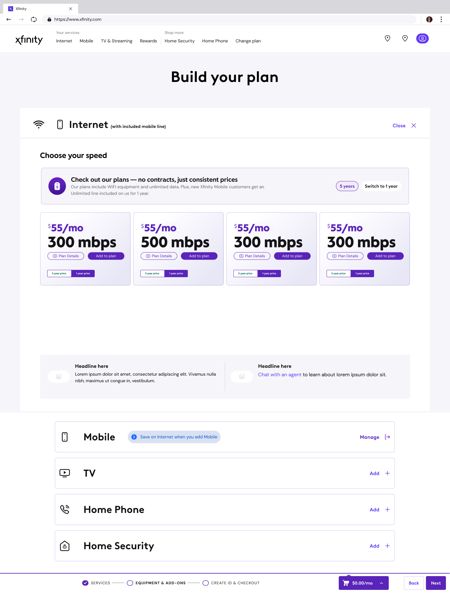












Some work is in-flight or under NDA, artifacts drop in as they clear for portfolio use.
The Through-Line
What connects the two tenures isn’t just the brand, it’s the surface. Xfinity is the largest Internet provider in the U.S., serving 31M+ broadband customers with 75M+ devices on the platform. The design decisions made on xfinity.com shape whether households upgrade, bundle, stay, or leave. Both times, the work has sat at that intersection of brand and commerce, where what the page looks like directly determines what the customer decides to do.
What shifted: the altitude. In 2017, the work was upstream, refining brand standards for design systems, photography, and typography across print, digital, UX, and social. Researching and optimizing customer experiences across those 19M+ users. Building executive-level presentations that validated design decisions with data and user research. In 2025, the work is end-to-end, redesigning critical buy flows with an accessibility-first approach, streamlining design system adoption with reusable components, and improving conversion rates across every digital touchpoint. The decisions moved from coherence to conversion.
The first tenure built the framework. The second runs what the framework was built to enable.
Press & Platform
Major Comcast and Xfinity announcements during the current tenure, the product launches, pricing shifts, and platform expansions that shaped the surfaces I lead UX on.
Xfinity five-year price guarantee, Internet plans starting at $55/mo with no annual contract, unlimited data, and WiFi Gateway included
Press Comcast CorporateEveryday Pricing launch, four national Internet tiers with simplified, transparent pricing replacing promo-then-price-hike cycles
Press Comcast CorporateXfinity StreamStore, streaming marketplace with 450+ apps, 200,000+ titles, and StreamSaver bundle (Apple TV+ · Netflix · Peacock)
Launch Comcast CorporateStreamStore premium bundles expansion, largest marketplace for premium streaming bundles with new package tiers and provider integrations
Milestone Comcast CorporateXfinity Mobile Plus & Select plans, new mobile tiers as part of Comcast’s converged broadband + mobile + streaming push
LaunchReturning Bigger
The first tenure built the visual system. The second tenure leads the experience it was always meant to serve.
Returning to a brand at a higher seat changes what the work means. The same pages I art-directed as templates in 2017 are the same pages I now lead UX on as conversion surfaces. The visual system I helped define is the foundation the sales experience I run today is built on.
That continuity is the case study. Not two separate jobs at the same company, one career arc that moved from defining how the brand presents itself to defining how it sells.