Taste Creators
Taste Creators
Overview
- The logotype
- Don't Sleep On Em
- Tasty Vibes, four routes
- Tasty Vibes 2K18 lineup
- The Recipe, four week course
- The Recipe, workshop series
What We Did
The Outcome
Give several separate programmes one face
Taste Creators ran a few things at once: a playlist called Don't Sleep On Em, a showcase called Tasty Vibes, a course called The Recipe, and artwork for the artists around it. Each had its own audience and its own surface, from square social posts to vertical stories to streaming thumbnails and event flyers. They needed one mark that could sit on all of it, and a way for each new programme to look like part of the same house instead of a fresh start.
Identity first, then everything the identity had to carry
We drew the monograms and the logotype, then stayed on to make the work itself. That meant the Don't Sleep On Em mark and its square video template, the Tasty Vibes poster routes and the per artist flyer set, the flat lay system behind The Recipe and Artist Development Weekend, apparel animations, and cover art and social headers for Cheesy Boy, TwoCeez and Ode Tha Hustla. Static, motion and template work, mostly sized for social and for the room.
Twenty four routes on one sheet, then the one that got picked
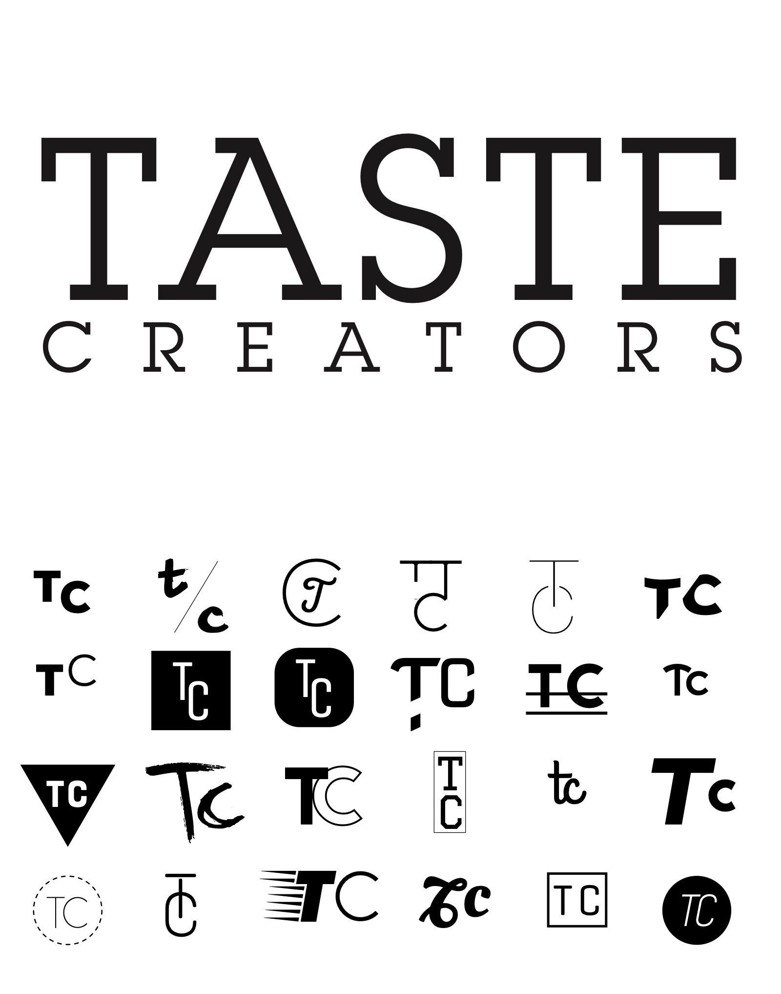
The mark is a serif TASTE over letterspaced CREATORS, picked off a sheet of twenty four TC monogram routes, plus a reversed version for dark work.
The sheet ran the initials every way they would go: stacked, boxed, circled, brushed, struck through, set in a triangle, drawn as a single ligature. Putting them all on one page is what made the choice a comparison rather than a preference.
One square composition, twenty one tracks through it unchanged
Each programme got a container built once and then refilled. The Don't Sleep On Em videos are a single square composition: an aerial cloud plate, the coral outline monogram, the hashtag, and a faint polygon ring that moves with the audio. Twenty one tracks run through it unchanged. The Recipe is one flat lay photograph with a red headline and a syllabus column, rebuilt for Brand, Marketing, PR and Money Week. Tasty Vibes 2K18 is one lineup layout where the cut out portrait and the name swap out.
The apparel spot
An apparel spot for hoodies, tees, caps and beanies, cut for social and pointing at shop.tastecreators.com.
One flat lay, rebuilt for Brand, Marketing, PR and Money Week
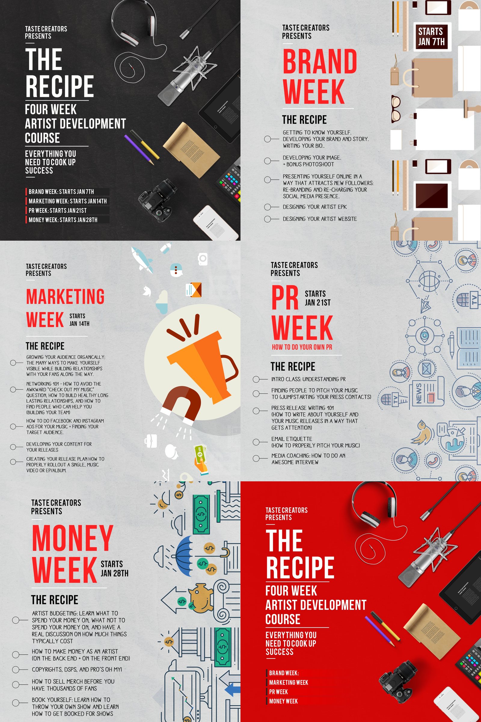
The Recipe went out as a four week course beginning 7 January. Each week takes the same flat lay photograph, the same red headline and the same syllabus column, and changes only what the week is about.
The same container, twelve workshops later
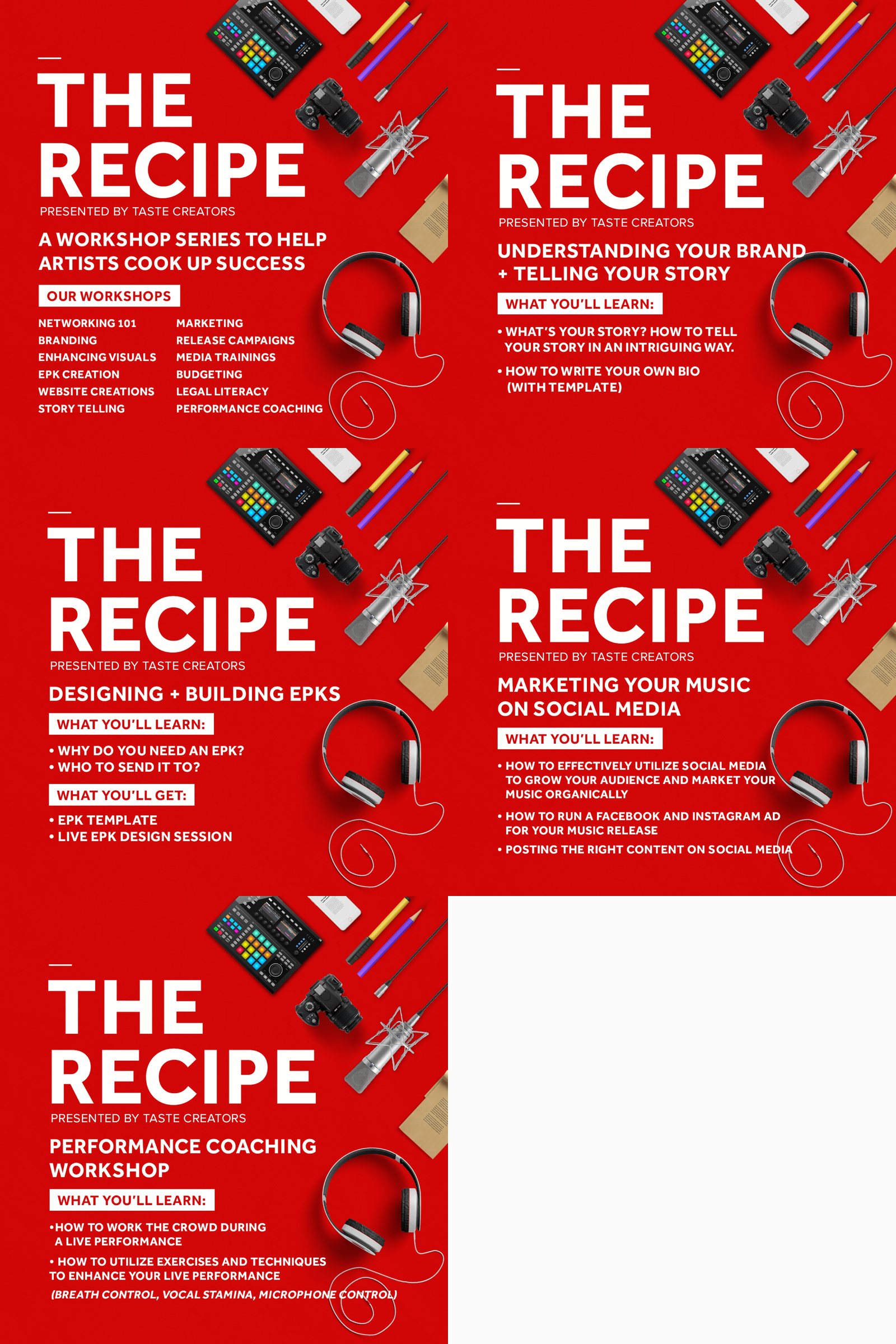
The course returned as a twelve workshop series: networking, branding, enhancing visuals, EPK creation, website creation, storytelling, marketing, release campaigns, media trainings, budgeting, legal literacy and performance coaching. Twelve cards out of one layout.
Three days on one sheet
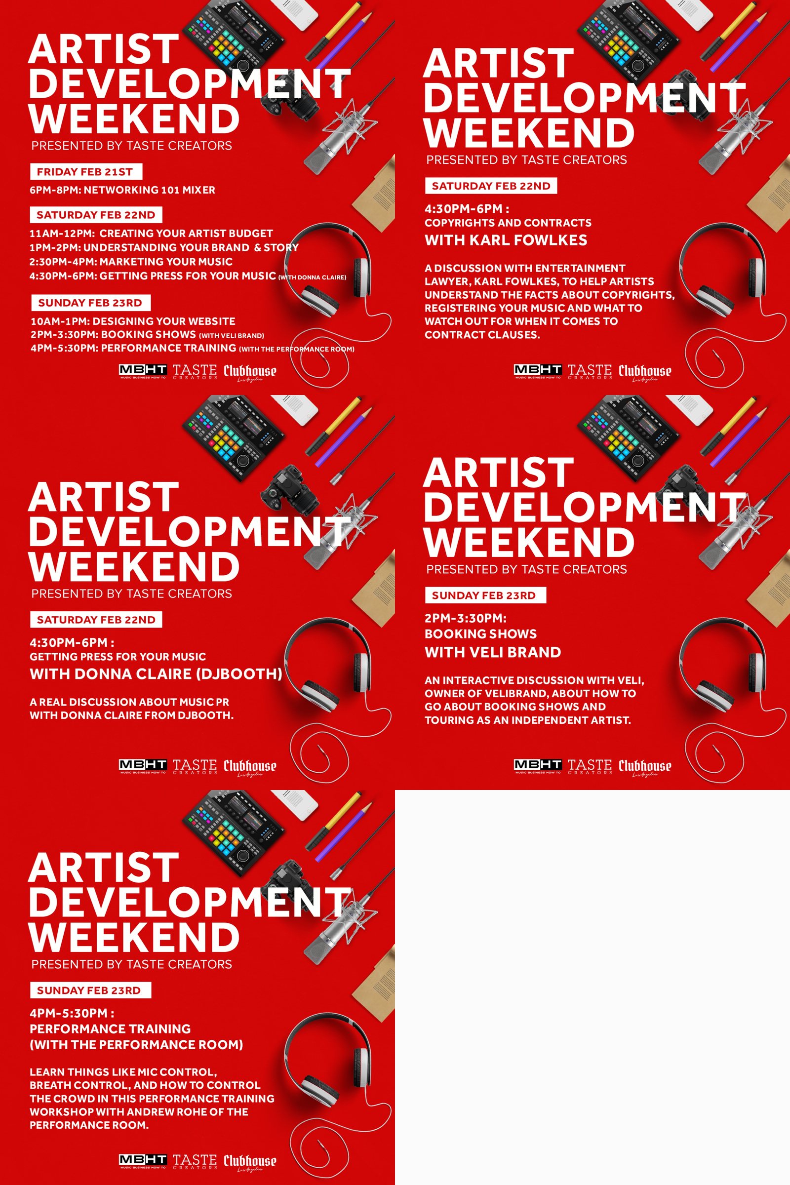
Artist Development Weekend ran 21 to 23 February 2020 with MBHT and Clubhouse Los Angeles: a Friday mixer, then two days of sessions from artist budgets and brand story through to booking shows and performance training.
Four poster routes, two neon chrome and two marbled paper
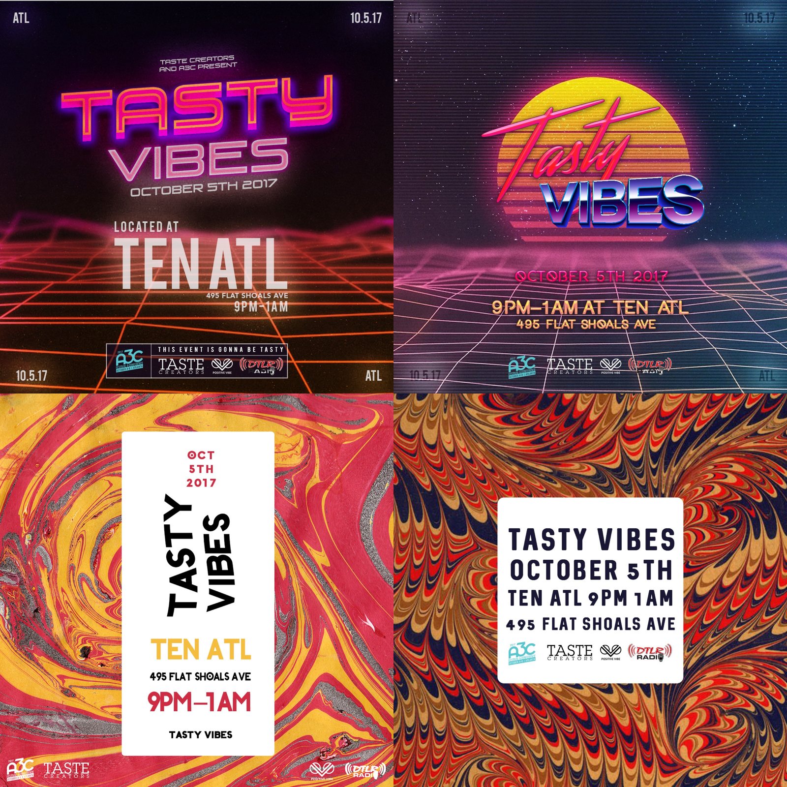
Tasty Vibes ran on 5 October 2017 at TEN ATL on Flat Shoals Avenue, nine until one, co presented with A3C, Positive Vibe and DTLR Radio.
One lineup layout, the portrait and the name swap out
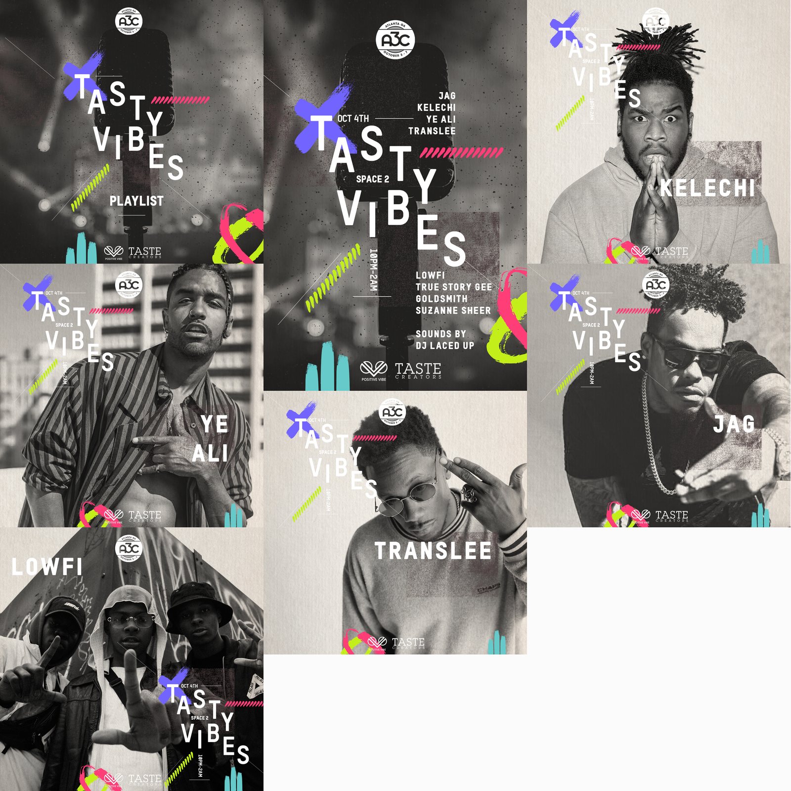
For 2K18, a playlist cover, a main flyer and square cards for Jag, Kelechi, Ye Ali, Translee, Lowfi and the rest of the bill. The edition ran in Space 2 from ten until two with DJ Laced Up on sounds.
Cover art and social headers for the artists around it
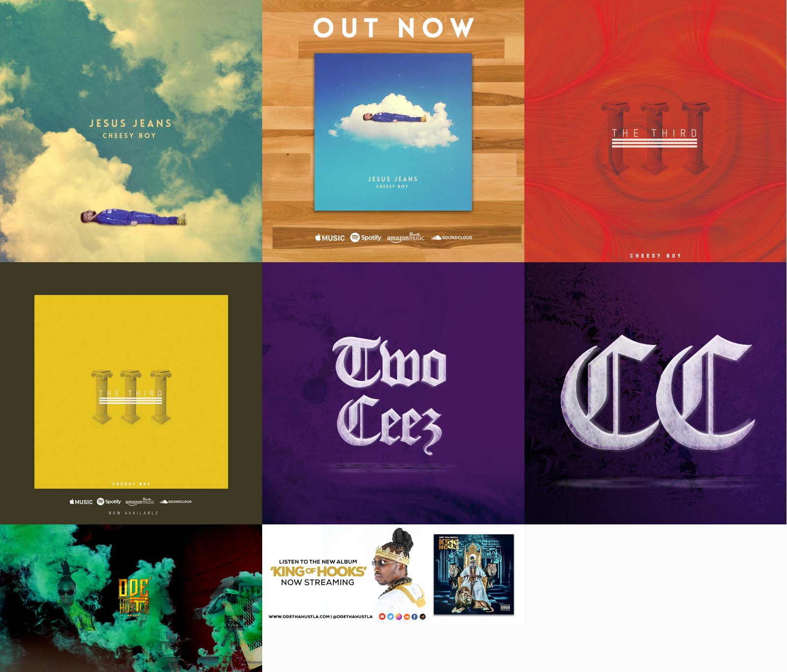
Cover art and social headers for Cheesy Boy, TwoCeez and Ode Tha Hustla, made to sit on streaming thumbnails and on the feed without a second version being drawn for each.
Where the work ran
It shipped as social posts, event flyers, playlist art and streaming artwork, across two Tasty Vibes editions, two generations of The Recipe, a three day Artist Development Weekend and the merch shop.
Five years of programmes came out of one monogram sheet and a handful of containers built to be refilled.
Build the container, then fill it
A small collective cannot art direct every post. What it can do is own a few containers well enough that anyone can drop new content in and the result still reads as the brand. We put the effort up front, into the monogram sheet, the flat lay photograph and the audio reactive composition, so that the twenty first track video and the twelfth workshop card cost almost nothing to produce and still looked like Taste Creators. The system is the deliverable. The posts are only what comes out of it.