SiriusXM
SiriusXM
Overview
- Design system
- Brand framework
- Interface patterns
- Content templates
What We Did
The Outcome
Designing a new visual direction for a media giant
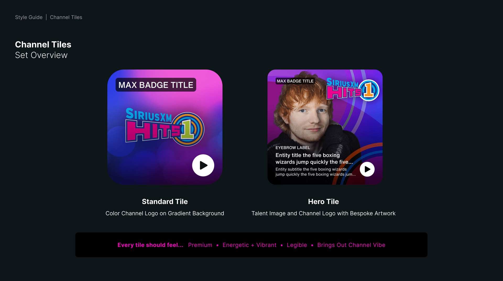
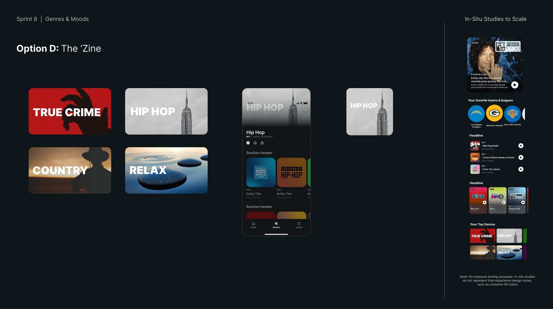
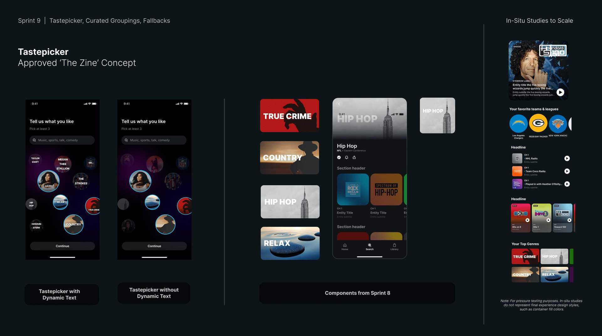
A unified tile framework. Eight content categories. One system that holds across audio, video, talent, live, and editorial.
SiriusXM wanted to evolve its digital identity: a refreshed design system, aligned across platforms, modernized for the way listeners actually use the app. We came on as art director, leading a team of six, to own the core tile framework and shape the broader UI and UX decisions behind how listeners navigate and discover content in a mobile-first environment.
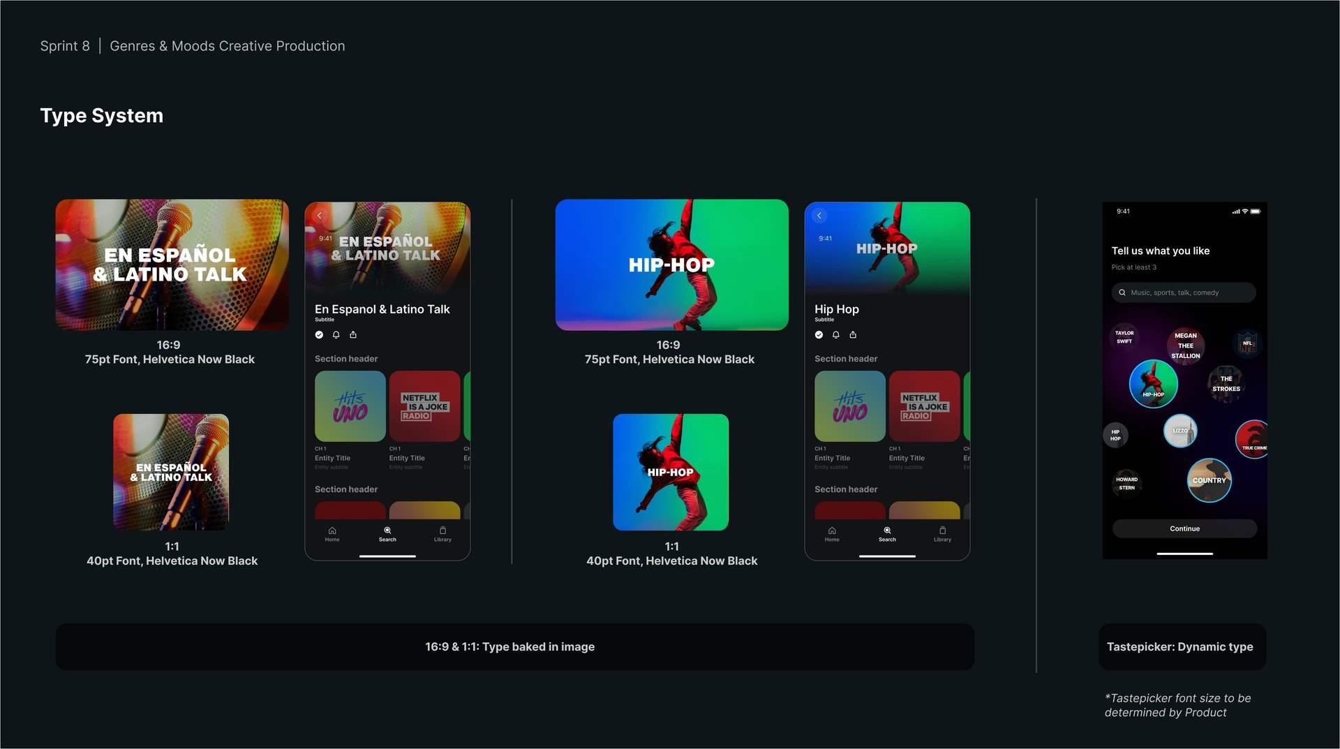
The framework had to define how content behaves through typography, color, and modular structure, with scalable sets spanning image, color, and abstract categories. We built it as mobile-first Figma templates: a flexible foundation SiriusXM's content ecosystem could keep growing into.
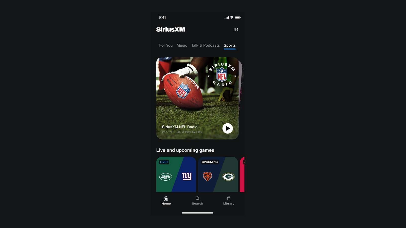
Art direction, brand systems and interface design, leading a team of six
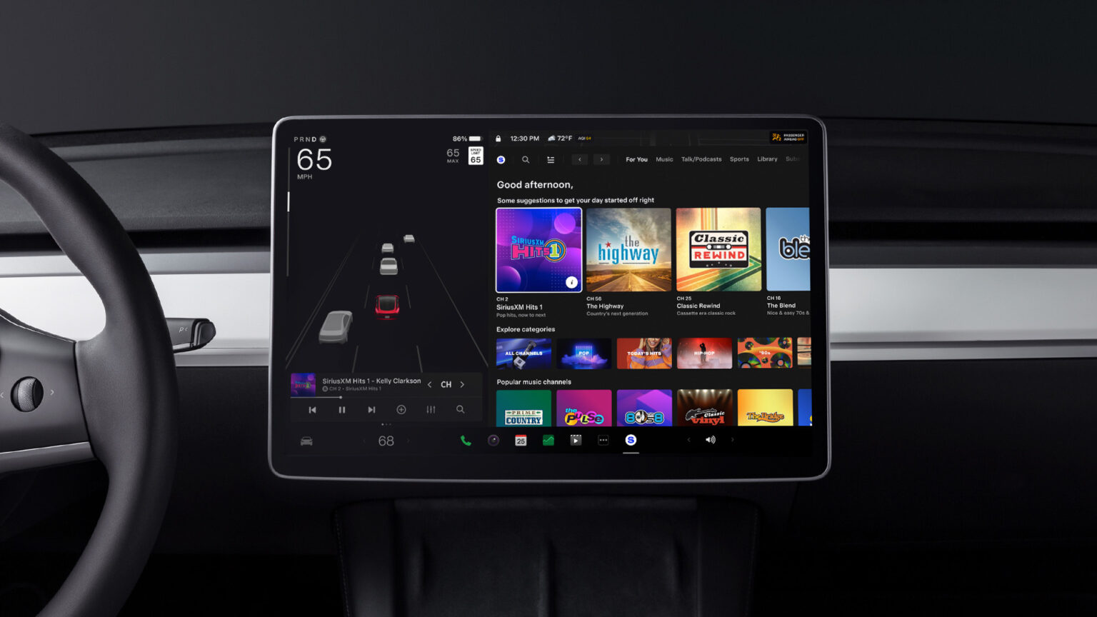
Therum contributed to the product design system and visual direction for SiriusXM’s mobile and digital interfaces, helping reimagine how the brand communicates and organizes its massive catalog of music, talk, and sports content.
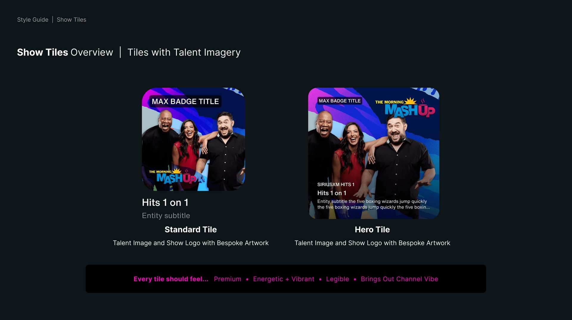
core content categories · audio, video, editorial, talent, live, fallback, interview, generic
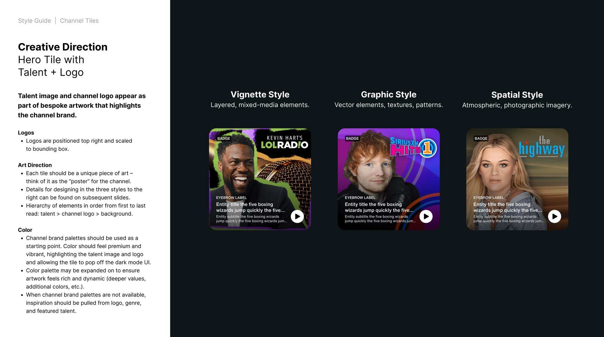
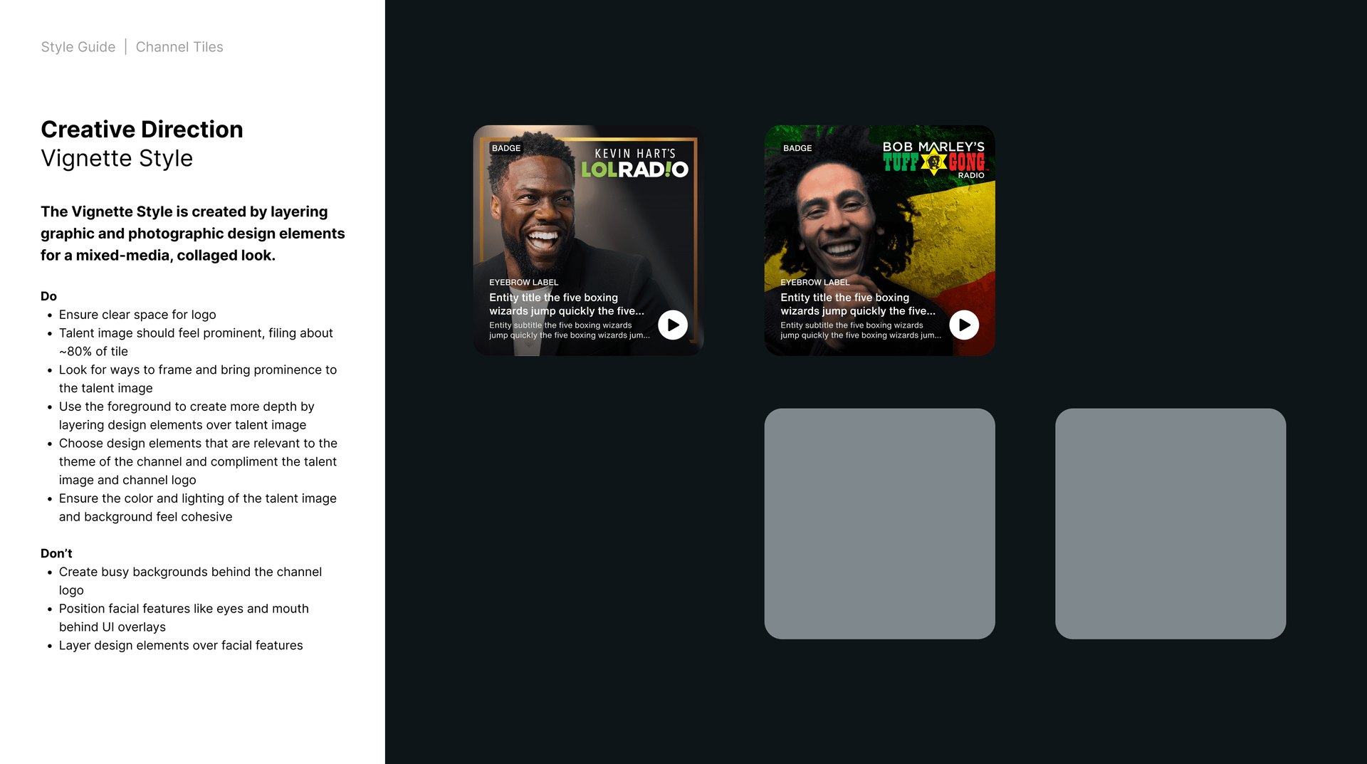
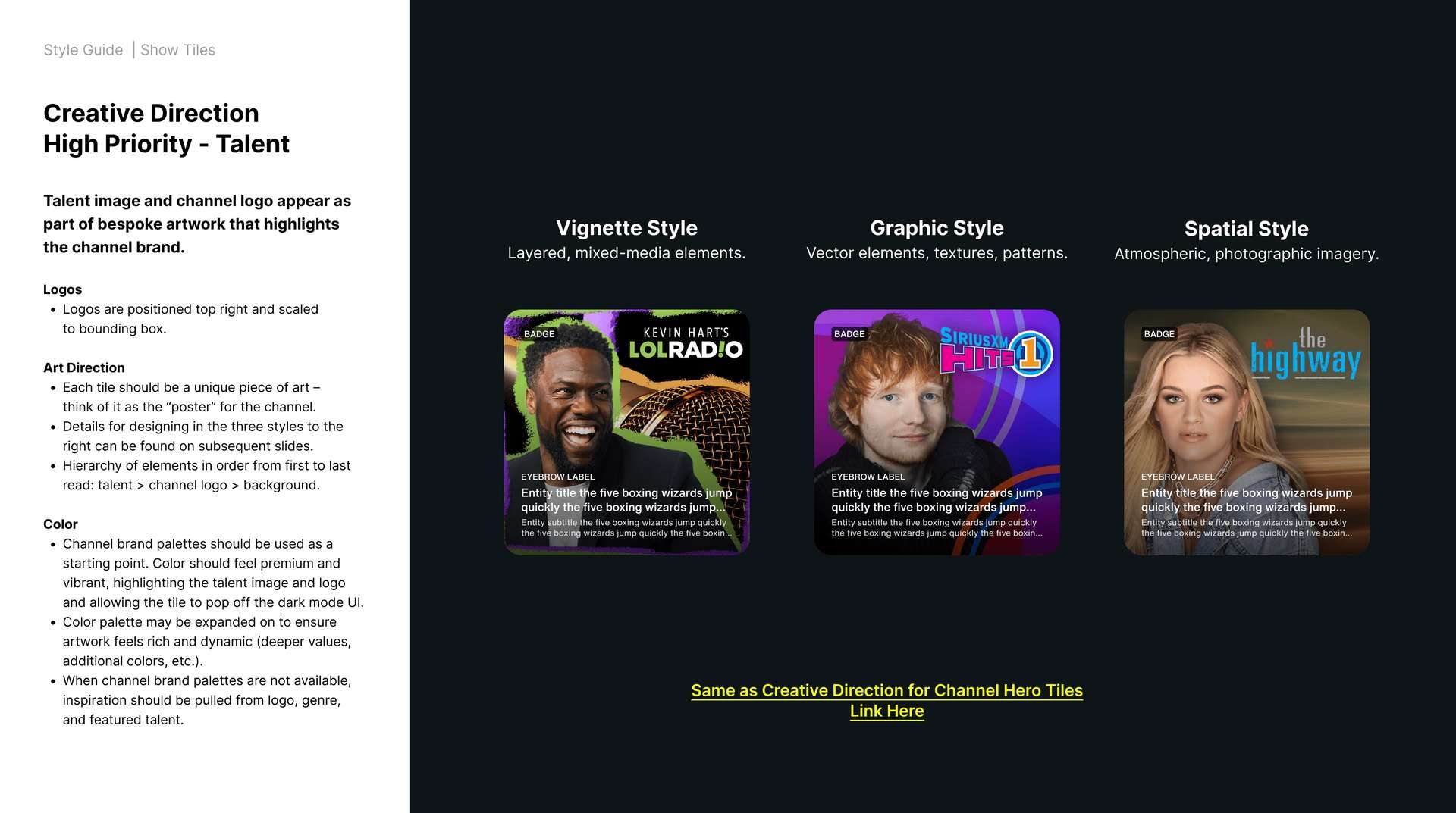
visual styles · vignette, graphic, spatial, mixed media
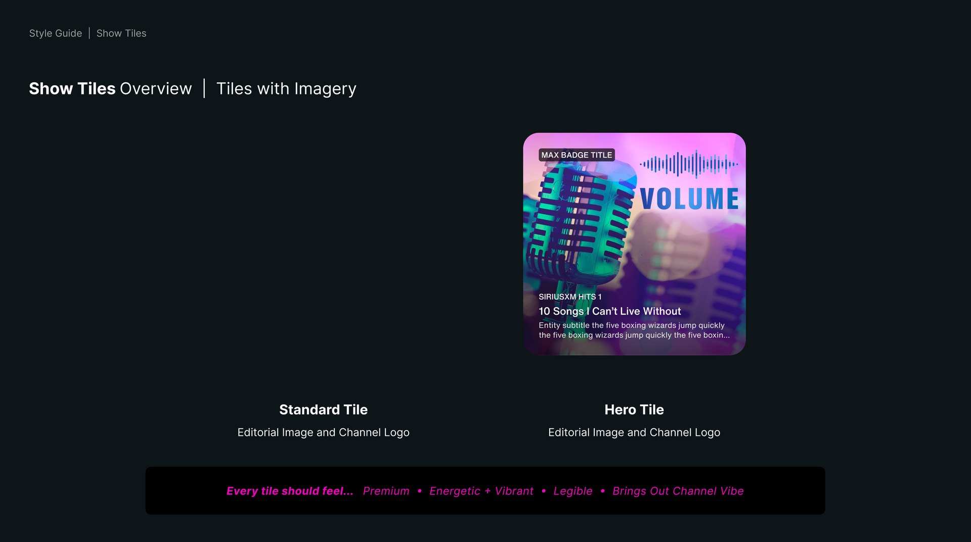
tile framework · standard, hero, promotional, same rules
designers · the team we led on the framework
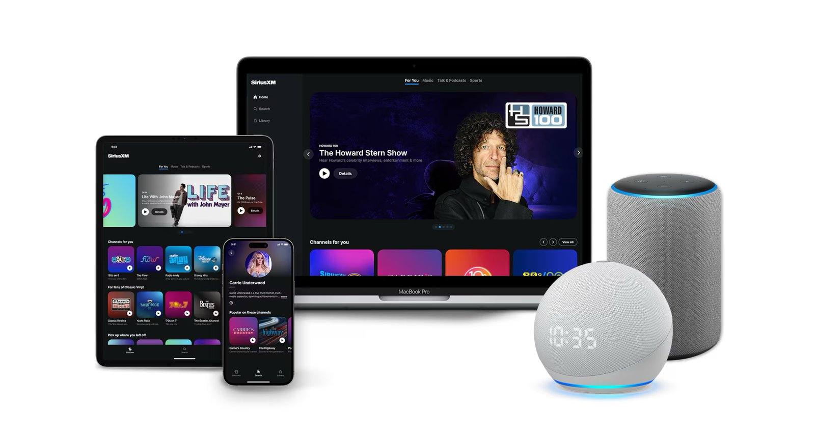
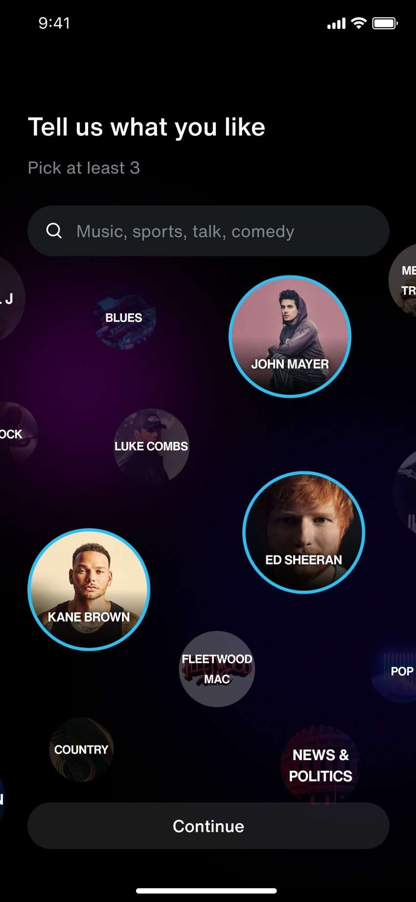
A flexible design language built around clarity, motion and hierarchy

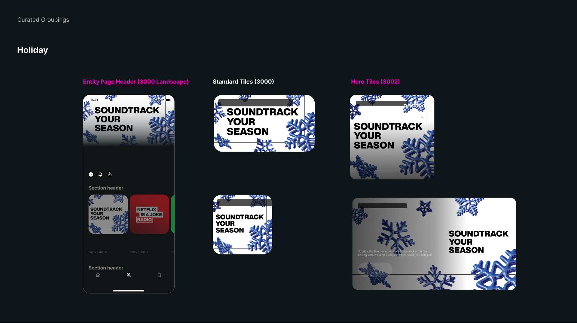

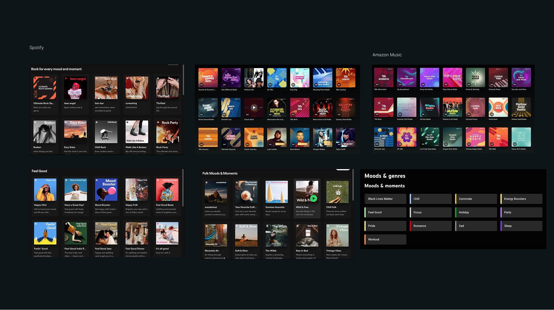
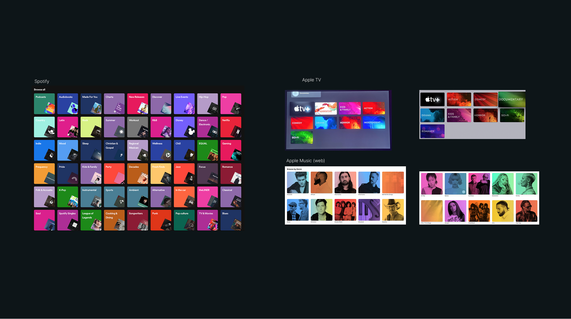
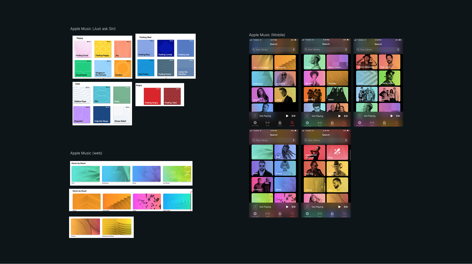
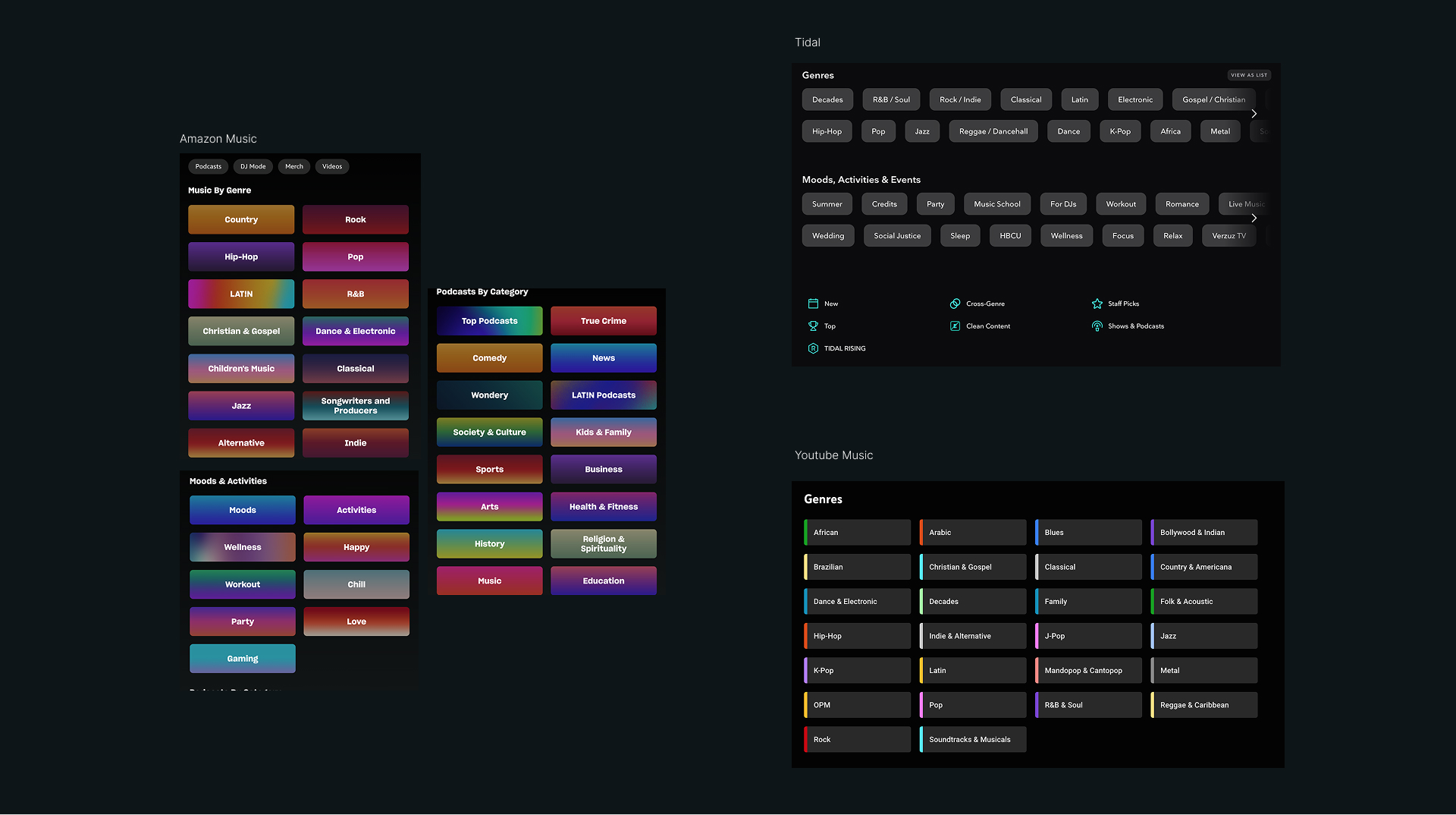
We started with research, not aesthetics. We studied how peer platforms communicate brand and structure content across large-scale media ecosystems: how the competition presents audio and video, sets hierarchy, and guides people through dense libraries.
Those findings shaped a framework that unifies content types, media formats, and visual styles across the experience. The goal was clarity and consistency at scale, without flattening personality or genre expression.
We developed a flexible design language built around clarity, motion, and hierarchy. The focus was on bringing visual depth to content while maintaining simplicity, using color, typography, and image-driven layouts to emphasize personality and ease of use.

The Design System
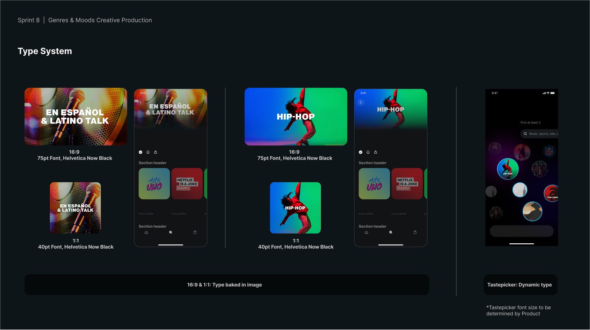
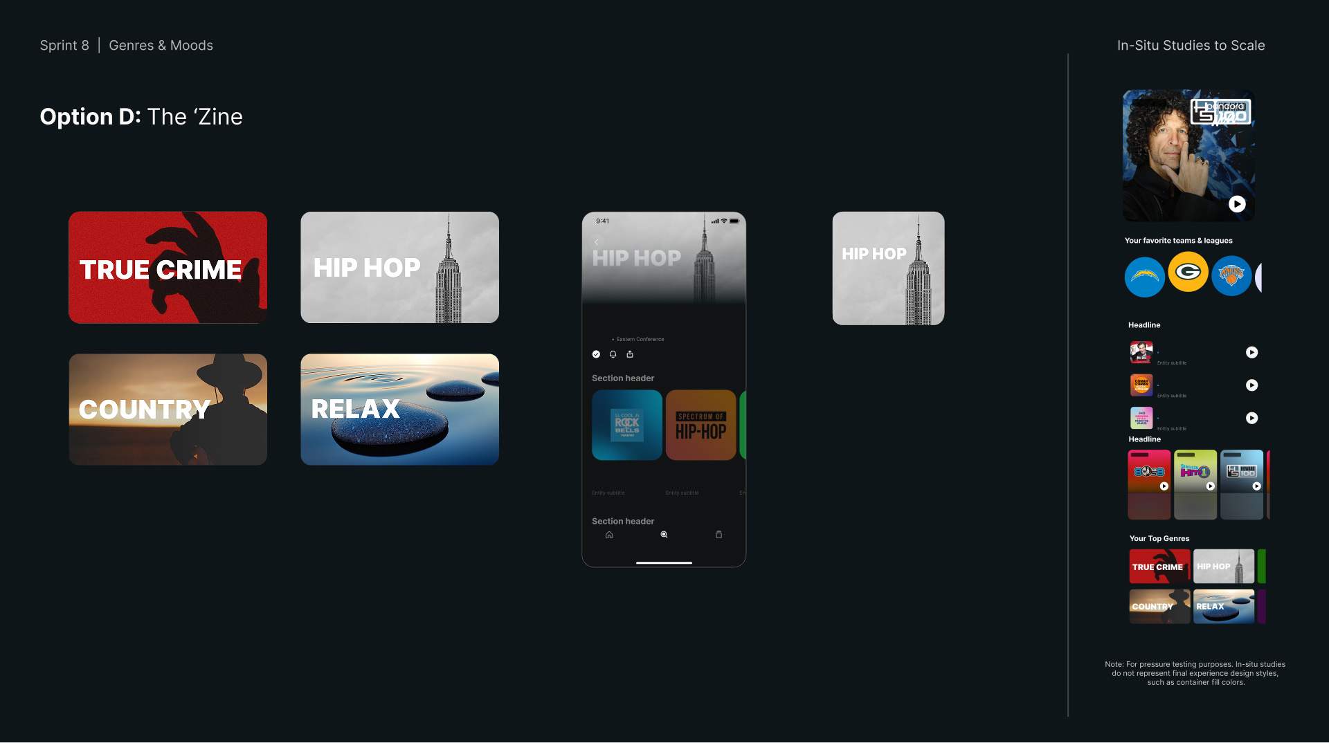
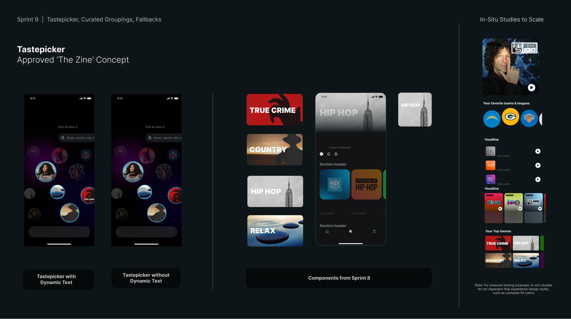

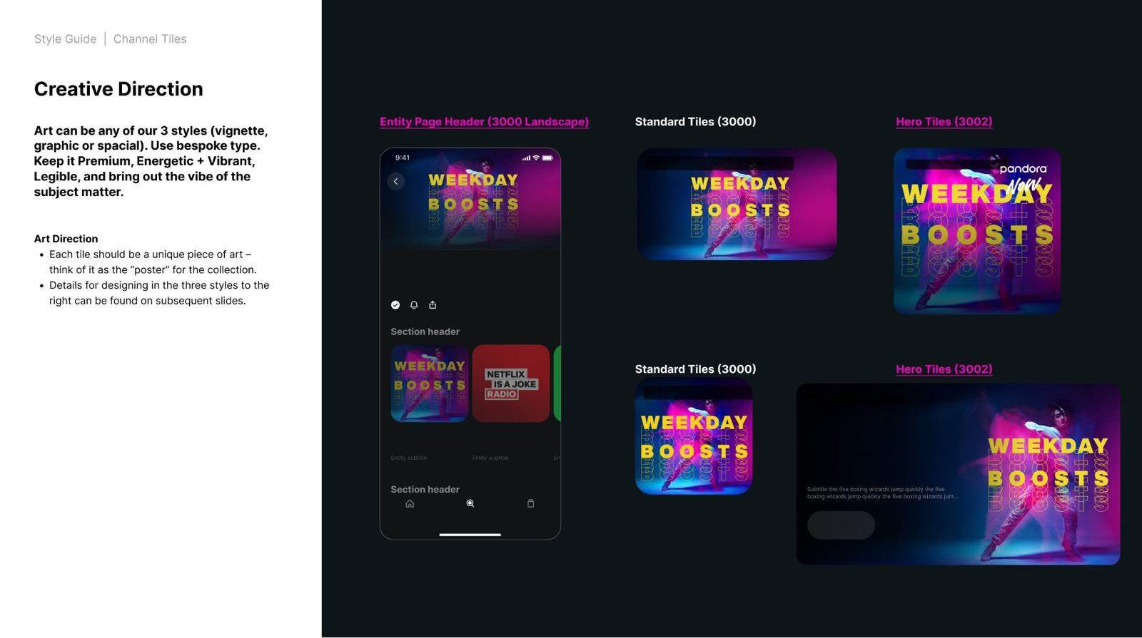
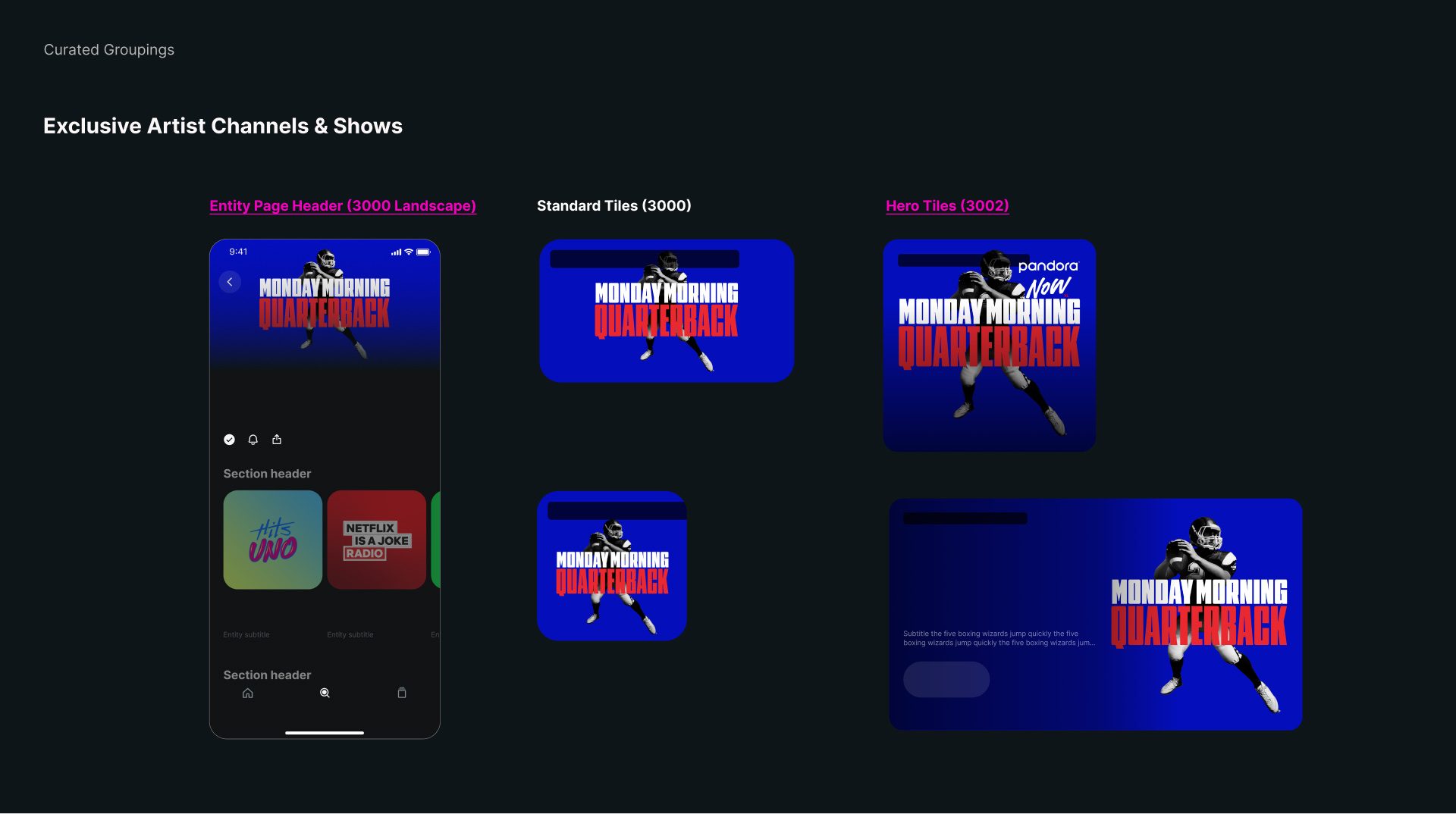
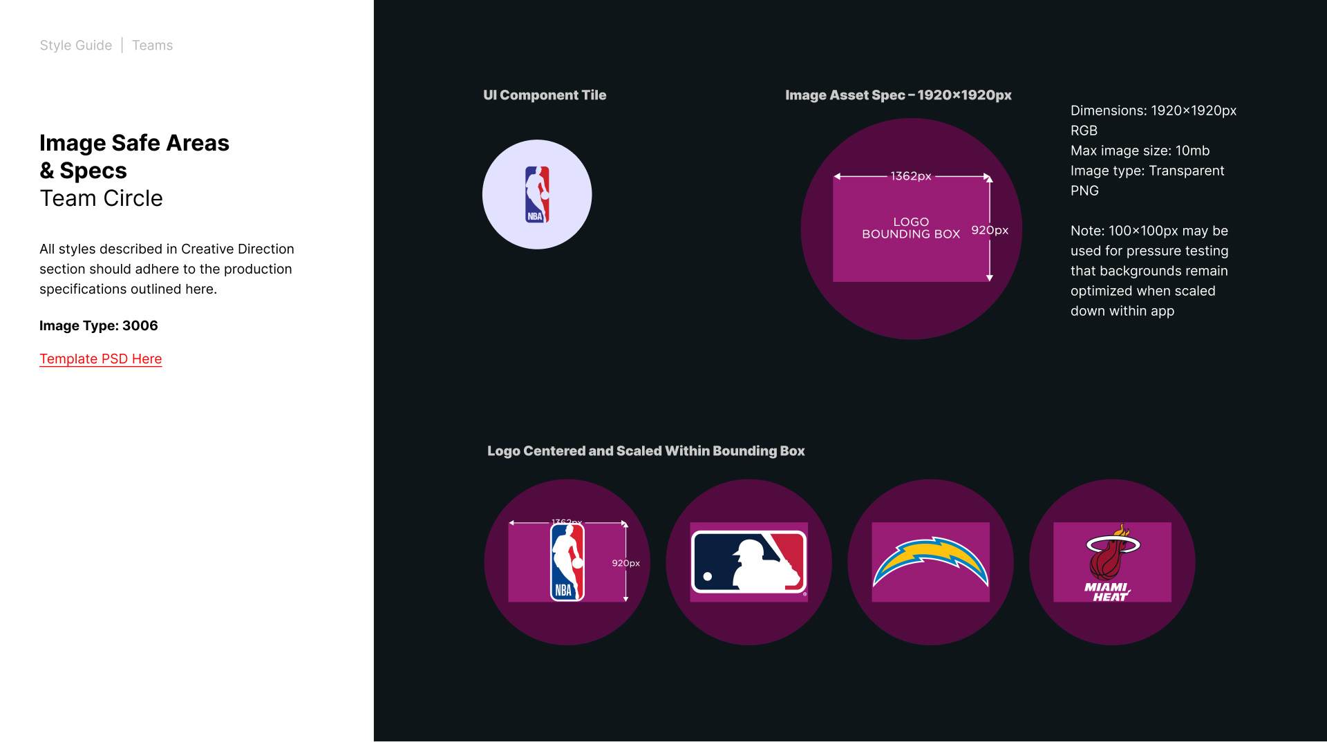
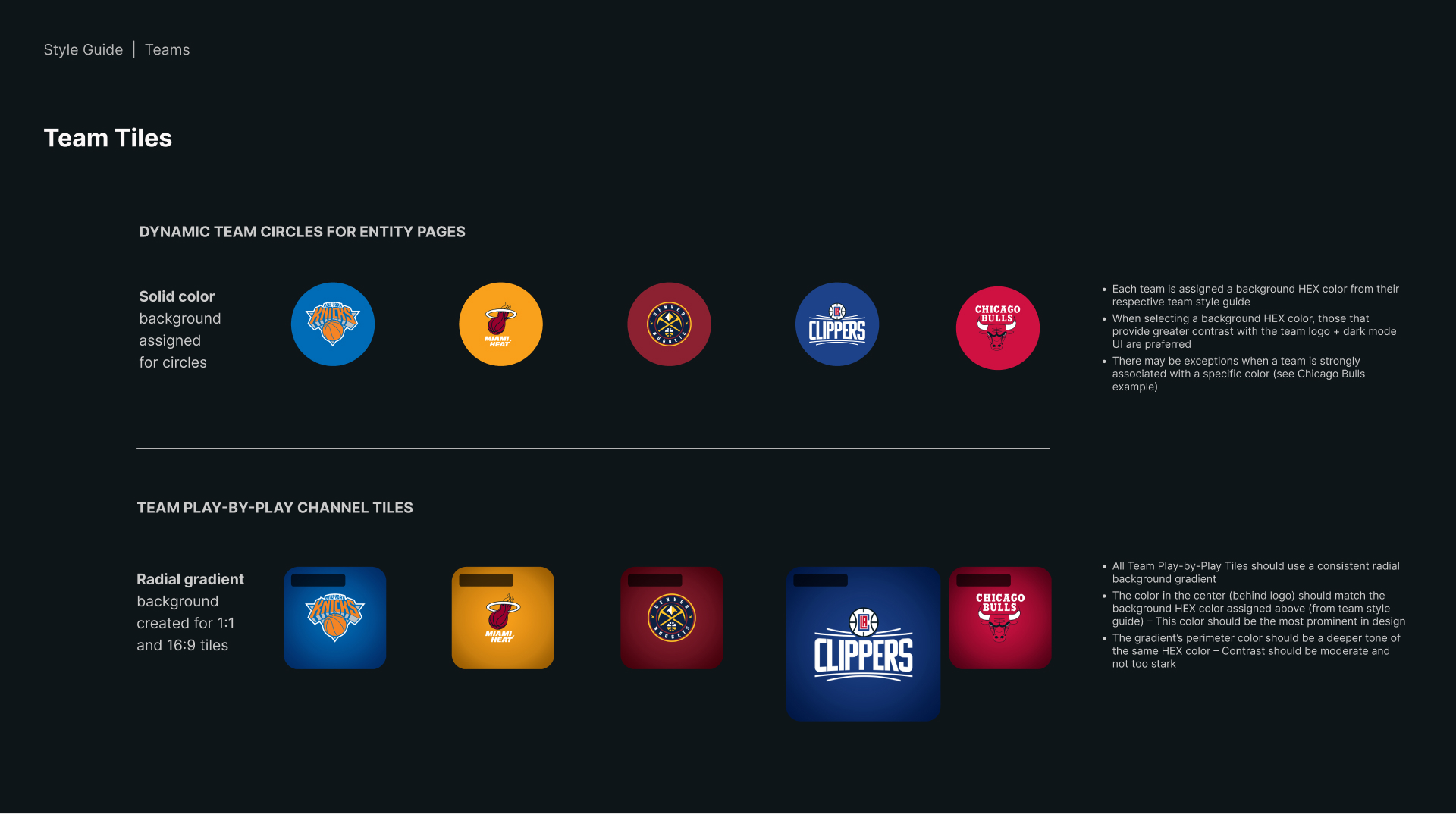
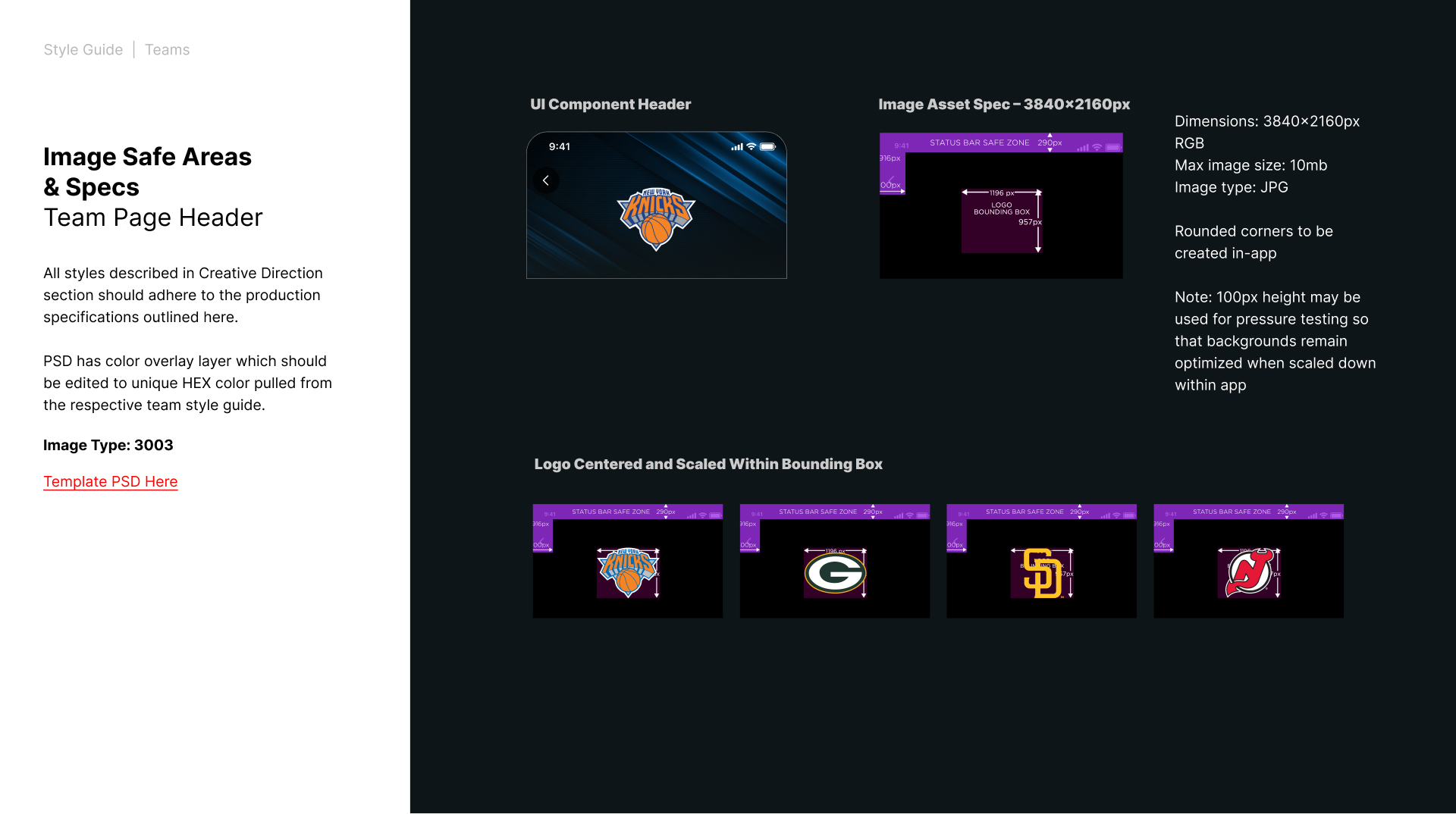
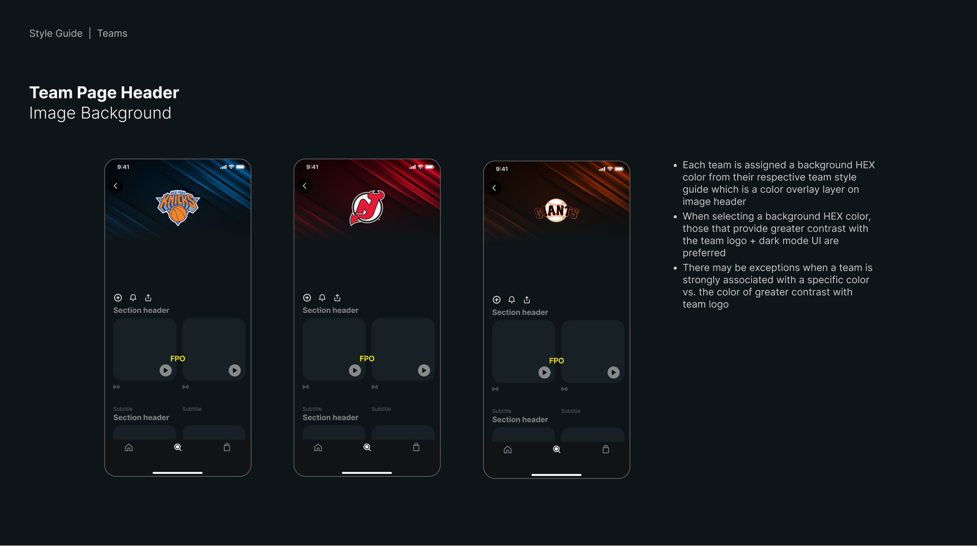
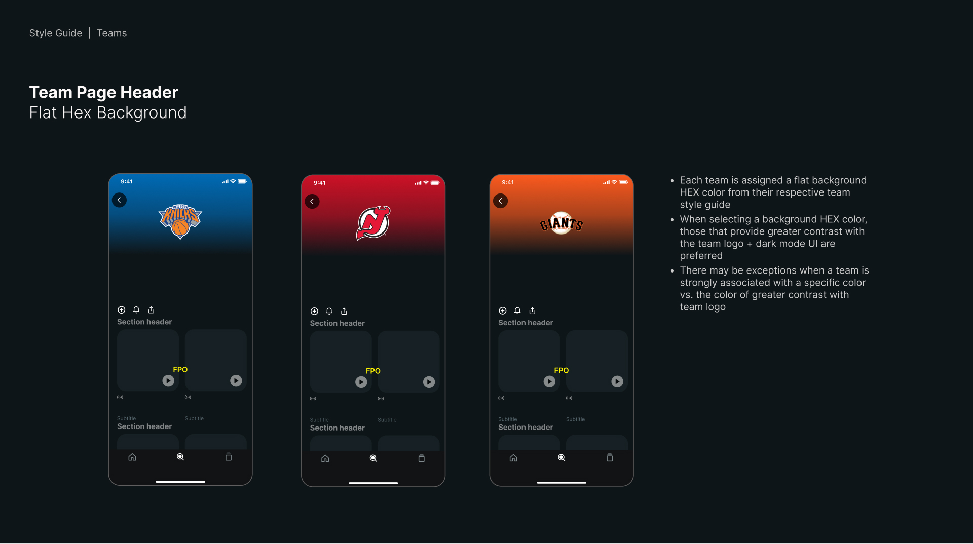
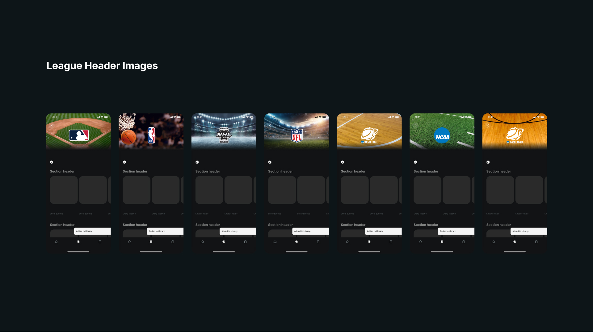

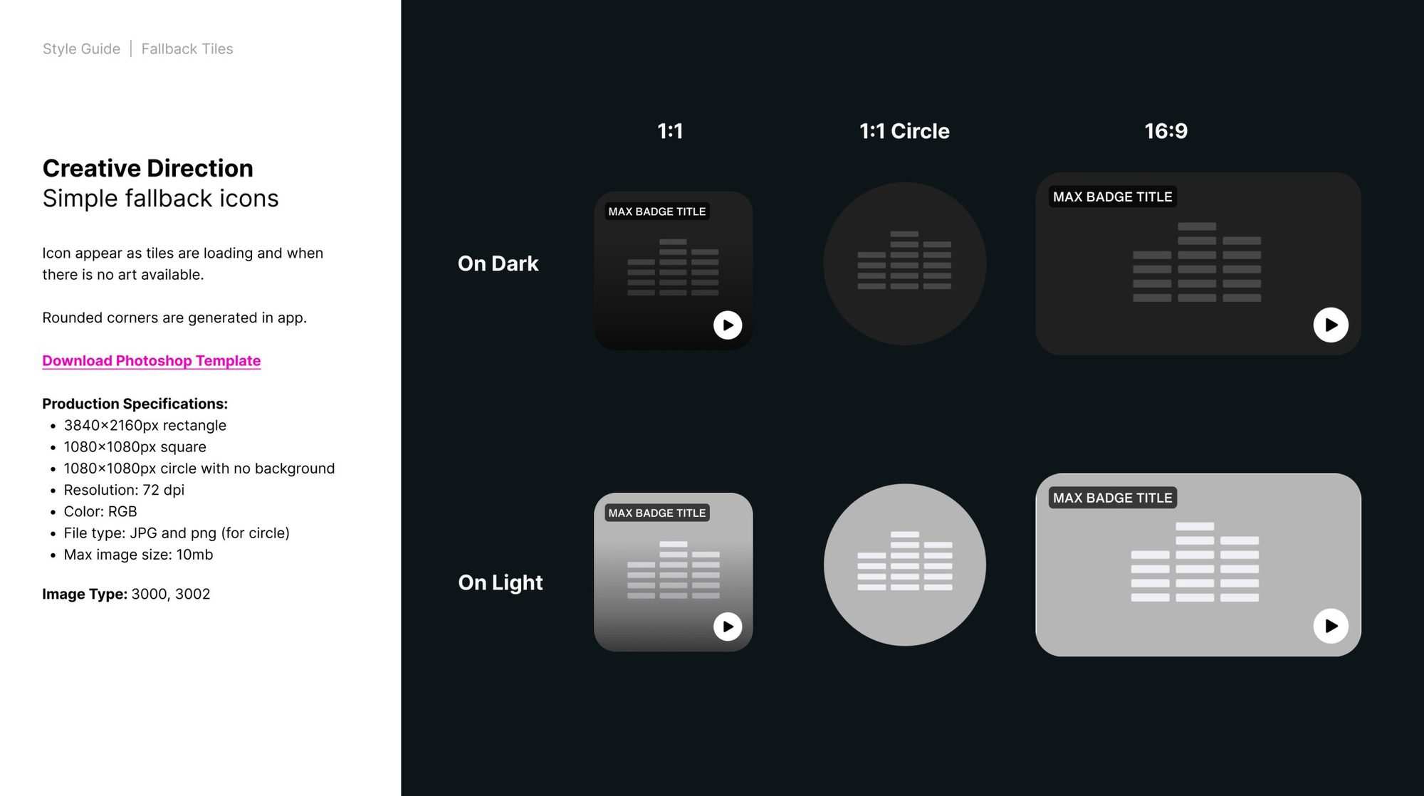
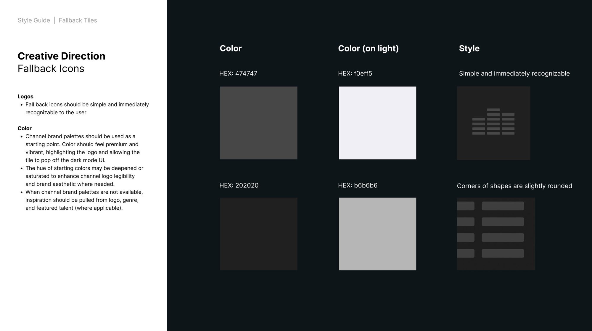
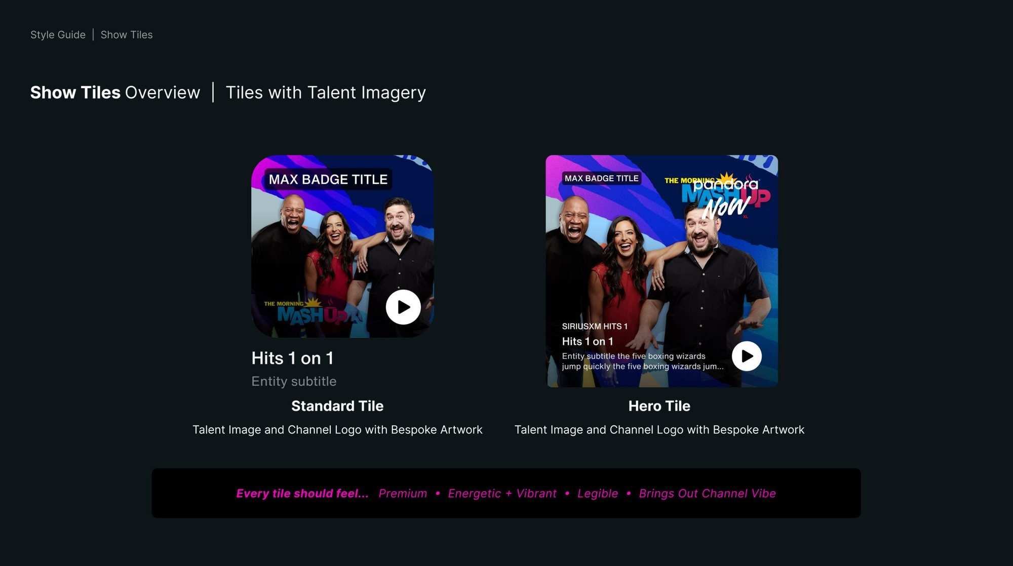
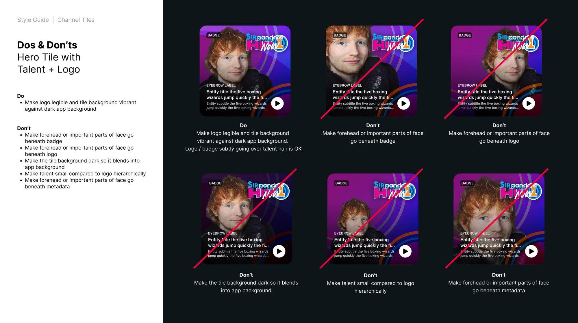
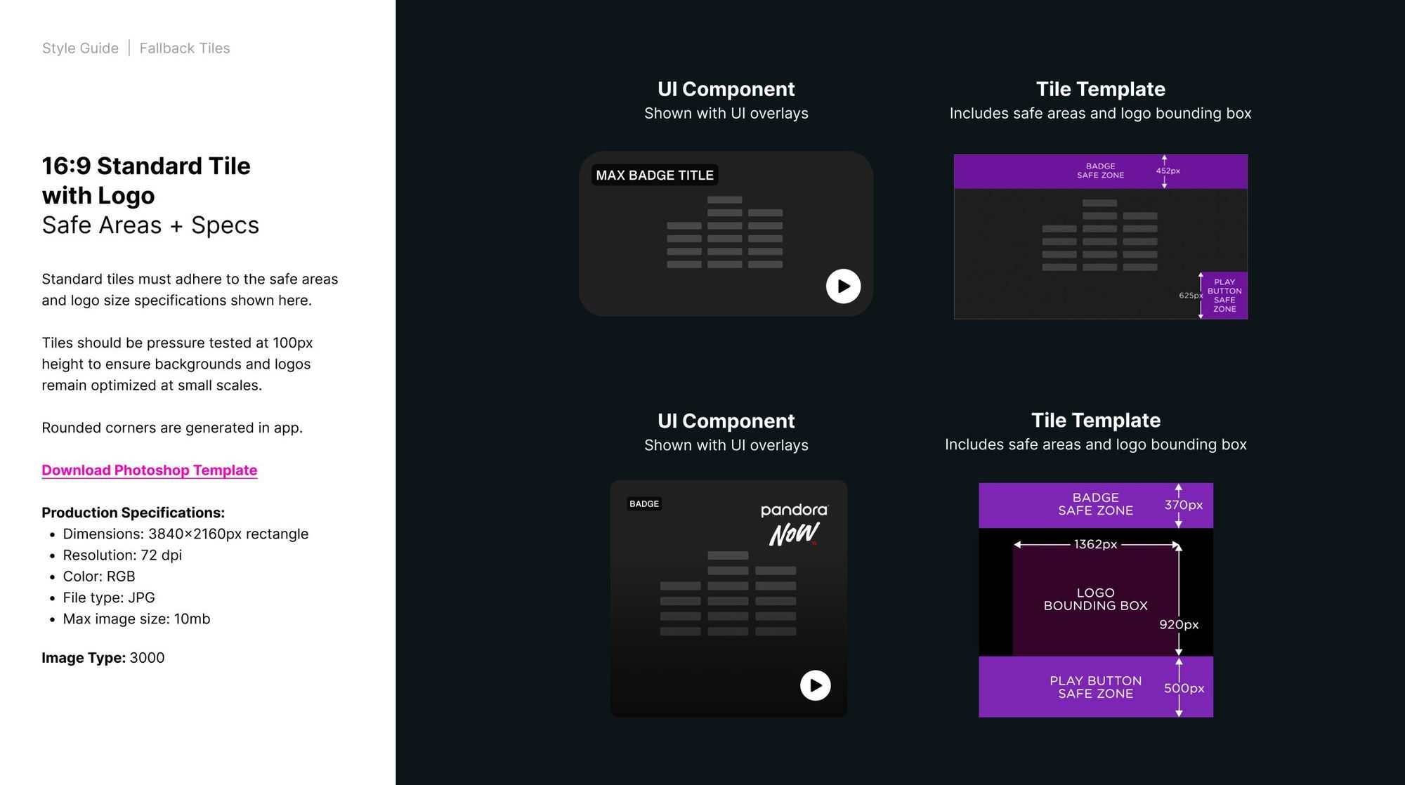
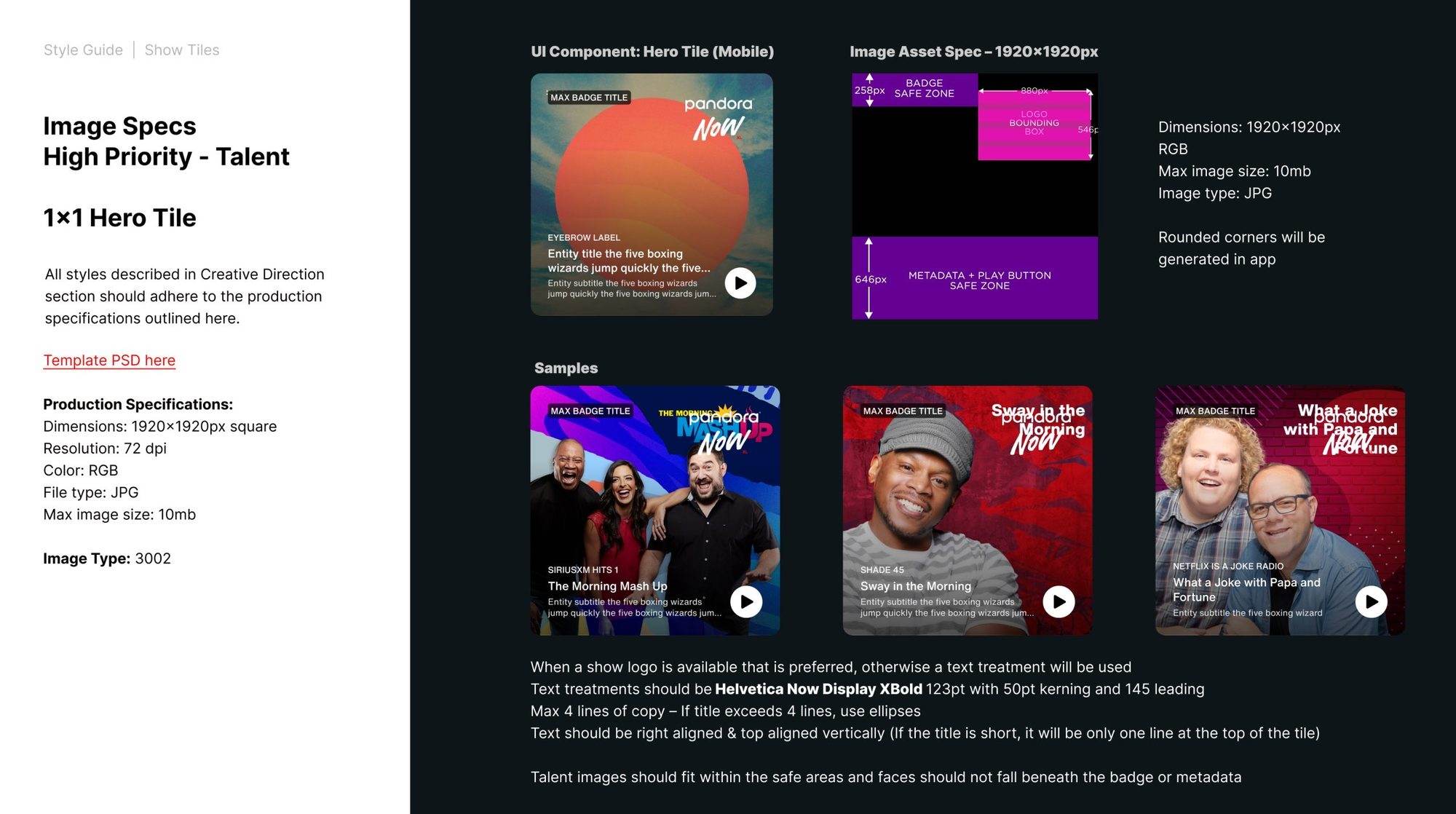
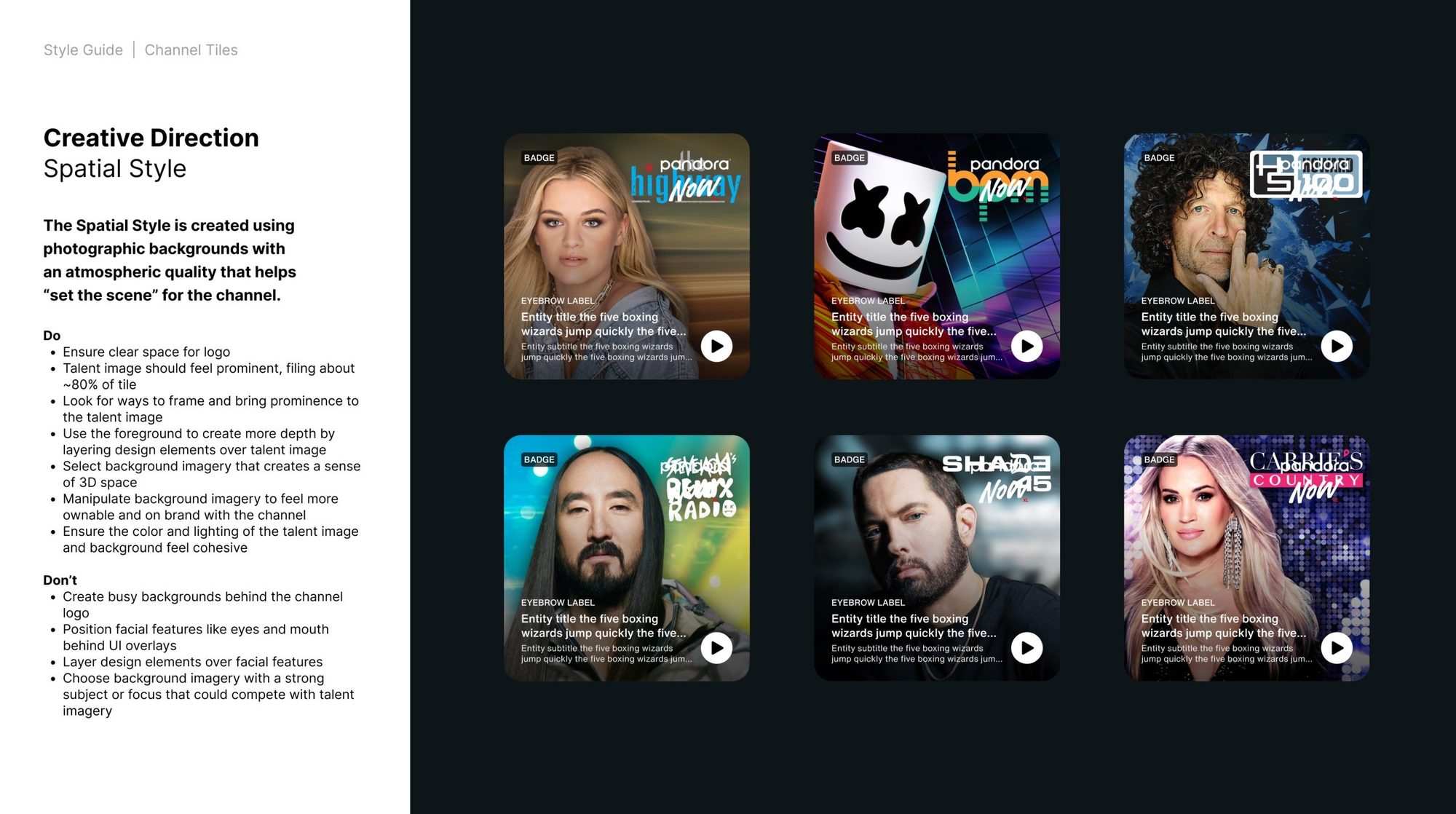
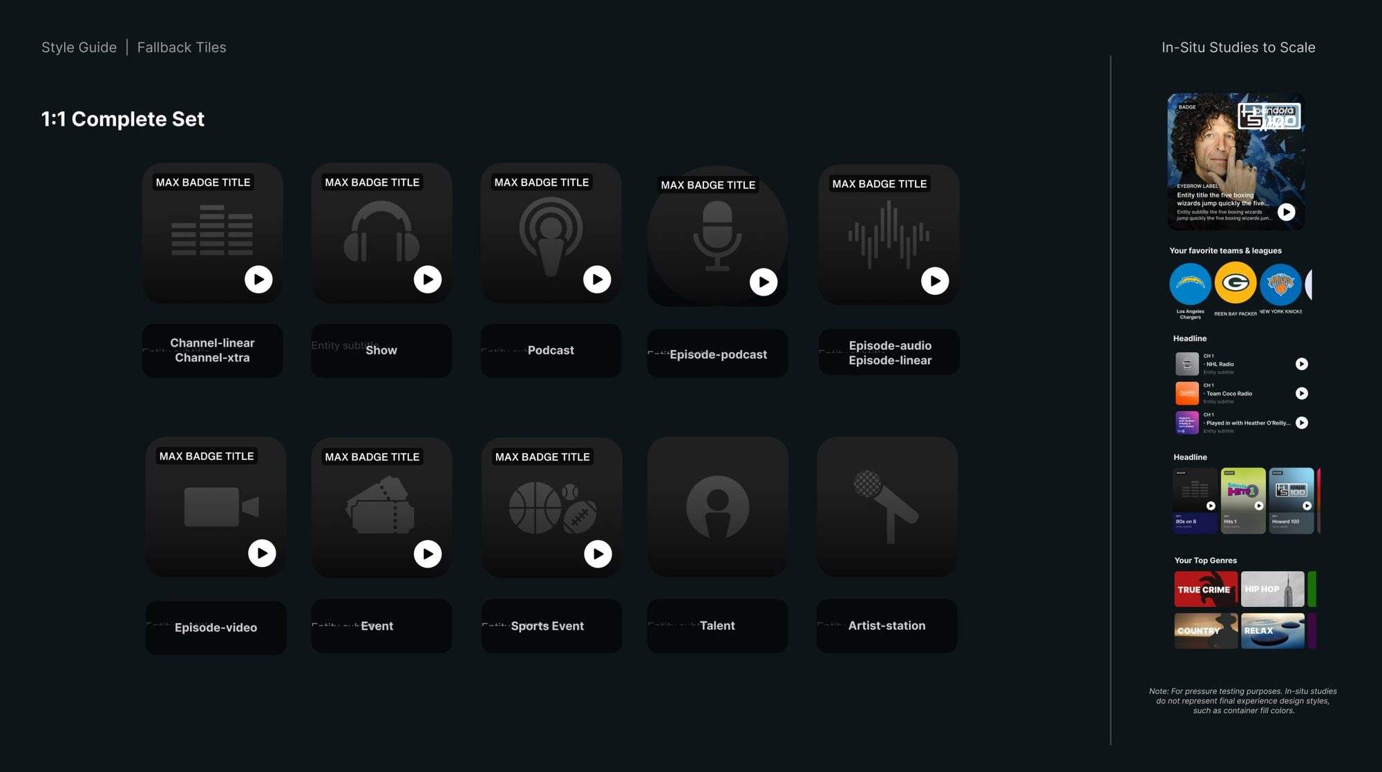
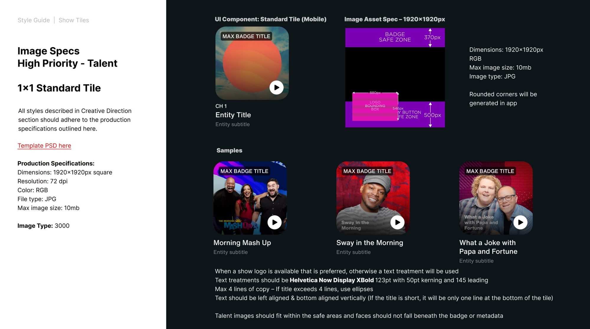
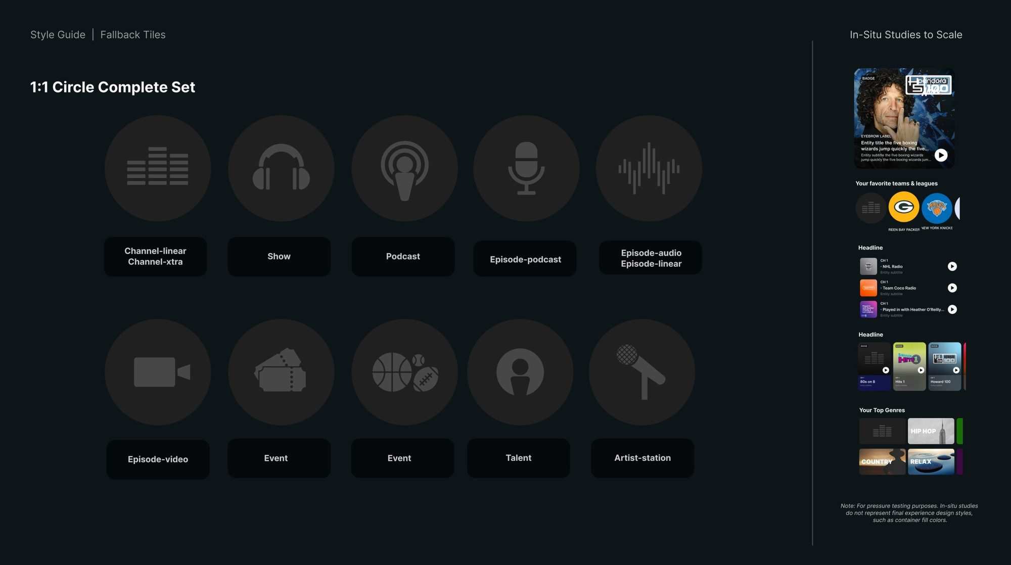
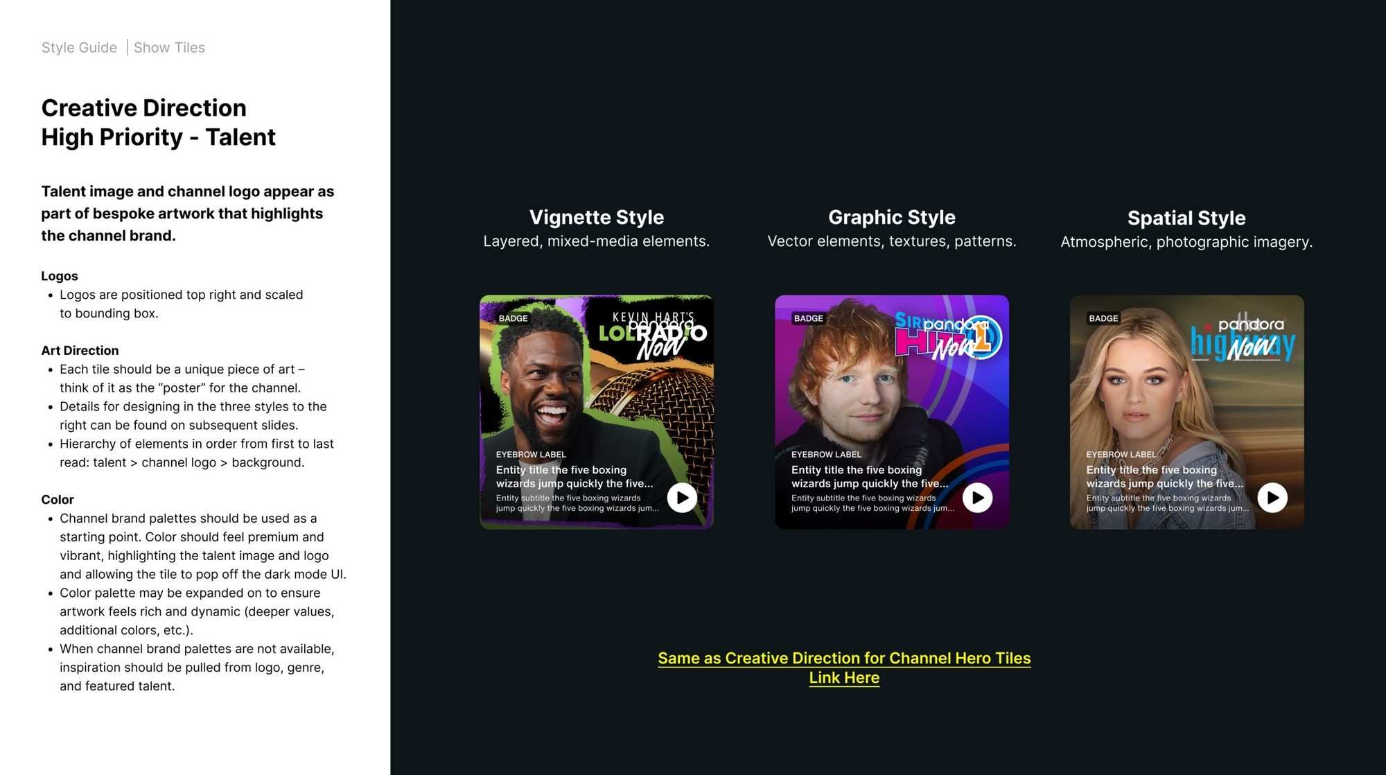
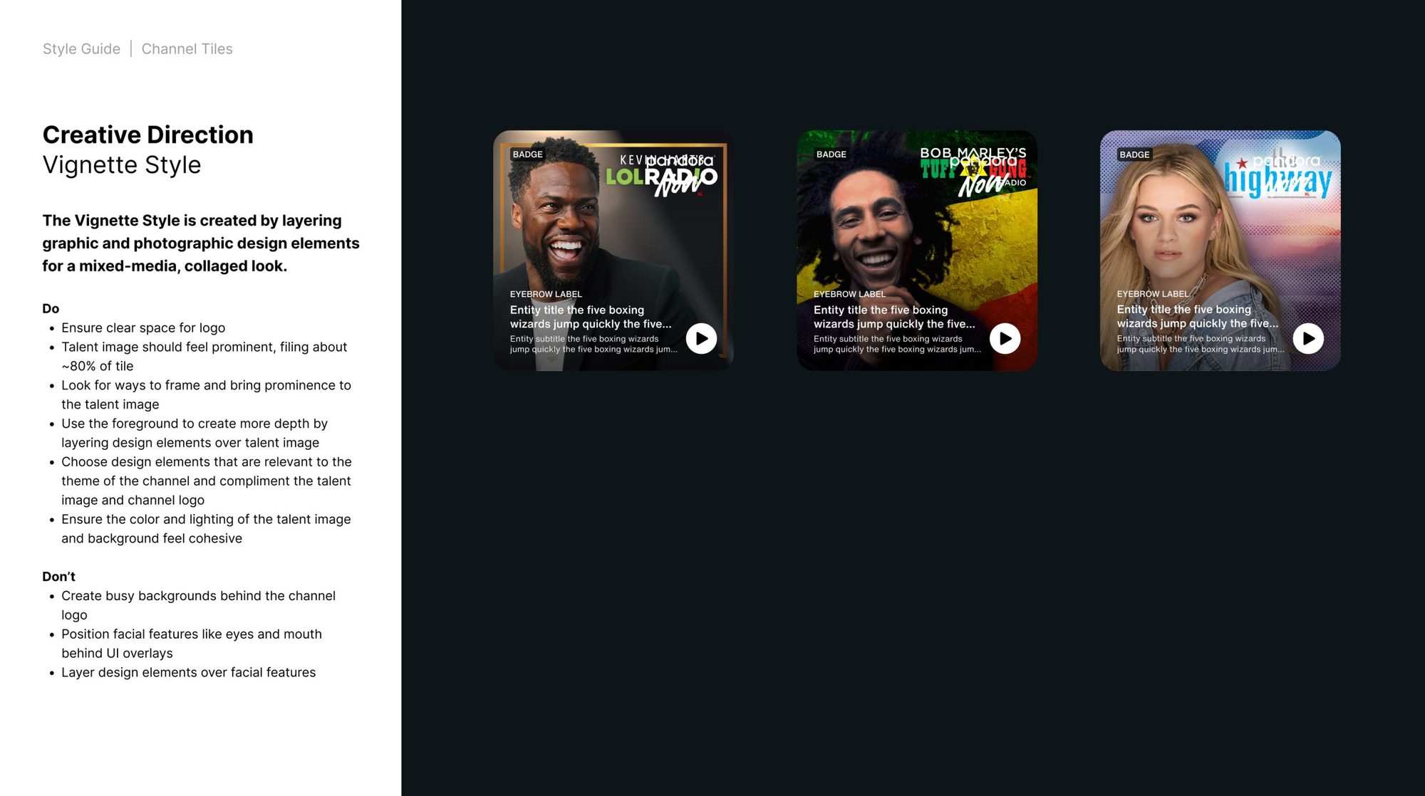
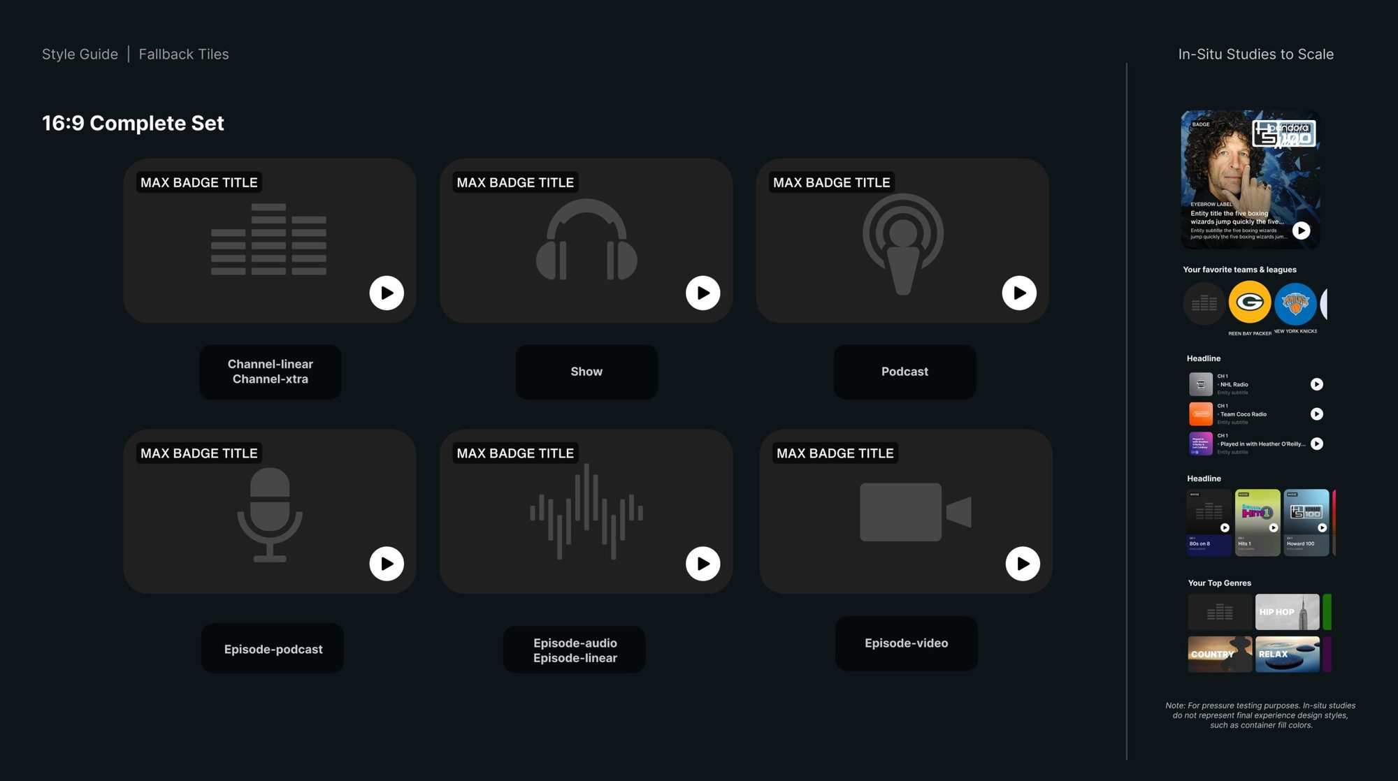
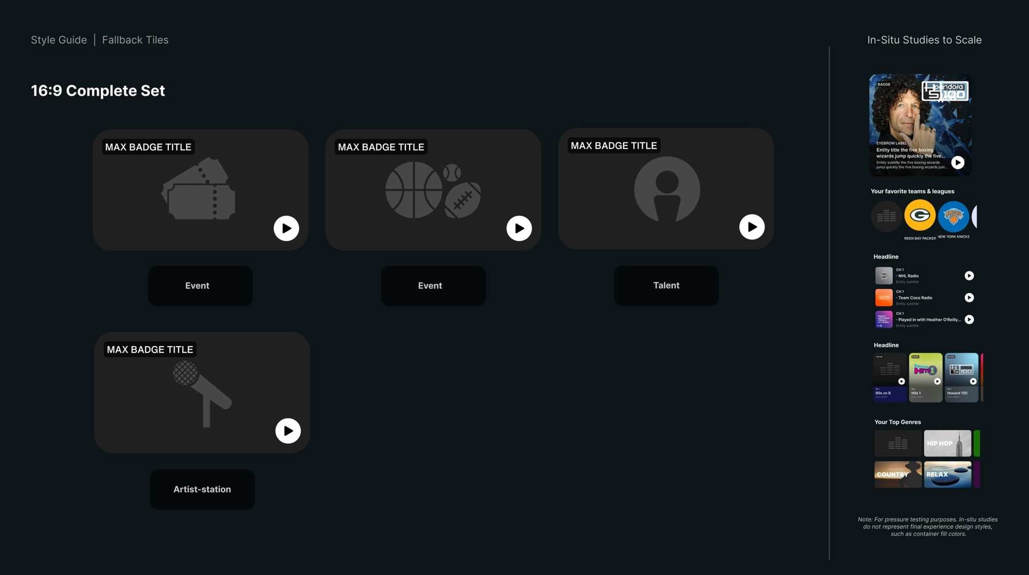
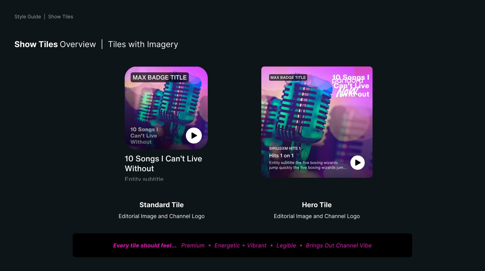
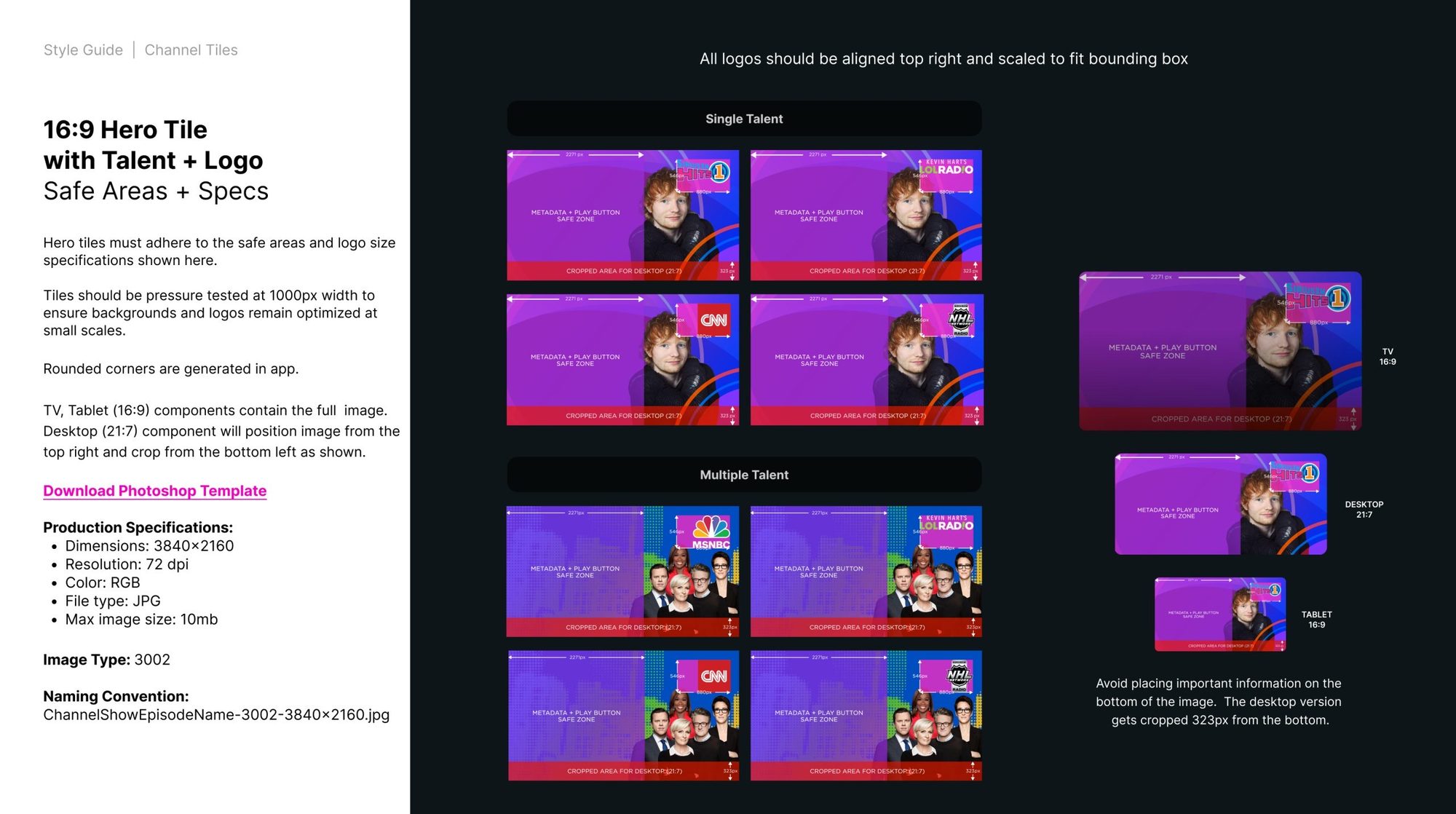
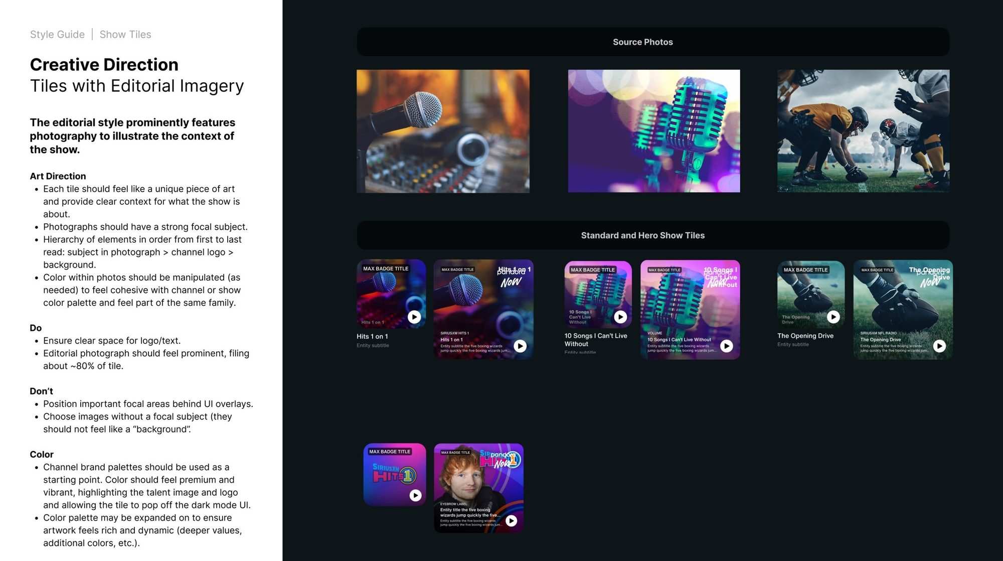
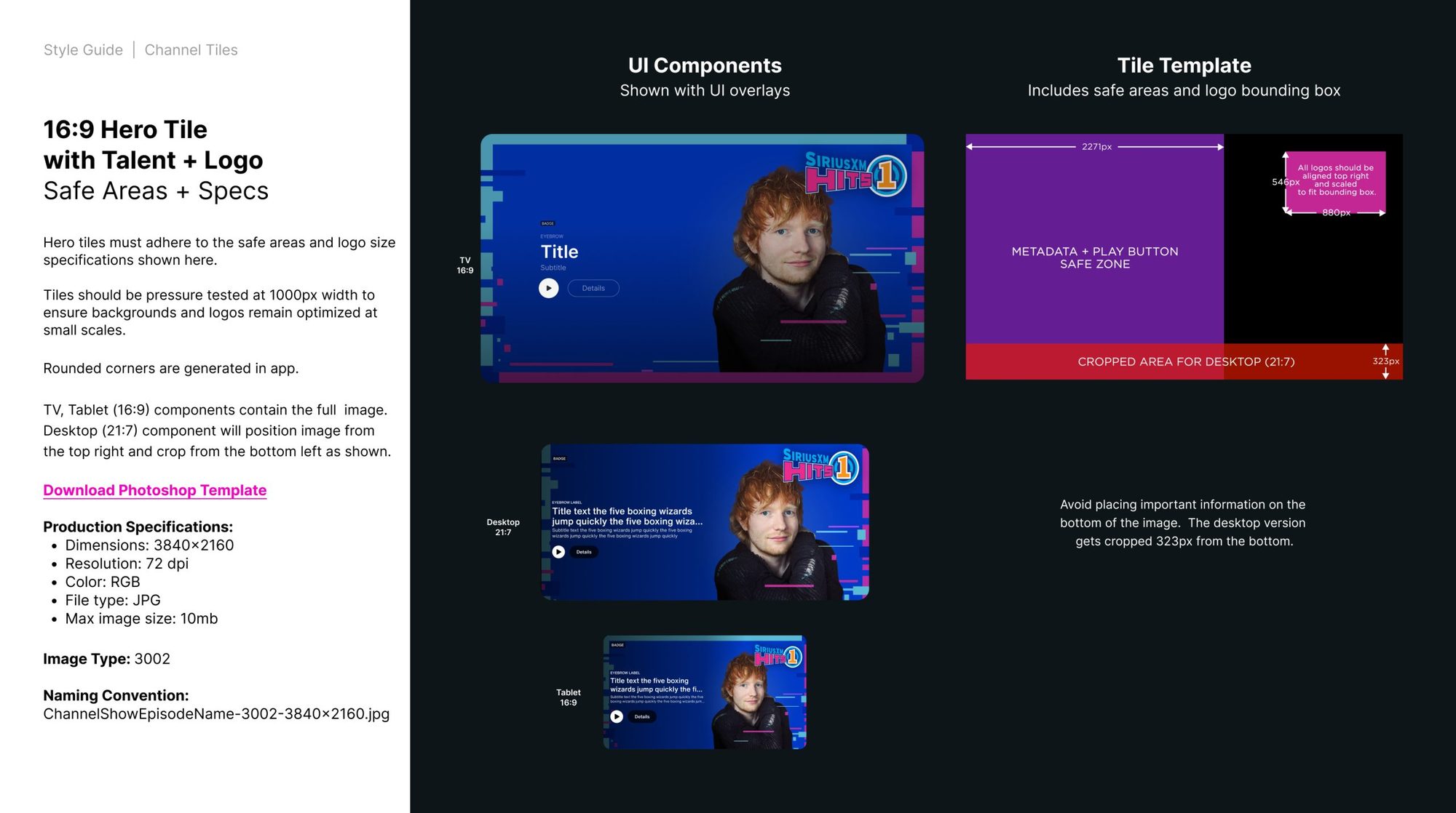
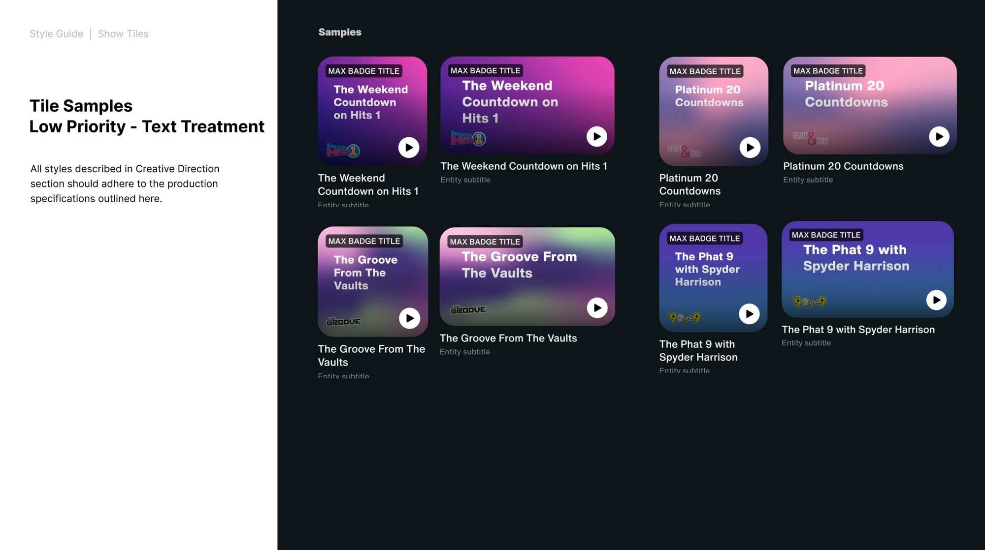
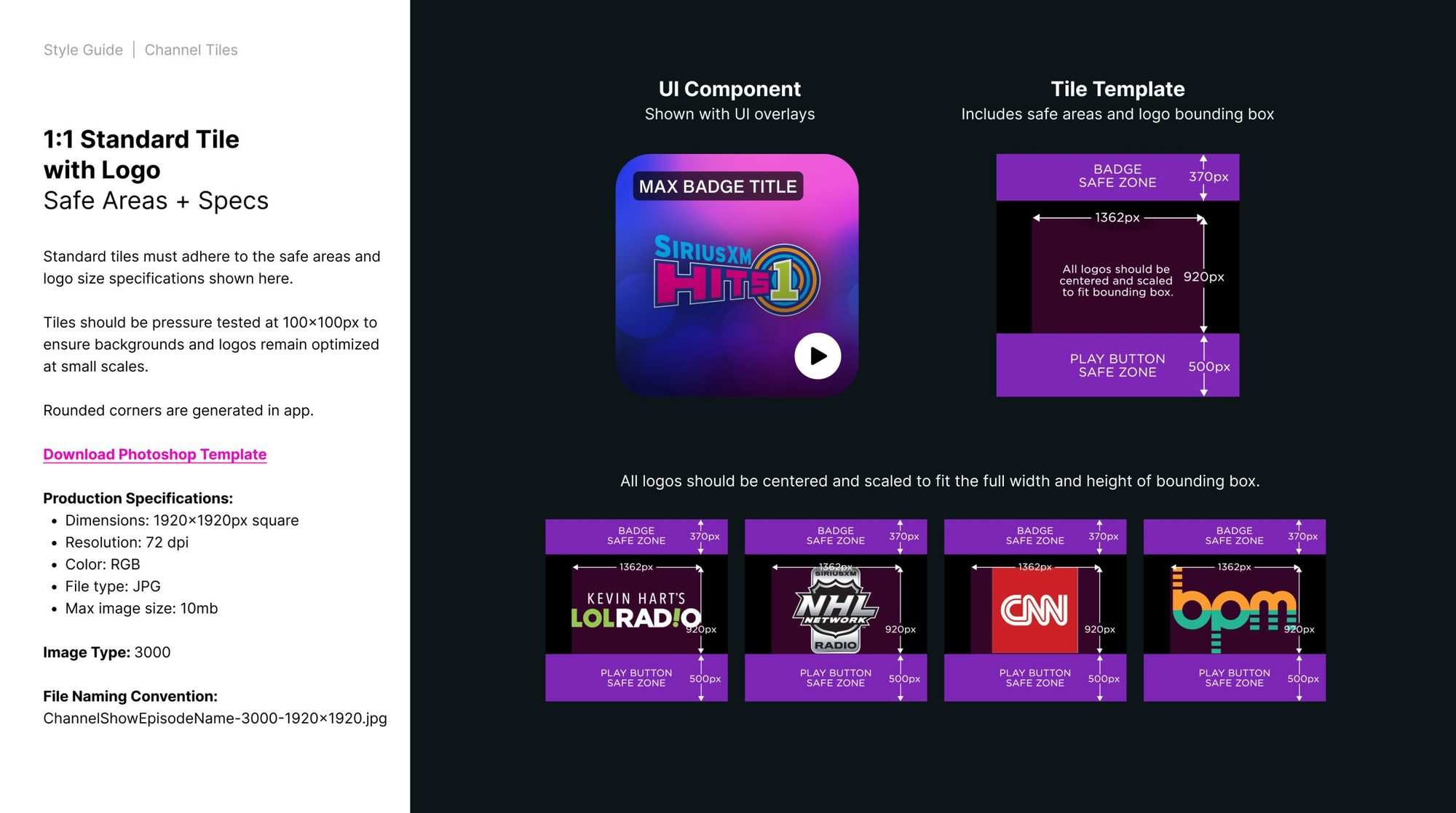
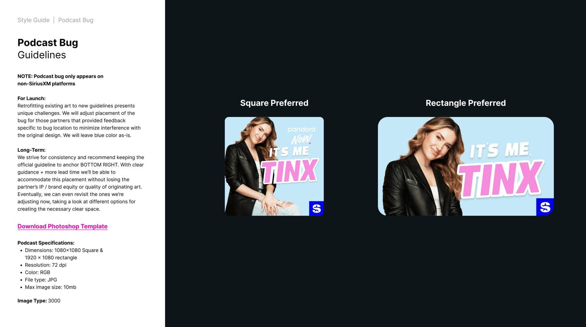
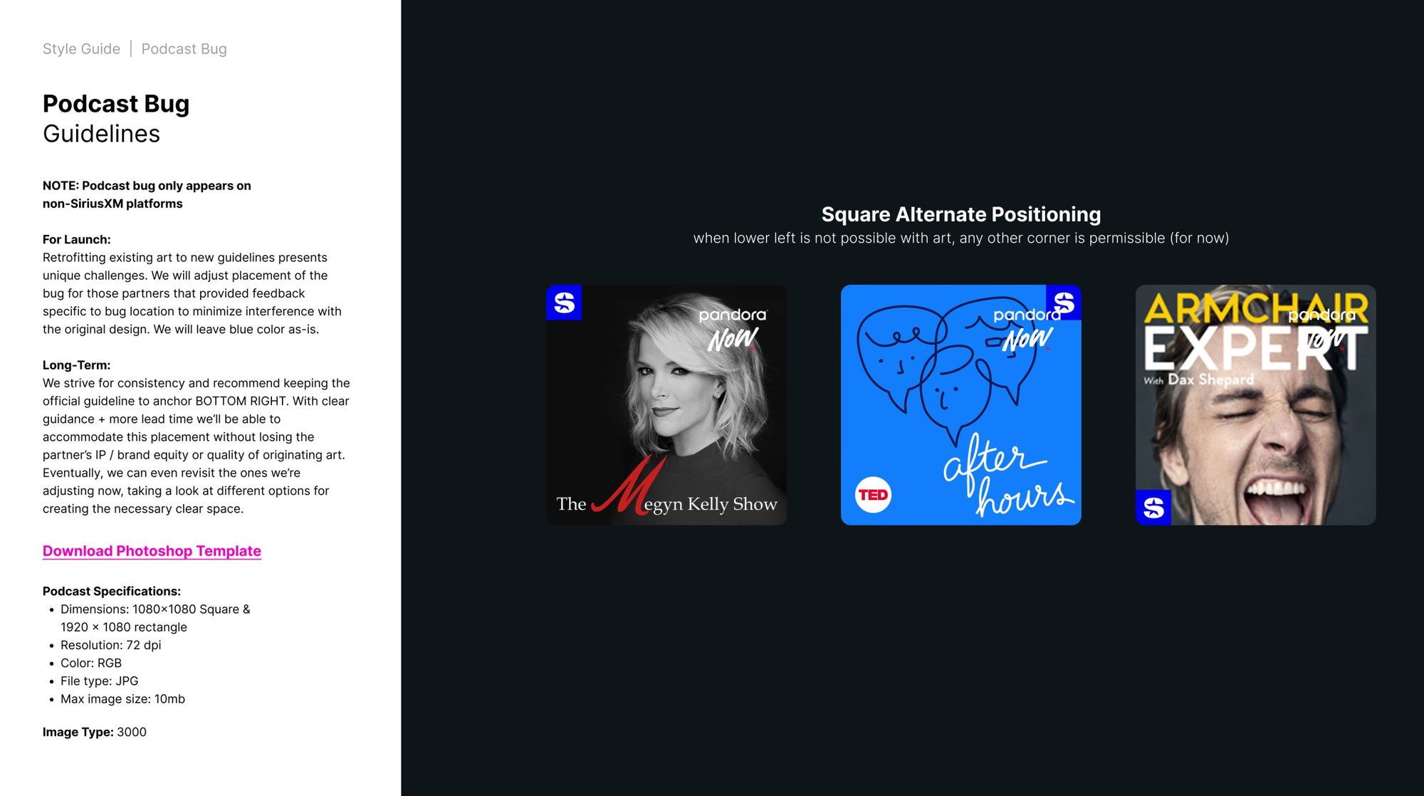
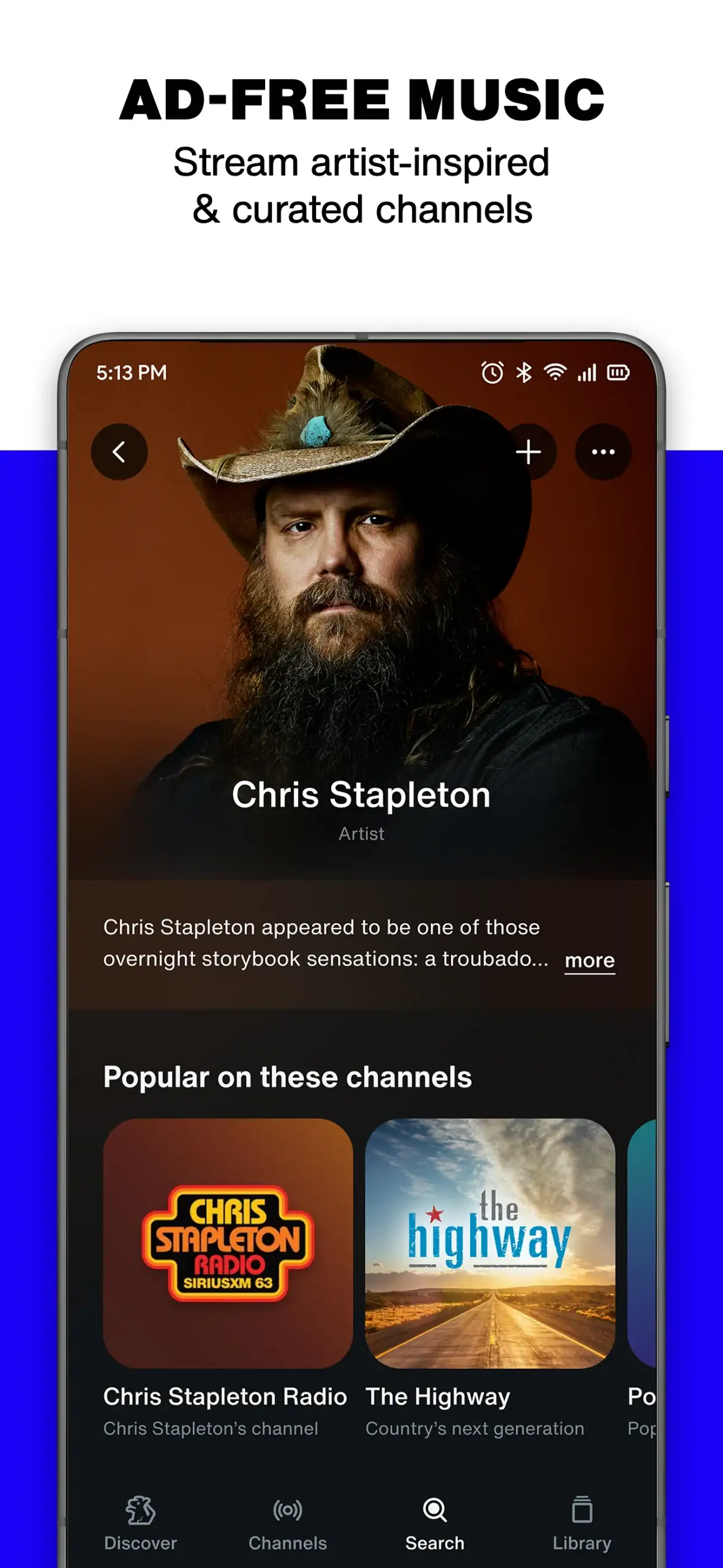
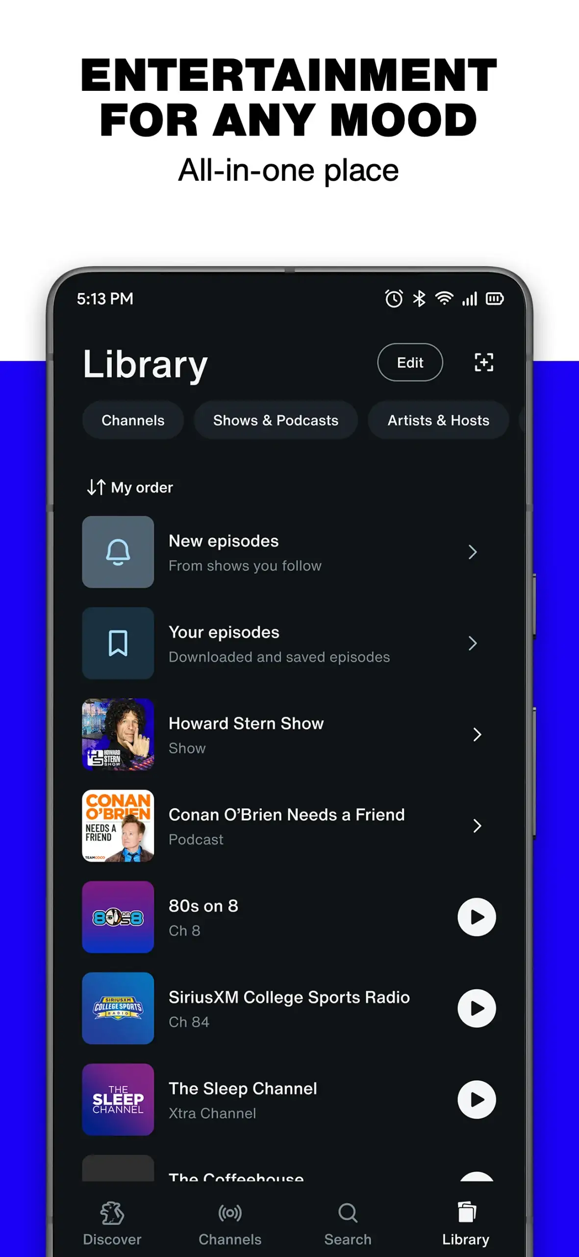
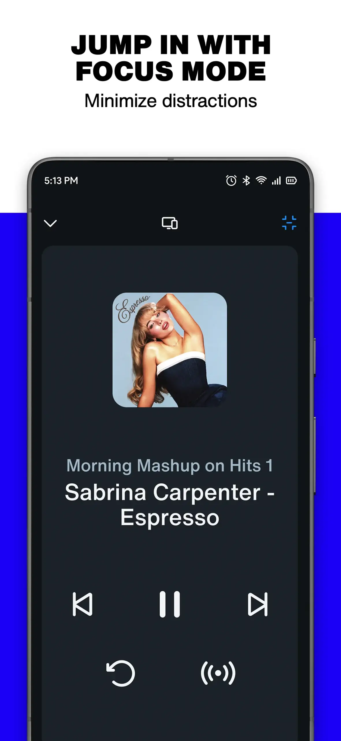
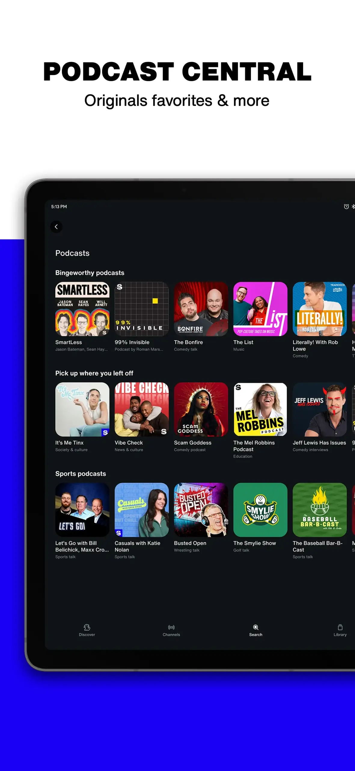
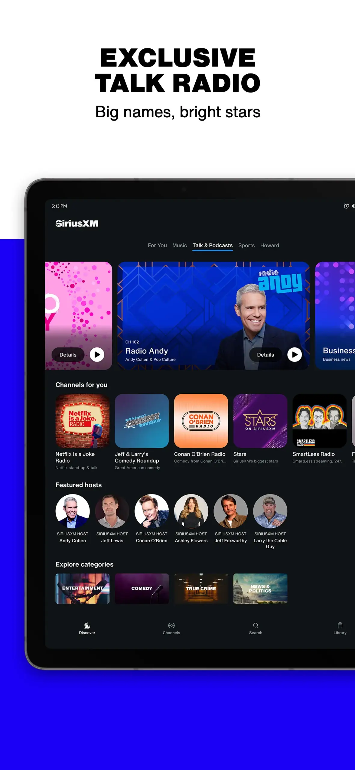
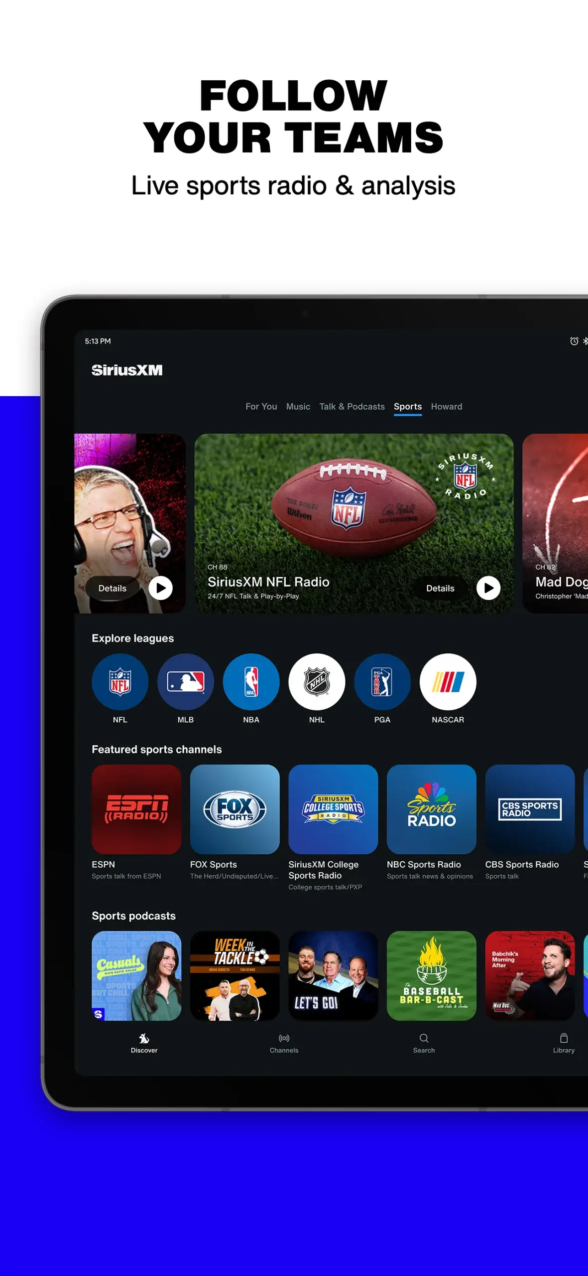
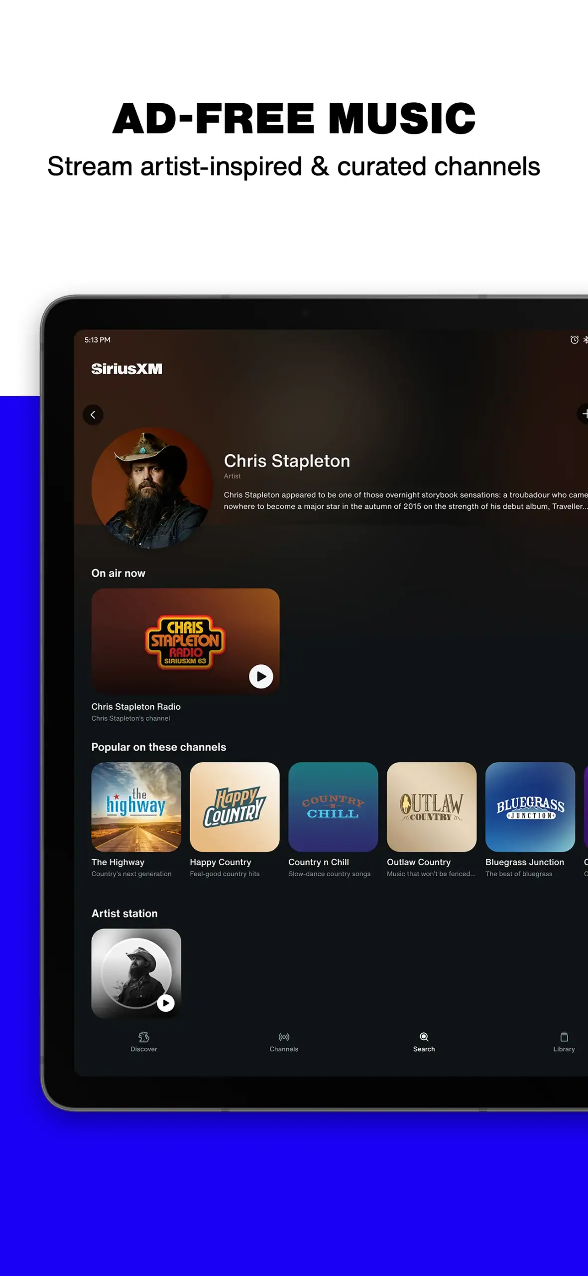
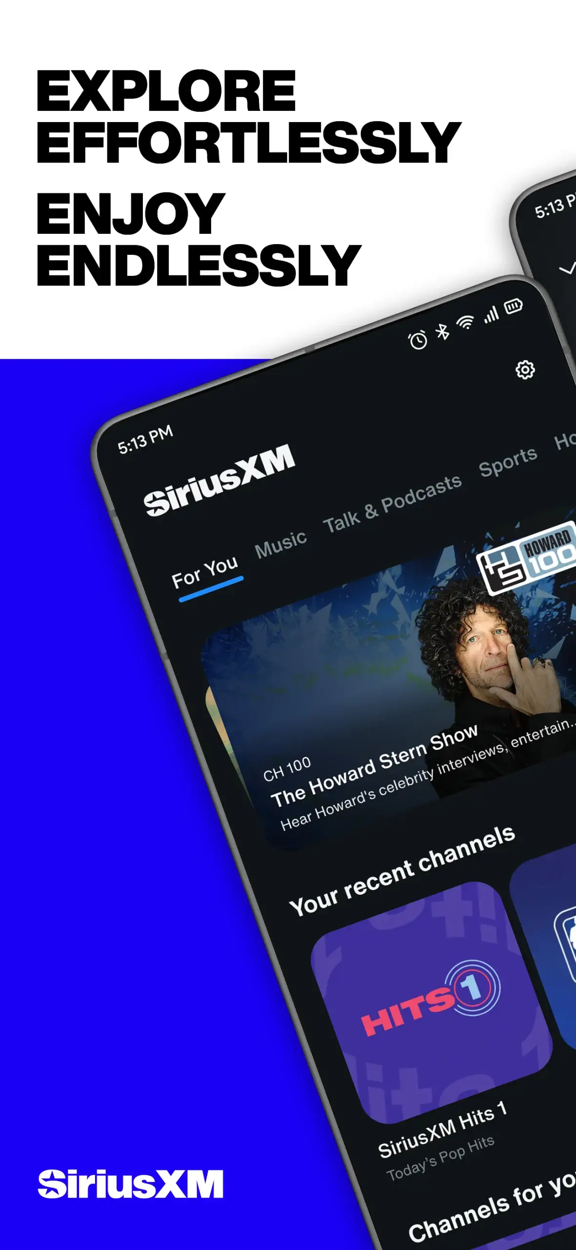
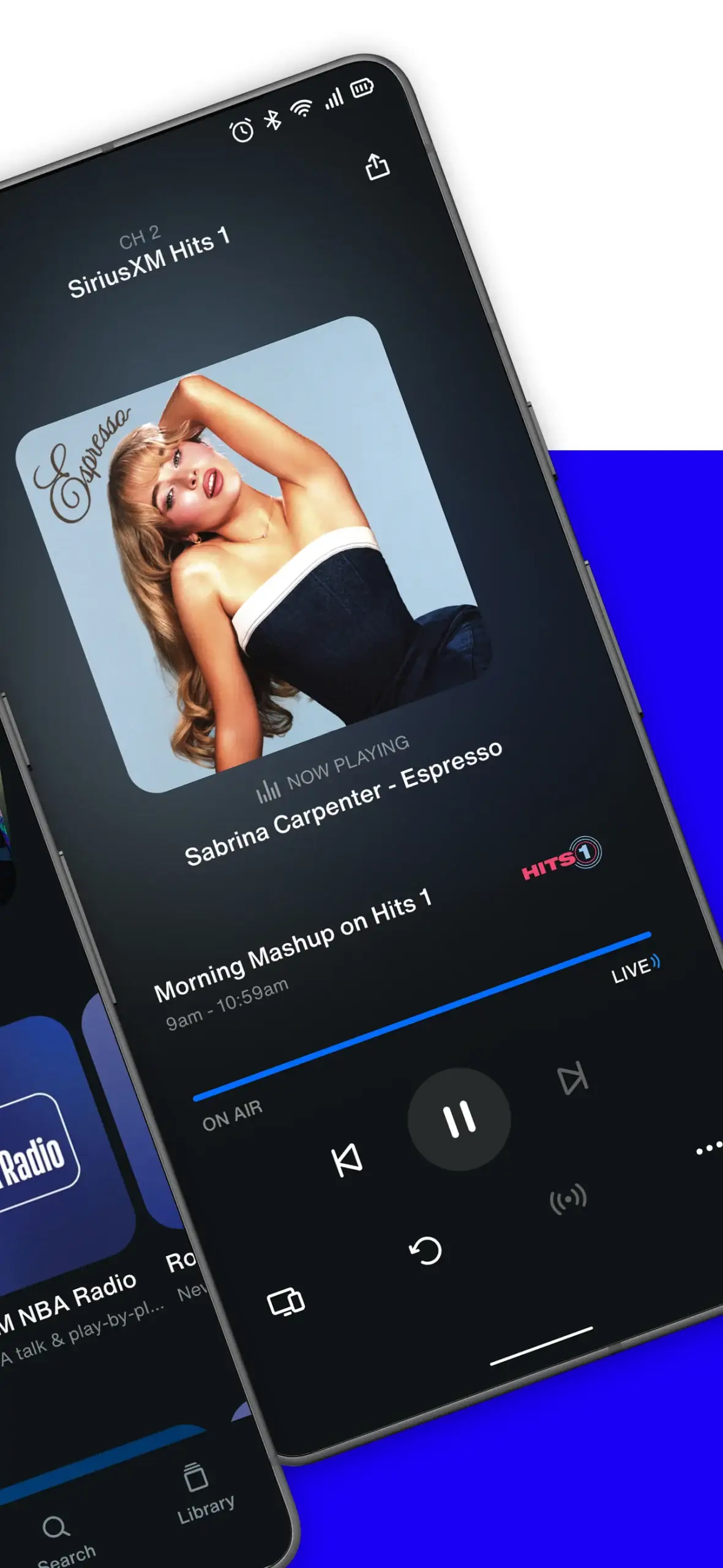
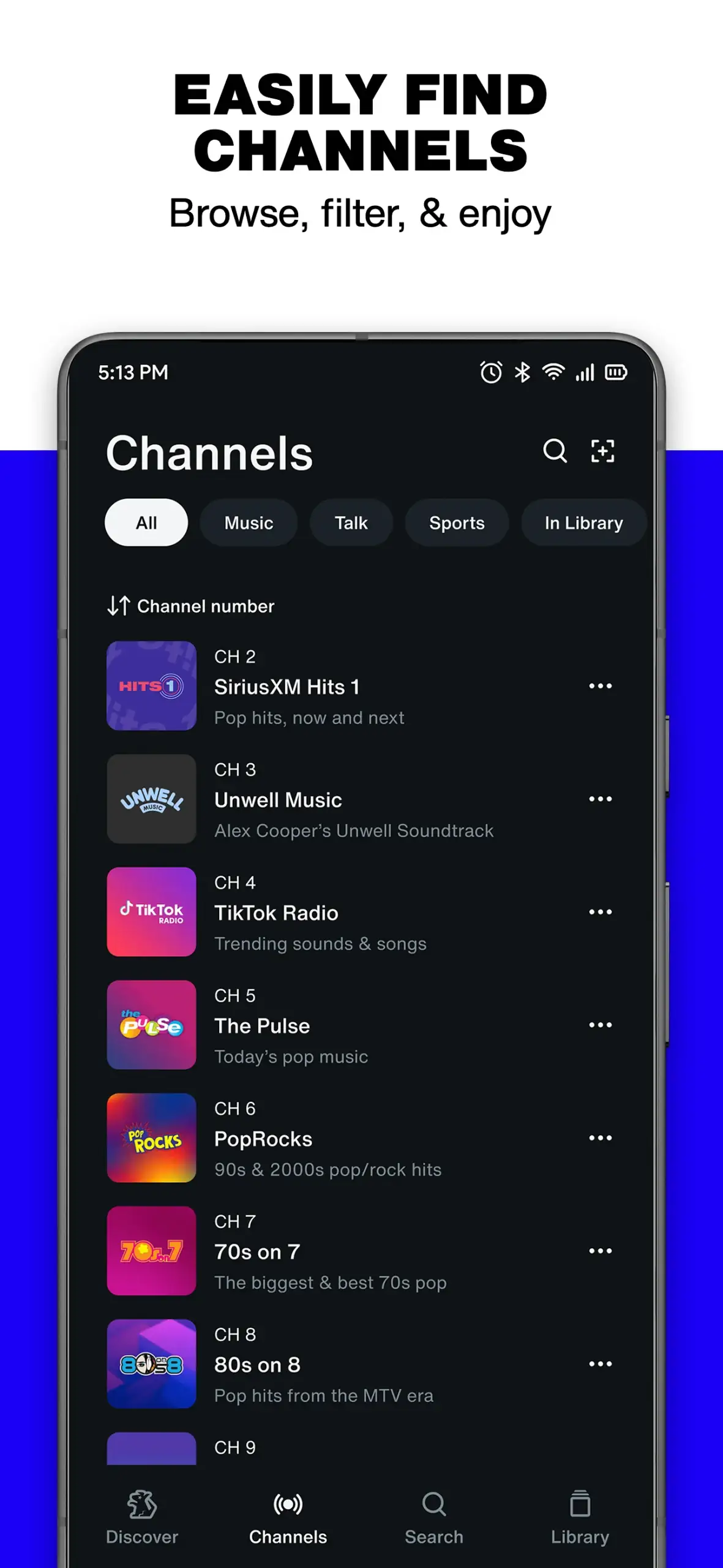
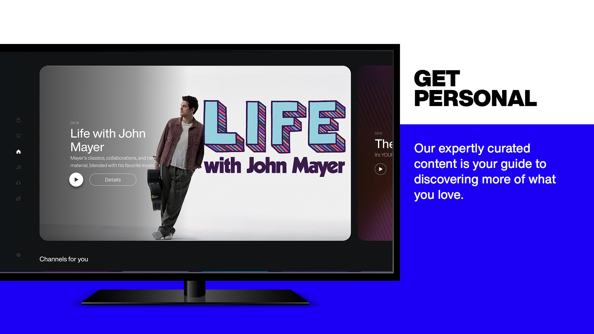
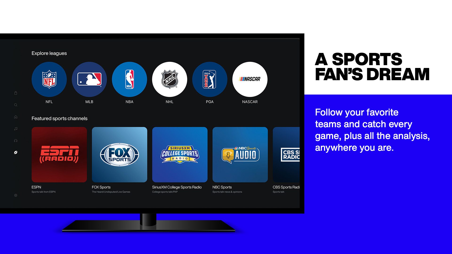
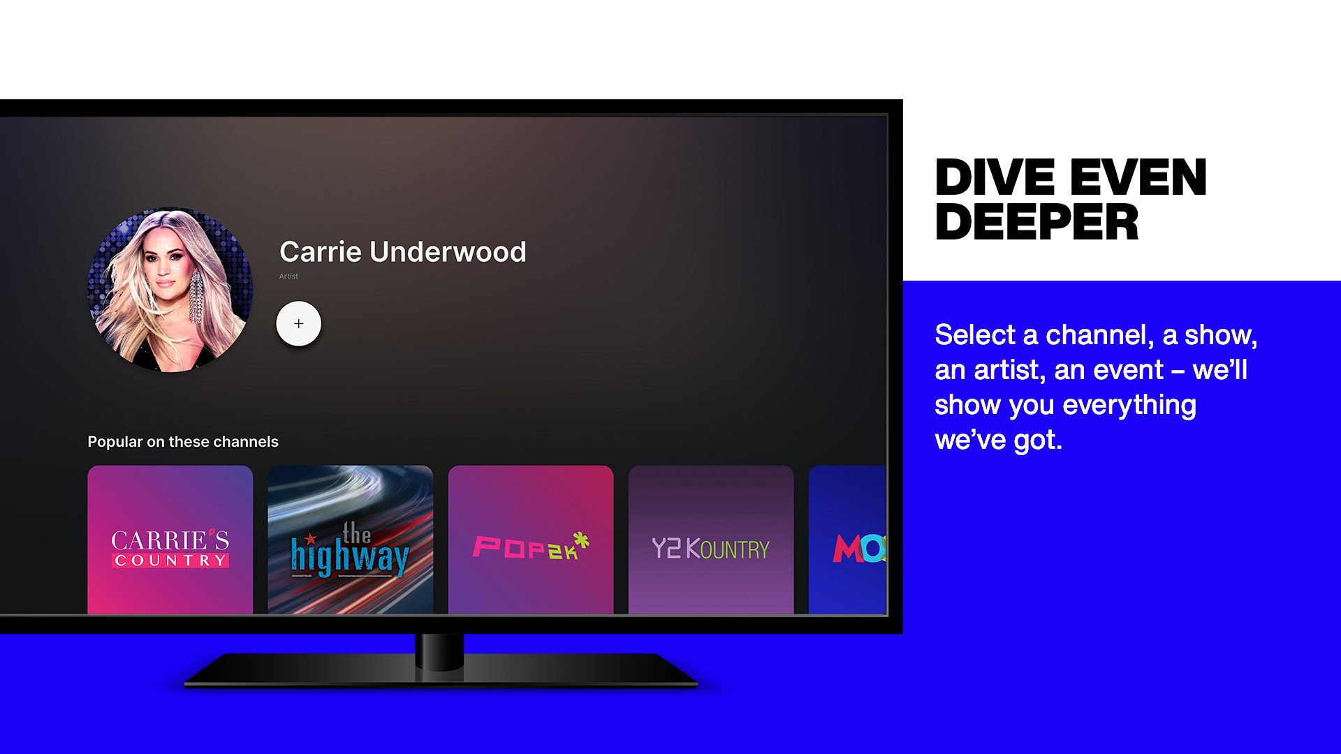
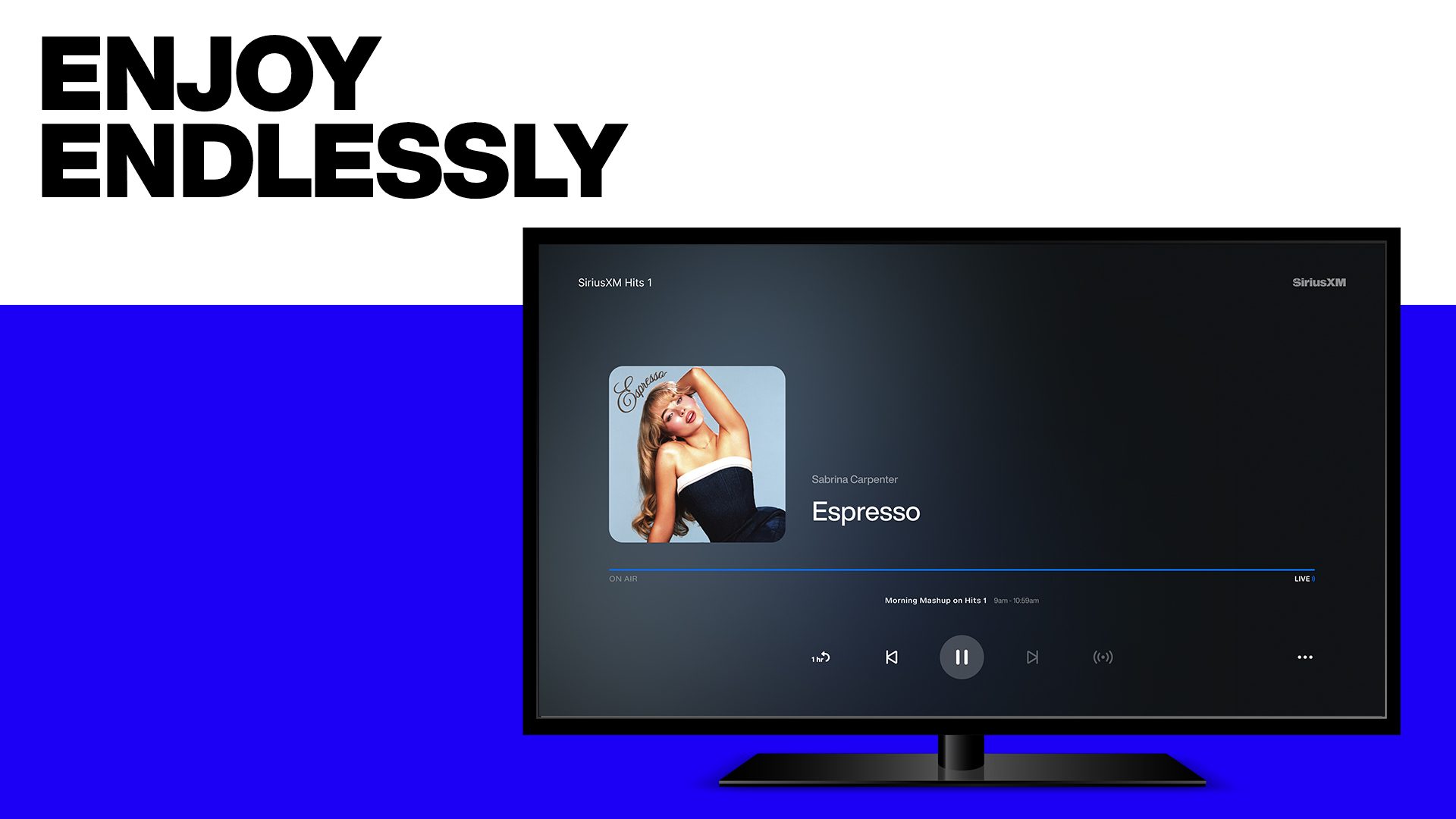
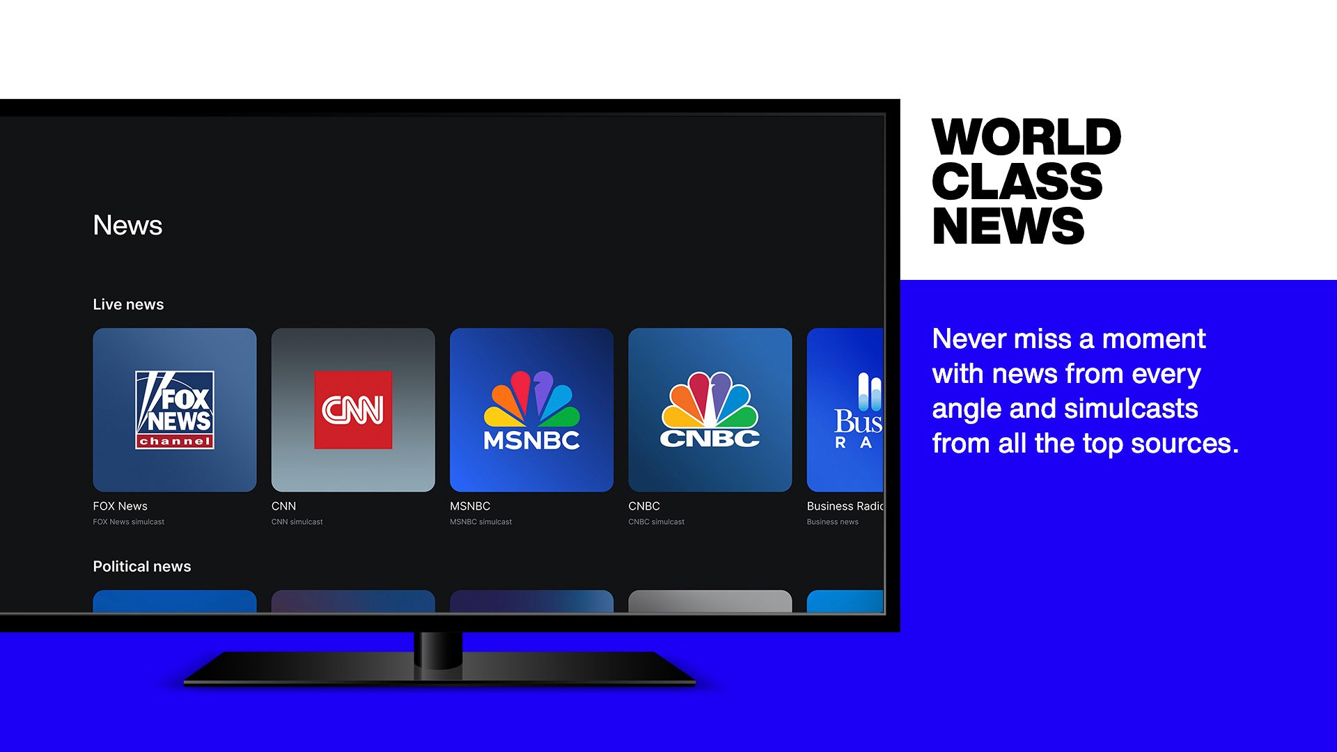
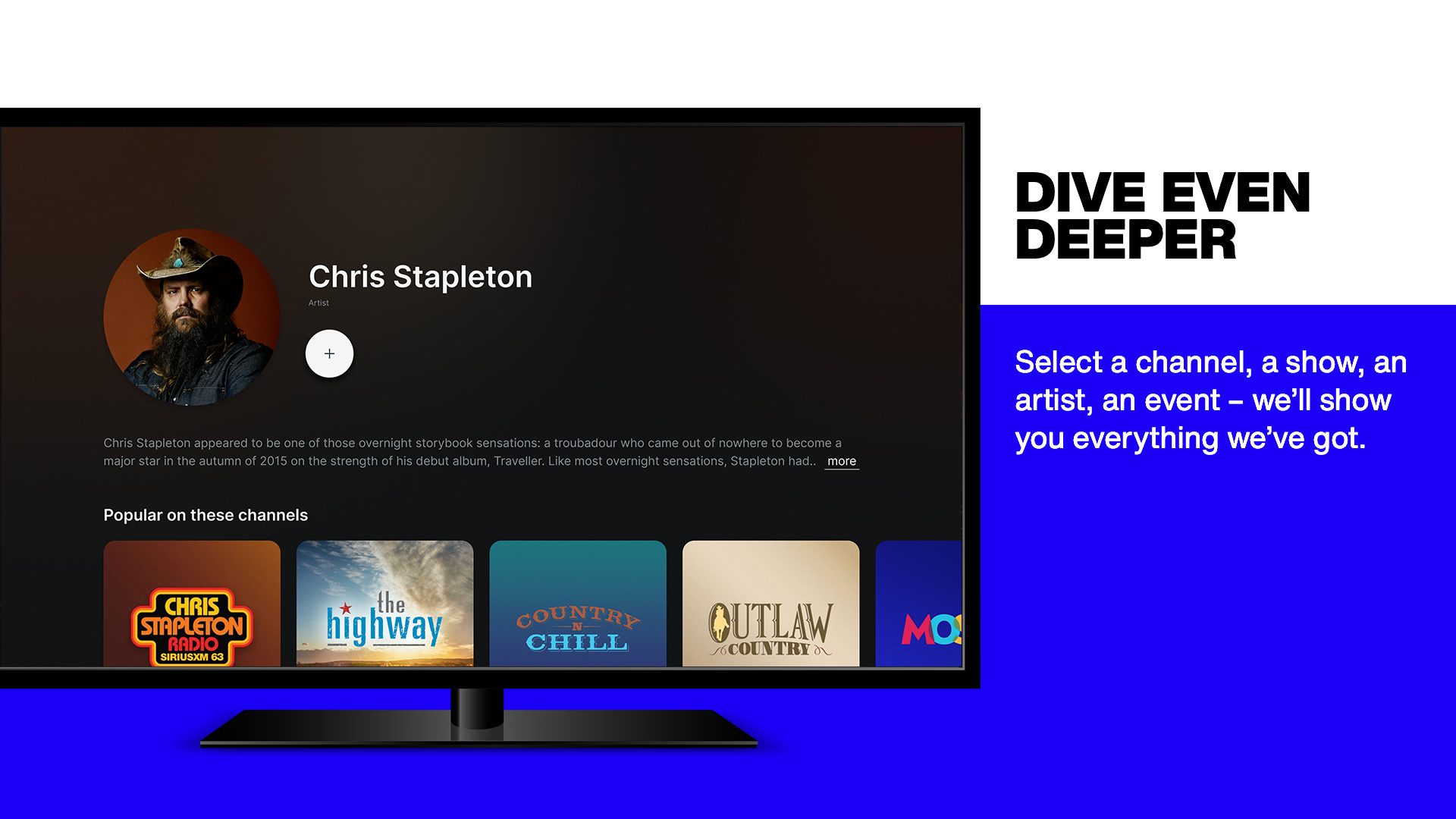
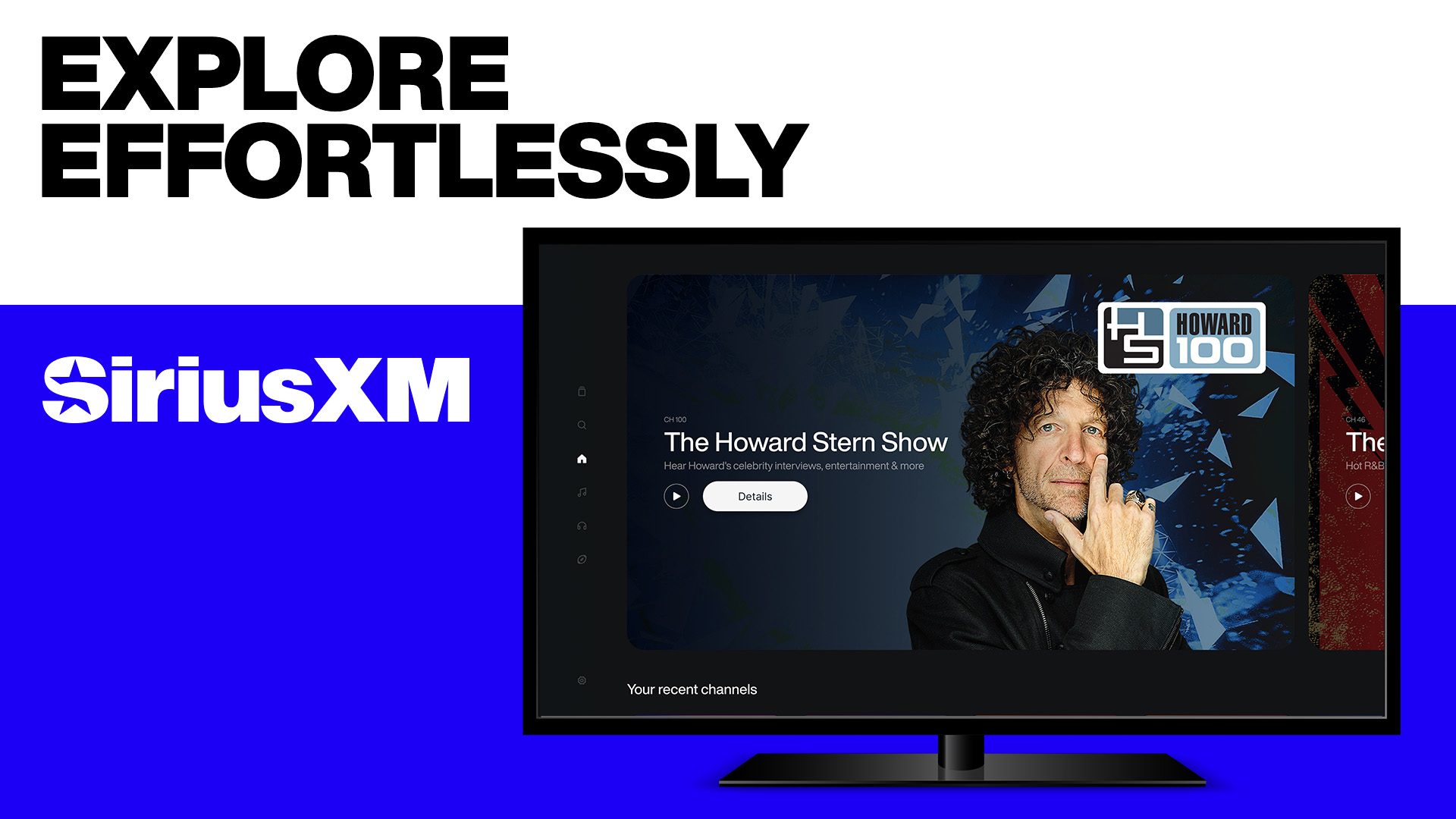
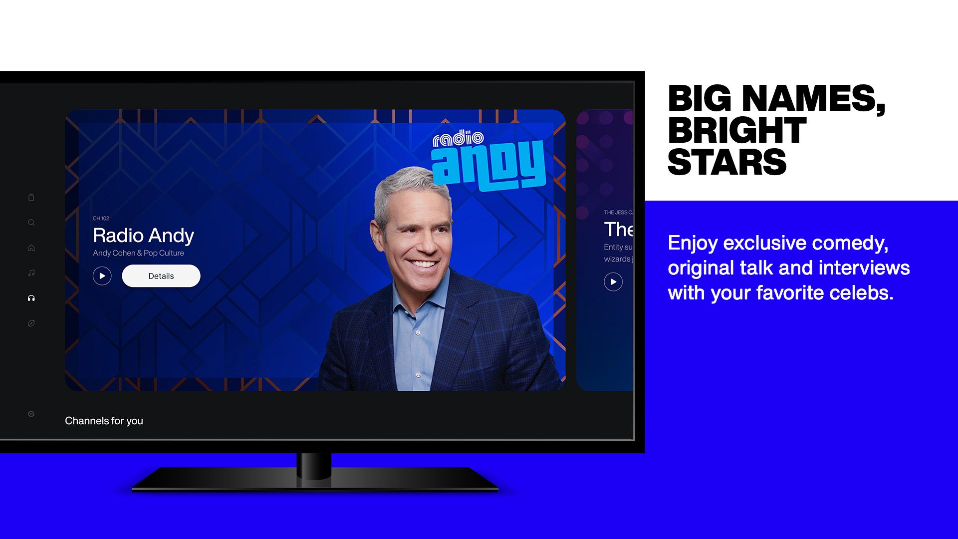
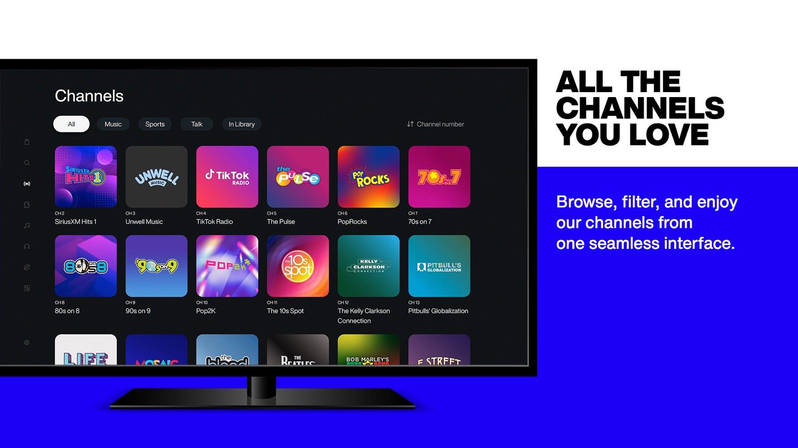
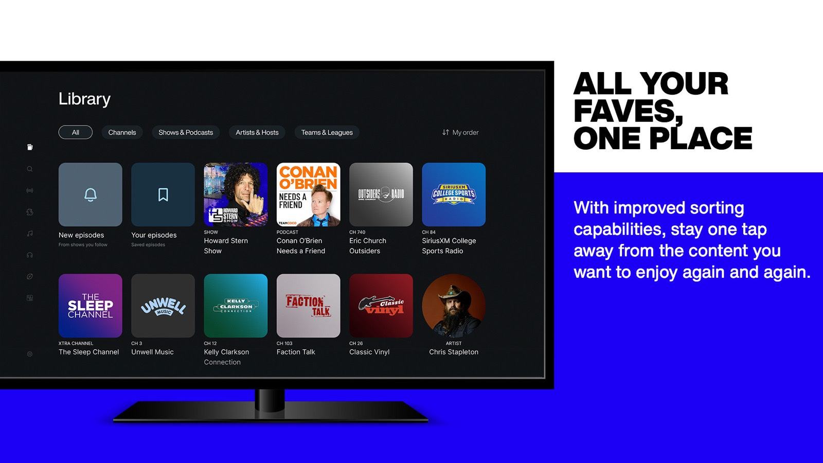
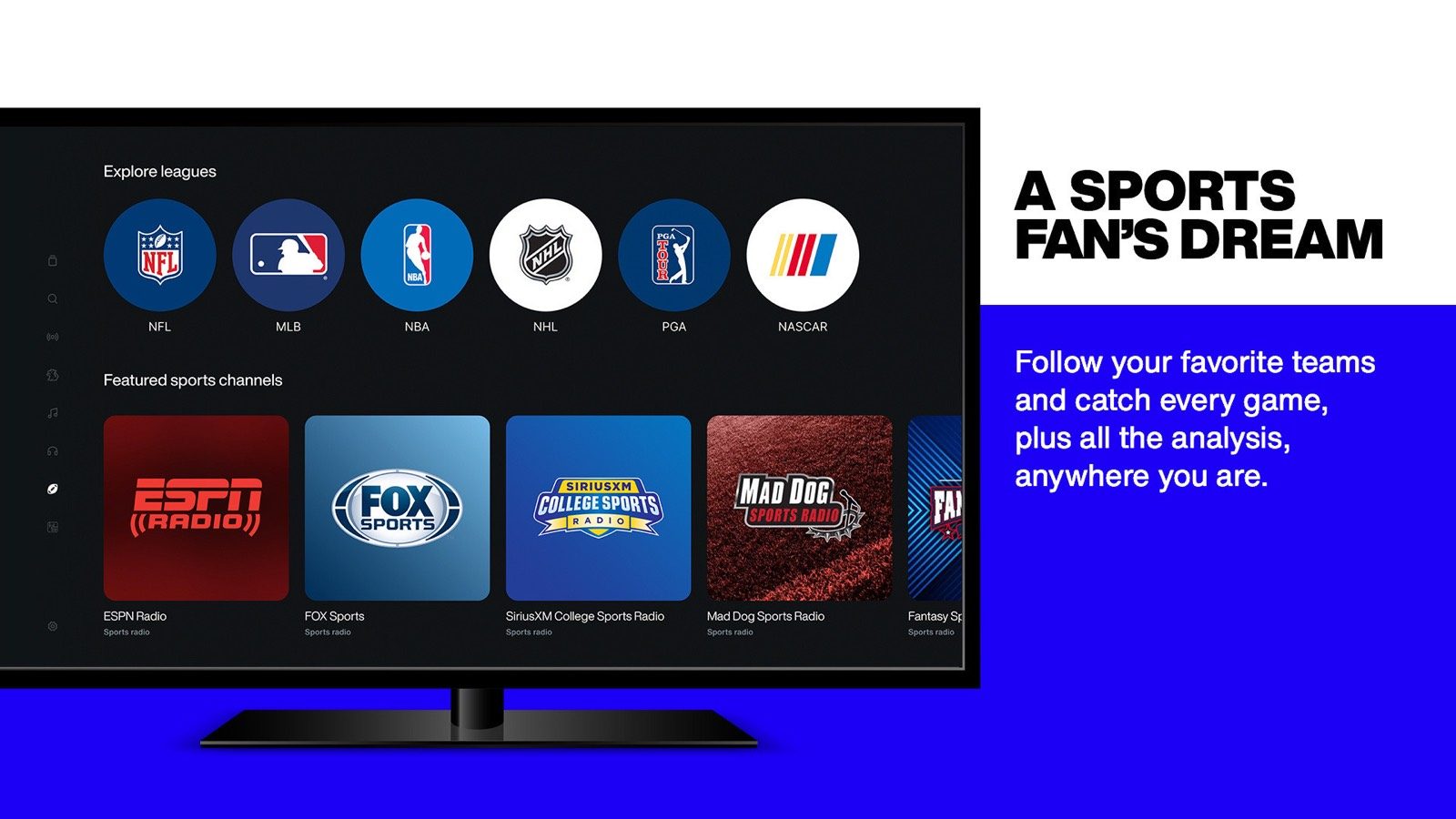
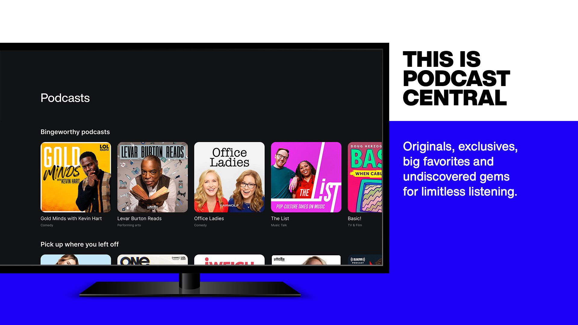
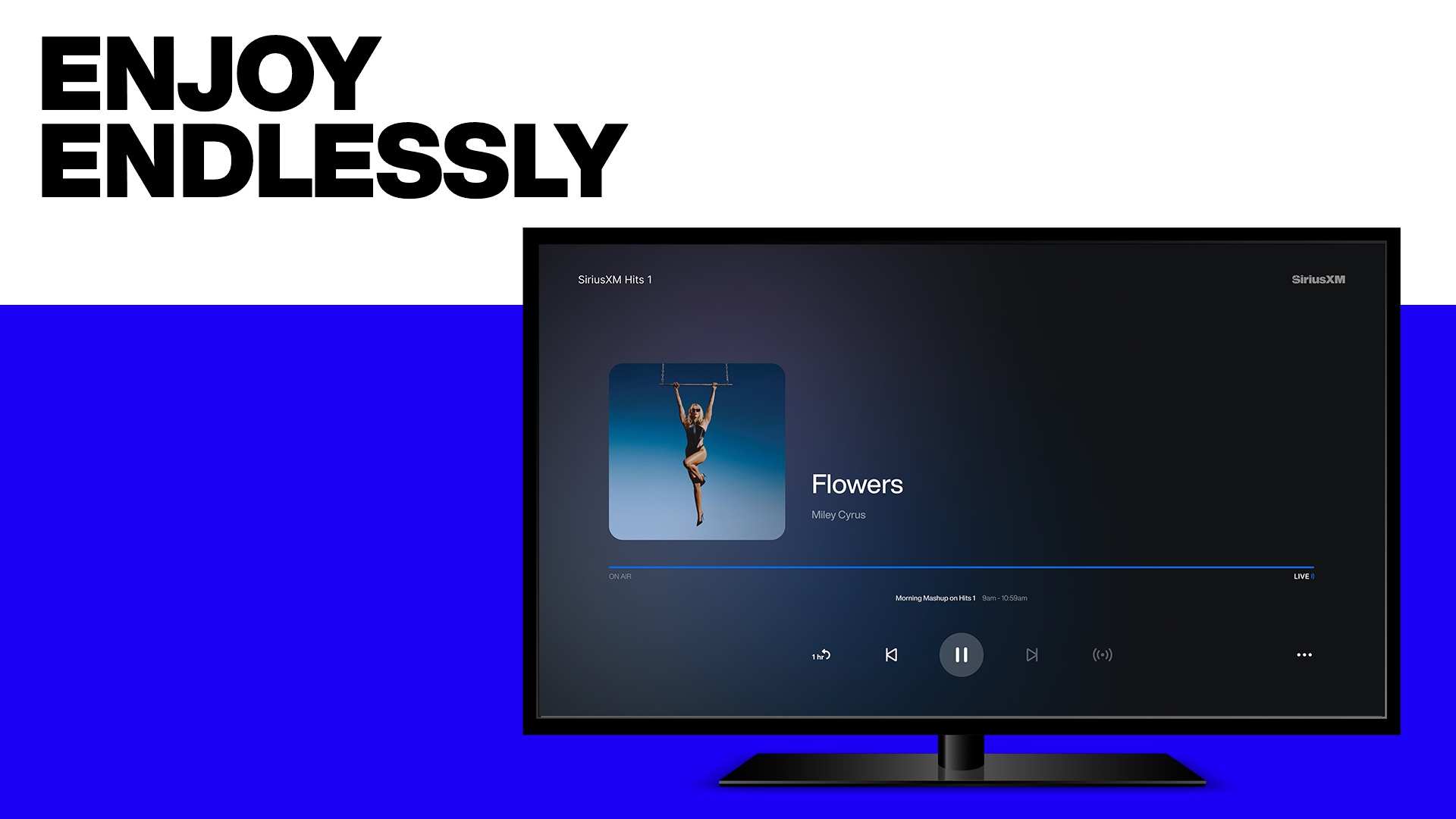
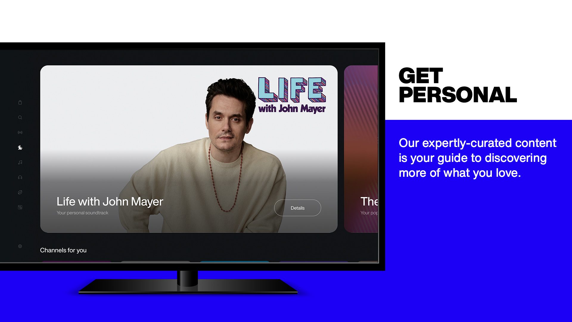
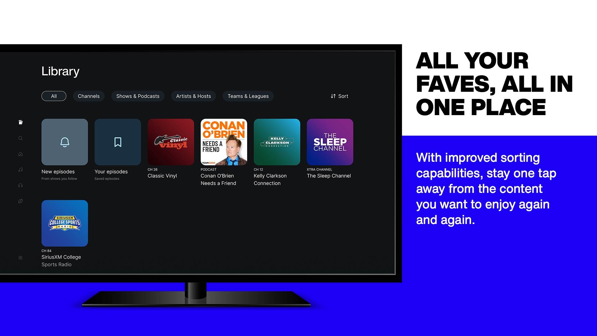
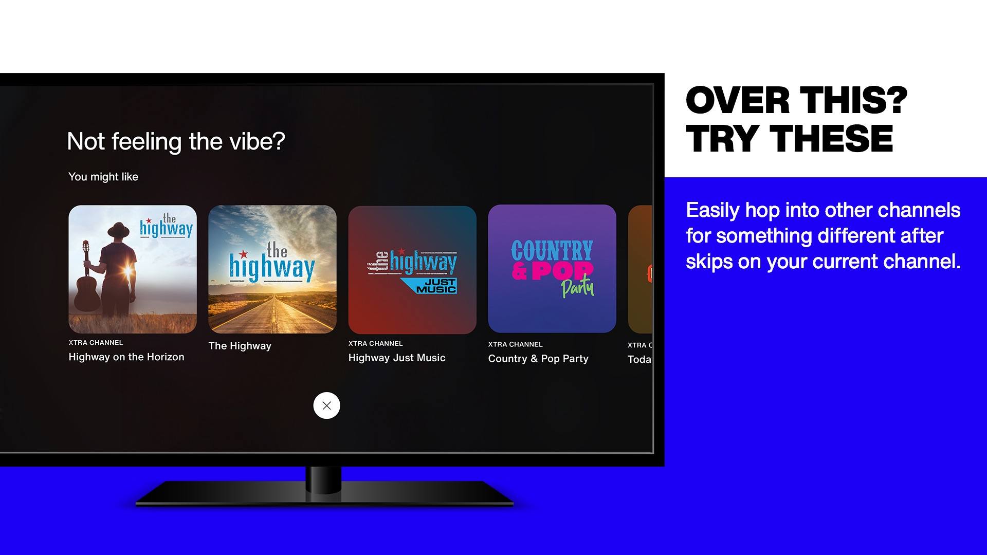
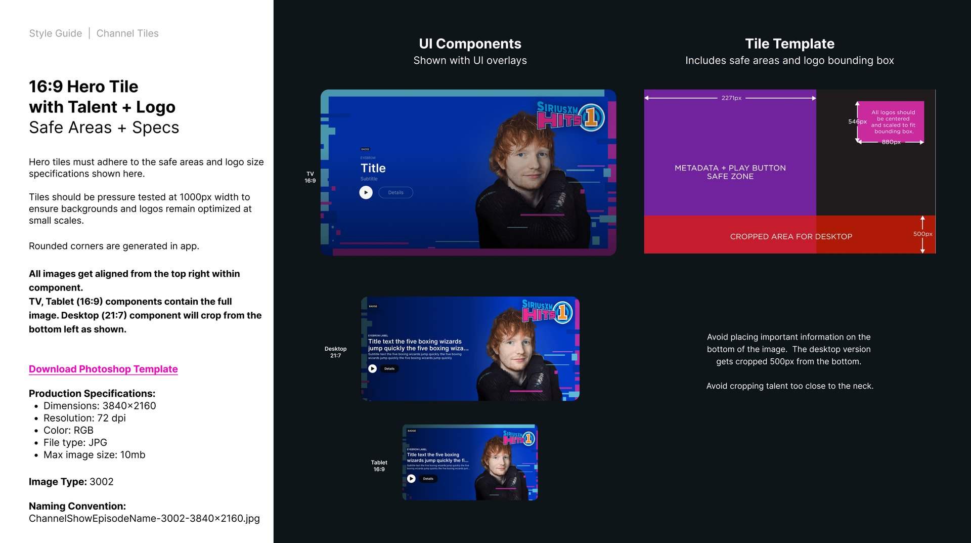
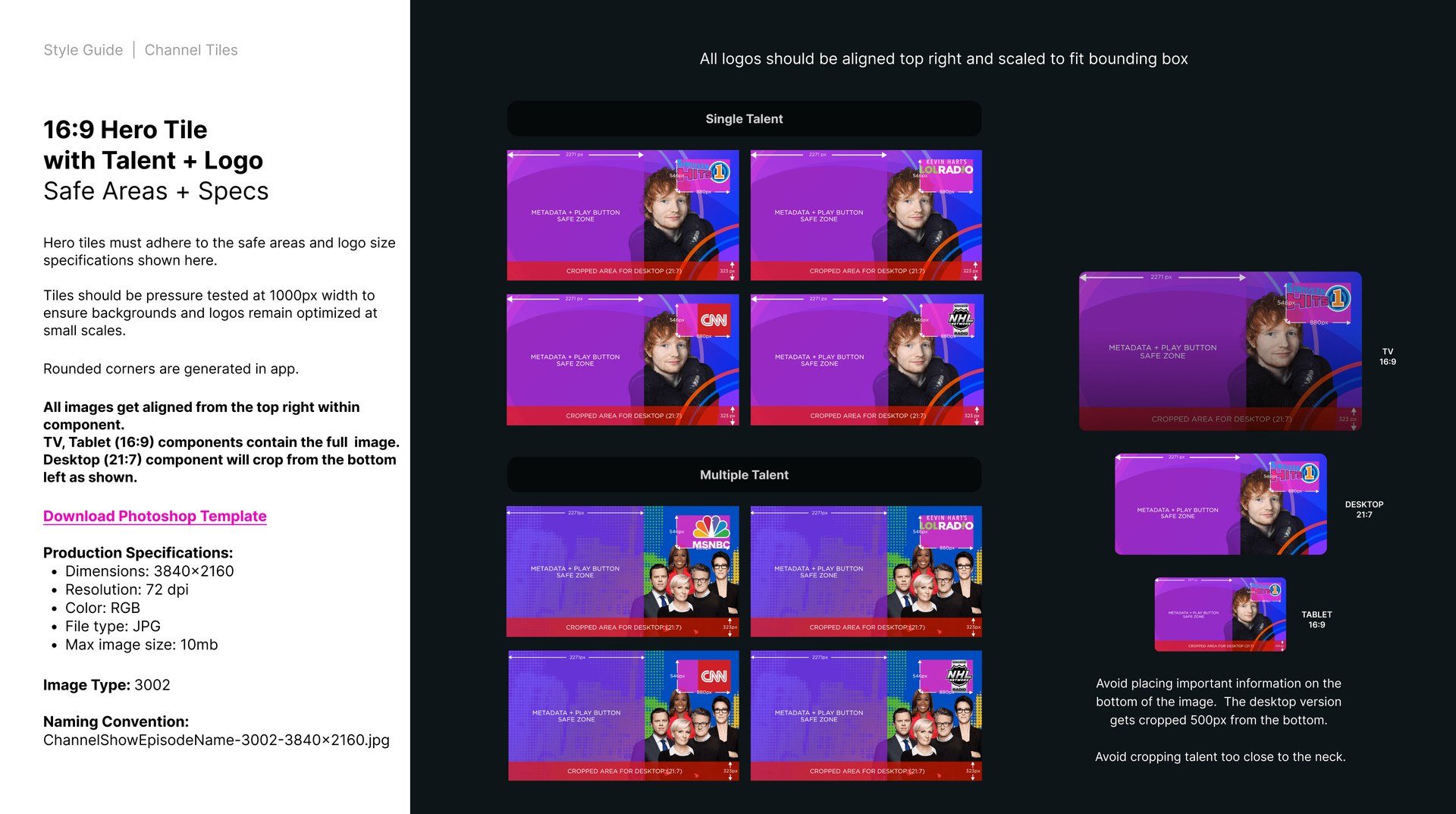
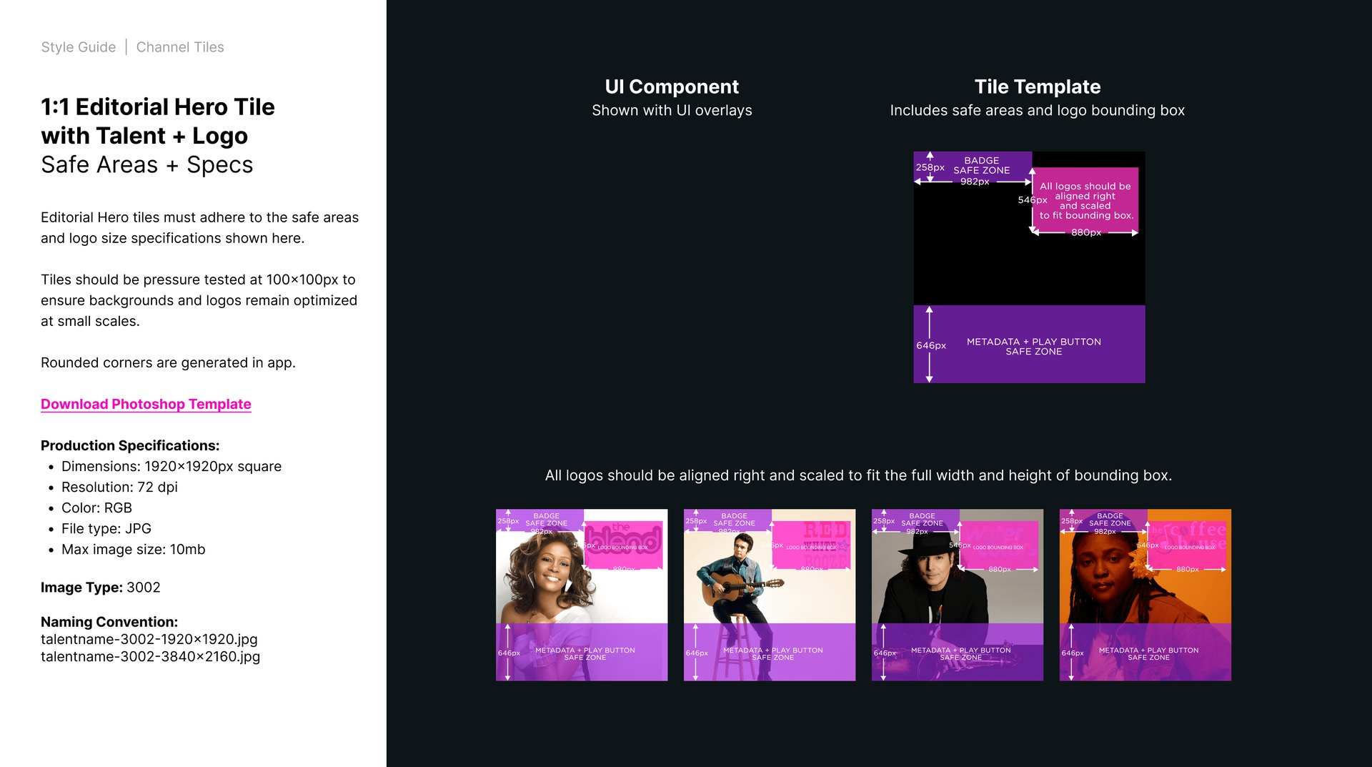
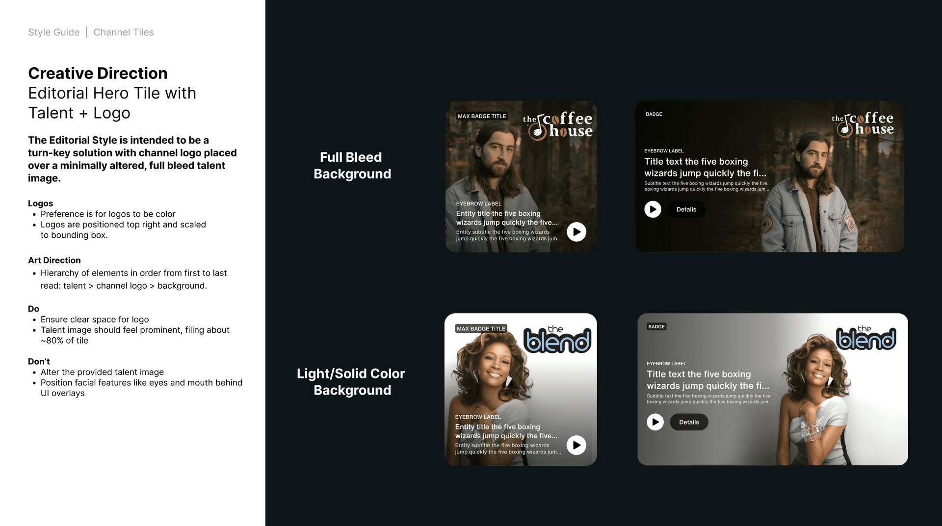
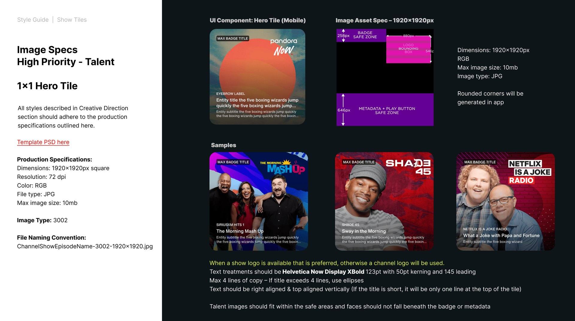
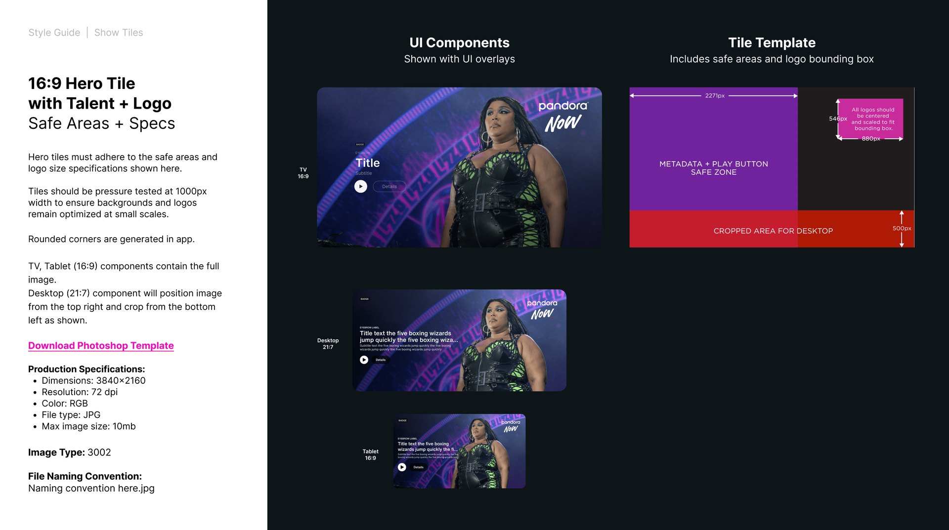
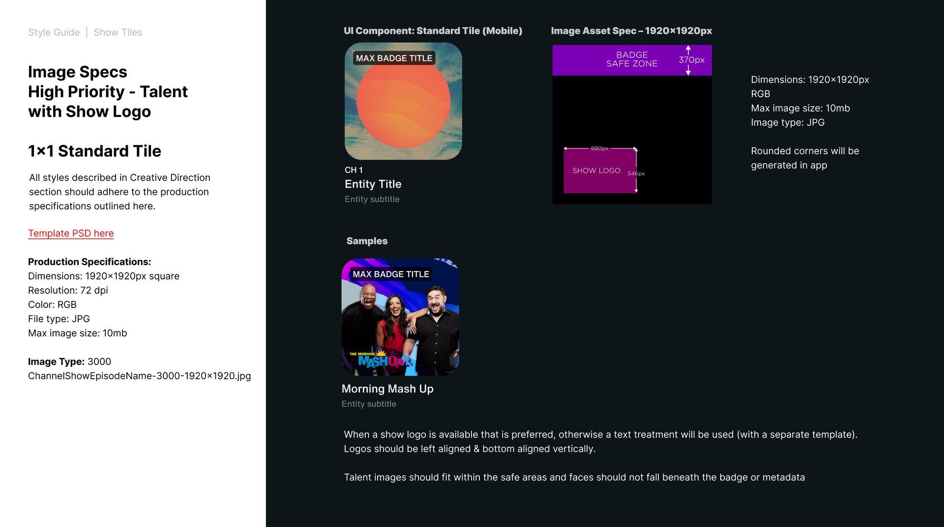
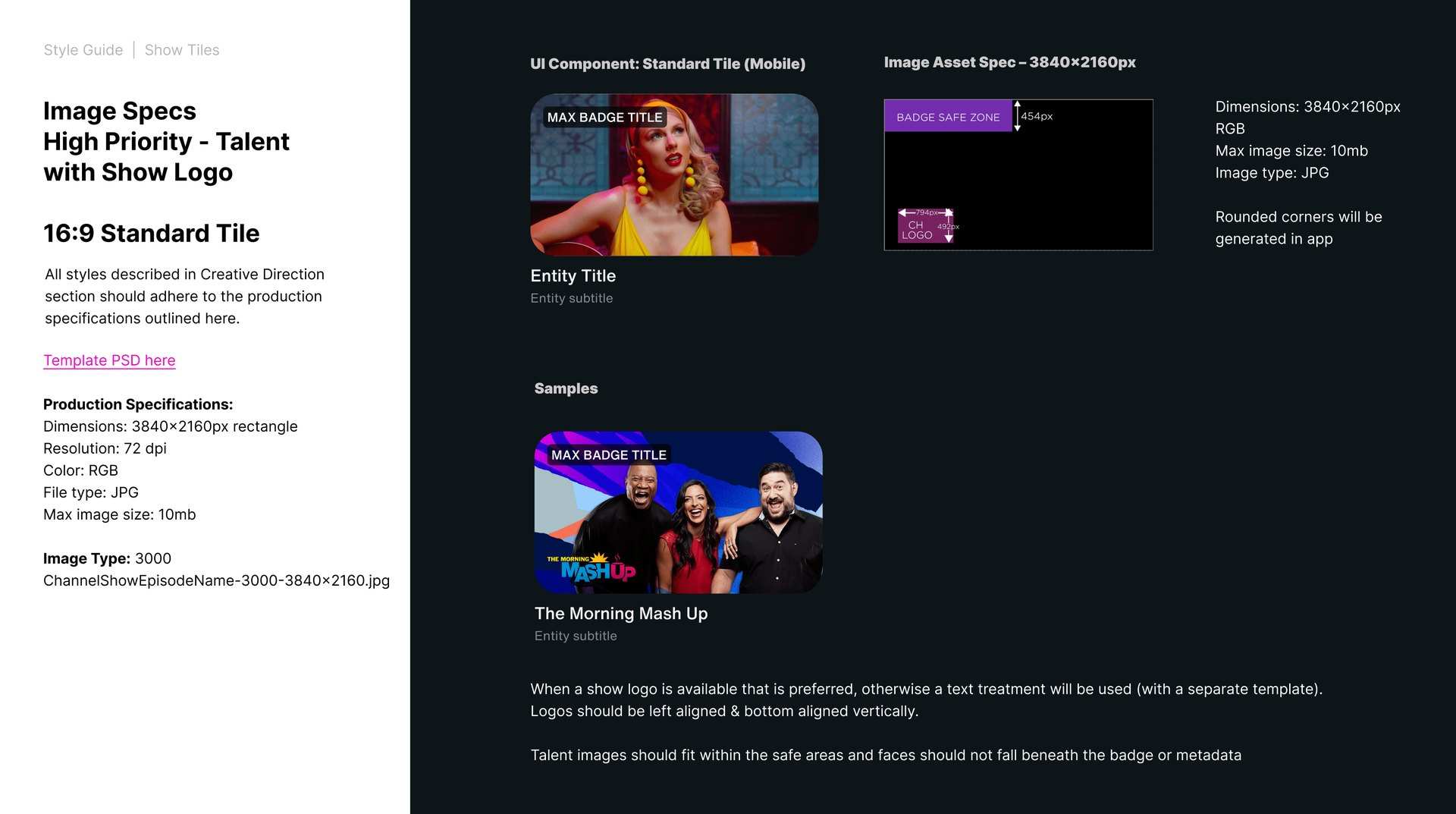
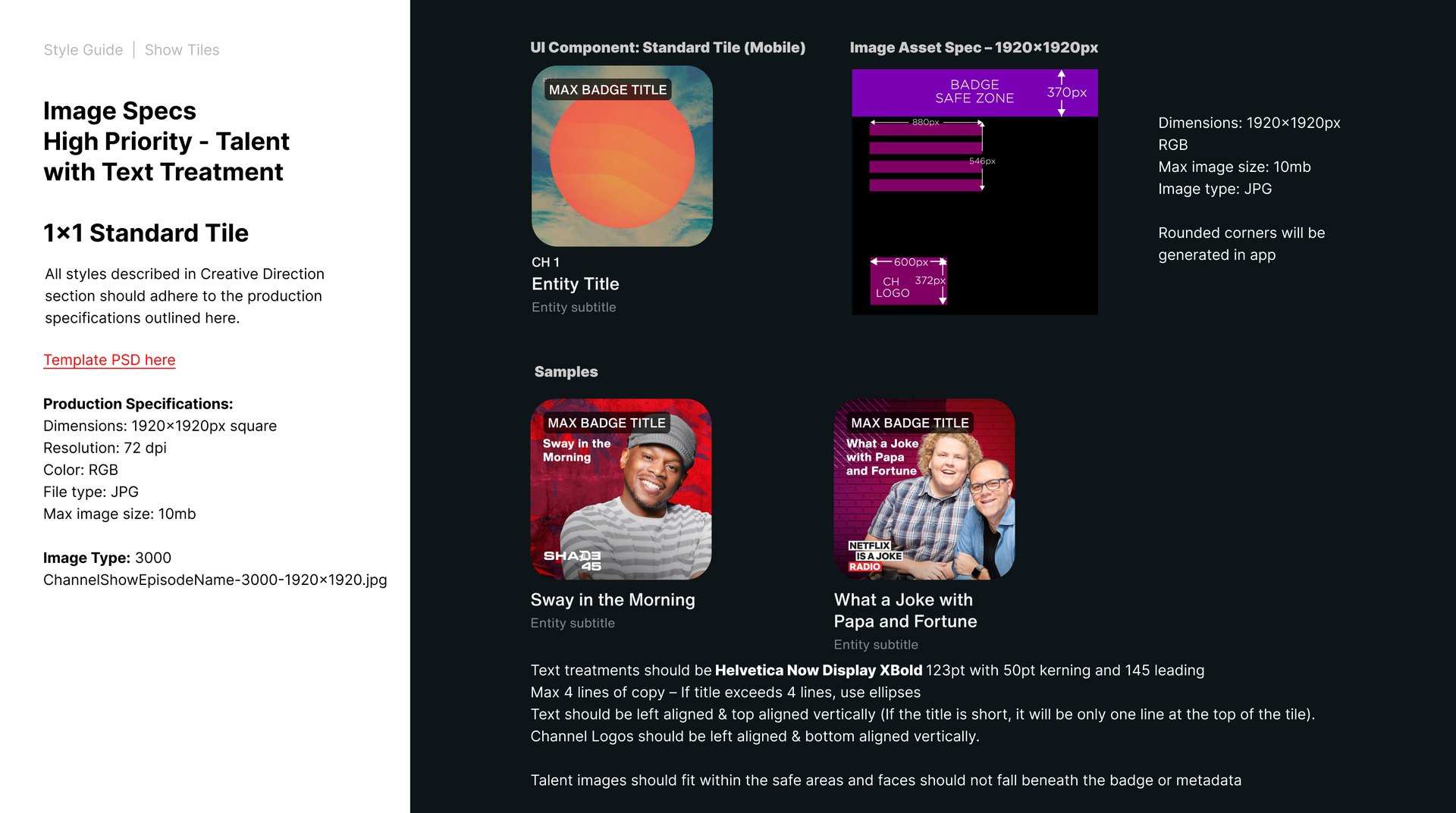
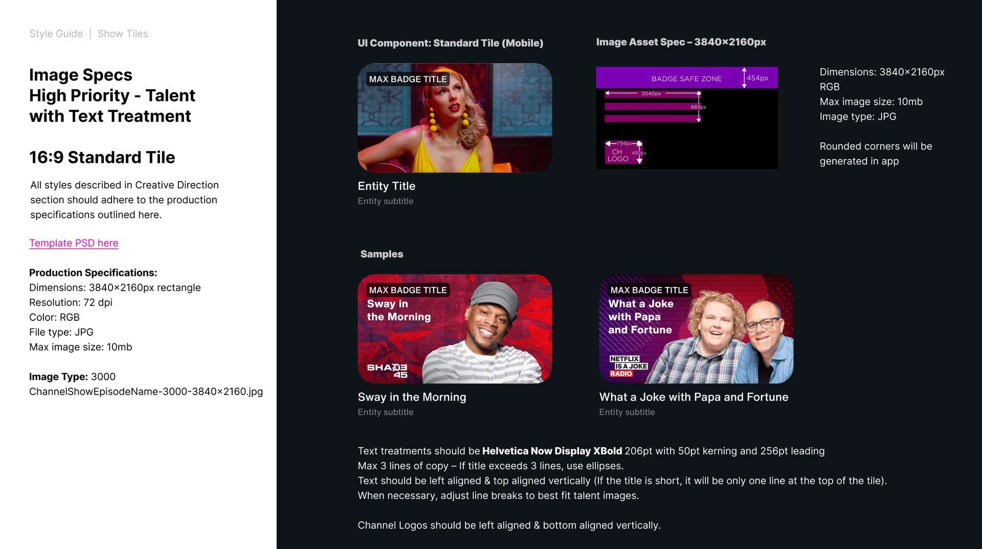
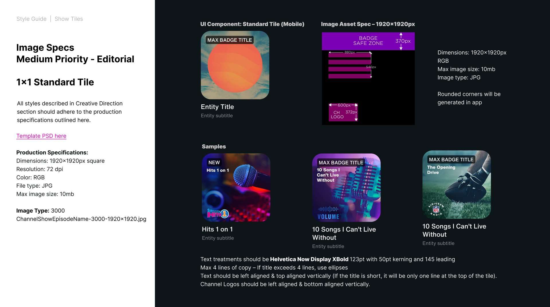
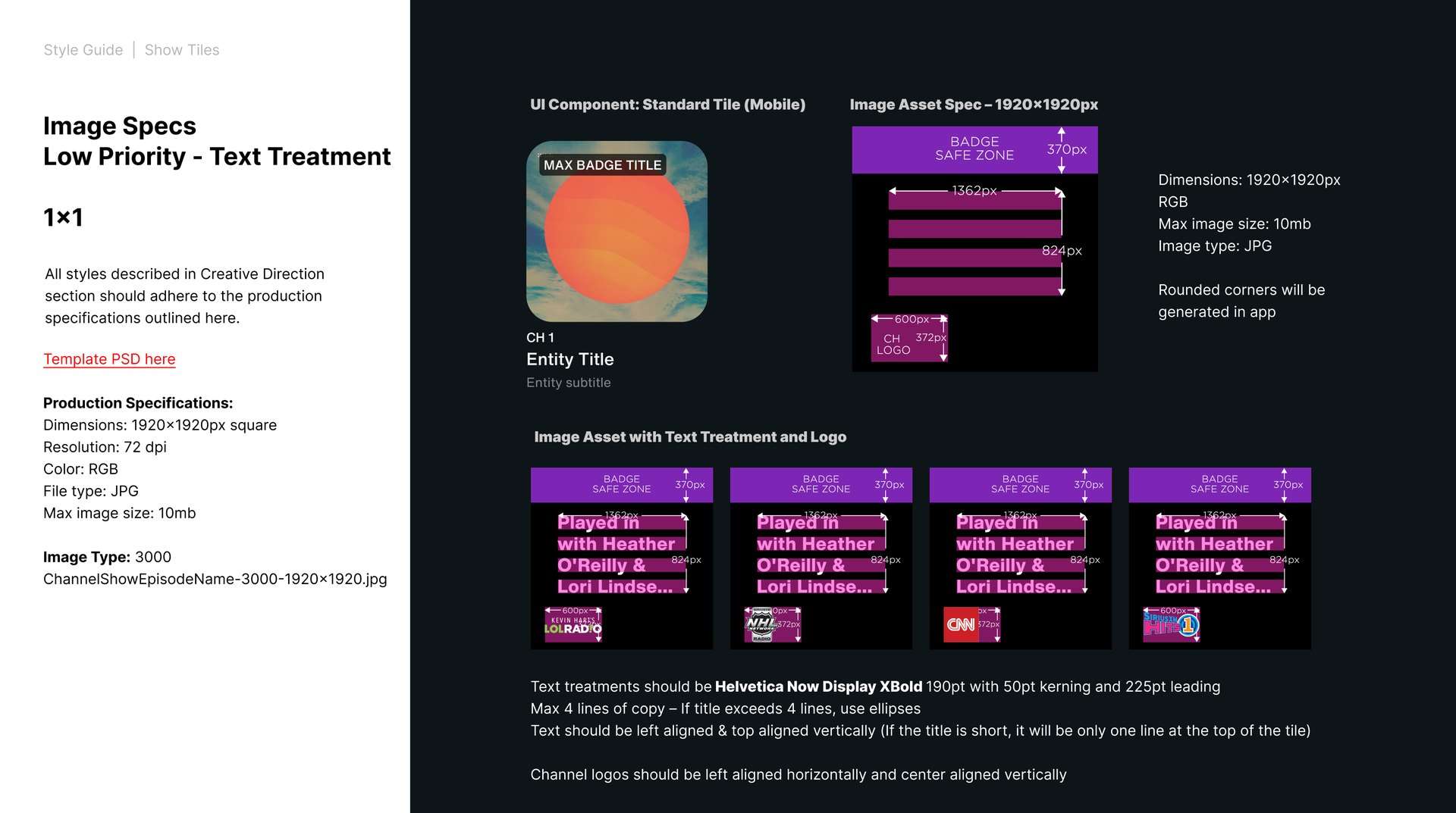
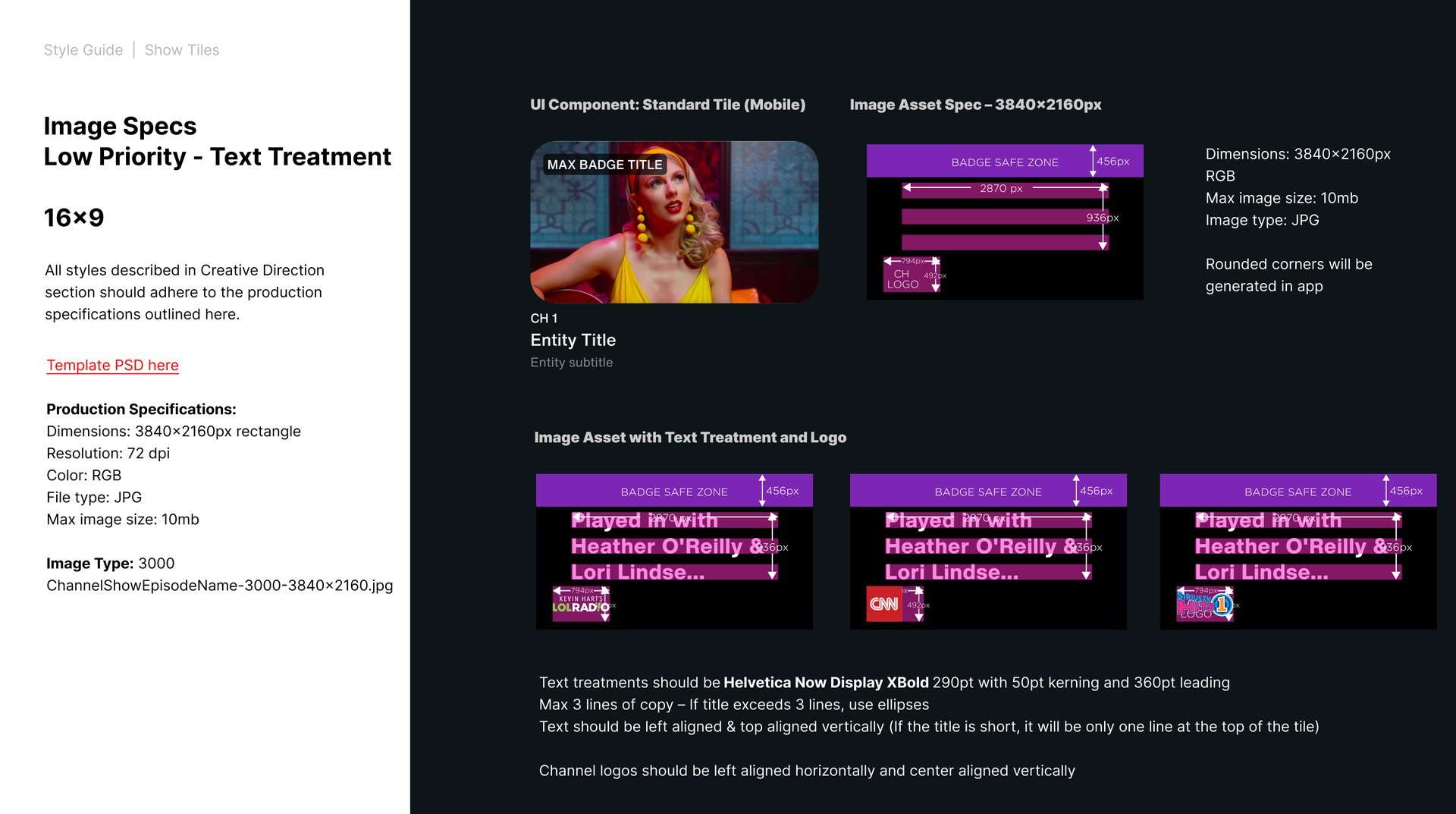
We documented the system at depth: per-tile rules, do/don't behavior, hierarchy logic, safe areas, motion specs, photographic and graphic treatments, brand alignment guides. The level of specification that lets a content team produce thousands of tiles a week without re-litigating the rules each time.
The Deck · 19 chapter slides · Style Guide Deep-Dives · 50 documentation pages · tile rules · hierarchy · motion · safe areas · placement logic
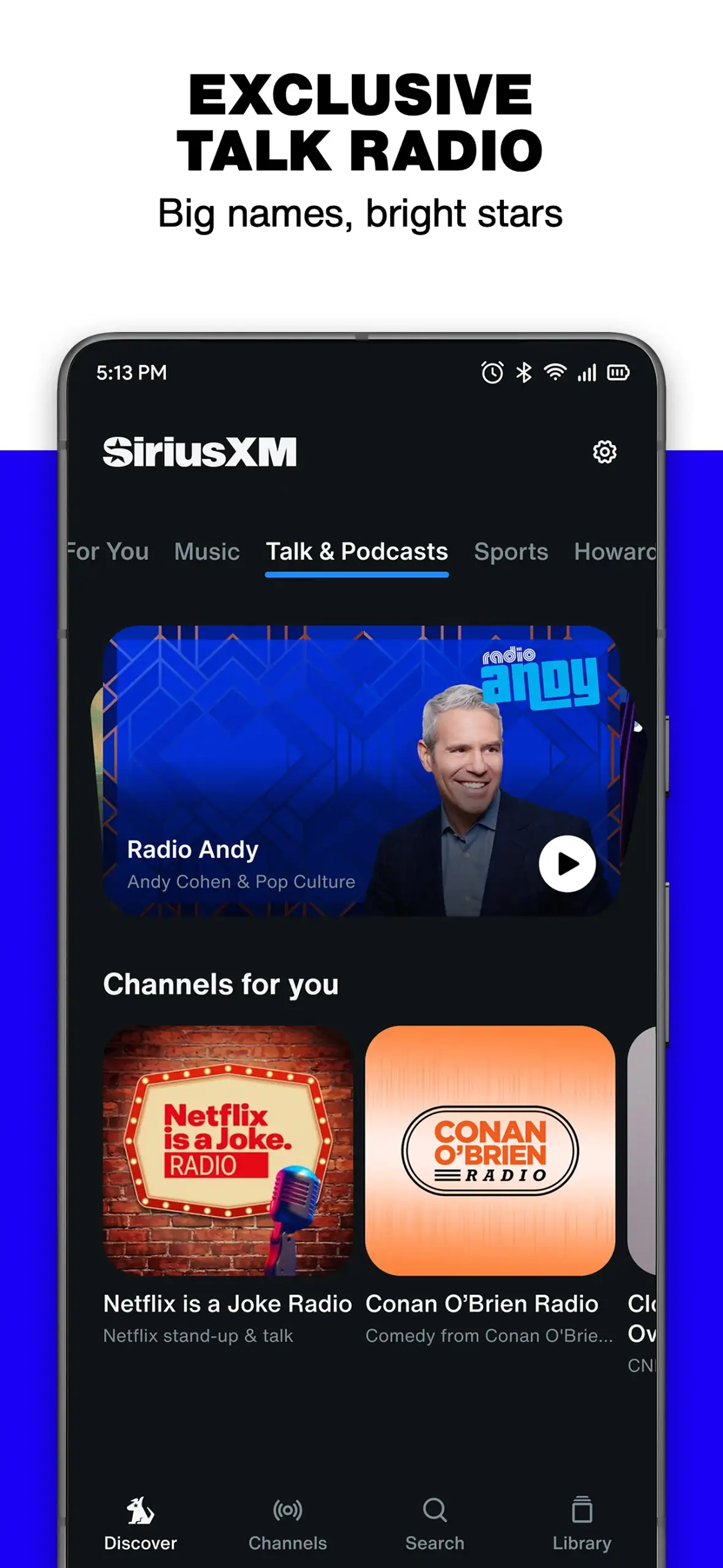
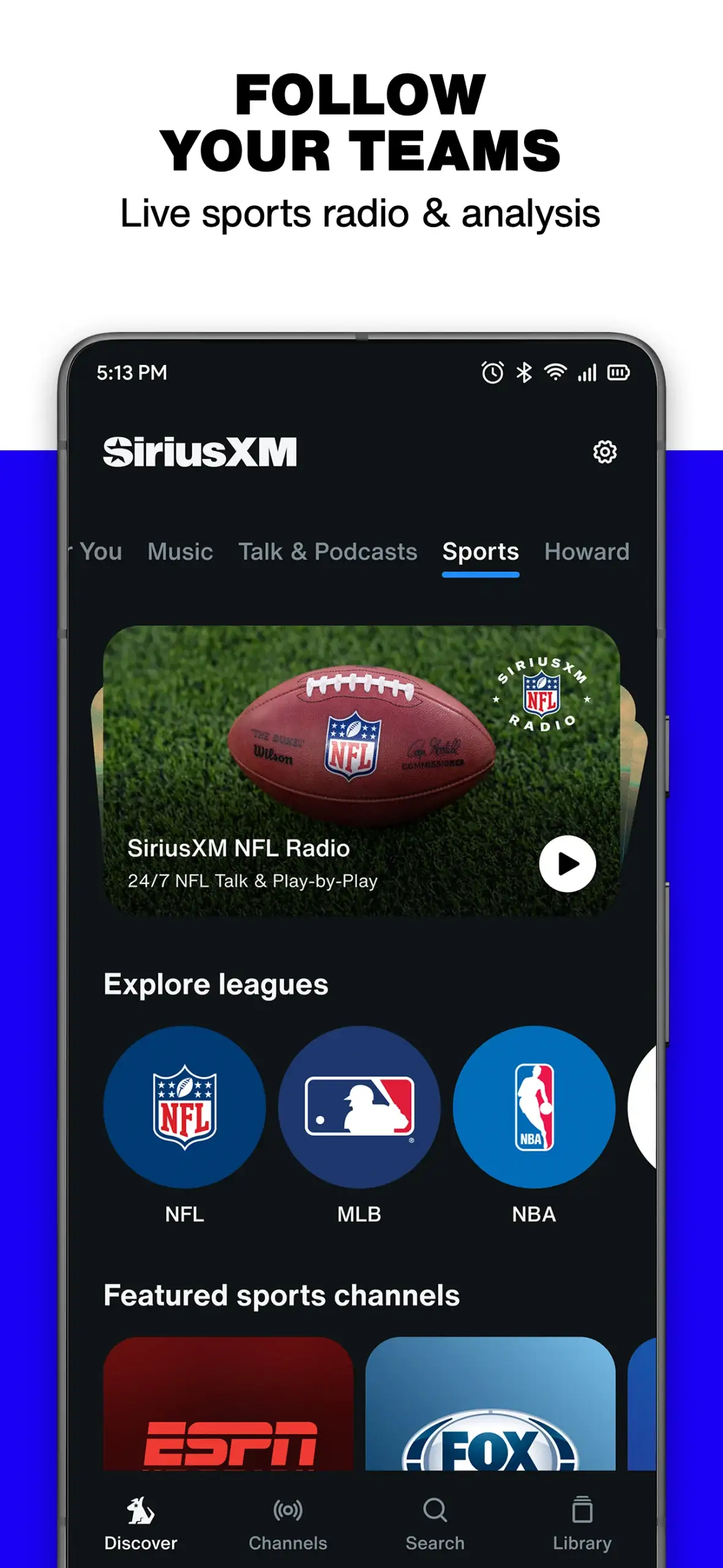
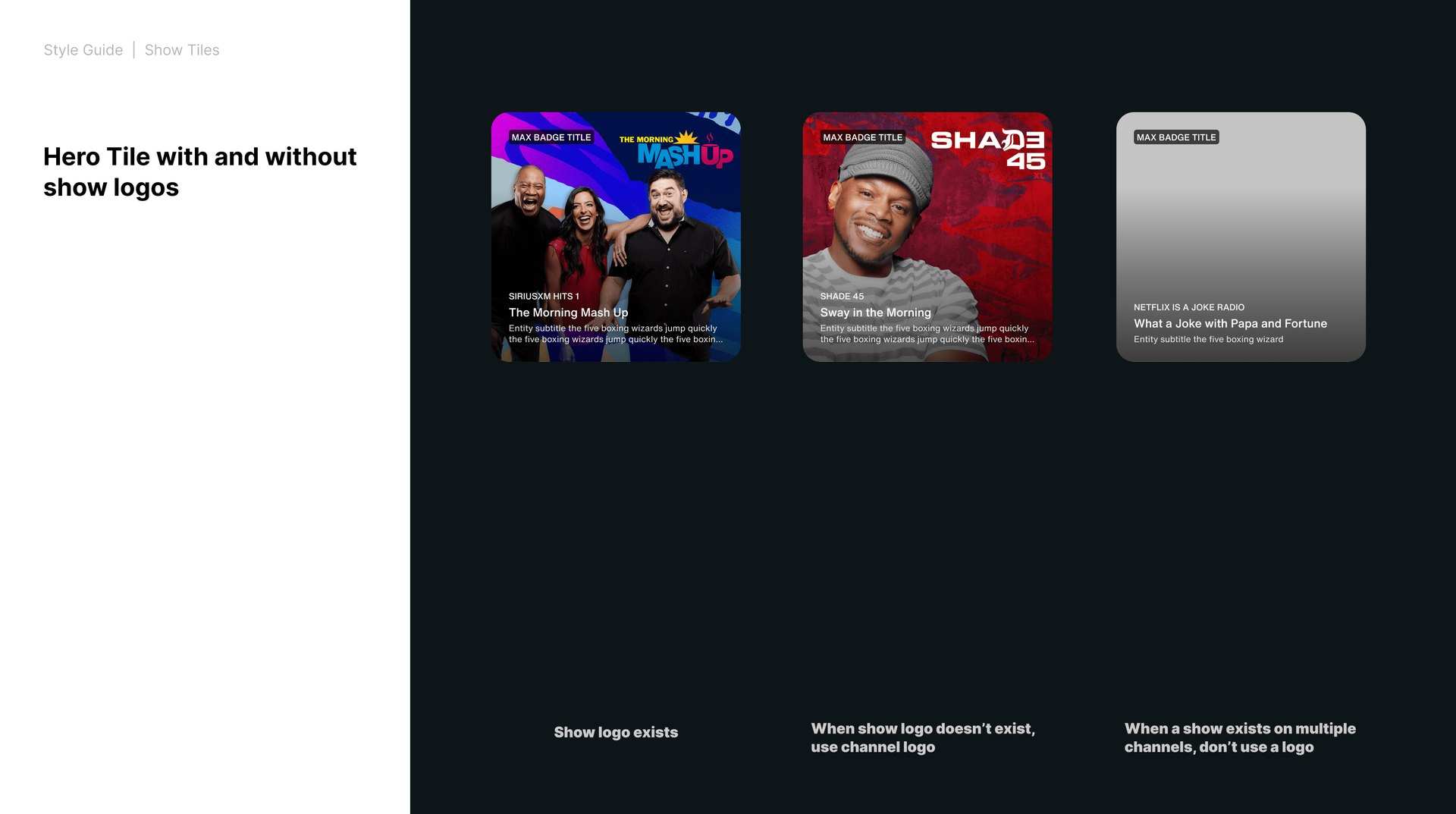
A unified product design framework for SiriusXM's app ecosystem: modular components, updated navigation, refreshed interaction patterns. Visuals tuned for responsiveness across mobile, tablet, and in-car displays. Every tile type carries clear guidelines for typography, hierarchy, color, motion, safe areas, and logo placement.
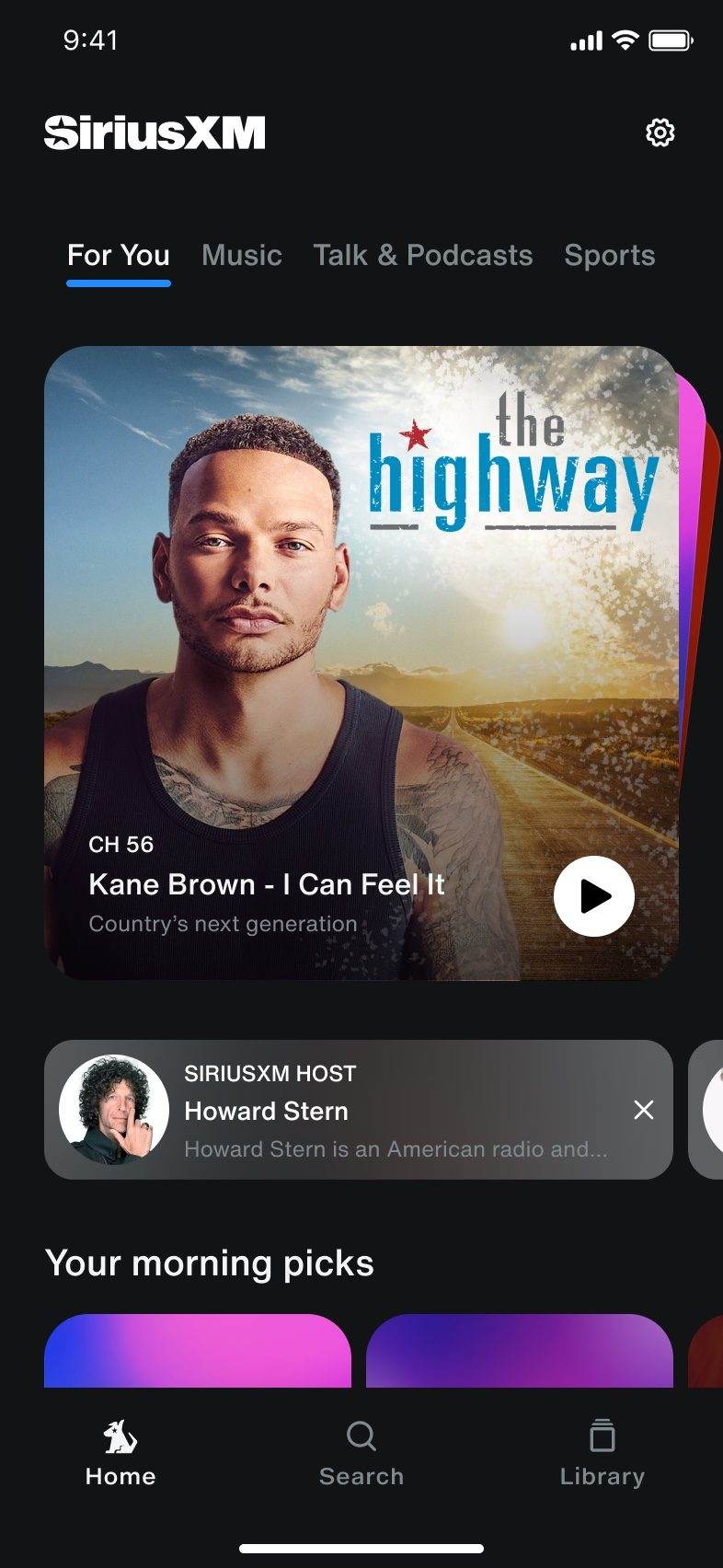
Results in Market

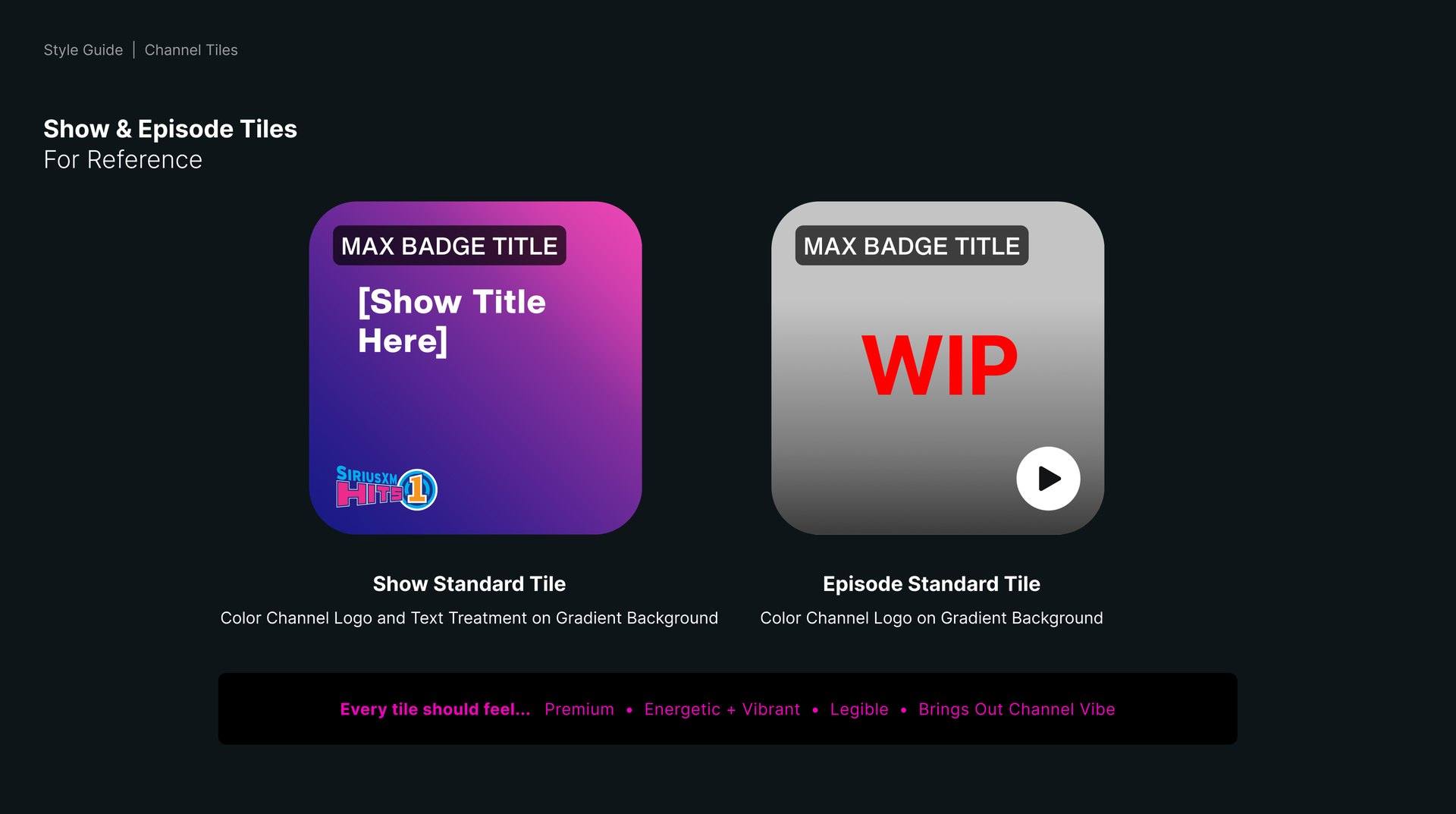
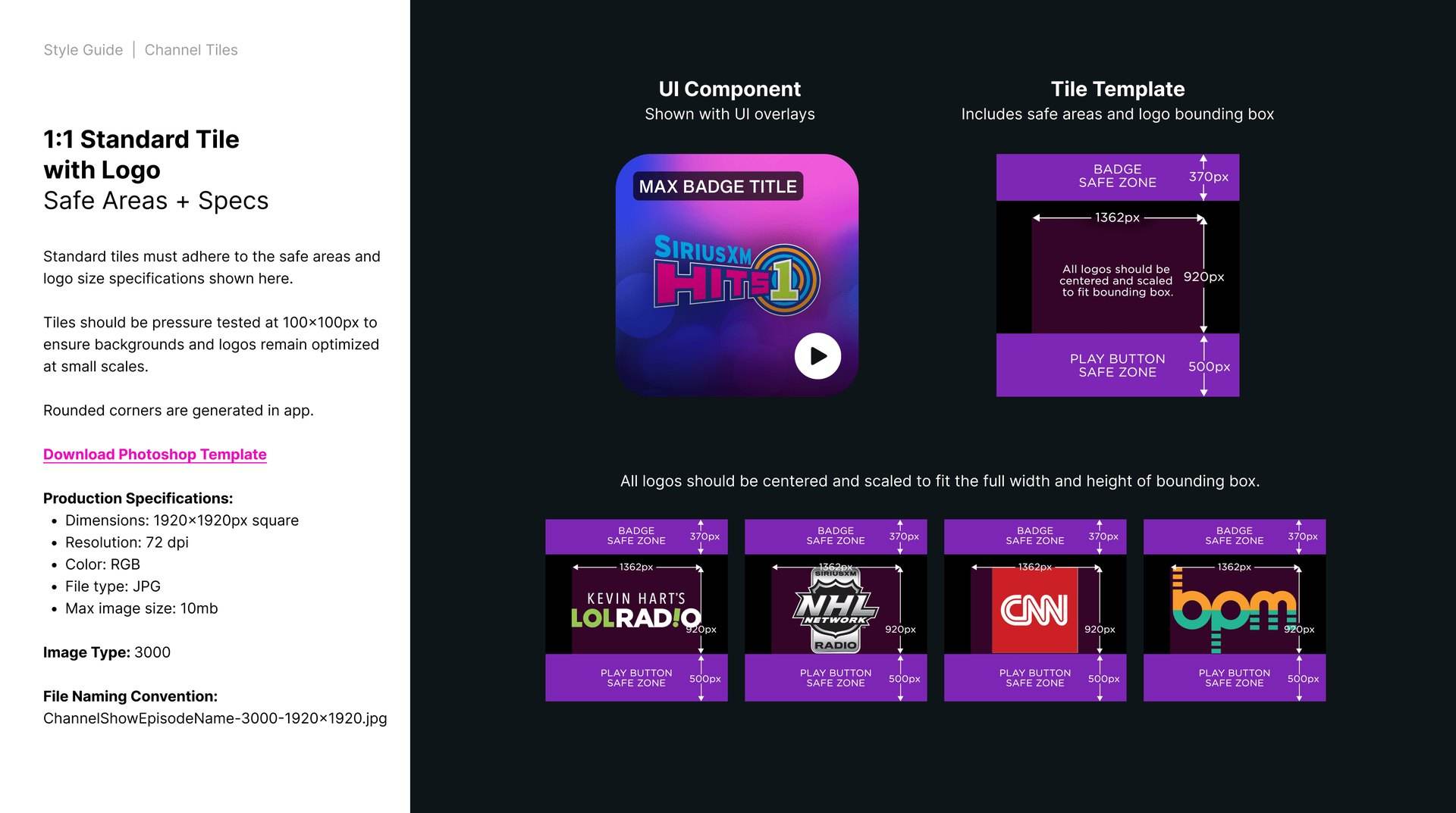
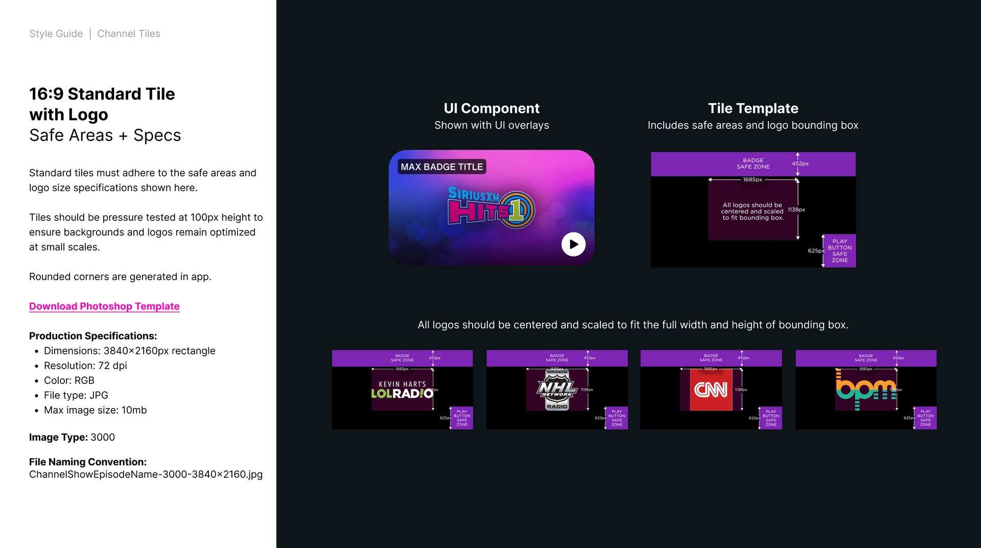
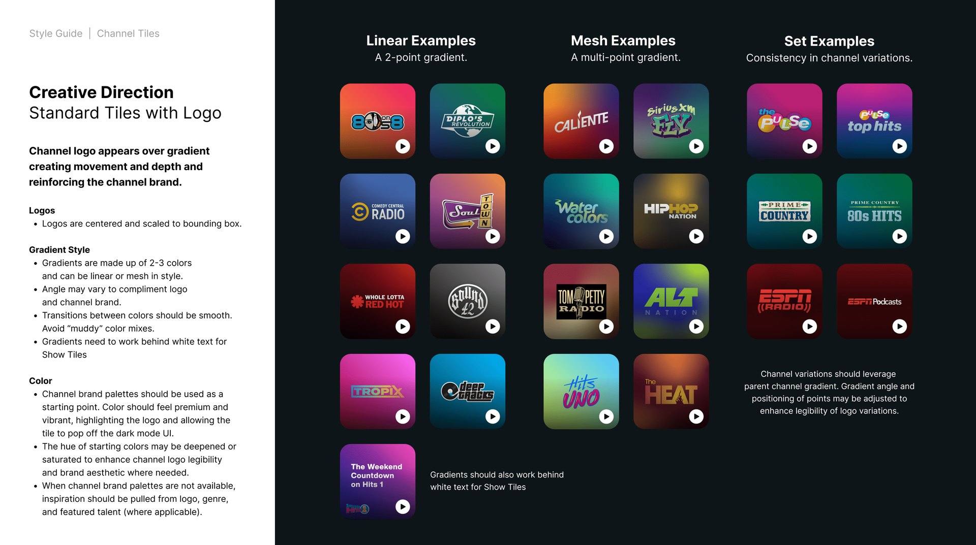
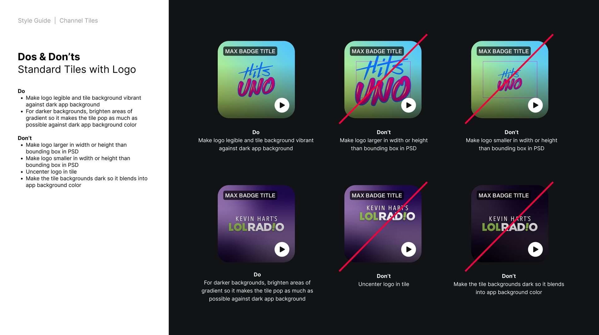
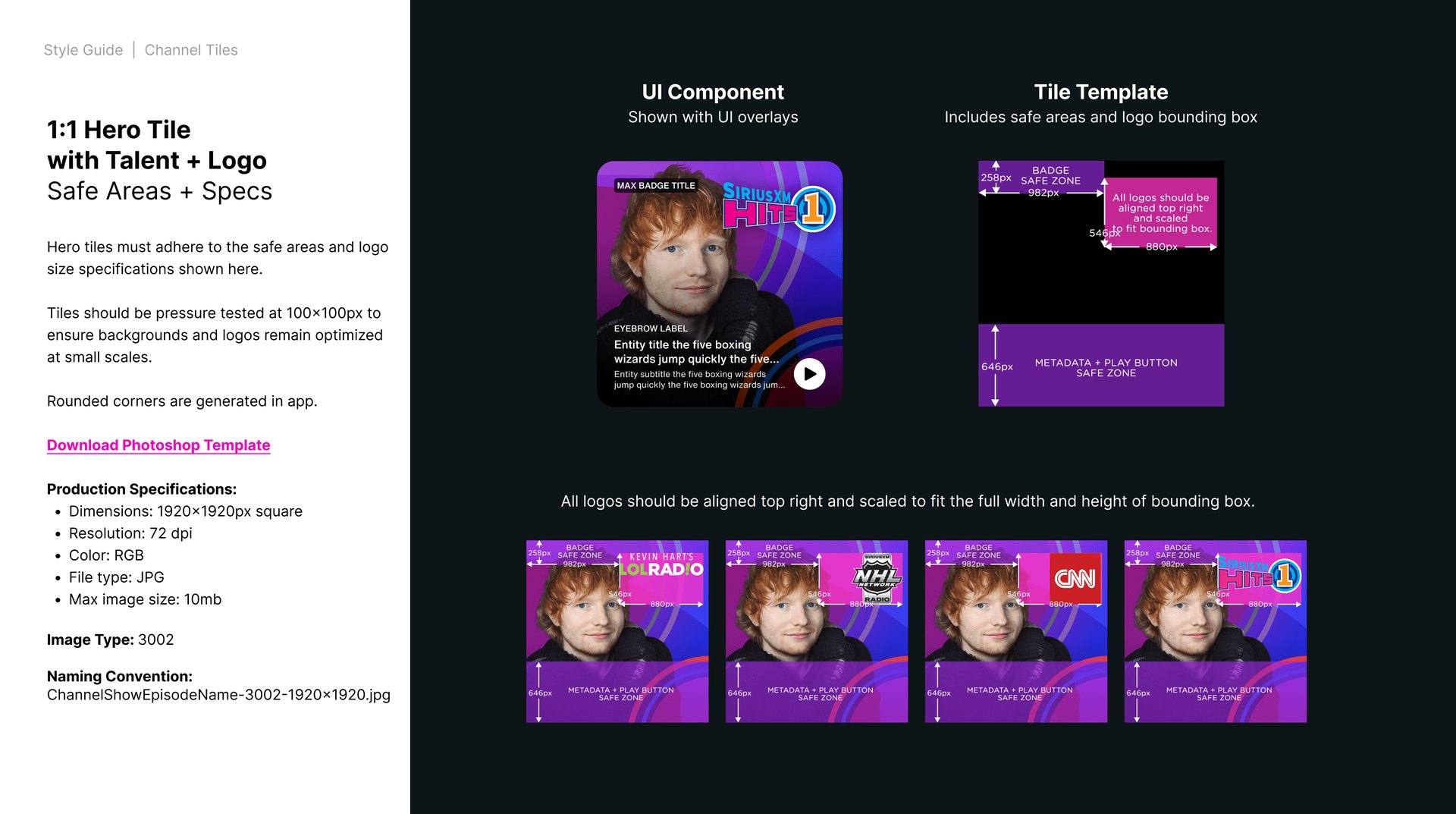
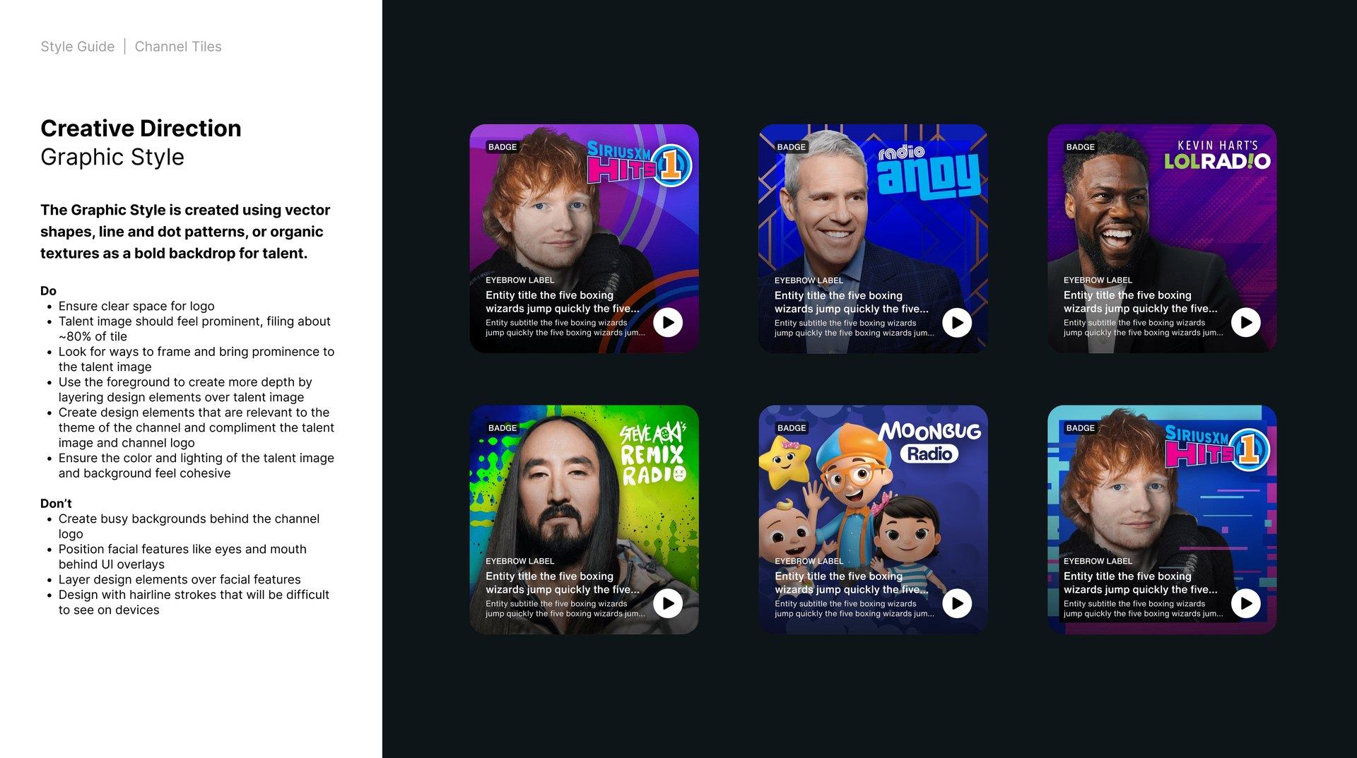
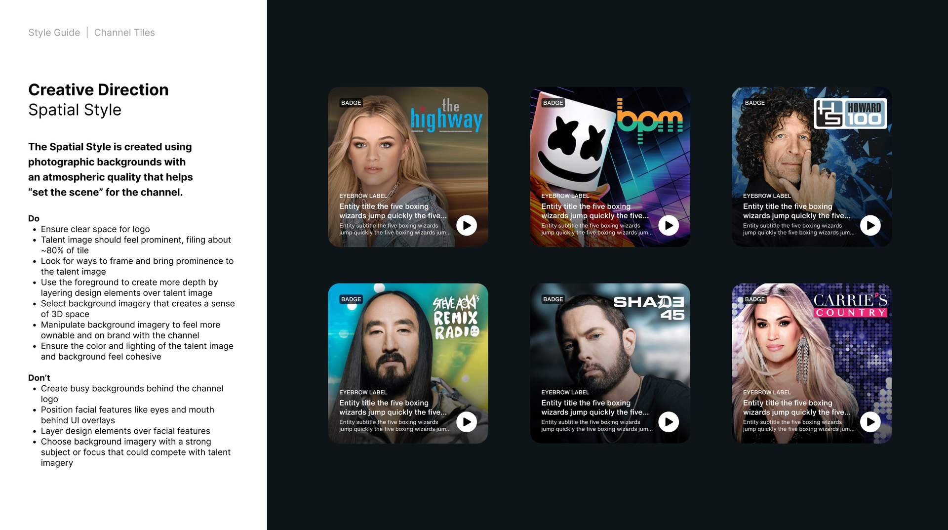
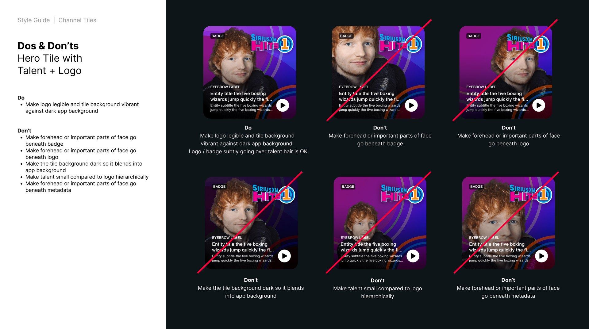
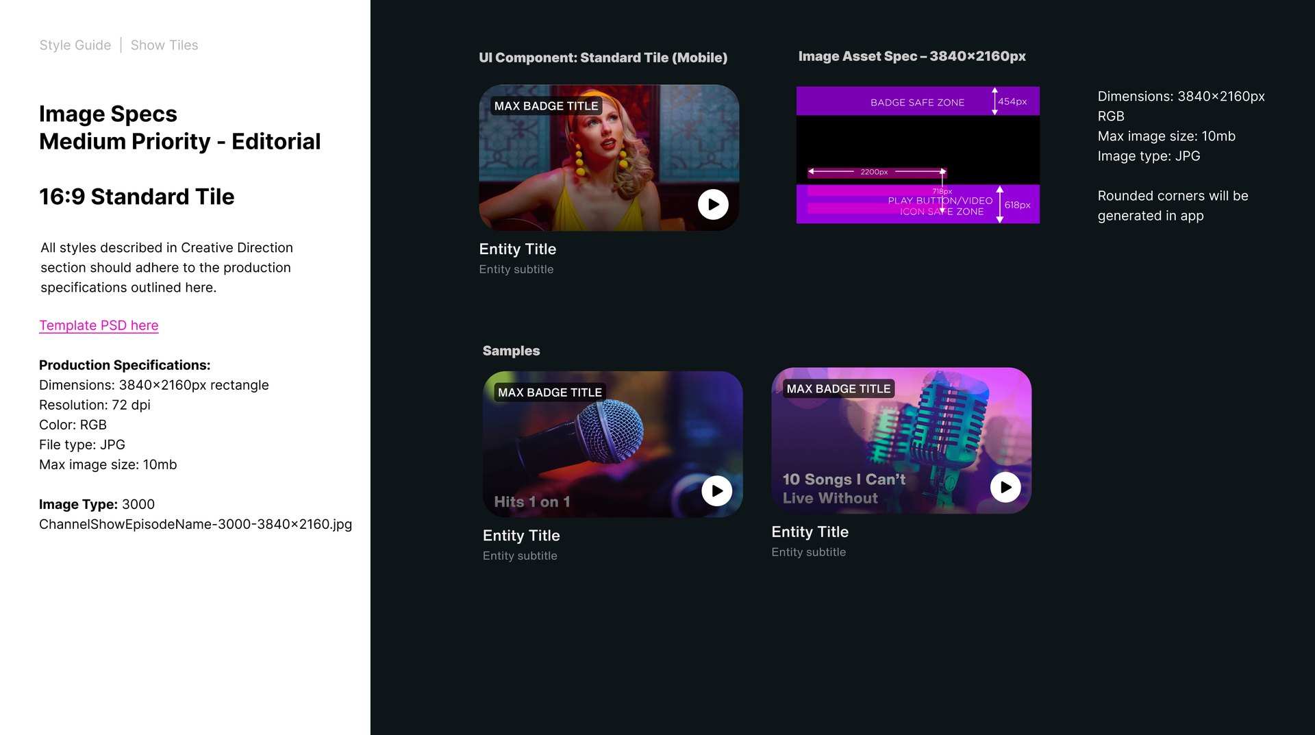
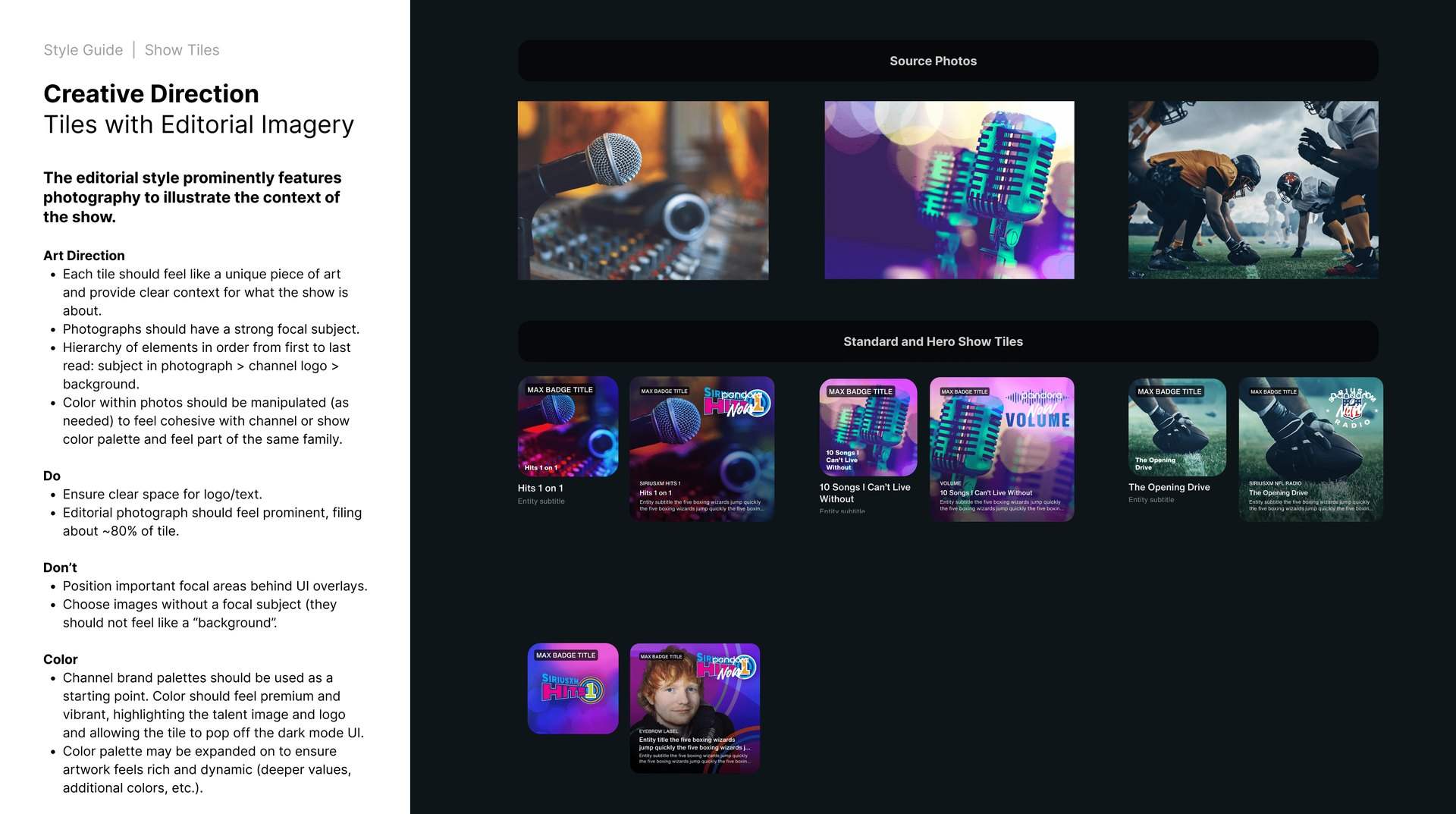

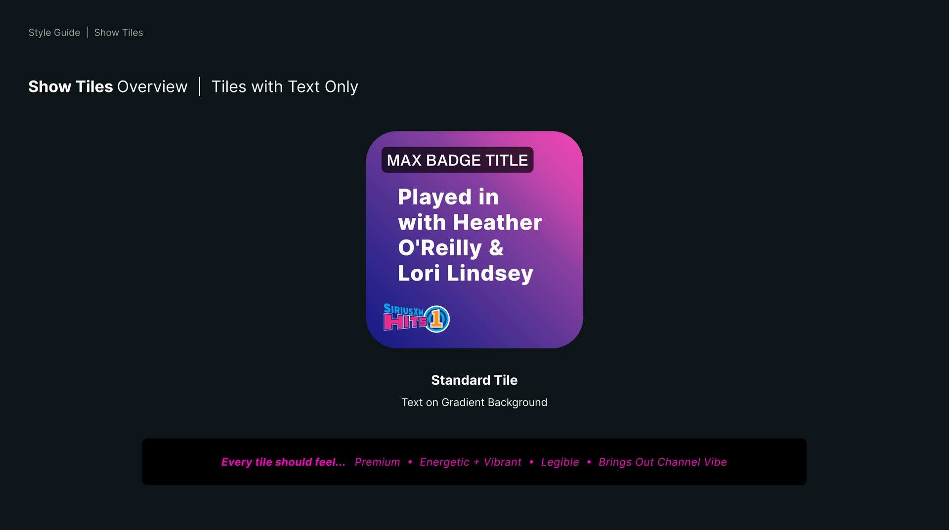
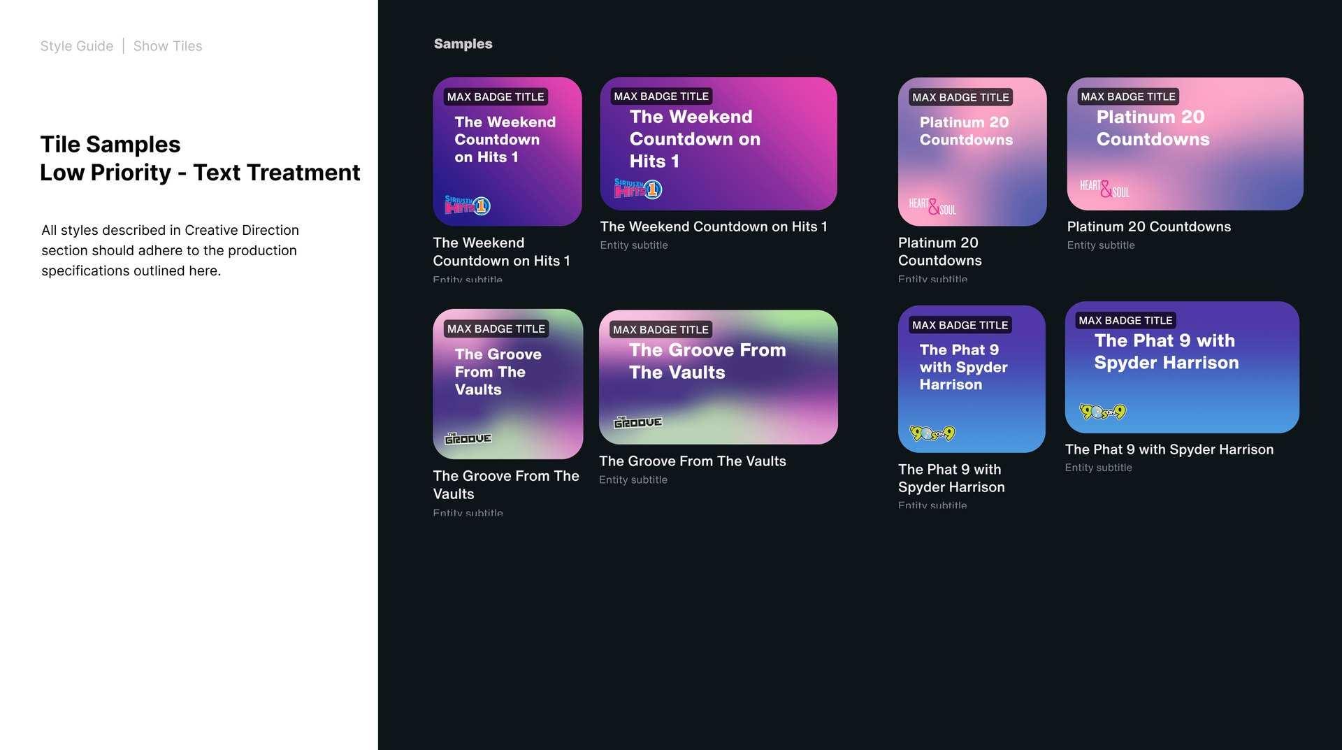
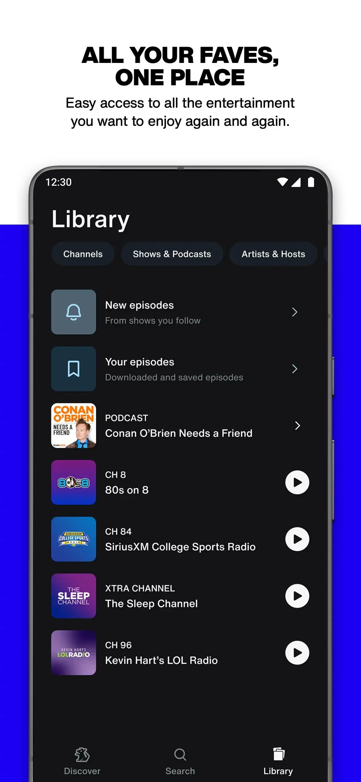
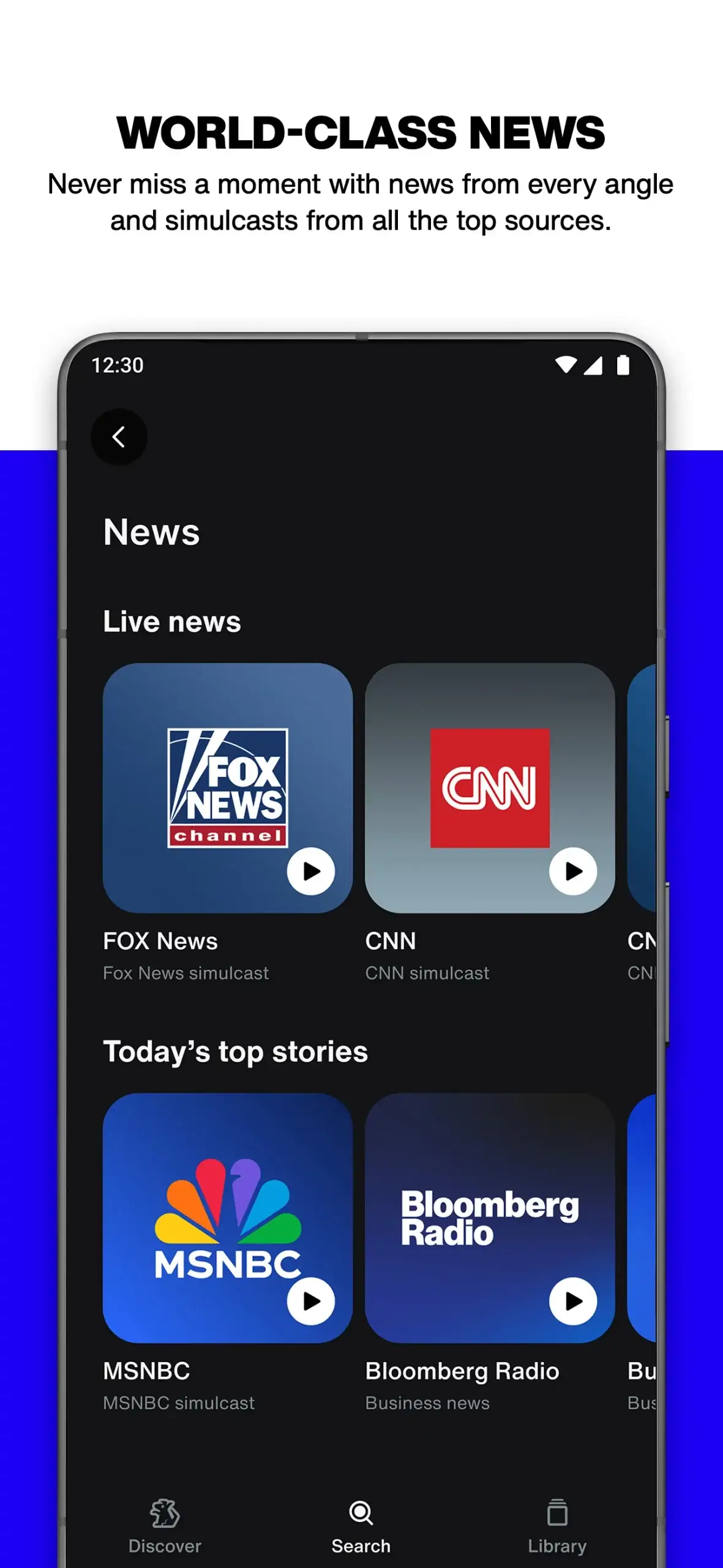
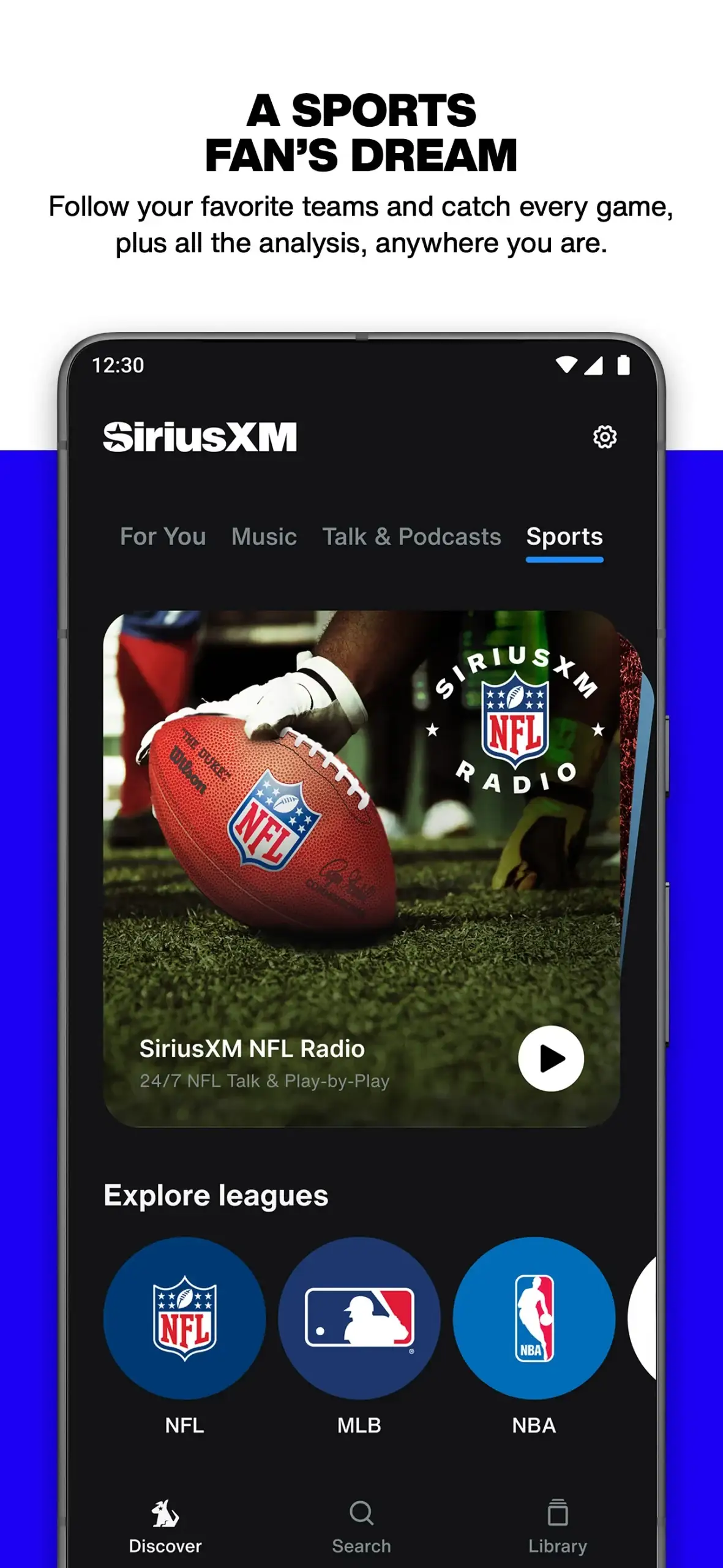
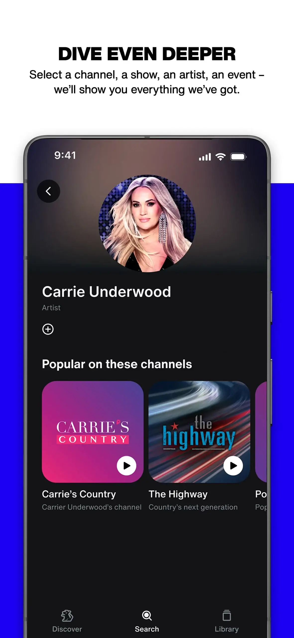
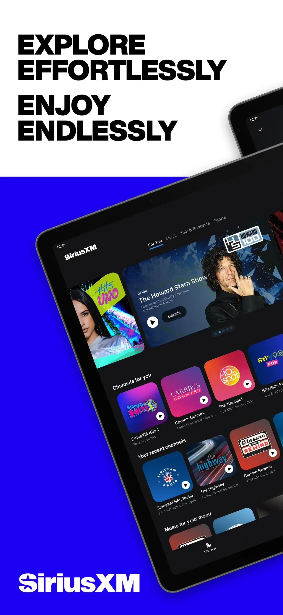
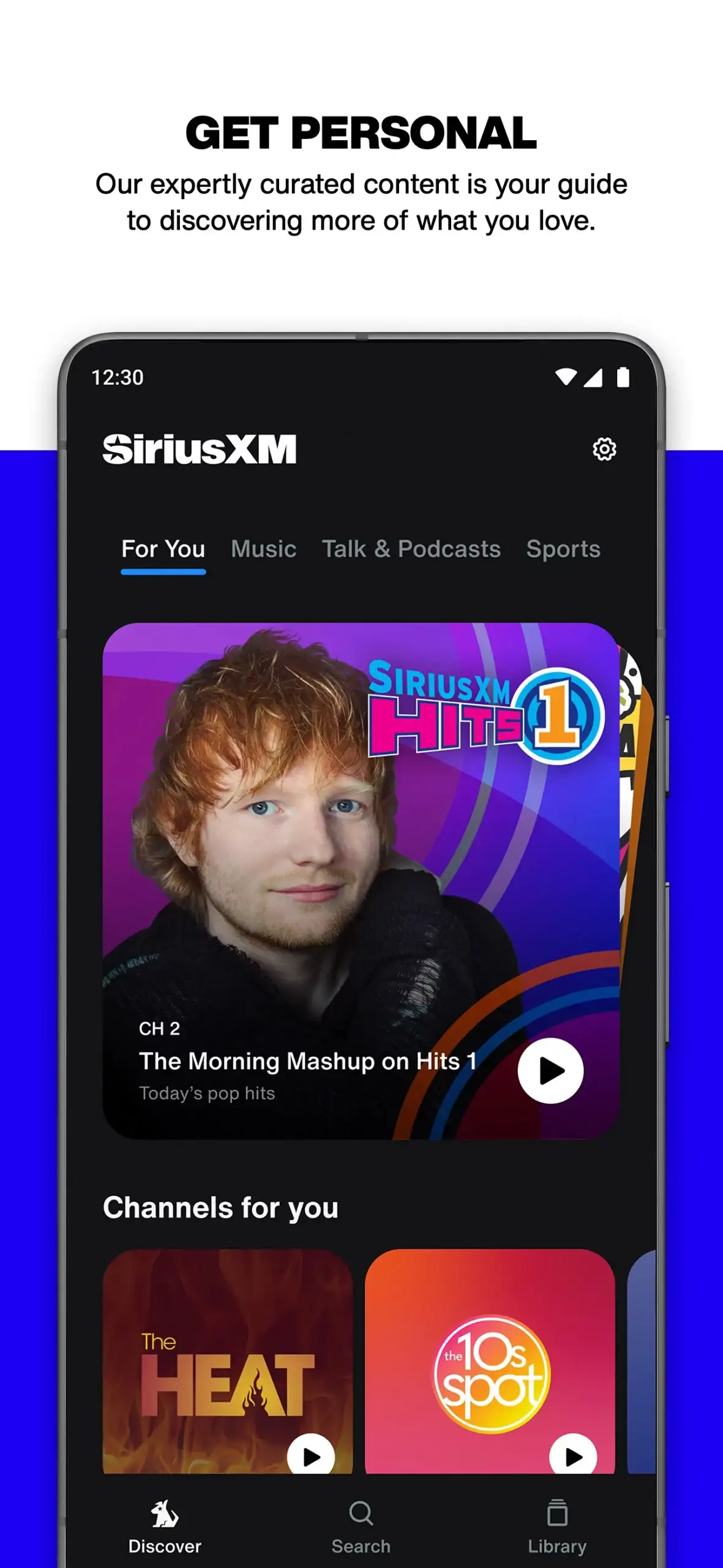
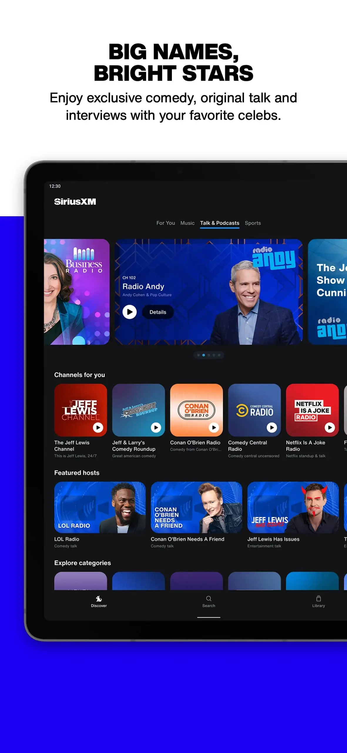

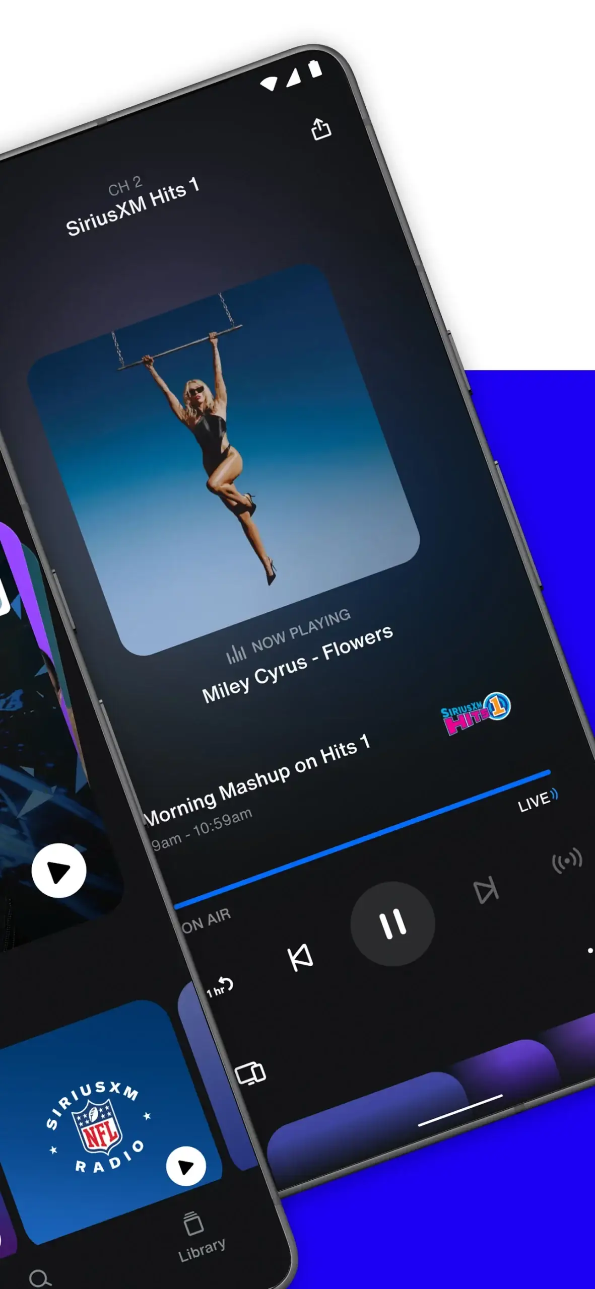
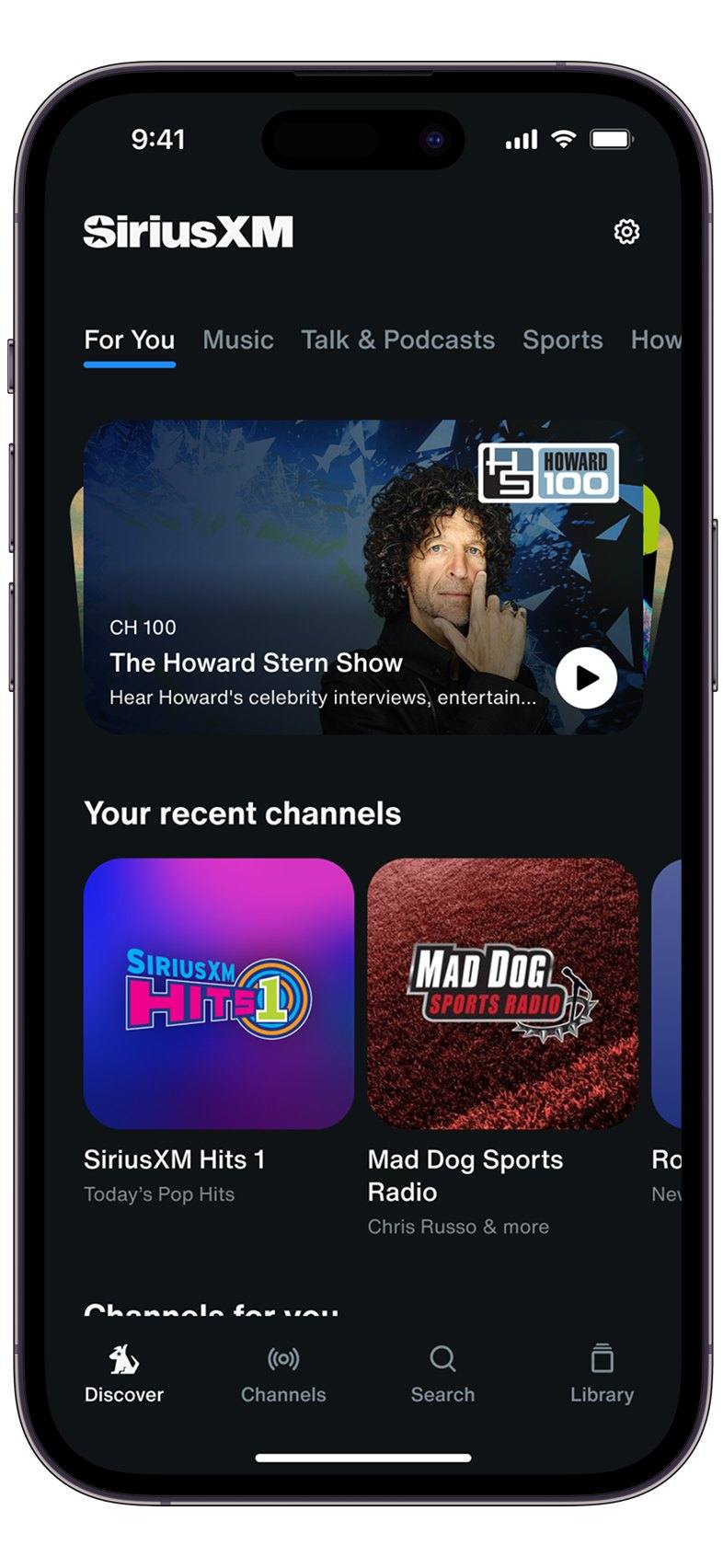
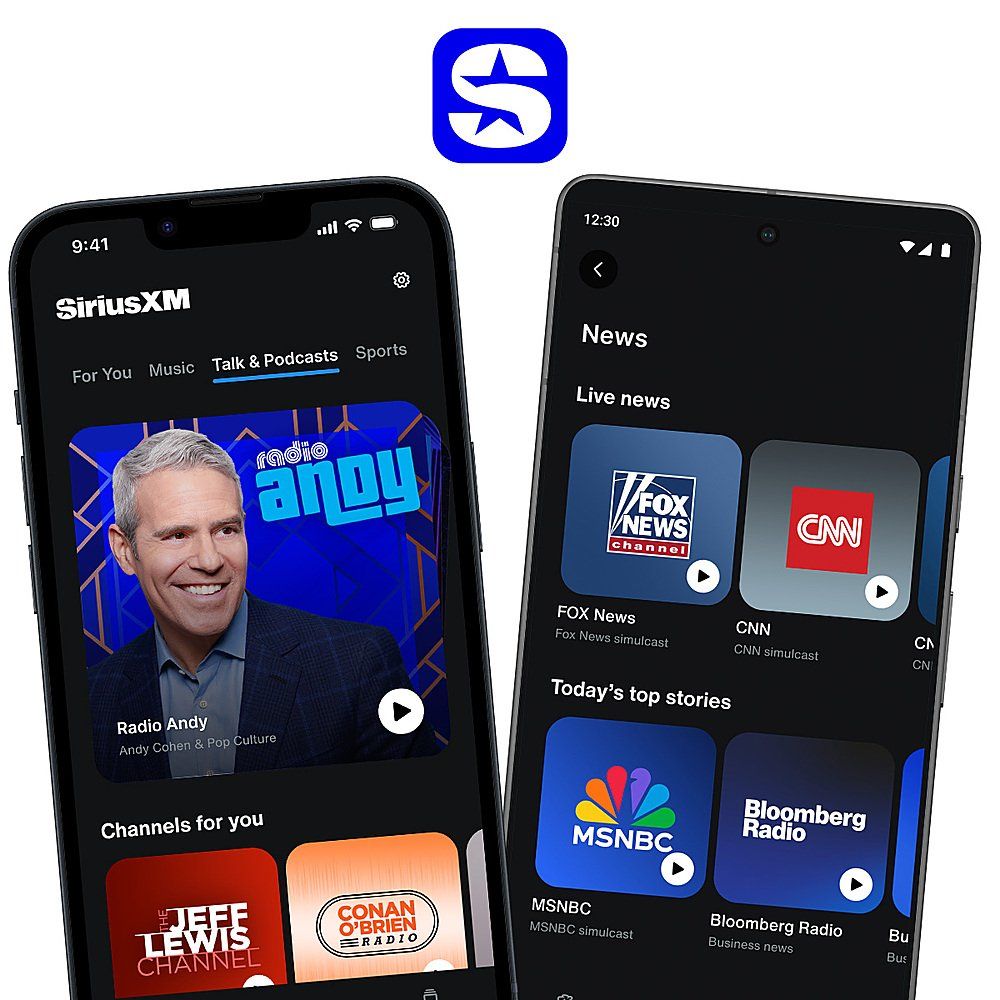
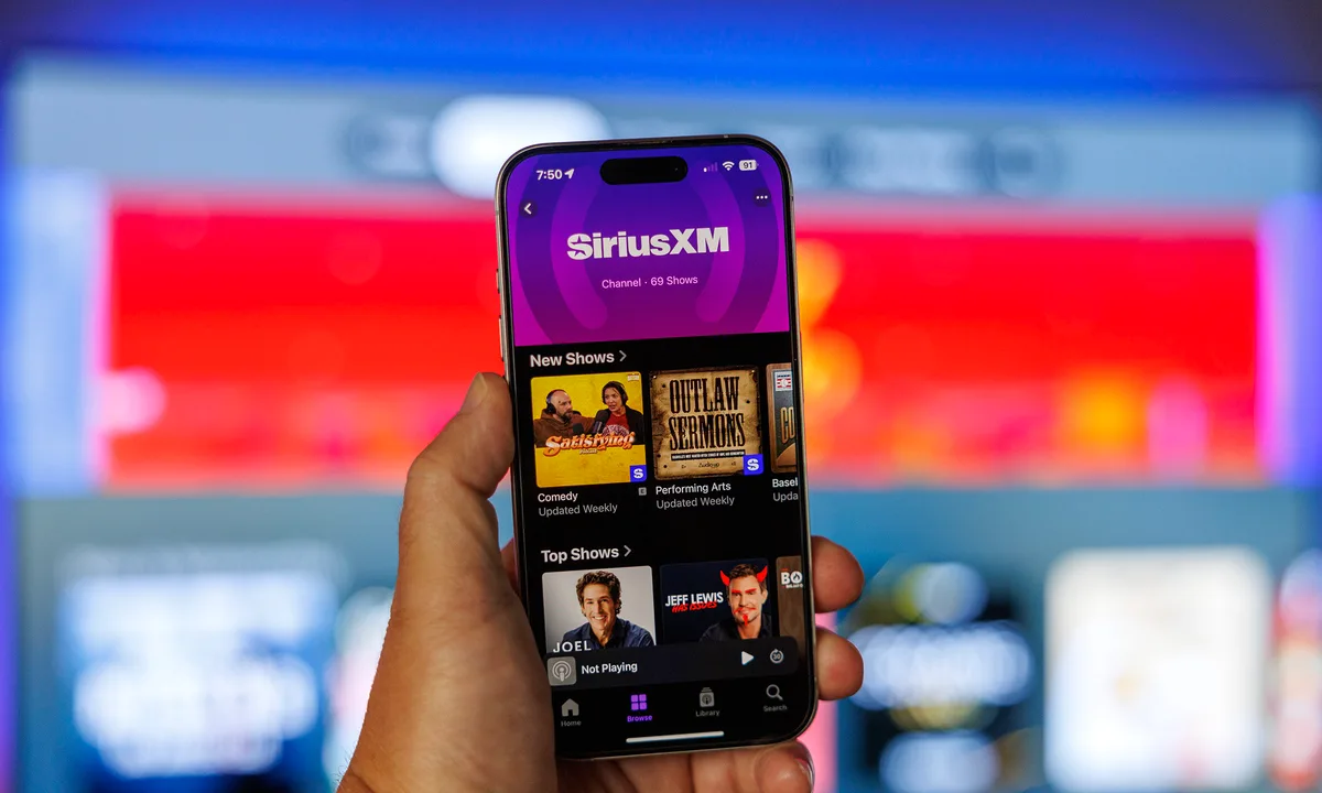
A bold new presence across digital platforms. A more immersive, accessible, and contemporary listening experience, sitting on top of one of the largest audio businesses in the country.
The redesign gave SiriusXM a refreshed visual surface across mobile and digital, streamlining content delivery while keeping the brand's energy and depth intact. The system holds across standard, hero, and promotional placements, scaling from the smallest tile to the most prominent in-app feature.
A flexible content system that balances clarity with expressive visual language and carries both audio and video. It sped up iteration and content rollout across platforms, so the brand could keep adapting to how listeners actually behave.
In-depth Figma files for the SiriusXM tile system, component sets, spec layers, motion guides. Available on request.
Designing What Endures
SiriusXM reflects Therum’s ability to merge entertainment and structure. We believe great design amplifies experience, balancing storytelling, usability, and motion to create systems that feel alive and intuitive.
Build systems that can hold complexity without breaking. Structure, when designed intentionally, becomes a multiplier for culture rather than a constraint on it.
At SiriusXM the challenge was scale: thousands of audio and video programs, multiple content types, constant rotation. We didn't chase a look. We defined the rules that let content move clearly and consistently across the platform. Typography, color, motion, and layout became functional signals, not decoration, so every tile stayed legible, expressive, and adaptable at any size or placement.
The payoff was faster production, clearer navigation, and stronger brand cohesion across a massive catalog. Separating visual style from structural logic gave SiriusXM flexibility without fragmentation, consistency without stagnation.
That is the kind of work we want our name on: a framework that proves itself in real conditions and keeps working as the platform, the team, and the catalog grow. Not something that looks new for a launch, something that still holds a year in.
- VarietySiriusXM Unveils New Logo, Rebuilt Streaming App With Lower-Priced Plan and Expanded Programming Lineup
- DeadlineHoward Stern, Kevin Hart, Kelly Clarkson & More Help SiriusXM Unveil Sweeping Rebrand, New App, Updated Subscription Pricing
- TechCrunchSiriusXM unveils new streaming app, set to launch next month
- CNBCSiriusXM is targeting younger customers with new app and streaming plan