Case Study

Netflix Creative Labs

Netflix Creative Labs brings together creative directors, strategists, producers, data specialists, innovators, and artists to reimagine promotional creative across the Netflix ecosystem, using A/B testing, creative workshops, research, and custom tools to continually evolve their output.
Project snapshot
Delivered

Netflix Creative Labs

Overview

Netflix Creative Labs brings together creative directors, strategists, producers, data specialists, innovators, and artists to reimagine promotional creative across the Netflix ecosystem, using A/B testing, creative workshops, research, and custom tools to continually evolve their output.
  • Visual Creative

What We Did

Across four rounds of concepts, Therum explored vibrant typography, geometric forms, and subtle nods to the Netflix logo bump. The final direction came from a happy accident, shifting a set of horizontal bars 90 degrees produced a striking echo of the colored bars in the logo animation.

The Outcome

The result is a dynamic mark that gave the team immediate presence within the Netflix ecosystem.
ClientNetflix Creative Labs
Agency partnerTherum
Started2021
Launched2021
Duration6 months
01. The Ask

Create a brand identity for Netflix's Creative Labs team
Netflix Creative Labs brings together creative directors, strategists, producers, data specialists, innovators, and artists to reimagine promotional creative across the Netflix ecosystem, using A/B testing, creative workshops, research, and custom tools to continually evolve their output. Therum led the design and development of the team's brand identity.

02. Our Role

We designed the identity for a team inside Netflix, not for the Netflix brand
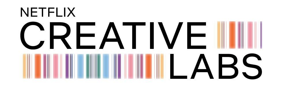
Creative Labs under the Netflix wordmark, version 1Creative Labs under the Netflix wordmark, version 2Creative Labs under the Netflix wordmark, version 3Creative Labs under the Netflix wordmark, version 4Creative Labs under the Netflix wordmark, version 5
1 / 5

Creative Labs is an internal group, so its mark had to sit under a logo that already exists without arguing with it. We led the design and development end to end: reference gathering, four rounds of concepts presented as numbered options, and the final mark. The parent brand stayed fixed and untouched. What we made was the part that names the team, written in a language the rest of the company already reads.
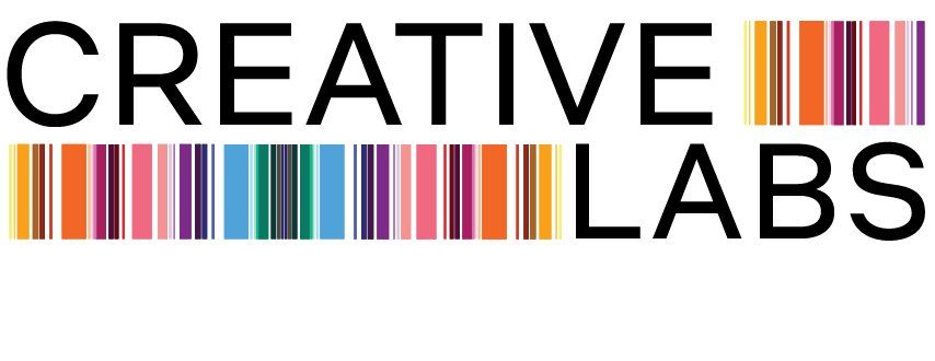
Creative Labs on its own, version 1Creative Labs on its own, version 2Creative Labs on its own, version 3Creative Labs on its own, version 4The colour bars on their own
1 / 5
03. Our Approach

Take the thing everyone already recognises and turn it ninety degrees
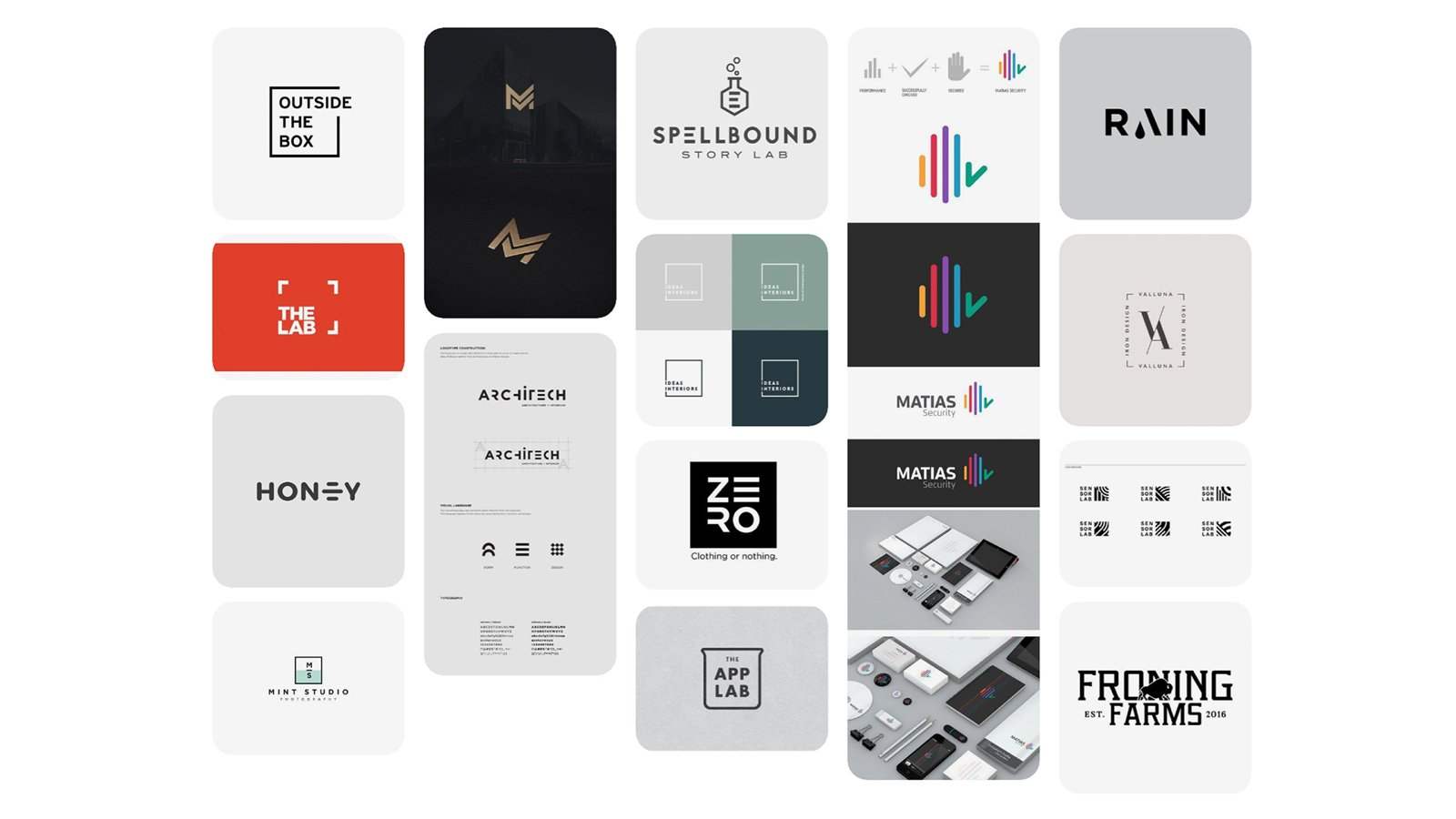
Reference board of lab and studio marks: a flask, beakers, The Lab, The App Lab, sound bars and stationery mock-upsMoodboard
1 / 2

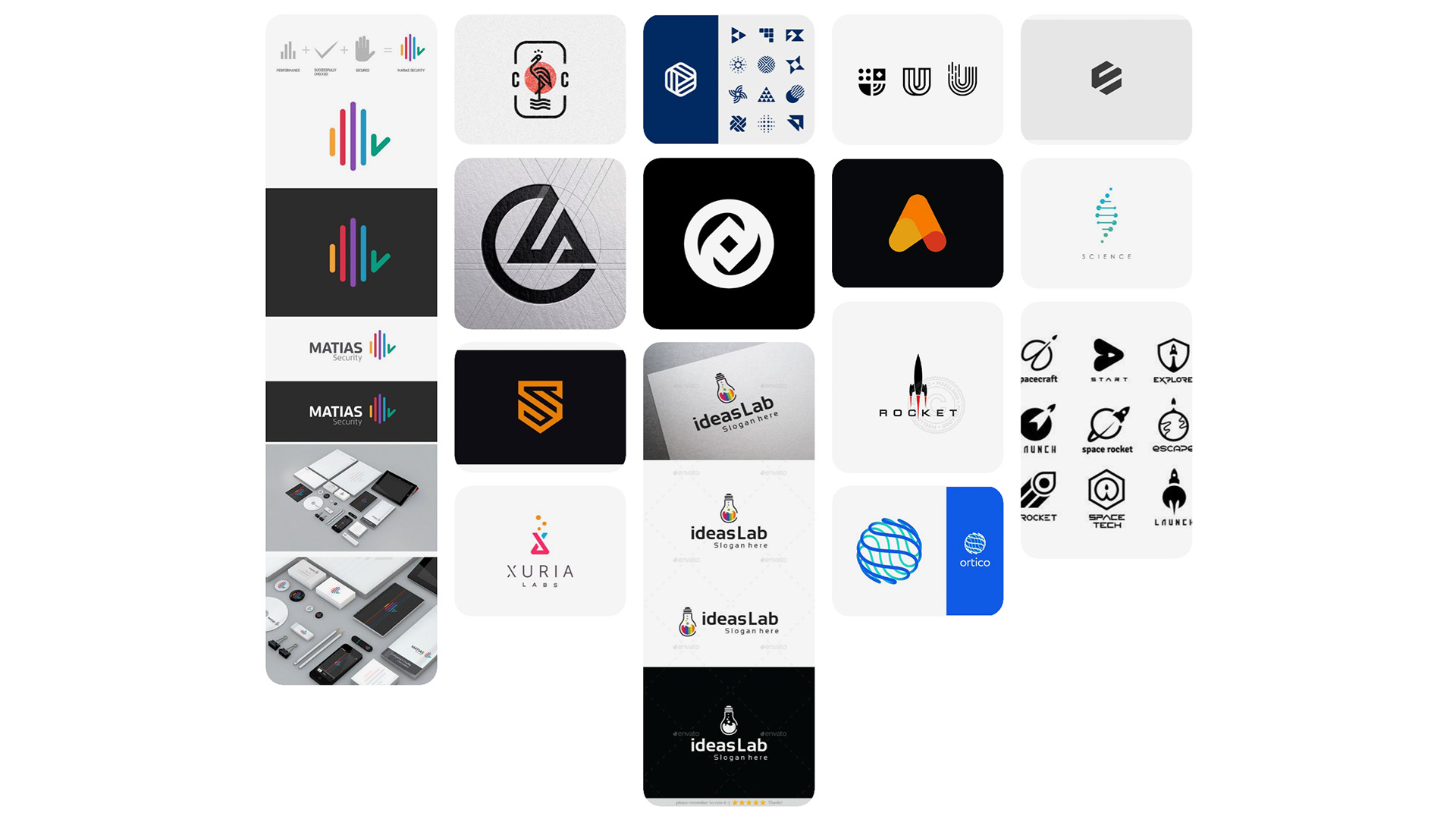
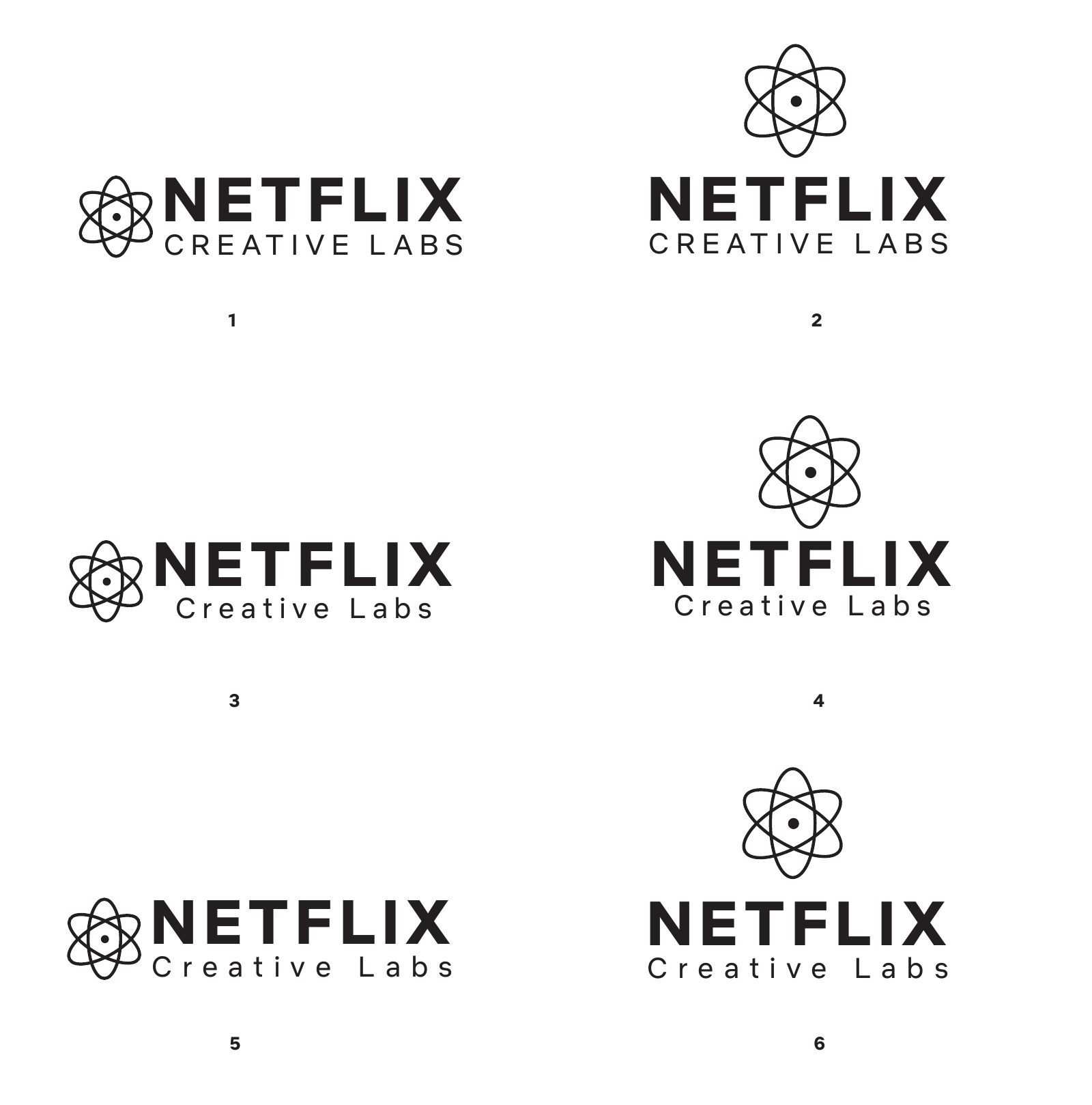
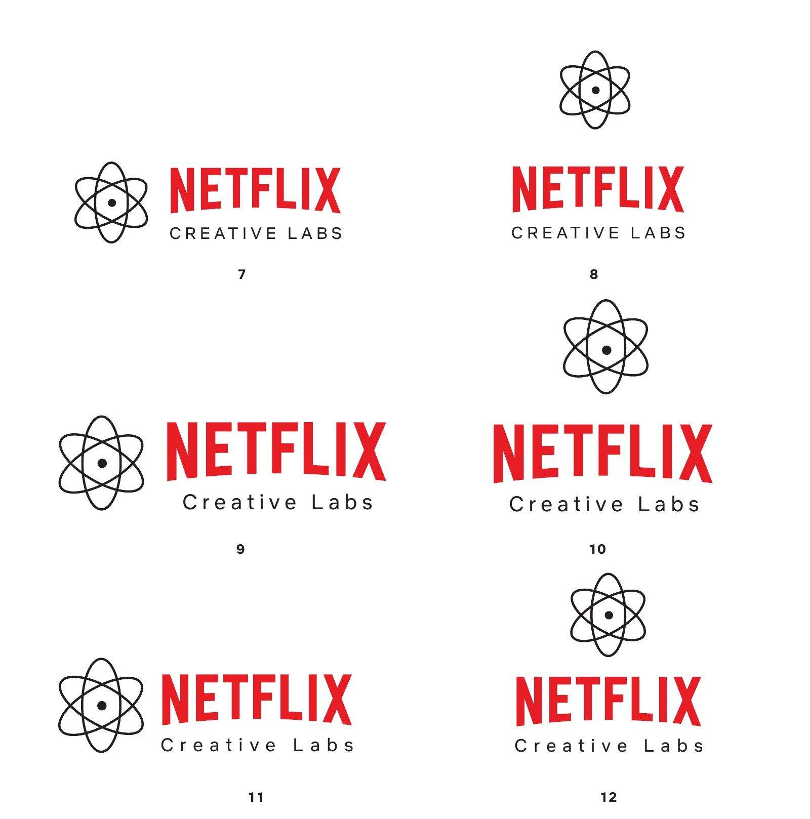
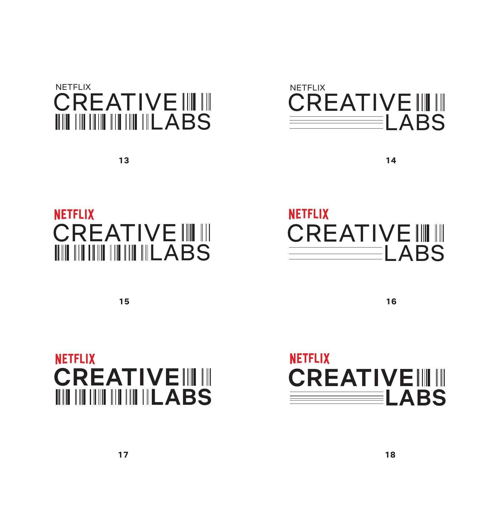
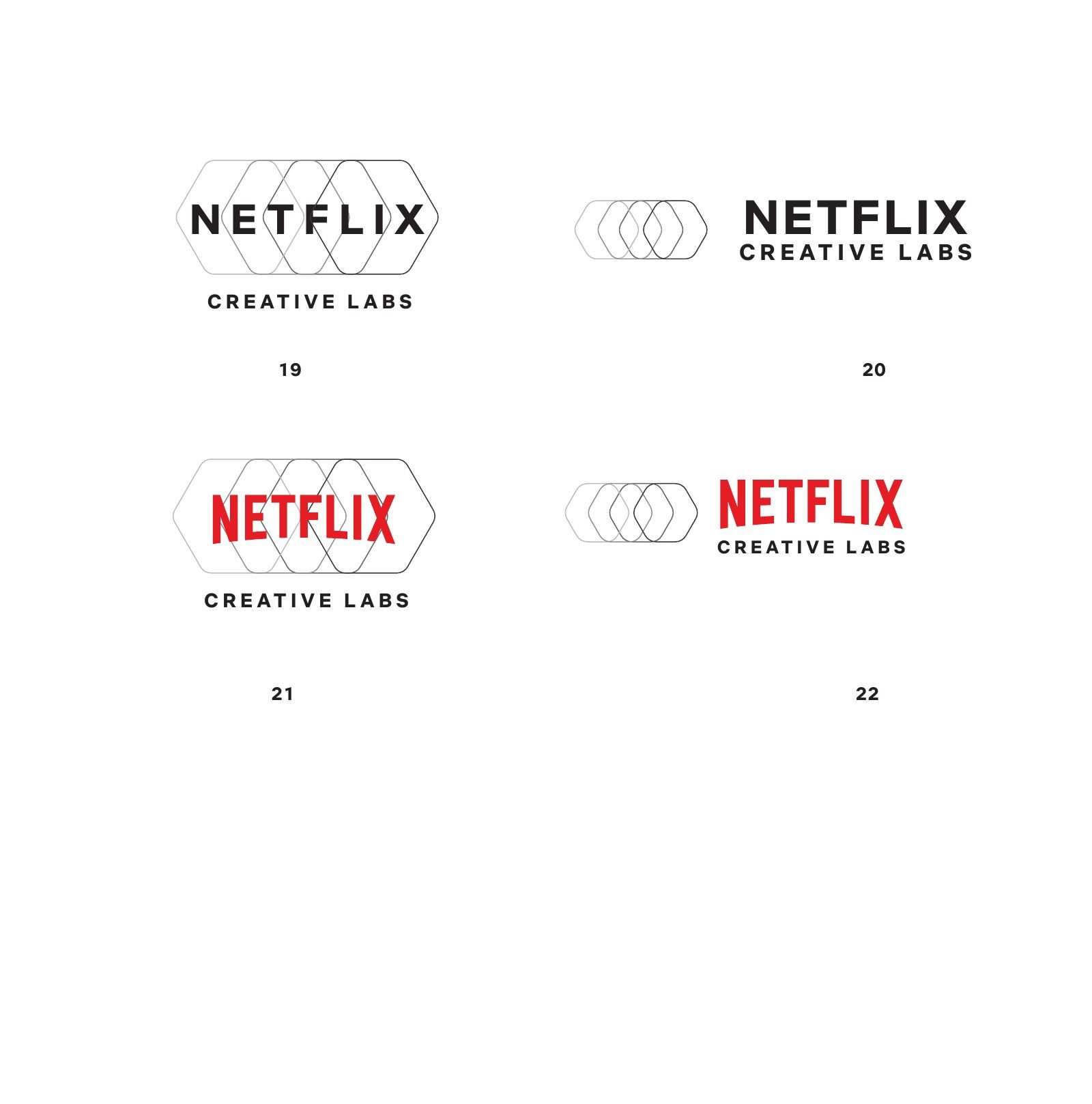
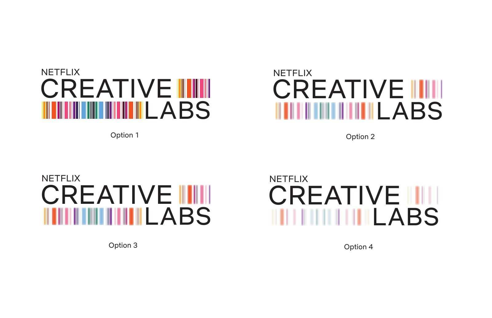
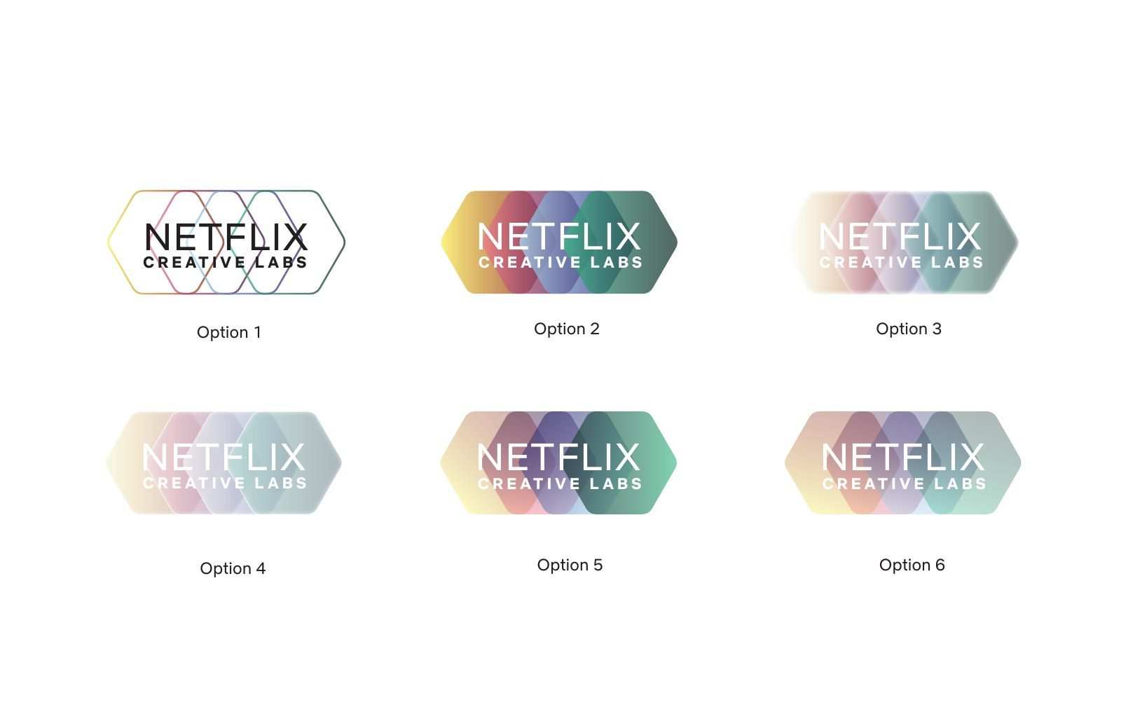
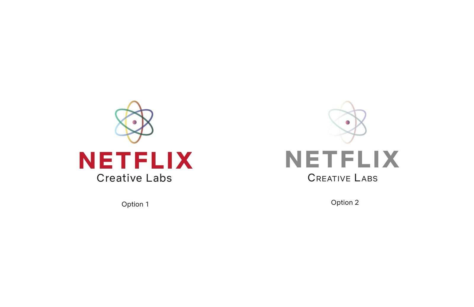
We started on a board of lab and science marks, flasks, atoms, rockets, tight monograms, to see what the category expects of a team called Labs. By round four we took the families to the room and labelled them plainly as numbered options. One put an atom orbit above the wordmark. One nested hexagons around the full name. One packed vertical colour bars into the space around CREATIVE LABS, shown at full saturation and in faded versions so the team could choose how loud to be.
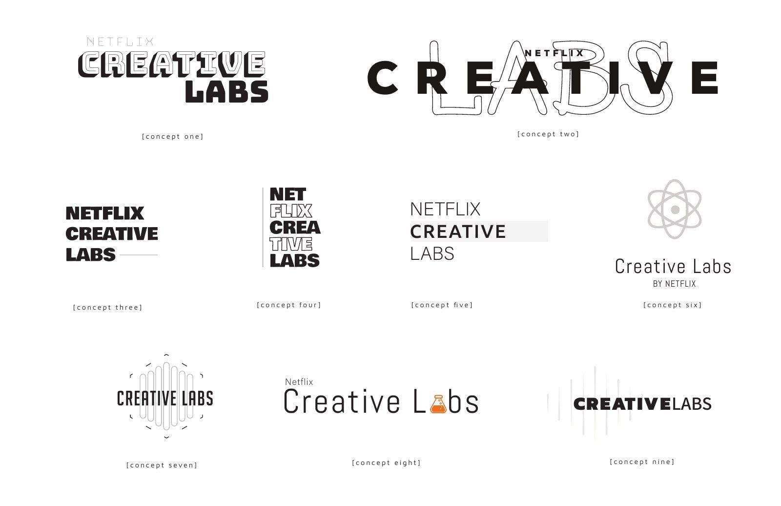
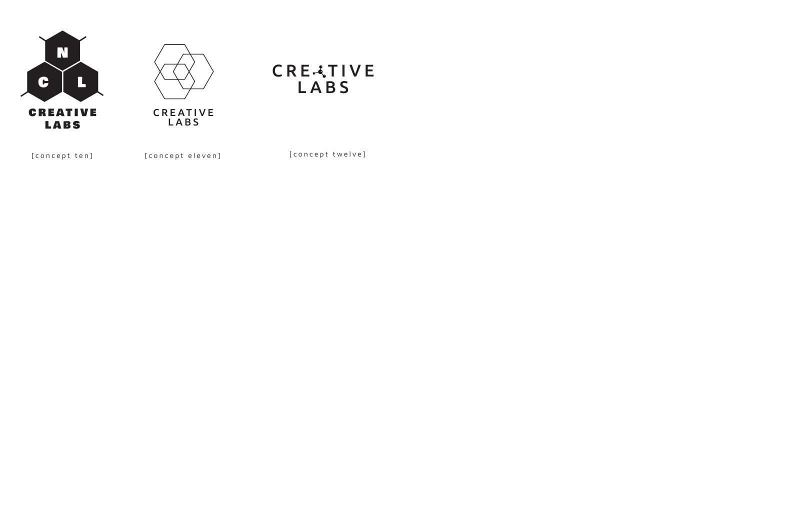
Creative Labs wordmark concepts one to nineCreative Labs mark concepts ten to twelve
1 / 2
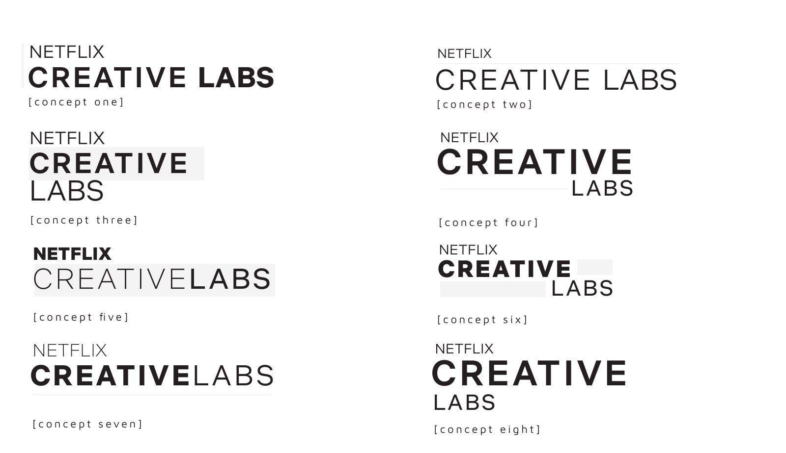
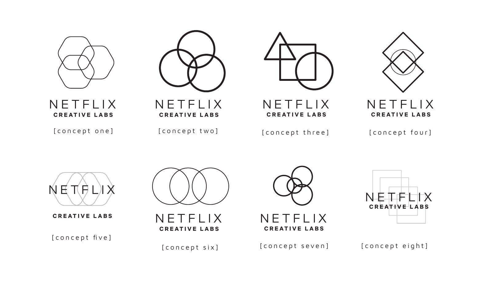
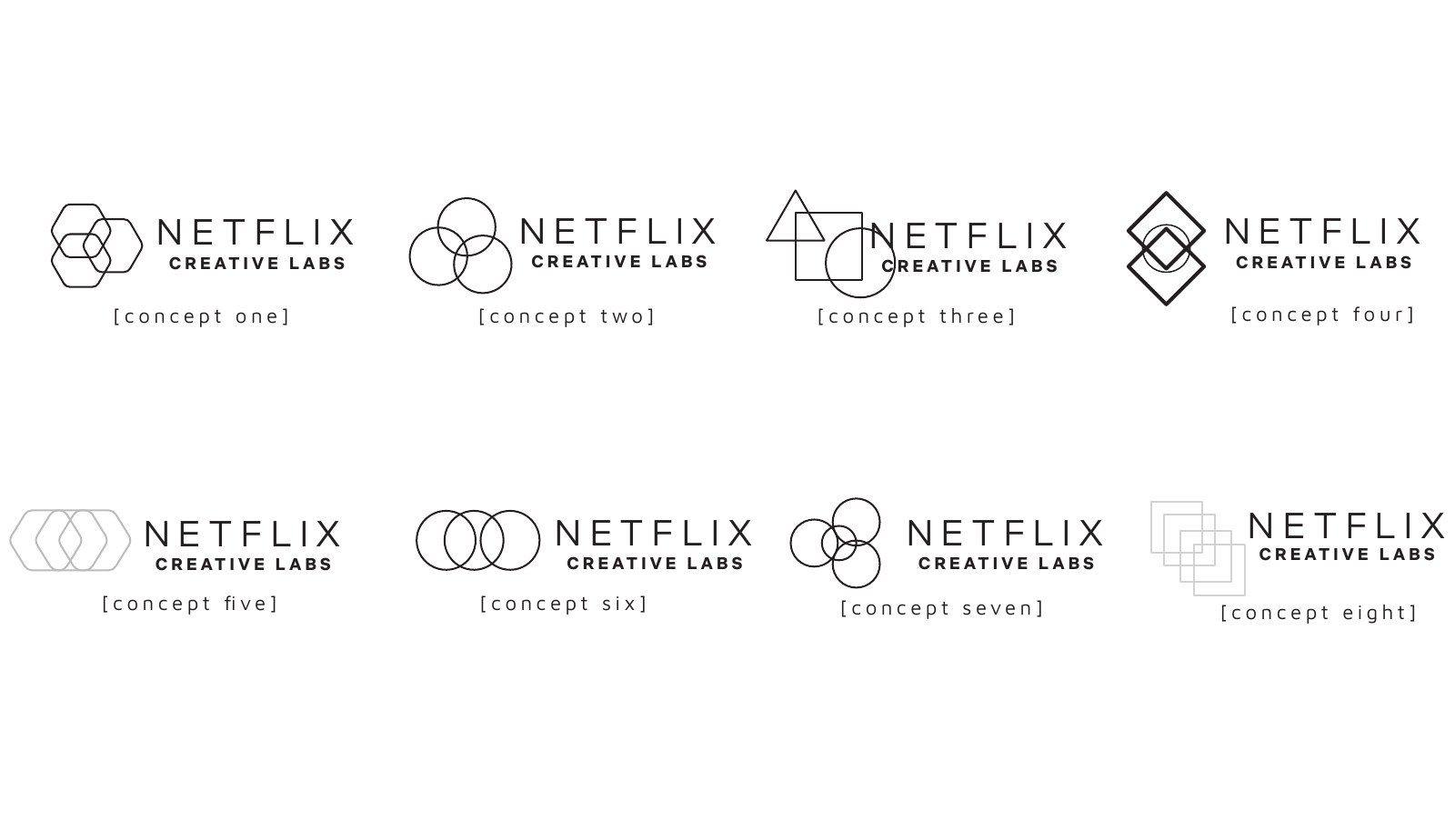
Netflix Creative Labs typographic lockups, concepts one to eightNetflix Creative Labs line marks of hexagons, circles and squares, concepts one to eightNetflix Creative Labs horizontal lockups, concepts one to eight
1 / 3
Lockups 1 to 6: an atom mark with Netflix Creative Labs in blackLockups 7 to 12: the atom mark with Netflix in redLockups 13 to 18: Creative Labs with barcode stripesLockups 19 to 22: hexagon marks with Netflix Creative Labs
1 / 4
Netflix Creative Labs with colour bars, options 1 to 4Gradient hexagon badges, options 1 to 6Atom mark lockups in red and in grey, options 1 and 2
1 / 3
04. Key Outputs

An Identity that helps put a face on an important internal organization
Final Design

Across four rounds of concepts, Therum explored vibrant typography, geometric forms, and subtle nods to the Netflix logo bump. The final direction came from a happy accident, shifting a set of horizontal bars 90 degrees produced a striking echo of the colored bars in the logo animation.
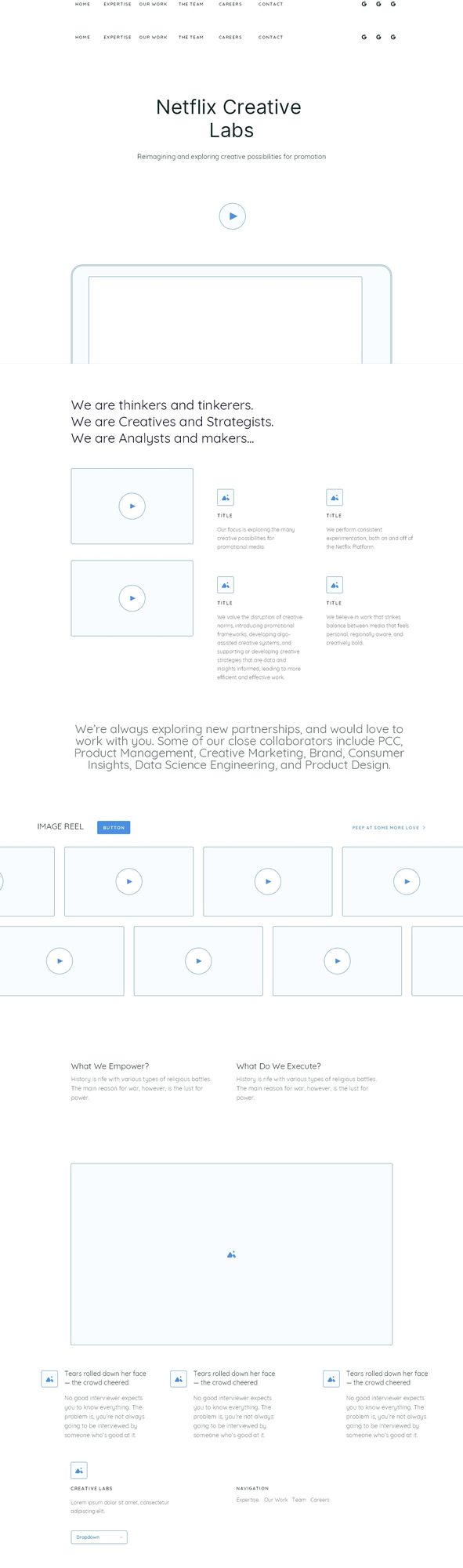
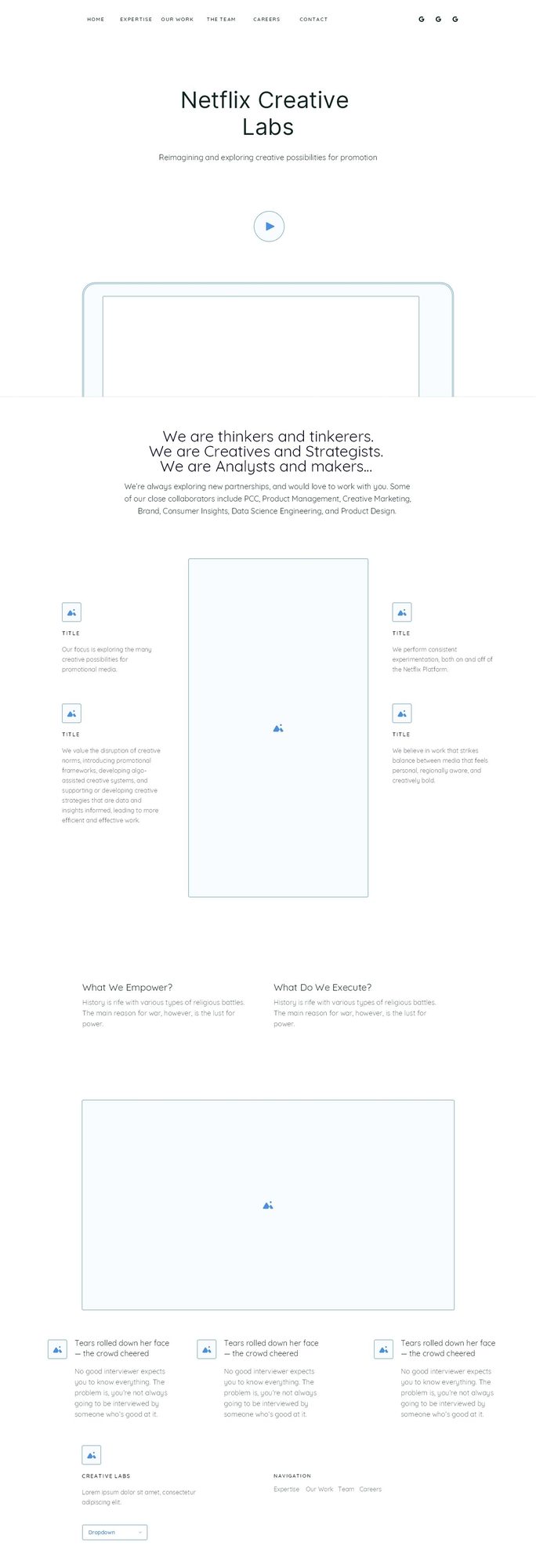
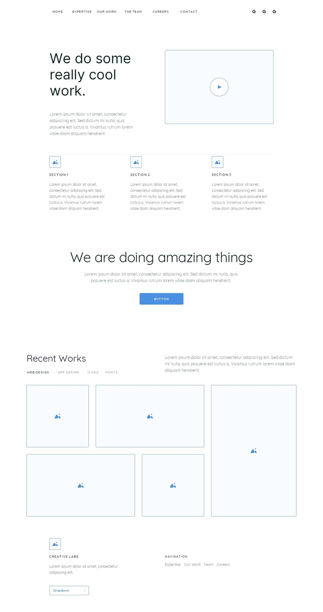
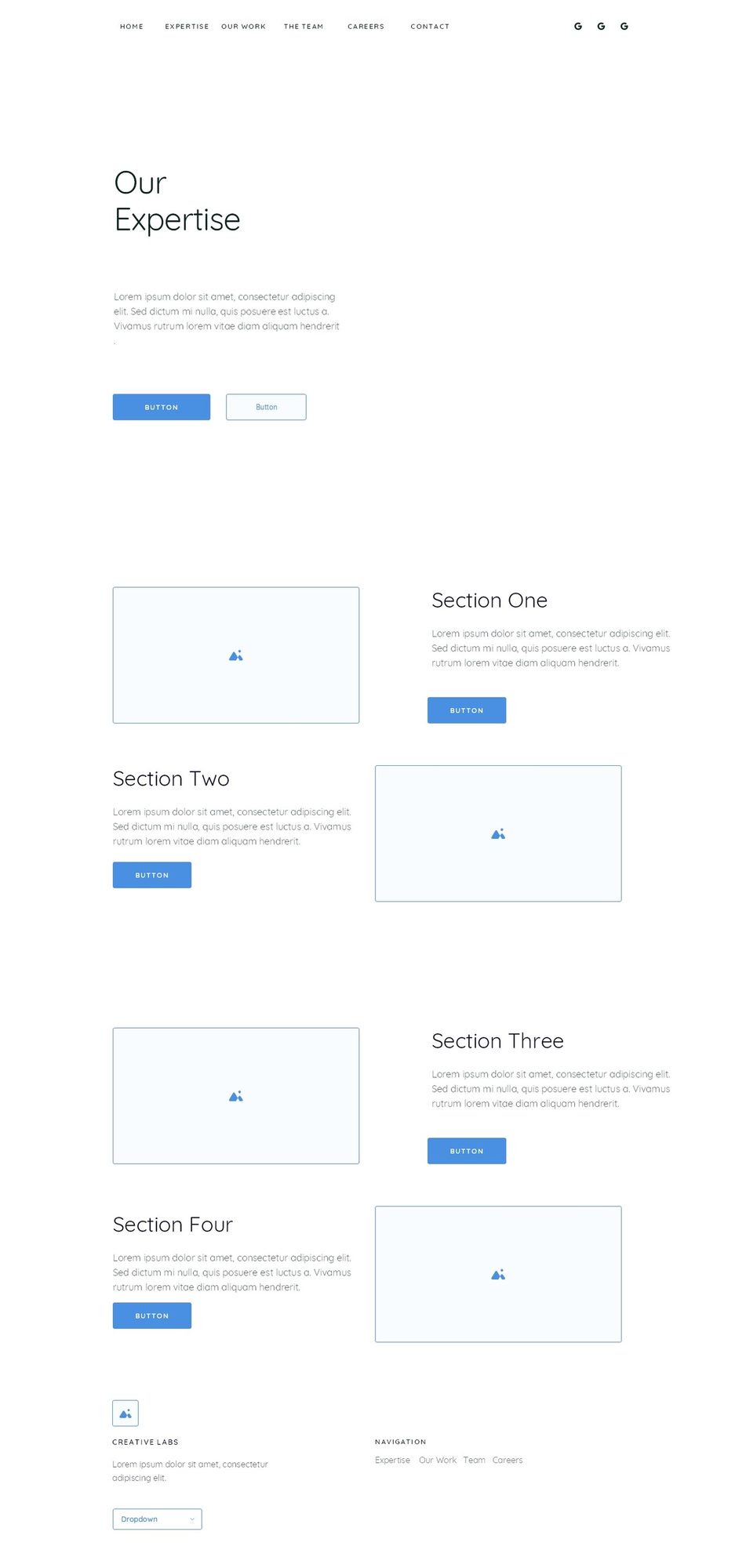
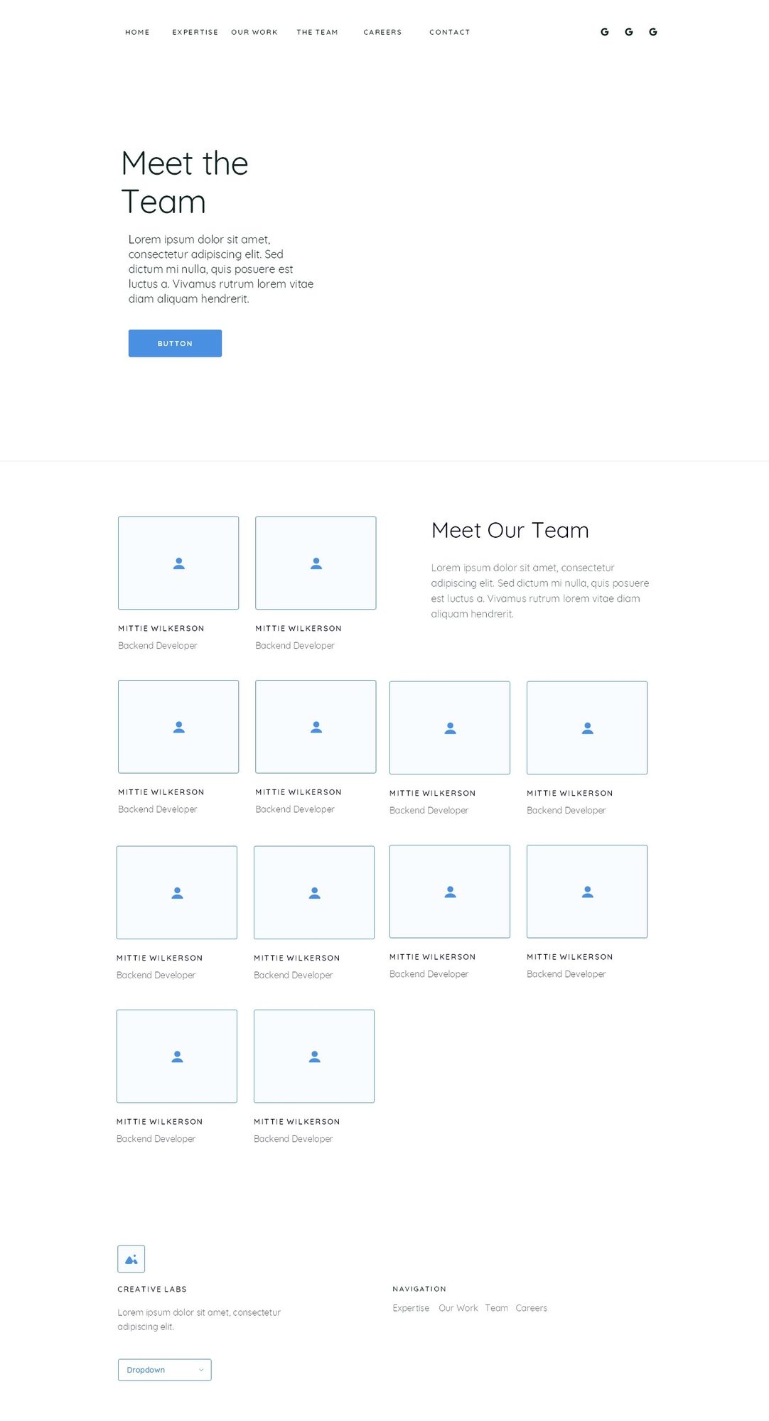
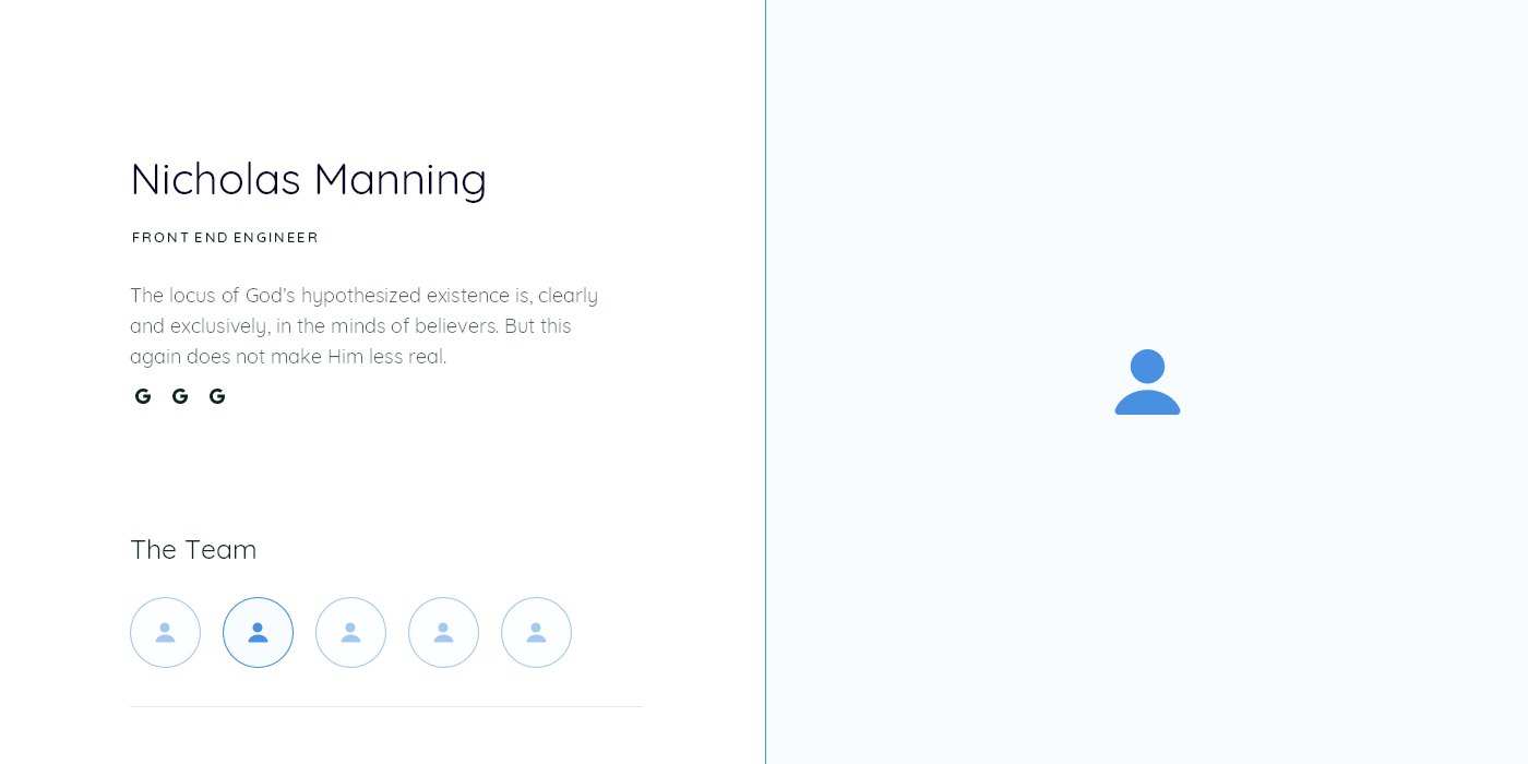
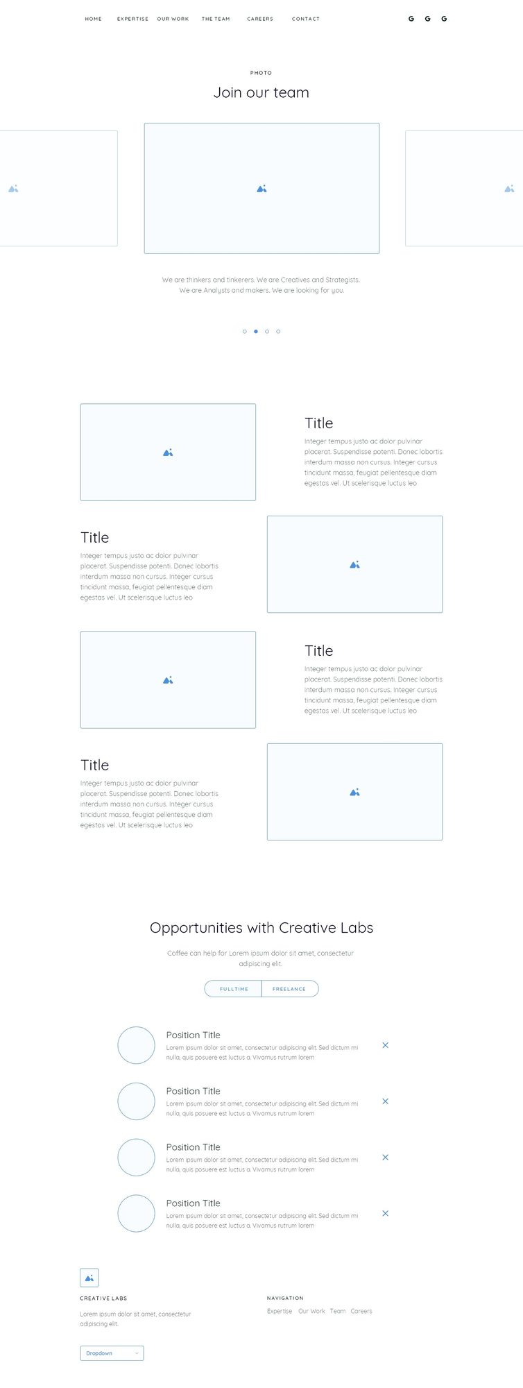
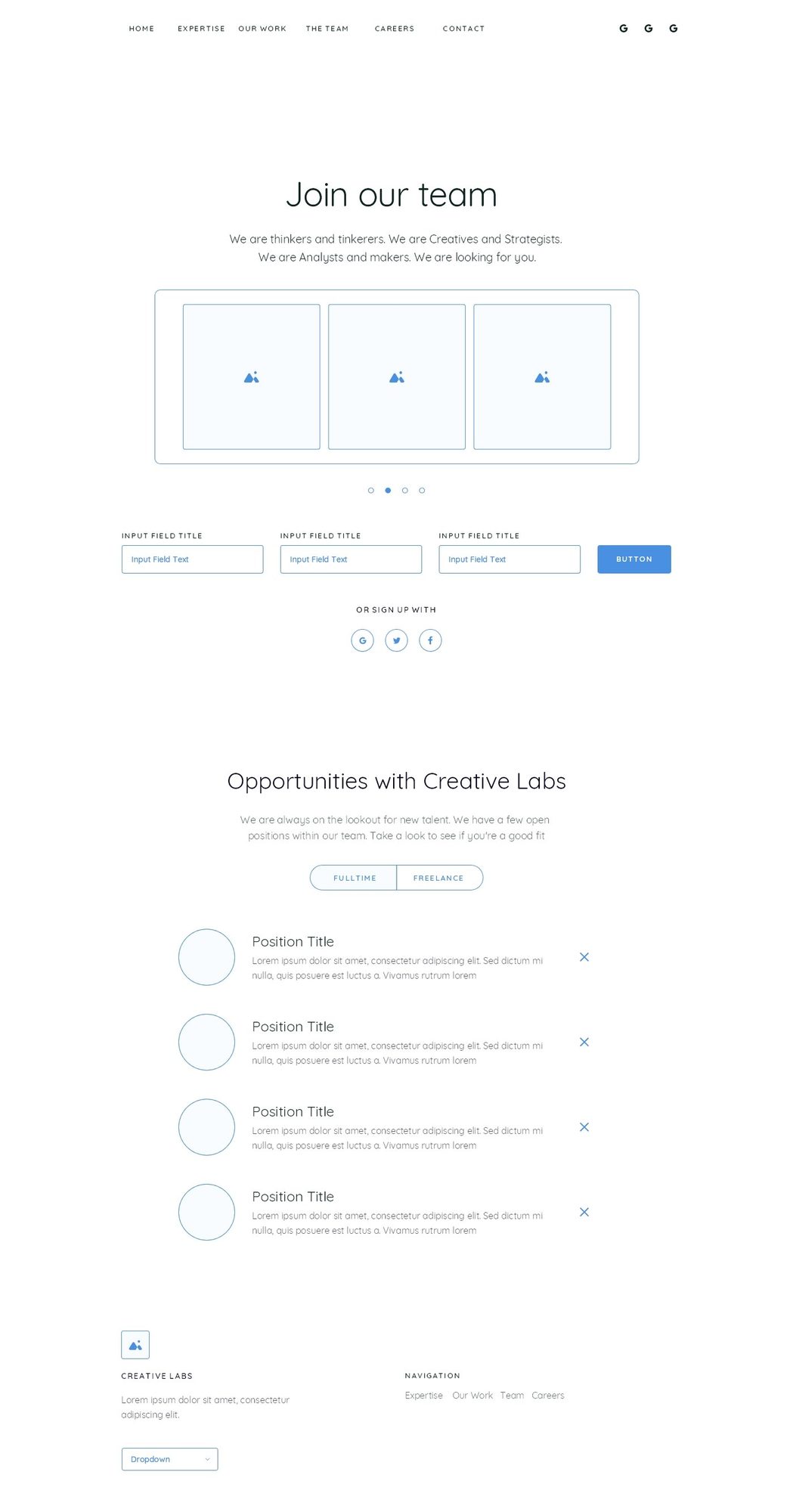
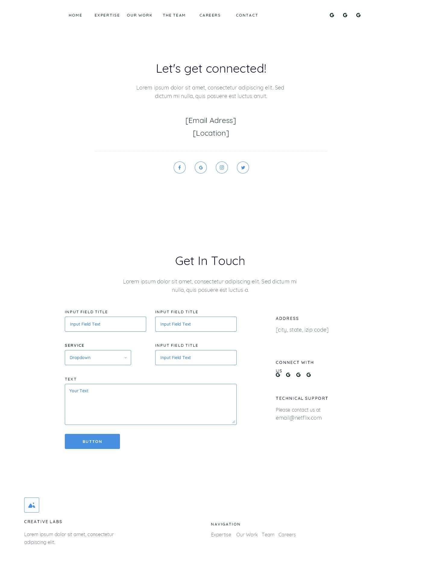
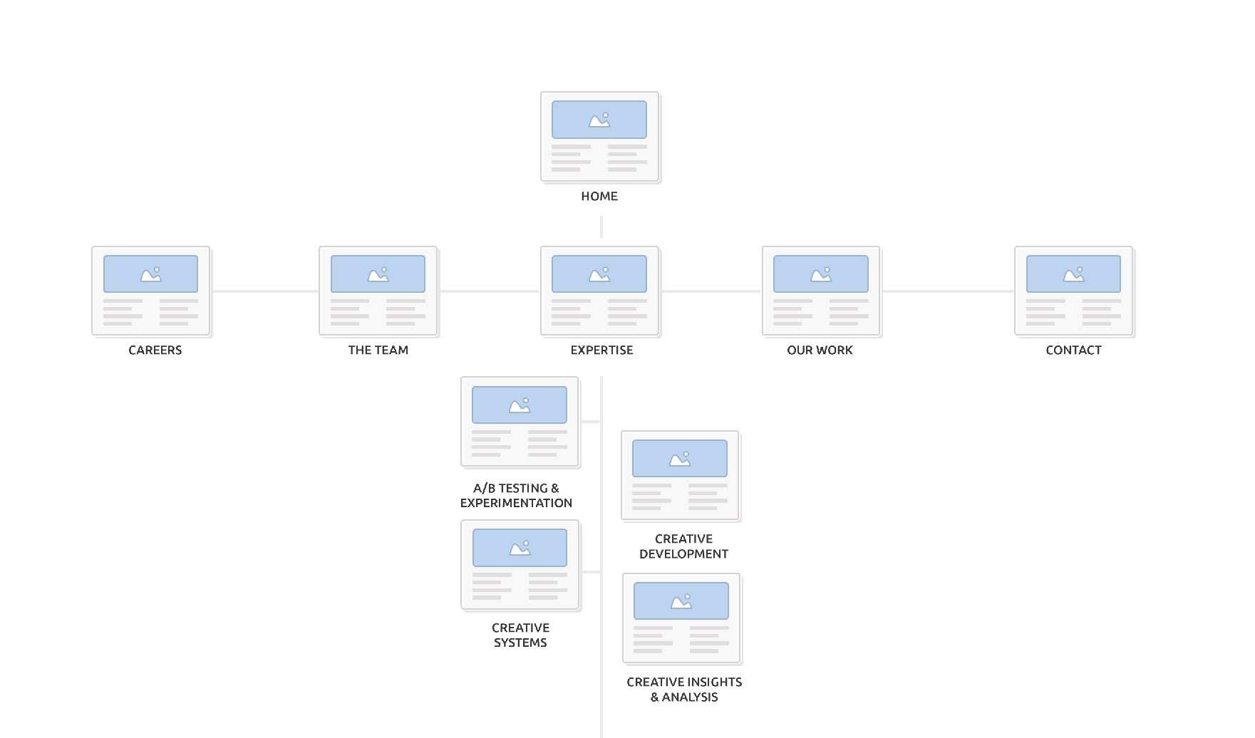
creative labs site, wireframes
Home
Home, continued
Our work
Expertise
Team
Team, profile pop out
Careers
Careers, continued
Contact
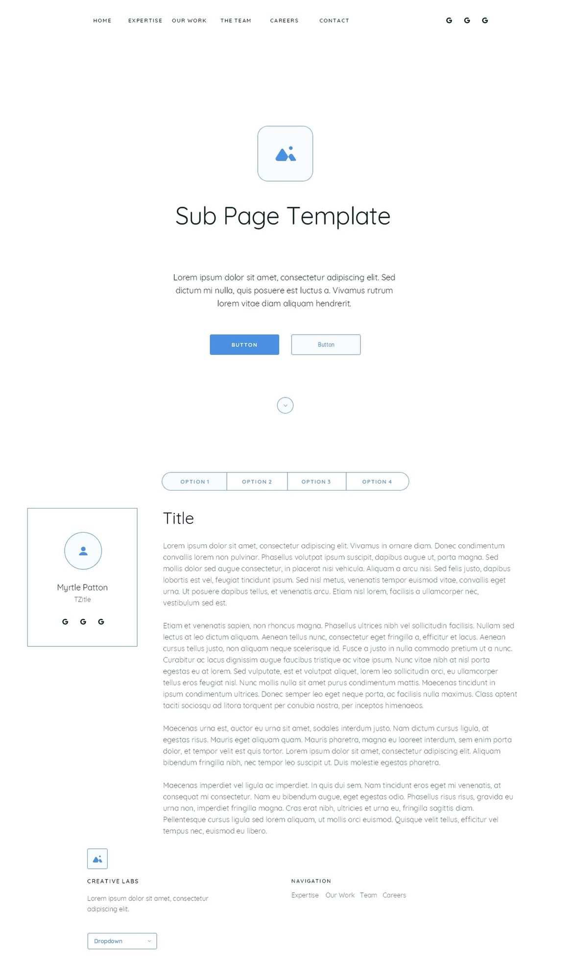
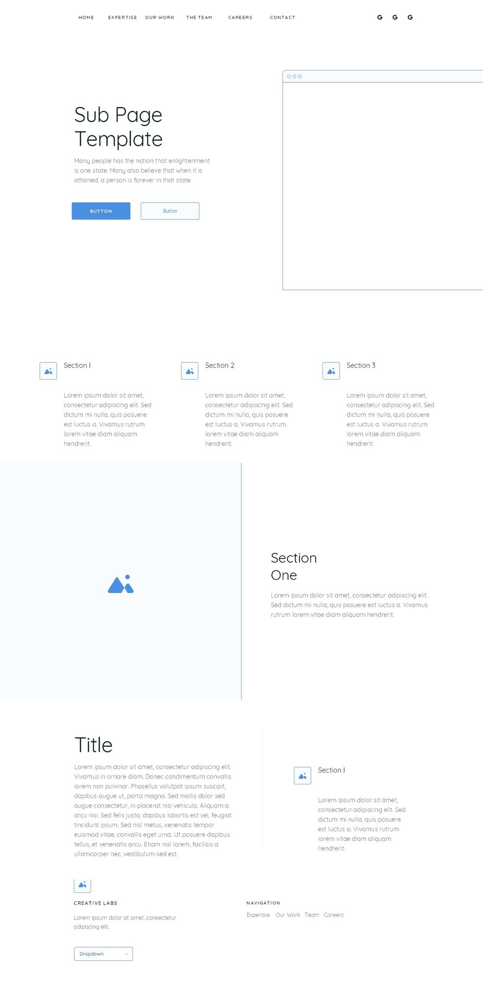
Sub page template
Sub page template, continued
05. The outcome

Created a dynamic logo that created immediate impact for the internal organization.
A/B testingCreative developmentPromotionalStrategy
1 / 4

The result is a dynamic mark that gave the team immediate presence within the Netflix ecosystem.

Creative Labs got a mark of its own, built off the bar shift. It reads against the Netflix logo animation without borrowing the Netflix logo, which is what an internal team needs: recognisable inside the company, clearly not the parent brand.
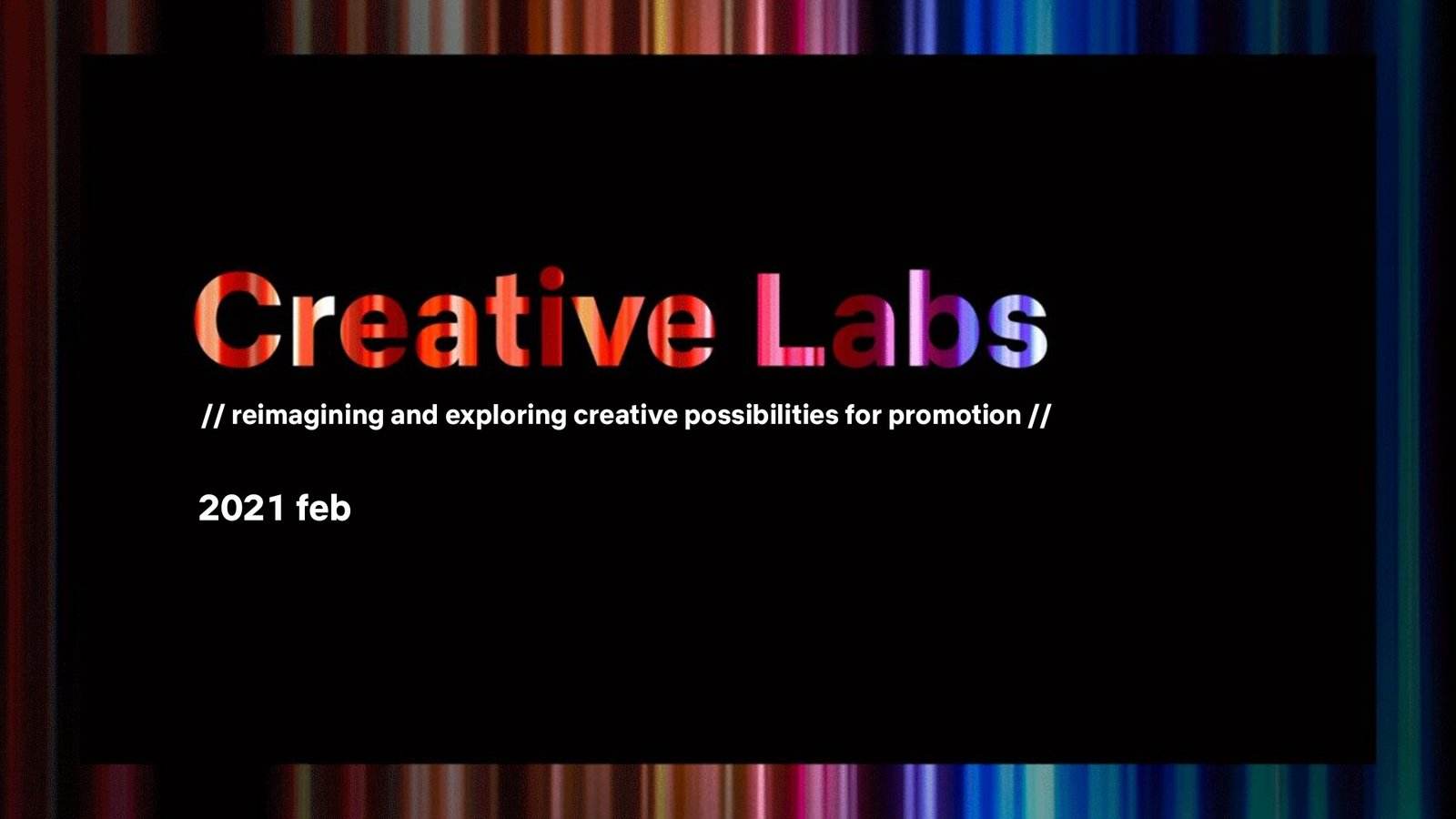
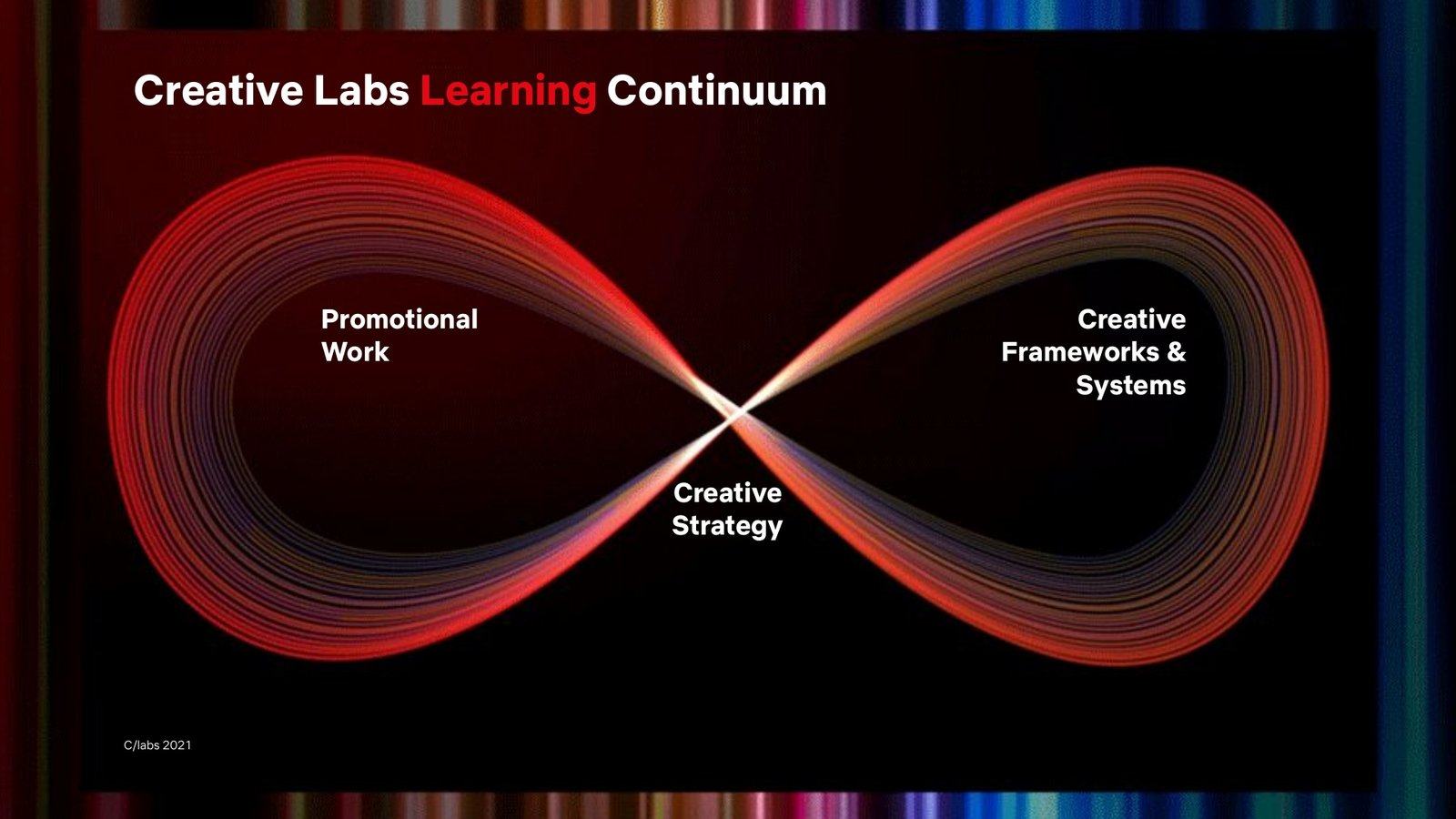
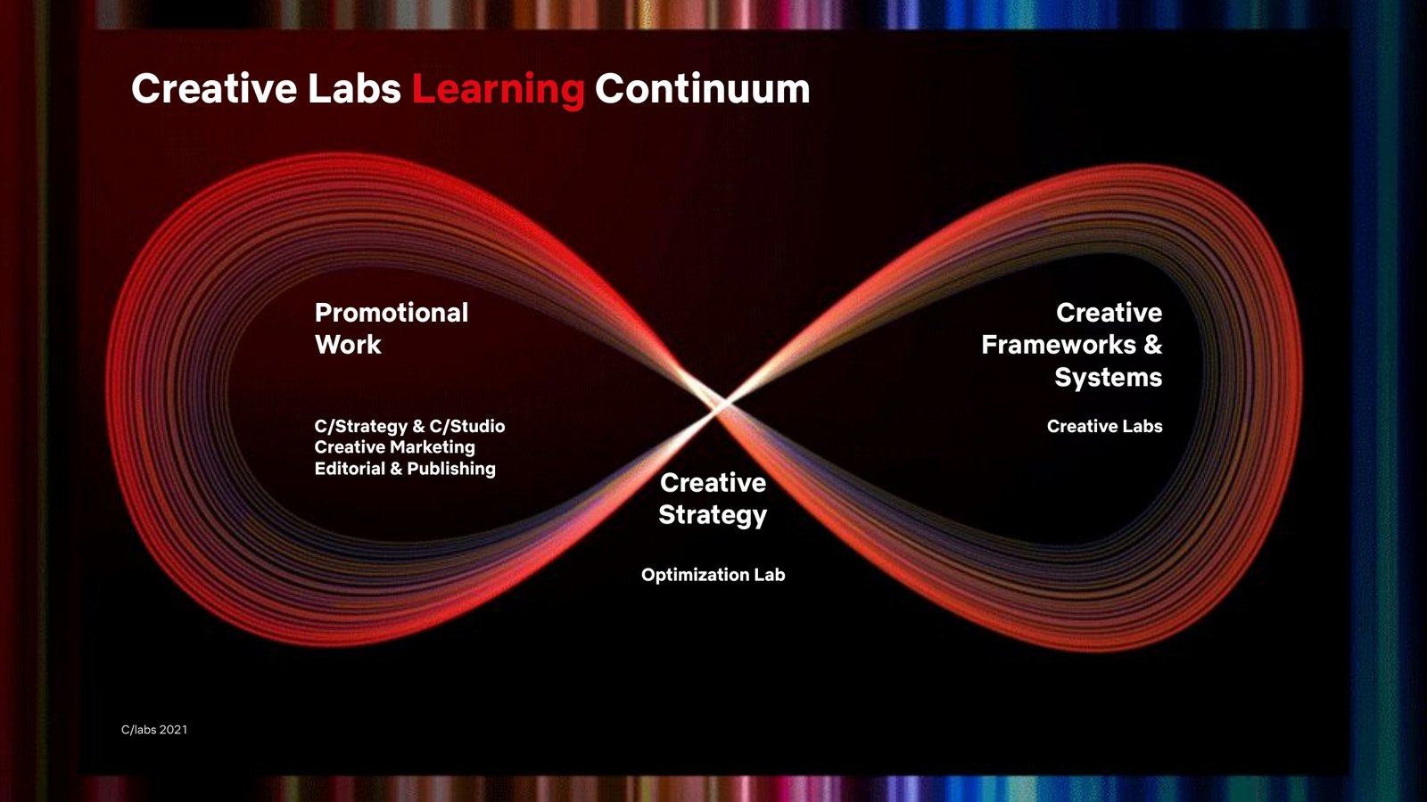
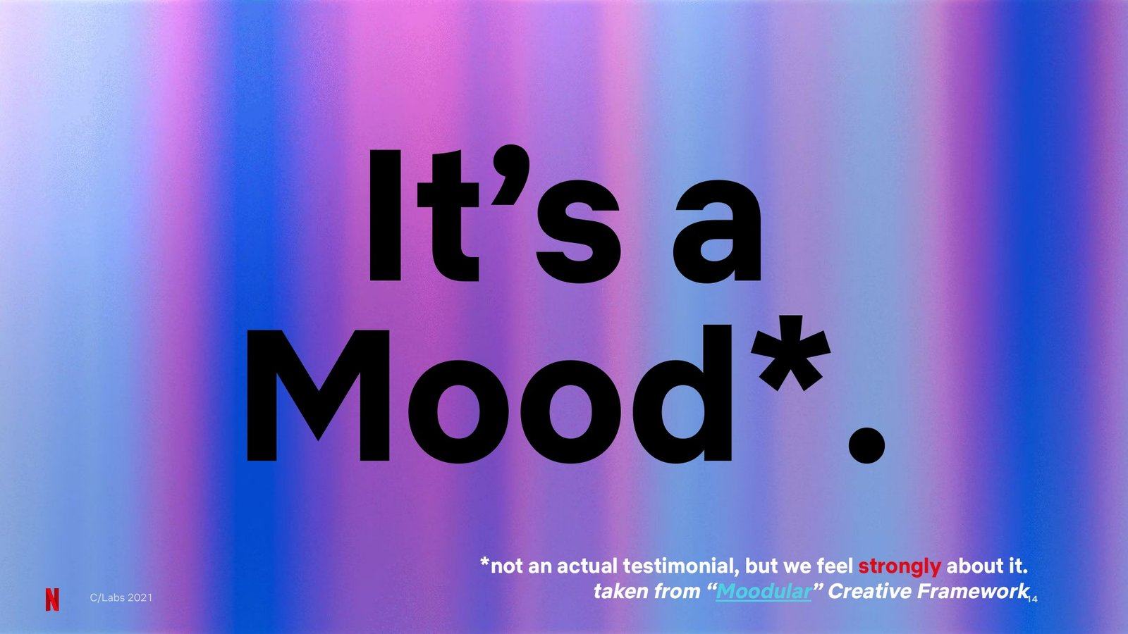
Creative Labs team deck, cover framed by the bar identityCreative Labs team deck, So who are Creative Labs?Creative Labs team deck, the learning continuumCreative Labs team deck, It's a Mood on the colour bars
1 / 4
06. Philosophy

Strategy first, execution second

The Creative Labs site map

Every decision we make is grounded in strategy first, execution second. Creative Labs is an internal group, so its mark sits under the Netflix logo without arguing with it.

Ready to create something amazing?