Mama Photog rebrand
Mama Photog rebrand
Overview
- The wordmark
- The lockup
- Drawing the name
- The identity kit
- The style tiles
- The direction she chose
What We Did
The Outcome
Rebrand a photographer who already had the name
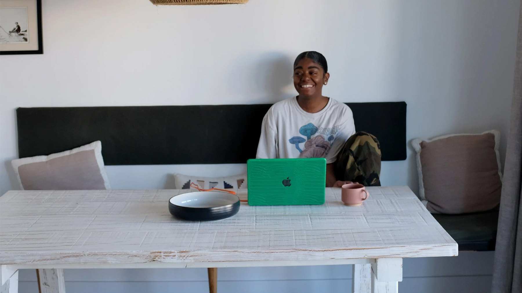
Mama Photog was evolving from a single photography practice into a multi-faceted creative brand with four branches: Mama Photog (personal), Mama Photog Brand, Creative Mama Home and Glow Black Girl Glow. This is the personal one, the brand that carries her own name.
The challenge was to reimagine her identity system so each entity could stand on its own while still feeling connected under one cohesive visual universe. So the brief was a rebrand in the proper sense rather than a logo on its own: it had to end with something she could run herself.
Ran the rebrand end to end, from the board to the finished files
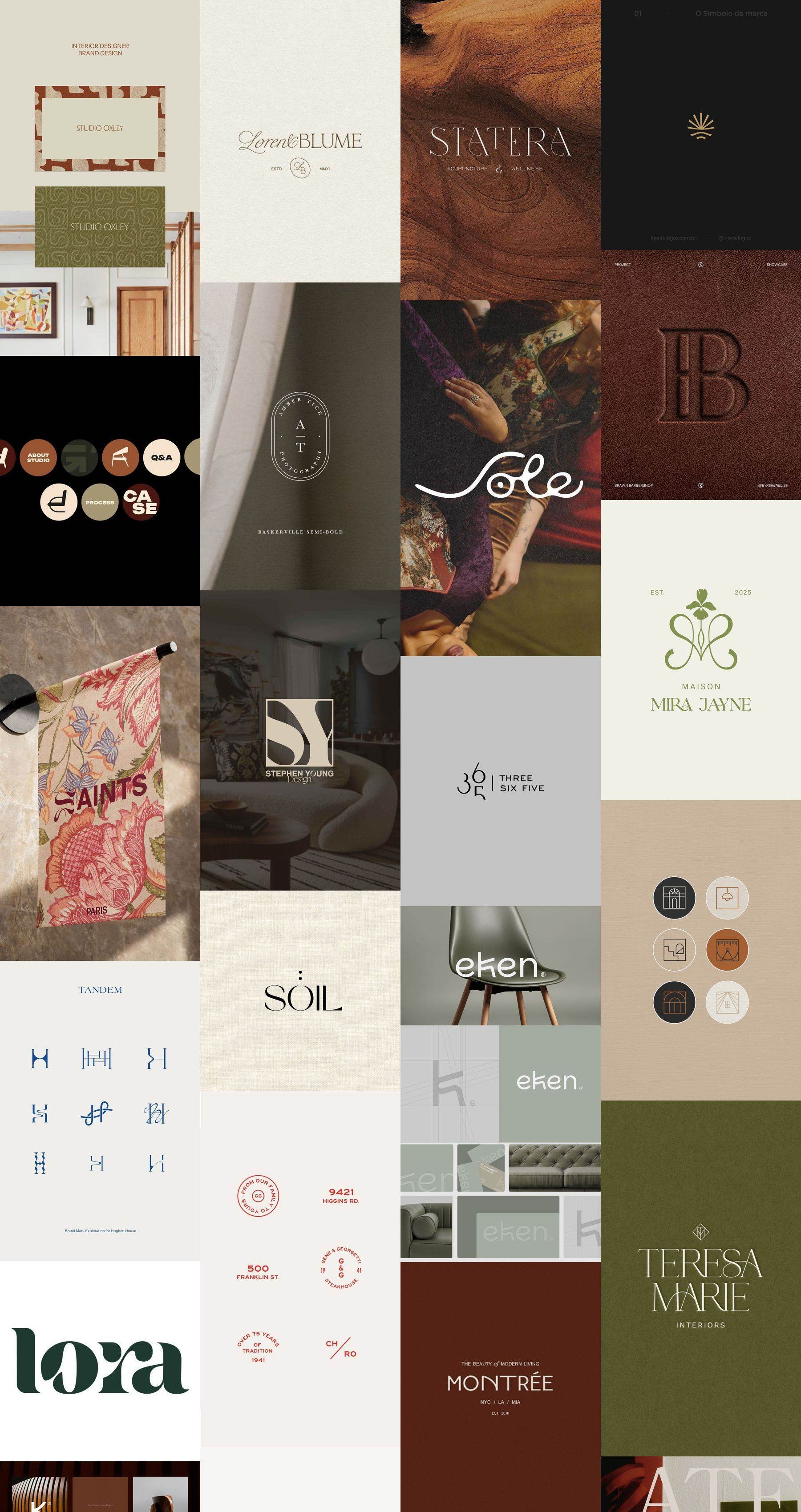
Therum led the creative direction, brand identity, and visual system development across all four verticals, partnering closely with Mama Photog to uncover what made each branch distinct. For her personal brand we built the moodboard with her, drew the logo rounds, set the style tiles, then produced the final identity and handed it over. The moodboard lived on Pinterest, and what it kept pulling toward was not photography at all: interiors studios, small-batch makers, monograms in high contrast serifs, warm neutrals. That is what set the type for this brand.
Draw the name every way it will go
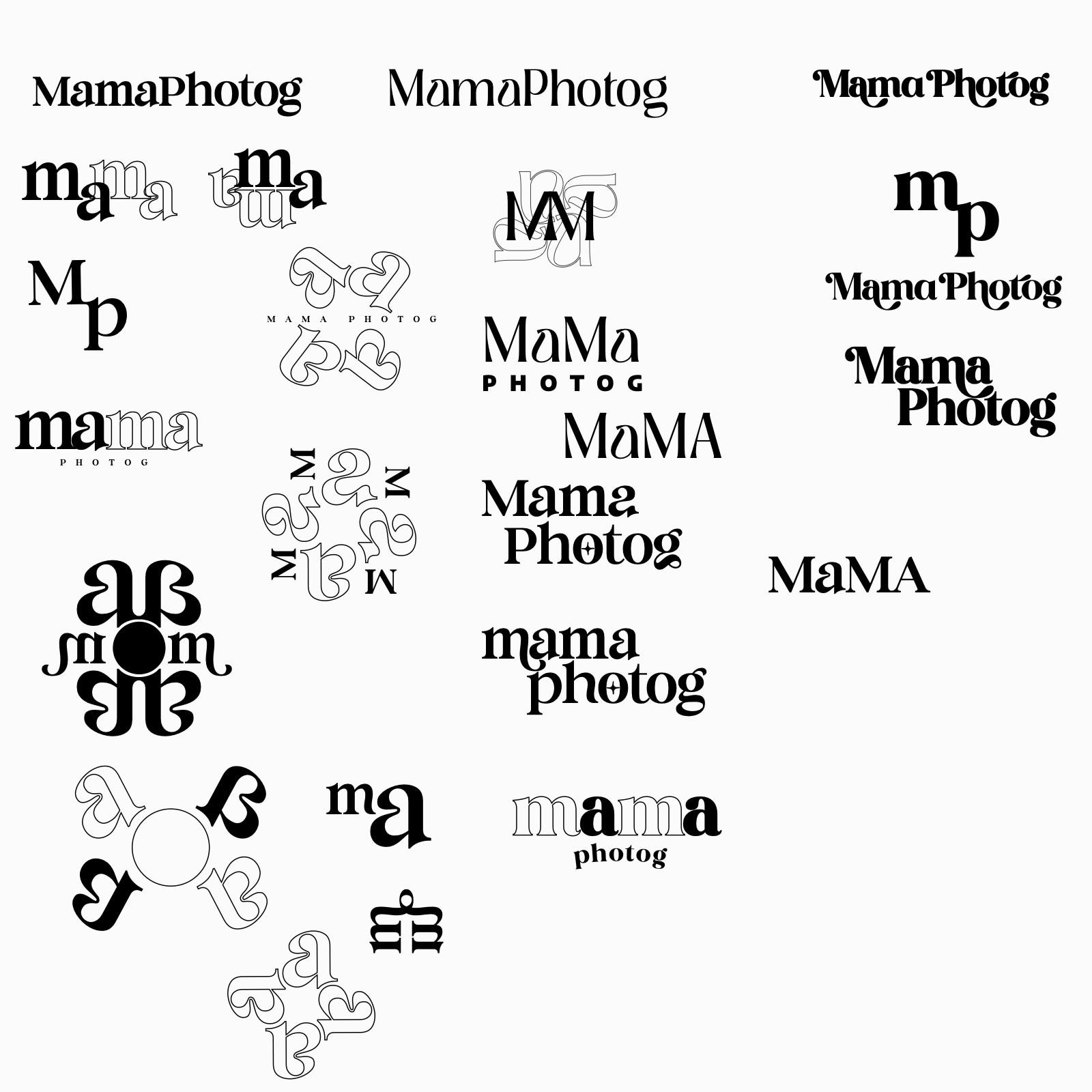
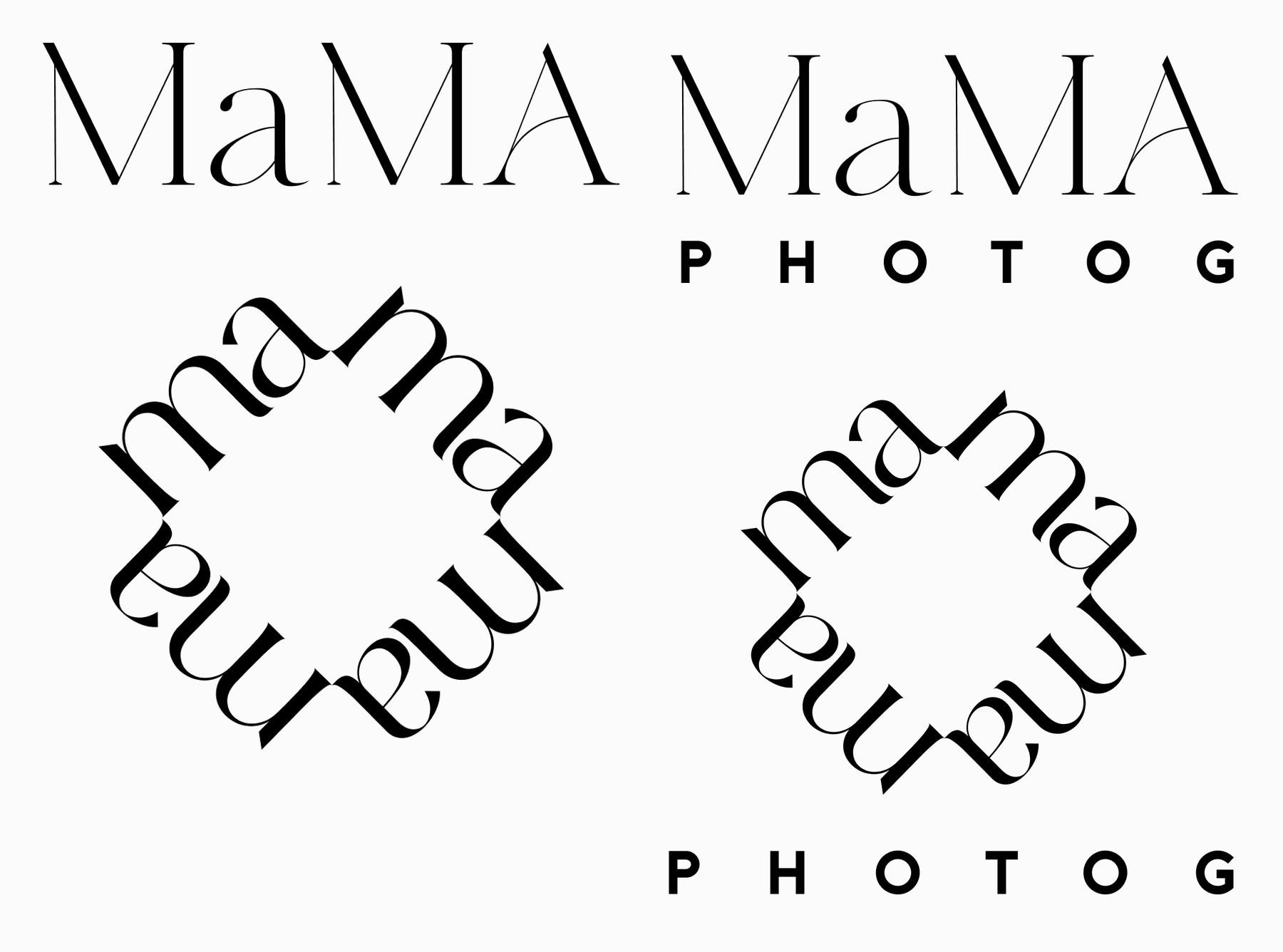
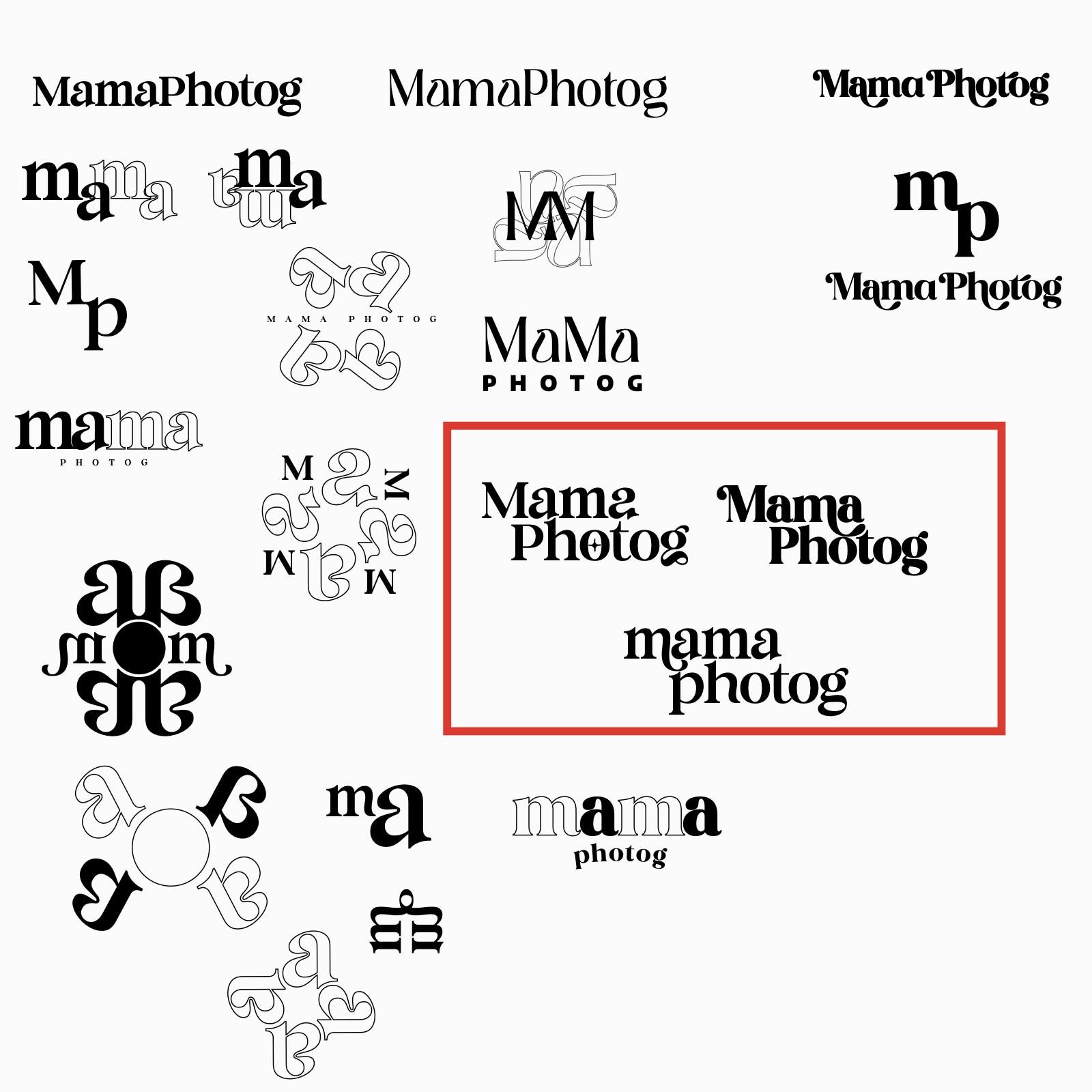
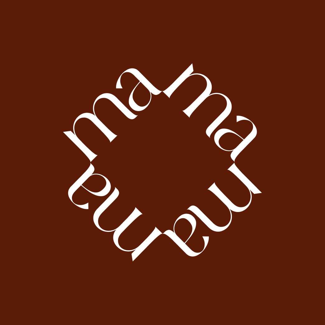
We began with an in-depth brand audit and visual discovery process, analyzing how her audiences engaged across lifestyle, wellness, and culture spaces. From there, we designed a unified identity system built around flexibility: minimal yet expressive, grounded yet radiant. Each sub-brand received its own visual language, color direction, and tone of voice, linked by shared type, spacing, and emotional warmth. Mama Photog set solid as one word. A stacked Mama over Photog. An mp monogram. And the one that went furthest: ma rotated four times around a centre until the word stops reading as a word and starts reading as a pattern. Three directions were boxed on the sheet for her to pick from.
Both worlds side by side, so the choice is a comparison
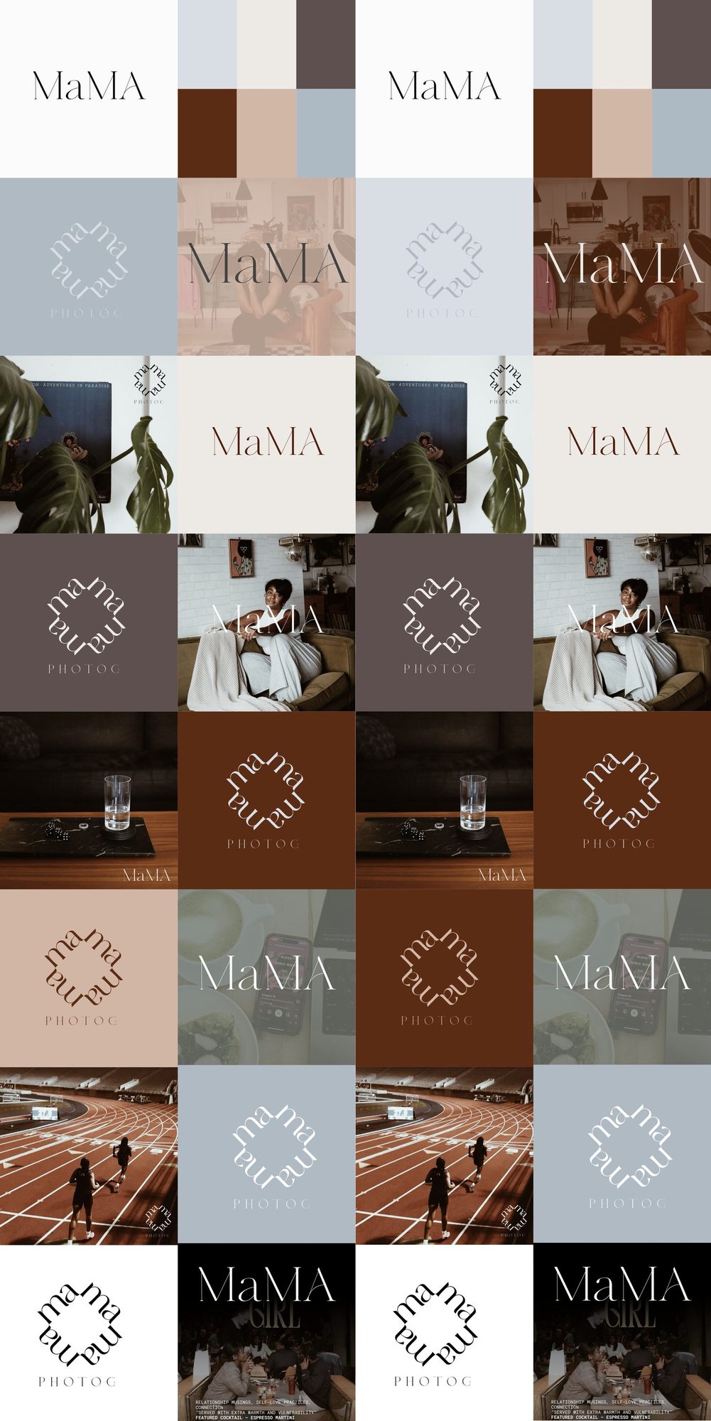
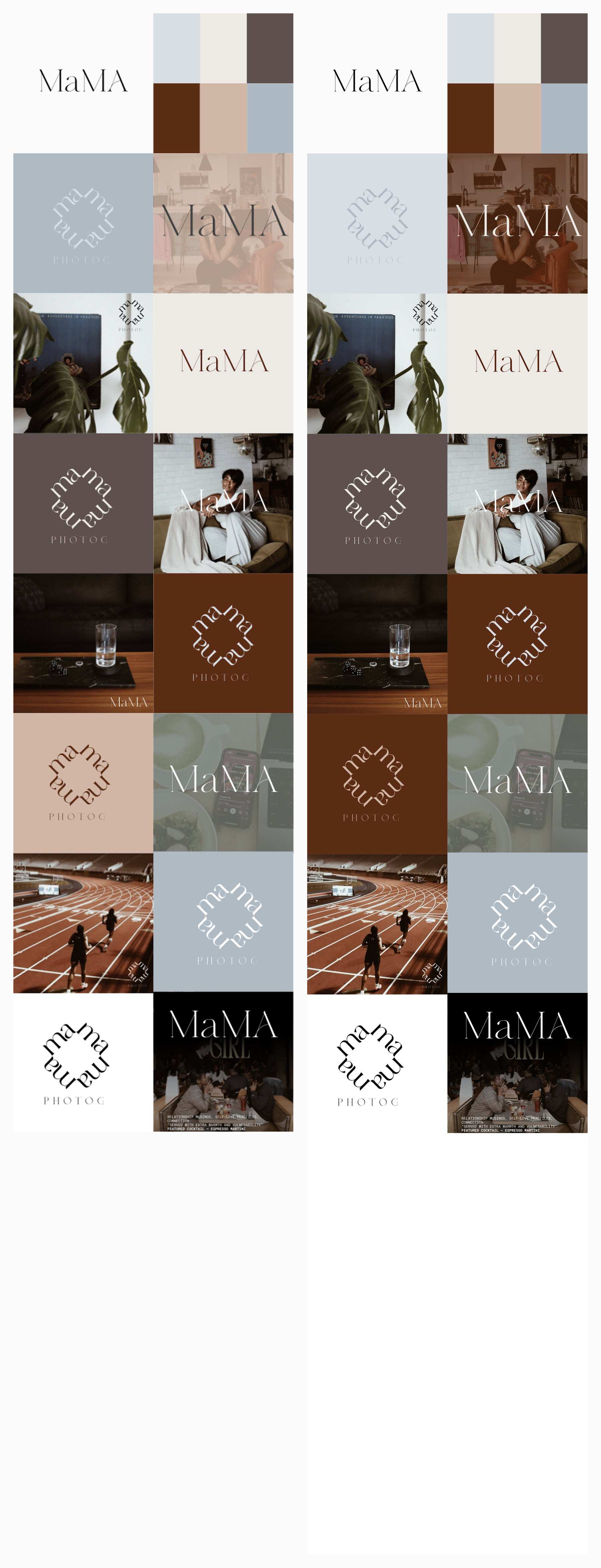
Version one runs cool: pale blue, blush and brown. The second warms the same grid up and carries the rotated mark through it. Each tile pairs the mark with the photography and the fields it would live on, so the decision is about a whole world rather than a logo on its own.
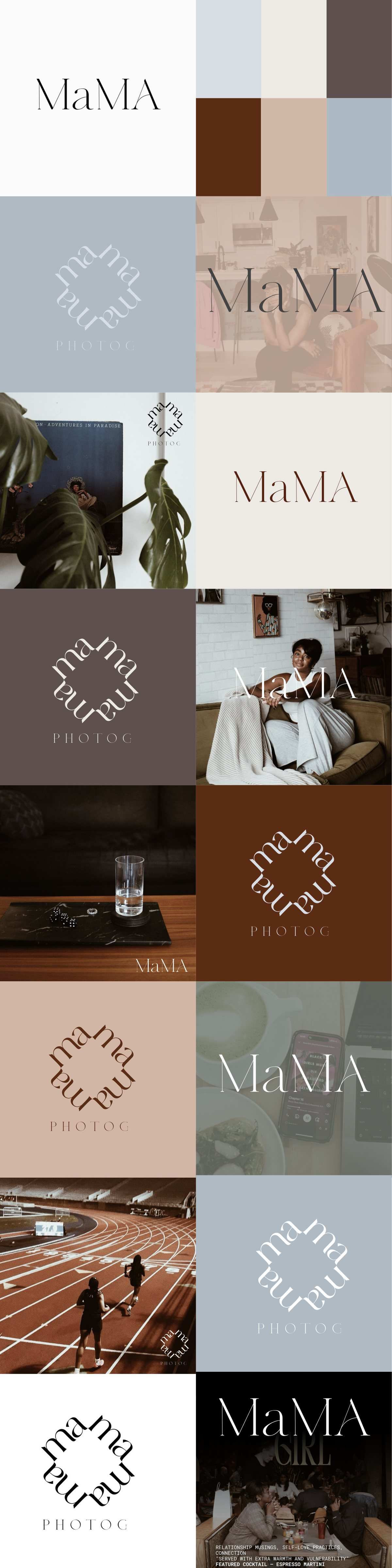

Sage, tan and a deep oxblood
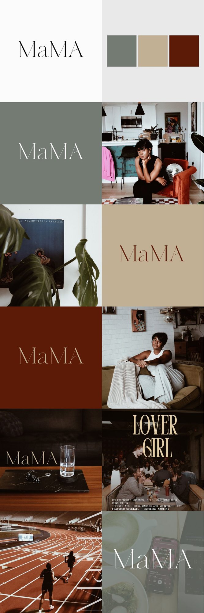
The final palette is sage, tan and oxblood, warm and low in contrast so a photograph never has to fight it. The tile also sets which pictures belong next to the mark, which is the part that keeps a personal brand consistent once the designer is gone.
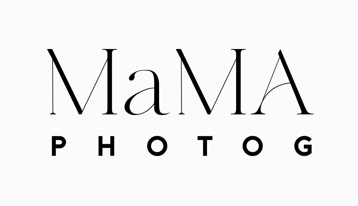
A wordmark, a lockup, a pattern mark and the pattern lockup
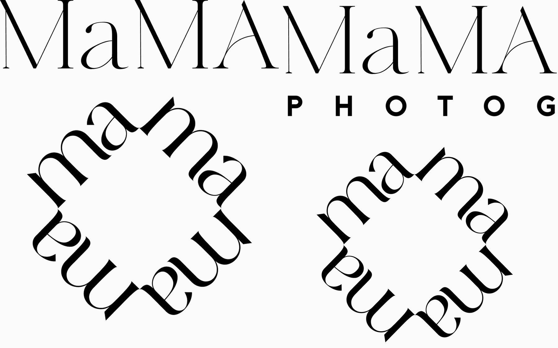
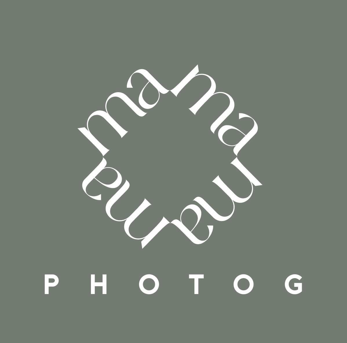
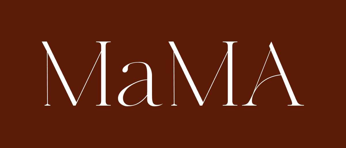
Across the four branches we delivered a full brand strategy and multi-entity identity system, a logo suite and visual guidelines for each vertical, updated brand messaging and copy alignment, social and digital collateral for the rollout, and system templates for future content and expansion. MaMA as the wordmark. MaMA over PHOTOG as the primary lockup. The rotated ma arrangement as a pattern mark for where the name is already known, and the same pattern with PHOTOG underneath for where it is not. Each was delivered in a black set and a white set, in three file formats, so the same mark holds on a print, on a watermark and on a profile picture without being redrawn.
She left with a system, not a logo
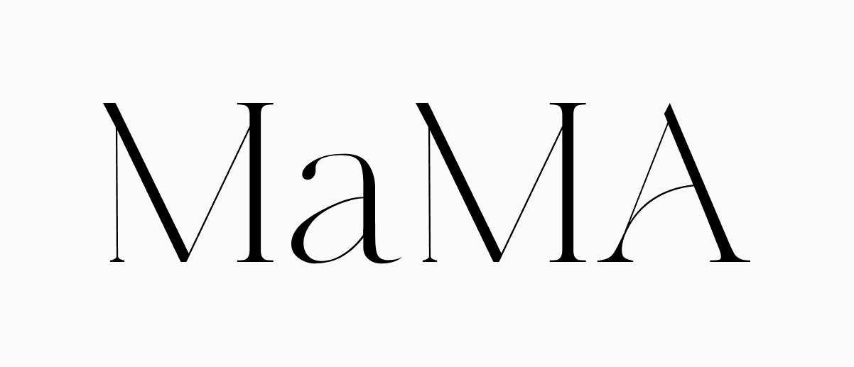
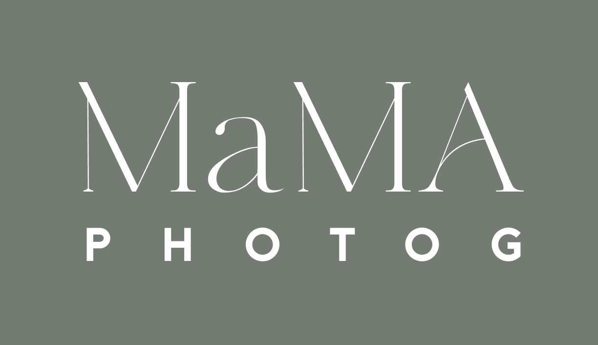
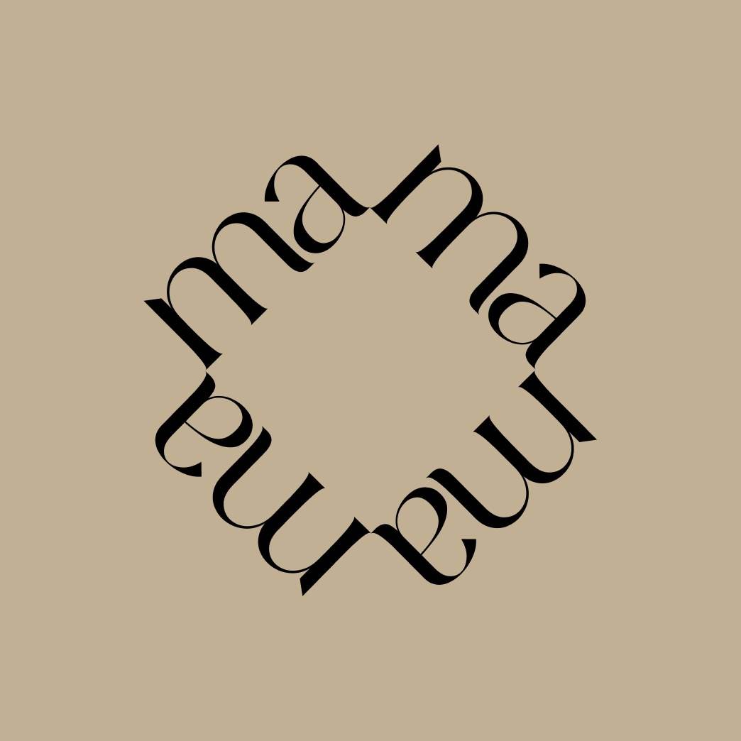
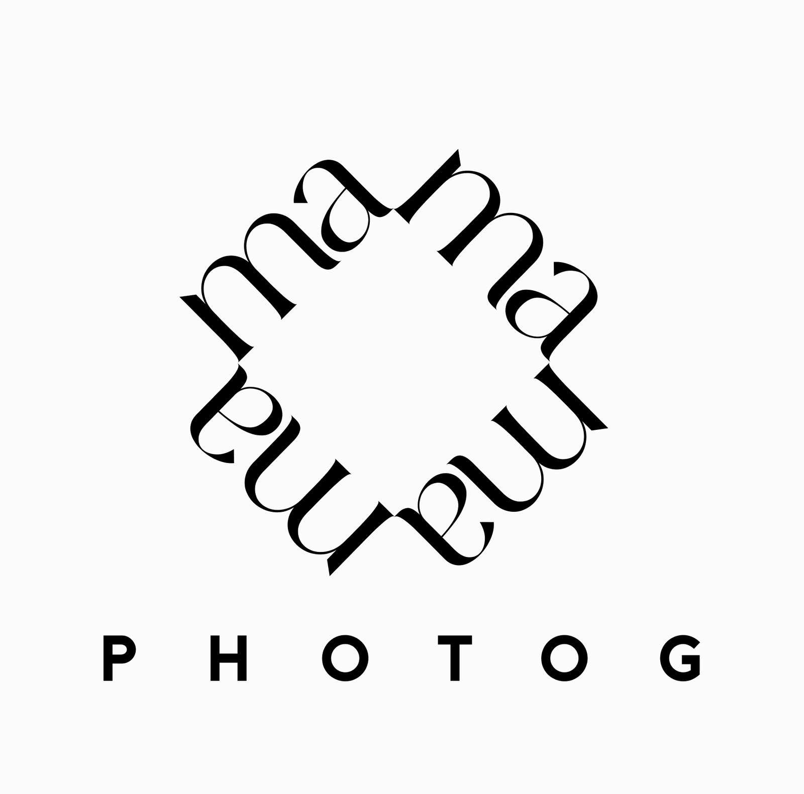
Four marks in black and white sets, three formats, and the style tile that says which photographs and which colours belong next to them.
The rebrand repositioned Mama Photog as a cohesive creative ecosystem rather than a single business. Her photography, wellness projects, and home ventures now share one brand foundation, strengthening recognition, expanding collaboration opportunities, and creating new pathways for growth.
The rotated ma that came out of the exploration is the part that does the most work, because it gives her a mark that reads at a glance and still carries her name inside it.
Everything else in the kit hangs off that one drawing: the pattern, the pattern lockup, and the way the wordmark sits when the pattern is doing the talking.
Designing for evolution, not just execution
This project embodies Therum’s belief in designing for evolution, not just execution. We don’t separate creative identity from human identity: we build systems that grow with the person behind the brand, ensuring every branch feels authentic, aligned, and alive.