Case Study
Lobos
Lobos sought to expand its visibility across paid media, motion, and large-scale placements. The goal was to unify its creative presence while maintaining the sophistication and authenticity of the brand across multiple channels.
01
Take a growing tequila brand with a clear identity and push it across every channel — paid, social, video, and out-of-home — without losing what makes it work
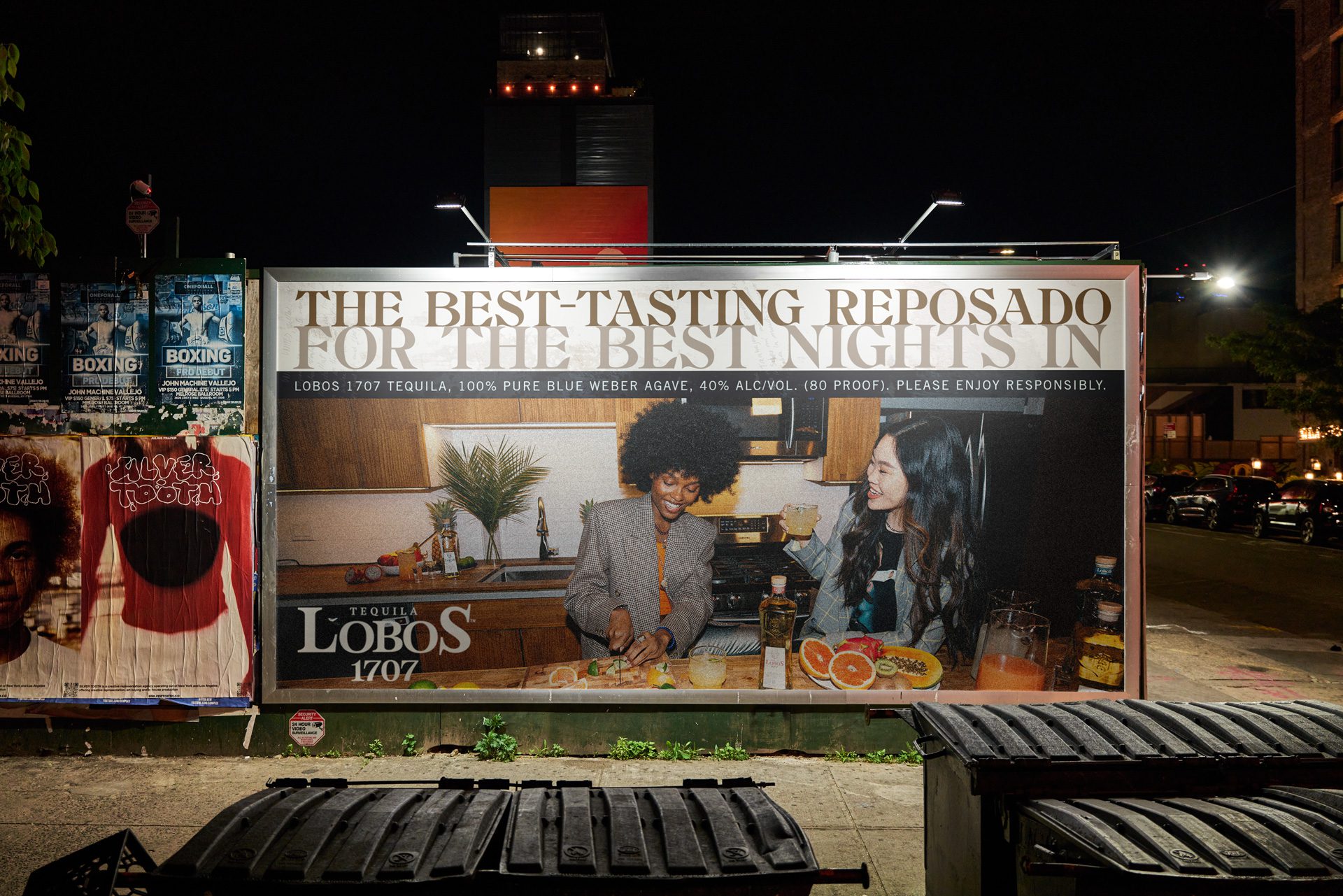
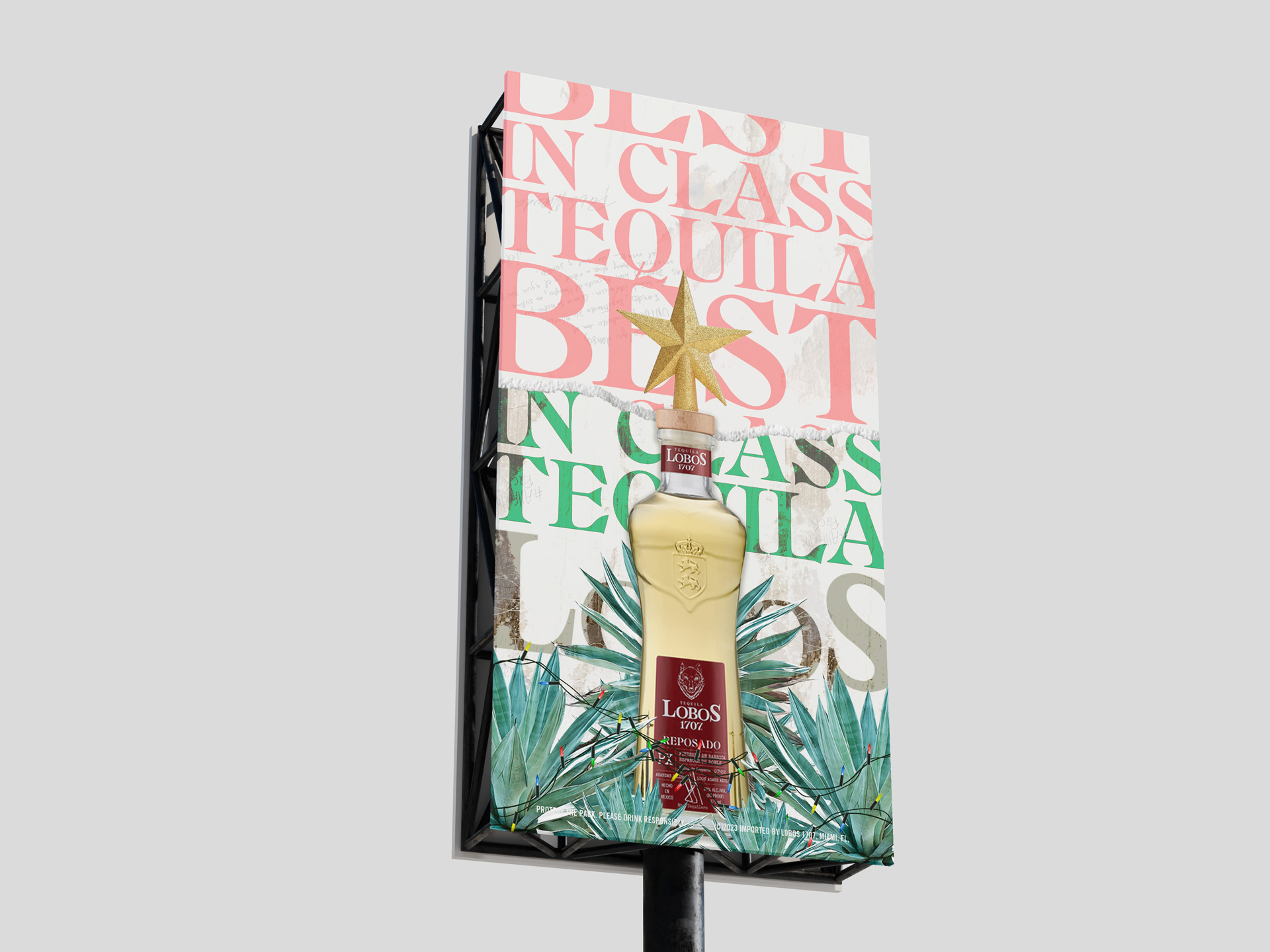
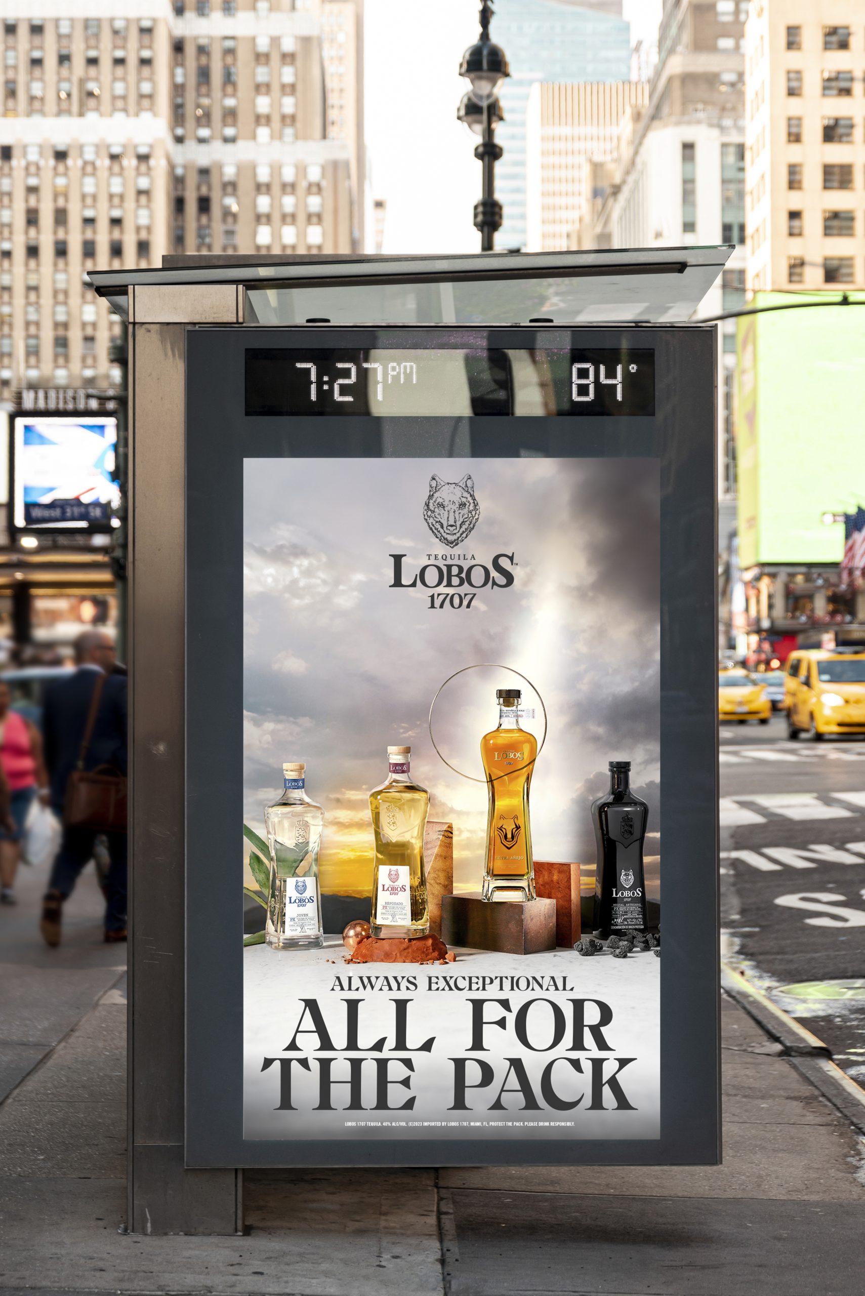
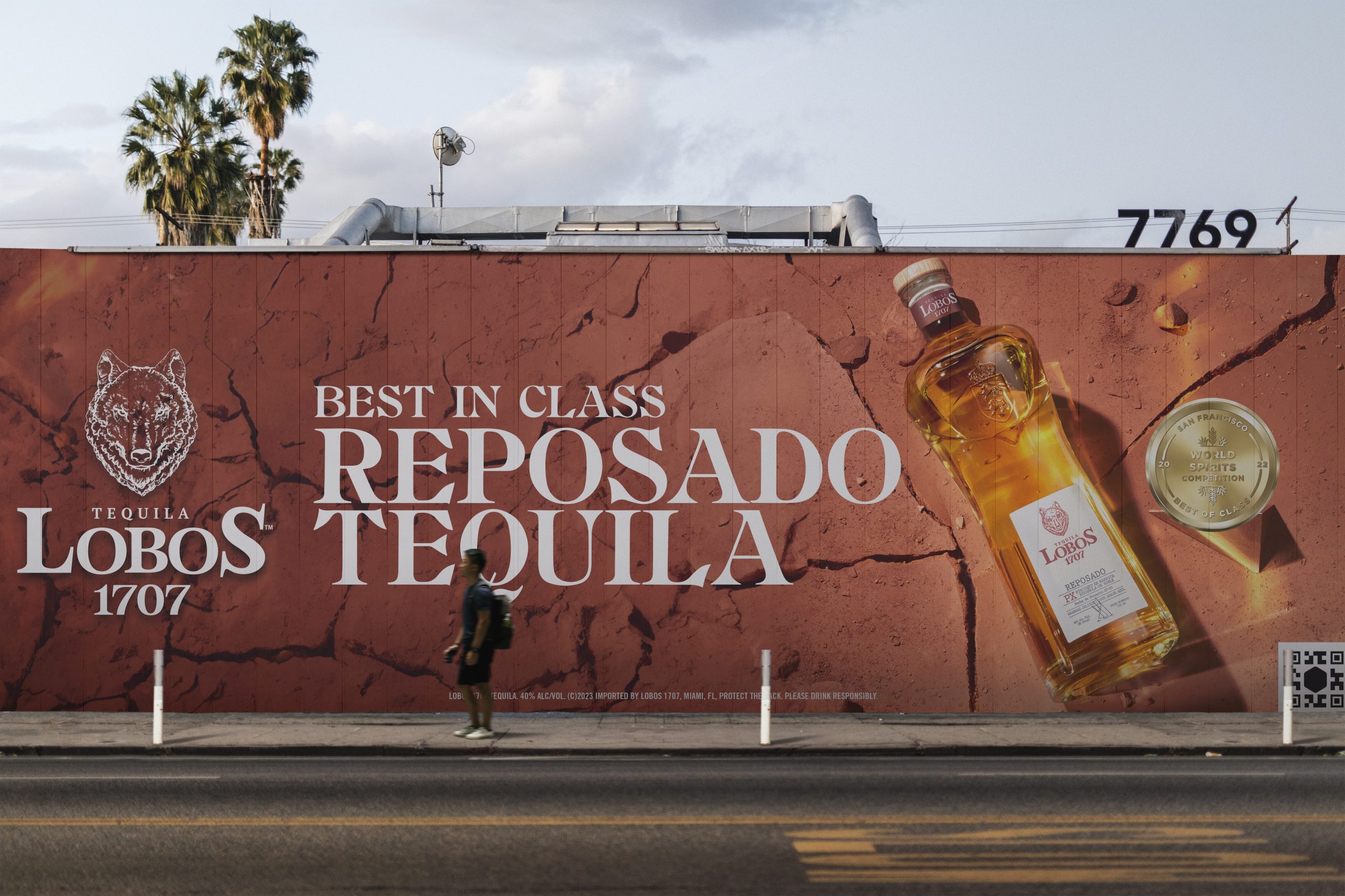
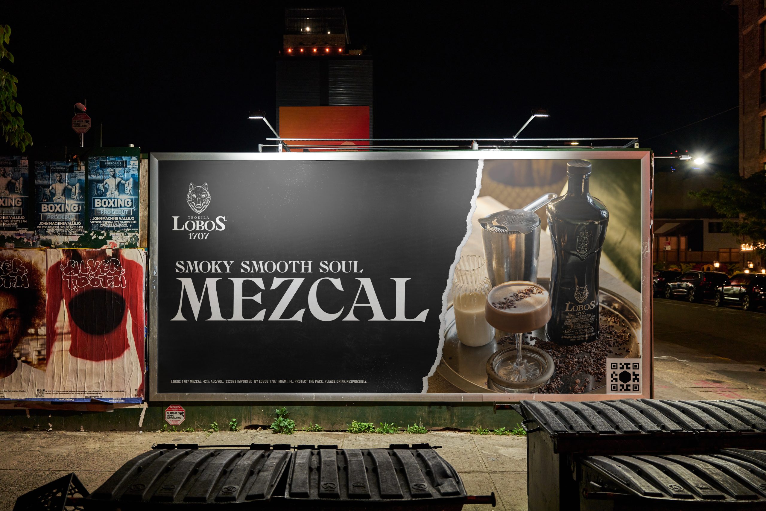
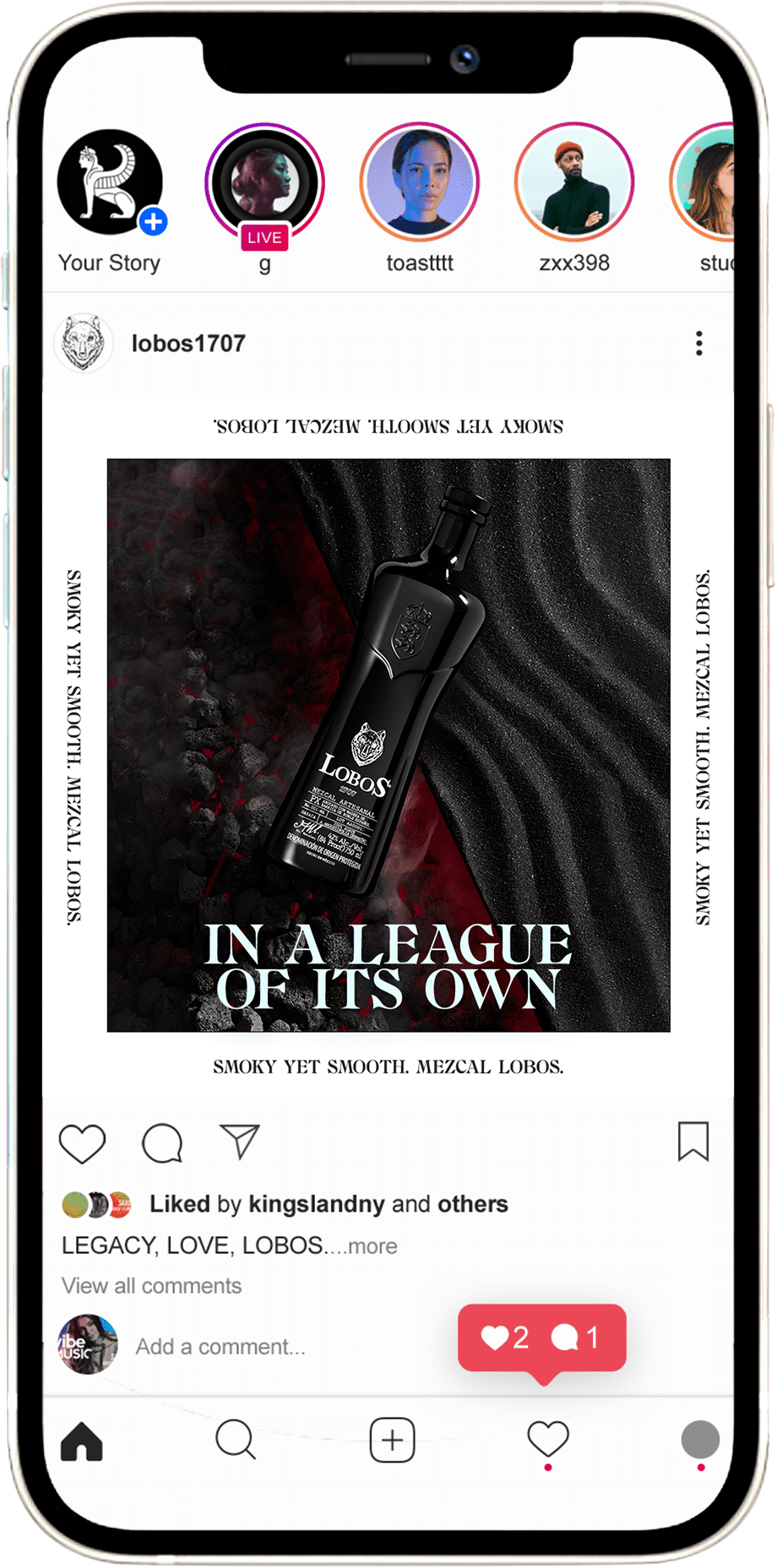
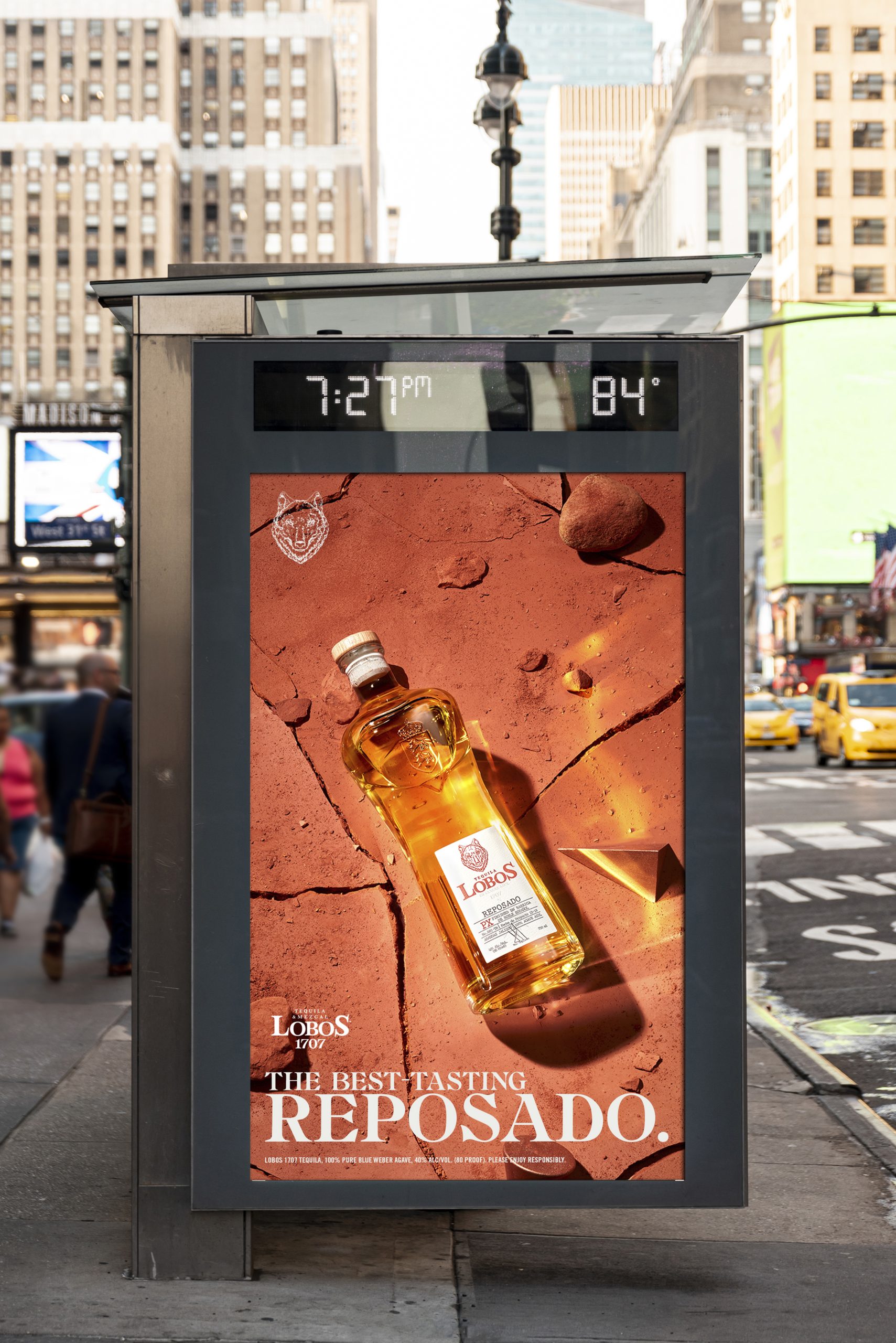
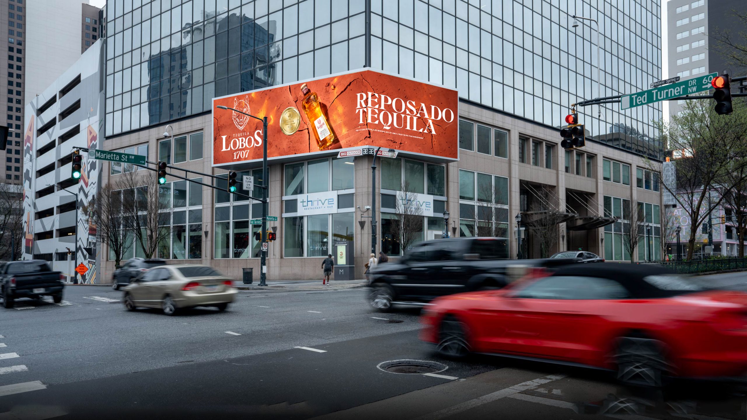
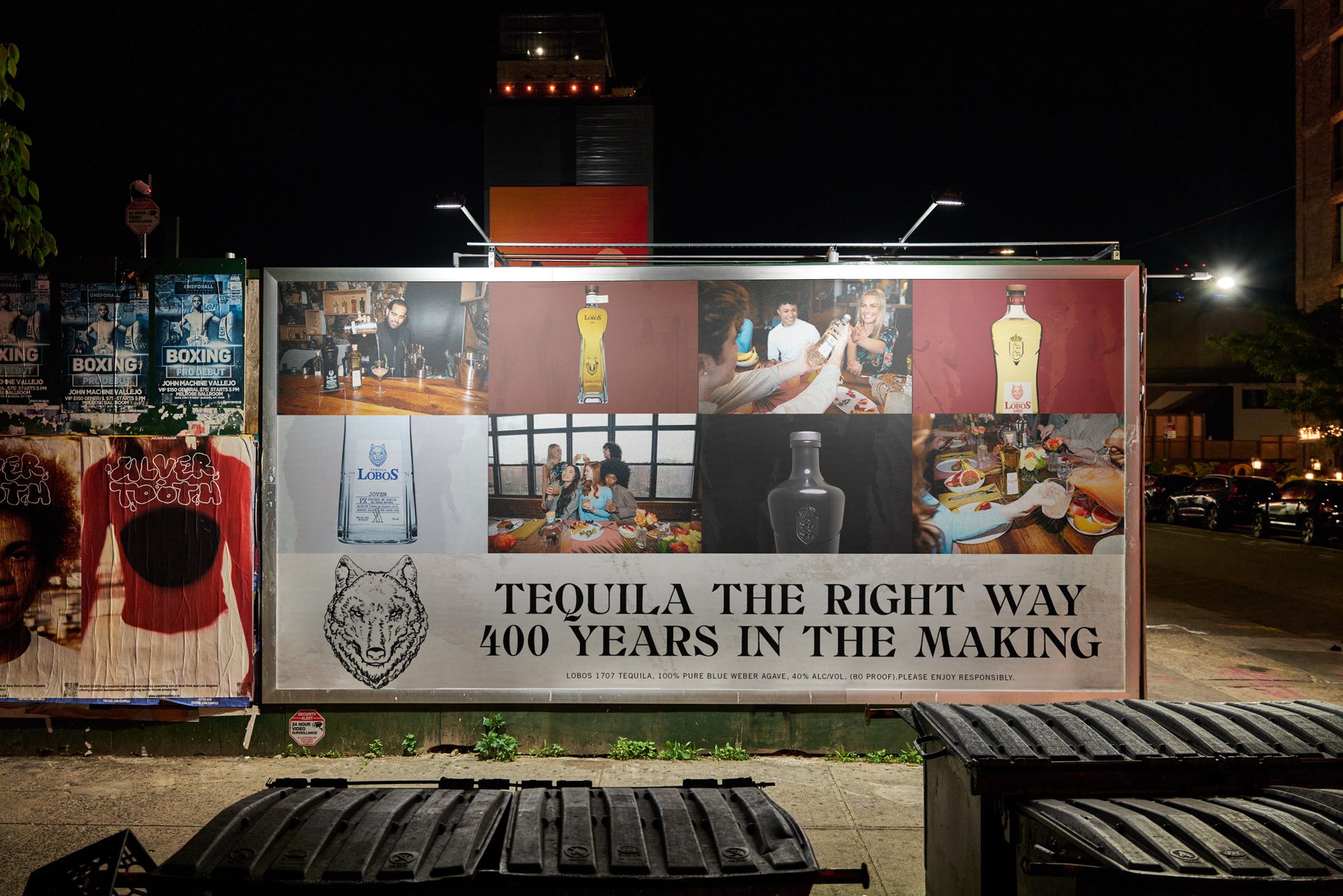
Lobos 1707 is not a generic celebrity spirits play. It has a specific visual character — warm, textured, rooted in craft — and a product range with distinct SKUs that each carry their own story. The ask, through our ongoing partnership with Kingsland, was to build out the full creative system: paid ads, social templates, animated video assets, and OOH executions including a New York City billboard. The scope covered every major touchpoint a growing spirits brand needs to compete at the next level.
02
Creative direction, design, and motion across Lobos' full channel mix
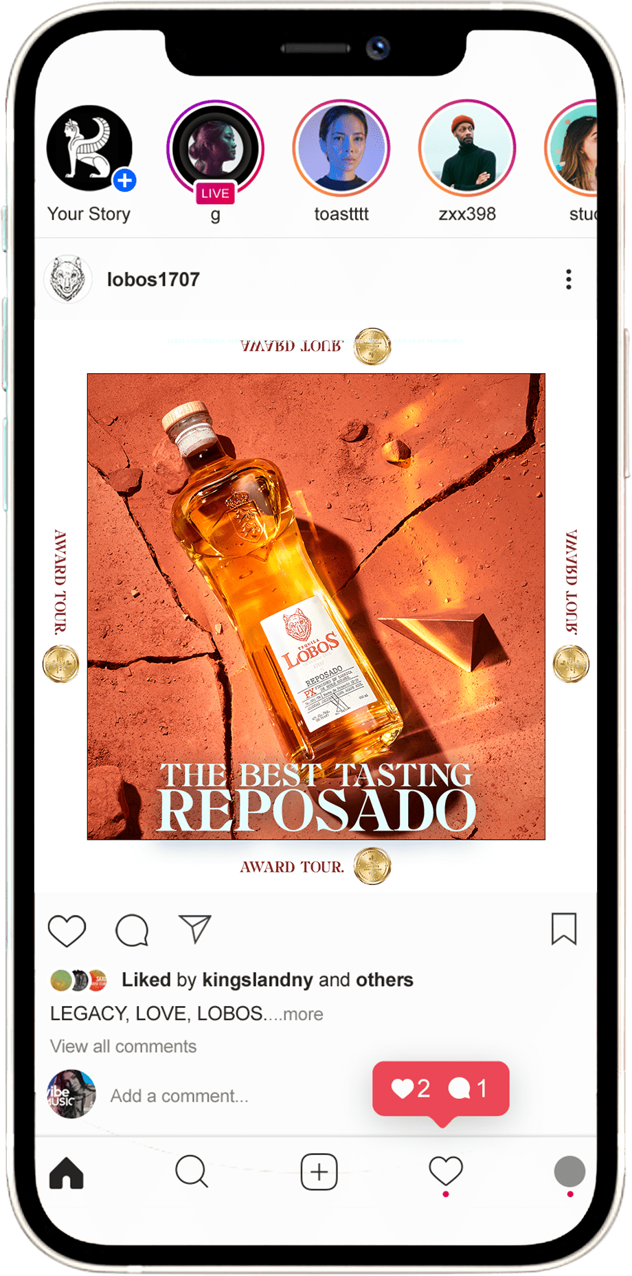
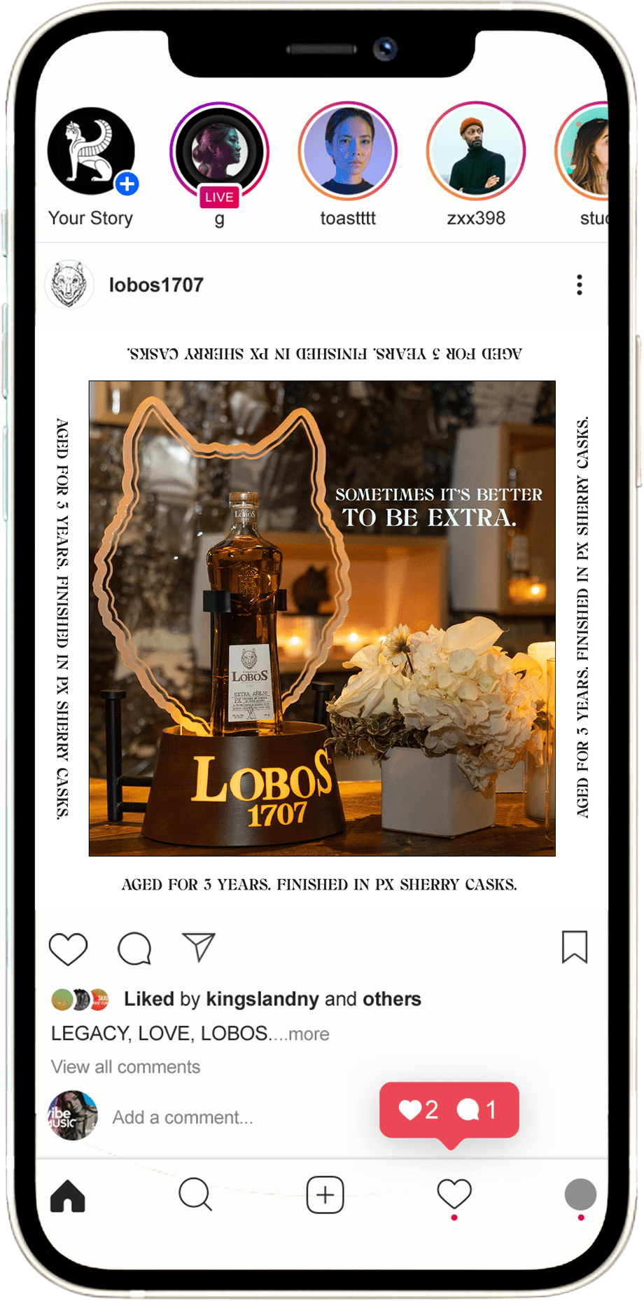
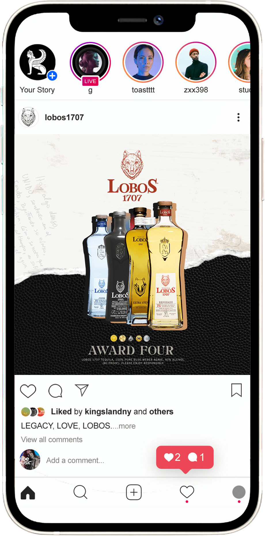
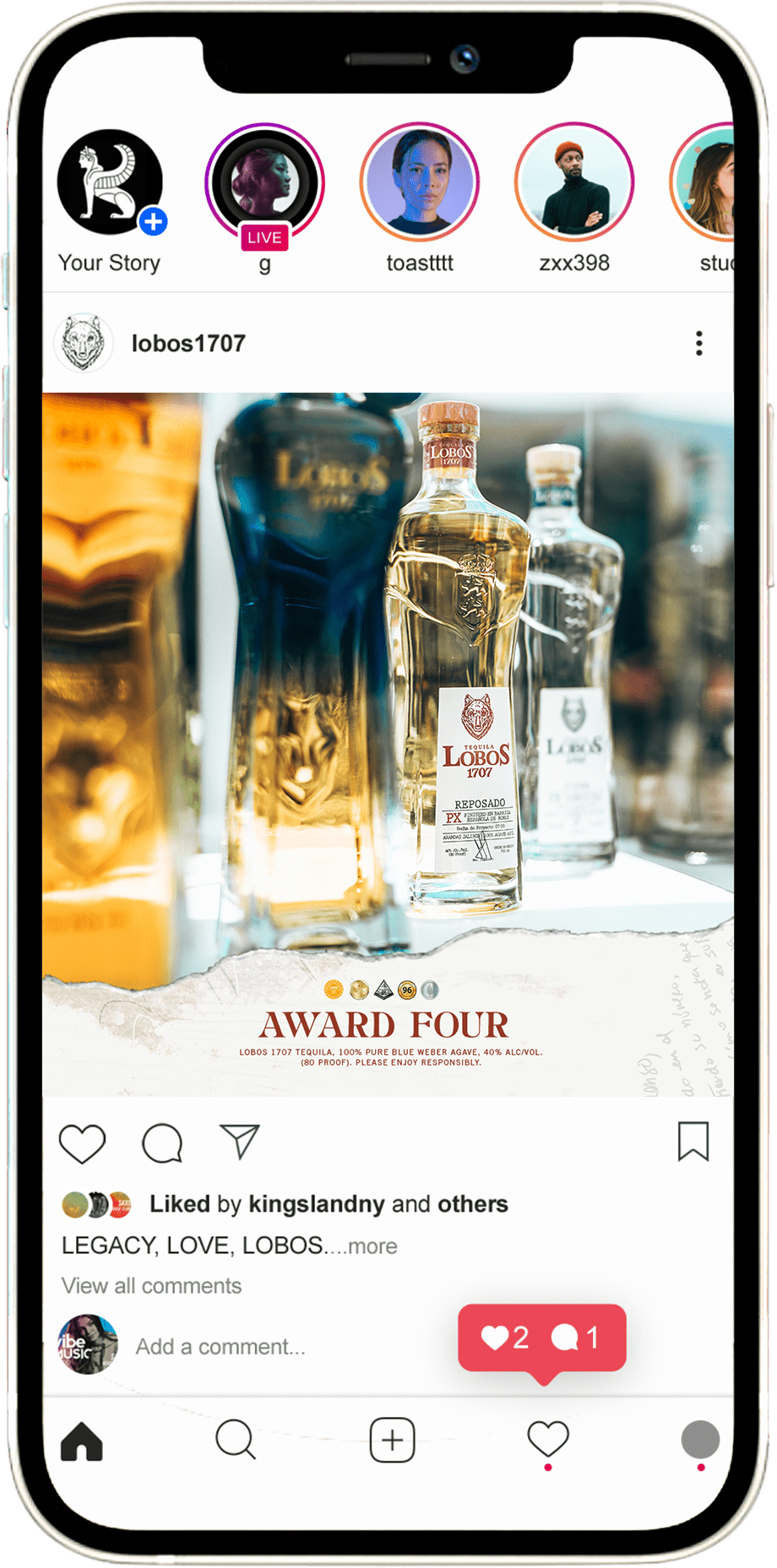
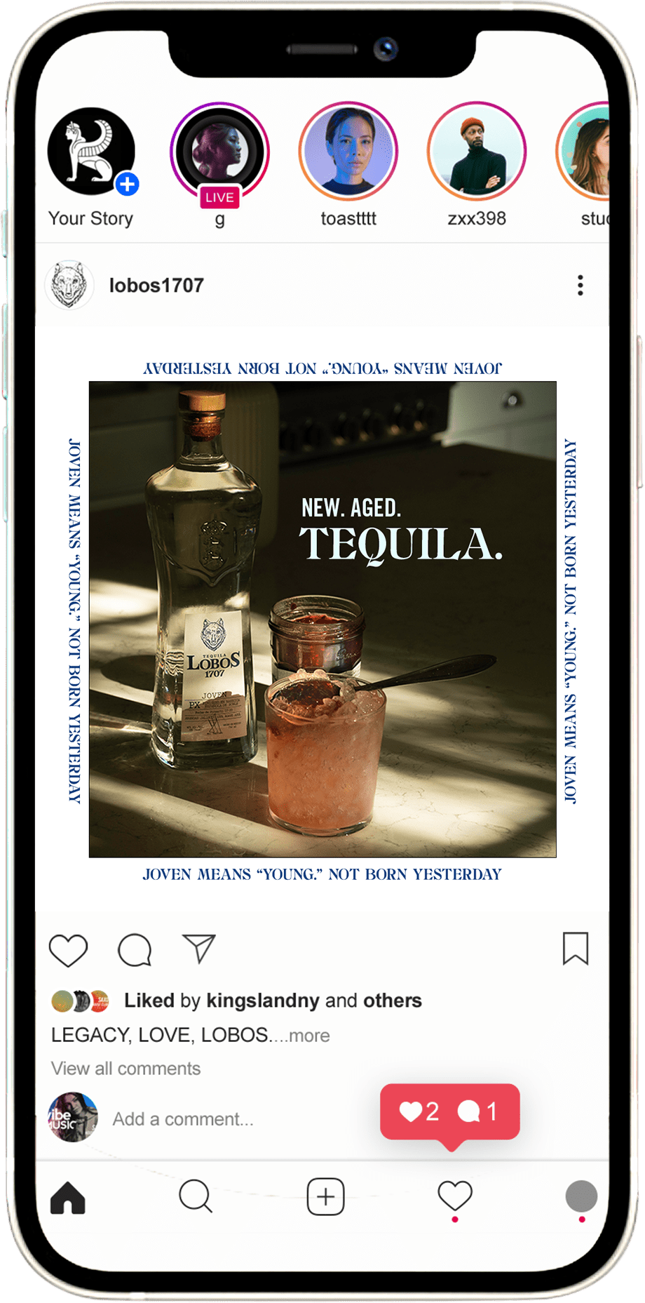
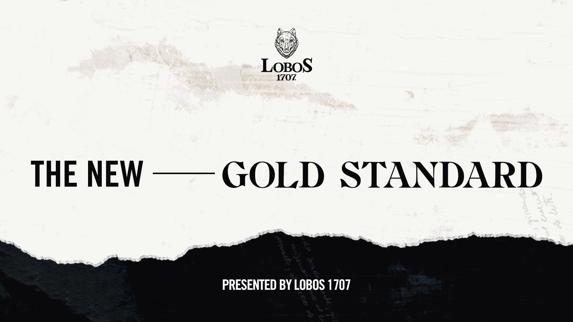
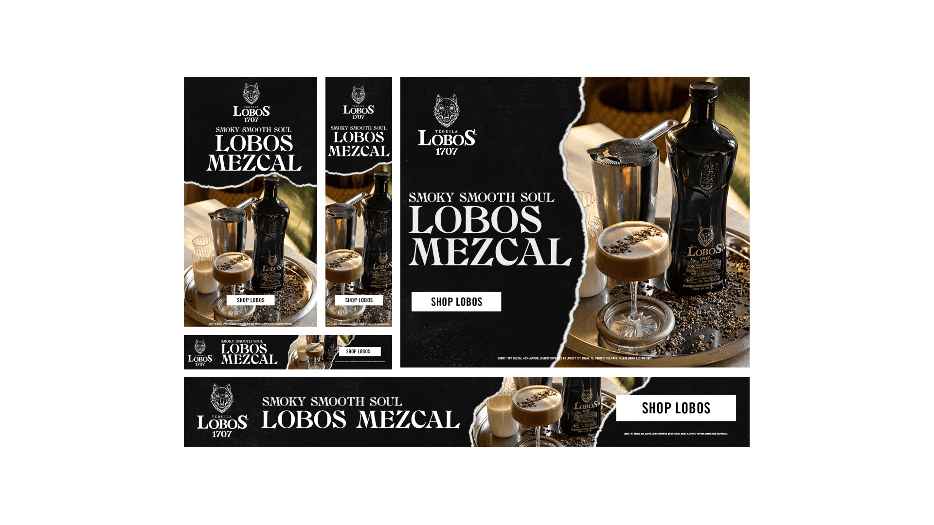
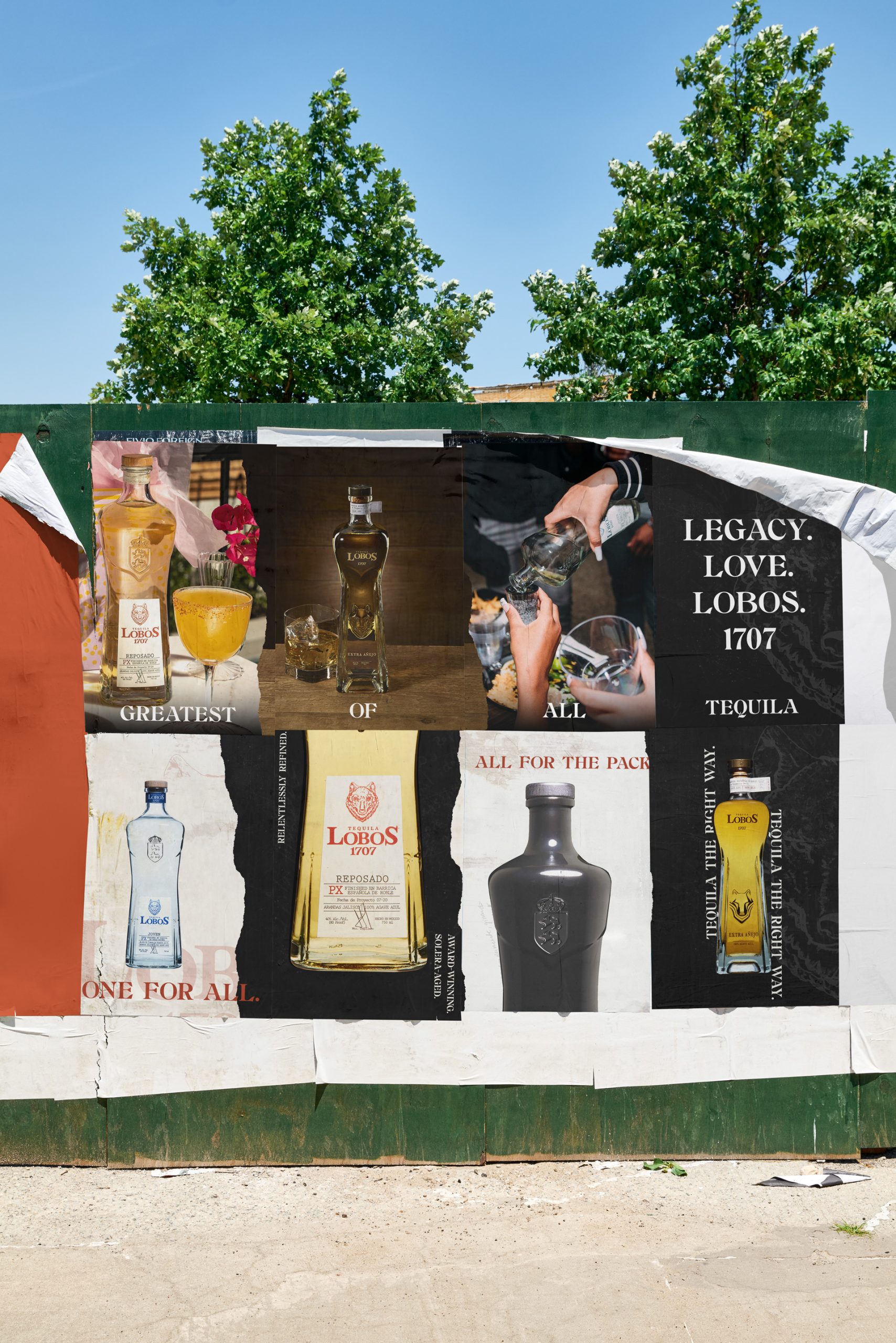
Working with Kingsland as the agency partner, we led creative direction and execution across two interconnected workstreams: a digital and social advertising campaign covering Lobos’ full SKU lineup, and a motion and OOH campaign built around video title and end cards, logo compositions, and large-format billboard placements. Both were grounded in Lobos’ existing brand identity, with Therum contributing additional creative direction that extended and elevated it.
03
Build templates that hold up at every scale — from a phone screen to a New York billboard
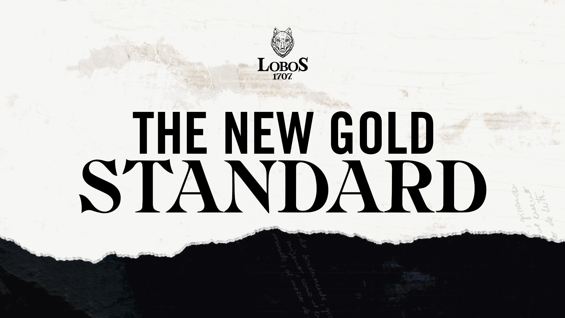
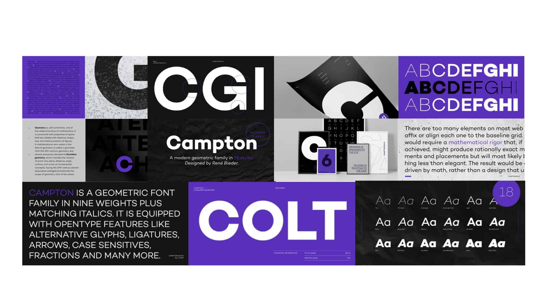
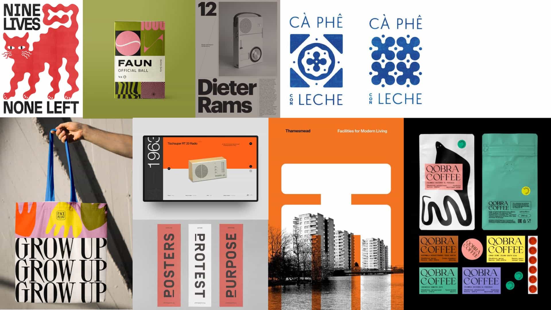
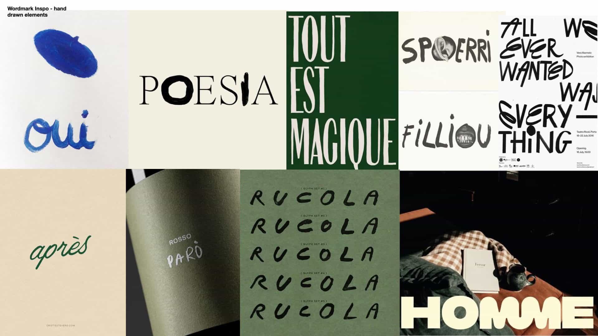
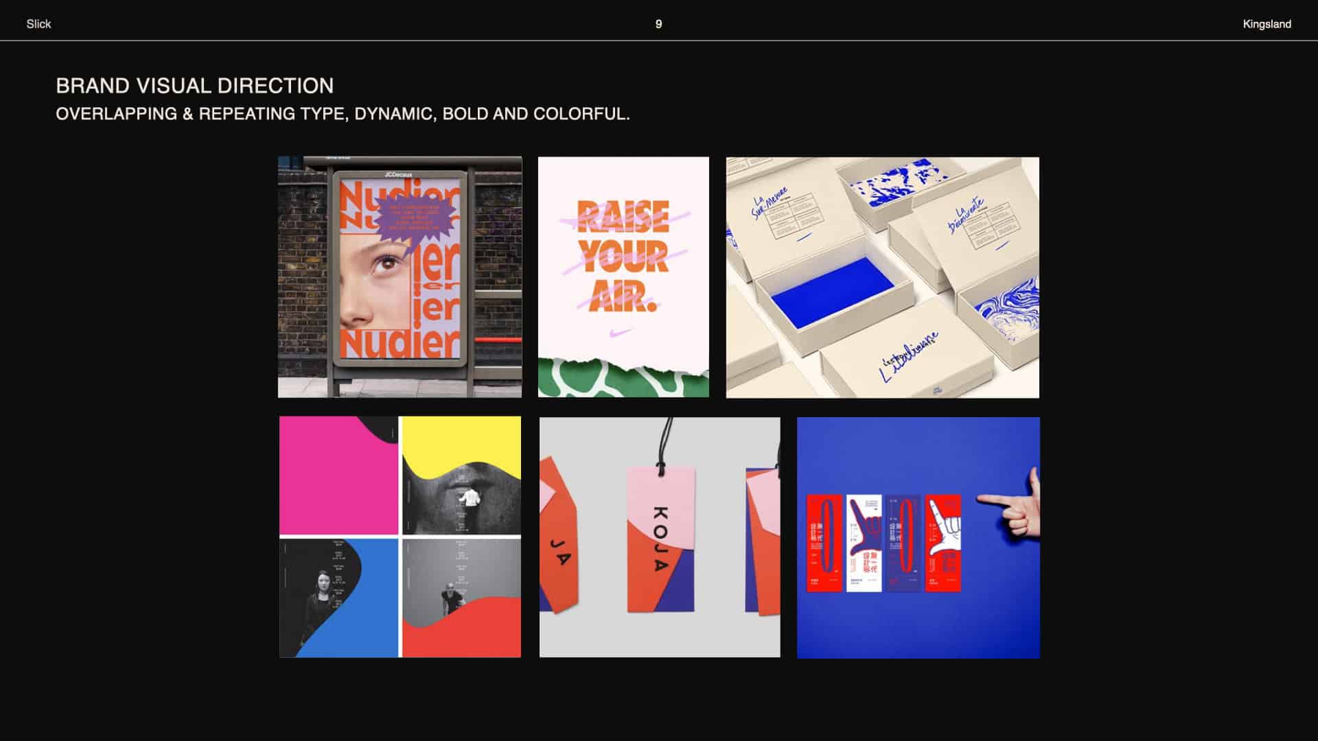
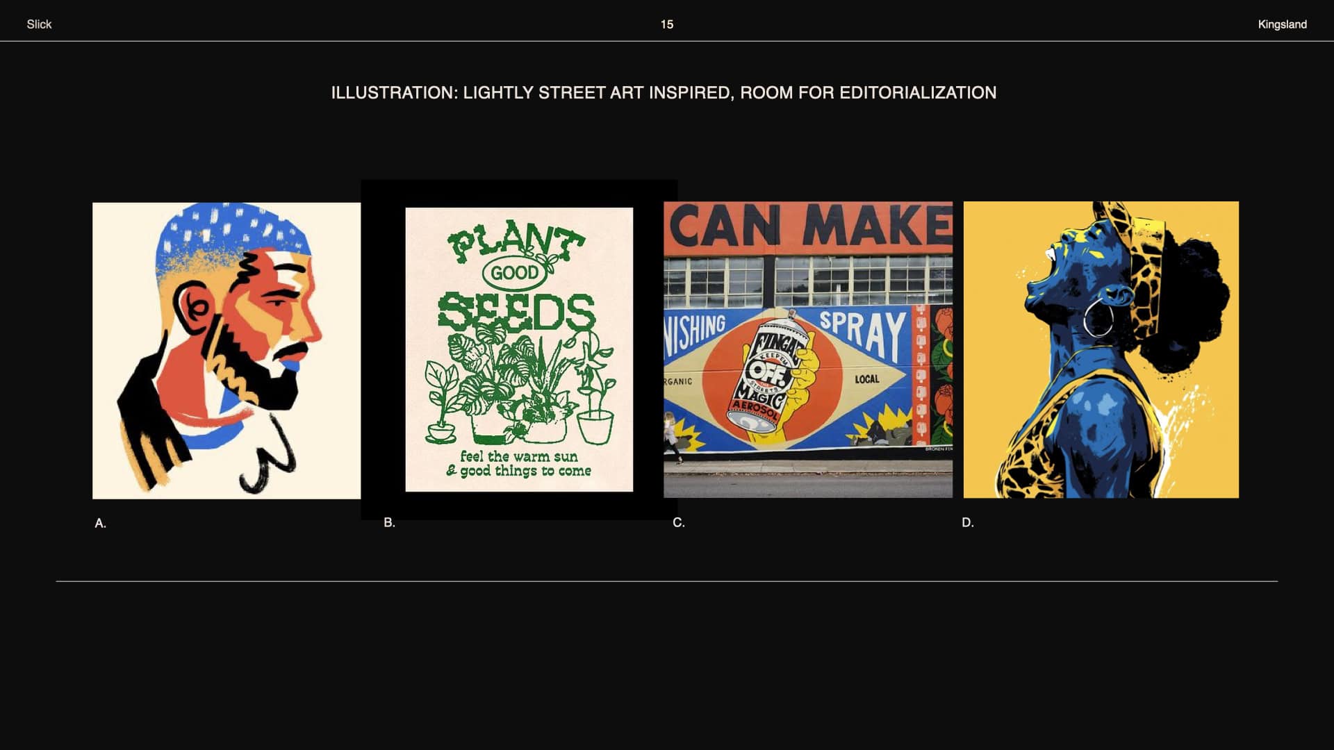
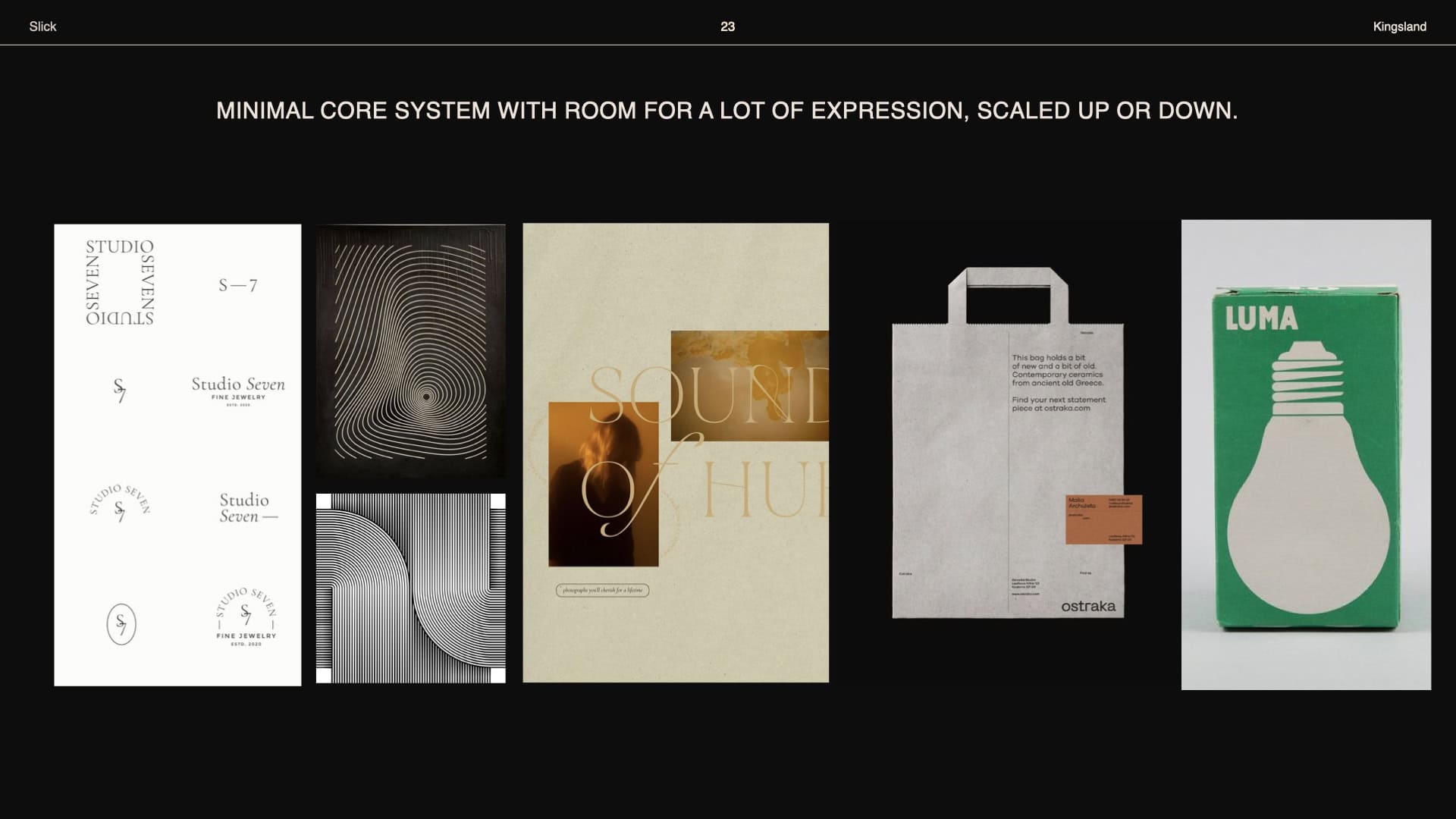
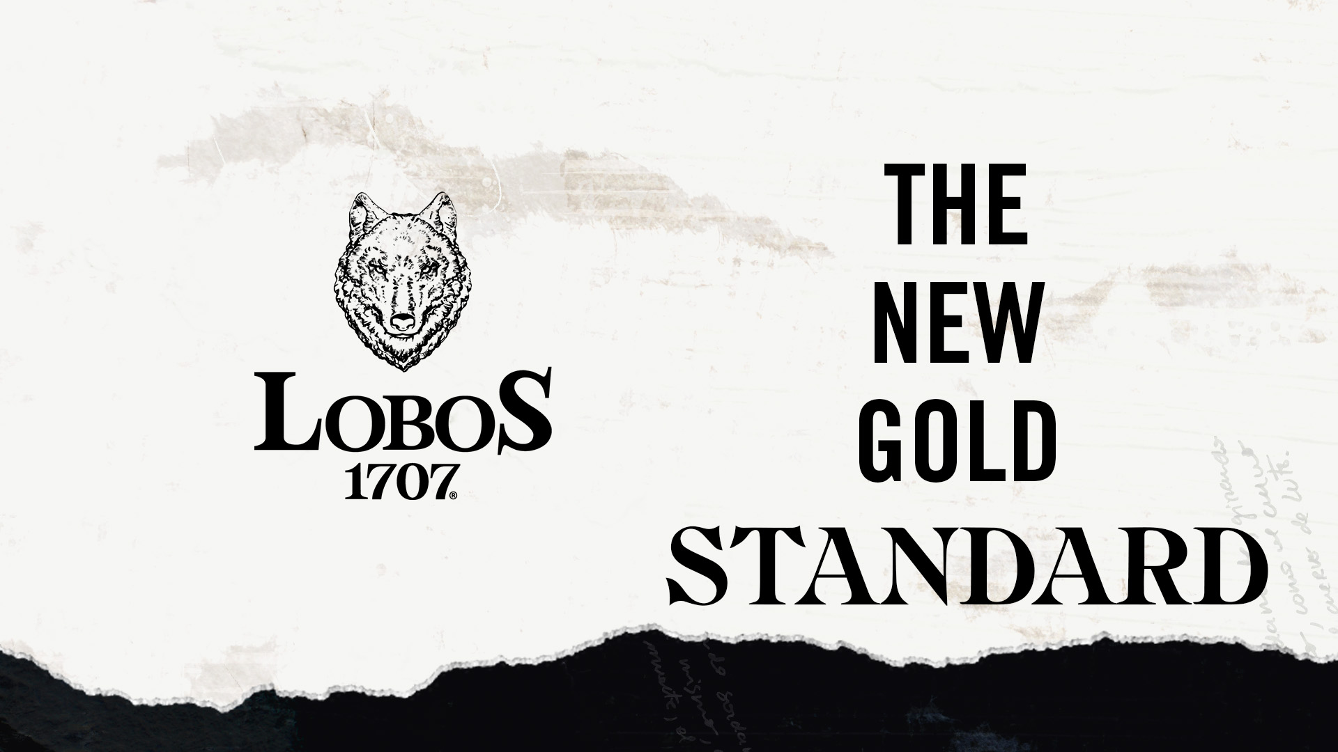
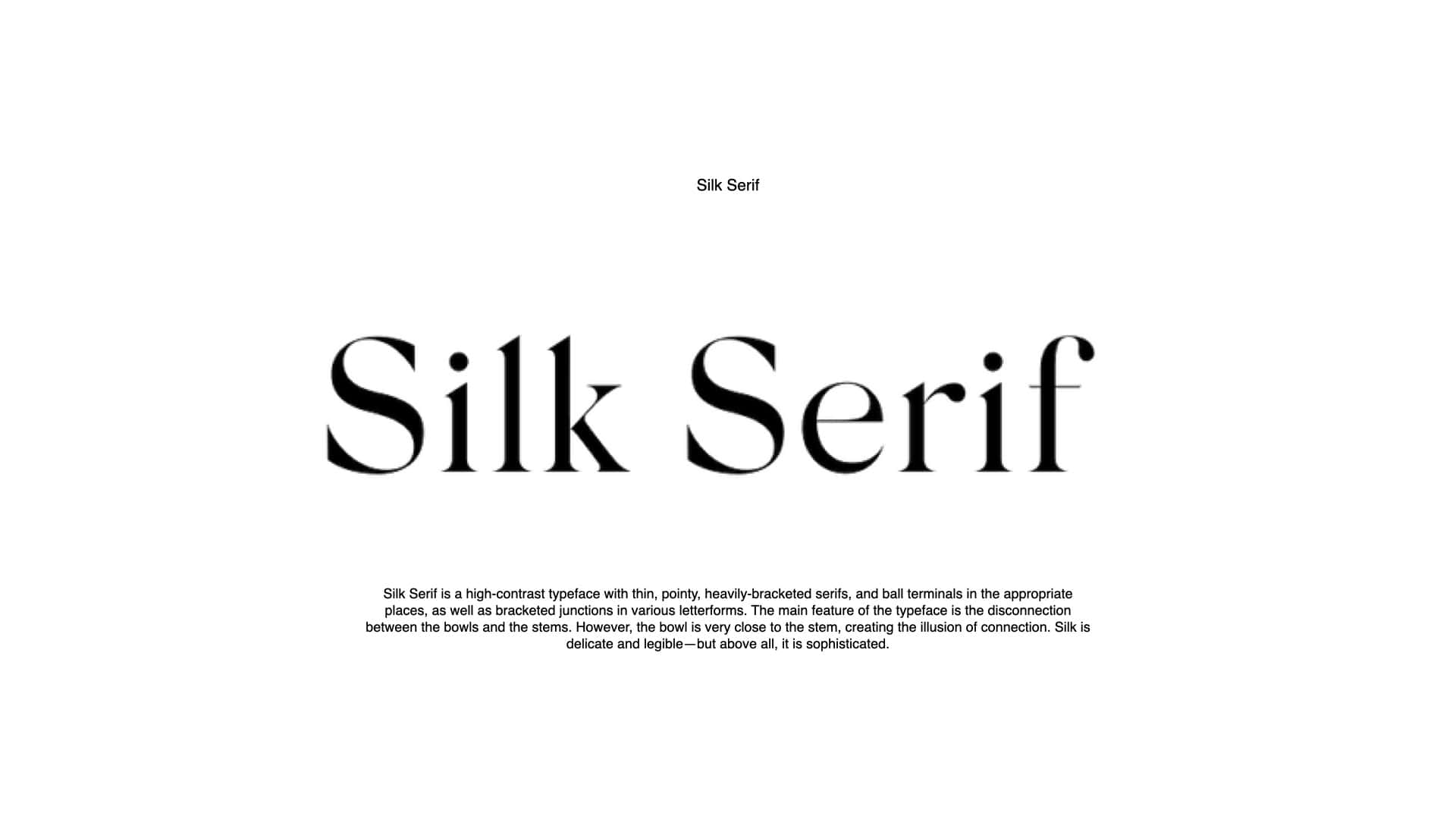
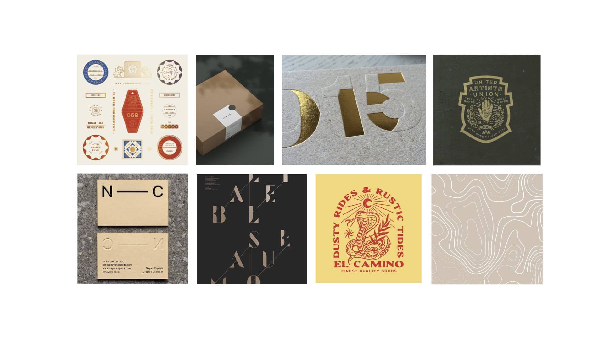
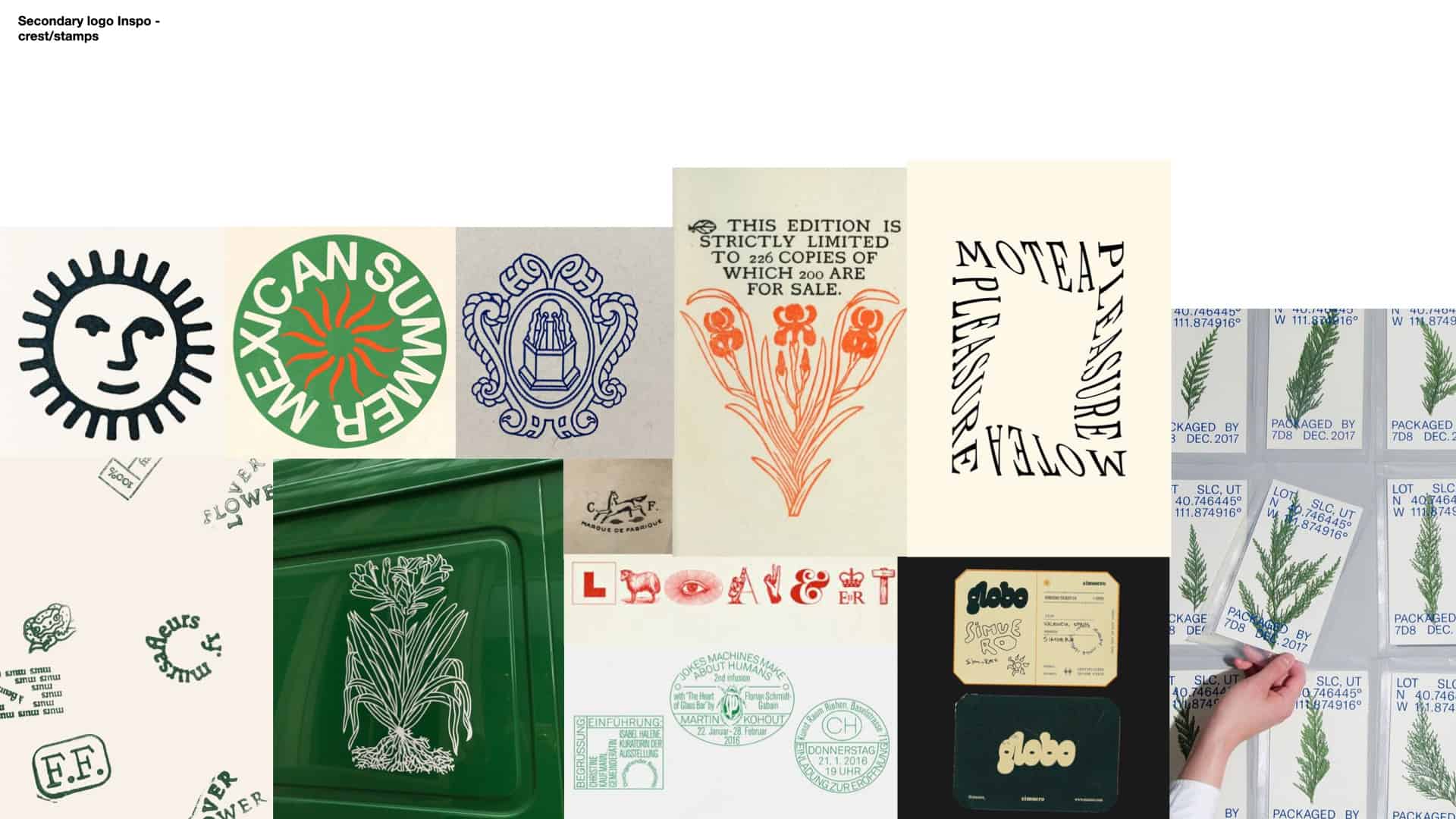
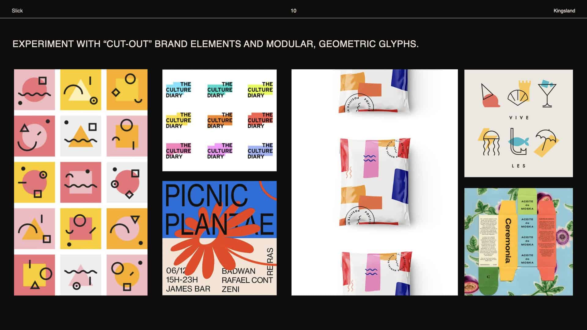
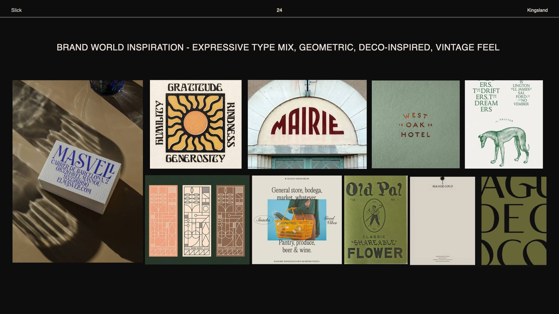
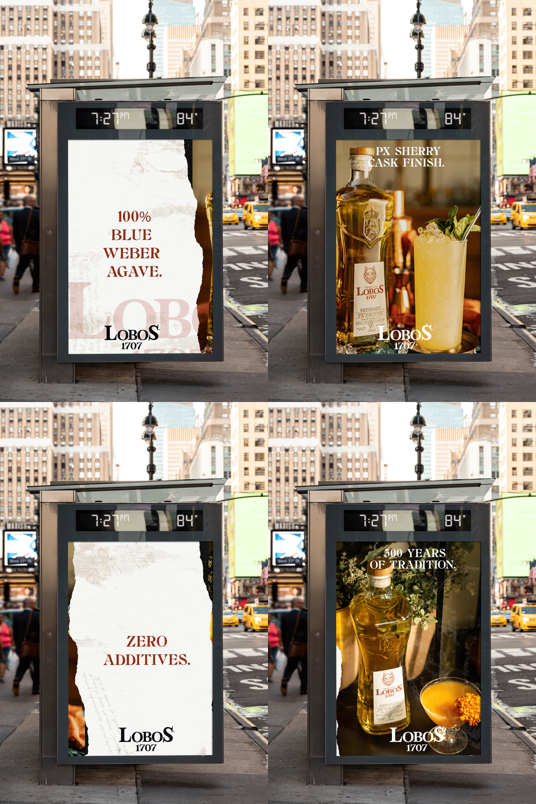
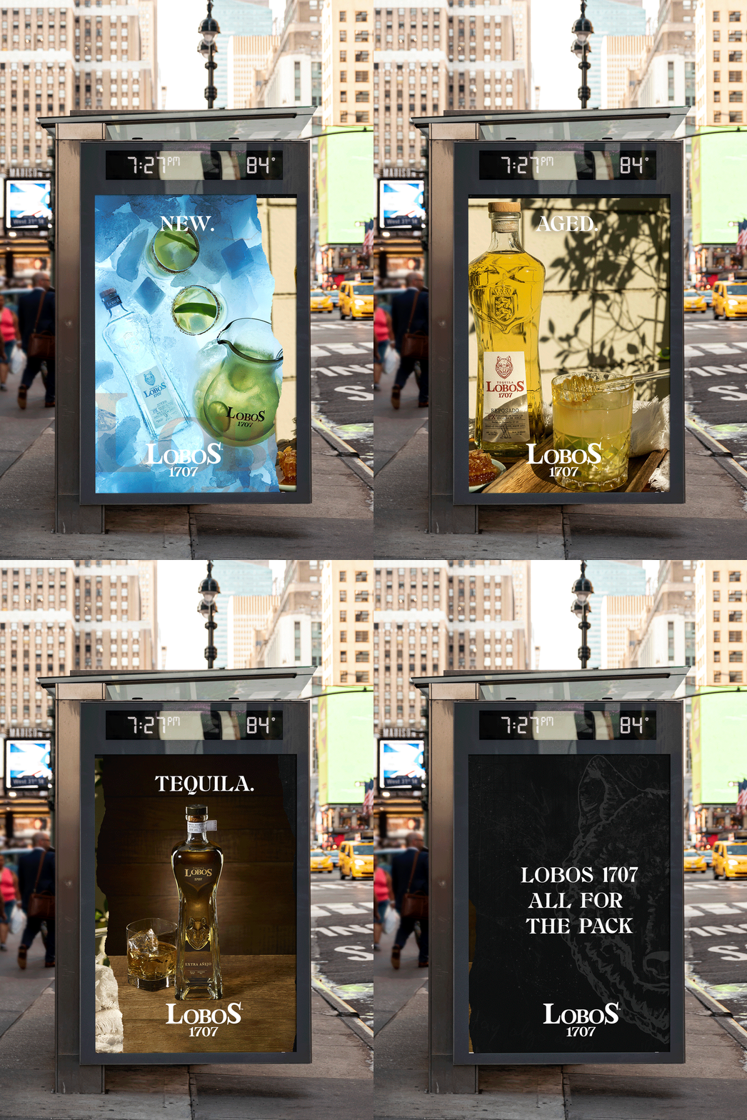
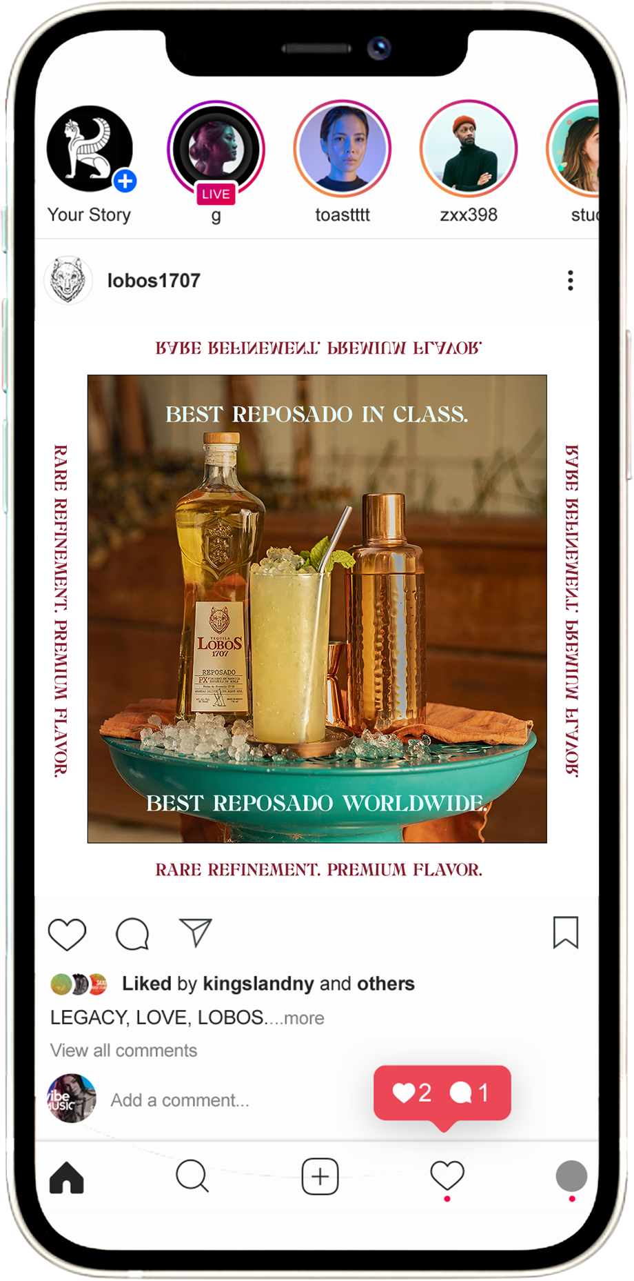
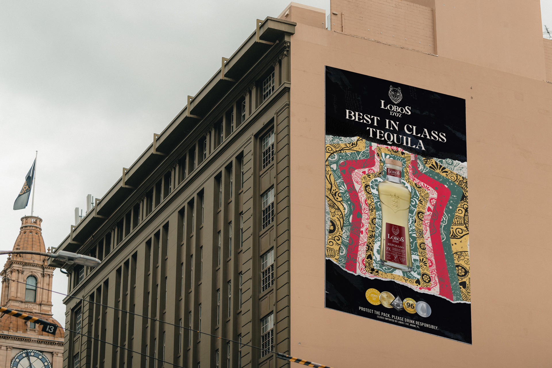
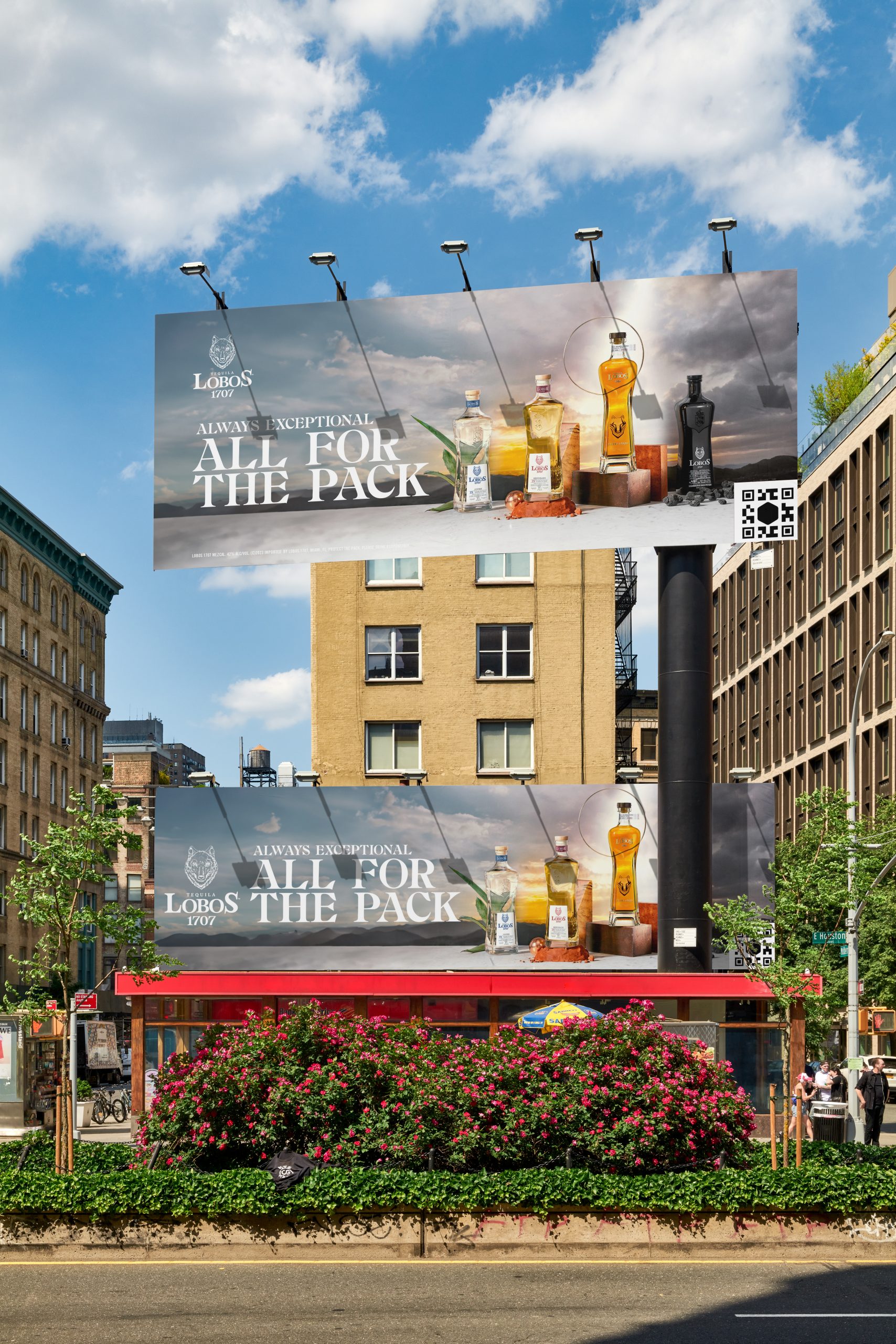
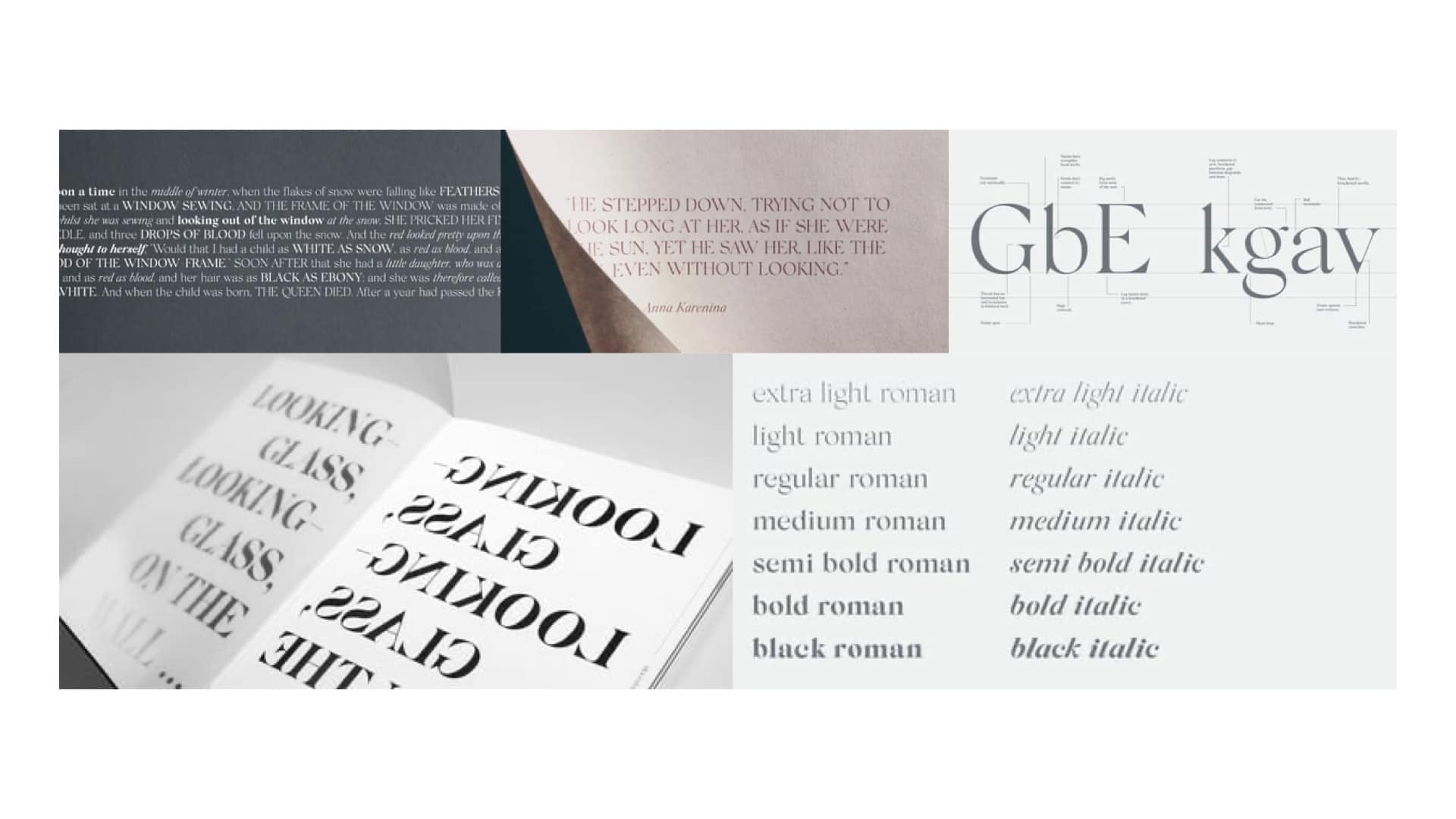
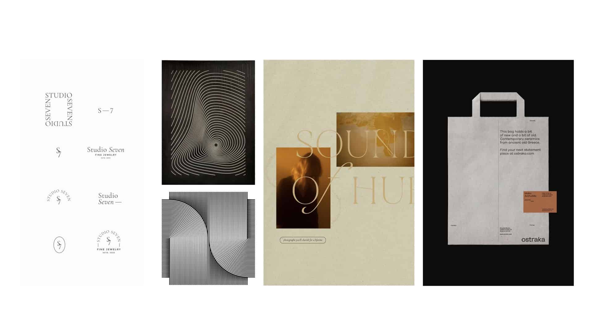
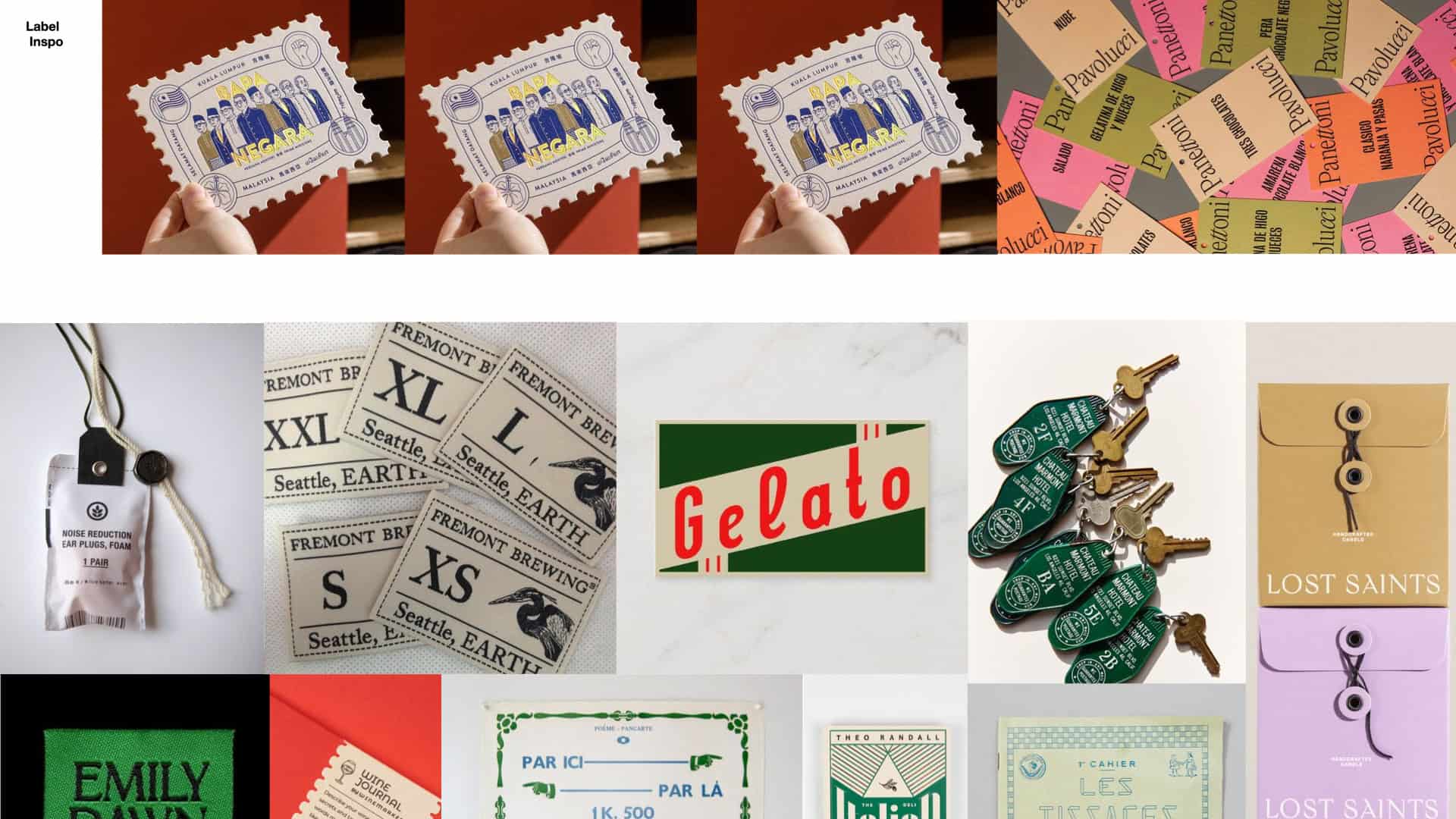
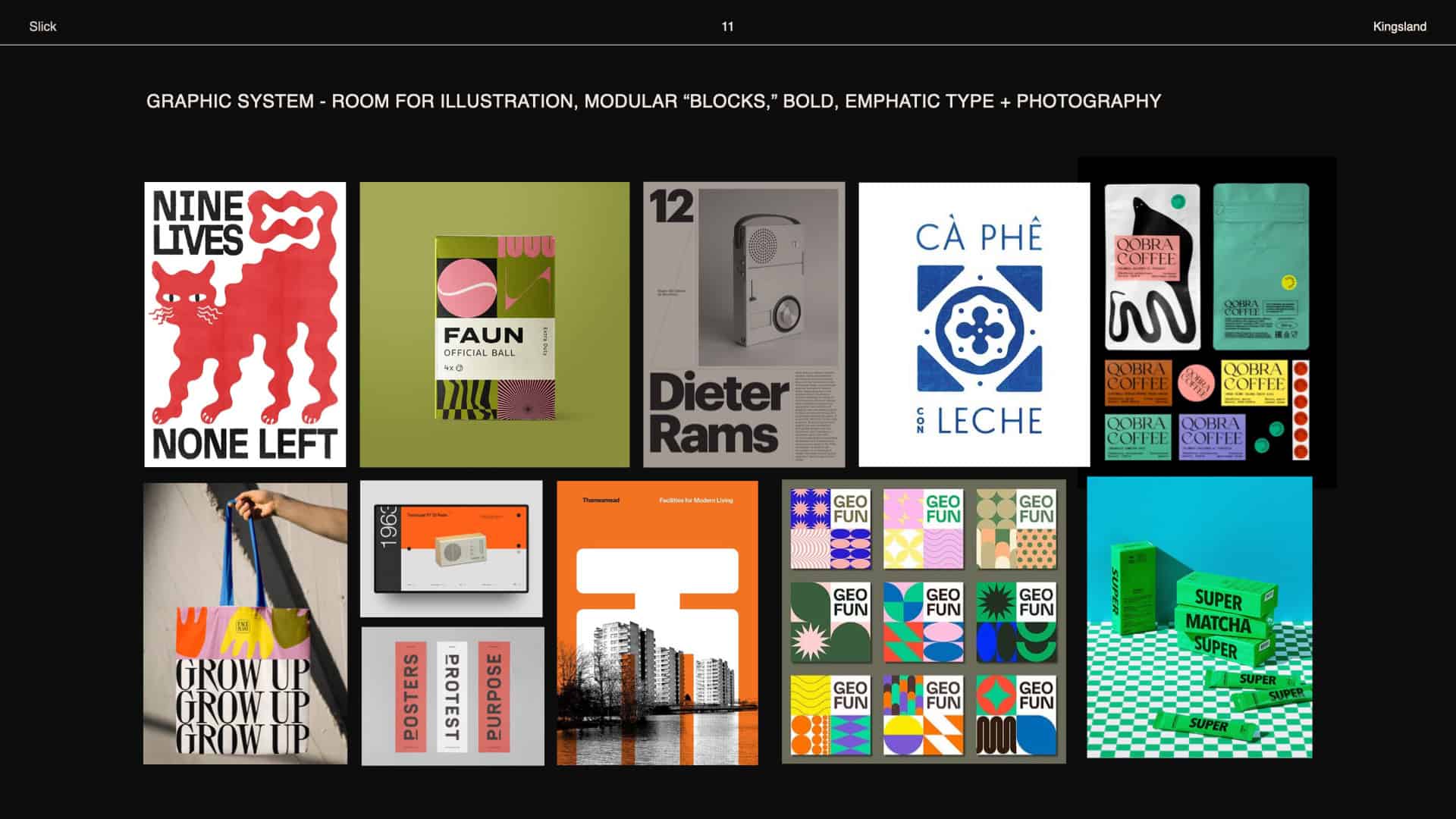
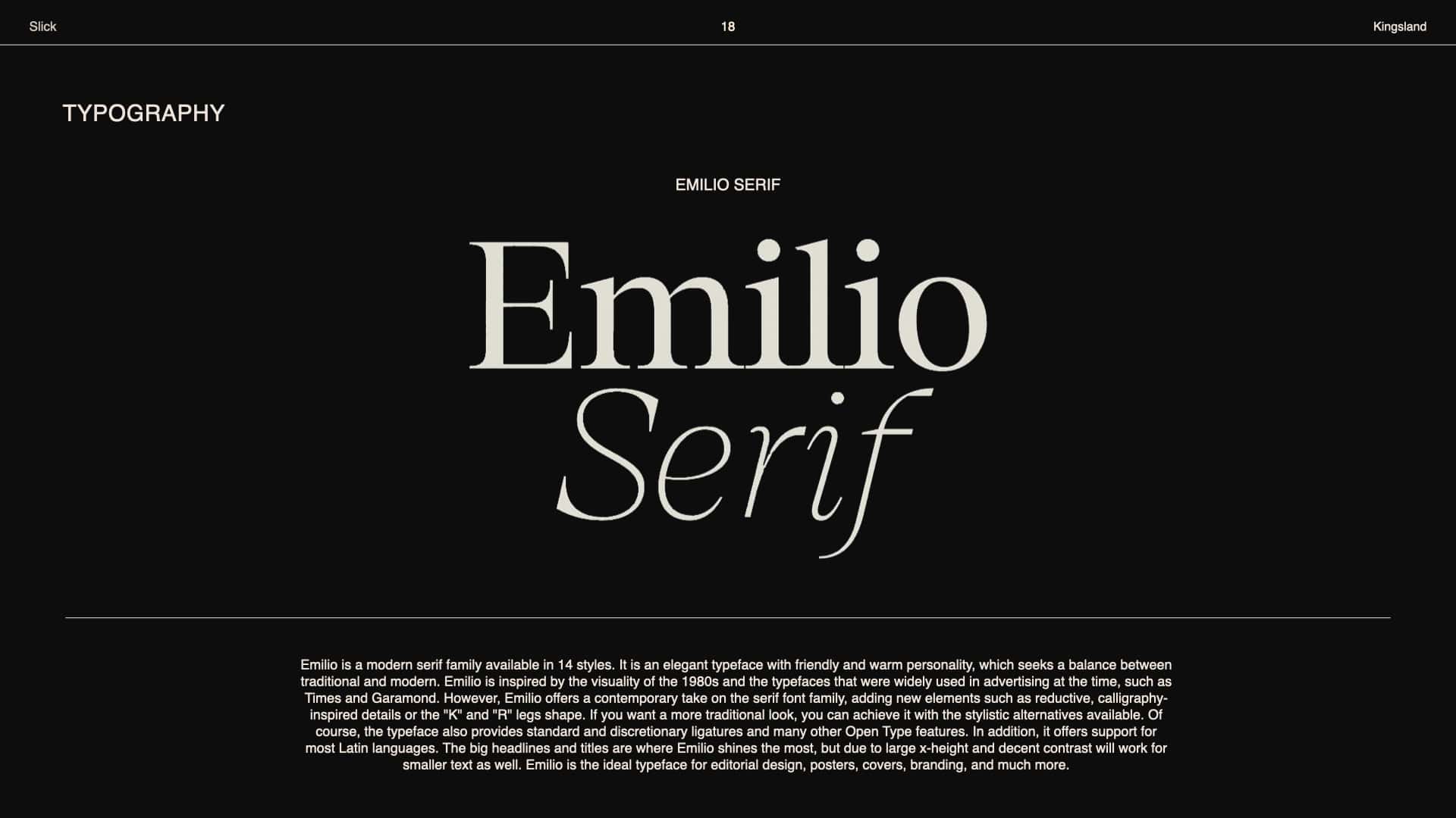
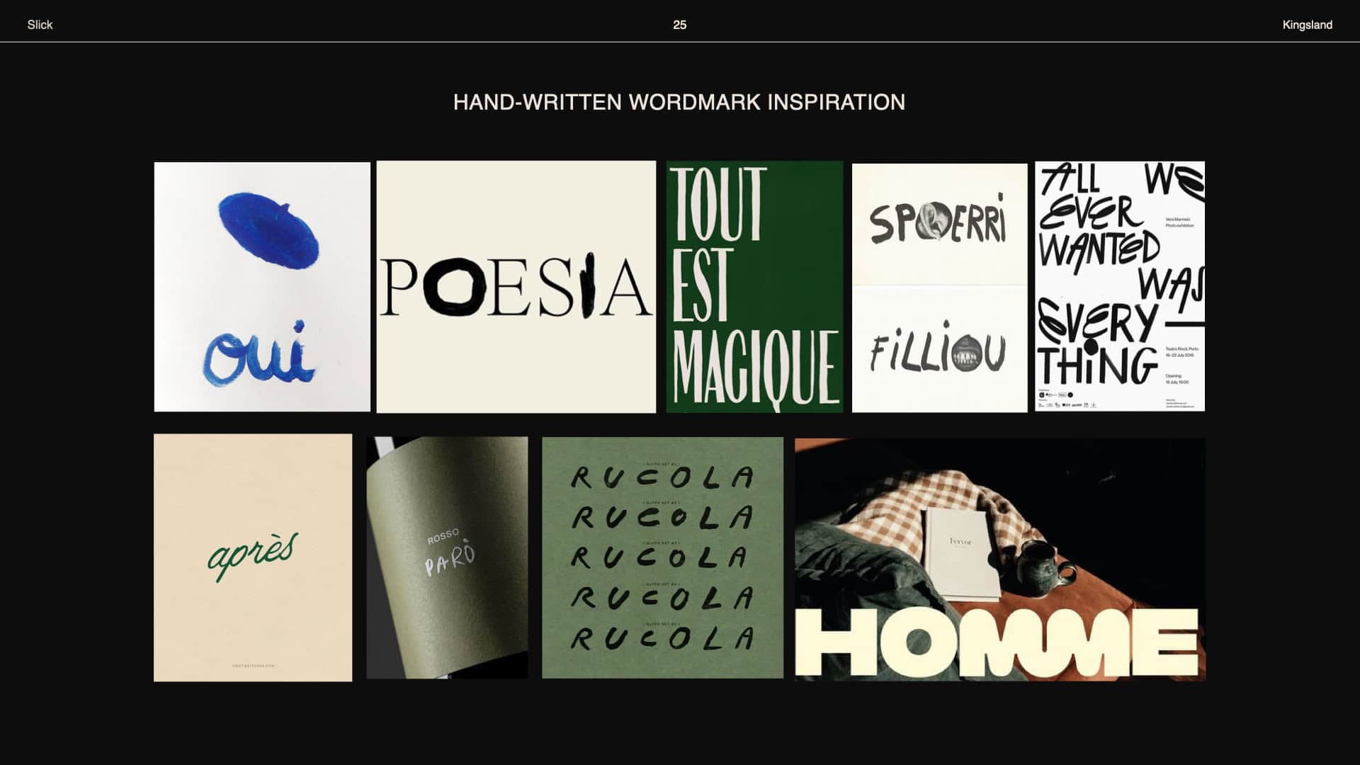
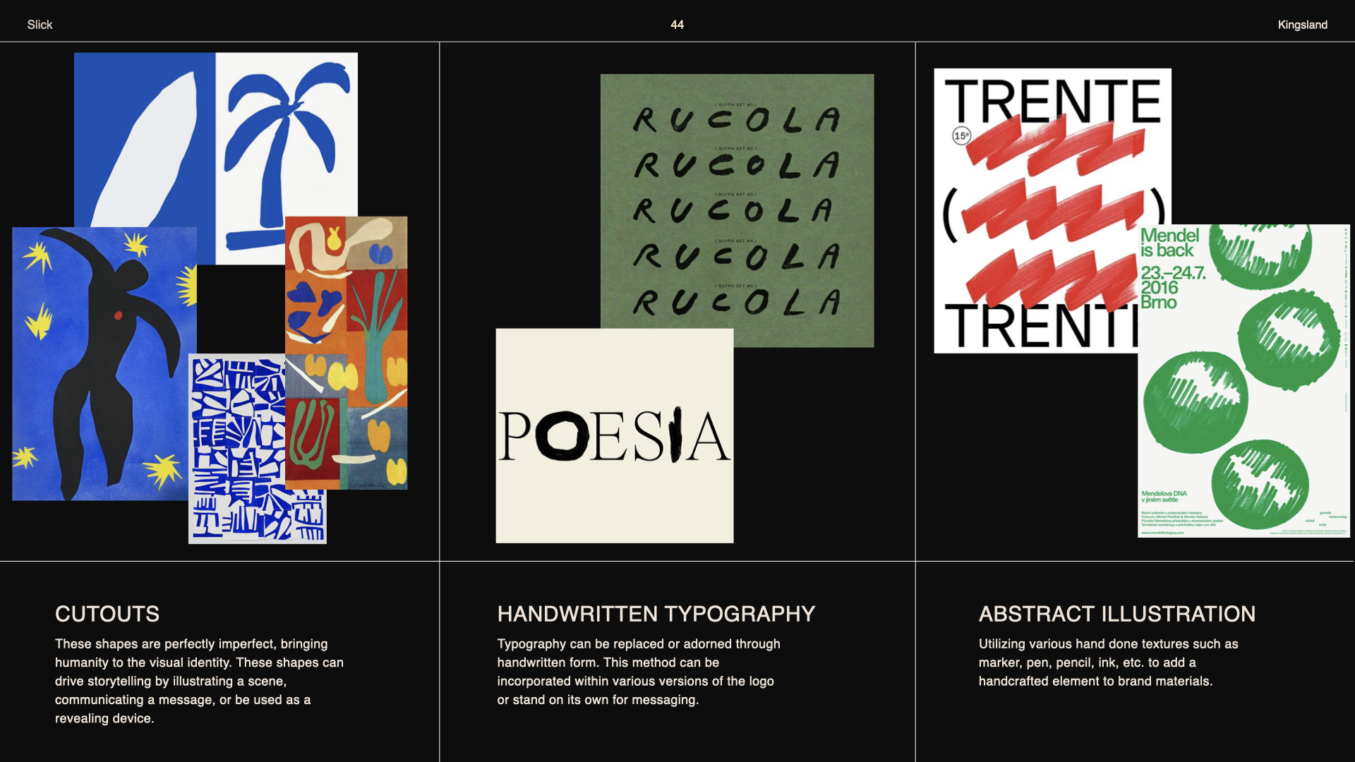
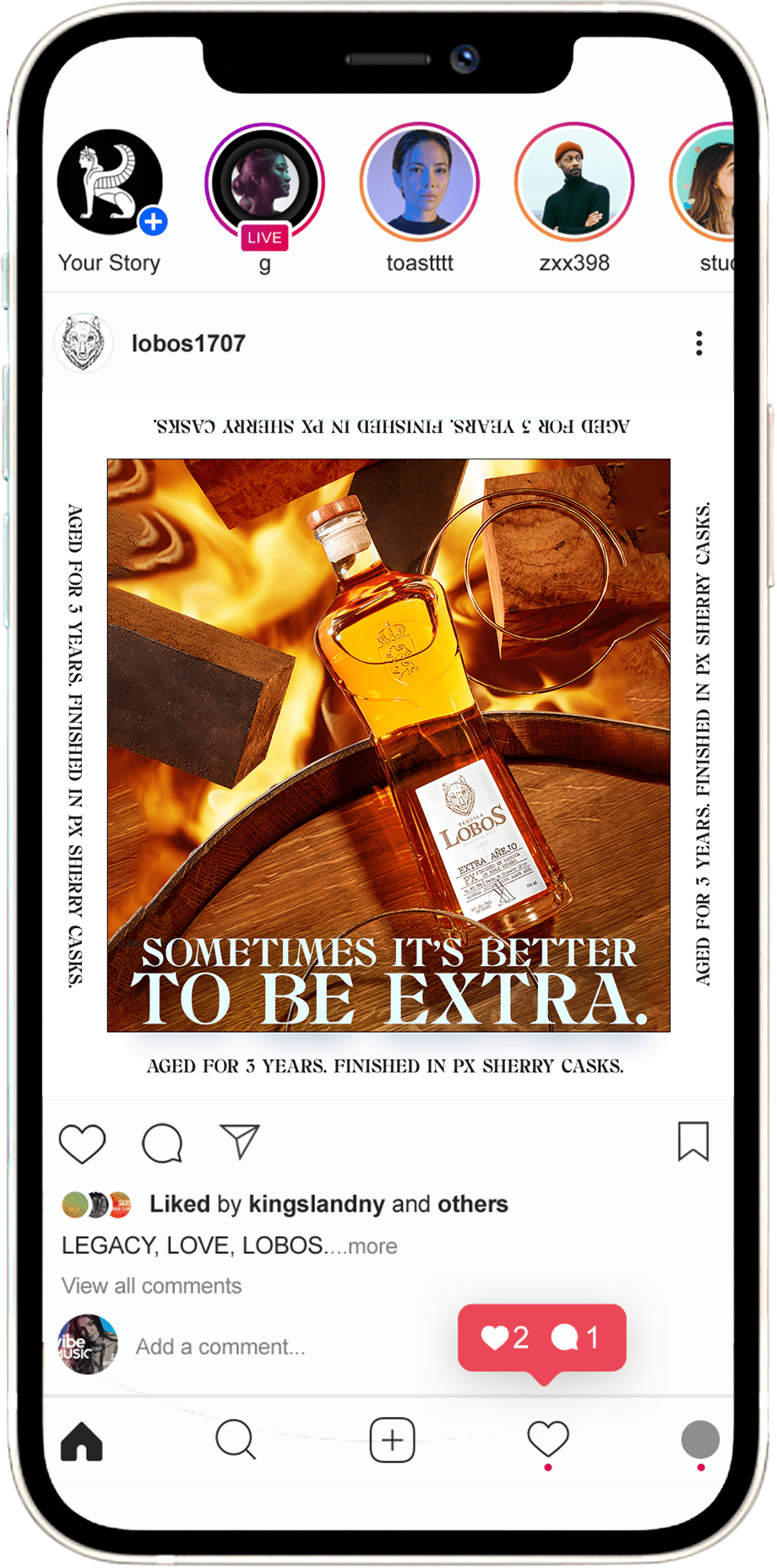
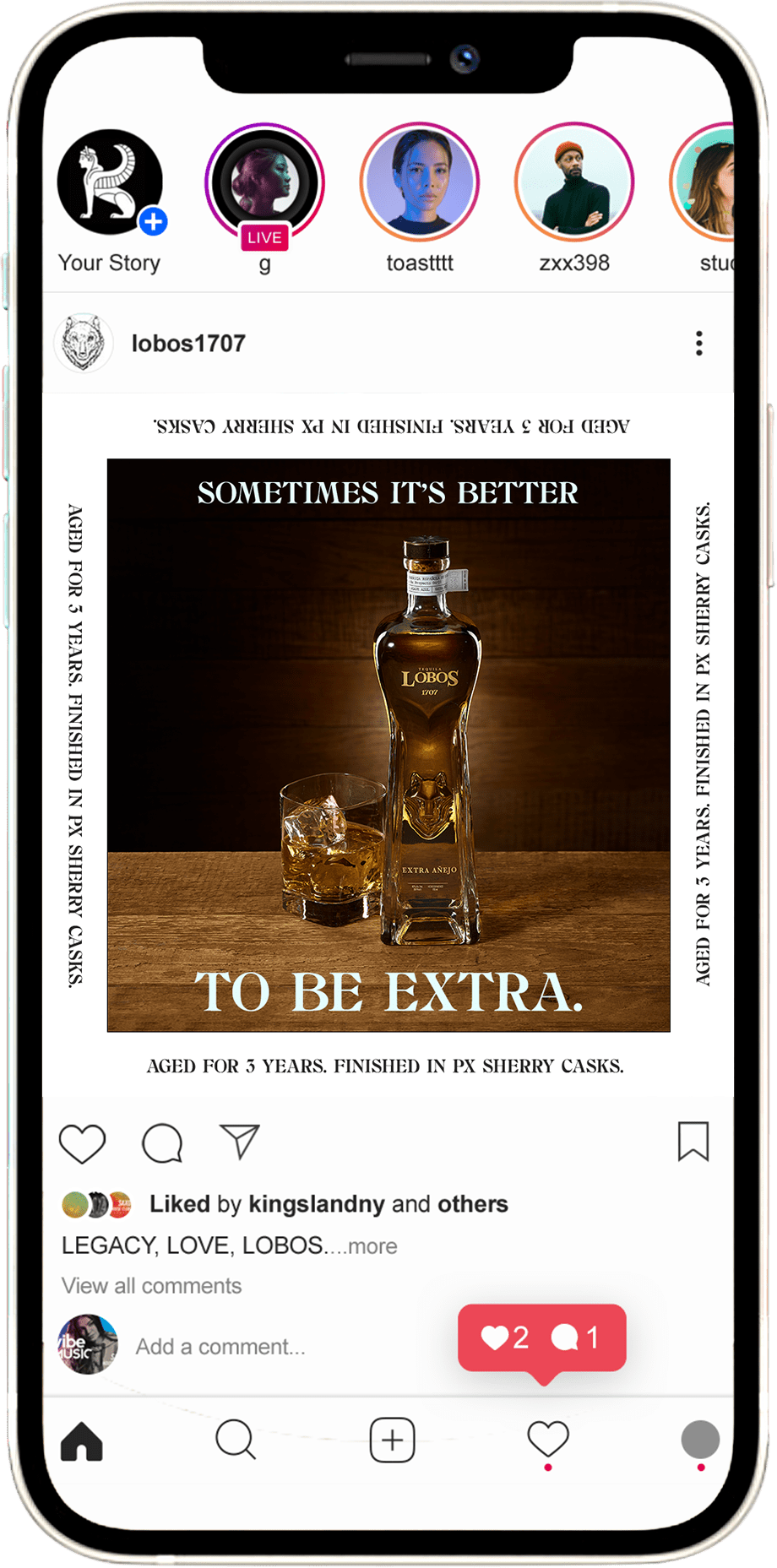
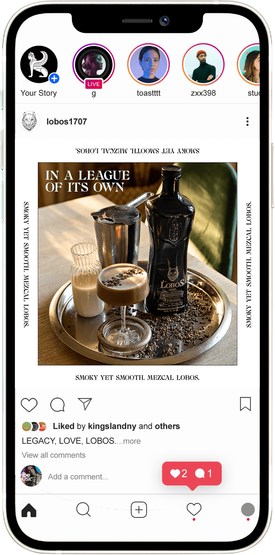
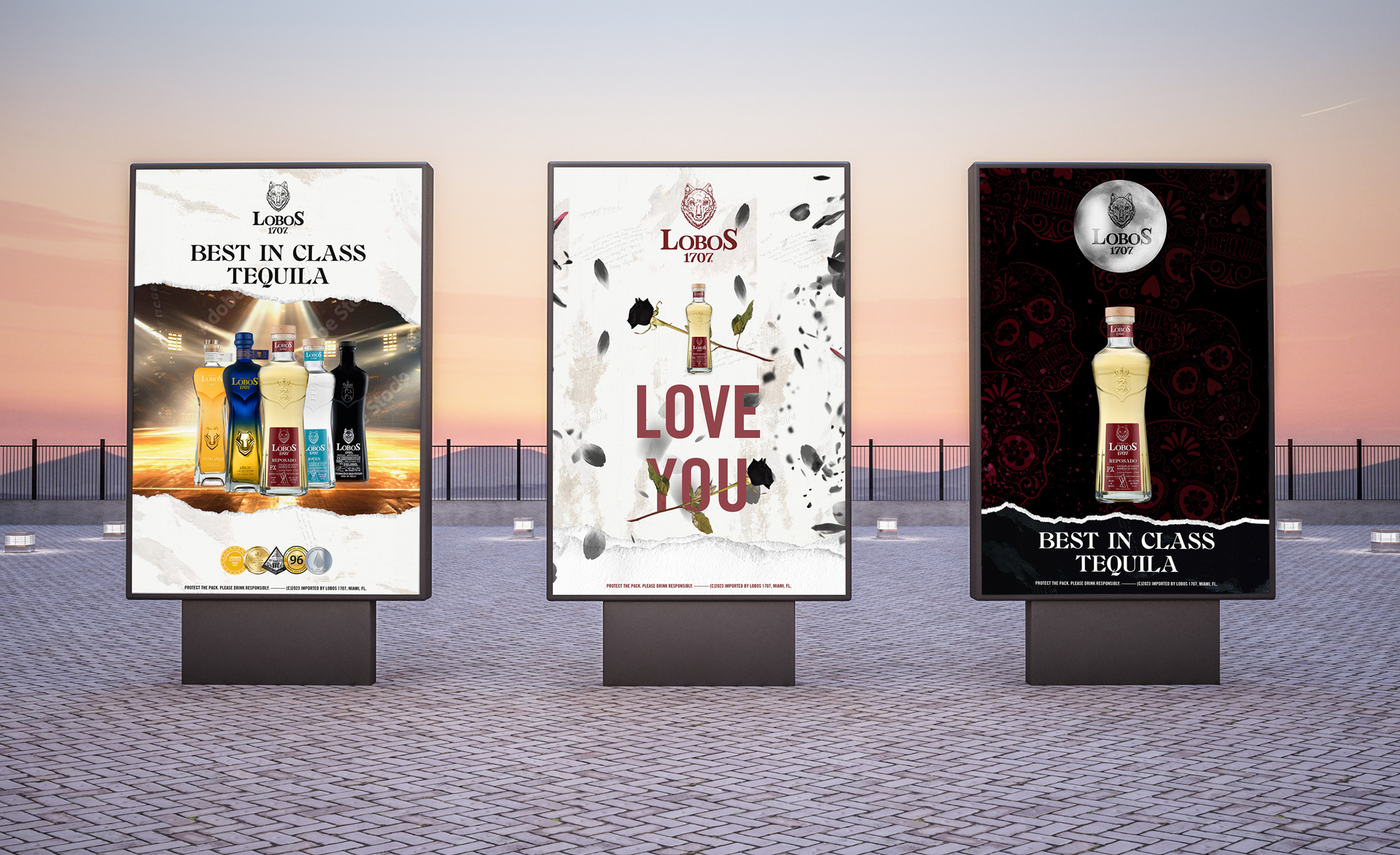
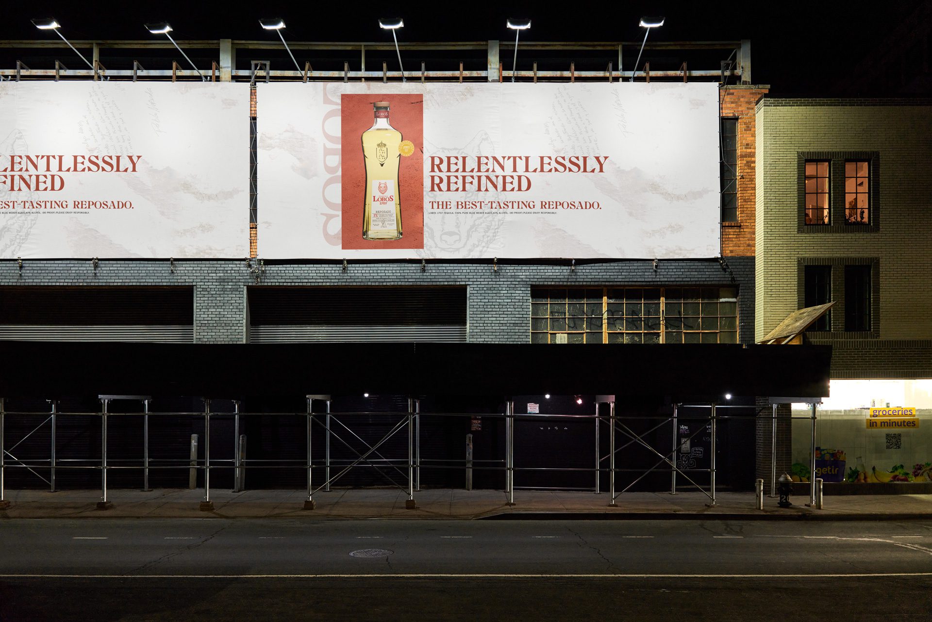
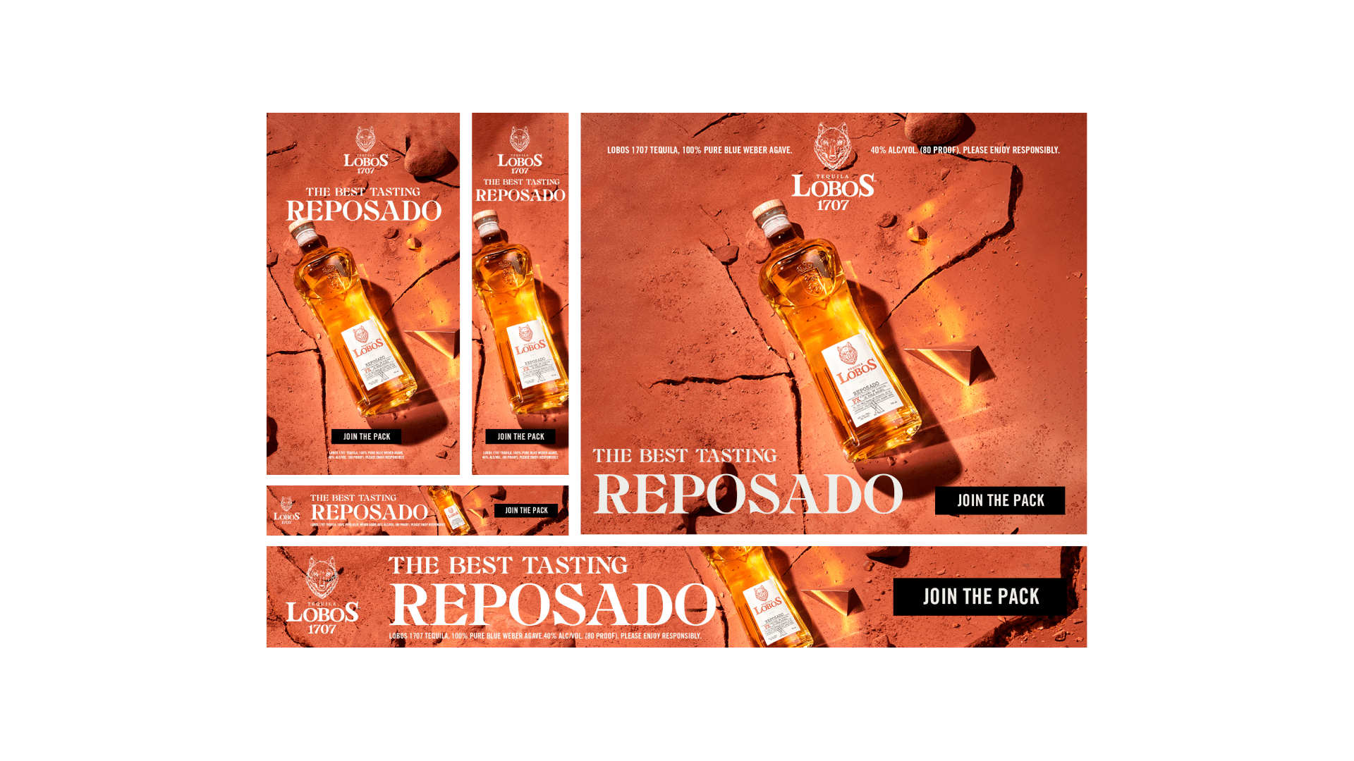
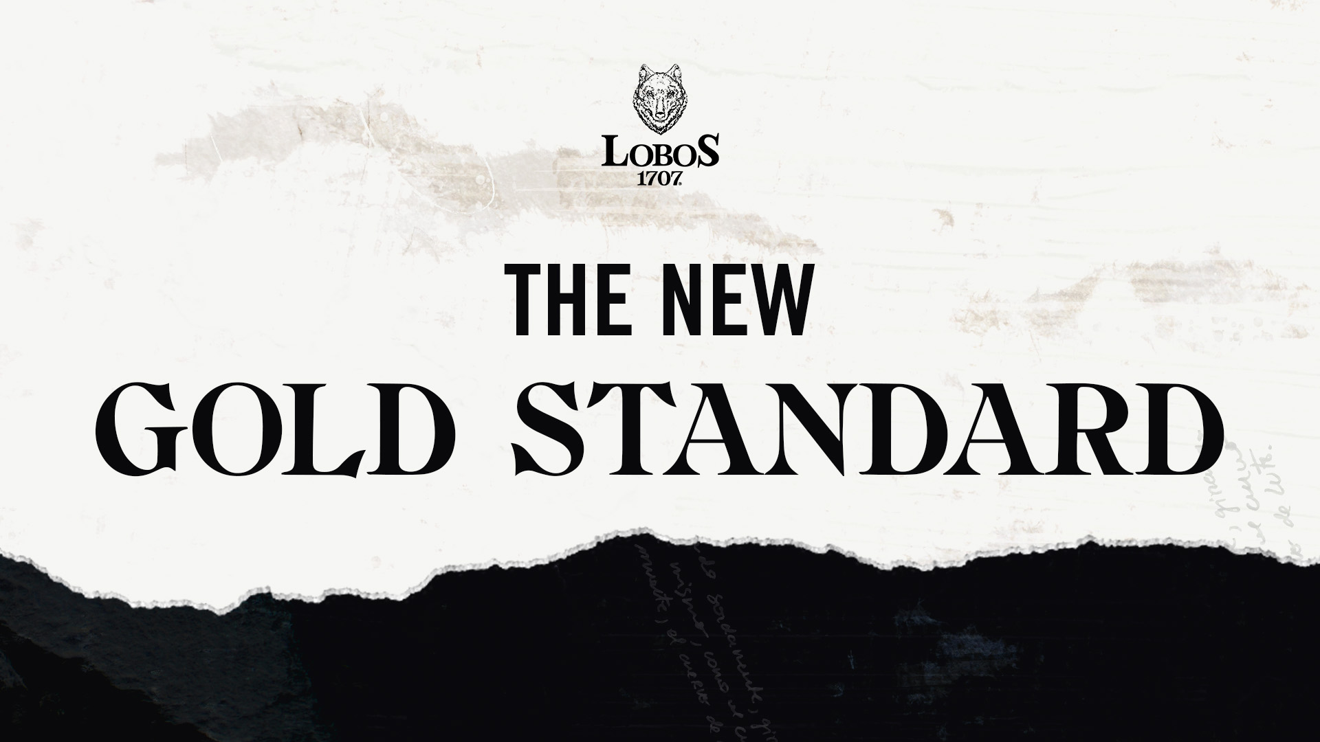
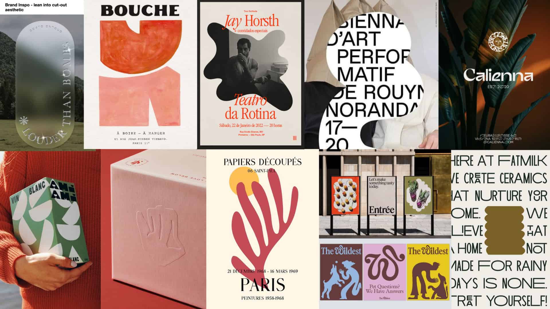
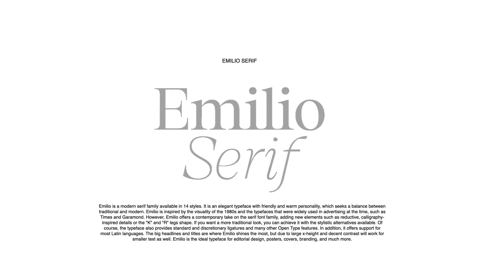
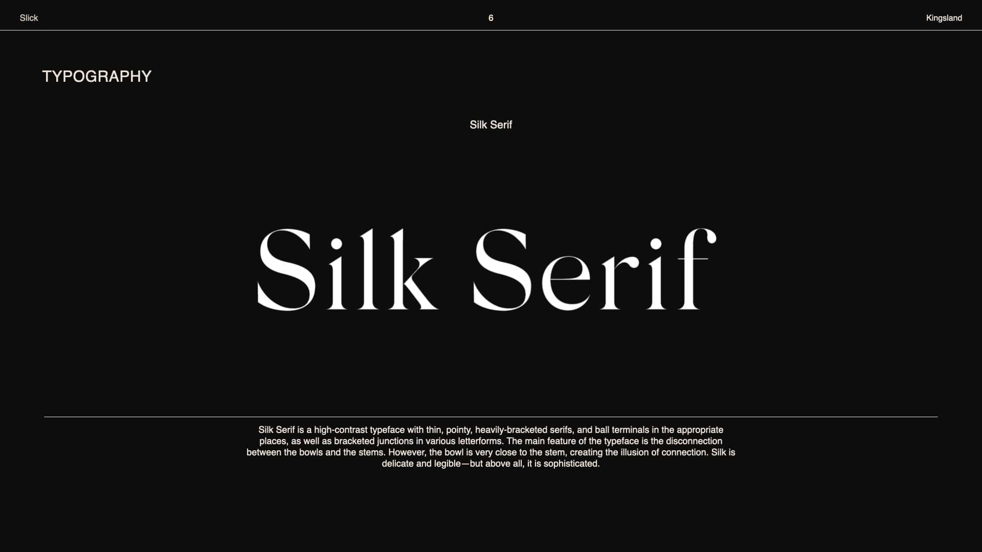
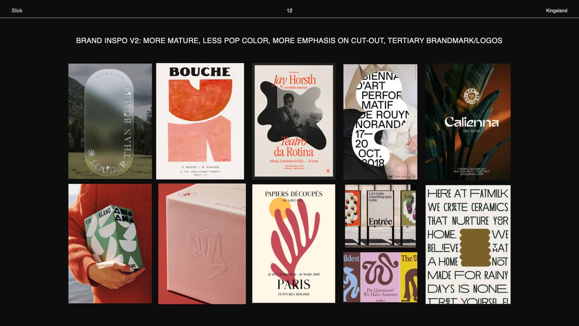
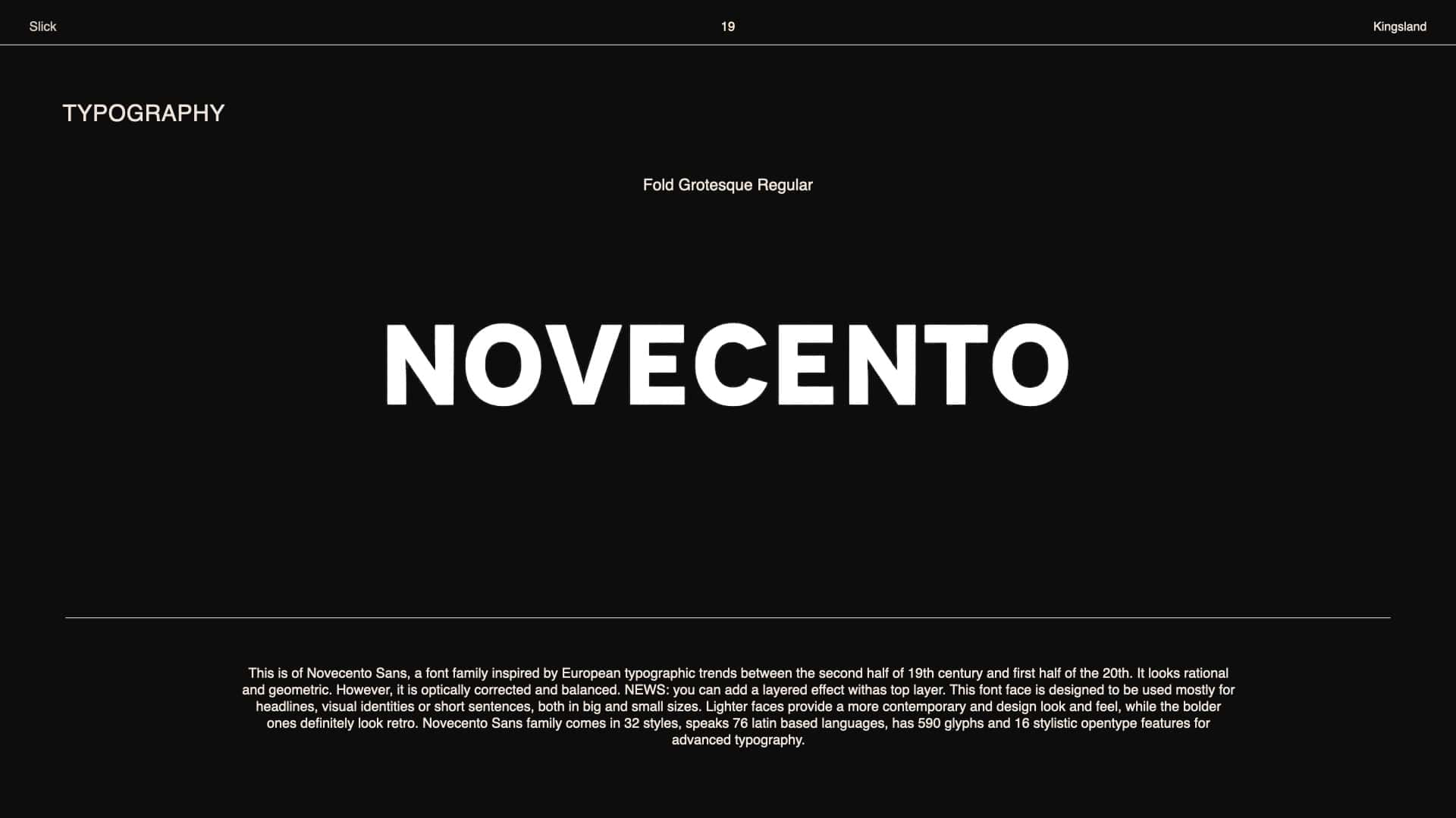
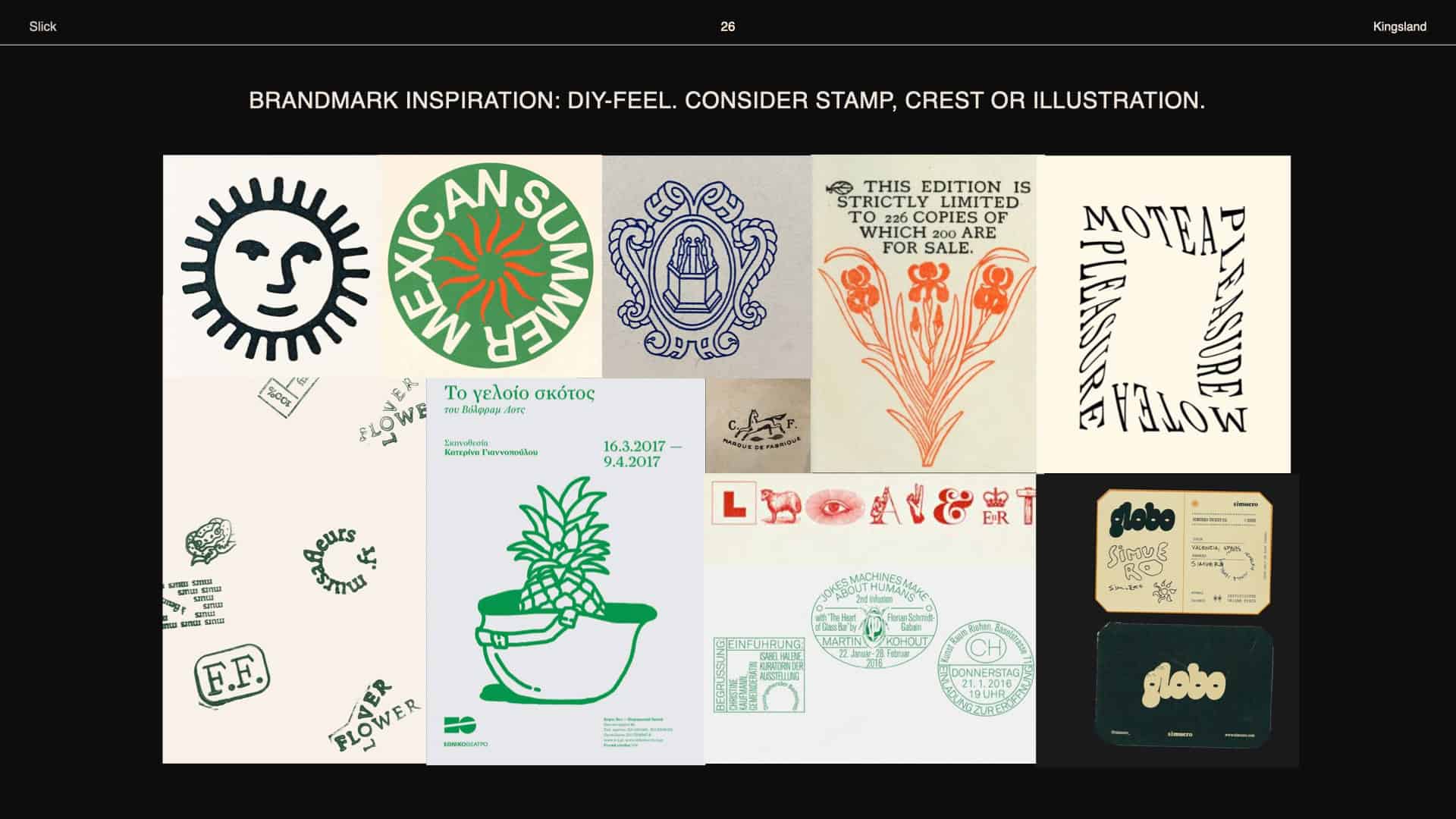
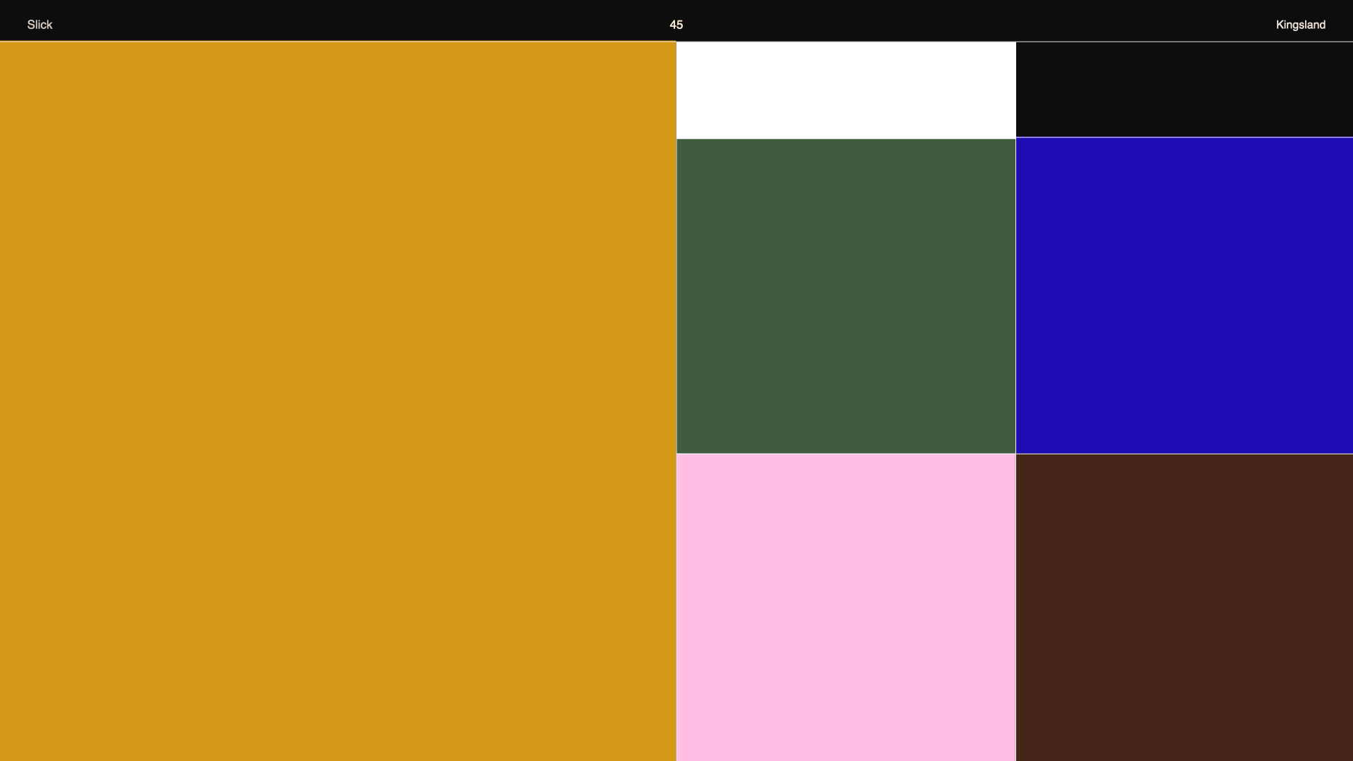
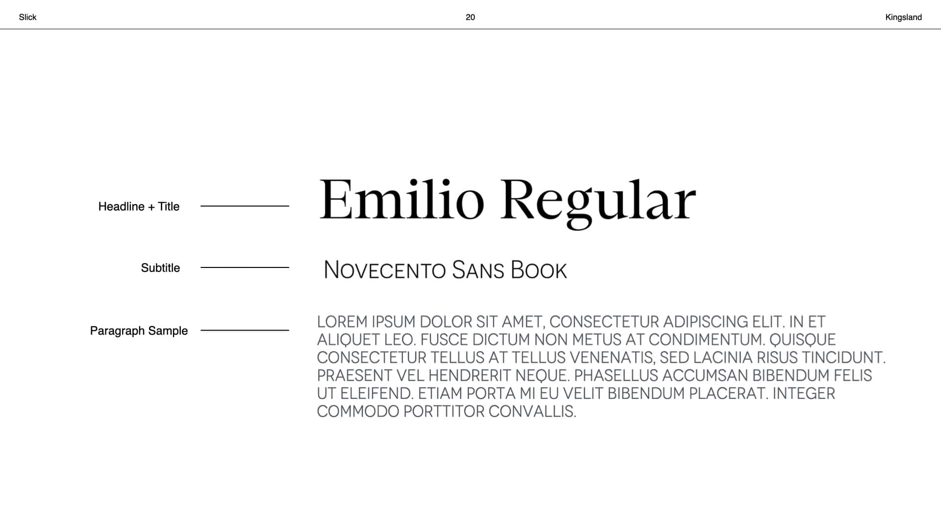
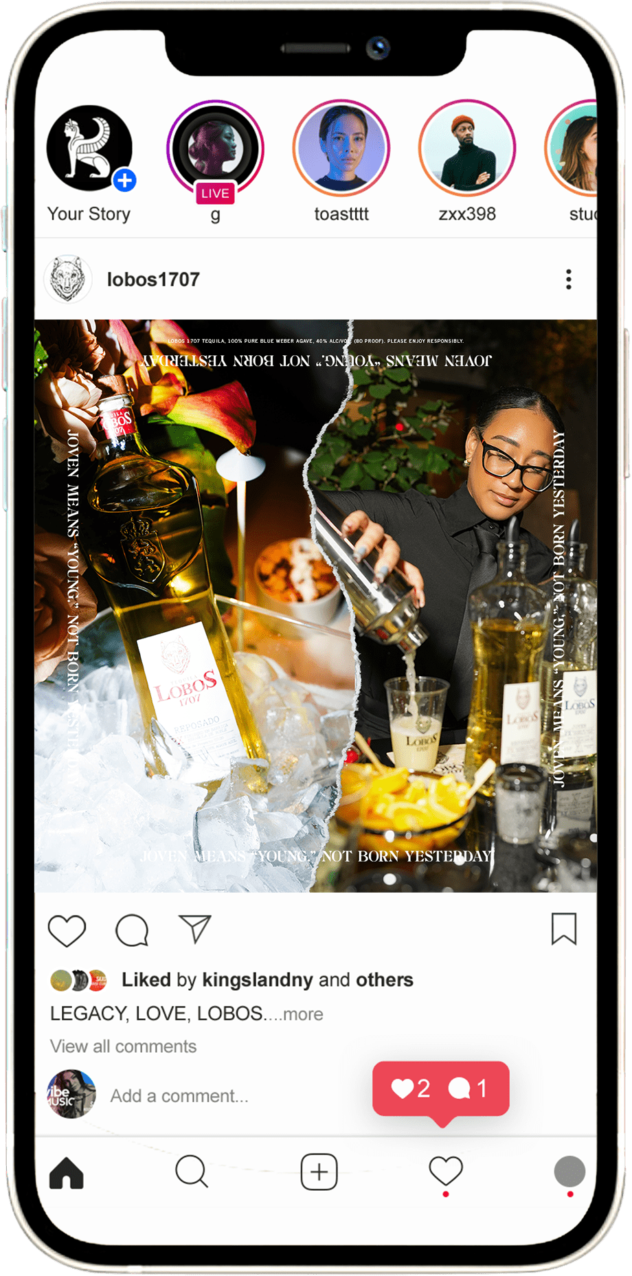
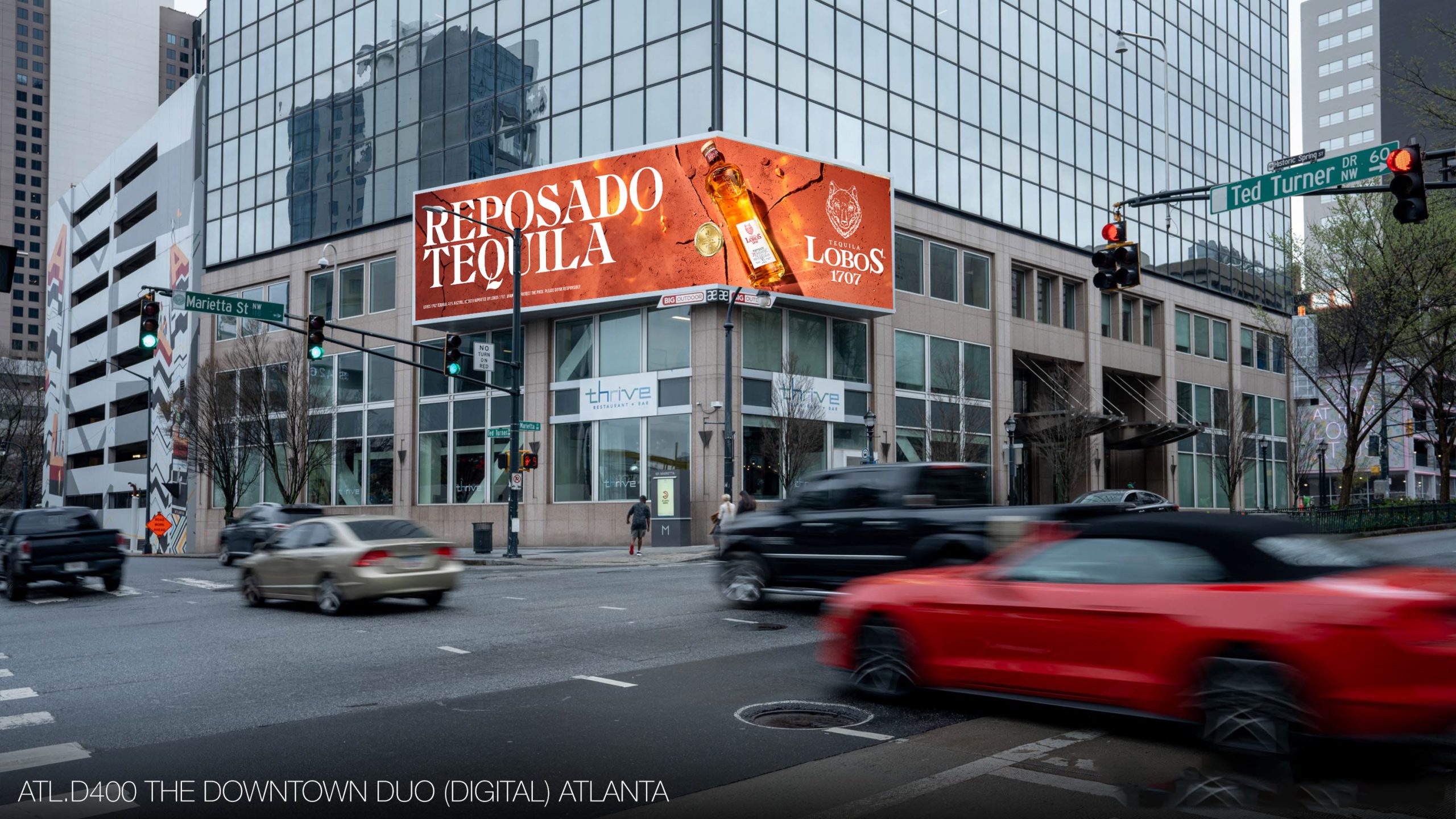
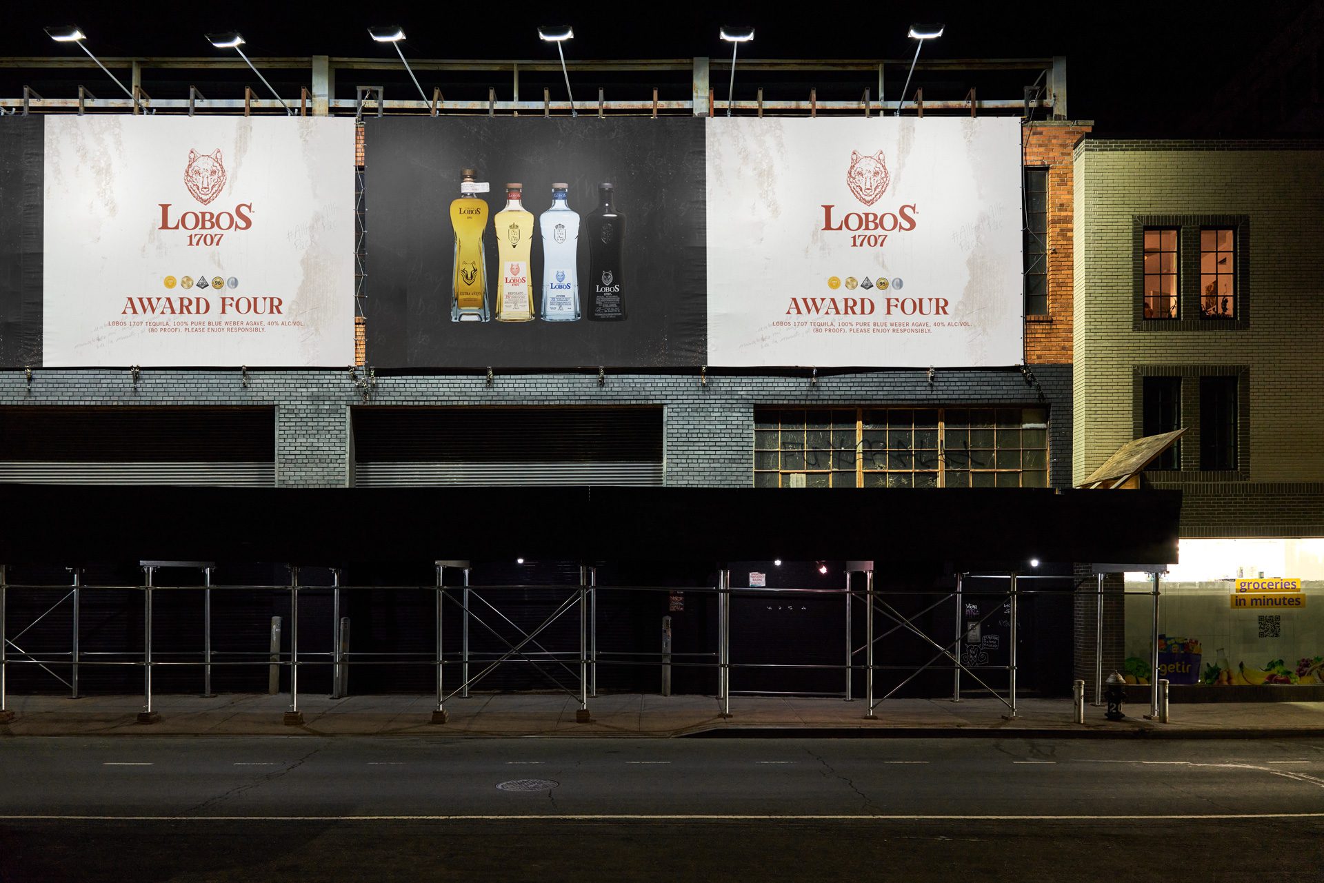
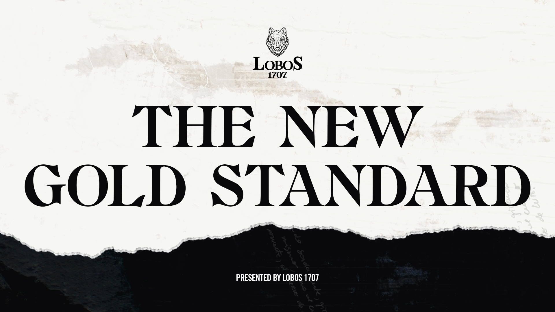
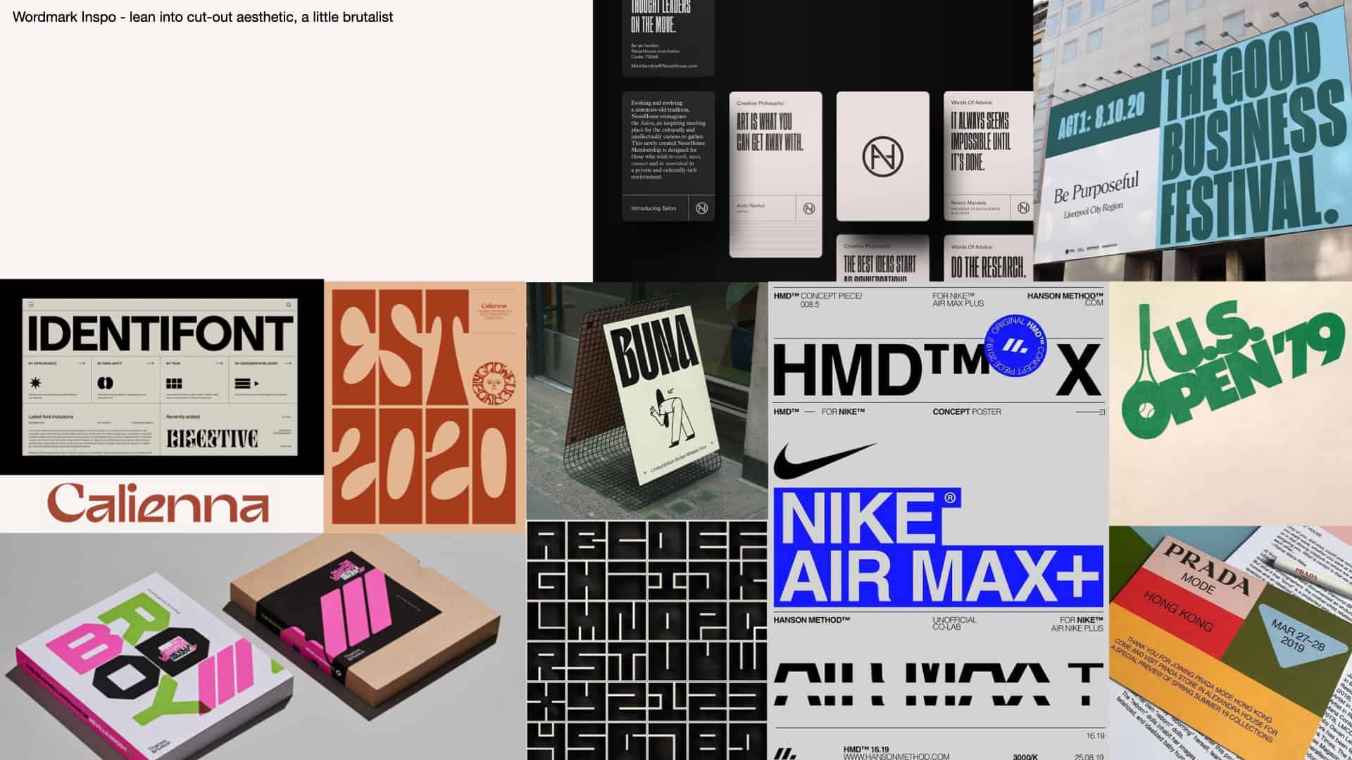
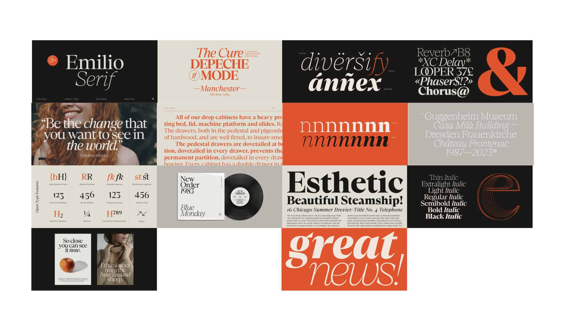
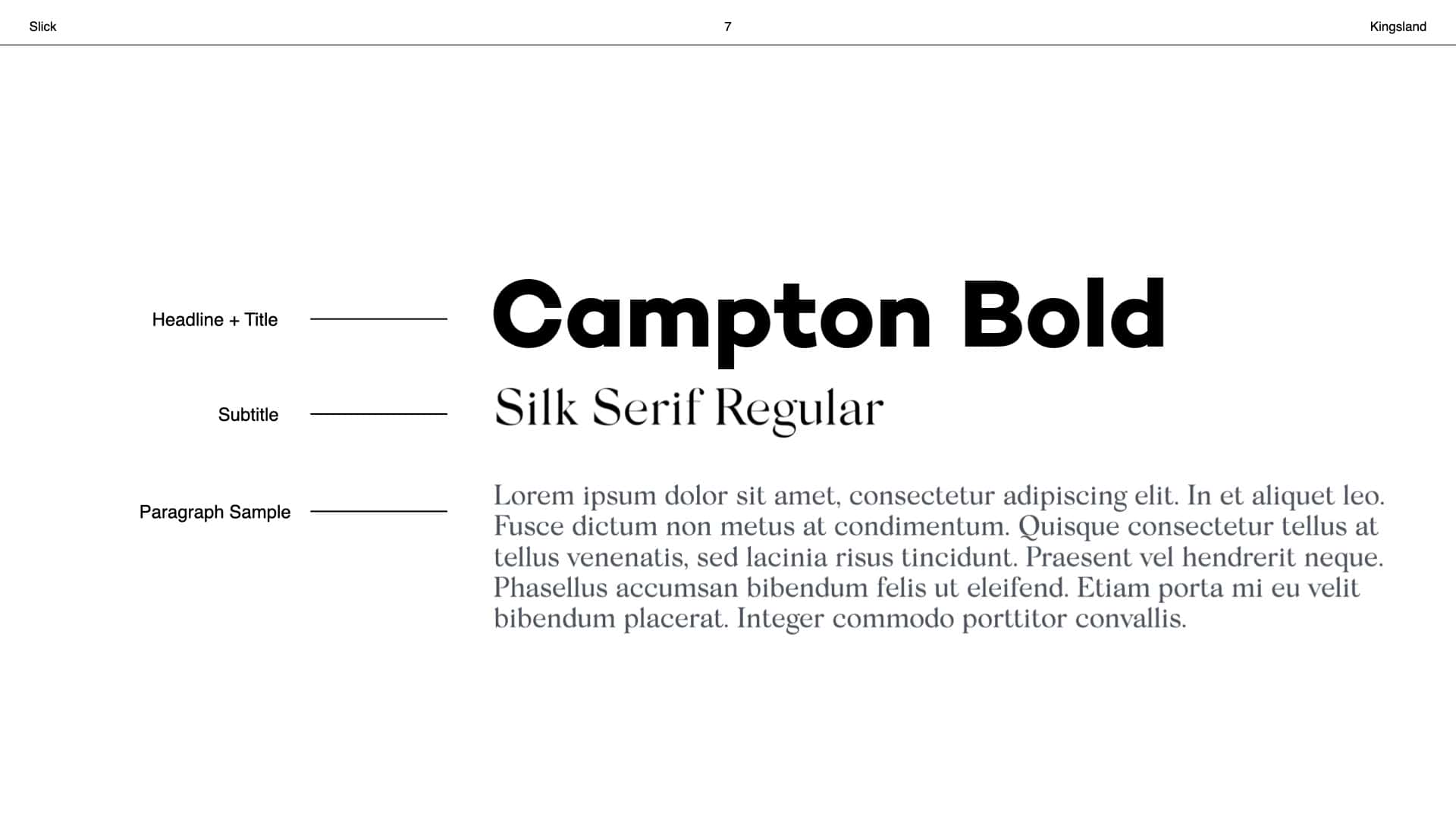
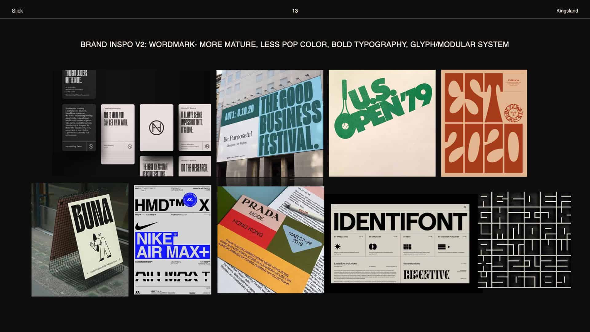
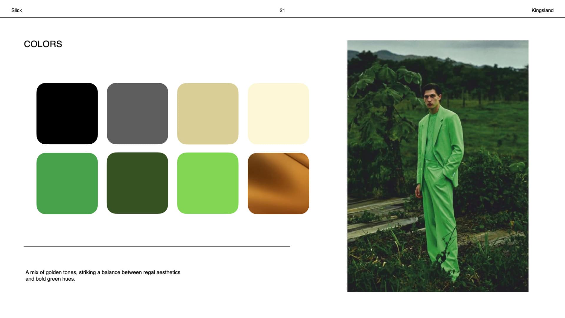
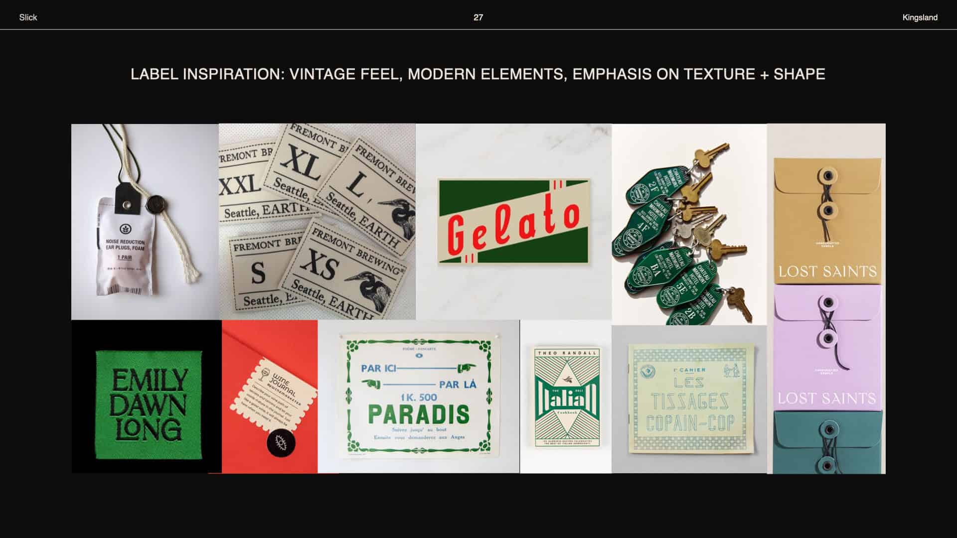
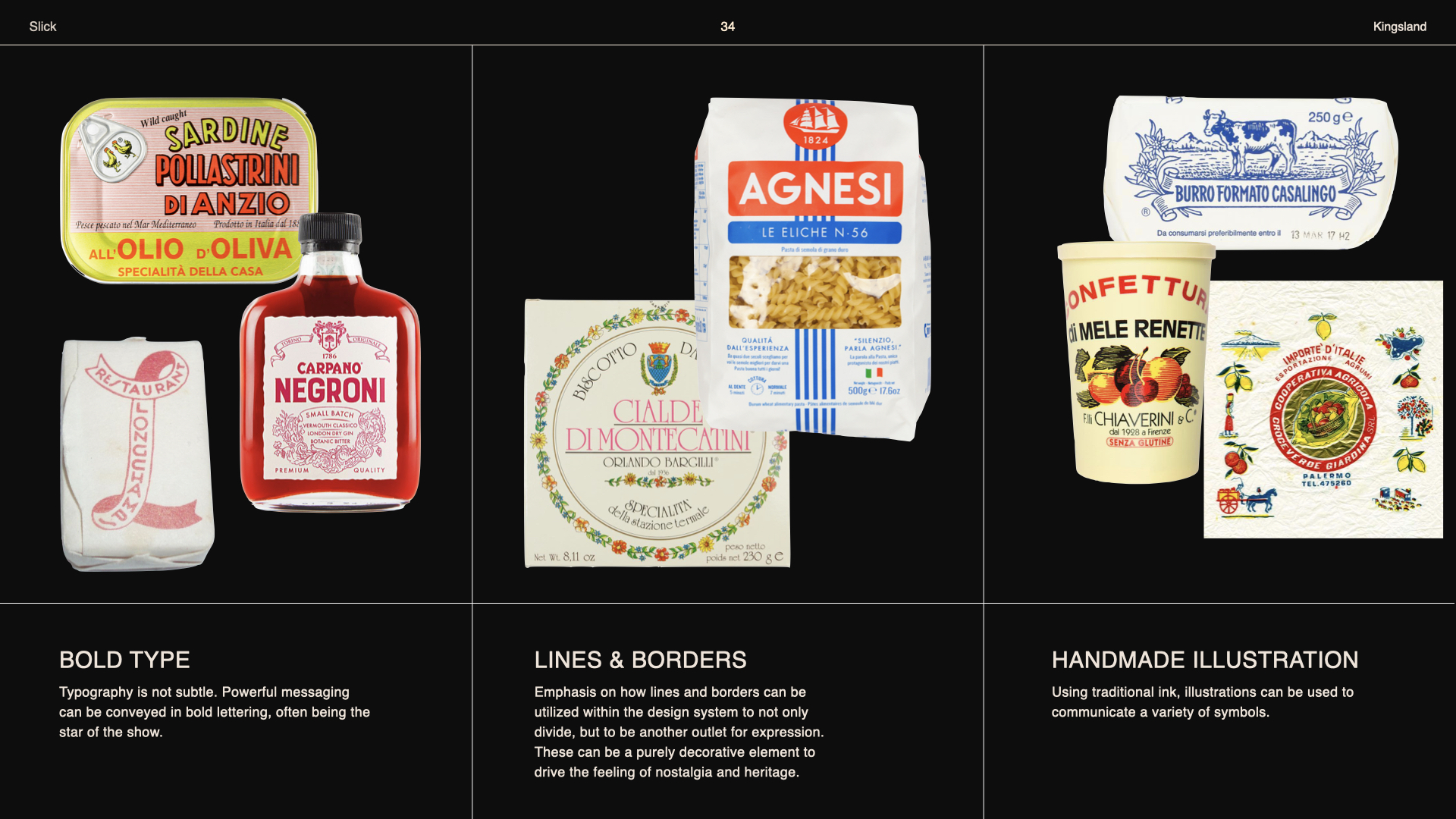
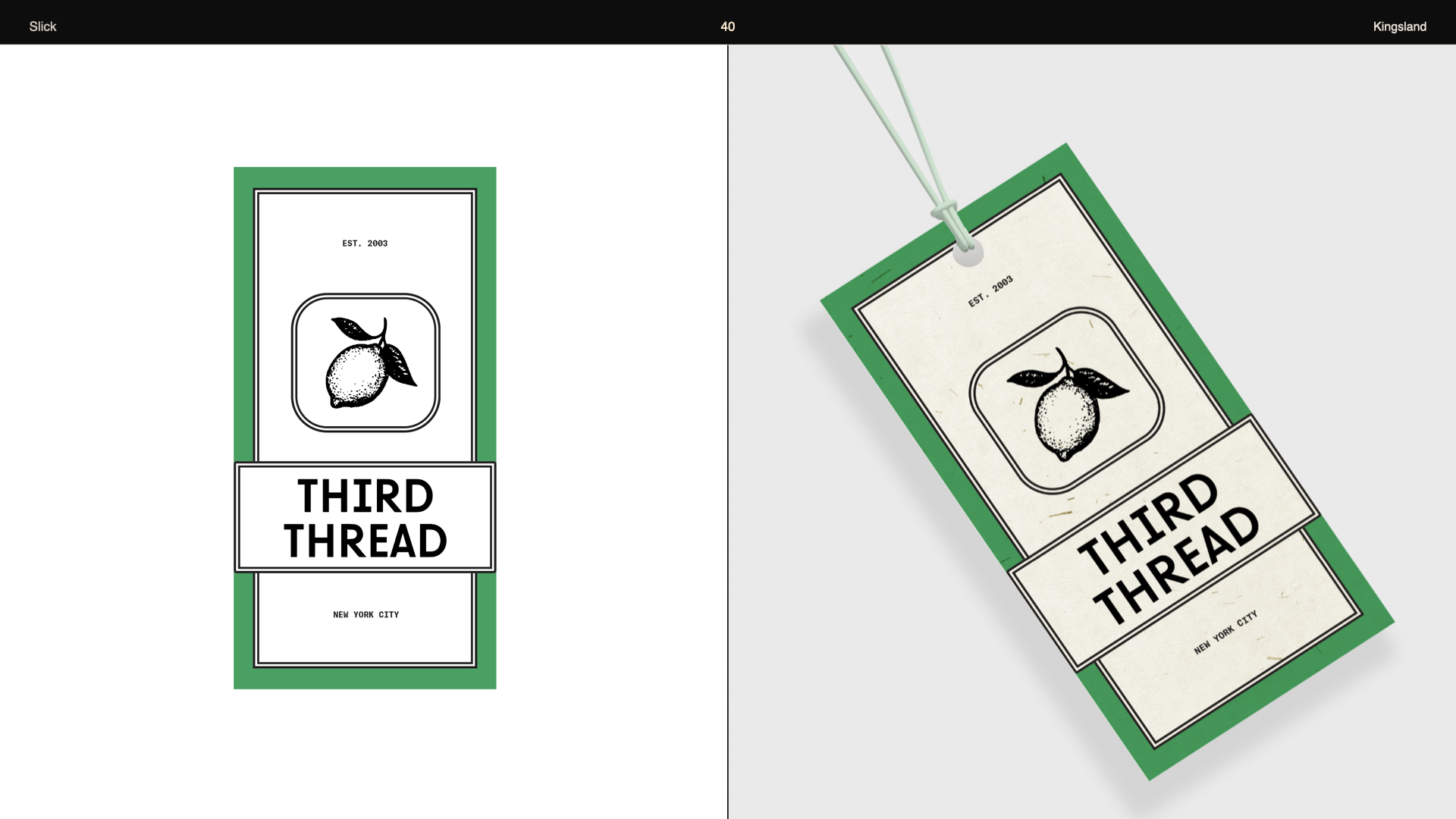
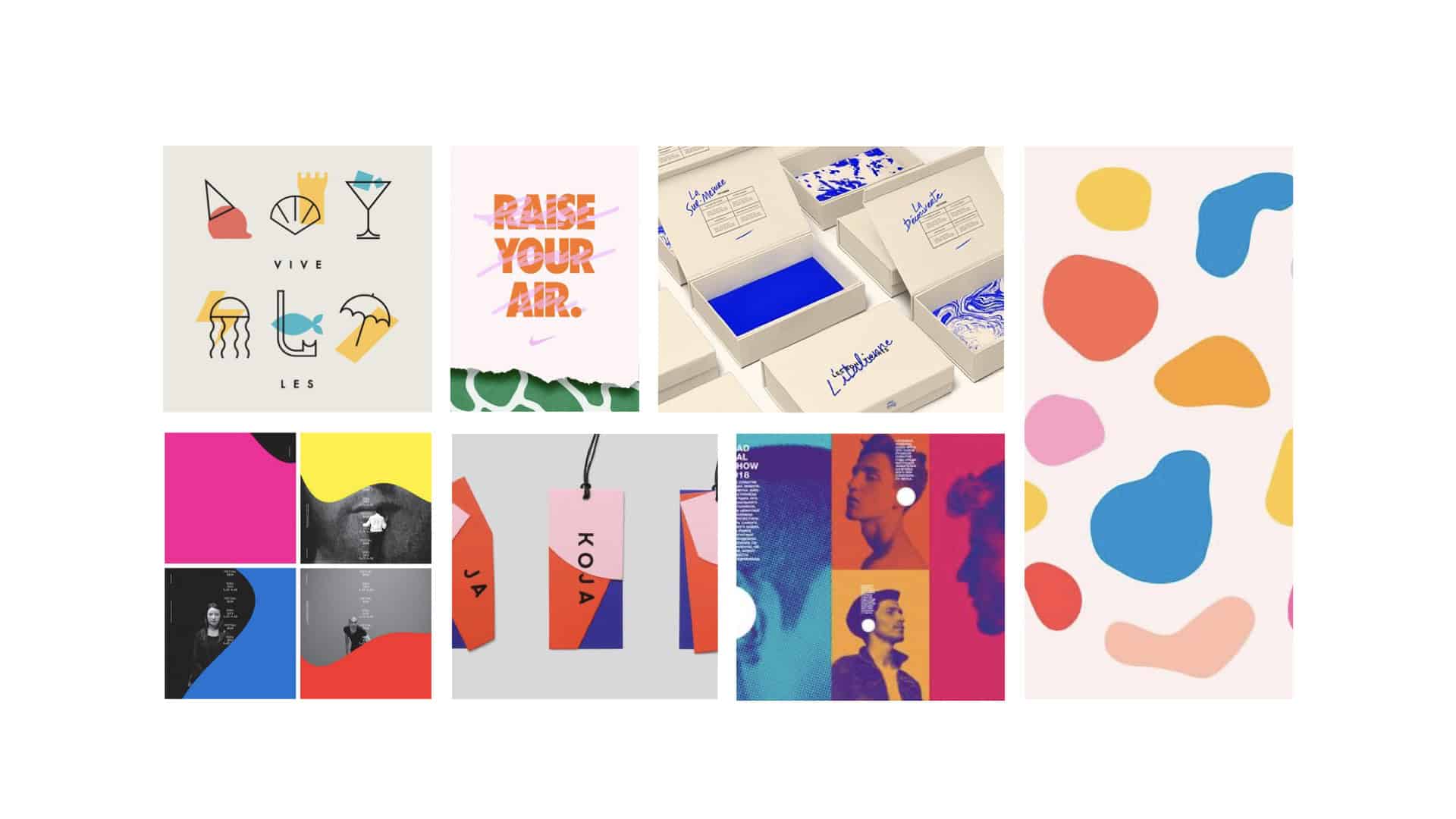
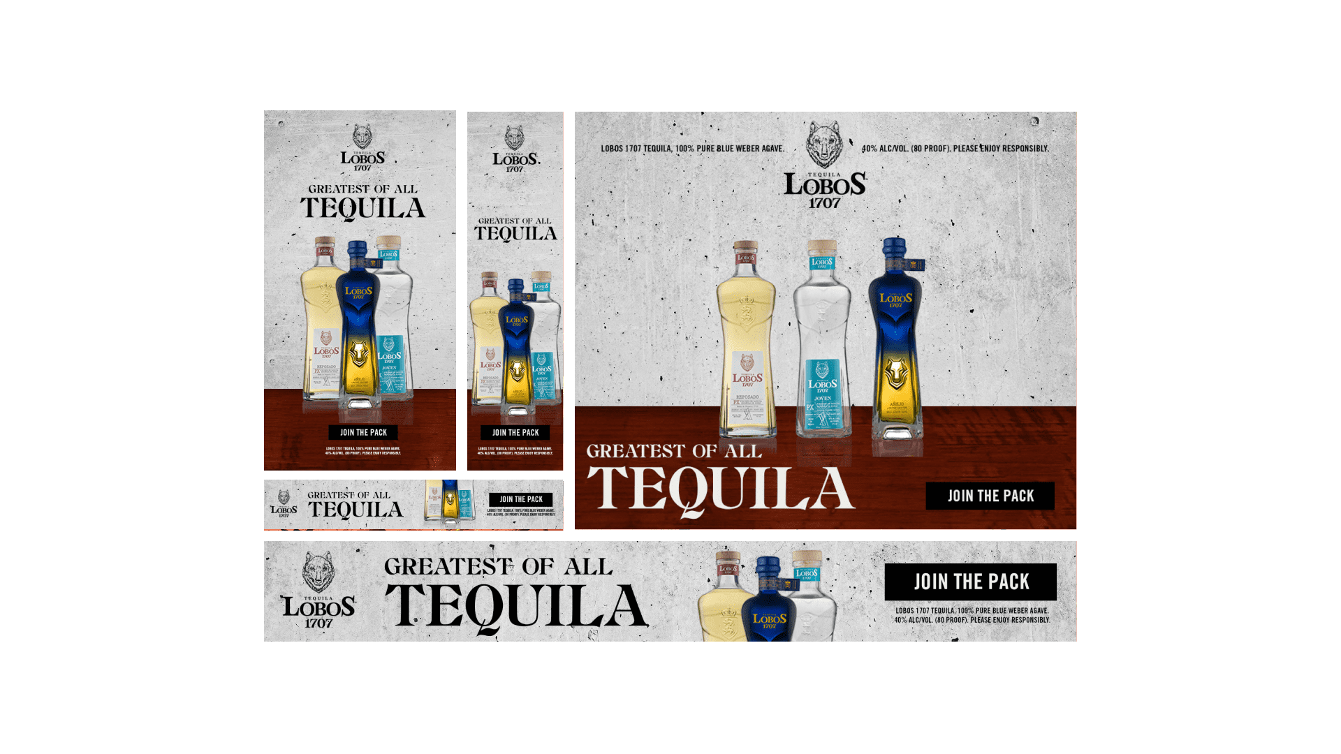
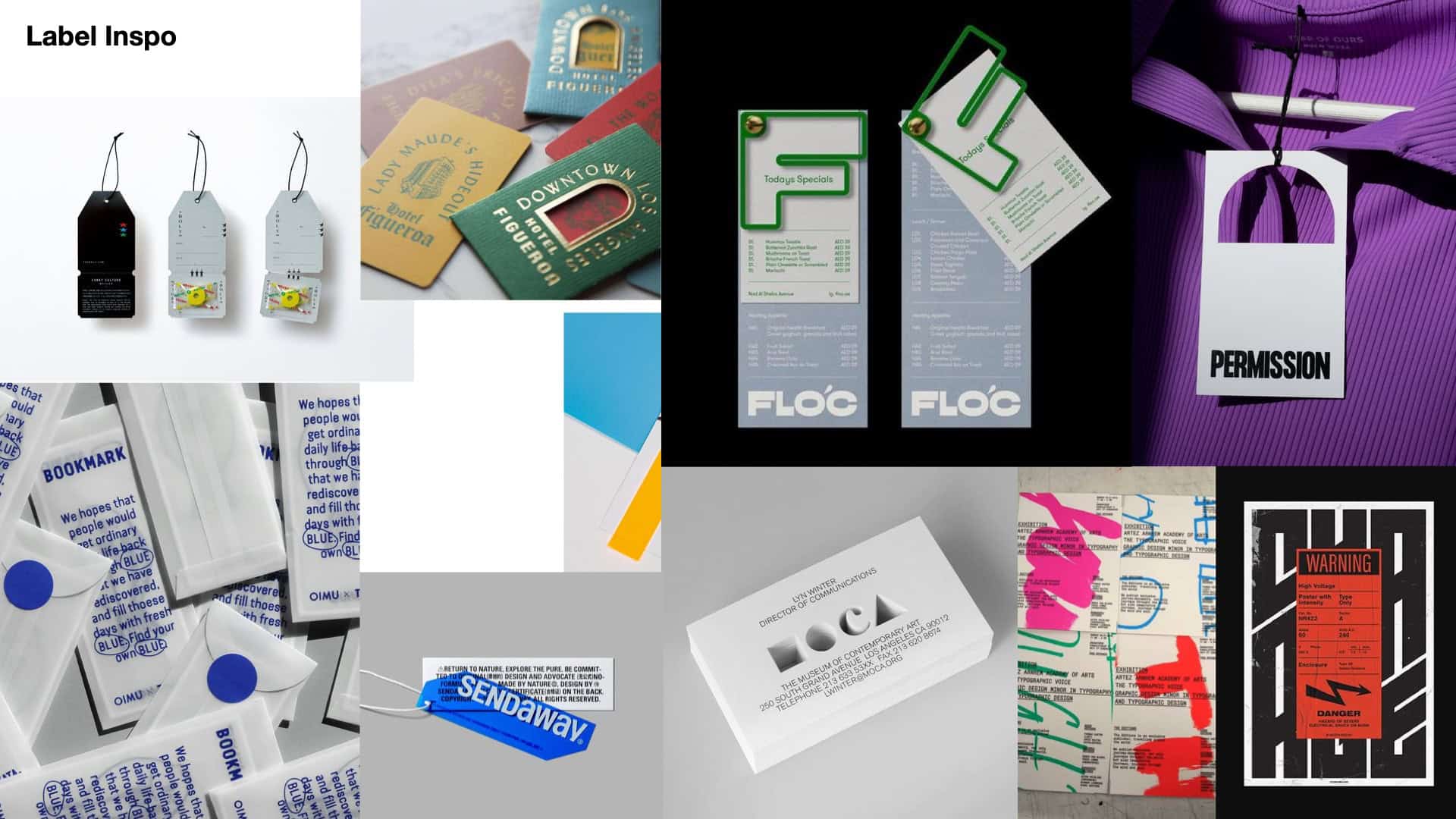
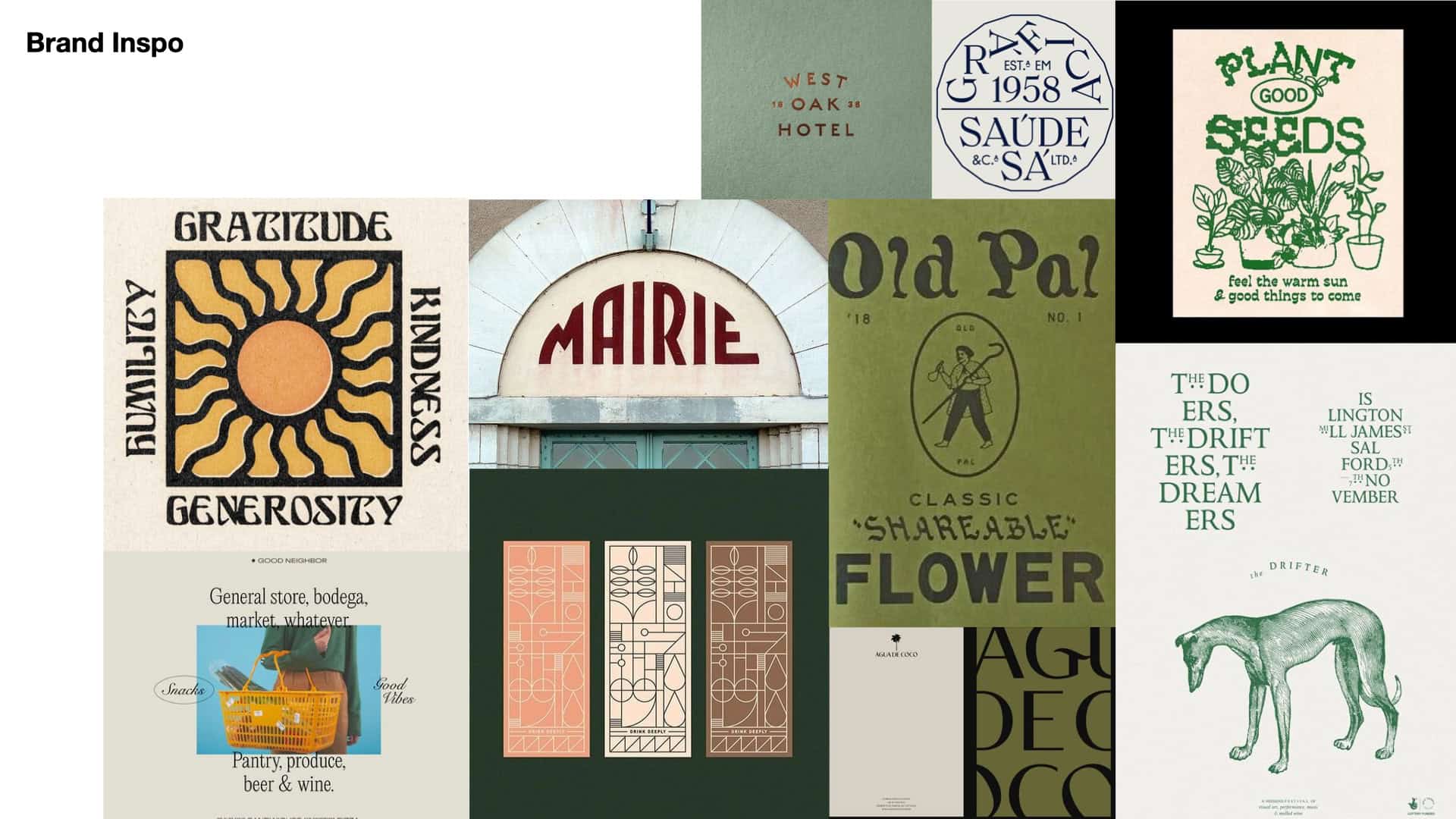
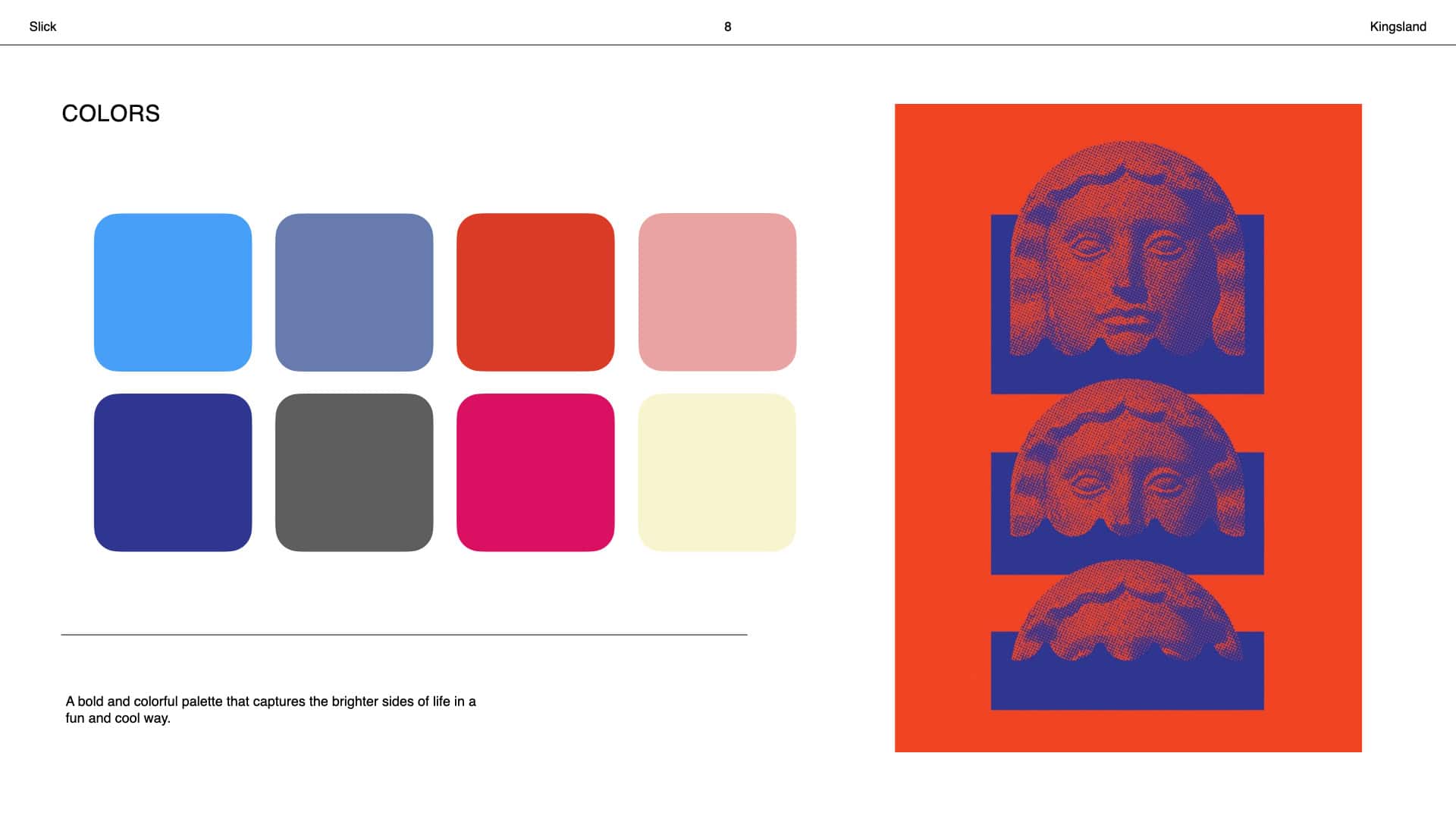
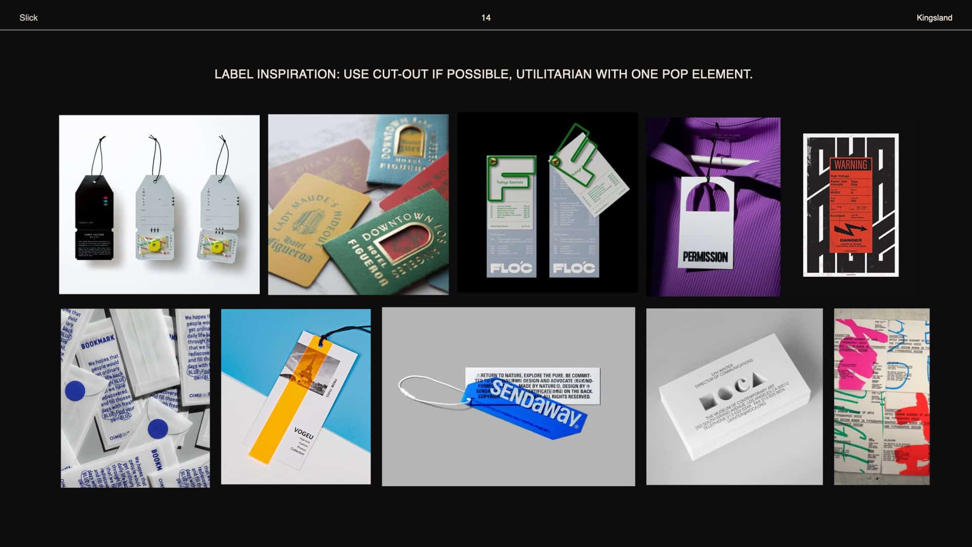
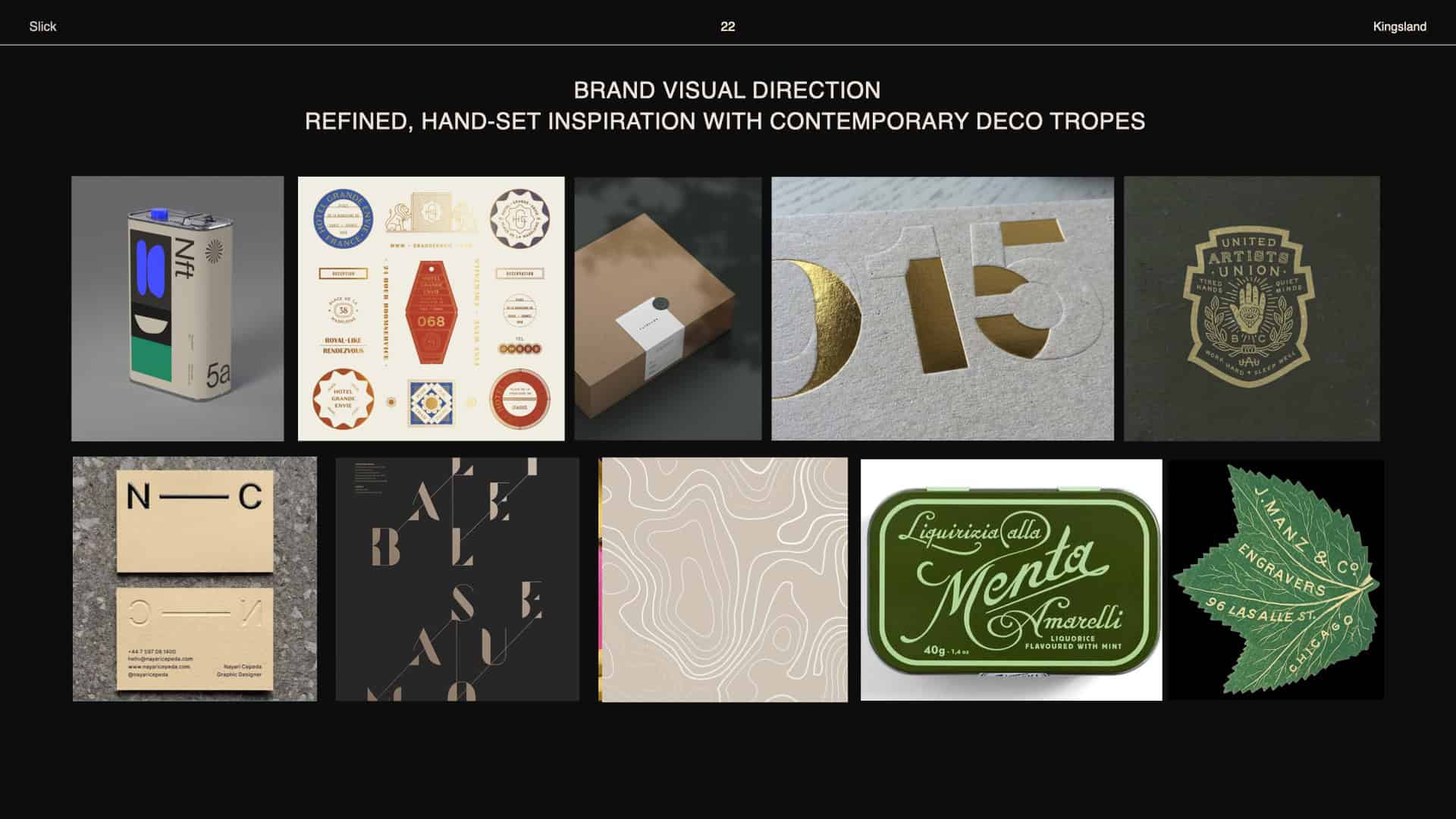
The spirits advertising landscape operates with a particular visual vocabulary: lifestyle photography, aspirational color grading, clean lockups. Lobos exists within that world but has enough visual character to push past the generic. The challenge wasn’t differentiating from the category — it was making sure that differentiation held consistently across a format range that went from a 1:1 social post to a city-scale OOH placement. We started with Kingsland to define a design direction that extended Lobos’ brand guidelines rather than simply restating them. Drawing from typographic references, vintage advertisement compositions, and editorial magazine layouts, we built a visual language that felt premium without being stiff — bold type, refined textures, warm tonal palettes that honored the tequila’s Mexican heritage without leaning on clichés. From there, the work split into two tracks. On the digital side, we worked with a small team of writers and account leads to align messaging and product positioning for each SKU — the Joven, Reposado, Mezcal, and award-winning expressions each required their own compositional thinking, pulling from a library of product and event photography to build compositions that were specific to each bottle. Templates were built to be flexible by design: text and image swappable, campaign-ready without requiring a rebuild from scratch each time. On the motion side, we developed title card templates and multiple end card bumper variants — four distinct directions — giving Lobos a video identity that could adapt across different campaigns while maintaining a unified signature. The New York billboard execution then proved the system at its largest scale, translating what worked on screen into a physical environment where design decisions that seem subtle in digital become unavoidable at 40 feet.
04
A complete cross-channel creative system — paid, social, motion, and OOH
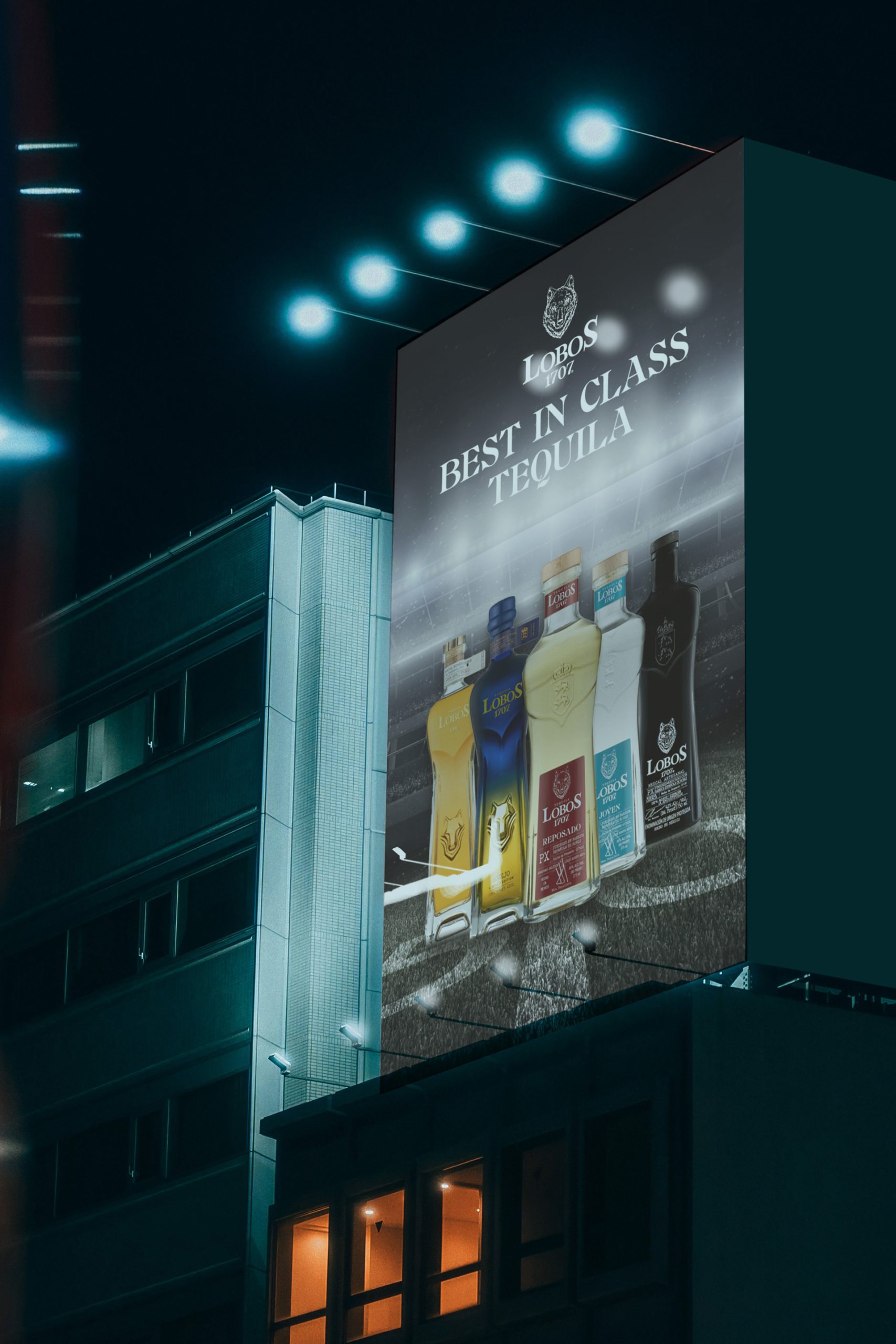
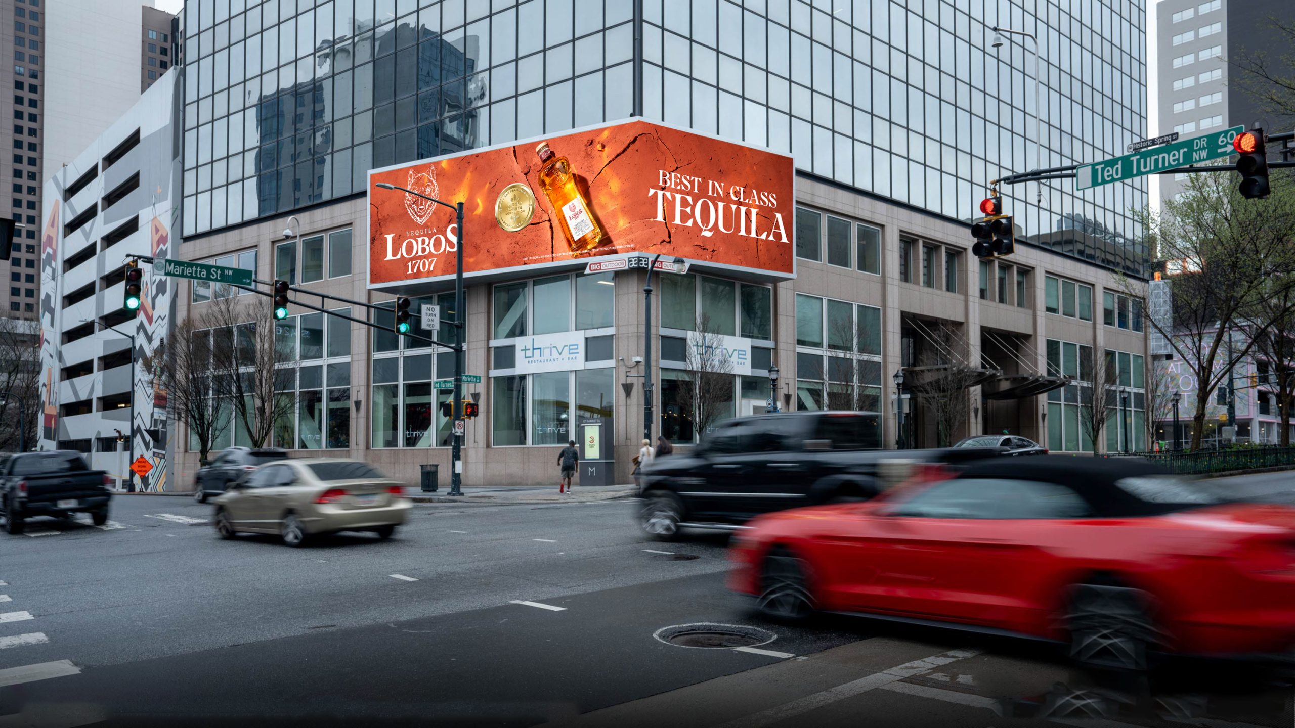
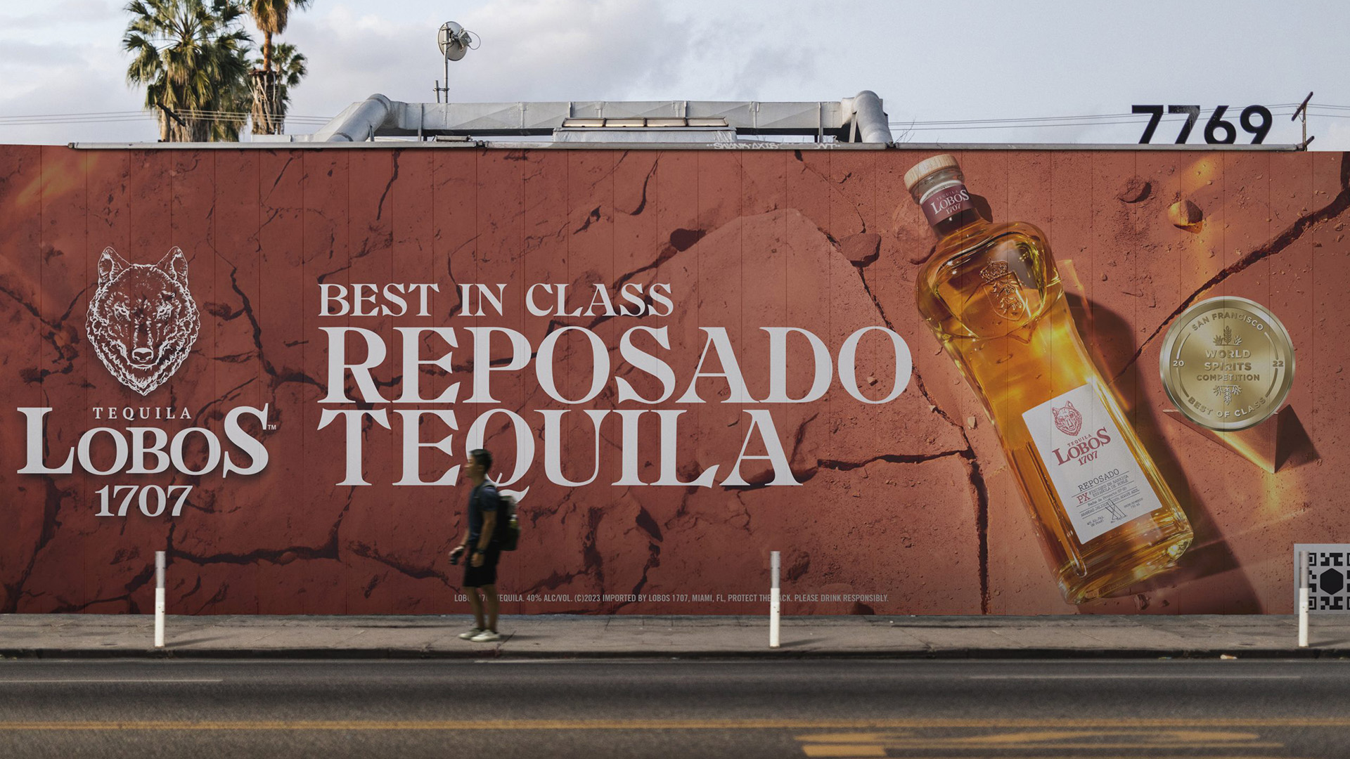
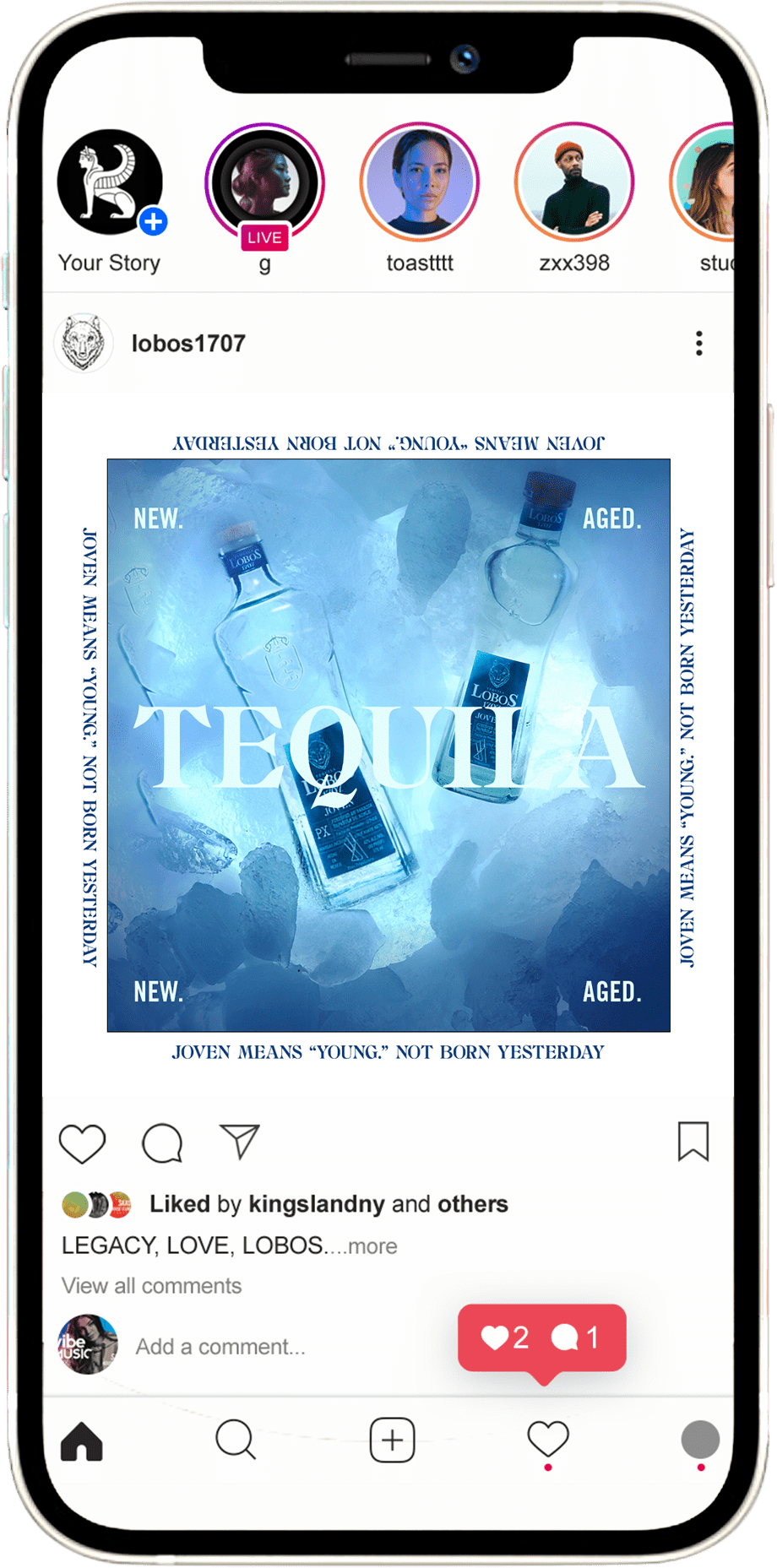
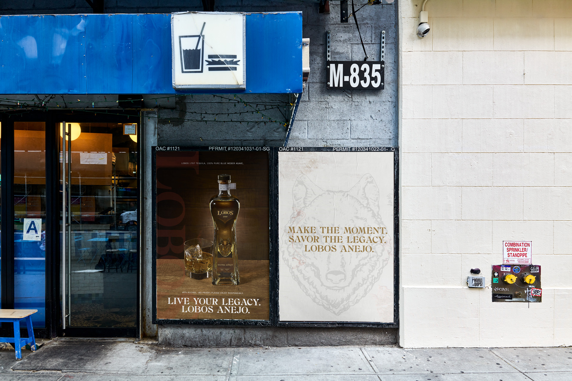
Per-SKU paid ad and social media templates covering Lobos’ full product lineup, built for flexible reuse across campaigns. Animated title cards, four end card bumper variants, and logo compositions with messaging for video. OOH billboard executions including a New York City placement. Every deliverable designed to extend the Lobos brand system rather than merely reproduce it.
05
Lobos creative in market across digital, video, and the streets of New York
The templates moved into live campaigns across paid channels, social, and OOH. The motion assets gave Lobos a video presence with real design identity. And the New York billboard put the brand on the street — visible, confident, and consistent with everything that ran alongside it digitally. The system worked because it was built to flex without fracturing.
06
A creative system is only as strong as its weakest format
A creative system is only as strong as its weakest format The easiest version of this project would have been building great paid ads and treating the motion and OOH as afterthoughts. We didn’t do that. Every format in this campaign — from a mobile story to a city billboard — was held to the same creative standard and the same brand logic. That’s not just a design philosophy. It’s the only way to build something that actually scales. Lobos is proof that Therum can take a brand from a social post to a street corner and make it feel like the same idea everywhere it shows up.