LetsGetChecked.
Posed as a one-pager. Shipped as a custom HTML solution wedged inside Salesforce. The 2023 Health Equity Report, designed and engineered solo, six breakpoints deep, inside a CMS that wasn't built for it.
Visit letsgetchecked.com ↗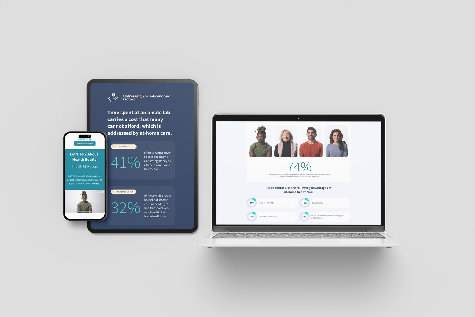
The pertinent details, what was built, what shipped, what it took.
LetsGetChecked
Lead design for LetsGetChecked’s healthcare e-commerce experience. At-home diagnostics brand scaling from DTC into enterprise health.
letsgetchecked.com ↗Solo Contractor · Designer · Developer
- Product interfaces
- Brand direction
- Creative assets
- Product design
- UI/UX
- Brand
- Creative direction
The Premise
Healthcare access is a brand-defining issue. The page had to act like one.
LetsGetChecked builds at-home health testing. The thesis of the company (healthcare should travel to the patient, not the other way around) was already baked into the product. What the company didn't have was a digital surface for the argument: a landing page and whitepaper that put the data behind the mission in front of the people who needed to read it.
The brief, on paper, was a one-pager. Hero block, stats, conclusion, download CTA. Done.
The brief, in practice, was harder. The page had to live inside Salesforce, LGC's CMS of record, and Salesforce wasn't built to host editorial-density landing pages with bespoke layouts at six breakpoints. The "one-pager" was actually a custom HTML solution: hand-written markup, hand-written CSS, hand-written responsive logic, all engineered to slot into a Salesforce template that fights you the whole way.
One designer. One developer. Same person. End to end, UX, UI, creative direction, brand stewardship, the build, the integration, the breakpoints.
What I Walked Into
A brand system in good standing, teal accent, cream surfaces, careful editorial photography of real people, a wordmark that stays out of its own way. Plus a stack of statistics about American healthcare access that were going to do most of the heavy lifting if they got laid out right.
Two problems sat on top of each other. The design problem was the one a long-form report always carries: a stat-heavy page someone has to actually read. Pages like this die in two predictable ways, overdesign the data and lose the argument under decoration, or underdesign it and hand the brand a Squarespace template stacked with pull quotes.
The engineering problem was Salesforce. The CMS was built for marketing email components and standard product templates, not custom editorial layouts. Every block had to be rebuilt as raw HTML and CSS that could survive Salesforce's render layer without breaking the responsive grid. No shortcuts. No frameworks. No safety net.
Make the data feel as urgent as it actually is. Ship it inside the box that wasn't built to carry it.
The Approach
Three moves shaped the page:
- Stats lead, copy follows. Every section opens on a number. The percentage is the headline; the explanation is the supporting line. Numbers are how a healthcare-access argument actually lands, nobody changes their mind because of an introduction paragraph.
- Photography of people, not products. The brand already had it. I leaned on it. Each stat block paired with a portrait of someone the data was about, a face, not a patient ID. The page never lets you forget that 59%, 60%, 52% are people.
- One column, six widths. Editorial layout. The page reads top to bottom, no carousels, no expanding panels. The same vertical column at 1920 narrows cleanly to 320, same hierarchy, same beats, smaller frame.
Process & Iteration
Five rounds got to the shipped page. Each one answered a question the last one raised. Showing the path because it matters, the layout didn't arrive by accident. It was the answer to a series of progressively sharper questions about hierarchy, brand fidelity, and how Salesforce was going to render any of it.
Wireframe
v1
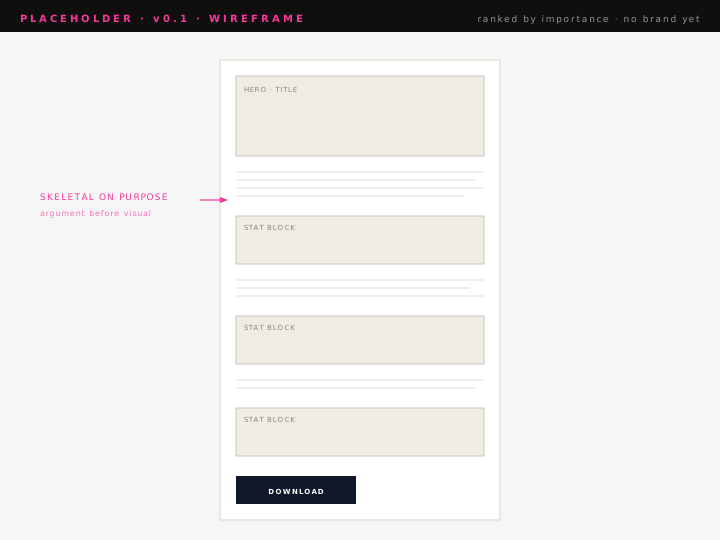
Wires were skeletal on purpose, rectangles with no brand inside them, sized by importance, ranked top to bottom. The argument got built before the visual layer touched it.
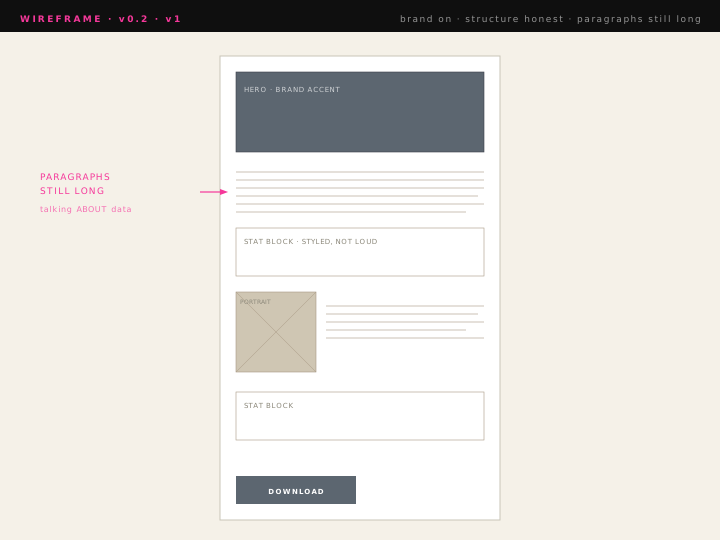
v1 brought the brand in: teal, cream, the editorial photography. The structure carried it, but the page was still talking about the data instead of with it. Section intros ran long. Stats were styled, not loud. The hierarchy that worked in wires got softened by paragraph blocks living above the numbers.
v2
v3
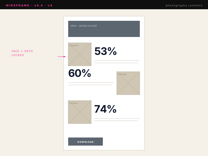
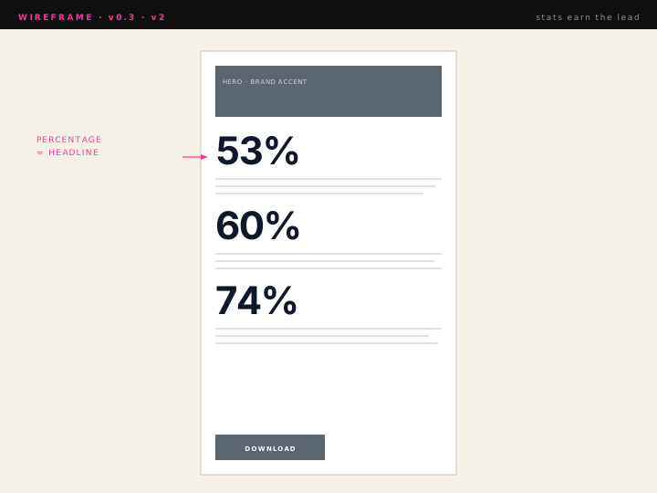
v2 inverted the rule: the percentage became the headline; the explanation dropped underneath. Each section now opened on a number, not an introduction. The page started doing what the brief was actually asking it to do.
v3 fixed the photography. Crop ratios got dialed against headline length so portraits and stats locked into a shared rhythm instead of fighting each other for vertical space. Faces moved closer to the data point they belonged to. The page started reading like one continuous editorial piece.
Final
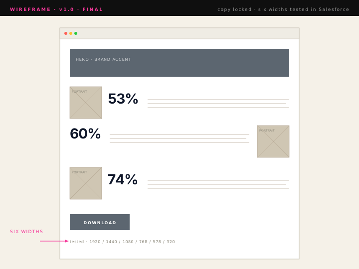
Final pass with locked copy. Type ramp tightened. Every section break re-tested at six widths against the actual Salesforce render, not the Figma frame. The page reads top to bottom in one pass, on a desktop or a 320px phone, inside a CMS that wasn't built to render it.
The Page
The full 1920 design, top to bottom, the answer the five rounds were trying to write. Hover to scroll through the page; click to open it full-size.

Across Devices
Six breakpoints, one page. The rule: same data hierarchy at 320 as at 1920, you don't get to drop the urgency because the screen got smaller.
Phone · Tablet · Laptop
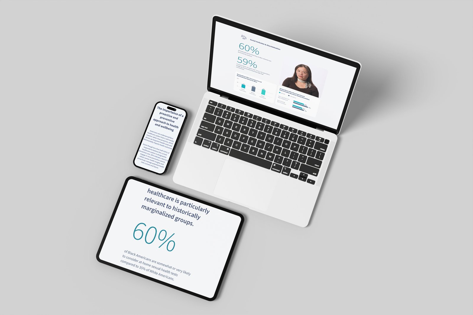 Device set · angle 2
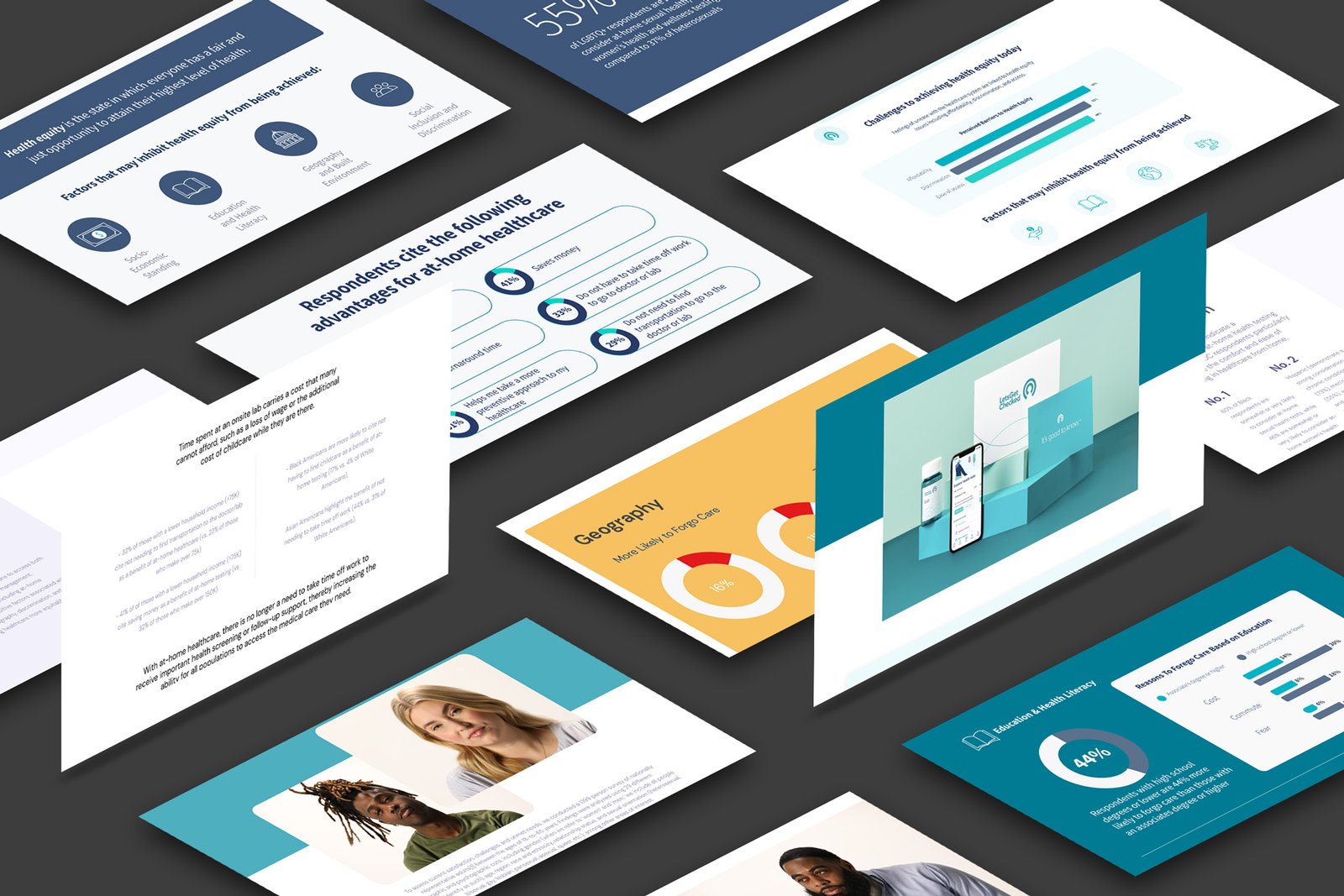 Device set · angle 3
What Shipped
A one-pager, on the surface. A custom HTML build, underneath. The Salesforce page nobody thought you could ship.
The page lives where it's supposed to live: on letsgetchecked.com, inside Salesforce, with the whitepaper attached and the data leading every section. Health Equity wasn't a launch event; it was a brand argument that needed somewhere to land. This page is where it landed.
The constraint wasn't a setback. It was the project. Salesforce shaped what was possible. Working inside it, without abandoning the editorial intent, is the case study.