J.P. Morgan Chase.
At a bank touching millions of customers daily, the distance between brand intent and brand execution is where trust erodes. I directed the visual output that closed that distance (card, email, web, ATM, print, photography) making every surface feel unmistakably Chase.
Visit chase.com ↗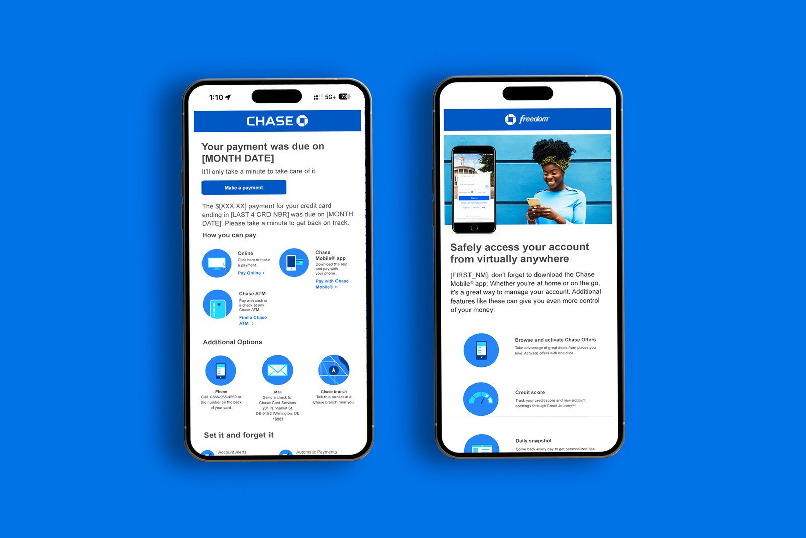
The pertinent details, what was built, what shipped, what it took.
J.P. Morgan Chase
Art direction across Chase’s consumer banking brand, print, digital, email, and ATM. Enterprise-scale brand system work.
chase.com ↗Art Director (part of a team of Art Directors)
- Print campaigns
- Digital assets
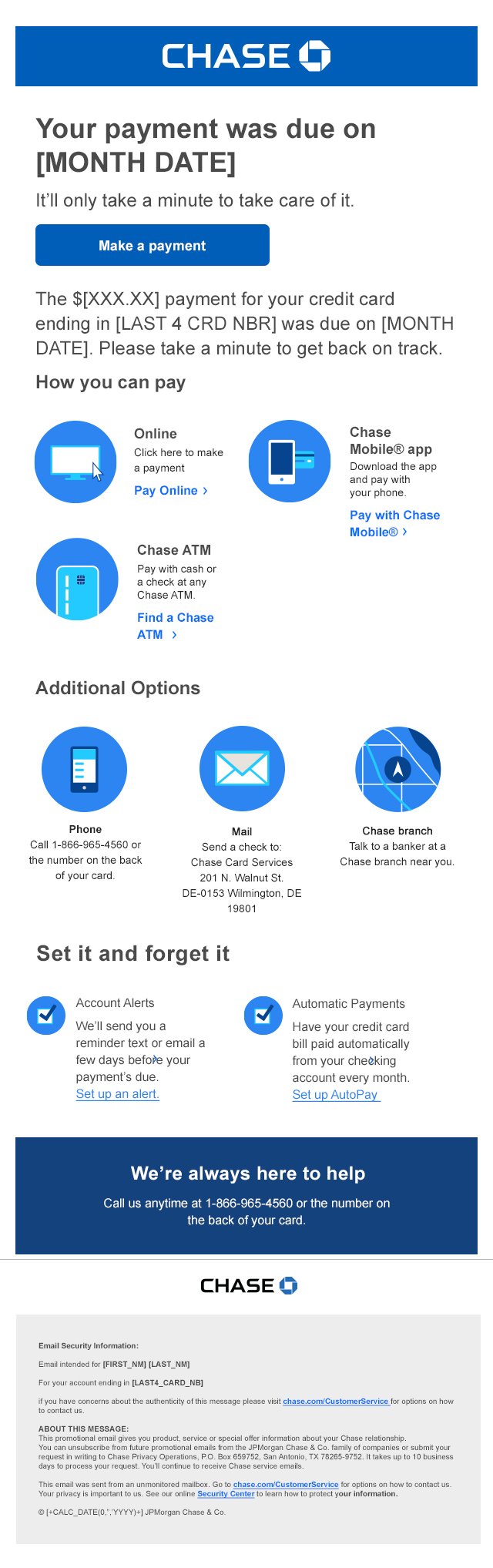
- Email designs
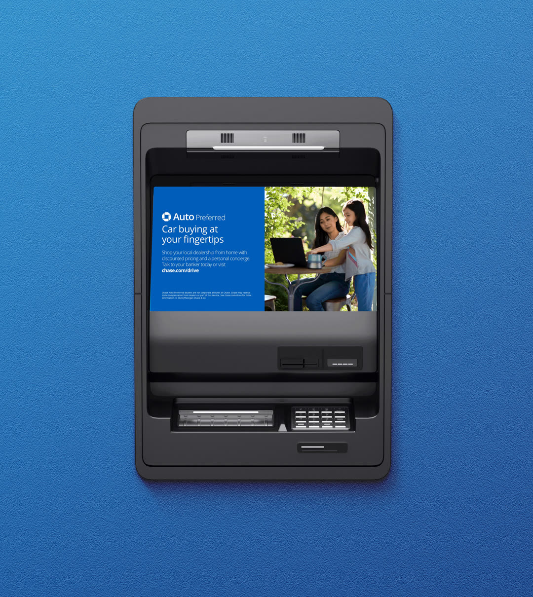
- ATM interfaces
- Art direction
- Brand systems
- Digital
The Challenge
J.P. Morgan Chase serves millions of clients across banking, investment, and wealth management. The brand surface is massive, card graphics, email campaigns, web banners, ATM interfaces, print collateral, photography. Every one of those surfaces meets a customer at a moment of financial attention. That is not a design brief. That is a trust contract.
The brand and design system was crafted by a team of creative directors. The real test was execution at scale, making sure every individual surface honored that system without dilution. Most institutions lose brand coherence at the edges: the email that does not match the card, the ATM screen that feels generic, the mailer that could belong to any bank. I came on as art director, running a direct team of three under the creative director, to make sure none of that happened.
What We Built
Two moves carried the work. A modular email system, designed so every campaign variation, every regional send, every product push still felt unmistakably Chase. Consistency at volume, without flattening the creative into lifeless templates. And a custom icon and graphic library built to communicate complex financial concepts (rates, terms, programs, eligibility) clearly and engagingly, inside a visual tone that holds for a major bank.
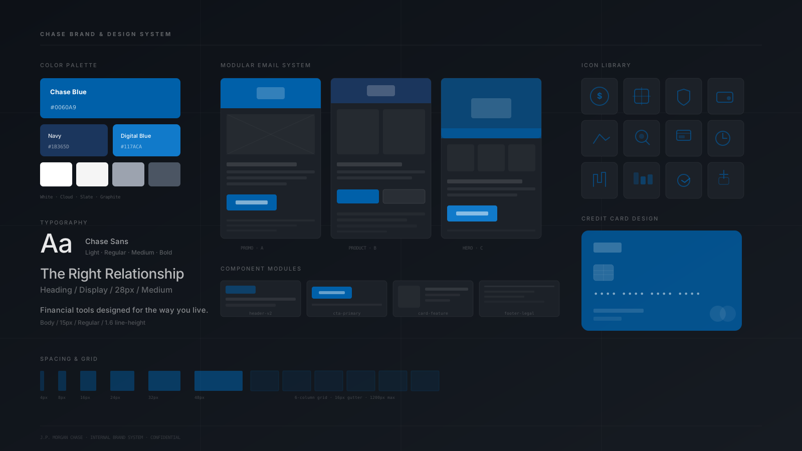
More from the modular kit


Every Image, a Brand Signal
The bank does not get a second chance to introduce itself.
Beyond the system work, I drove art direction on photography, the surface where brand perception is built or broken in a single glance. Every image had to function as a trust signal. Not stock. Not generic lifestyle. Imagery calibrated to communicate reliability and innovation at the exact moment a customer is paying attention to their money.
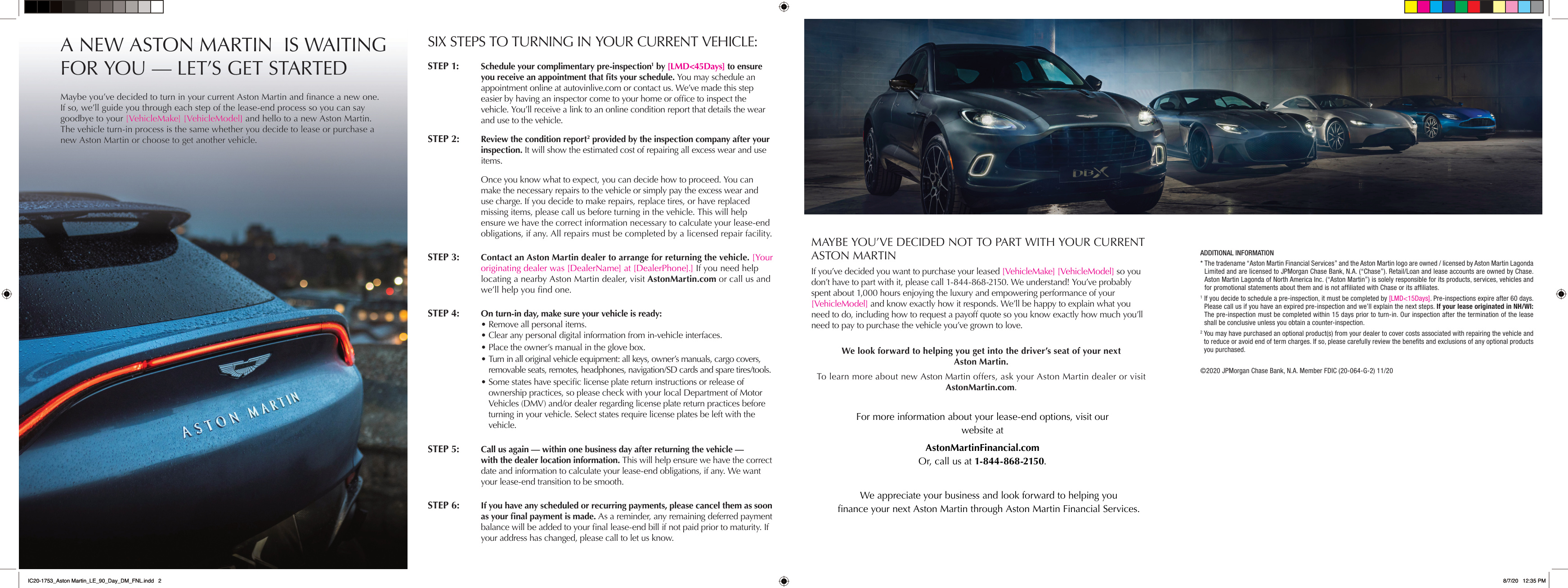
Direct mail, Aston Martin × Chase

The modular email system shipped to production and became the backbone of Chase's campaign output, personalized, visually consistent communication at the scale a global bank demands. The icon library gave product and marketing teams a shared visual vocabulary for concepts that previously required dense copy to explain. And the photography direction established a visual register that held across every channel: print, digital, in-branch, ATM.