Jaywalk.
Brand identity by Kingsland. Web design and photography direction by me, paired with Kingsland's developer on the build, for New York Distilling Co.
Visit jaywalkrye.com ↗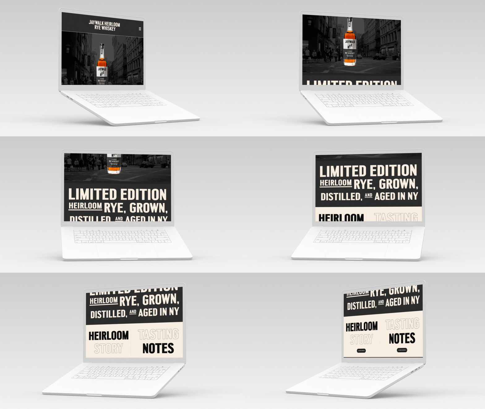
The pertinent details, what was built, what shipped, what it took.
New York Distilling Co.
Five-page microsite for Jaywalk Rye Whiskey, brand translation from bottle to screen. Designed from a brand kit and a deadline, built with Kingsland’s developer.
jaywalkrye.com ↗Lead Designer
- Responsive microsite
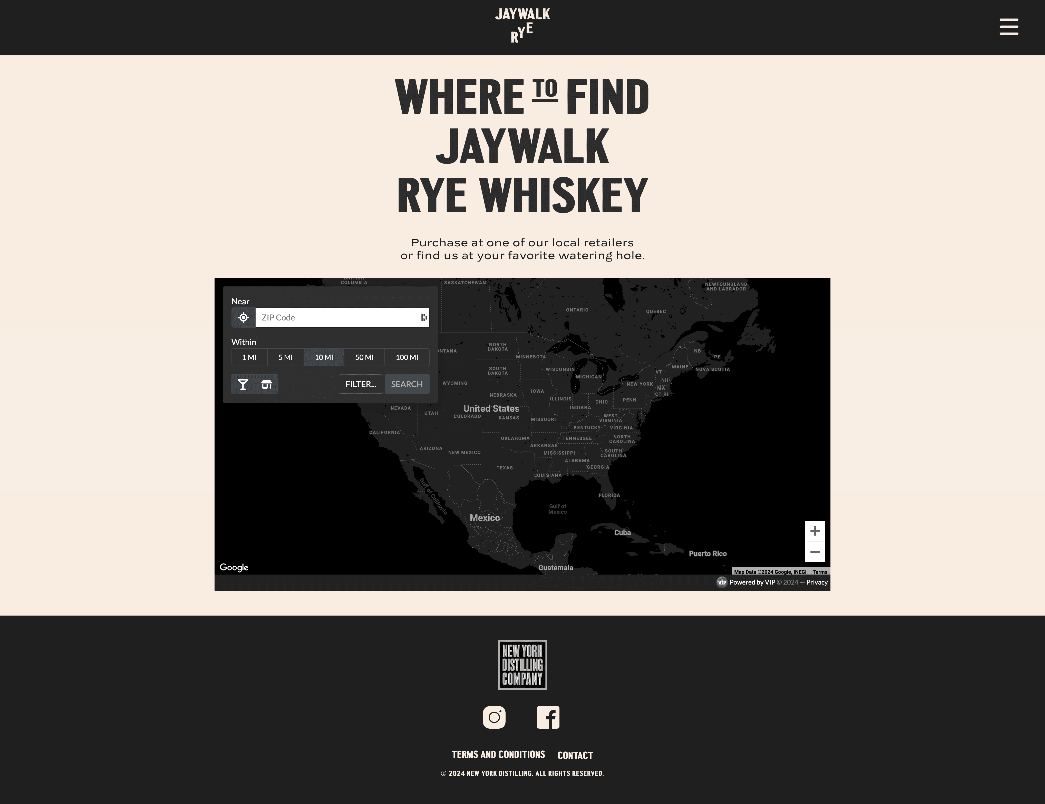
- Store locator
- Photography direction
- UI/UX
- Brand translation
- Photography direction
The Premise
New York Distilling Co. was founded by Allen Katz and Tom Potter in Brooklyn, Potter had already co-founded Brooklyn Brewery, and Katz brought decades in the spirits world. They started distilling rye in a Bushwick warehouse, ran a bar called The Shanty next door, and built a reputation making grain-to-glass whiskey before most craft distillers were filling their first barrel. Their earlier expression, Ragtime Rye, laid the groundwork. Jaywalk was the next generation, including an Heirloom expression made from an extinct New York rye varietal they revived.
Kingsland, a Brooklyn brand agency, had just finished the Jaywalk identity, wordmark, bottle design, type system, color palette. The production run was already moving. Retailers had orders in, and the line was expanding nationally and globally. But the brand had no web presence to point anyone to.
I was brought on to lead the web design, working alongside Kingsland’s developer who handled the build. The brief: translate Kingsland’s brand identity into a focused microsite that could ship alongside the bottles.
What I Walked Into
The starting state was a brand kit and a deadline. No CMS, no hosting, no wireframes, no copy deck. Kingsland had finished the identity round and handed off assets. NYDC had inventory headed to shelves. The microsite existed in everyone’s head and nowhere on a server.
The brief was tight: don’t redesign the brand, extend it. Build a focused microsite around the three SKUs, the distillery story, and a way to find a bottle nearby. No e-commerce, Jaywalk moves through retailers, not direct-to-consumer.
The Approach
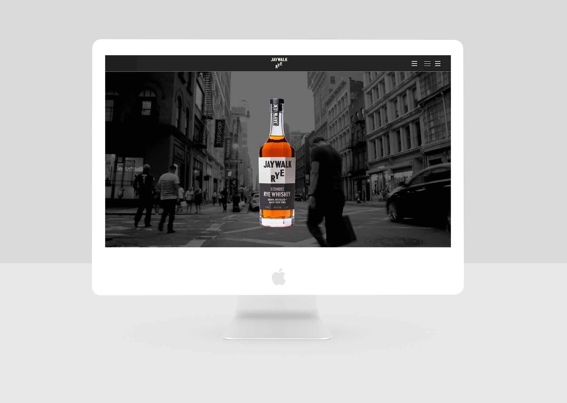
Lead with the bottle on every surface. That was the rule. Editorial layout, one image per section, copy in the negative space, no carousels. Every page puts the product front and center, then gets out of the way.
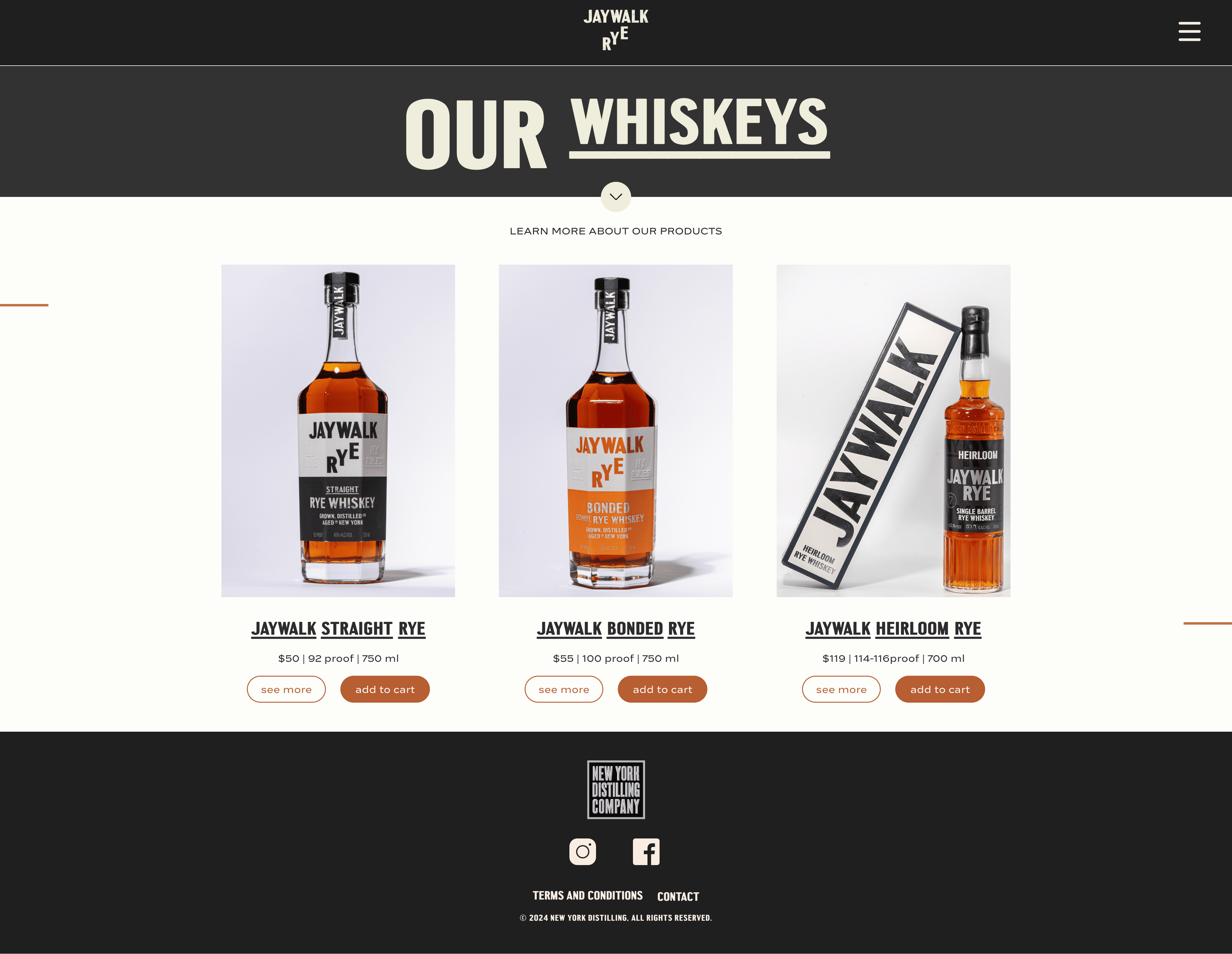
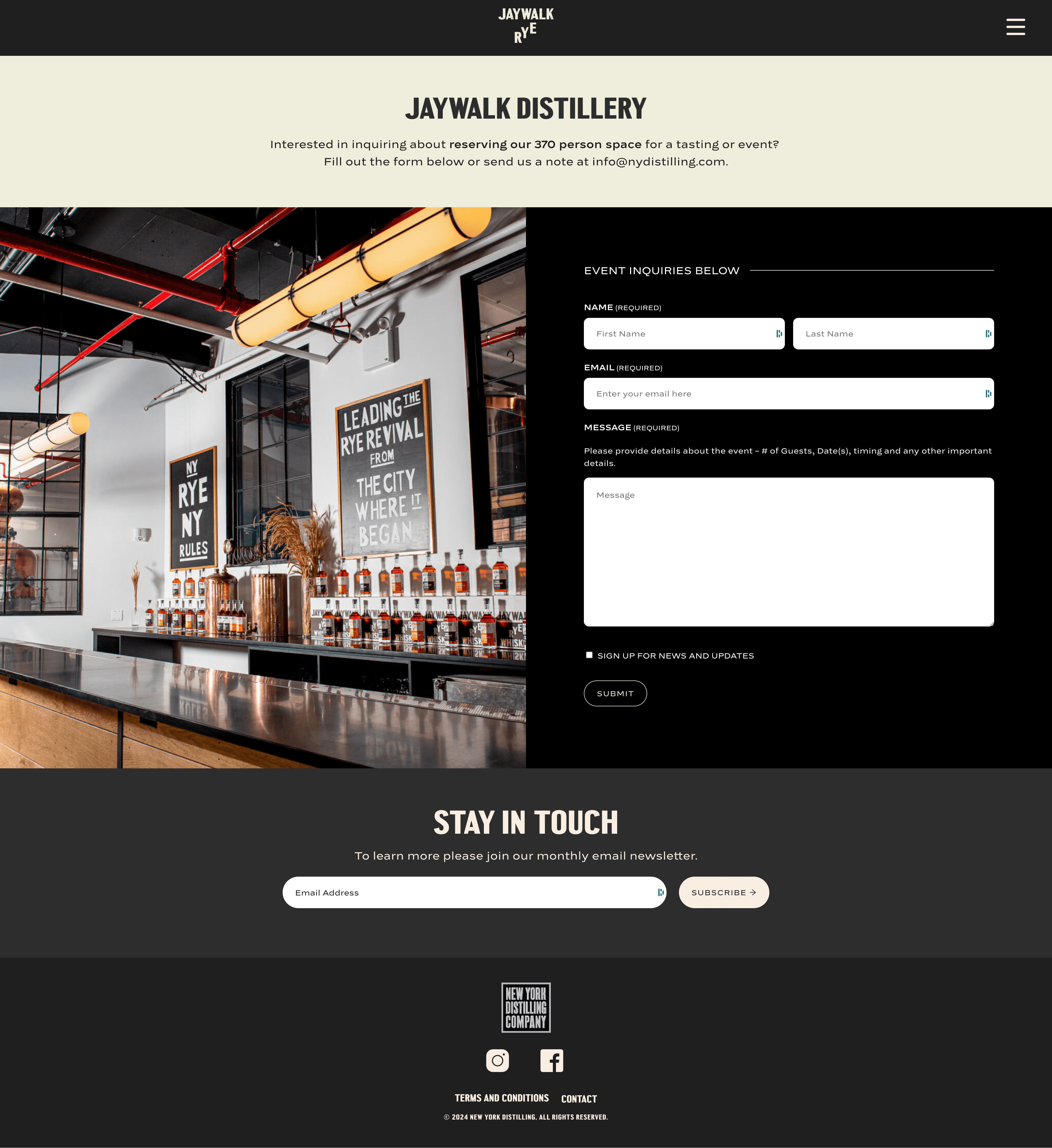
The navigation model is five pages, one voice. Home introduces. About gives the rye its origin story. Whiskeys lays out the three SKUs as a single horizontal flight with tasting notes and provenance for each. Distillery puts a place to the process. Find sends the visitor to the nearest shelf, a store locator, not a checkout. Because the product moves through retailers, the microsite’s job is desire and direction, not transaction.
The age gate loads before anything else, a legal requirement for spirits. It needed to feel like part of the site, not a speed bump bolted onto the front door.
Wires First
Before any bottle photography landed in a comp, I tested the structure as low-fidelity wires. The point was to lock the anatomy (where the bottle sits, where the spec table goes, how the locator behaves) before the brand layer made everything look correct by default.
Three of the page anatomies as wires, Home, the SKU flight, and the locator. The rest of the surfaces inherit the same primitives: full-bleed hero, copy block, action.
The Brand
The brand identity is by Kingsland, a Brooklyn brand agency. Their approach pulled from vintage typography, ghost signs, and New York subway wayfinding, the visual language of the city Jaywalk comes from. The custom Central Avenue typeface anchors the system. The whole identity is brash, unabashedly NYC, and built on pre-Prohibition history: New York as the rye whiskey capital of the country before the government shut the stills down.
Kingsland’s philosophy for the brand was to break the small, stupid rules to never stop moving, fitting, given the name. They designed the wordmark, the bottle, the type system, the palette. What follows is what I built from.
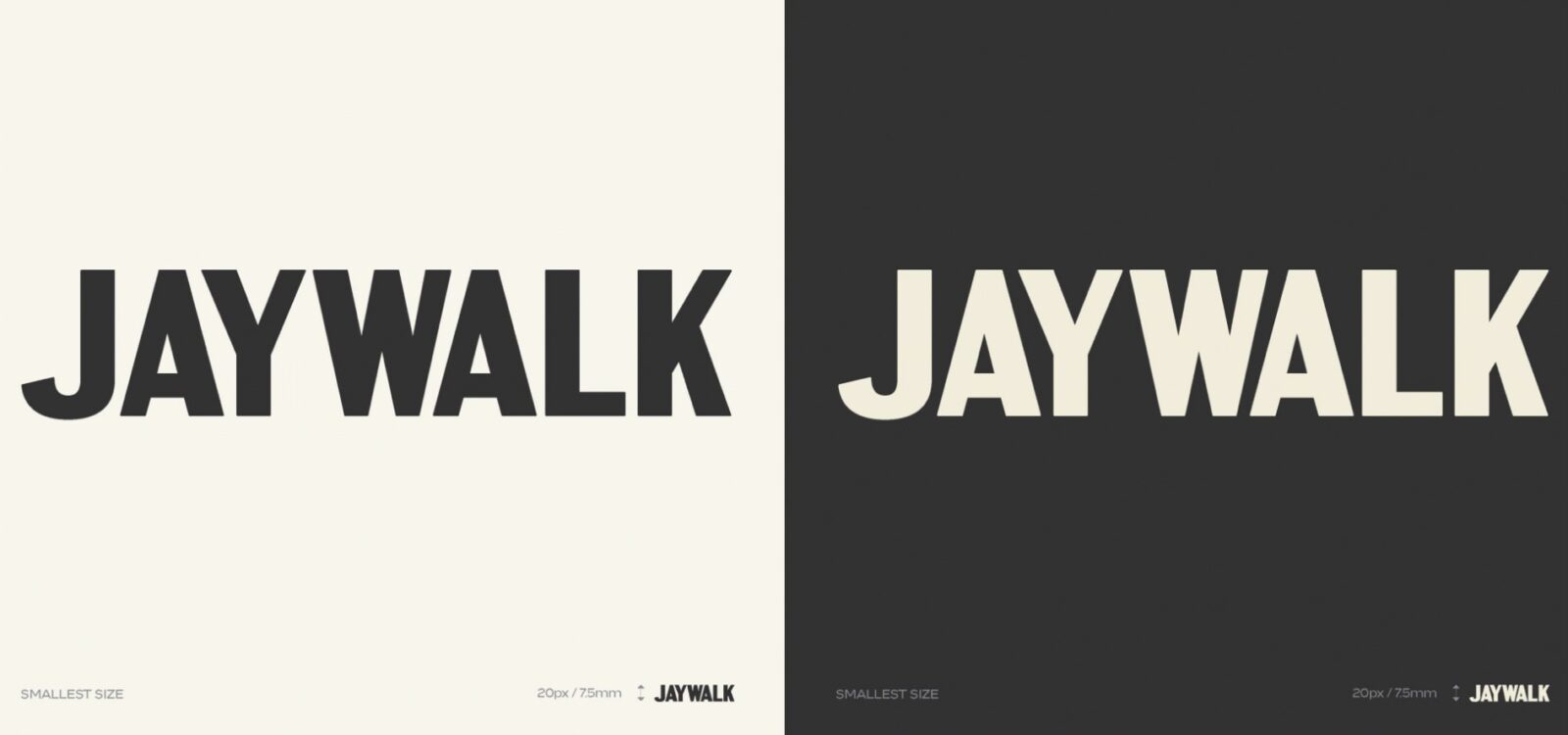
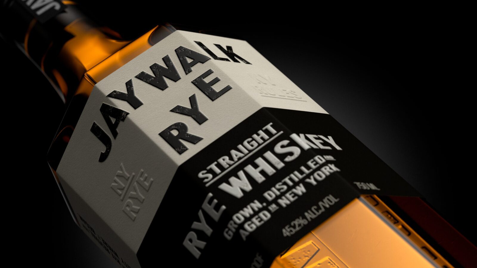
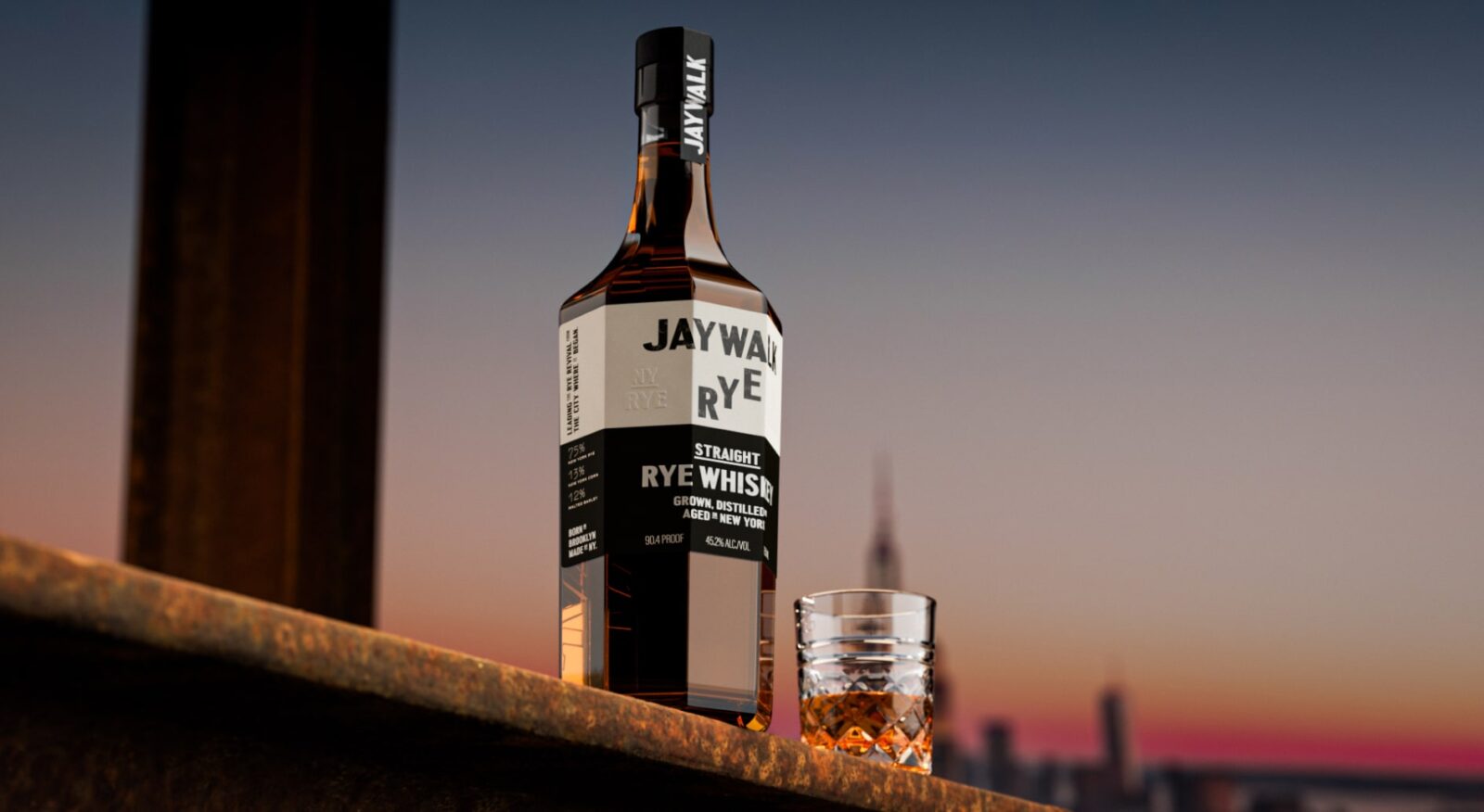
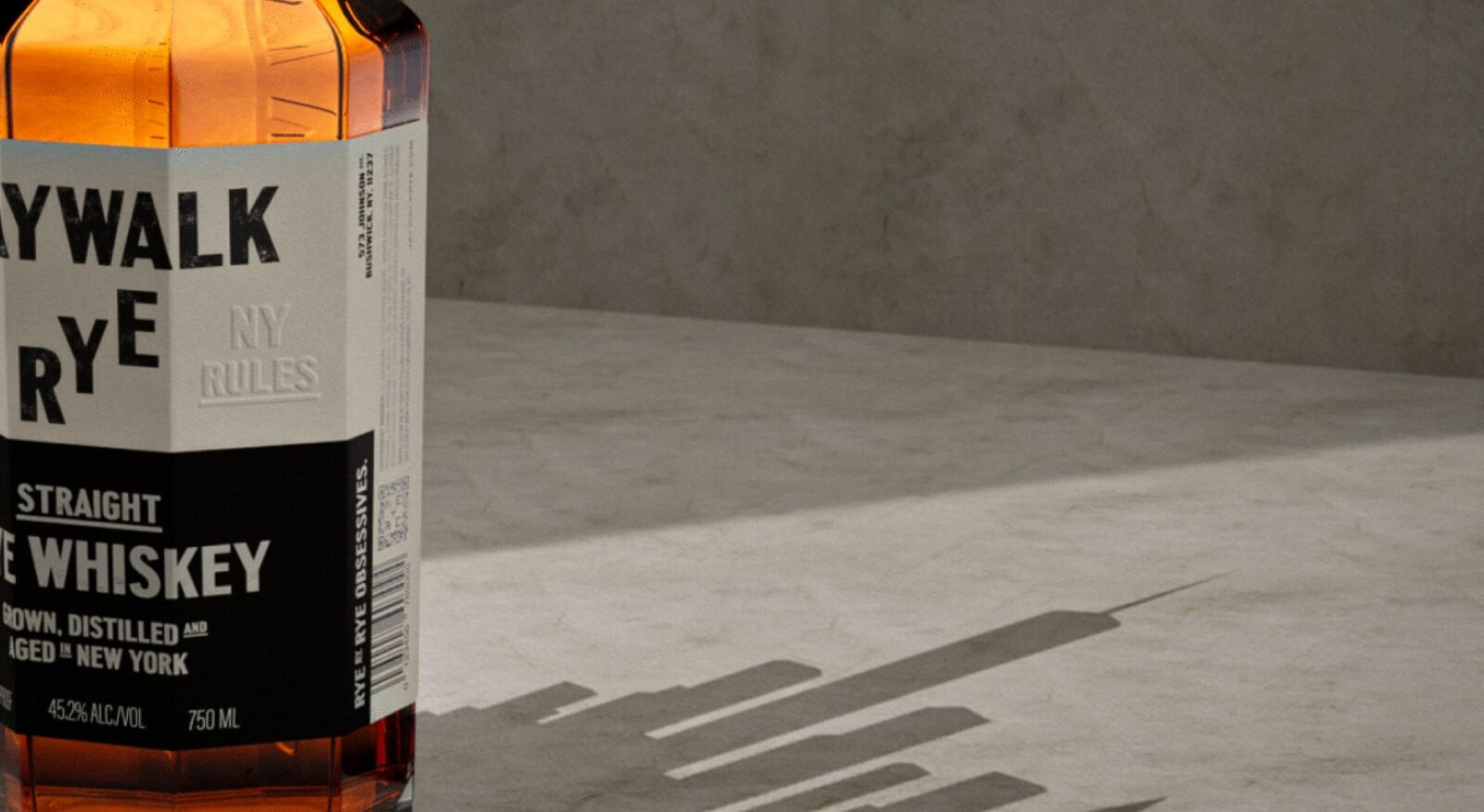
Brand identity by Kingsland.
What I extended on the web side: type lock for the screen, layout grids tuned to the bottle’s proportions, motion treatment on page transitions, photography direction for the SKU and lifestyle shots, microcopy tone. The point was to keep the brand intact and make the site feel like a continuation of it, not a separate thing built by a separate team.
The Product
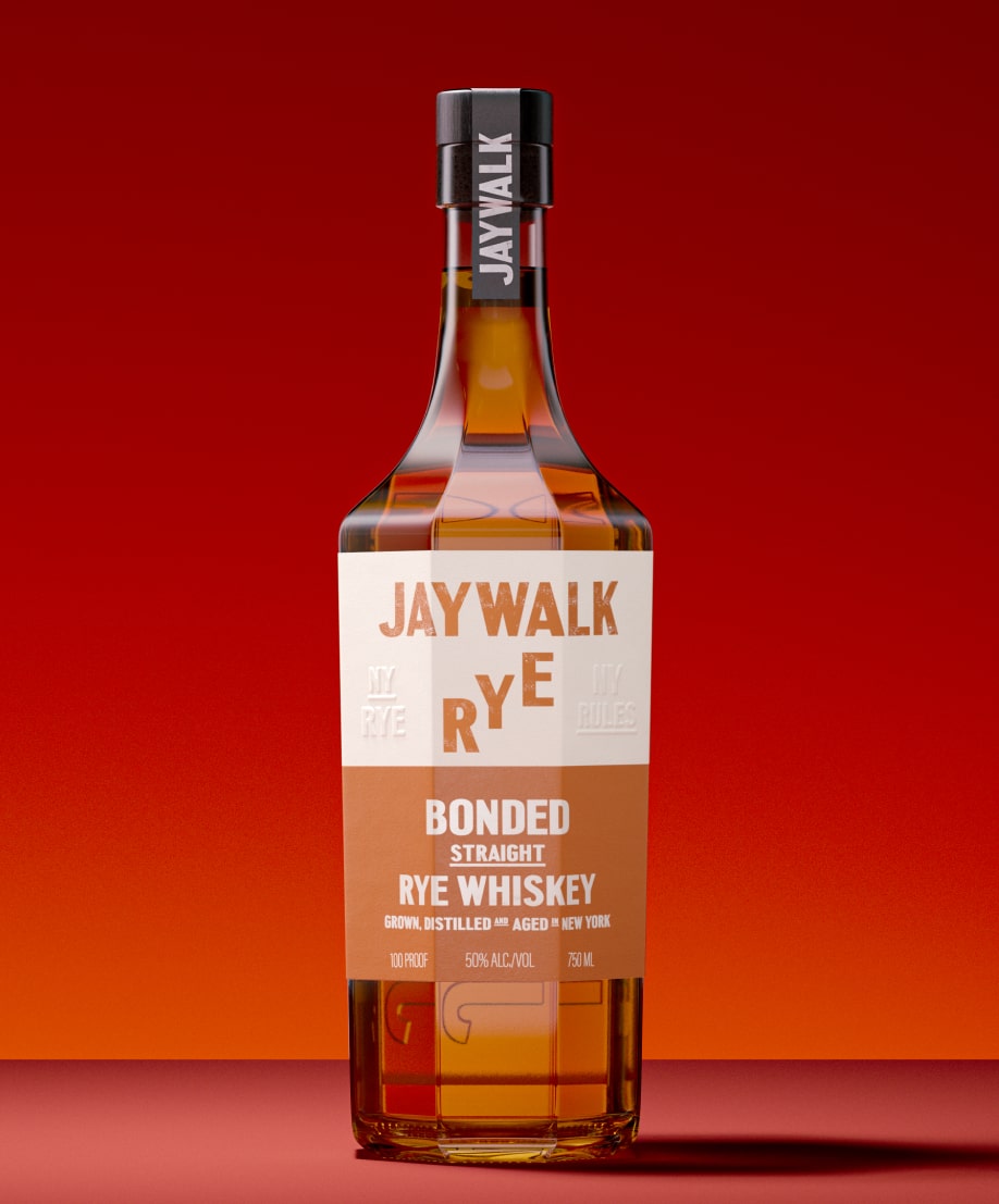
The entire site orbits one object. Every layout decision, every scroll trigger, every transition, all of it was built to hold the bottle. Three SKUs, three visual registers: lifestyle against the skyline, studio isolation on color, and editorial on raw concrete.
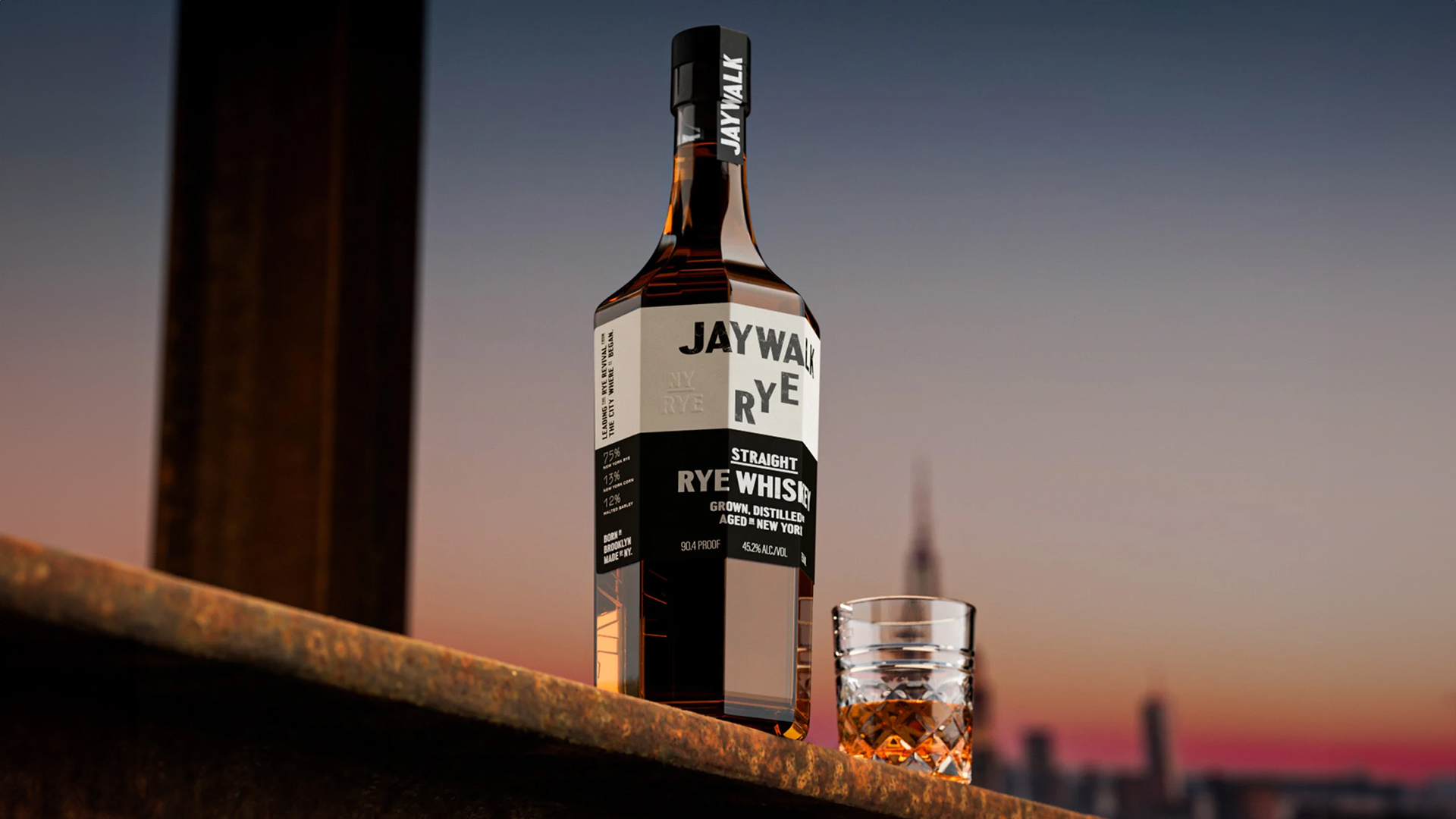
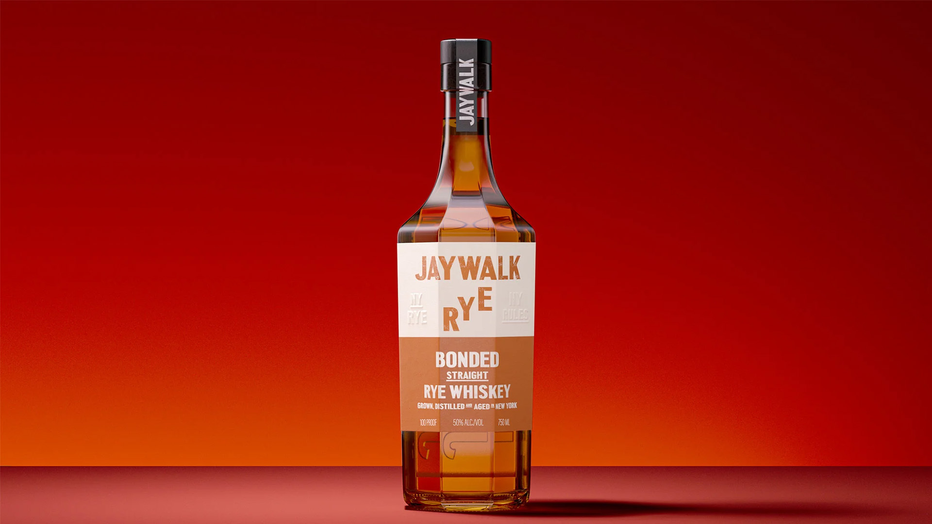
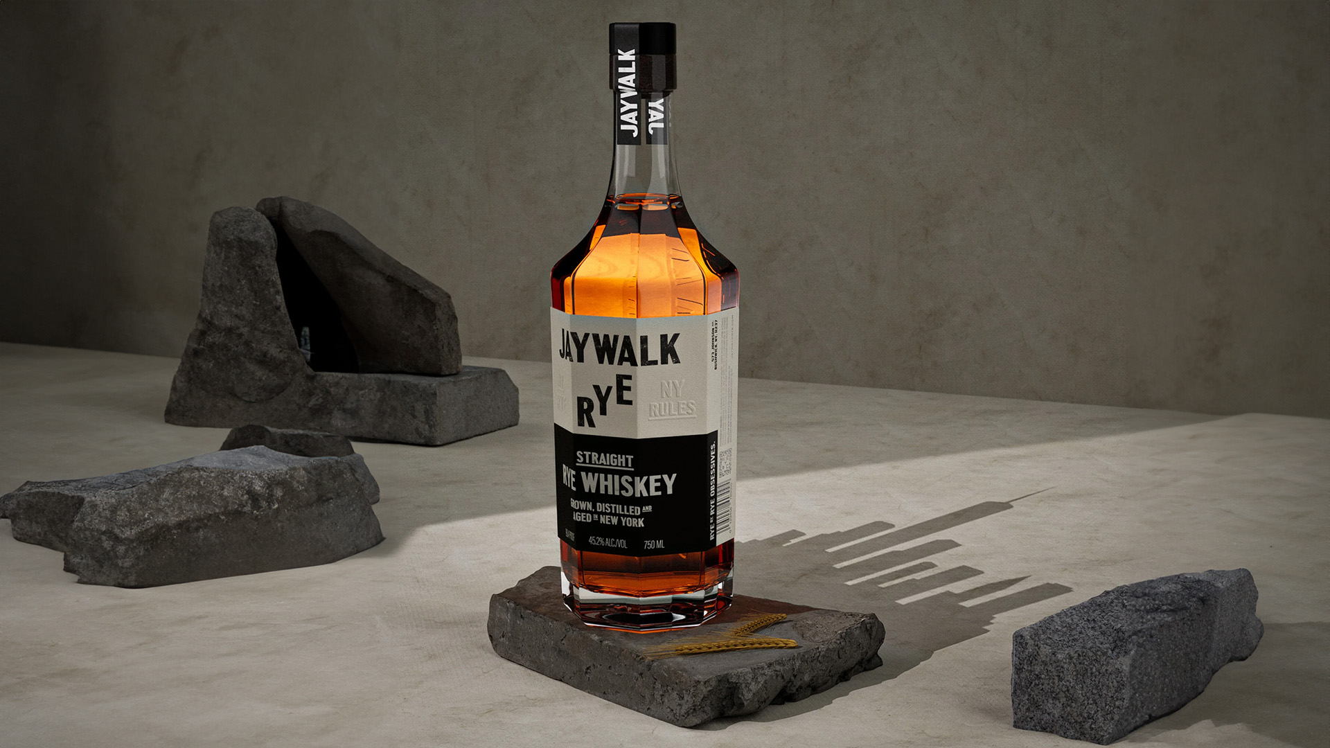
Straight on the skyline. Bonded in the studio. Straight on concrete. Same bottle, different registers, all directed to anchor the site’s editorial layout.
Five Pages, One Object
Five surfaces, one continuous voice. Home does the introduction, bottle over a desaturated NYC street, the wordmark floating. About gives the rye its origin in time and place. Whiskeys lays out all three SKUs as a single horizontal flight, each with tasting notes, proof, and provenance. Distillery puts faces and warehouse floors to the process. Find sends the visitor to the nearest shelf with a map-driven locator.
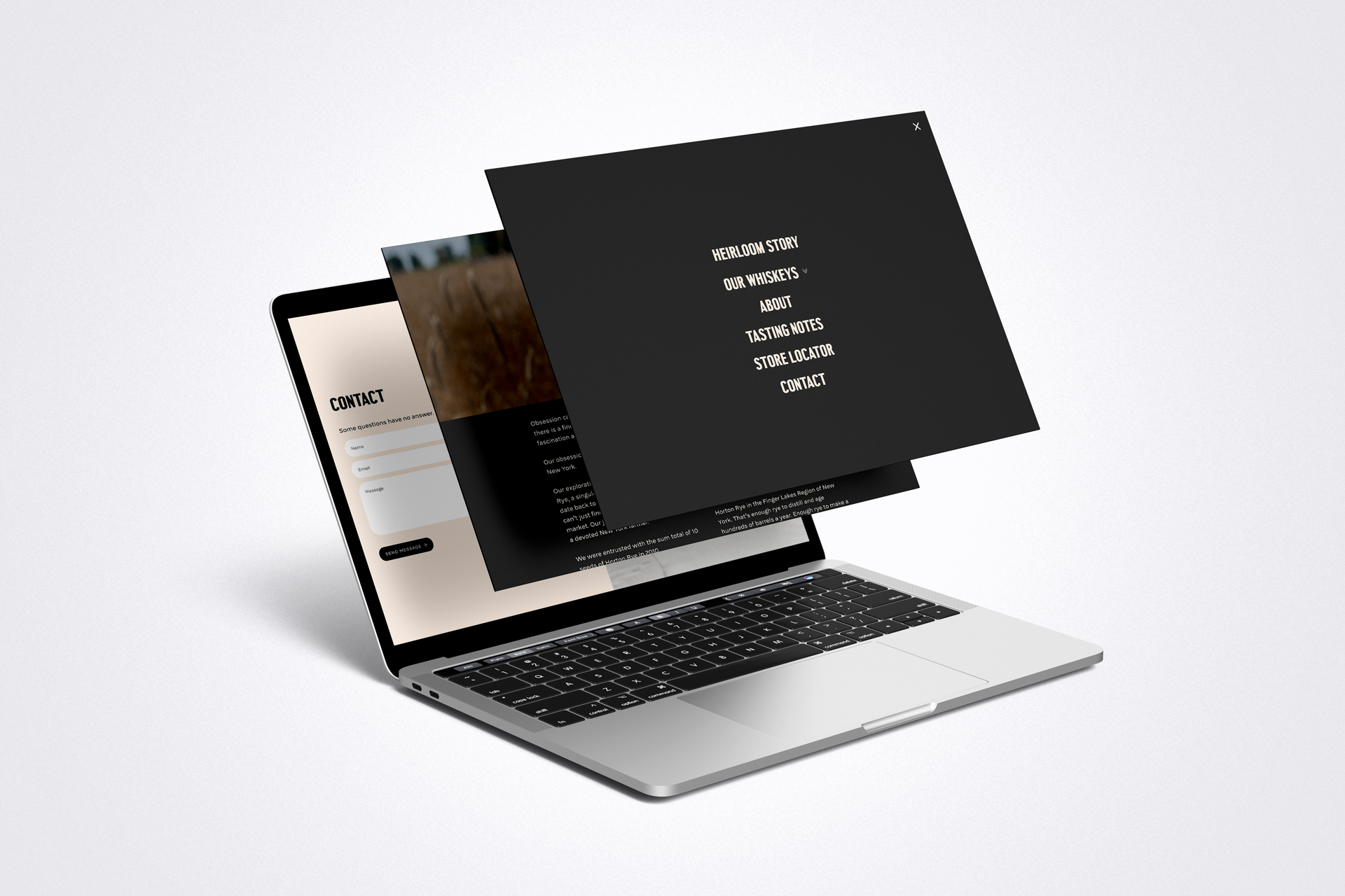
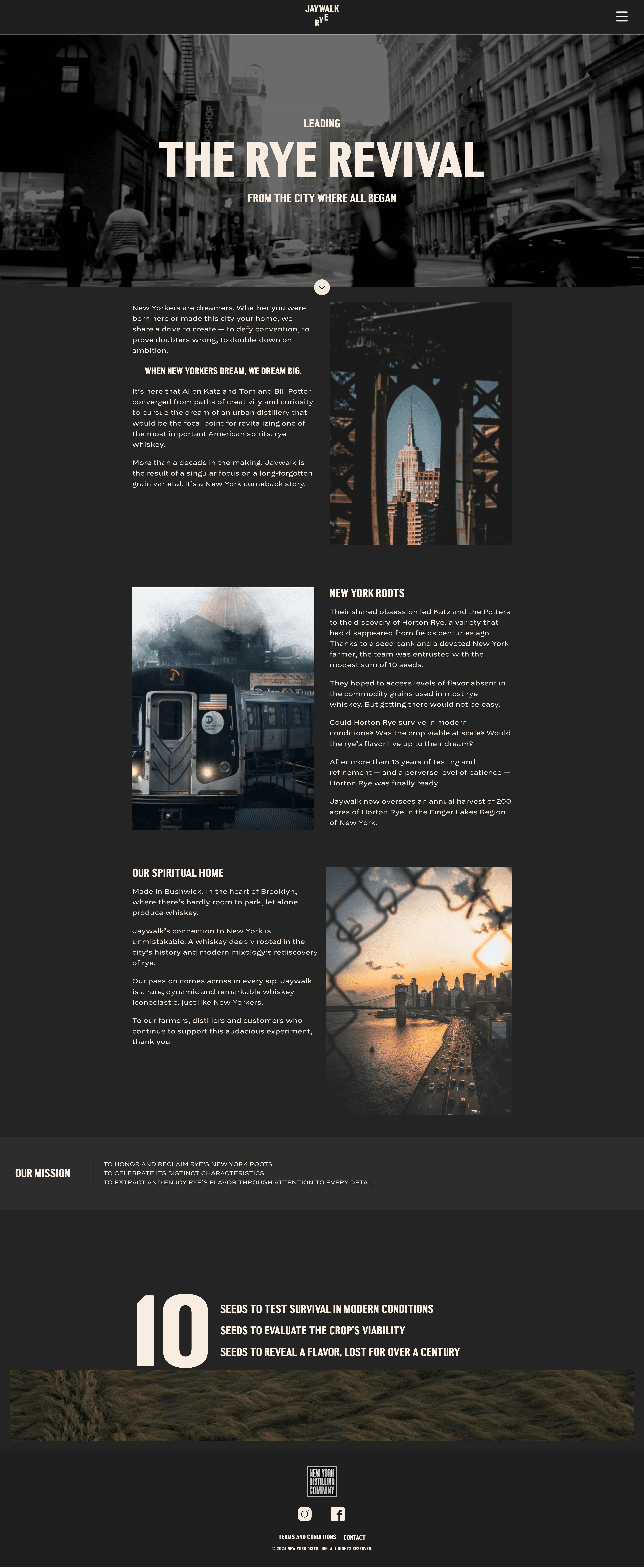

Born in Brooklyn
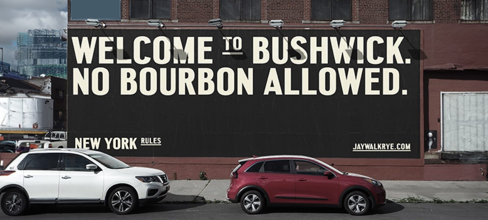
Jaywalk isn’t made in a co-packing facility upstate. It’s distilled in a warehouse in Bushwick, steps from the bar where the first batches were poured. The brand lives on the building.
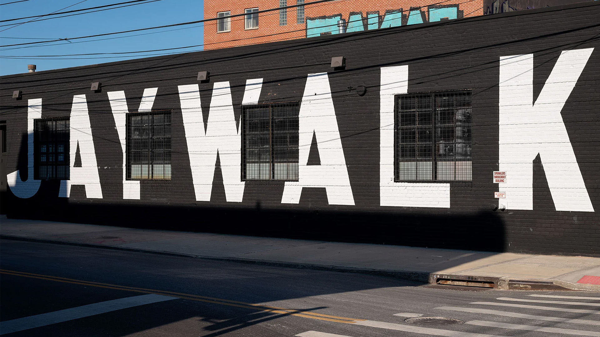
The distillery in Bushwick. The brand is on the wall and in the grain.
What Shipped
A five-page microsite designed and built from a brand kit and a deadline. The wireframes locked the anatomy. The brand layer made it feel like Kingsland’s identity had always been a website. The product photography put the bottle where it belonged, front and center on every surface.
Jaywalk shipped aligned to the production roll-out and has been live at jaywalkrye.com since launch. The site drove retail discovery through the store locator, gave the brand its first digital home, and held the line Kingsland drew, without redesigning a single element of their identity.
The Live Site
The microsite lives at jaywalkrye.com. Toggle the viewport below to see how the layout responds across desktop, tablet, and mobile.