Holland Homecare
Holland Homecare
Overview
- Visual Creative
What We Did
The Outcome
Holland Homecare (HHC), a Philadelphia provider of in-home care for seniors and individuals with disabilities, wanted a brand identity that connected better with its clients. Working closely with the HHC team, Therum led a full rebrand: a new logo, color palette, typography, and brand system built to evoke trust and comfort.
We owned the identity and every surface it had to live on
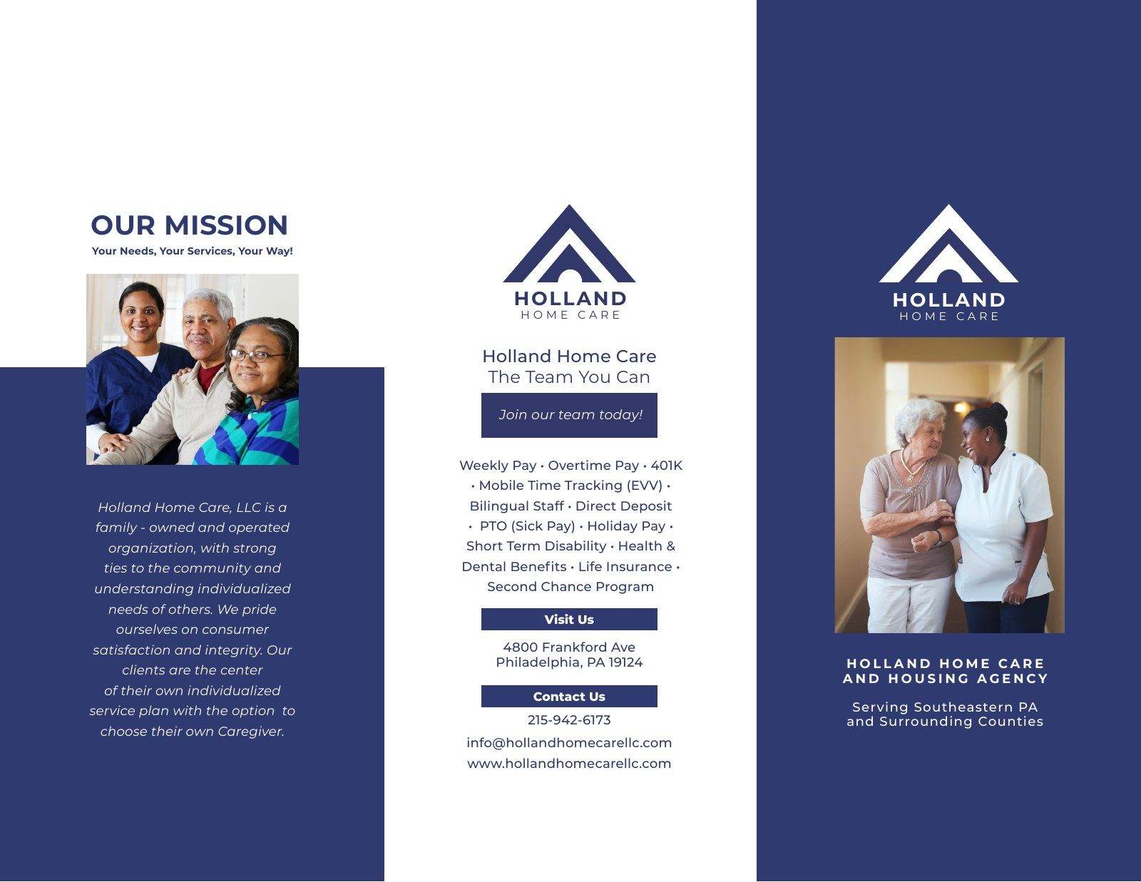
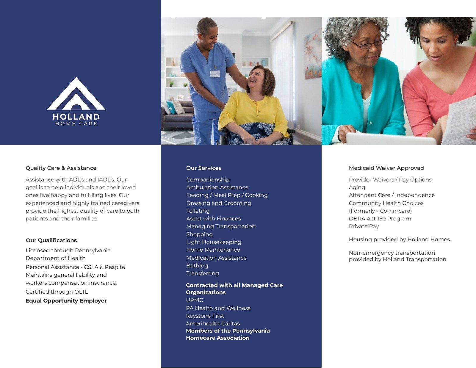
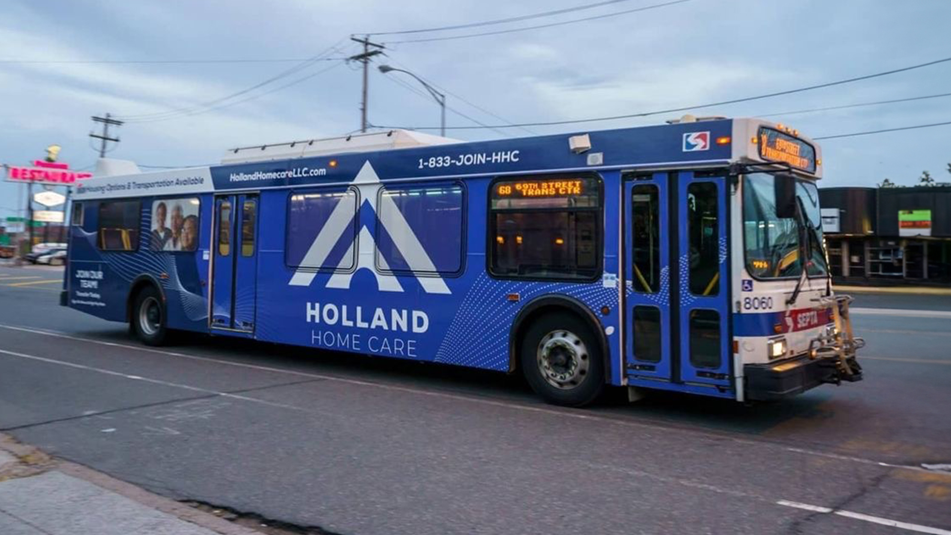
Holland came to us through 14th and Market, and we worked with their team. We owned the logo, the colour palette, the type and the brand system with its secondary pattern, then carried them into the print documents, a little of the website and the out of home designs. Because one studio held both the system and its applications, the navy chevron reads the same on a shirt pocket as it does down the side of a bus.
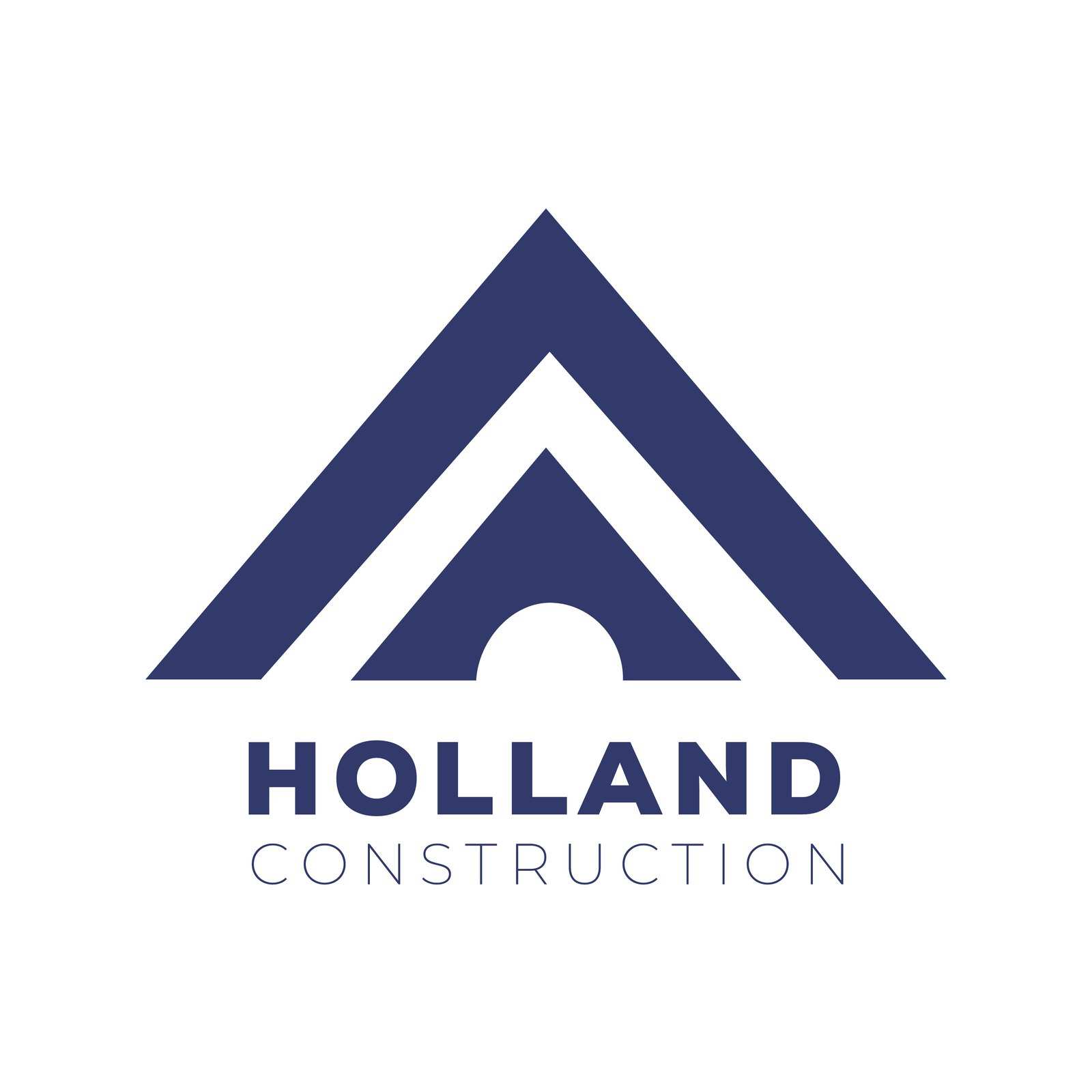
A new logo cut back to one idea, in one navy and one weight
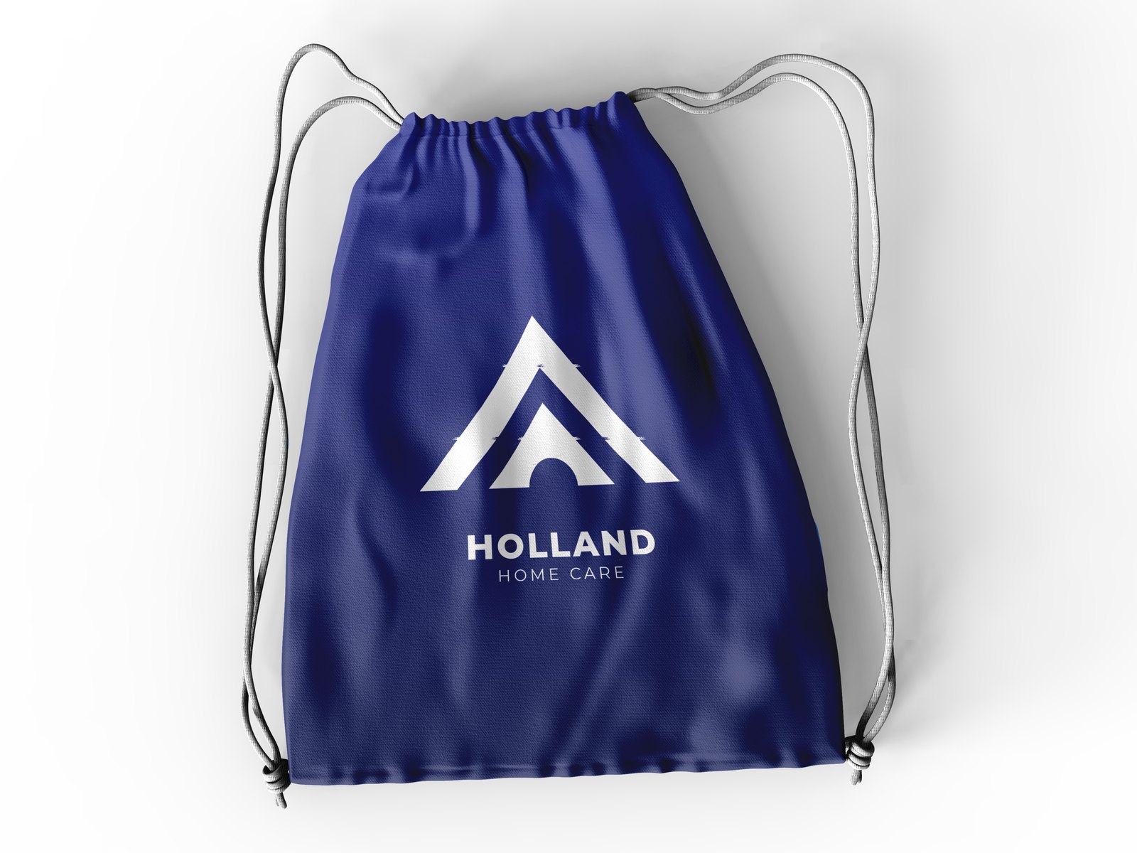
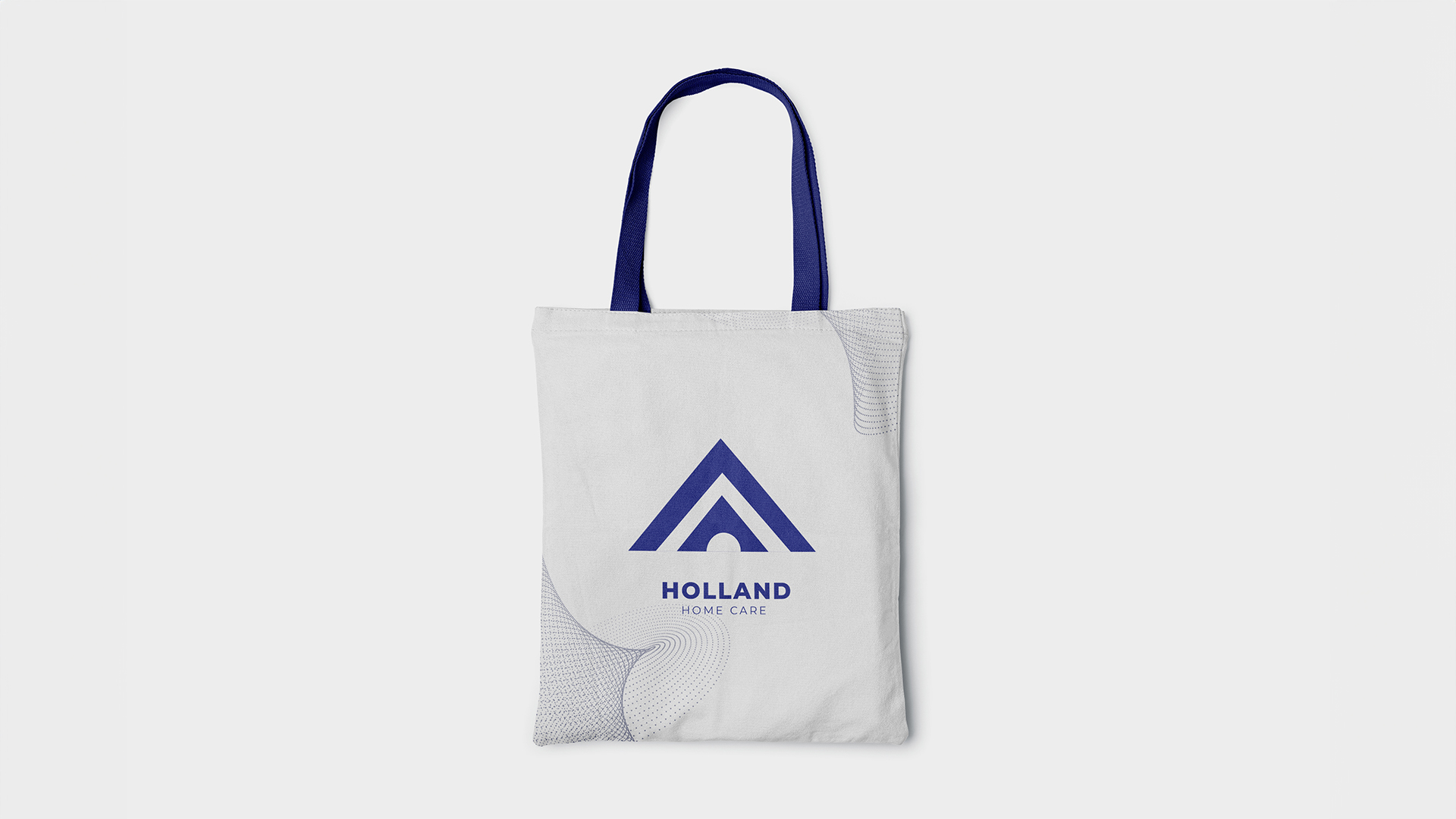
The old logo stacked a three-peak mountain, heavy serif initials, a rule and a drop shadow, and it falls apart at any distance. We cut it back to one idea: two nested chevrons with an arched opening at the base, a roof and a doorway in the same shape. One navy, one weight, flat edges, no effects. Then we drew a dotted contour pattern to carry the warmth the bare mark could not. It holds at an inch on a shirt and across a full wrap.
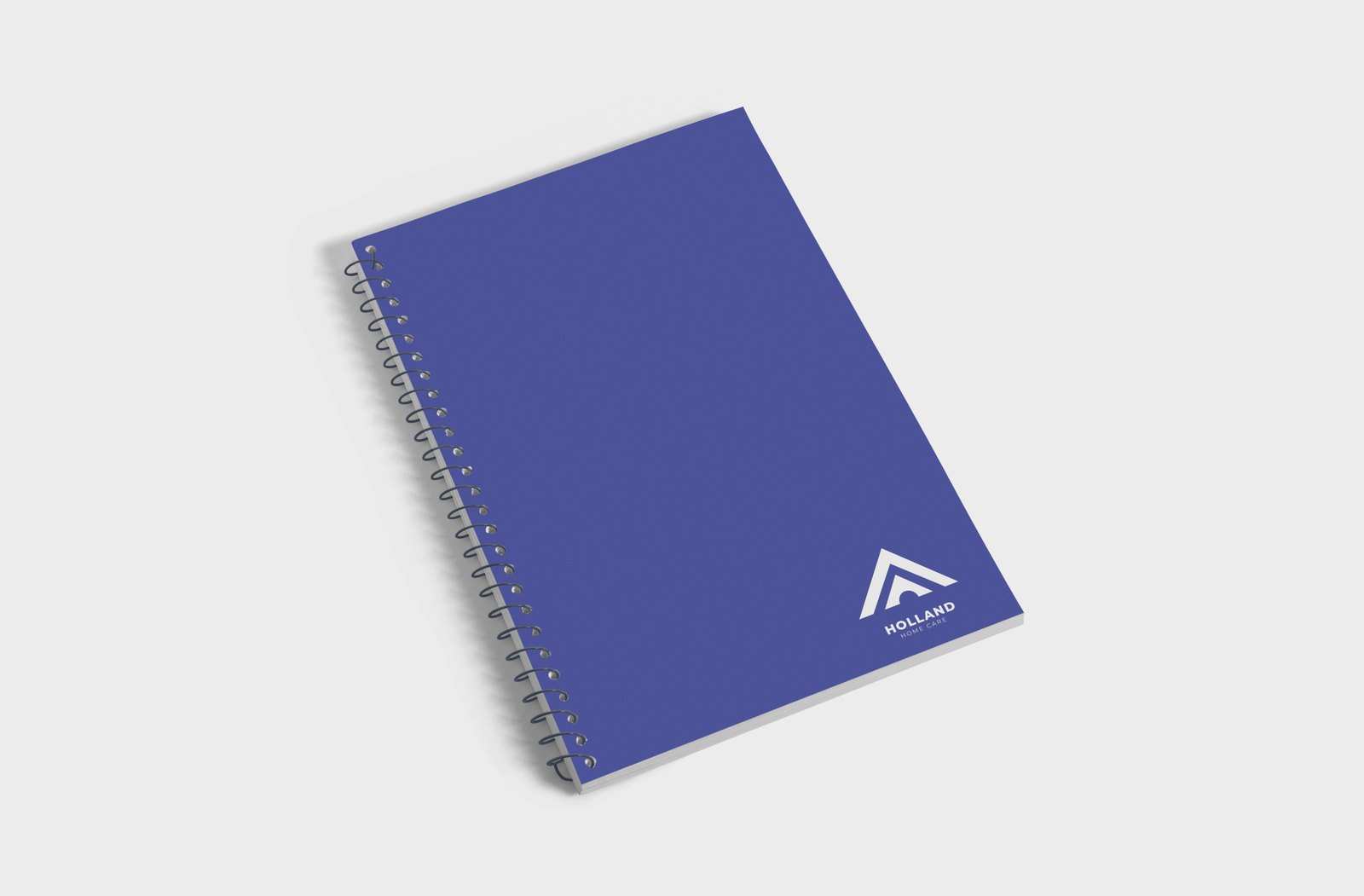
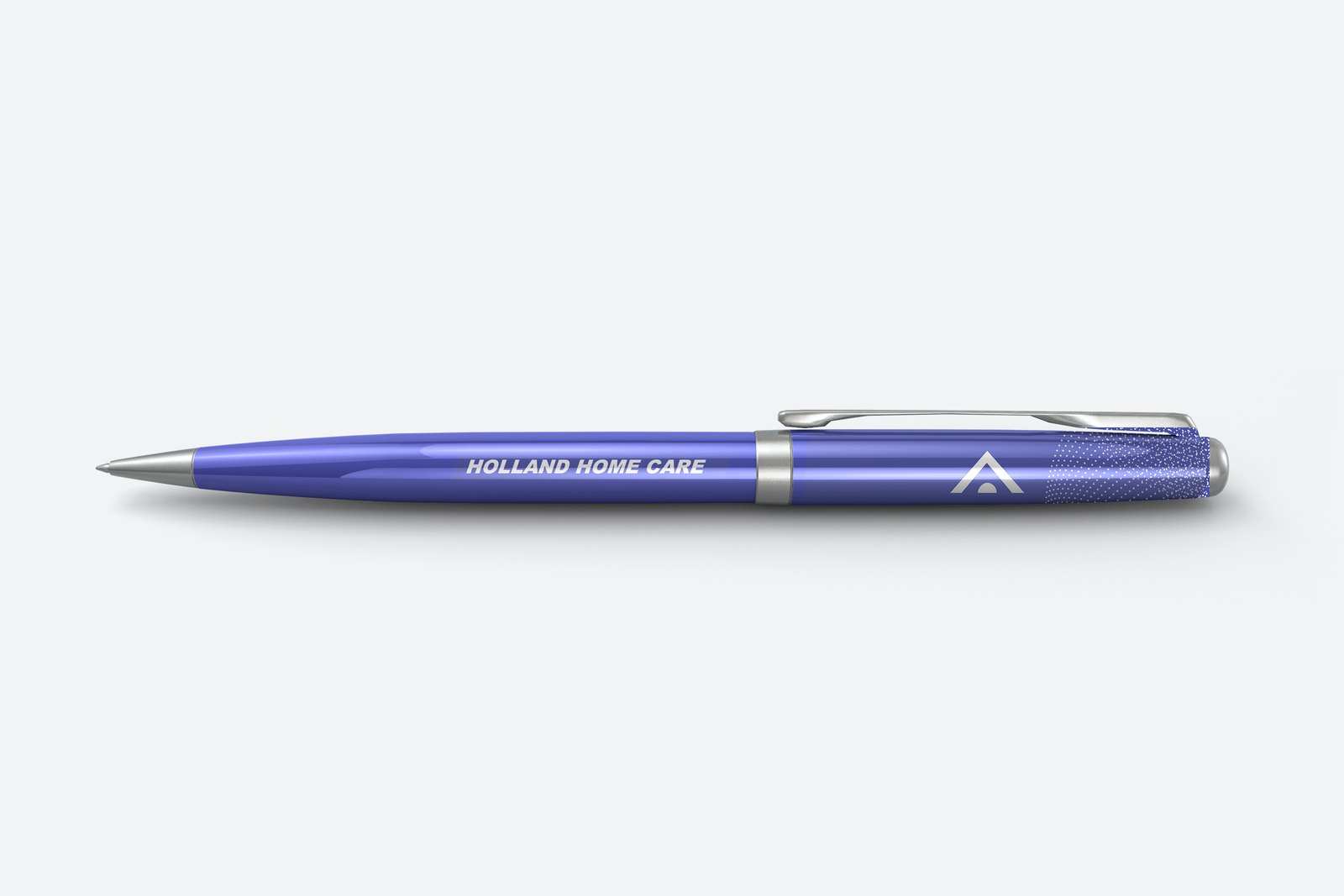
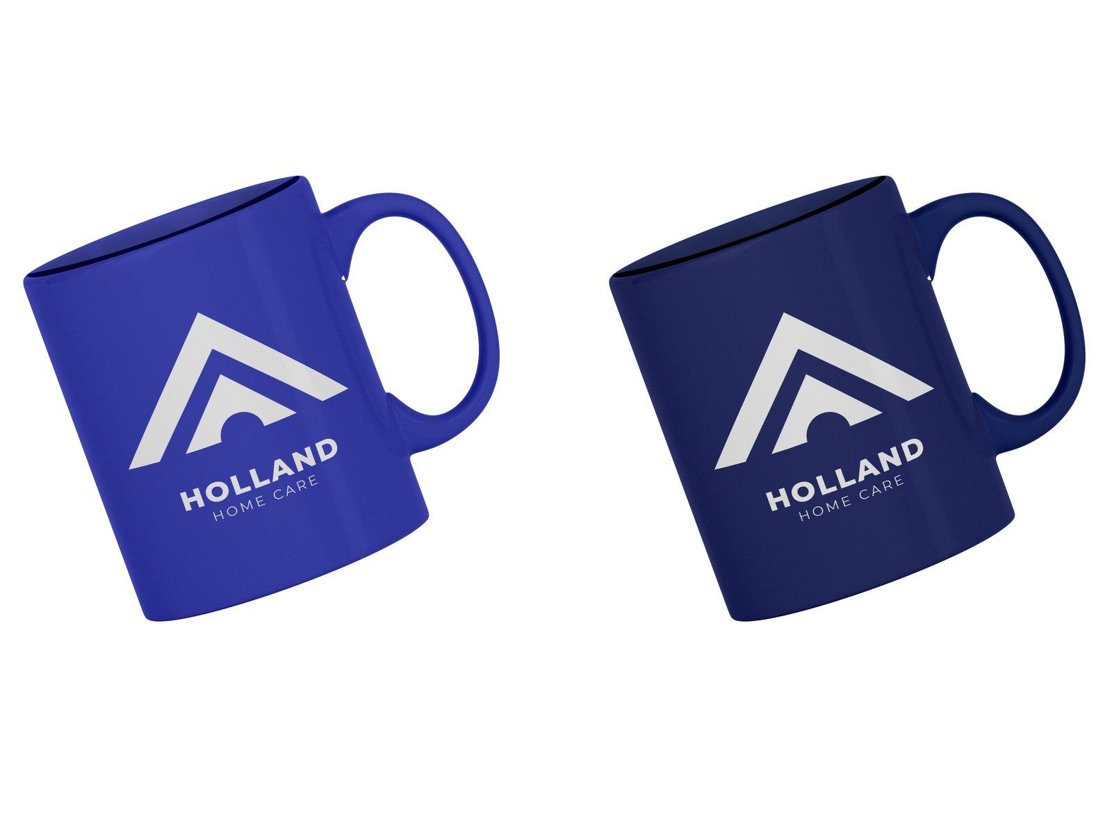
Logos and the redesign, print documents, a little website work and the out of home designs
Logos and the redesign
Print documents
A little website work
The out of home designs
The entire Philadelphia area saw the work
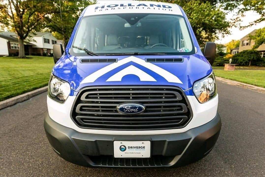
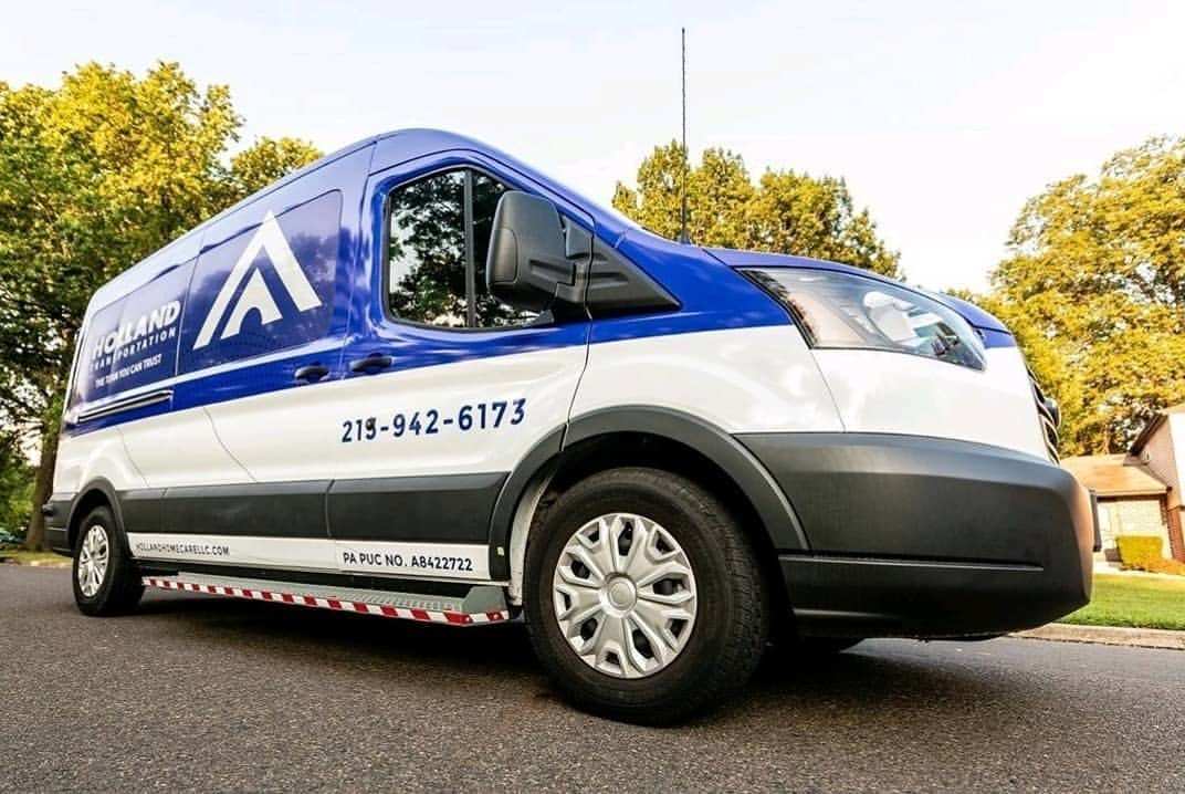
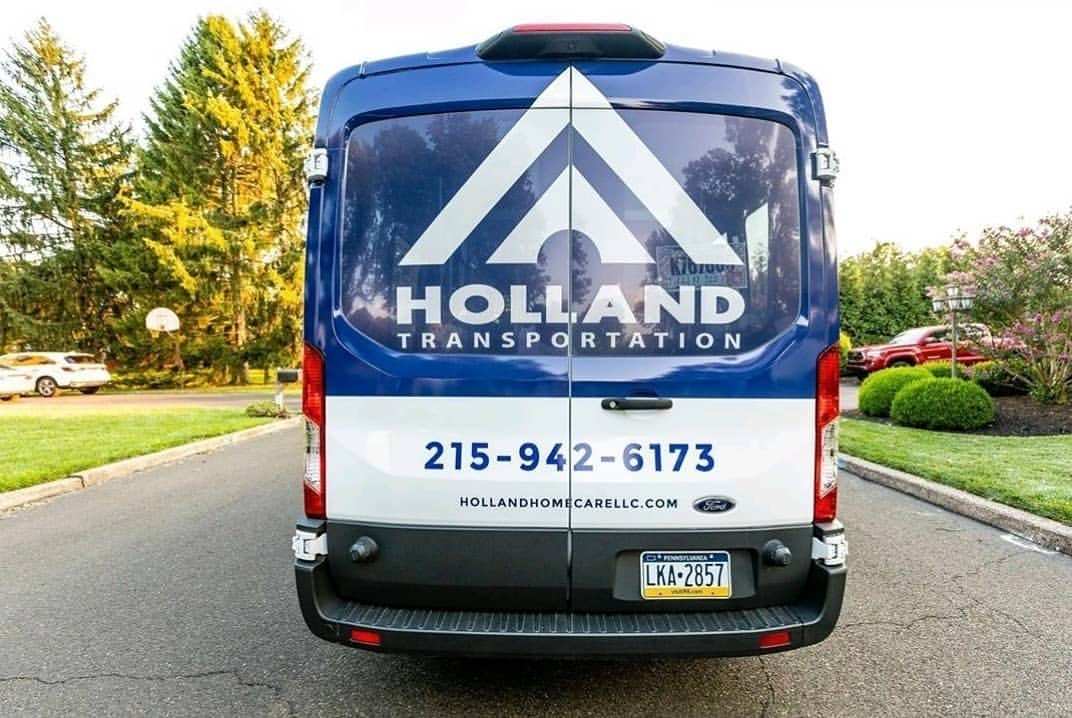
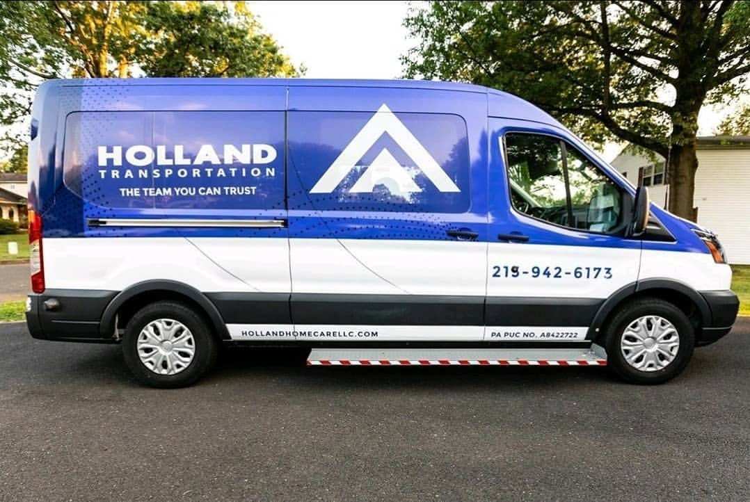
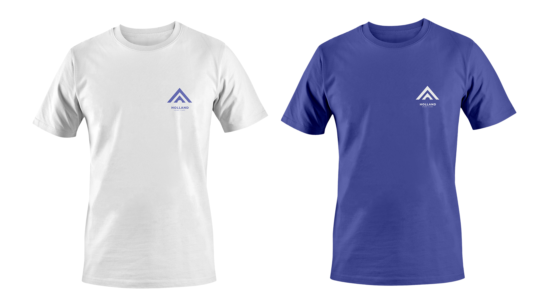
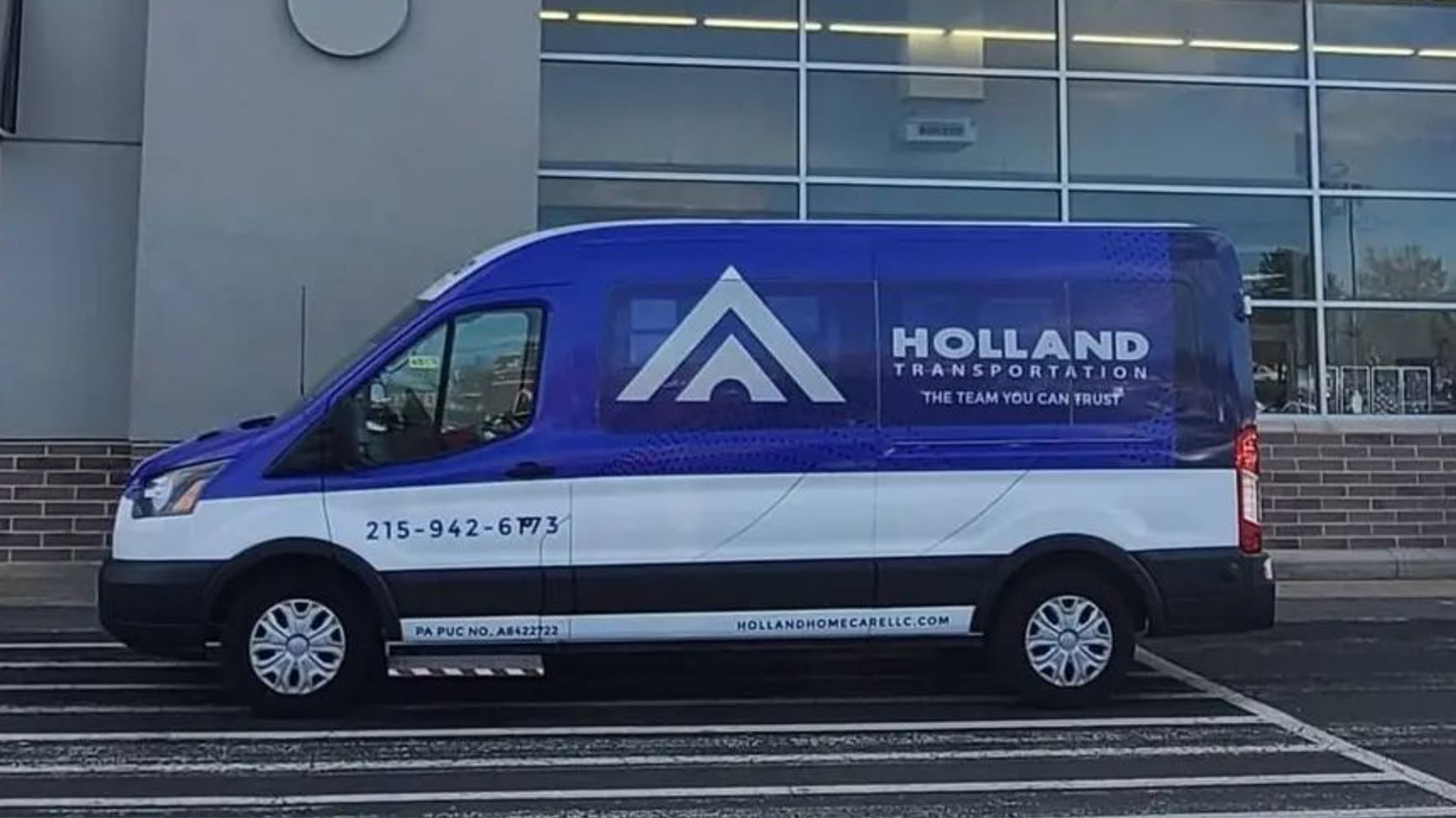
Holland Homecare is based in Philadelphia, so the whole region saw the design work. The out of home designs wrap a bus end to end in navy with a recruitment line, and the same mark runs down the side of a van. It prints on white and blue tees and on a canvas tote, and the trifold brochure carries the same navy mark.
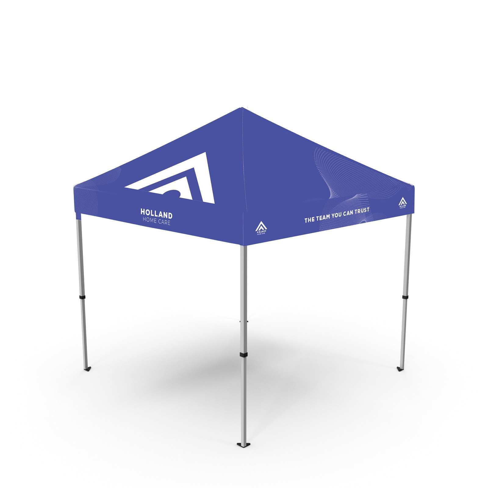
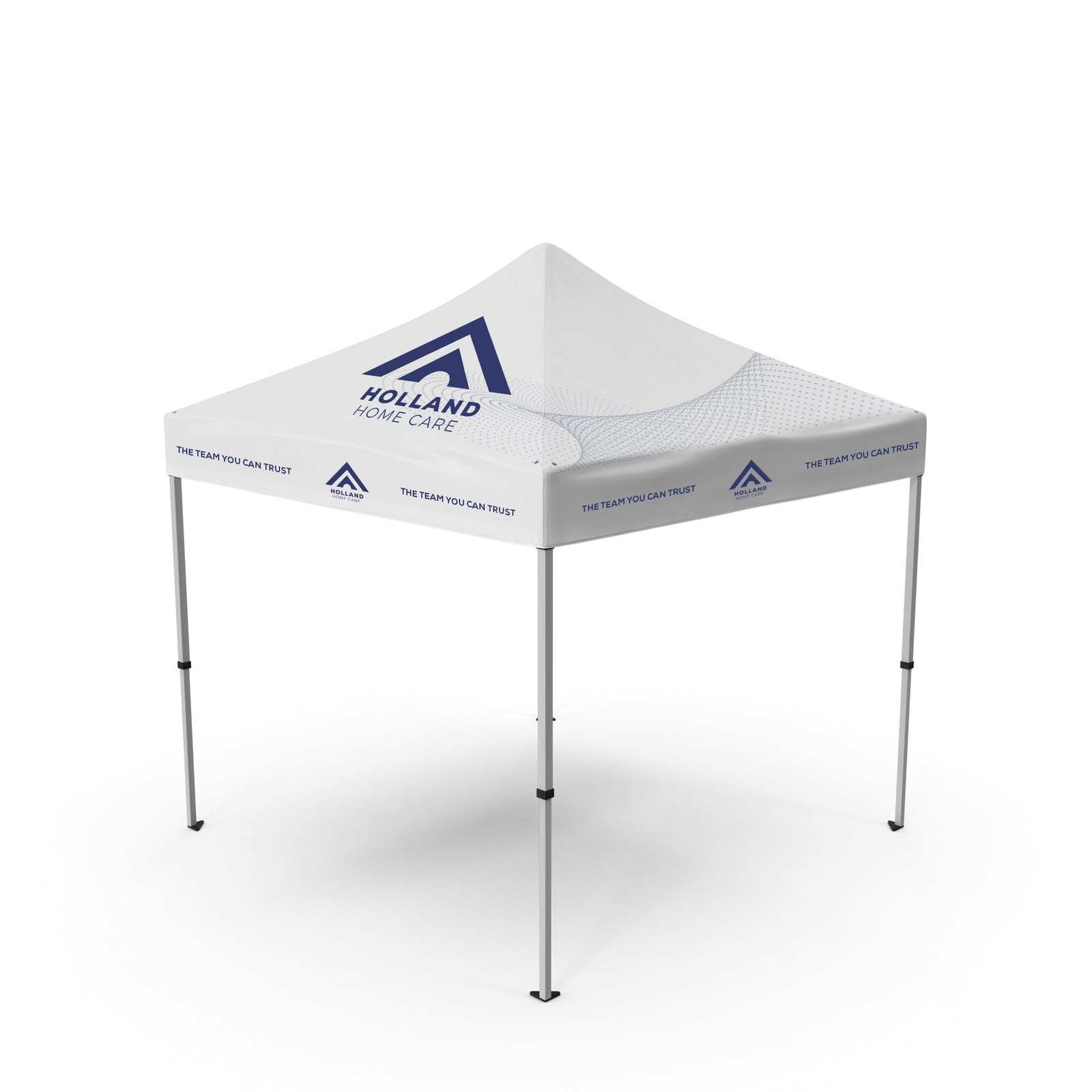
Build the infrastructure first. Everything else follows.
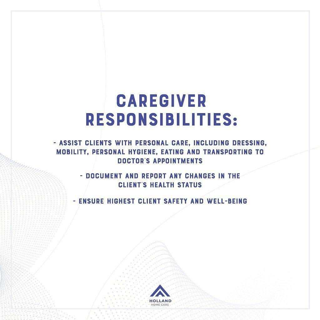

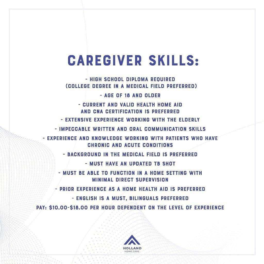
We built the brand system first: the logo, the colour palette, the type and the pattern. Everything else followed from it, from the print documents to the out of home designs the whole Philadelphia area saw.