Ford Motor Company
Ford Motor Company
Overview
- UX components
- UI page builds
- Design system contributions
What We Did
The Outcome
Ford, in collaboration with VMLY&R, aimed to modernize its digital experience.
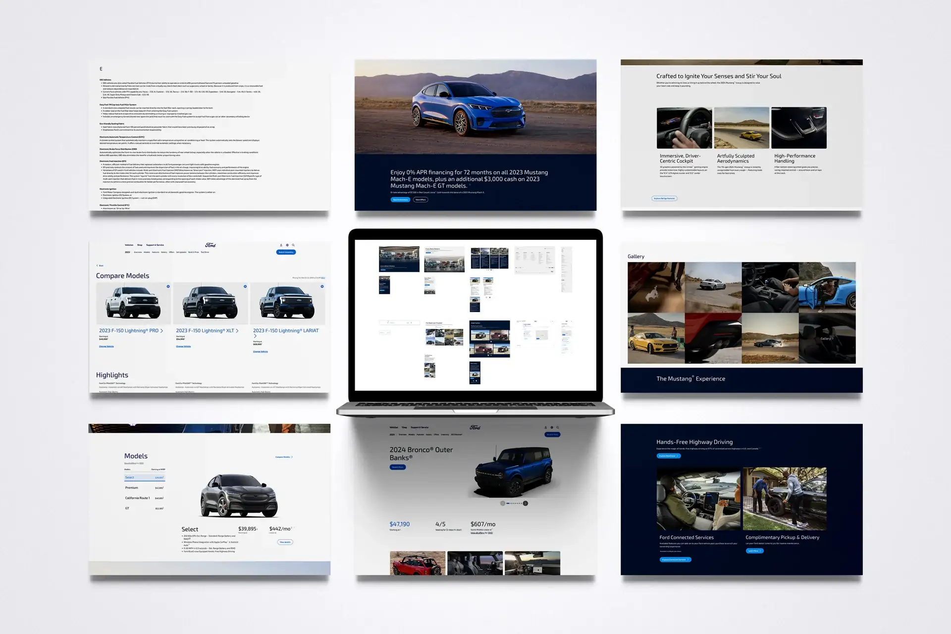
The goal was to unify design and functionality across multiple touchpoints while maintaining the strength and familiarity of the Ford brand.
No rebuild. No greenfield. Just the components.
The headline brief sounded clean. The actual brief was harder. Ford couldn't, wouldn't, tear the platform down. No rebuild. No greenfield. No fresh stack. Refresh the digital experience inside the existing box.
That constraint was the project. Ford.com is a billion-dollar surface area, a hundred-plus model pages, a dealer network, a finance flow, a global footer that touches every locale. Nobody gets to throw that away. We learned the box, identified the components doing the work, and replaced them one by one without anyone noticing the floor moving under their feet.
We joined VMLY&R and Ford's web team for that work. An eight-person design crew, two tracks: UX components for the design system, and UI construction on the pages those components compose. The brand stayed. The chrome got rebuilt from the inside.
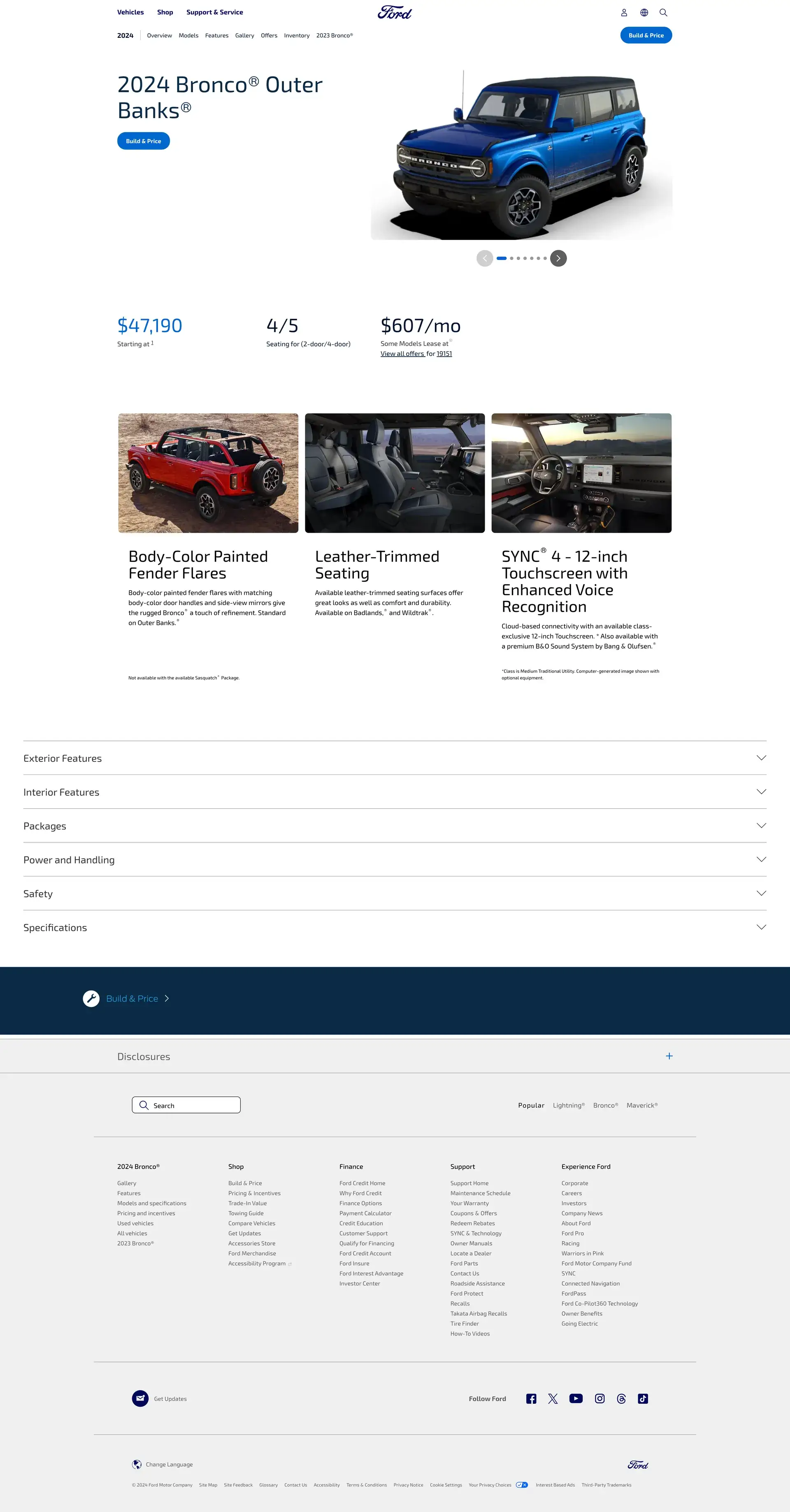
Therum contributed UX and UI design, developing new components, page layouts, and maintaining the integrity of Ford’s design system.
The focus was on usability, accessibility, and consistency across global digital platforms.
The constraint set the cadence. We couldn't redraw the site, we had to retrofit the components running it. So the work moved in two-week sprints: identify a component doing the heavy lifting, study how it slotted into the legacy framework, redesign it to a higher bar without breaking the seams it had to plug into. Demo at the close of every cycle. Hand off, integrate, verify. Then the next one.
Working inside a legacy box is its own discipline. Nobody invents their own grid here, they inherit one. We didn't pick the font, we respected the one that's been on every showroom poster and dealer brochure for decades. The craft is finding the moves that still feel new inside that frame.
Our split: UX produced the reusable components, system-grade, drop-in for the platform team. UI styled and assembled the pages those components compose. Every component closed the same loop: design, hand-annotated spec, walk-through with engineering, integrate, verify on staging. The handoff was the work. Most projects ship handoffs as an afterthought. On Ford, handoffs were the artifact.
8
designers in the room · one shared design system
2 wks
component to ship · design, spec, hand off, integrate
0
platform rewrites · everything had to land inside the existing box
1 brand
Ford's identity, untouched, the system extended it
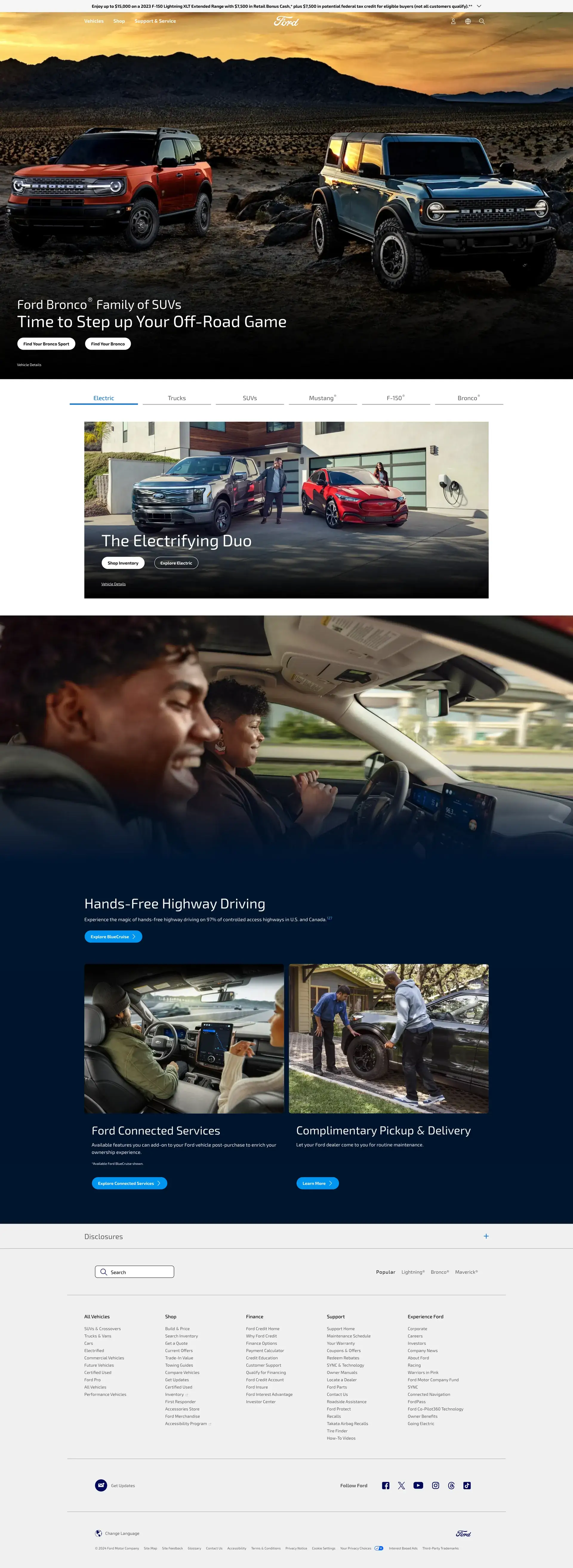
We took a structured approach to simplify navigation and content hierarchy while enhancing the visual language through clean layouts and strong brand expression.
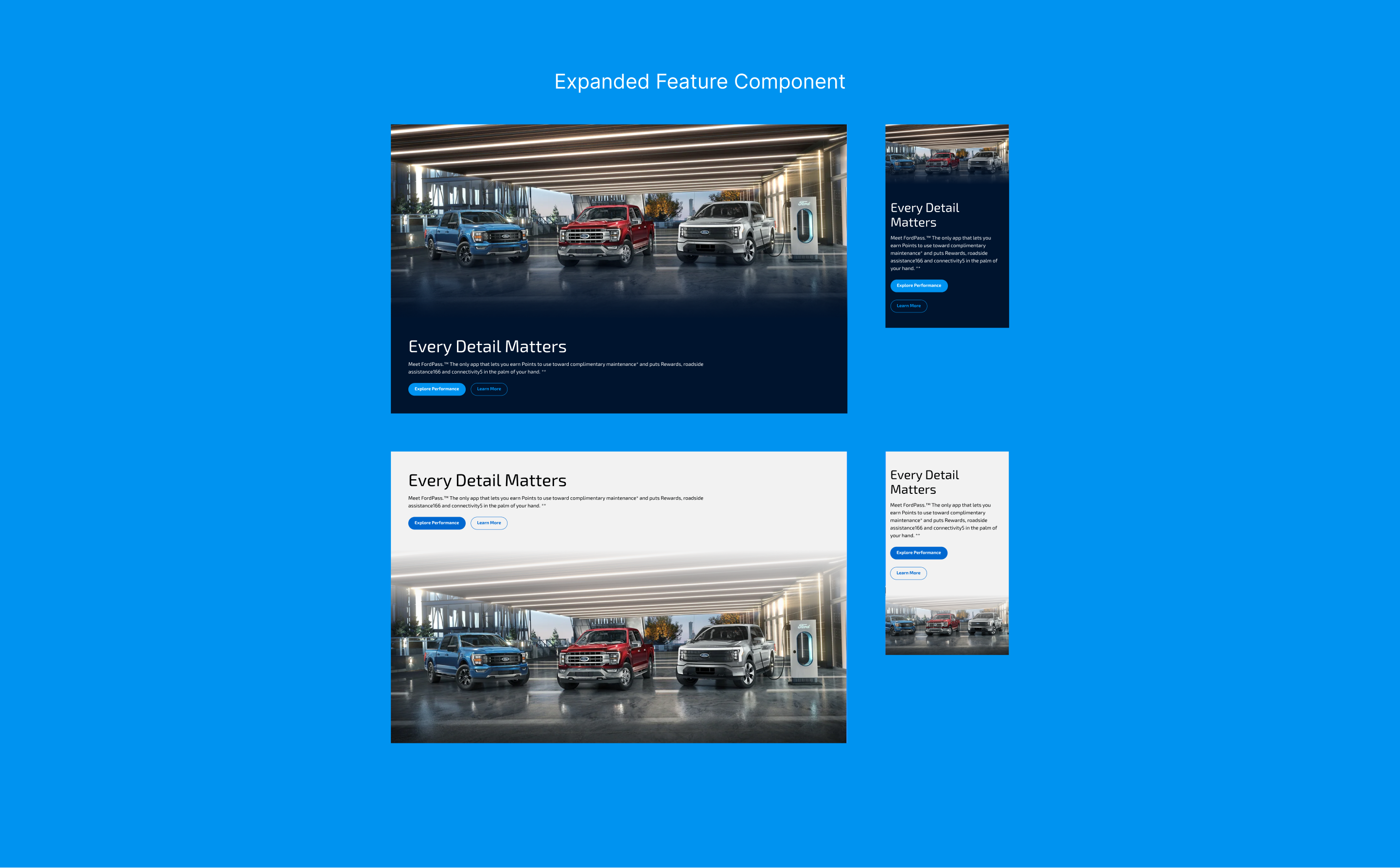
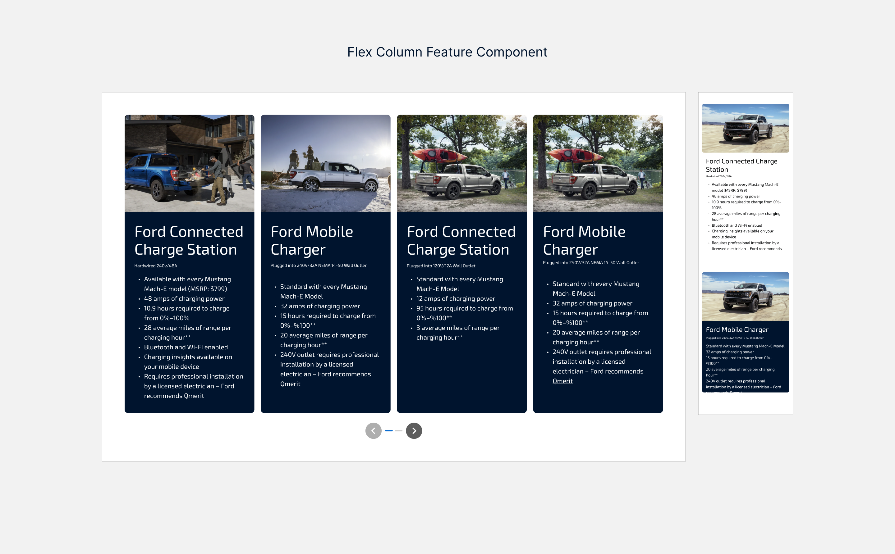
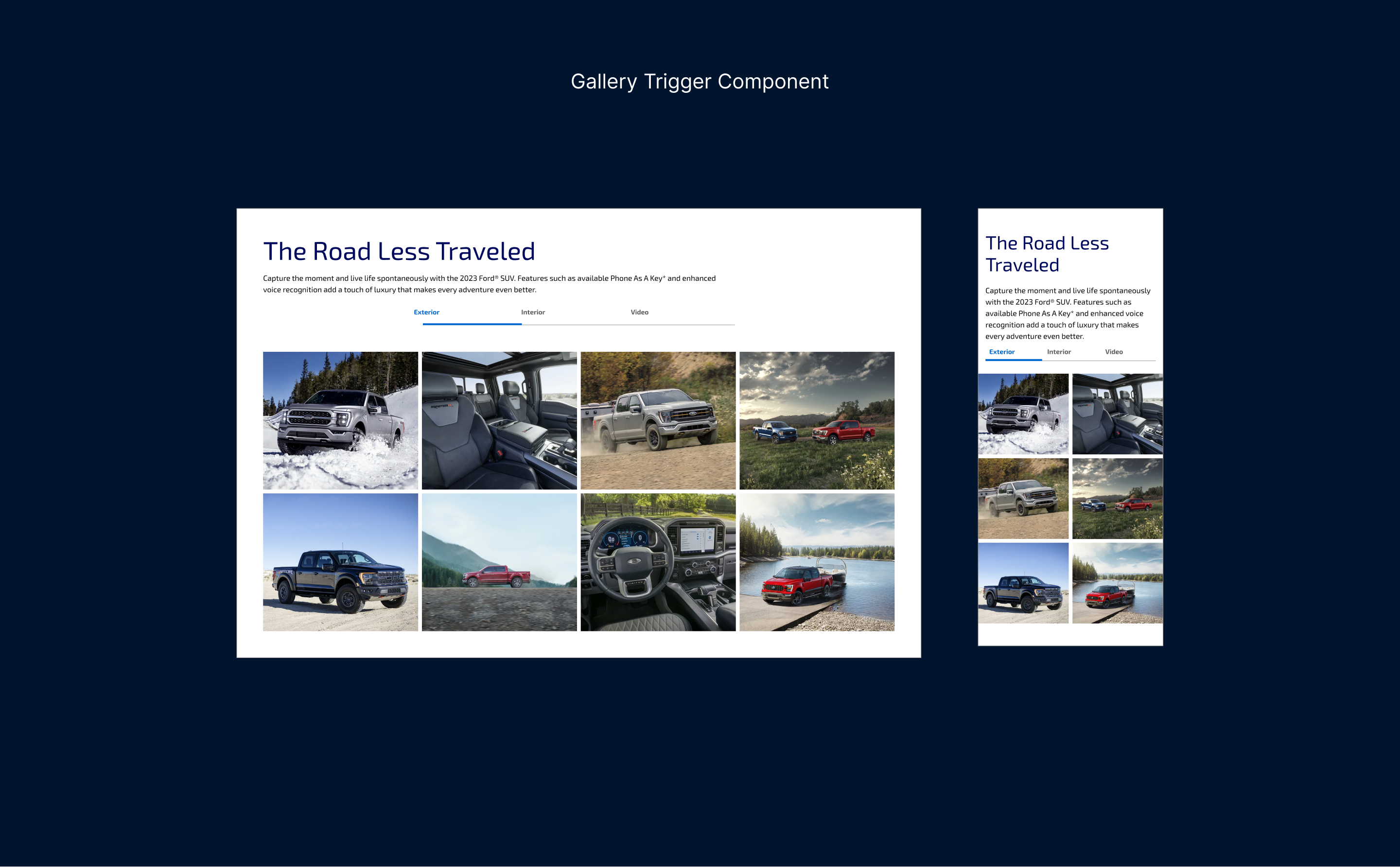
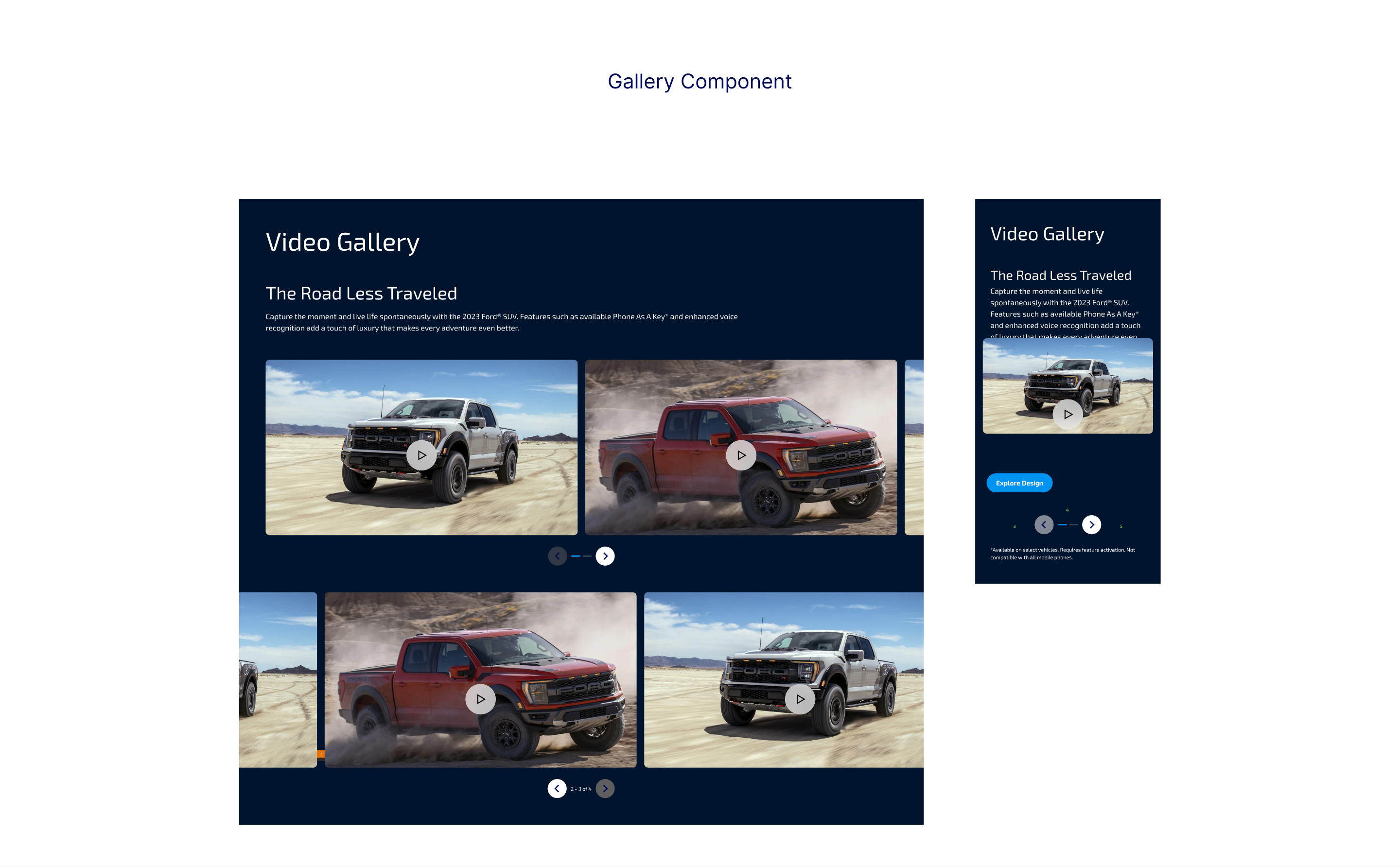
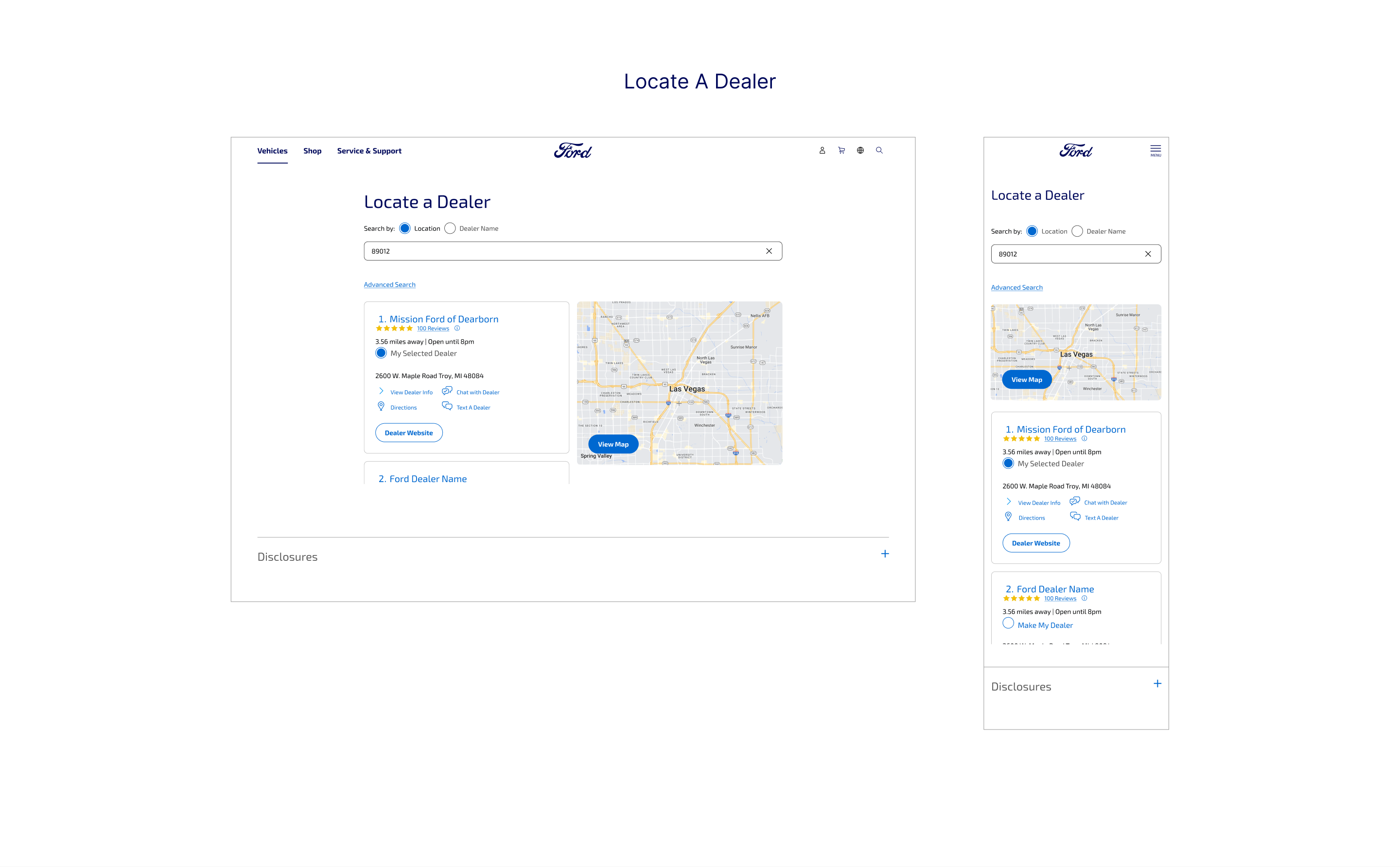
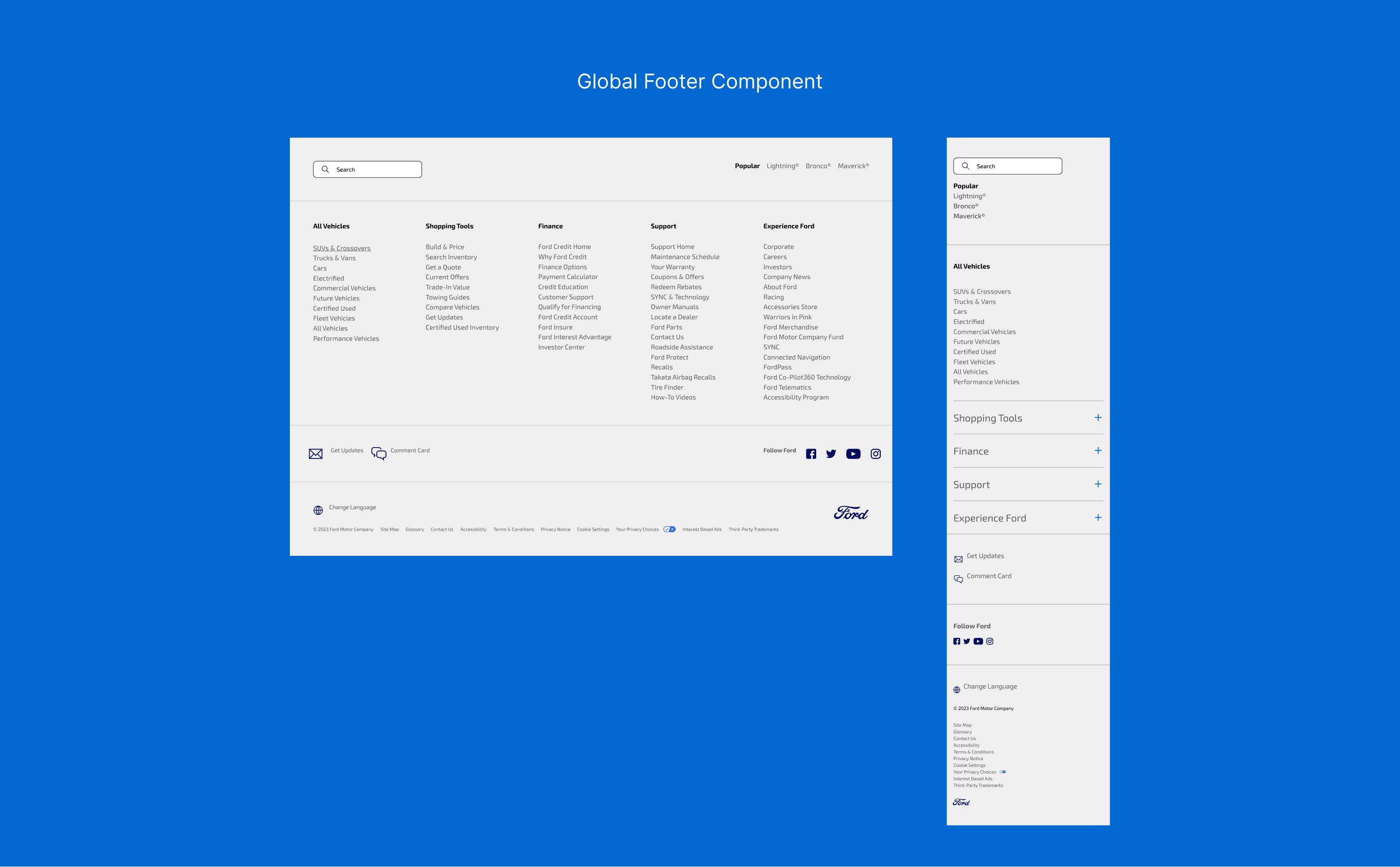
Every detail, from button states to content modules, was designed to support a seamless and responsive user experience.
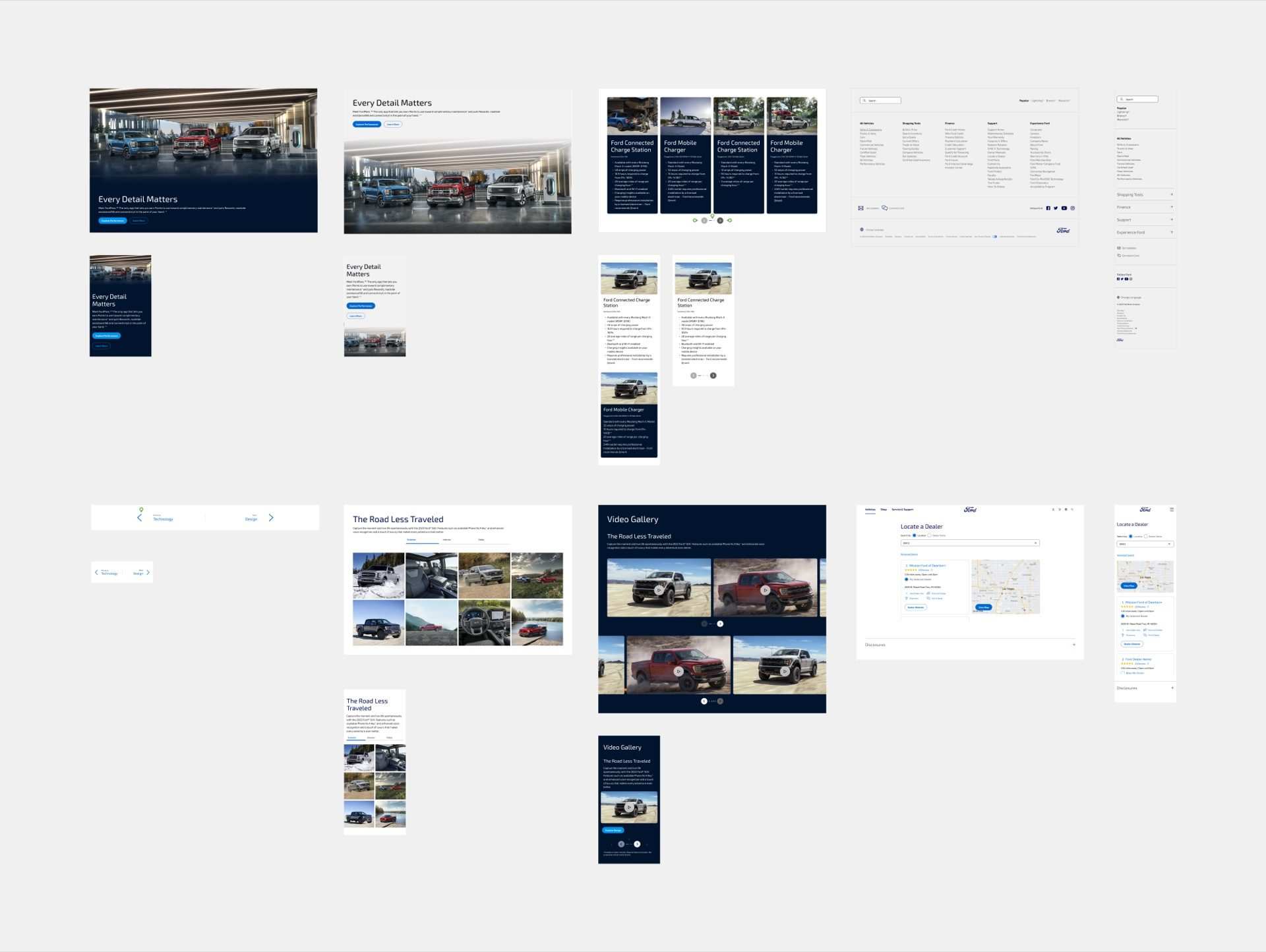
The components we contributed to the system. Each one earned its place by replacing something Ford was already running, quietly, at the same spot in the page, doing the same job better. Built and hand-annotated in Figma. Spec'd to the pixel.
Three more components in the system, Next/Previous, Glossary, Sitemap, followed the same sprint-to-handoff loop.
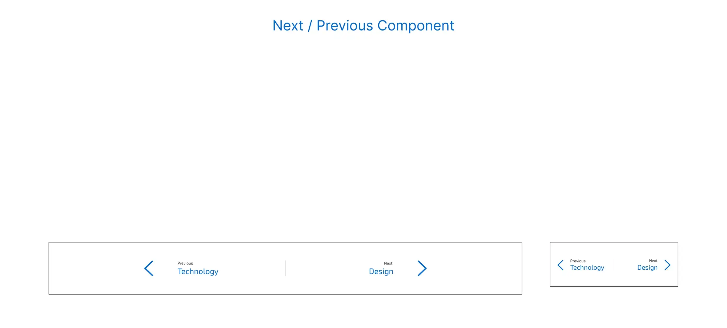
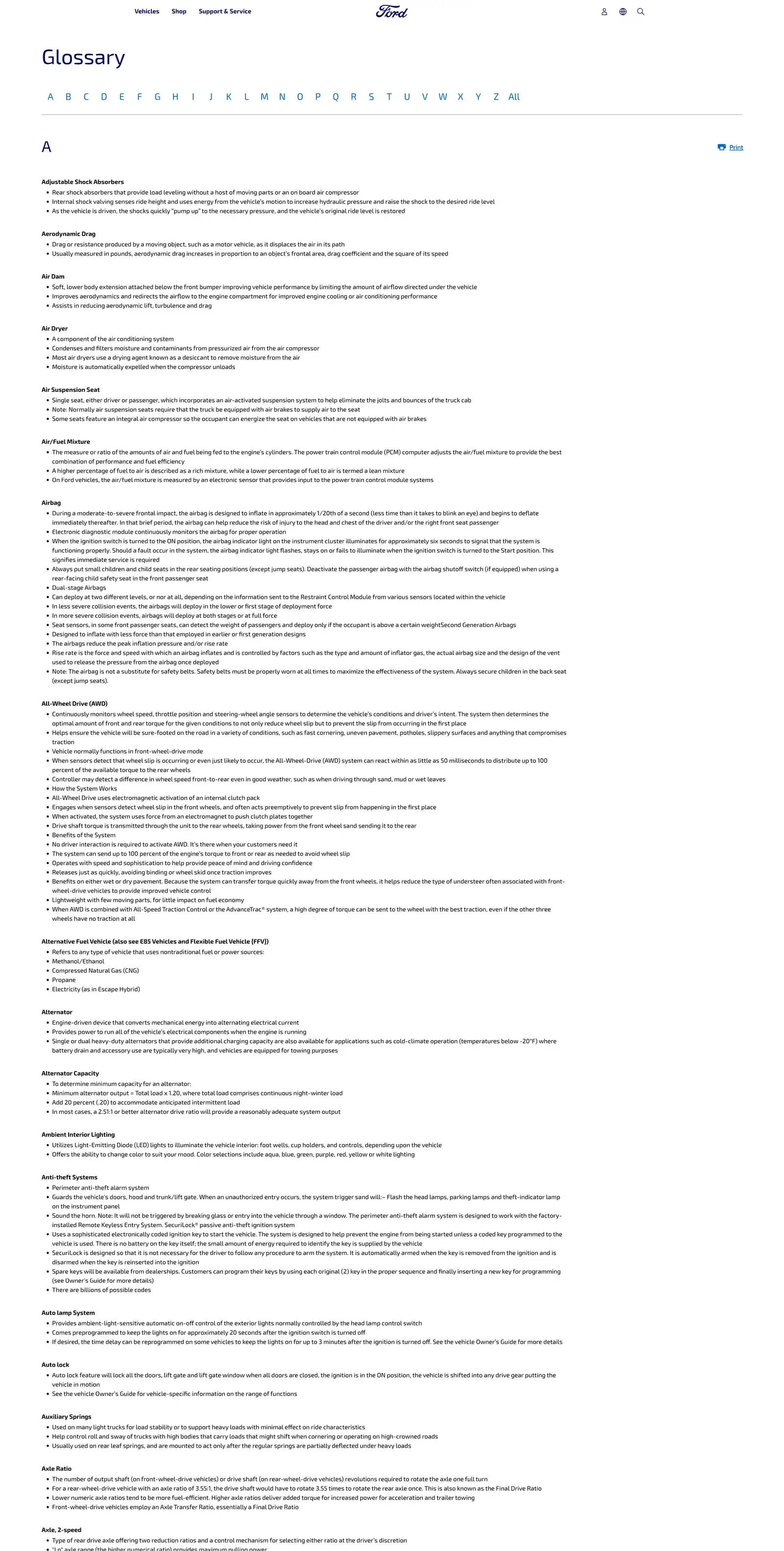
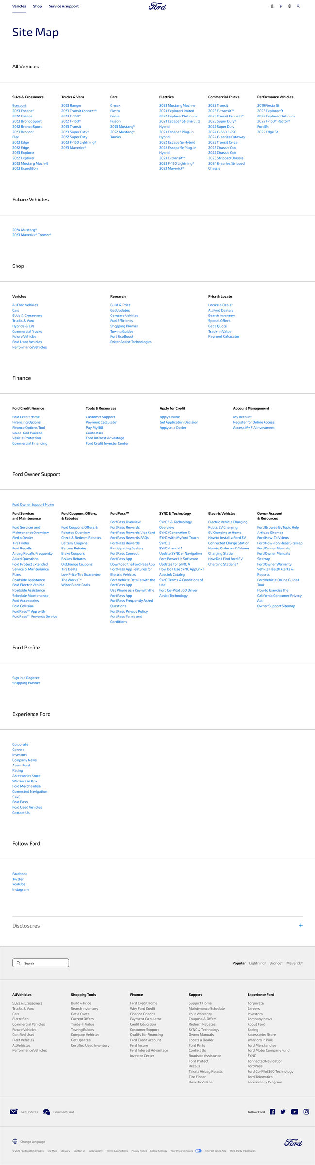
We delivered a full suite of UX and UI components, visual systems, and page templates built to scale.
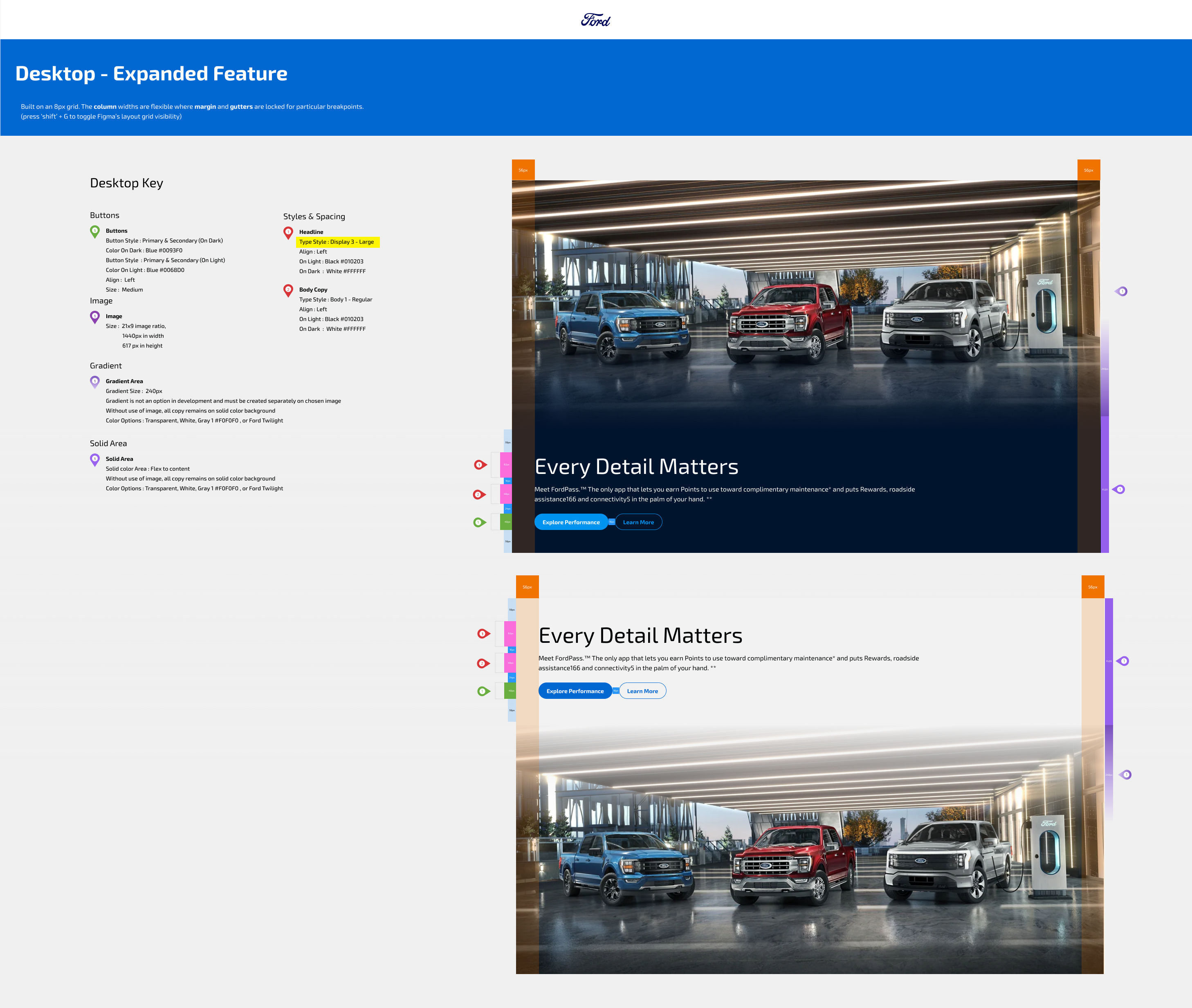
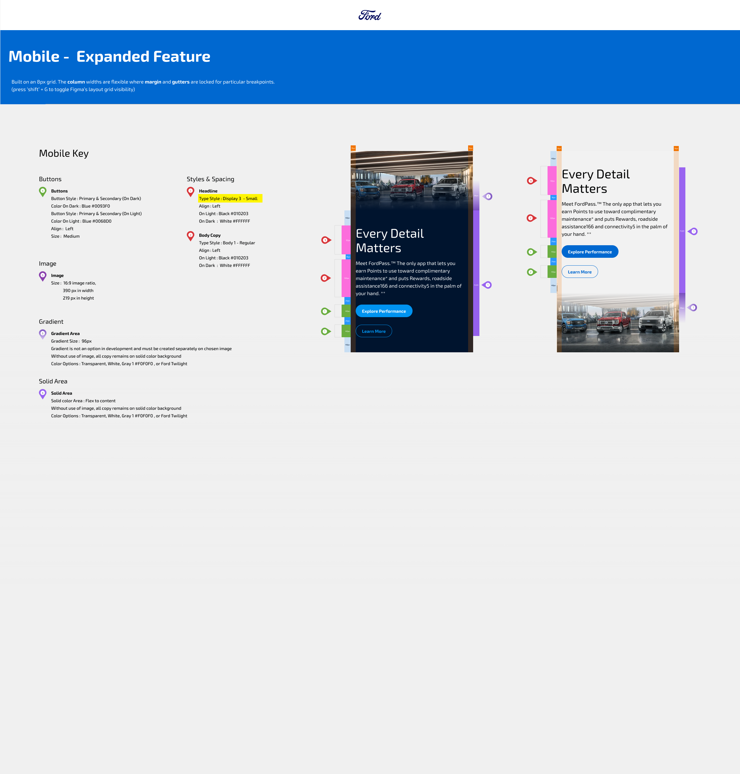
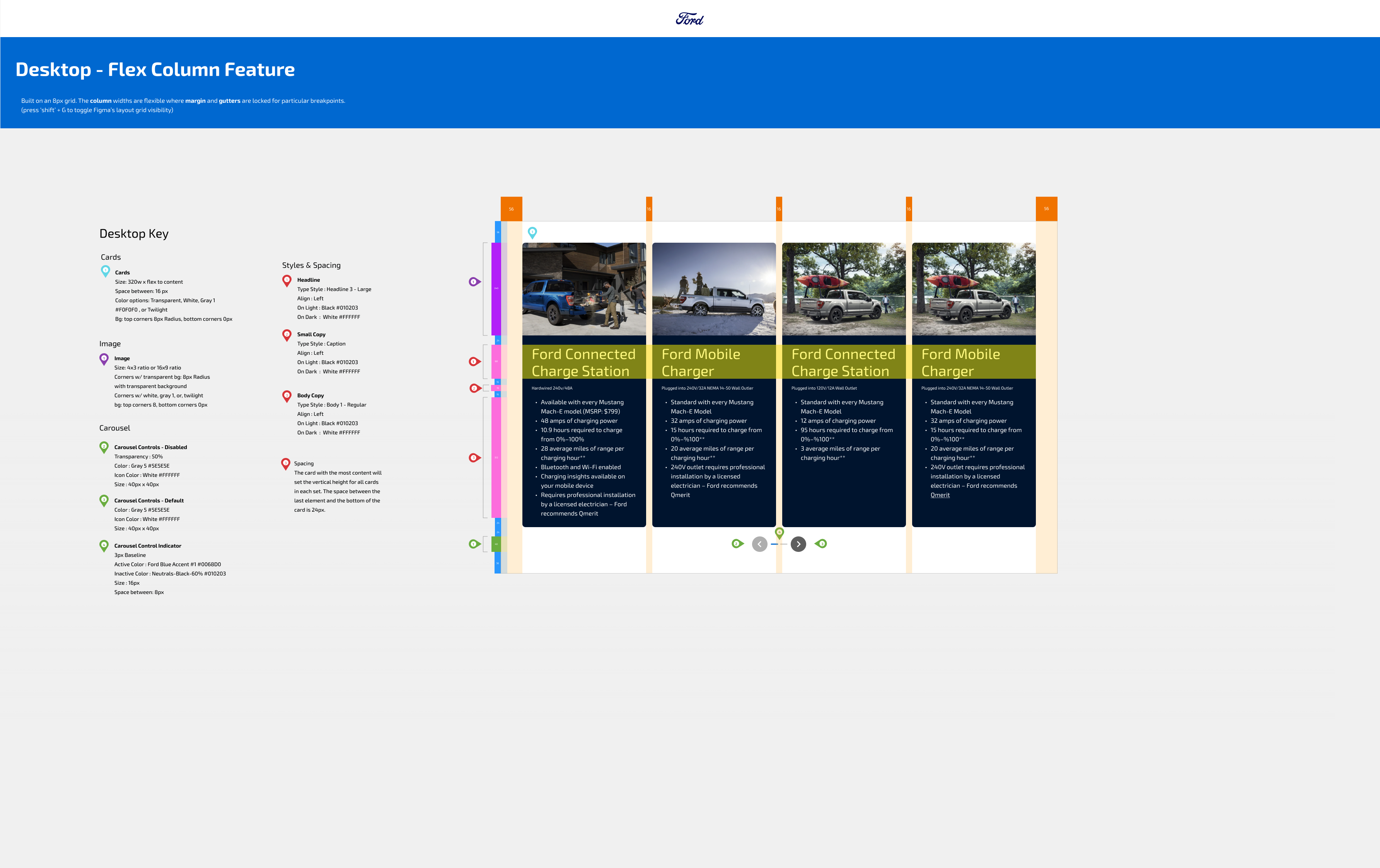
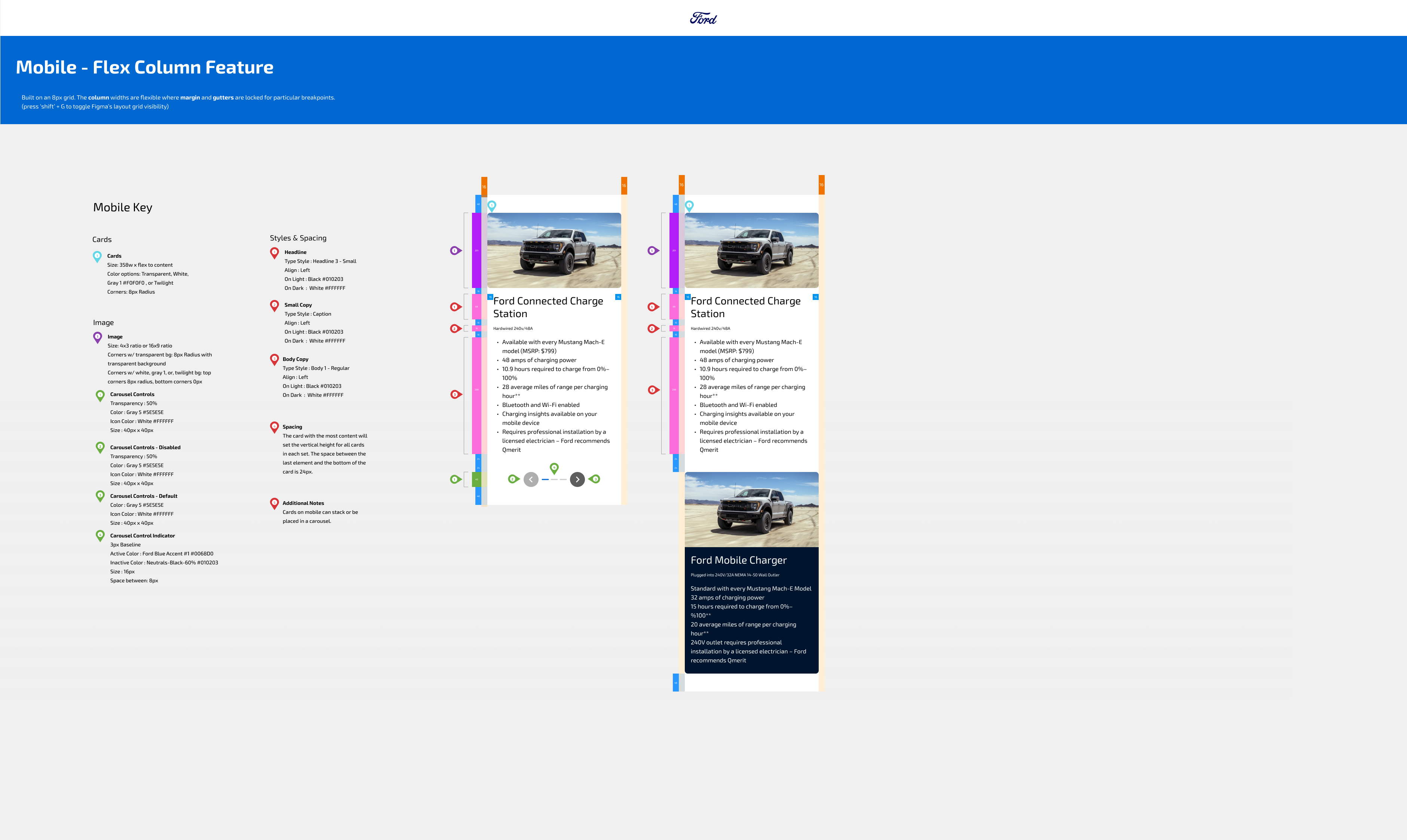
These assets were integrated into Ford’s broader ecosystem, ensuring flexibility across product pages, campaigns, and digital tools.
The part most case studies skip. When the platform stays and only the components change, the spec sheet is the deliverable, the document that tells Ford's engineers exactly where to cut, what to keep, and how the new piece sits next to the old code that's still running. Every measurement, every state, every responsive break, every motion curve, drawn by hand and labeled.
We didn't design components and throw them over a wall. We drew the wall, with the components on one side and the dev's integration path on the other, and walked across it with engineering each sprint until the new piece was indistinguishable from the existing chassis.
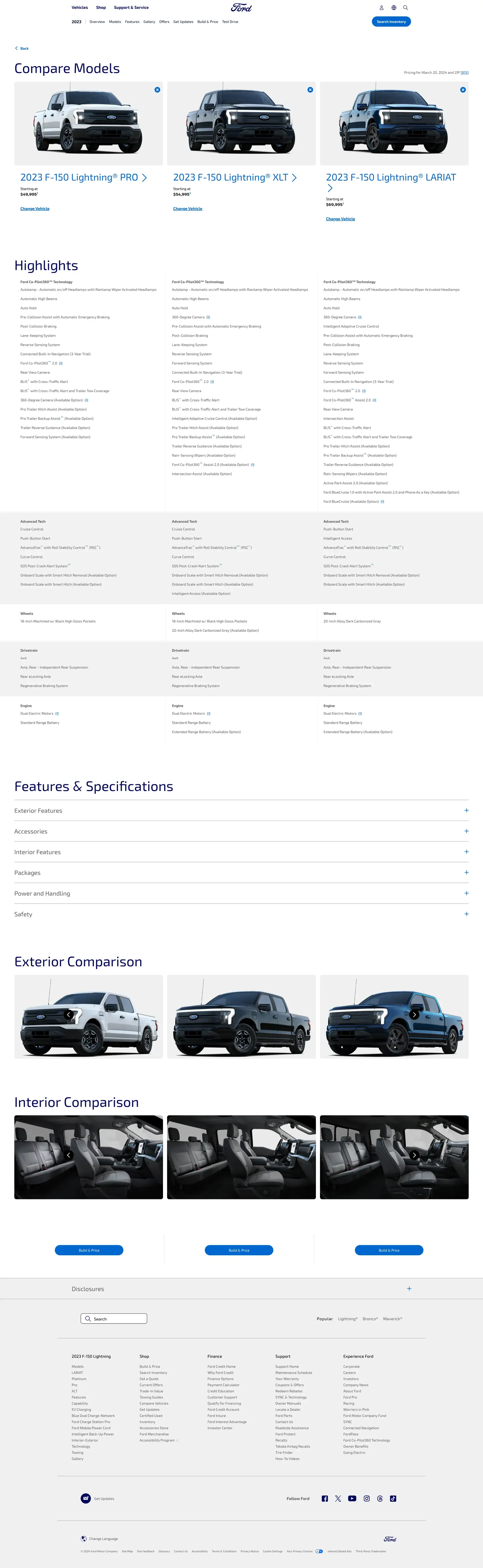

The result was an immersive digital framework that balanced precision and energy.

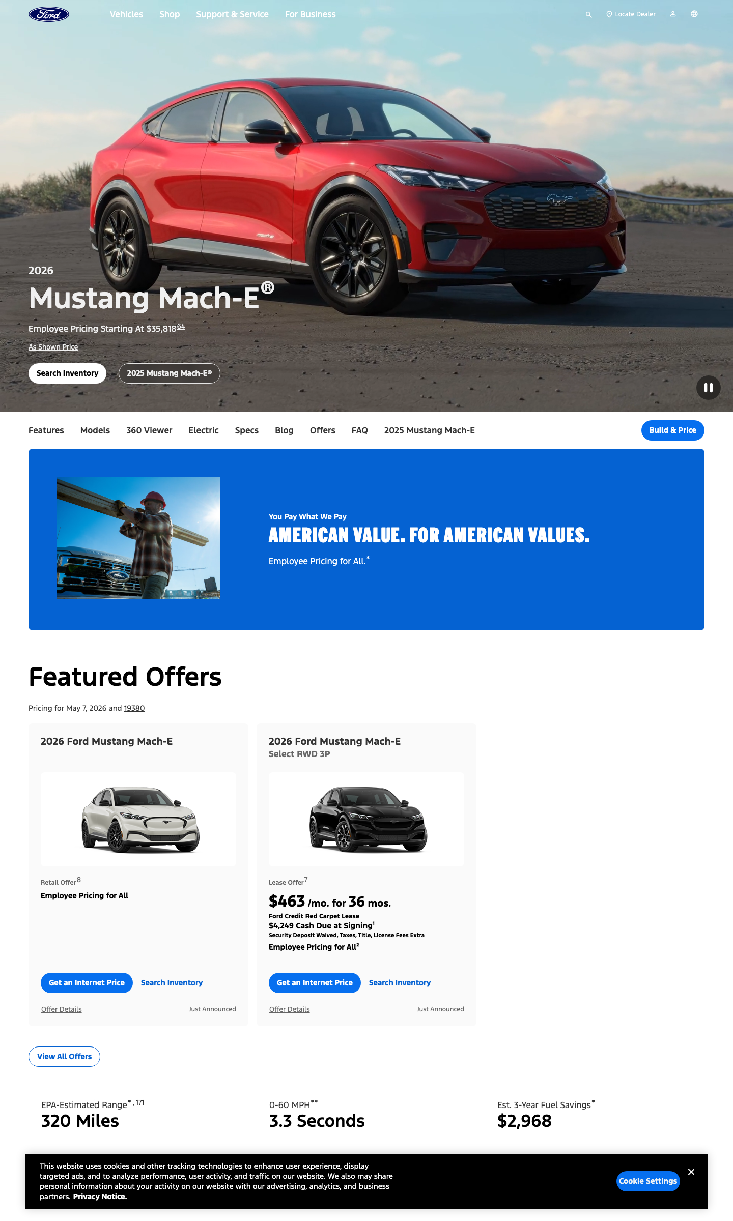
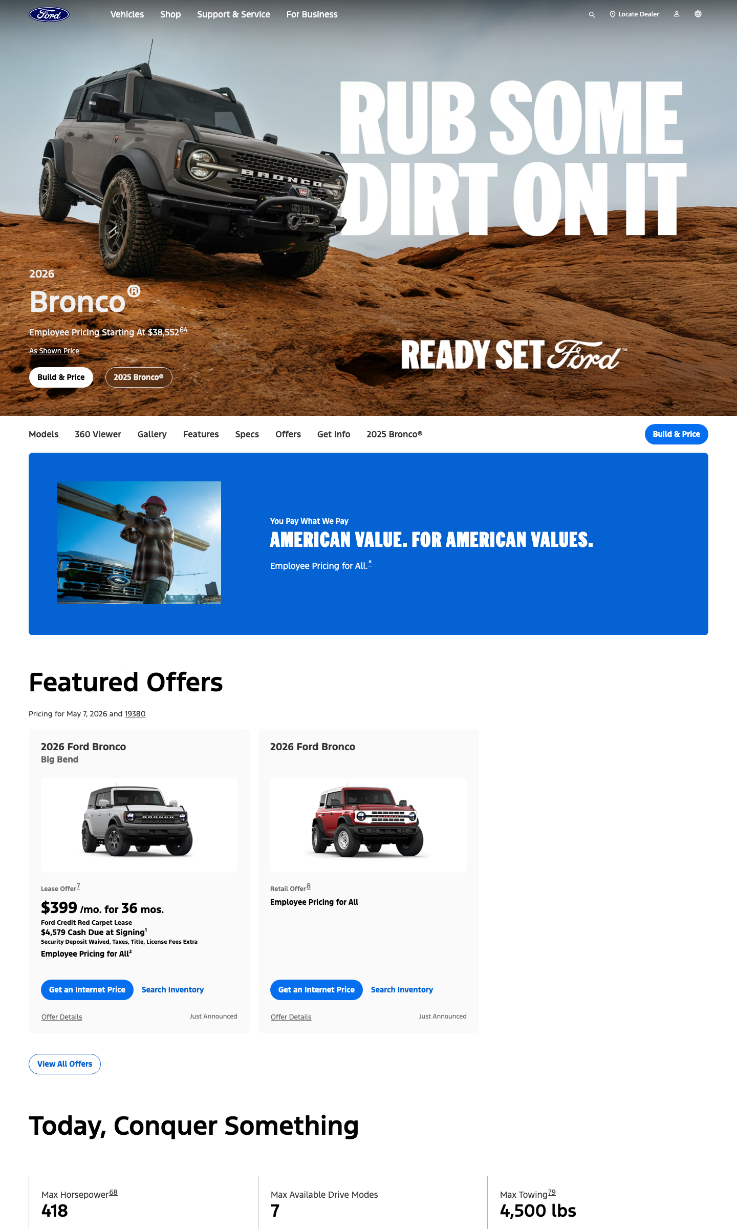
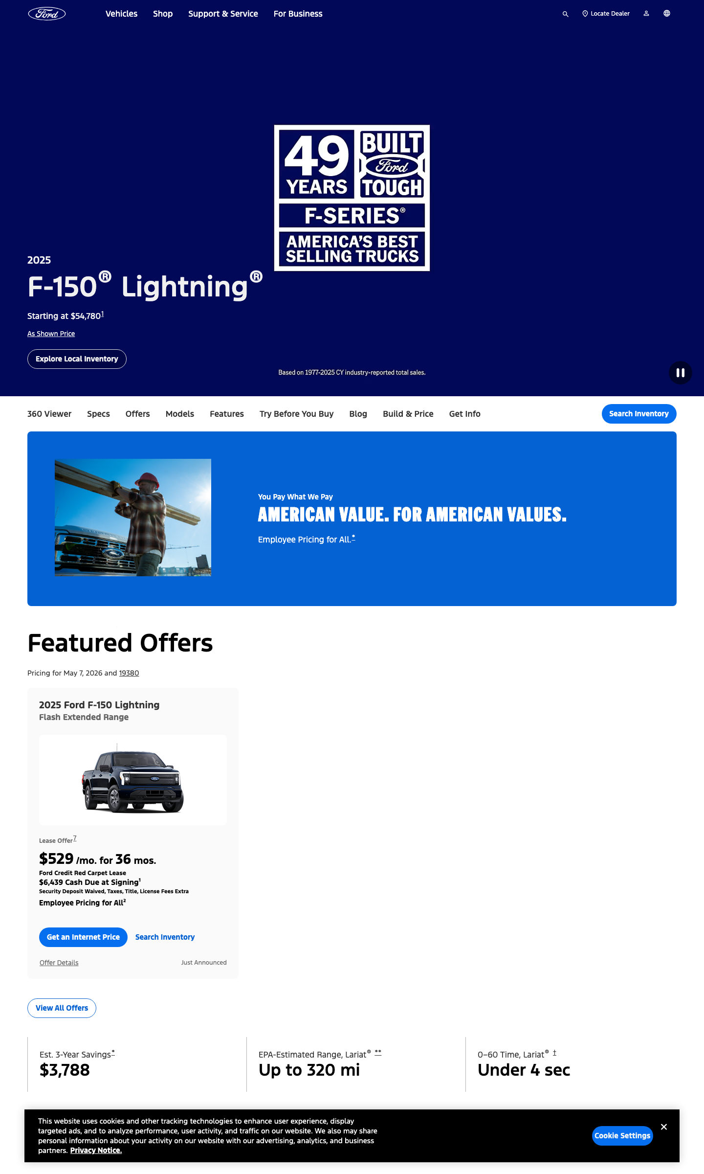
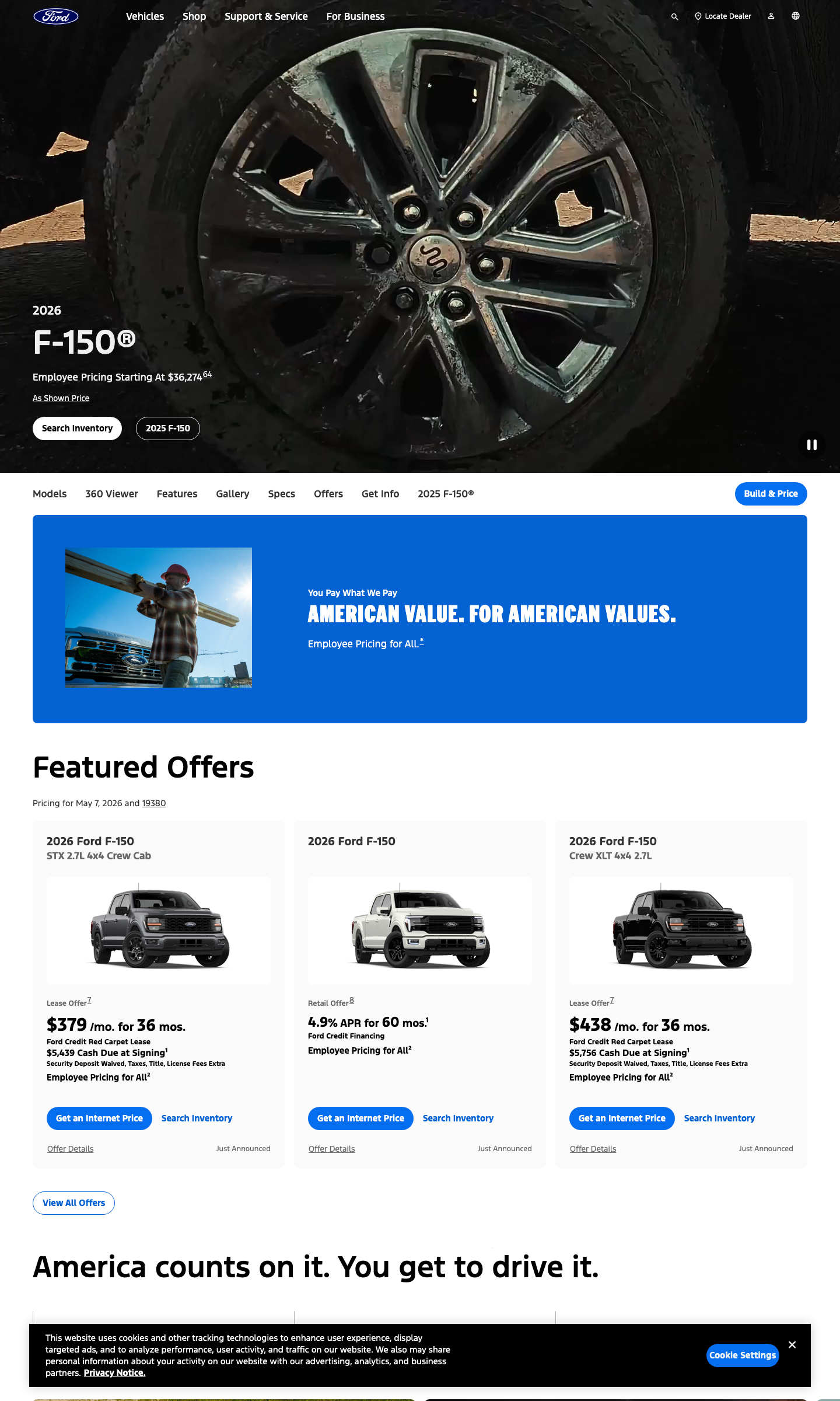
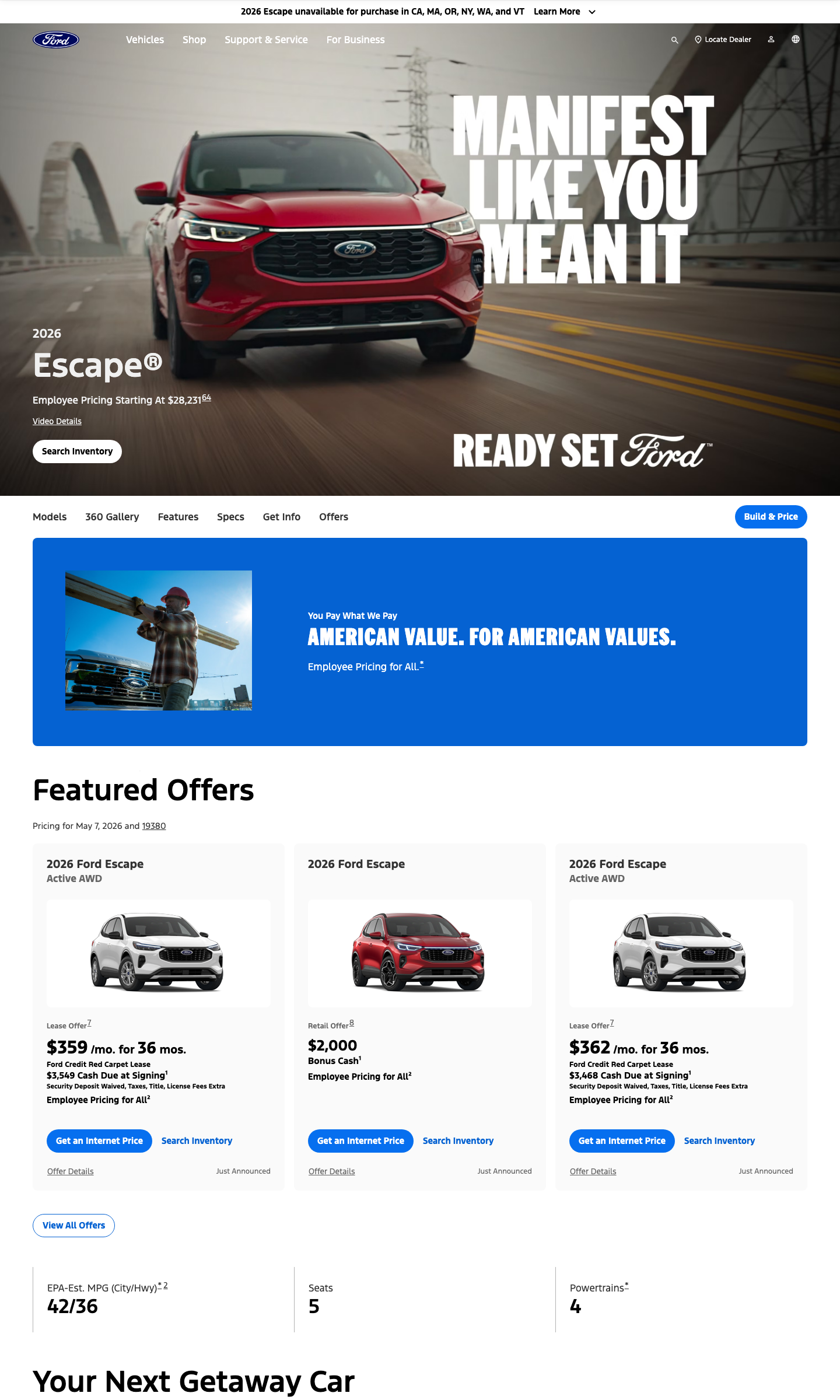
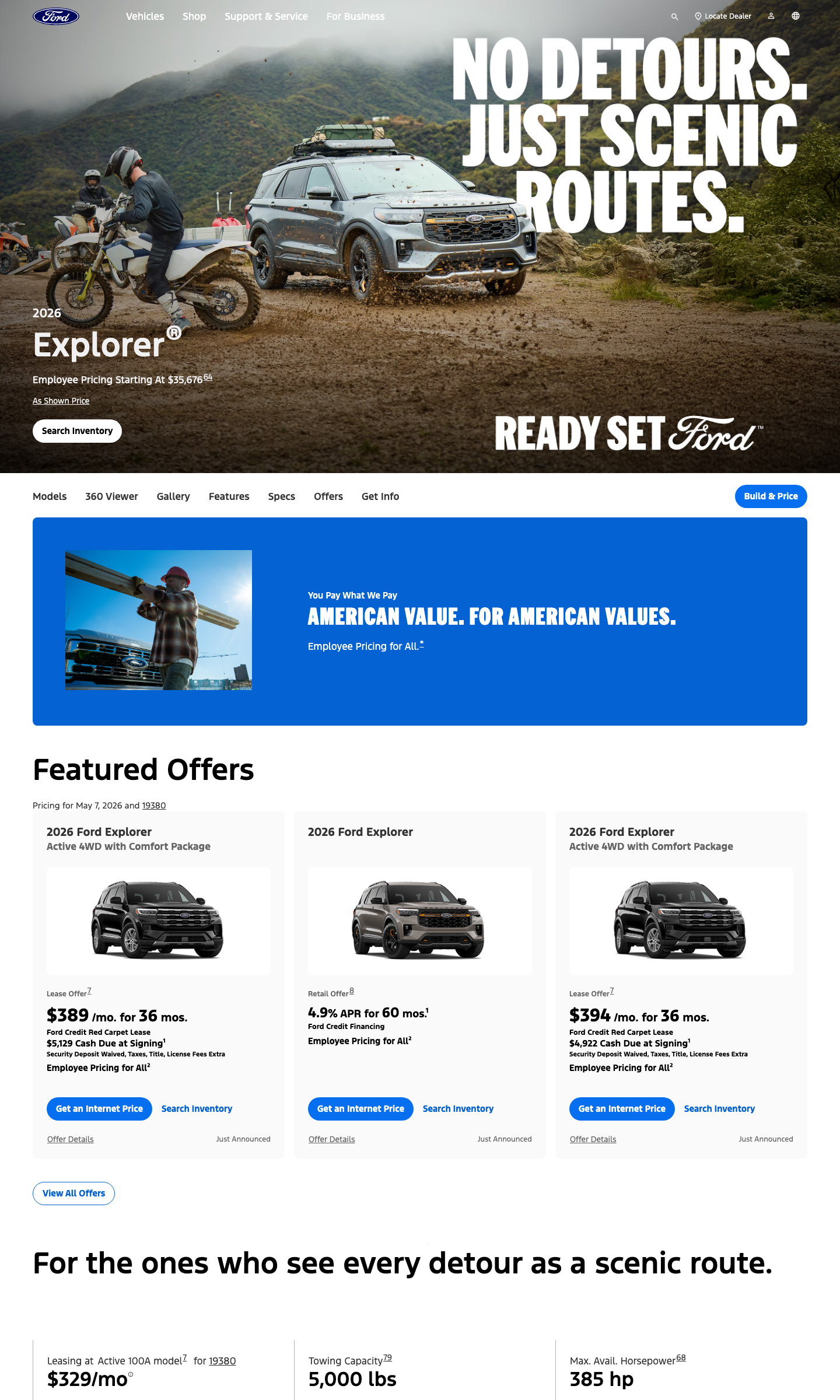
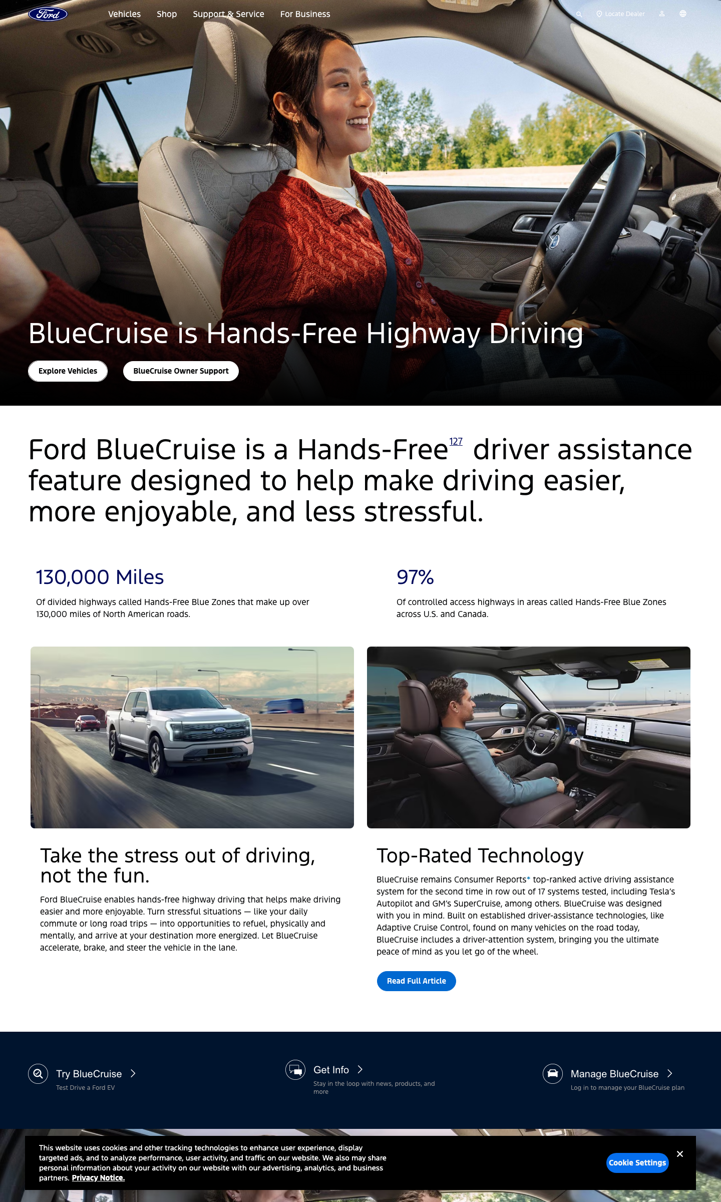
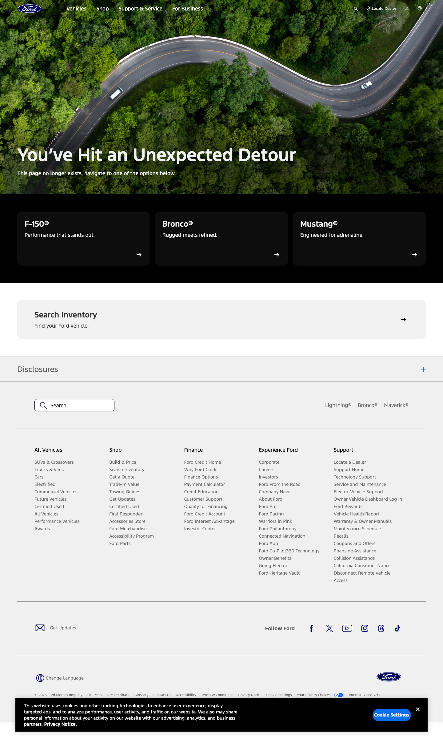
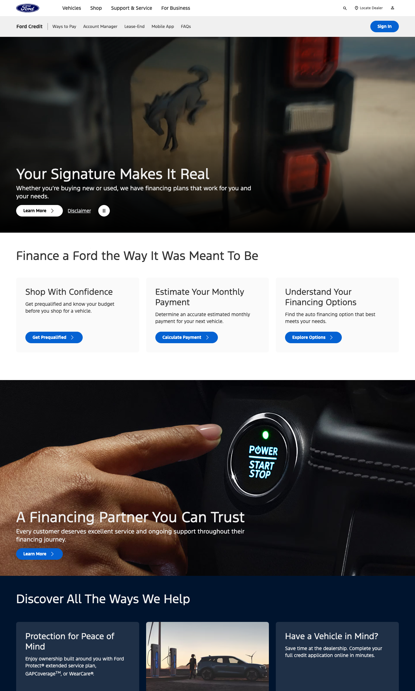
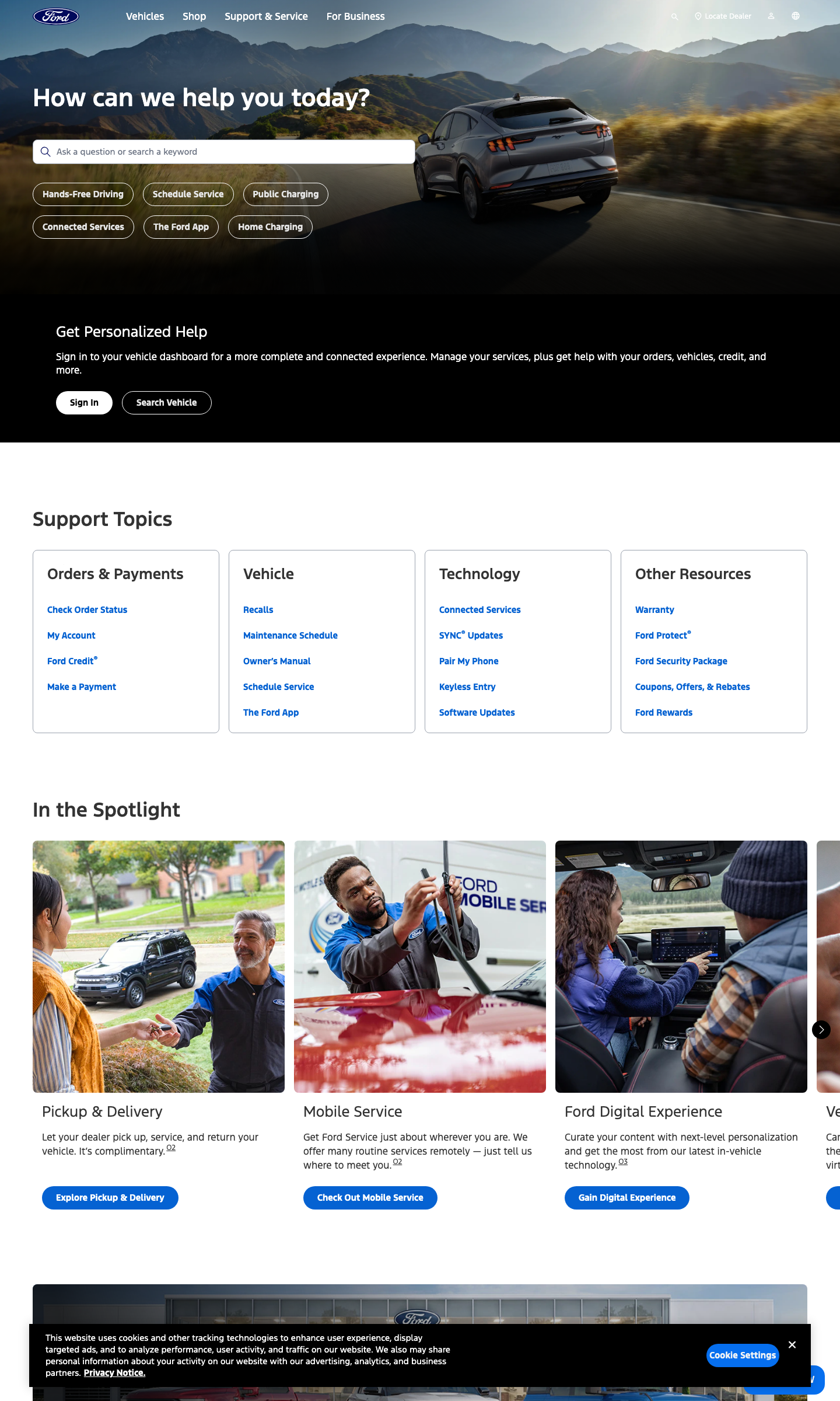
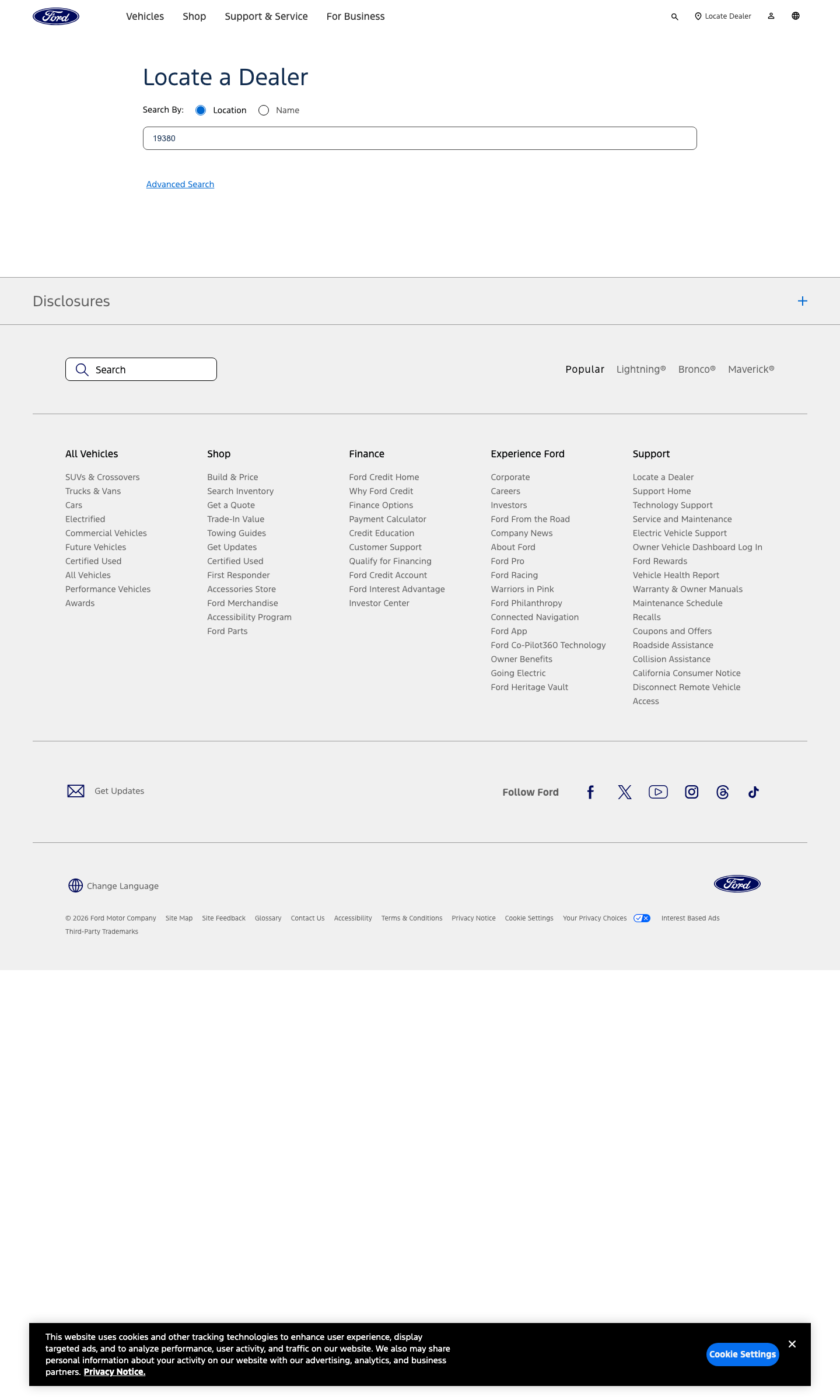
This is what shipped. Every page in the frame above runs on the components, dropped into the existing chassis, styled to the brand, verified on staging before it went live.
The new system gave Ford a refreshed online presence that’s clear, adaptable, and visually strong, aligning the brand’s digital experience with its legacy of innovation and design excellence.
Build the infrastructure first. Everything else follows.
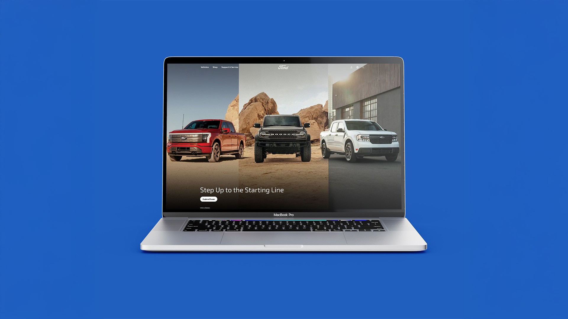
The Ford project reflects Therum’s commitment to collaboration and system thinking. By building from the inside out, prioritizing structure, scalability, and craft, we helped evolve an established brand into a modern digital environment without losing its heritage.