Electrolux.
A brand system that already worked (navy ground, cyan accent, technical line iconography) and a brief that asked for more dynamism without leaving home. The deliverable wasn't a redesign. It was a map of the directions the system could hold.
Visit electrolux.com ↗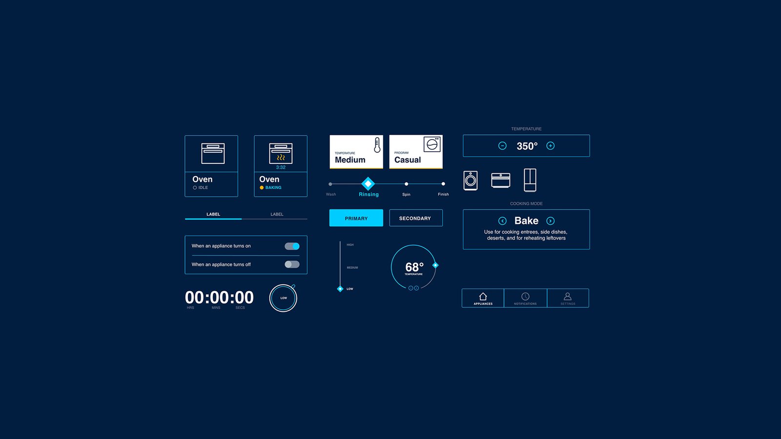
The pertinent details, what was built, what shipped, what it took.
Electrolux
Art direction and UI design for Electrolux’s digital product experience. Premium appliance brand, enterprise-scale design system. Built with MadPow.
electrolux.com ↗Art Director · UI Designer (4-person team at MadPow)
- UI designs
- Art direction
- Creative assets
- Art direction
- UI design
The Premise
More dynamism. Stay inside the brand. Show the room, not just one corner of it.
MadPow brought me in to develop UI concept work for Electrolux's smart-home appliance interface. The system was already built (component library, color logic, type ramp, iconography) and it was working. The brief wasn't to fix it. The brief was to find more movement inside what already existed without breaking what was already true.
The deliverable on paper was four UI concepts. The deliverable in practice was something more useful: a small library of directions Electrolux could test, validate, A/B against each other, and pull from later. Four legible options beats one polished pitch every time. A team can defend a choice when it's chosen against alternatives. They can't defend a choice that arrived alone.
The System I Was Given
Deep navy ground. Electric cyan as the single accent. Line-drawn appliance iconography (oven, washer, fridge) reduced to outline geometry. Status cards, sliders, primary/secondary actions, mode selectors, temperature dials, toggles, a timer, a three-up tab nav. The whole interaction surface as one component sheet, sized and ranked.
The kit · navy + cyan + line iconography
This is the kit. The job was to pull from it, not replace it.
Four Concepts
Four directions, each one pulling on a different lever the brand already had permission to pull. None of them invent new components, they re-tune the ones that already shipped. Read each one as a hypothesis: what happens if Electrolux talks like this?
Light & Open
Inverted ground · amber + cyan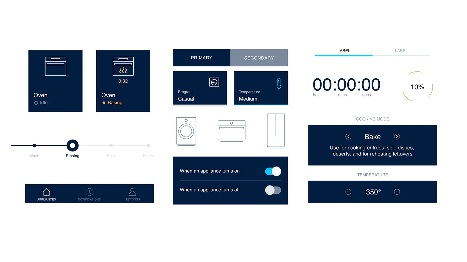
The system flipped from dark to light. Components keep their geometry but live on a white field, with navy borders carrying the line work. A second accent enters, warm amber, pairing against the original cyan as a secondary hierarchy color. Status reads quieter; structure reads louder.
The hypothesis: Electrolux can run an editorial-clean surface without losing its technical signal. Useful in marketing contexts, store kiosks, or anywhere the appliance is sold instead of operated.
Confident & Direct
Same palette · louder voice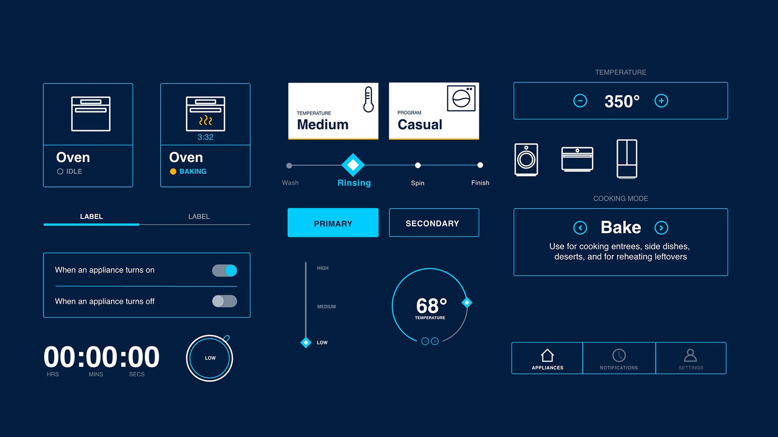
Same navy, same cyan, intensified. Components stand on uniform borders instead of mixing solid and outline. The PRIMARY button gets a full cyan block; the SECONDARY recedes. Type sits one weight heavier. The white temperature/program cards keep their pop but the rest of the screen calms down so they earn it.
The hypothesis: the existing brand language is right; it just needed less hesitation. This is the version that says the same thing at lower volume and somehow gets heard better.
Lifestyle & Warm
Photographic content · orange action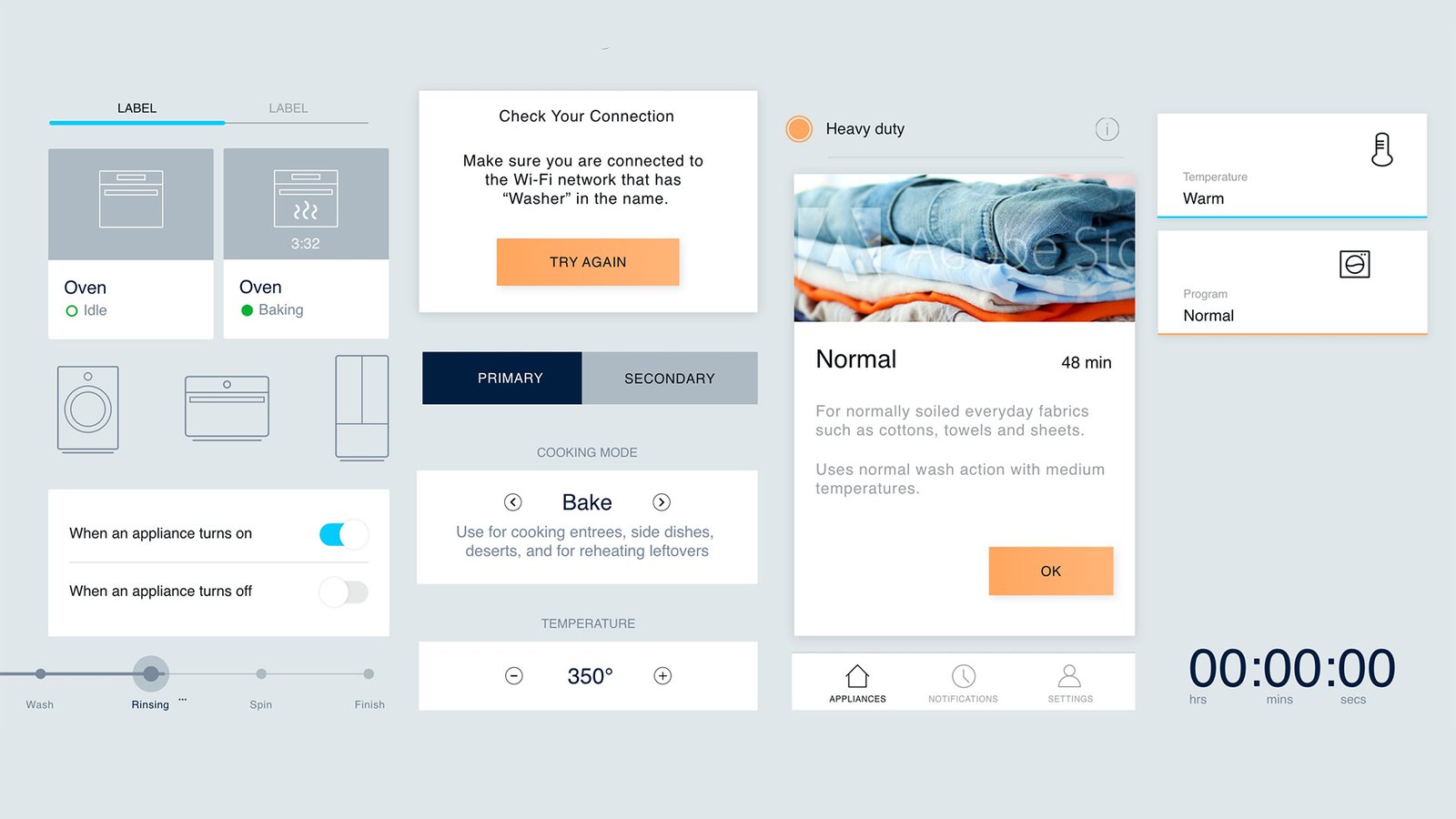
The system meets a person. Photographic content slots into the program cards, the laundry pile inside Normal, instead of staying in line-icon abstraction. CTA color shifts from cyan to a warm orange (TRY AGAIN, OK). The ground softens to a pale gray. Components keep their shape; the content inside them changes register entirely.
The hypothesis: the smart-home interface doesn't have to look like a control panel. It can look like the laundry it's about to wash.
Soft & Tactile
Pastel pills · physical feel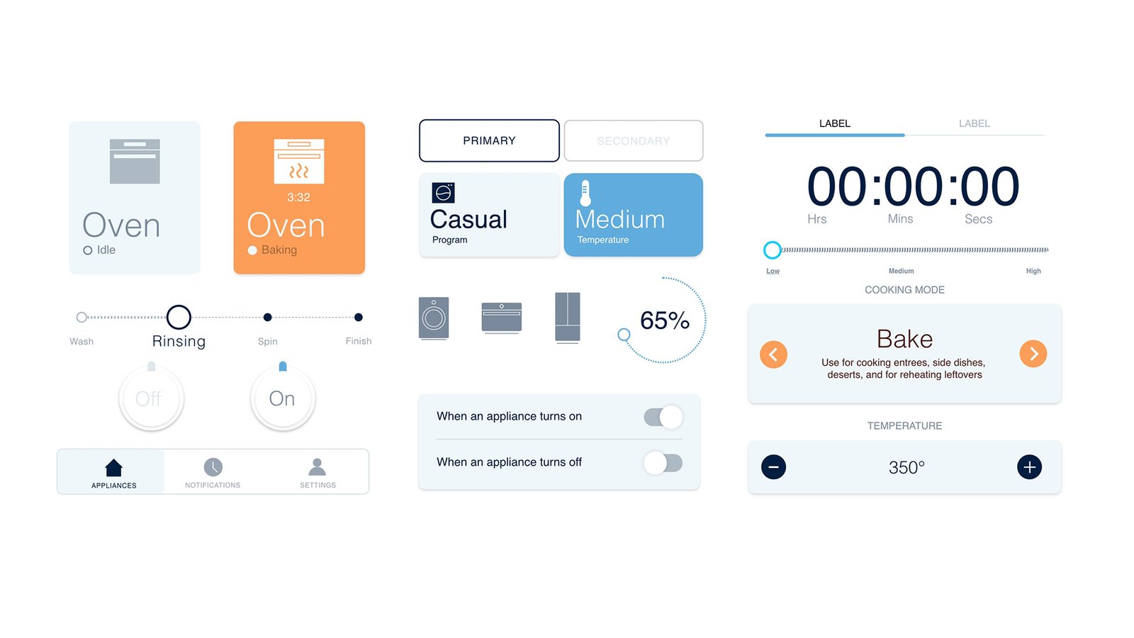
The most divergent of the four. White ground. Components rebuilt as soft pastel pills (pale blue, pale orange, light gray) with rounded corners and slight shadows that read as physical. The On/Off control becomes a pair of tactile knobs. Iconography drops into a softer gray. Cyan exits almost entirely.
The hypothesis: a friendlier, more consumer-grade voice for Electrolux's lower-tech surfaces, the part of the line that lives on a kitchen counter and gets used by everyone, not just the spec-sheet reader.
What Held Across All Four
The reason four concepts can sit next to each other and still read as the same brand is that the system never moved. The components, the information hierarchy, and the icon library carried across every direction. What flexed was tone, ground, accent, type weight, button shape, photographic vs illustrative.
That's the actual finding. The Electrolux system is wider than the way it was being used. Same bones, four legible voices, and the team can pick the right one for the right surface instead of forcing one tone to do every job.
Range, Not Just Direction
A team that has four directions can A/B test, validate, and pick. A team that has one direction can only hope.
Concept work earns its keep when it stops being decoration and starts being decision support. Four directions next to each other is what lets a brand team A/B test surfaces against real users, defend choices to leadership with options on the table, and grow a single system into a flexible voice without burning it down to start over.
That's what this was. Not four mockups. Four moves on a board, for a brand that already knew its game and needed the next play mapped before it called it.