Deadass: A Comedy Show
Deadass: A Comedy Show
Overview
- Collaboration & Curation
- Immersive Experiences
- Visual Creative
What We Did
The Outcome
Build a visual identity for a live comedy show that's also a cultural institution in the making
DEADASS isn’t a comedy show that happened to get popular. It’s a deliberate platform, founded by Mouse Jones, Tiffany Wagner, and Spank, built to center Black talent, Black community, and Black humor in a format that matches the energy of New York City itself: fresh, in your face, and flat out funny. Running at SOBs, it books comics nobody has heard of alongside viral names, and the room has the reputation to match, described as one of the toughest in New York. A show like that doesn’t need gimmicks. It needs a visual identity that can hold the weight of what it actually is.
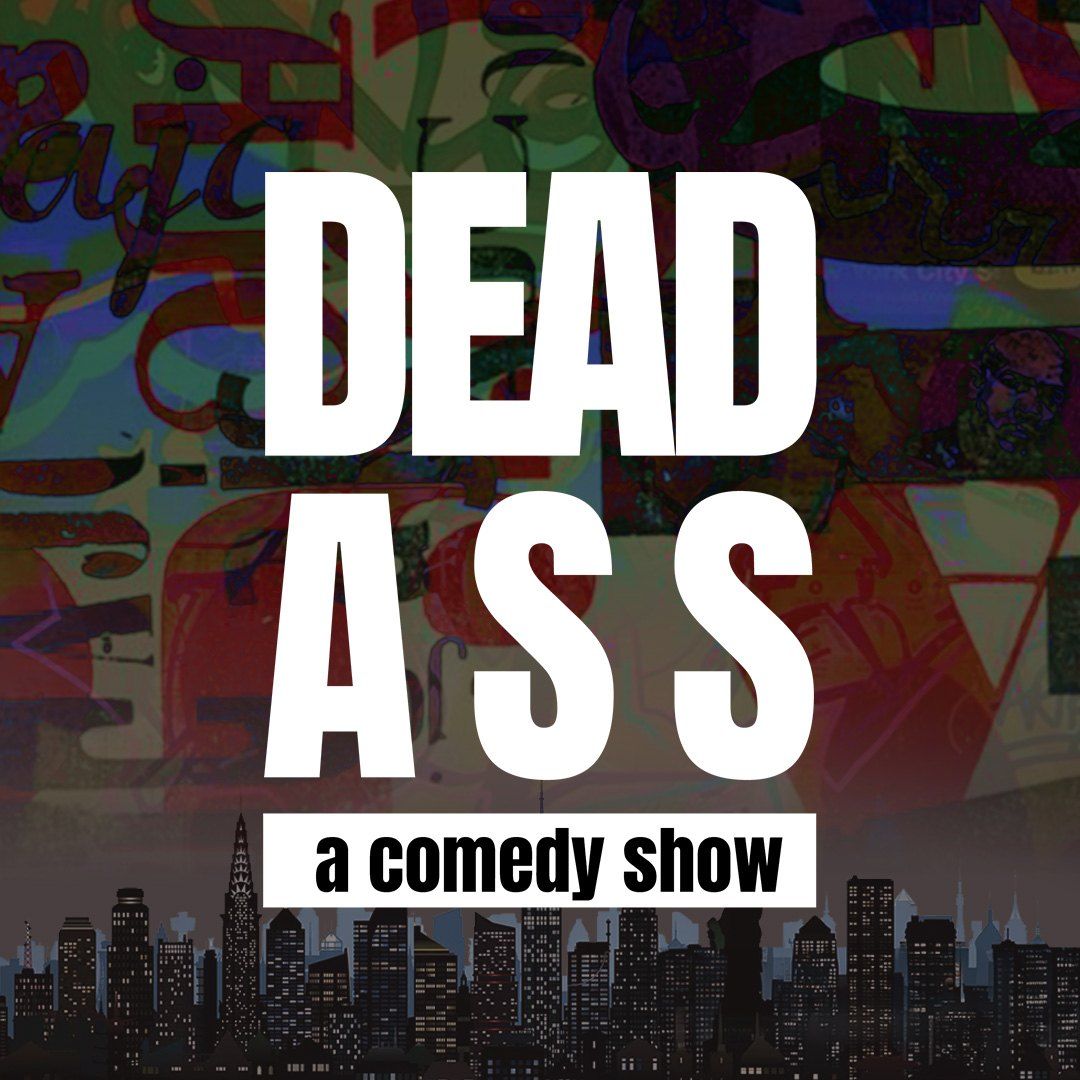
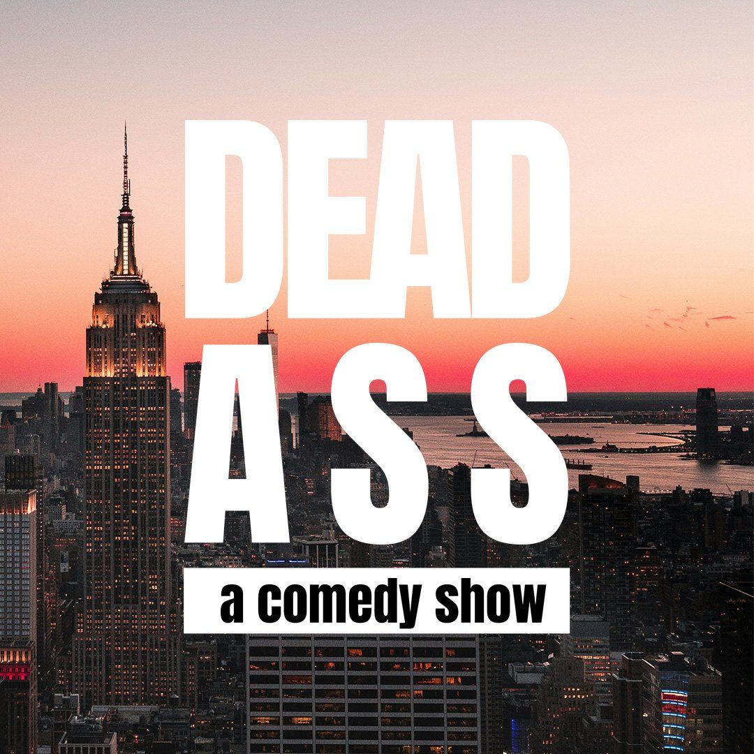
Brand design, motion graphics, and event visuals, from stage to screen
Therum partnered directly with Mouse Jones and the DEADASS team to build the visual language for the live experience and carry it across every format it needed to live in: on-stage, in promotional motion content, and in social drops designed to move with the culture around the show.
Mine the references, find the intersection, build something that couldn't exist anywhere else
We approached the project with deep respect for the culture and tone of the event. The visual design embraced bold typography, layered motion, and social-native formats to bridge between live performance and digital culture.
We started with a moodboard organized across six territories: Late Night TV, Times Square, Bold Type, Color, the 90s, and Black Culture. That framework wasn’t arbitrary, it mapped the exact cultural coordinates DEADASS occupies. The show sits at the intersection of the late night tradition (SNL, The Tonight Show, The Martin Show, Def Comedy Jam) and something rawer and more current, born specifically out of New York and the generation that grew up watching those shows and is now ready to make their own.
The references did what good moodboards do, they revealed the tension the design had to hold. Late night TV brought structure, prestige, and the visual grammar of a show that takes itself seriously as a platform. Times Square brought scale, density, and the particular visual aggression of a city that competes for your attention at every corner. Def Comedy Jam and the 90s Black culture references brought the cultural grounding, the reminder that the most important thing on stage is the talent, and the design has to earn its place around it, not over it.
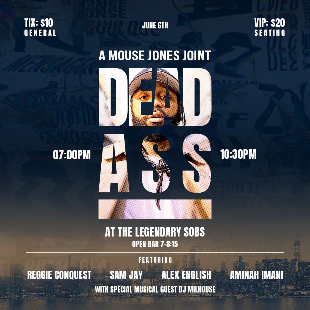
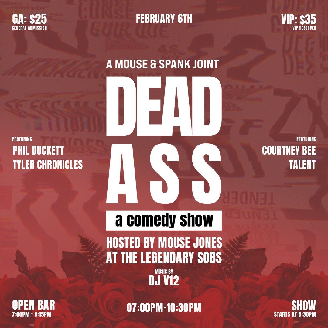
From that territory we ran through over ten logo directions, badge lockups, circular treatments, script explorations, stacked condensed type, overlapping letterforms. Each one was testing a different balance of those tensions: how serious, how playful, how street, how stage. The starred concepts pointed toward what was working, and what was working was always the most confident, most stripped back direction. The identity that landed was the one that needed nothing extra: “DEAD / ASS” stacked in maximum-weight condensed type, “A Mouse Jones Joint” sitting above it like a film credit, “a comedy show” locked in a solid bar underneath. Black and white only. No gradients, no texture, no decoration. Just the words and the weight behind them, which is exactly what Mouse Jones brings to a room every time he walks on stage.
A full brand identity and event visual system for DEADASS
A full brand identity and motion graphic package for the event; event visuals including on-site signage, stage assets and ambient graphic motion; and social content and promotional motion pieces to amplify the live experience.
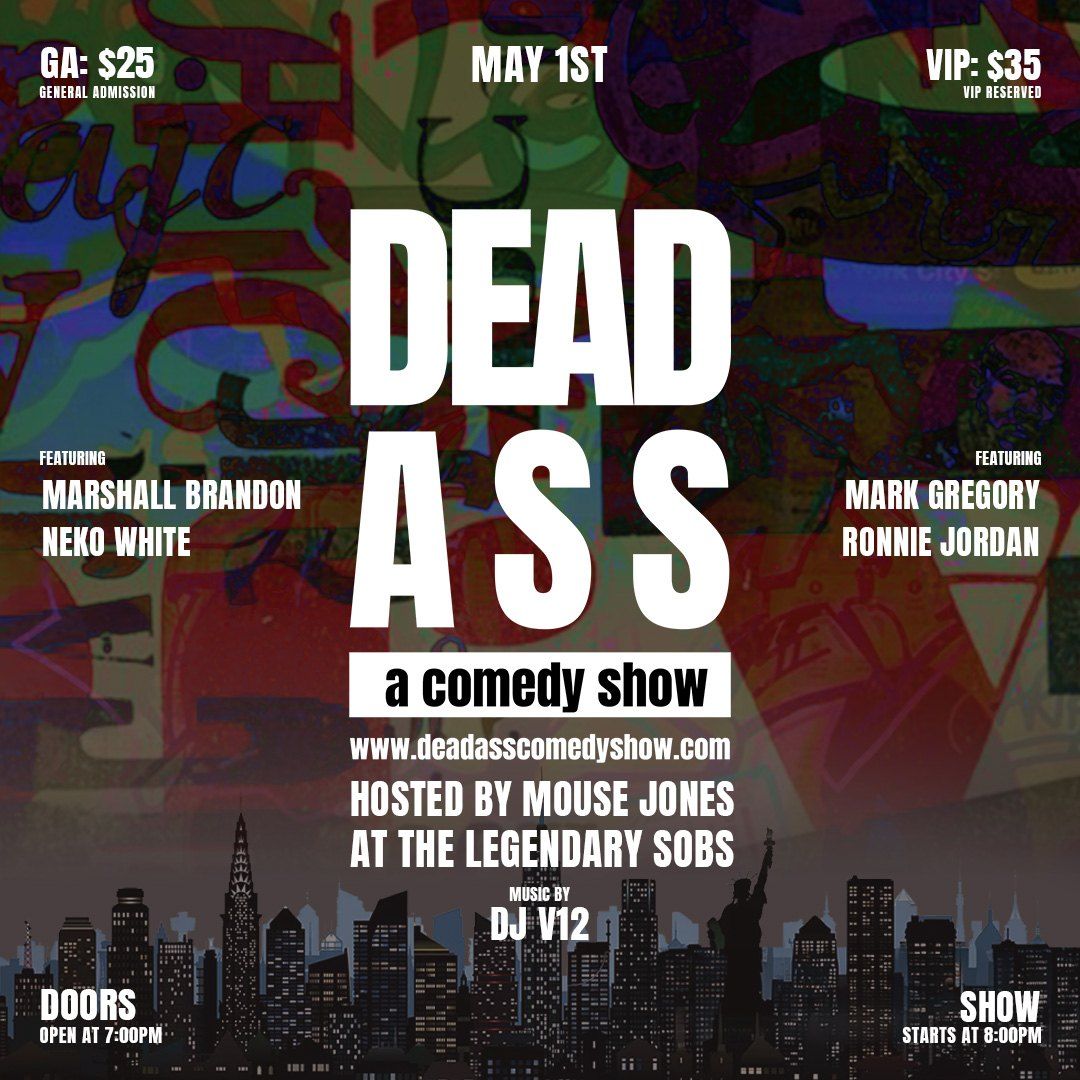
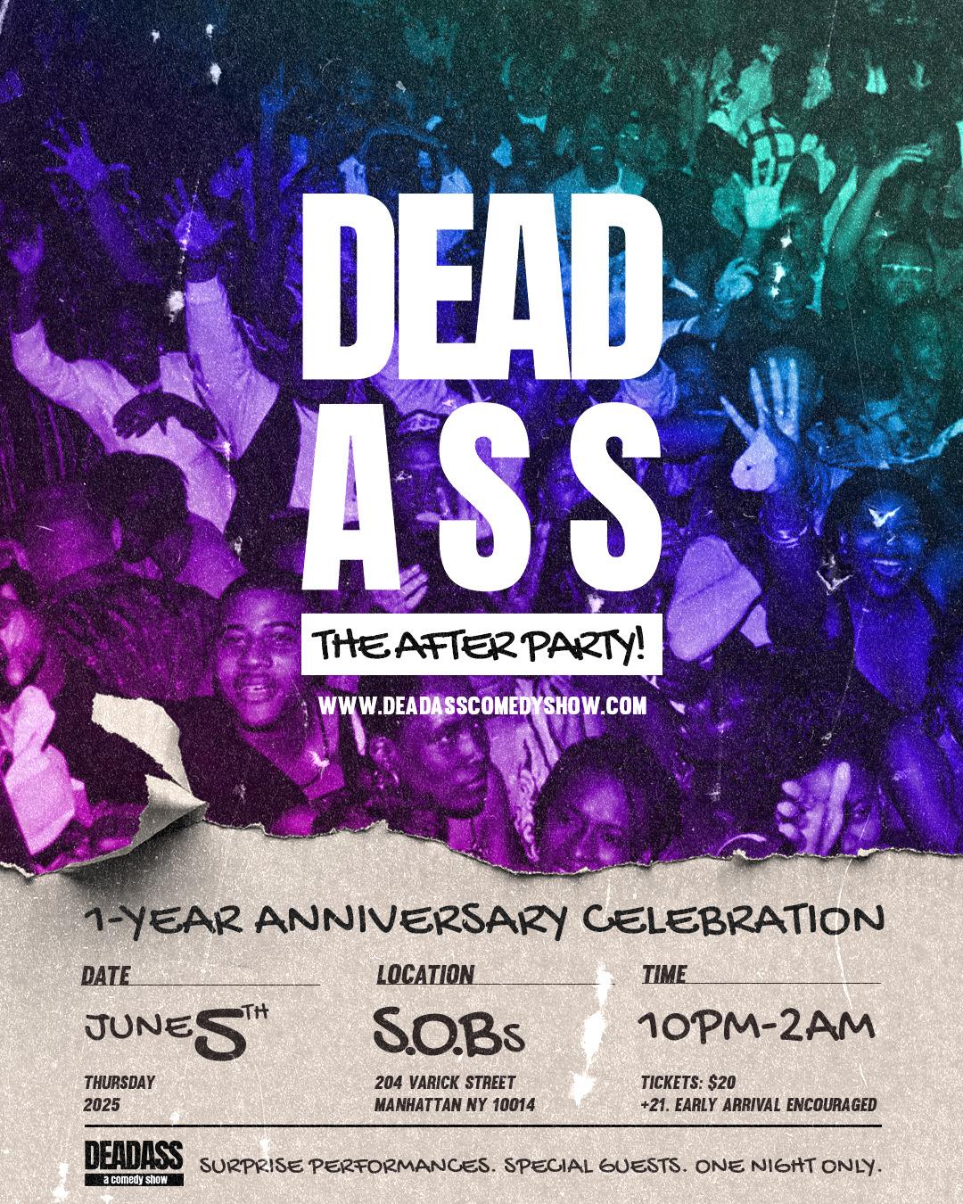
A visual presence that matched the cultural ambition of the show itself
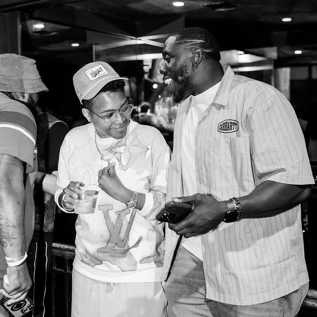
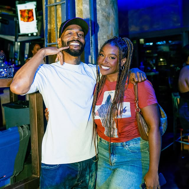
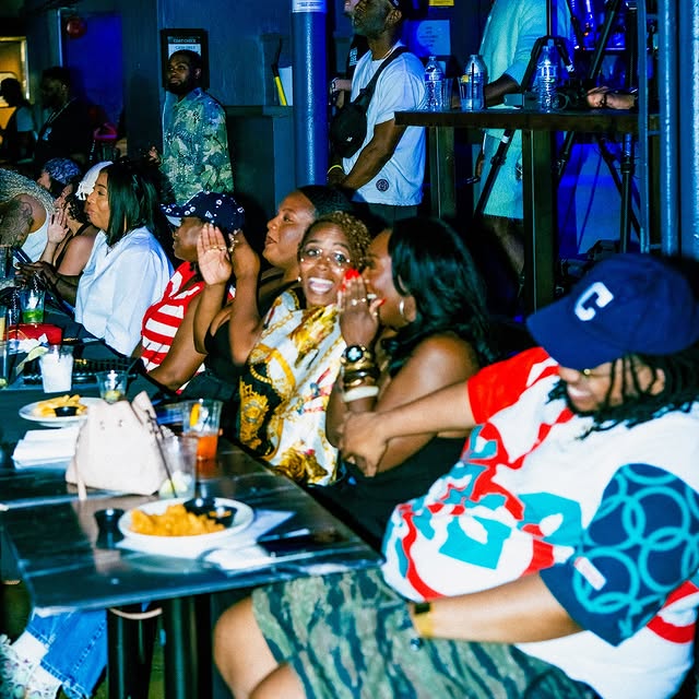
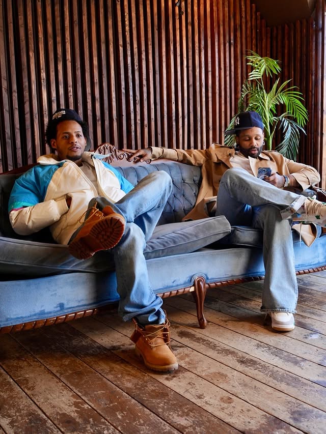
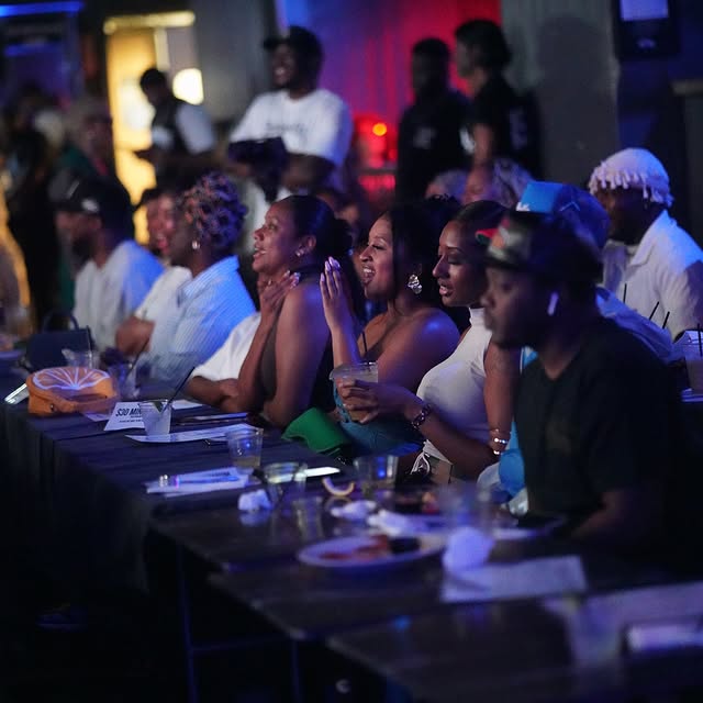
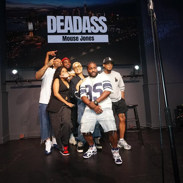
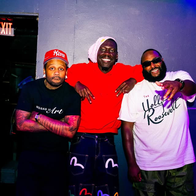
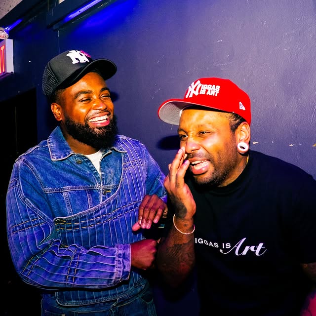
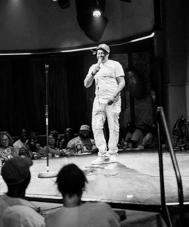
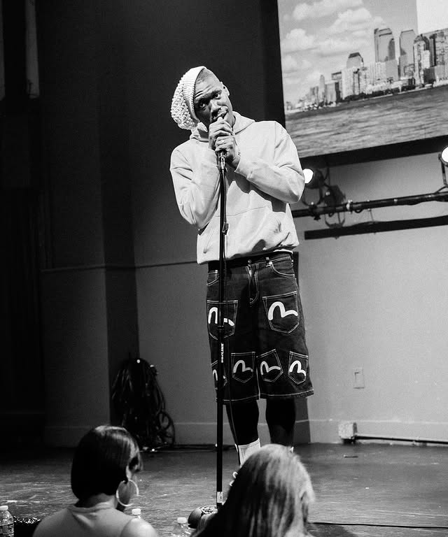

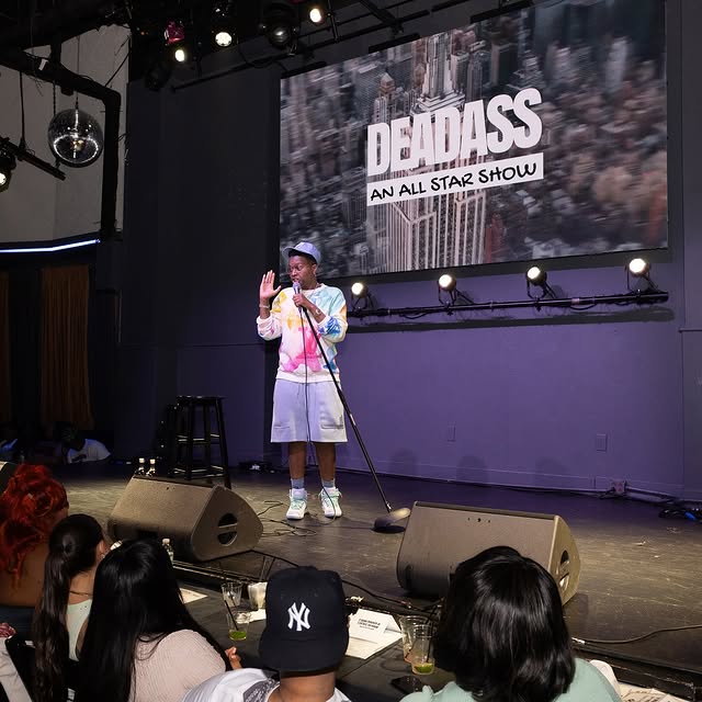
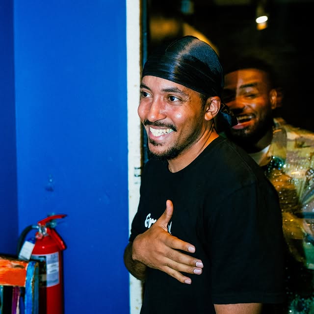
DEADASS now has a visual identity that can hold its own next to the names it books and the platform it’s becoming. The brand travels from stage to screen without losing what makes it distinct, which for a live comedy show with serious cultural momentum is exactly what the work needed to do.
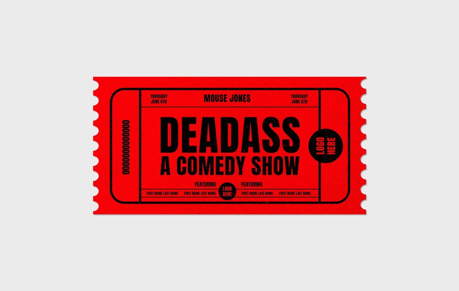
Cultural credibility can't be faked, so we don't try
The worst thing a show like DEADASS can get is design that looks like it was made by people who don’t understand the room. Mouse Jones and his team are building something real, and the visual work had to be real too. Culture isn't a brief here, it's the entire context. That means listening before designing, understanding who the audience actually is, and building something that earns its place in the experience rather than sitting on top of it.
This project underscores Therum’s belief in designing for culture, not just clients. At the intersection of live experience, community and brand, our process is rooted in clarity, craft and authenticity.