DailyPay.
Four partner brands. One pay platform. The brief was three words long, elevate, stay minimal, and the work was every co-brand landing page that had to look like both companies at once without looking like either of them tried too hard.
Visit dailypay.com ↗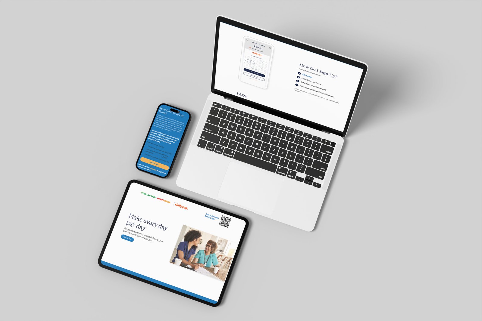
The pertinent details, what was built, what shipped, what it took.
DailyPay
Partner marketing page redesigns for DailyPay’s employer-facing product. Corporate landing pages that had to convert HR buyers without diluting the consumer brand.
dailypay.com ↗Lead UI Designer (solo contractor)
- Landing page redesigns
- Partner page templates
- Before/after case studies
- UI/UX
- Art direction
The Premise
Elevate the page. Keep it minimal. Don't lose the partner.
DailyPay sits inside the on-demand wage access category, the platform that lets a worker pull earned wages before payday, instead of waiting for the cycle to clear. The product itself is invisible until you're enrolled. The only thing a prospective user sees first is a landing page.
And those landing pages are co-branded. They live with the partner: Target's, Kroger's, Dollar Tree's, DaVita's. Every single one has to do two things at once, sell the partner's offer (this benefit is yours, signed, your employer) and sell the DailyPay platform (this is how you'll actually use it). The design has to read as part of both companies without looking owned by either.
The brief, as written: elevate landing pages but keep it minimal. Six words. The whole project lived in the gap between them.
What I Walked Into
A platform mid-rebrand. DailyPay was rolling out a new design system across the marketing surface, and the partner pages were where it had to land first, because that's the surface a prospective user actually sees before they ever touch the product. The system was new enough that it hadn't been stress-tested against four very different partner brands at the same time.
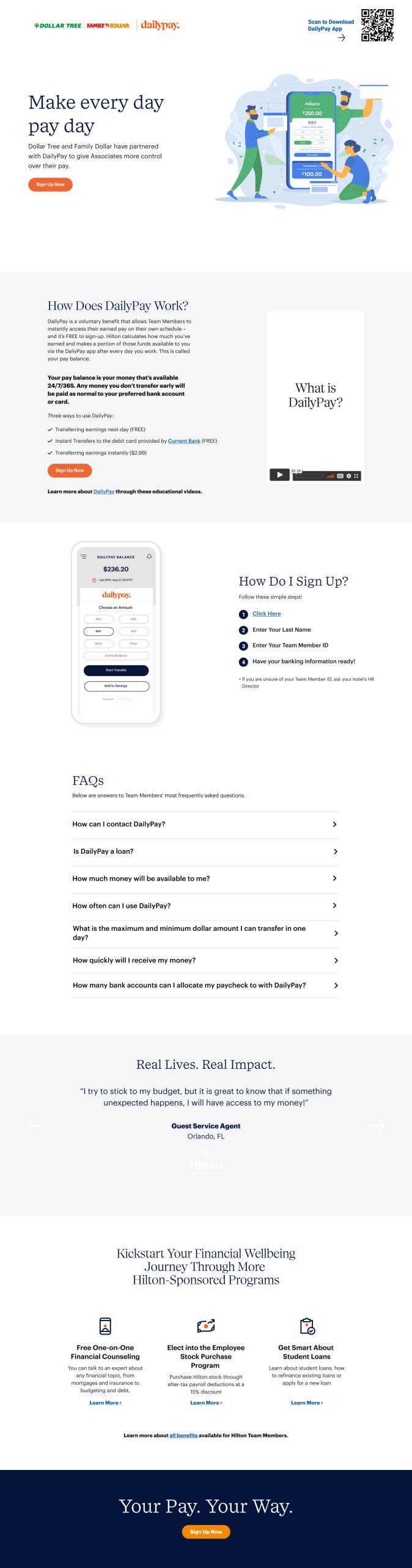
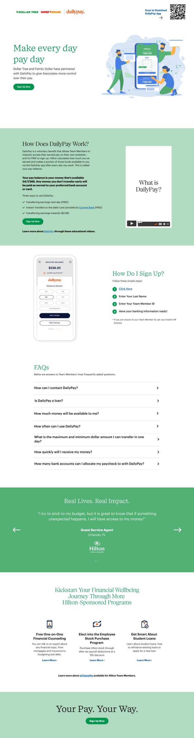
Four partners, four entirely different rooms. Target's red and its in-house photography of team members in red polos. Kroger's corporate blue. Dollar Tree and Family Dollar sharing a single co-brand surface where the green and the red have to coexist without one drowning the other. DaVita running a clinical-soft palette that has to feel calm before it can feel persuasive.
The DailyPay system had to hold across all four without flattening any of them, and the pages each partner had were already in market, which meant the redesigns I mocked weren't just new pages. They were arguments. Each one had to read as a clear step up before it could replace what was live.
The minimal half of the brief is what kept the pages from getting decorative. The elevate half is what kept them from looking like a stock template. Both halves had to hold at the same time, on every partner.
The page isn't selling a product, it's selling a benefit your employer just gave you. The design has to feel like permission, not pitch.
The Approach
Three rules ran every page:
- Partner brand leads, DailyPay system structures. The hero carries the partner's identity (their photography, their primary color, their voice) so the page reads like the employer talking. Underneath, the layout grid, type ramp, button shapes, and footer all come from DailyPay's updated system. The partner owns the volume; DailyPay owns the rhythm.
- One offer per page, one clear ask. No nested CTAs. No "learn more / sign up / download / chat." Each landing page resolves to a single primary action: get the app, get on-demand pay. Every section above the fold is another angle on the same answer.
- Treat the page like a flyer, not a website. Editorial layout. Stat / explanation / proof / CTA. The visitor is reading on a break-room phone, not a desktop in a meeting. The page has to read like a poster, even when you scroll its full length.
Four Partners, Before & After
For each partner: the page they had, and the redesign mocks I proposed against it. Three to a row (one existing, two redesigns) so the comparison sits in one read instead of asking you to remember what the OG looked like by the time you scroll to the new work.
Kroger
Grocery · corporate blue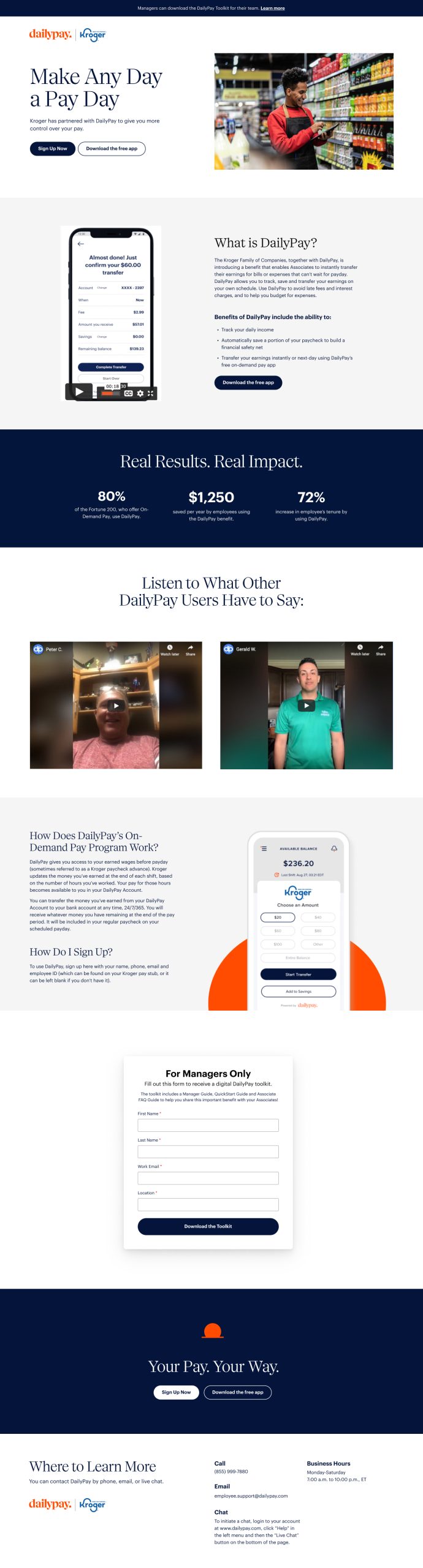 OGExisting
Target
Big-box retail · signature red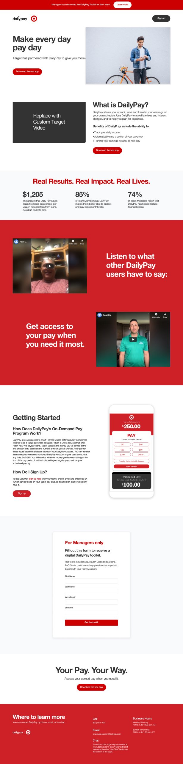
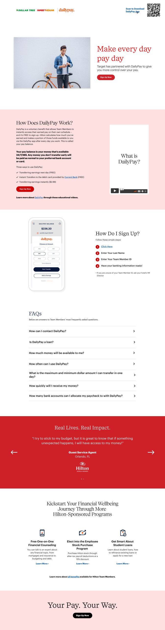
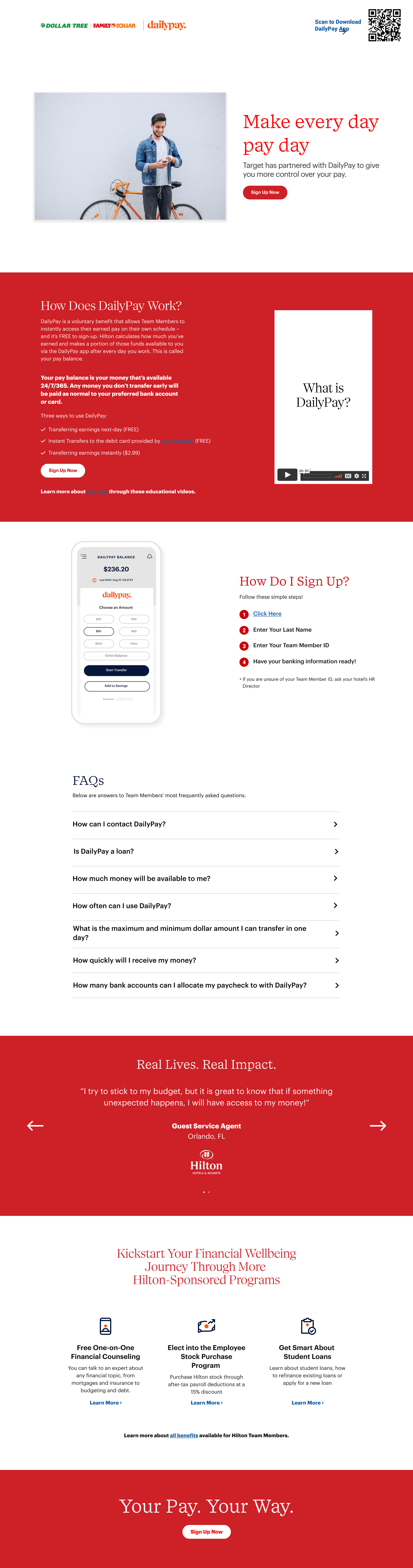
Dollar Tree · Family Dollar
Co-brand · one page, two logos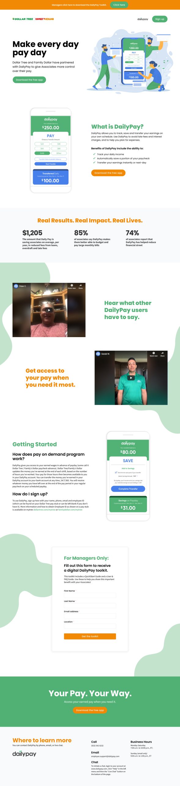
DaVita
Healthcare · clinical-soft palette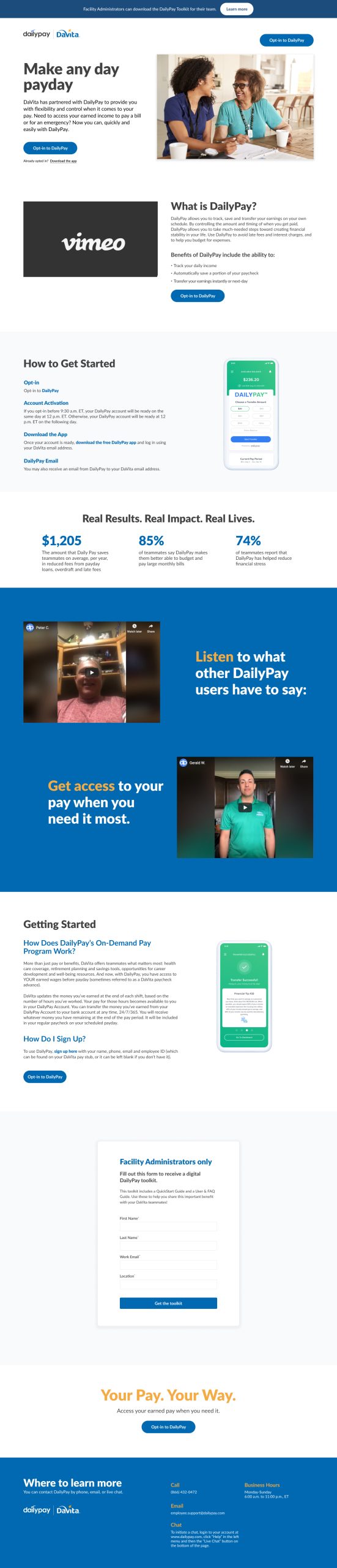
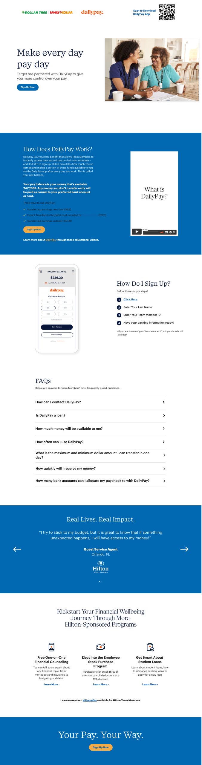
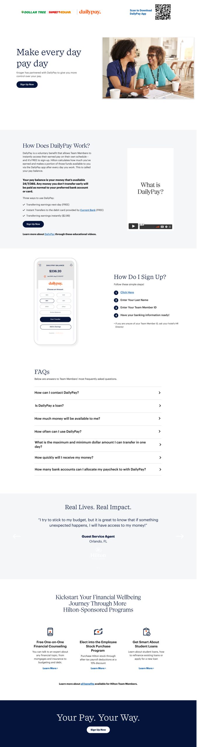
Hover any tile to scroll its full-page render. Click to open lightbox-size.
Four Pages, One System
The redesigns at a glance, same skeleton, four partners, the new DailyPay system holding underneath. Each tile lives in a real browser frame so the URL bar reads like the deploy. Hover to scroll the full render, click to open it lightbox-size.
Across Devices
Most of the traffic is mobile. The work was designed mobile-first, phone-readable in three seconds, then scaled up to desktop without the desktop turning into something different. Same page, two form factors. Hover either frame to scroll the full render.

What Shipped
Four partners. Four colors. One platform. The minimal answer that finally said elevate without raising its voice.
The redesigns were part of a broader initiative to align DailyPay's web experience with the new brand and design system. Each page carries its partner's identity and DailyPay's structure at the same time (the partner does the talking, the system does the carrying) which is what the brief actually meant when it asked for elevate and minimal in the same sentence.
The minimal half wasn't a constraint. It was the answer. When the page knows exactly what it's saying, it doesn't need to say it three times.