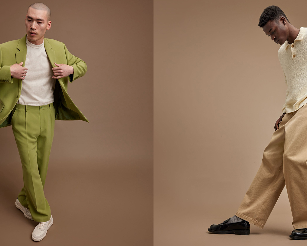
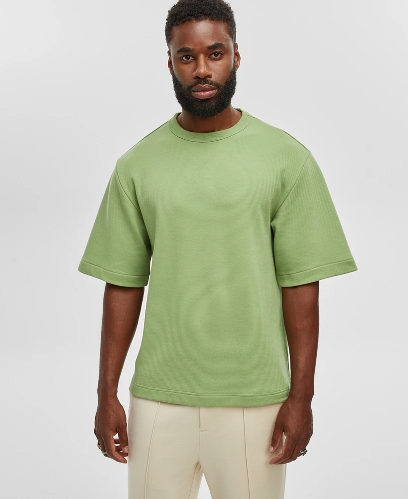
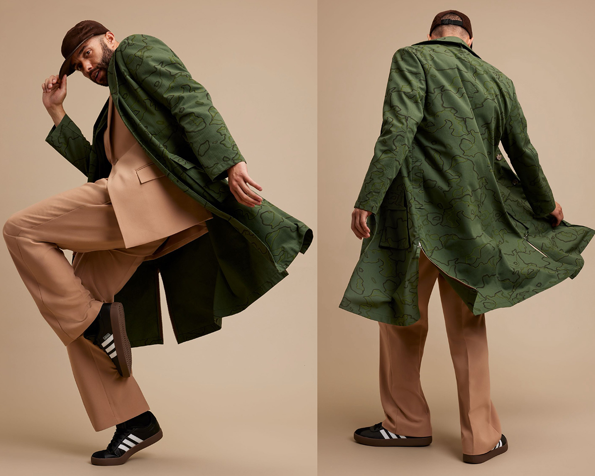
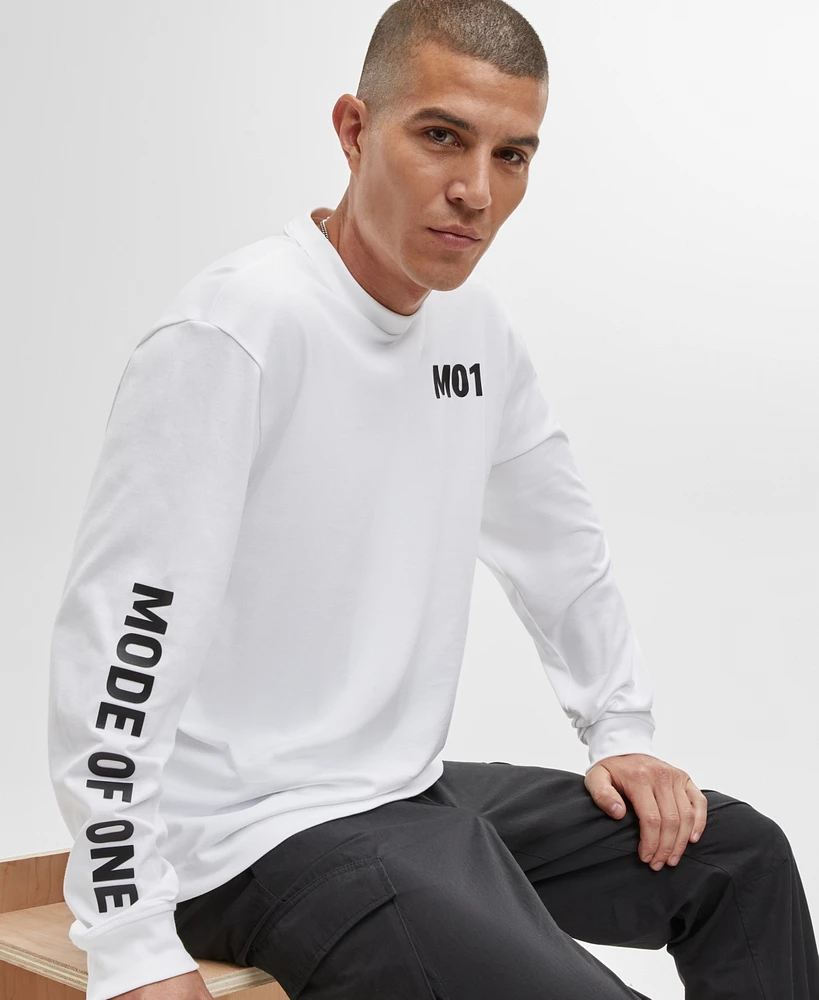
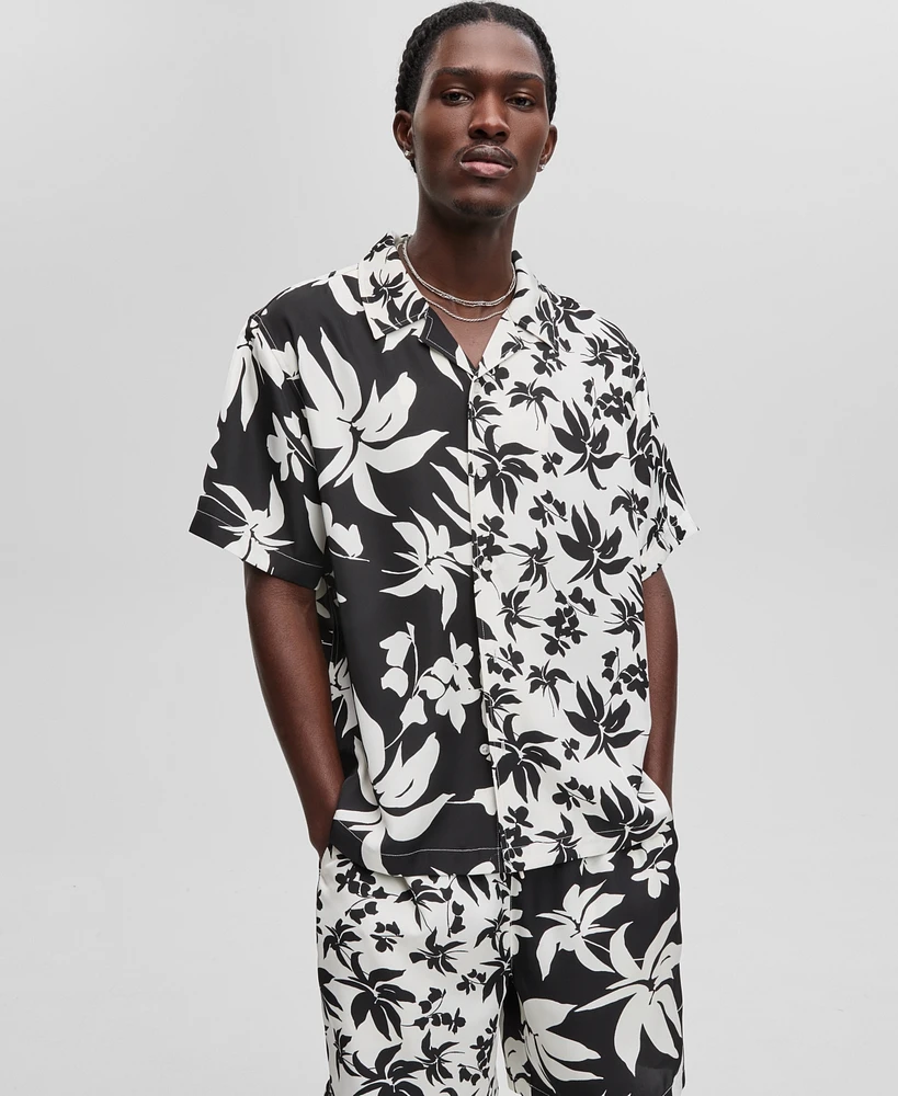
Get In Touch
[email protected]
Work Inquiries
[email protected]
Visual Creative June 3, 2020

JP Morgan Chase

JP Morgan Chase tapped Therum to unify its digital and physical communications, transforming the brand’s touchpoints into a consistent, user-centered experience across web, email, social, and print.

Task

Redefine and direct the visual expression of JP Morgan Chase’s digital and print communications to better reflect its evolving presence and services.

  • Strategy

    Brand Development, Art Direction, UX Guidance, Creative Direction

  • Design

    Email Templates, ATM Screens, Web Modules, Social Graphics, Direct Mail, Print Collateral, Presentation Decks

  • Client

    JP Morgan Chase

  • Tags

    ATM, Banking, Digital, Finance, Fourtune, Print

01. The Ask

Lead creative and visual direction for Chase’s brand assets across digital and physical customer touchpoints.

Therum led creative direction for JP Morgan Chase to unify and elevate brand touchpoints across digital and physical platforms. From email flows and social content to ATM screens, web modules, and printed mailers, we developed a cohesive visual system designed for clarity, consistency, and scale.

02. Our Role

Creative lead for a multi-channel brand refresh across digital, print, and public environments

Therum led the complete brand creation process, acting as both creative partner and strategic guide. From naming explorations to customer research and visual design, our role was to develop a brand that could live confidently on the Macy’s floor and resonate with its core shoppers. We helped Macy’s define who this brand was, what it stood for, and how it should look and feel across every touchpoint.

03. Our Approach

Creative cohesion through insight, structure, and modern design systems

We began with a thorough audit of Chase’s digital ecosystem, assessing how the brand showed up across email, web, and product surfaces. As an external creative partner, our role was to elevate and unify the brand’s visual language while honoring the systems already in place. We explored modern, human-first visual directions that could serve both campaign and evergreen needs, balancing consistency with flexibility. The result was a refreshed design system built on clean typography, intuitive hierarchy, and bold CTAs, supported by adaptable templates that enhanced clarity, accessibility, and long-term usability.

04. Key Outputs

A flexible system of branded assets for digital and physical environments

We delivered a full suite of visual assets designed to align and expand Chase’s refreshed identity across its ecosystem. This included:

  • Art direction across digital and print

  • Email and web design frameworks

  • Social and paid media templates

  • ATM screen treatments

  • In-branch signage and collateral

  • Print mailers and direct marketing assets

  • Presentation design for internal and external use

  • Scalable creative systems for future campaigns

05. The outcome

Creative systems that elevated Chase’s presence across every touchpoint

Our work helped bring consistency and clarity to one of the most visible financial brands in the world. By aligning creative across digital, print, and in-branch experiences, we made it easier for internal teams to execute and for customers to engage. The visual systems we built are still in use across campaigns, everyday communications, and ongoing platform updates — proving that good design doesn’t just look better, it works harder.

Back