We kicked things off with two-week design sprints, running them consistently over the course of about a year to tackle all components and templates. To ensure smooth sailing for our developers, we even dedicated a four-week sprint solely to crafting comprehensive documentation. This documentation covered everything from sizing and use cases to the nitty-gritty details of how things should look.
In my role overseeing production, design, and development for Timberland’s UI/UX e-commerce experience, I took the helm for both the EMEA and NORA markets. It was my mission to develop all assets for both websites, ensuring a cohesive and engaging user experience across regions.
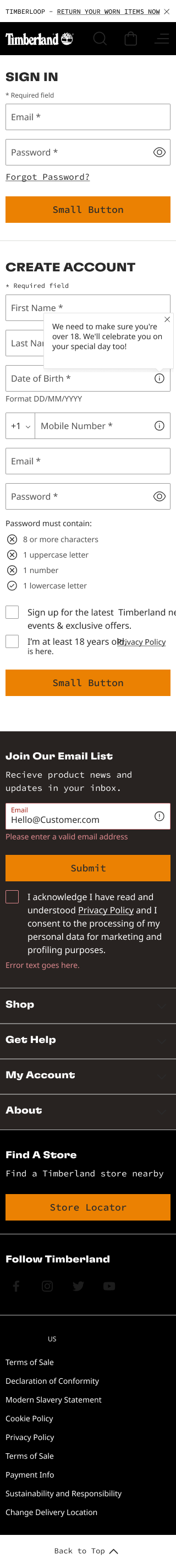
Check out the magic below as we demonstrate how our system operates. On one side, you’ll find a wireframe built from UX components, while on the other, we’ve got the fully themed site. It’s a cool side-by-side comparison that shows how our components seamlessly come together to create a sleek and engaging website. From the structured layout of the wireframe to the polished look of the themed site, you’ll see firsthand how our design system delivers a top-notch user experience.


