Get In Touch
[email protected]
Work Inquiries
[email protected]
Visual Creative June 3, 2020

Visa

Visa and CannonballSF tapped us to reimagine a full scale Out of Home campaign that could bring their refreshed identity to life after earlier concepts missed the mark.

Task

Reimagine Visa's most recent brand identity as a creative campaign across multiple forms of media

01. The Ask

Turn Visa’s refresh into a citywide Tap to Pay campaign

Visa needed to bring its refreshed brand identity into the real world through a focused Out-of-Home campaign. The goal was to reimagine the “Tap to Pay” message using a new visual system that could scale across environments, formats, and audiences. Therum was brought in to help translate the updated branding into a creative rollout that felt modern, clear, and unmistakably Visa.

Before After
02. Our Role

Concept-to-production partner for campaign delivery

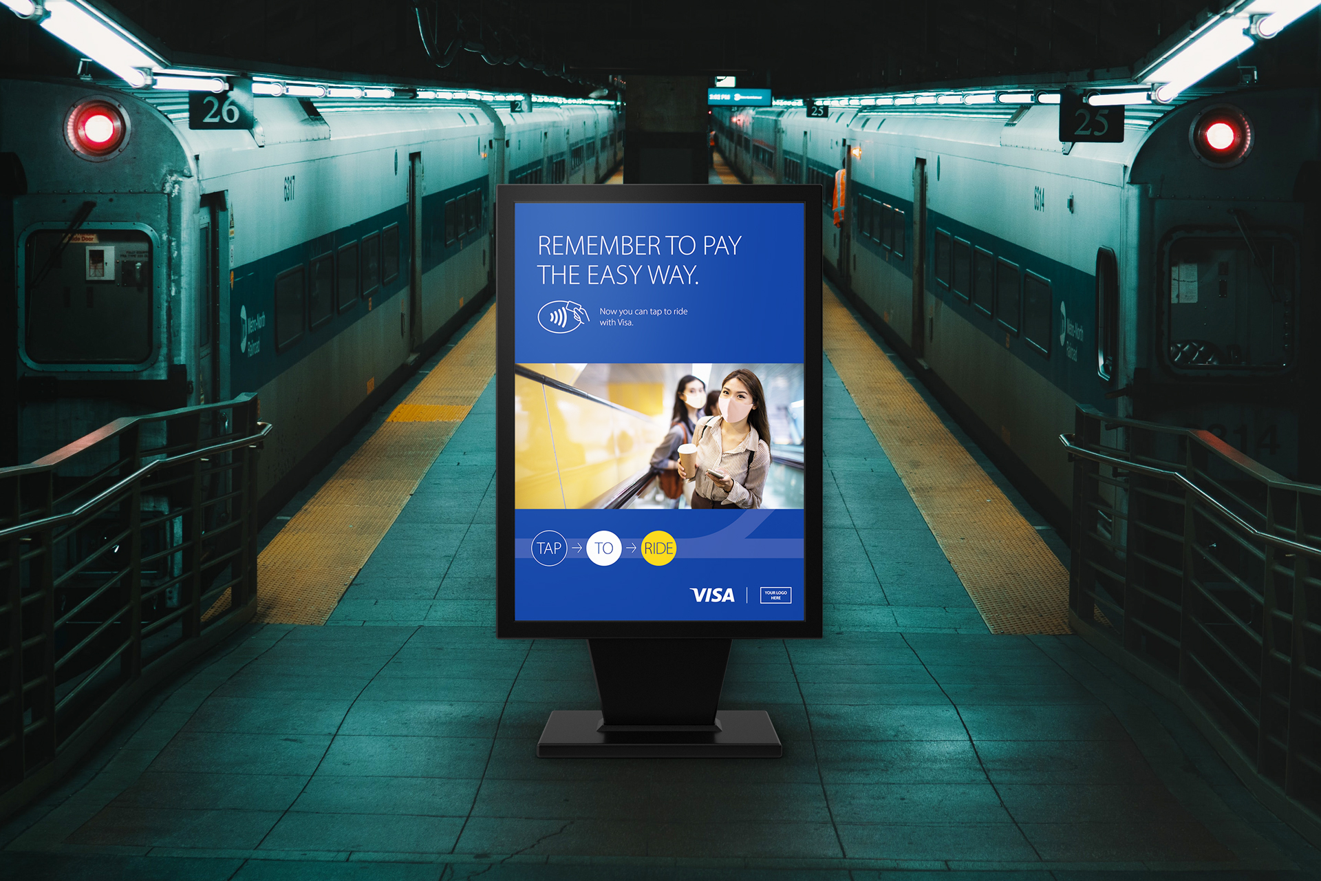
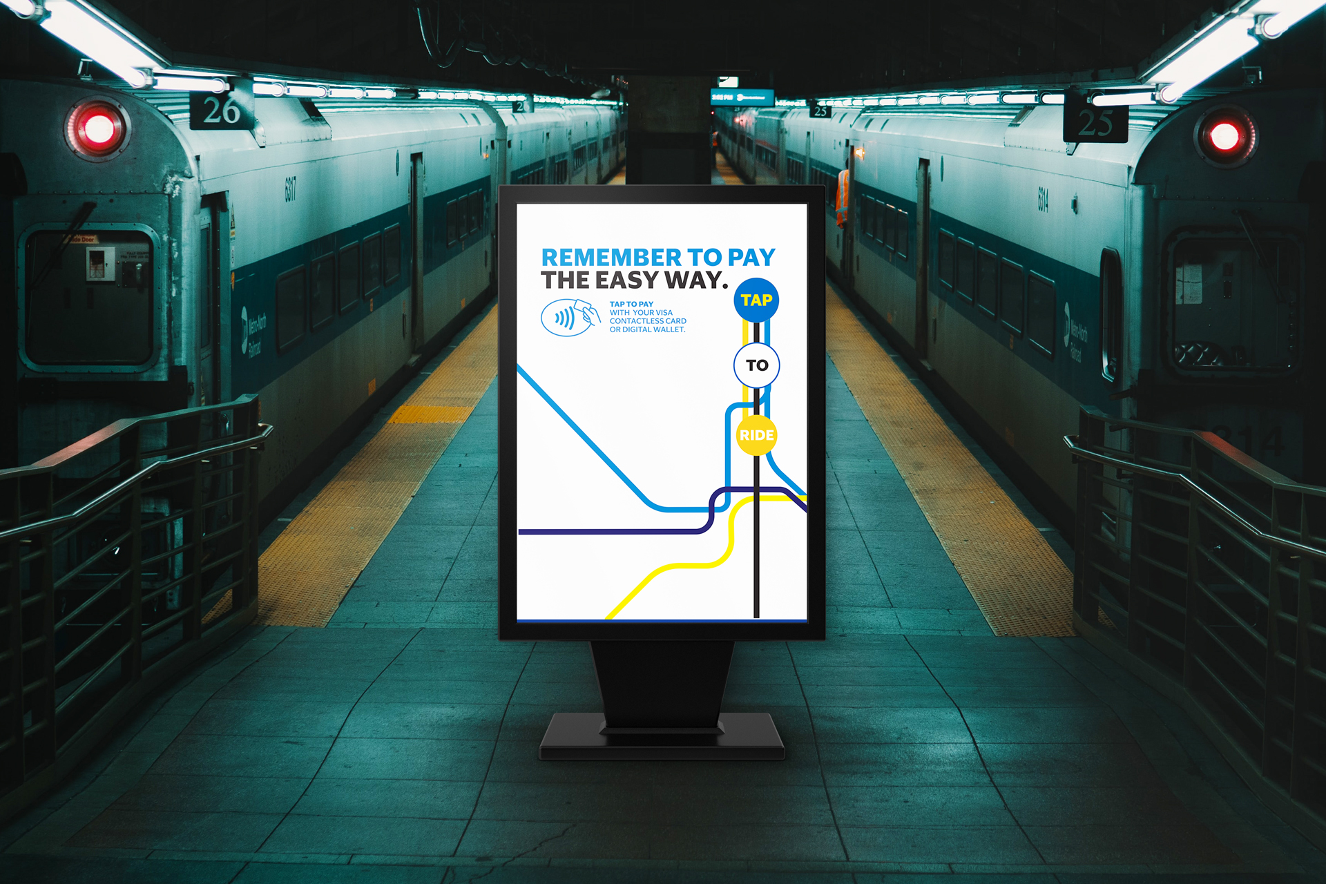
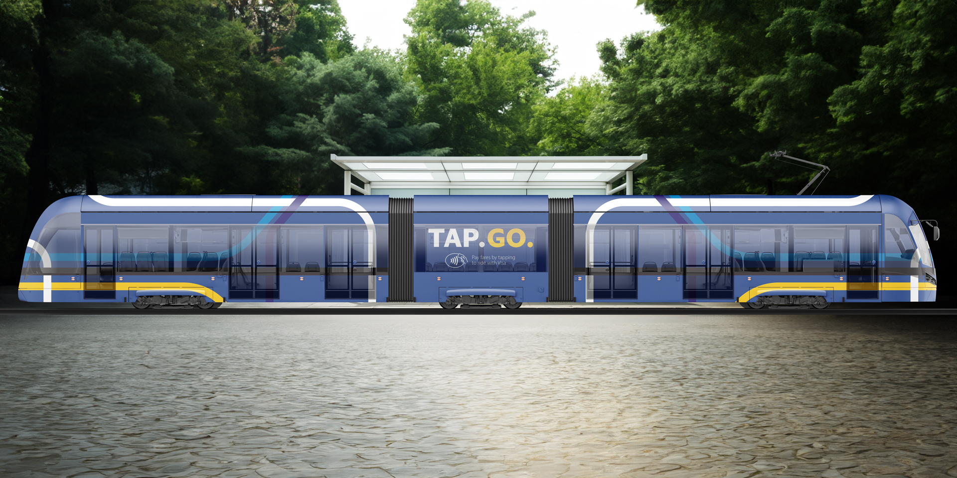
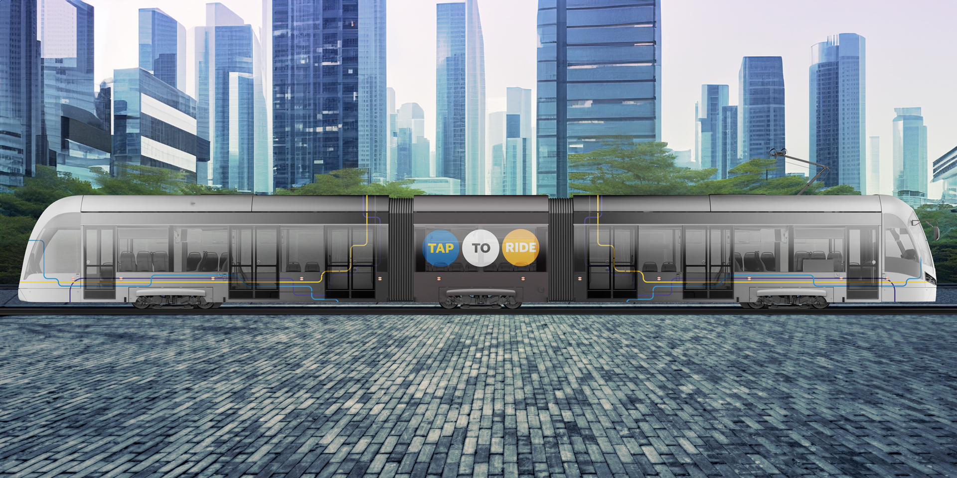
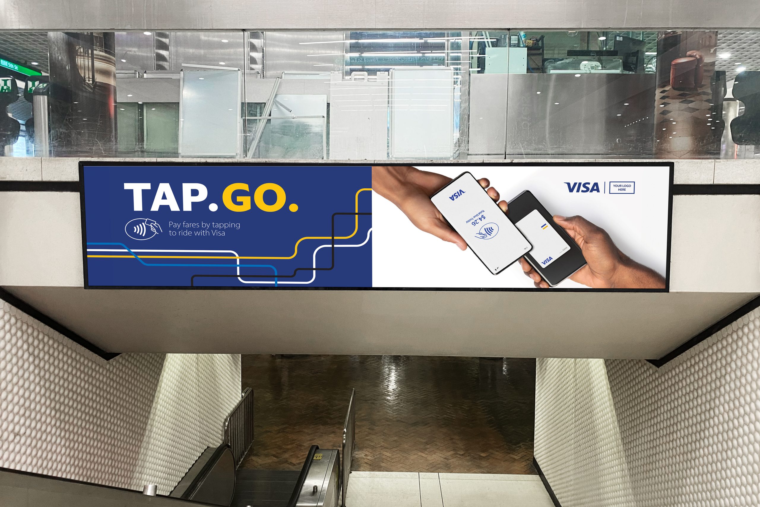
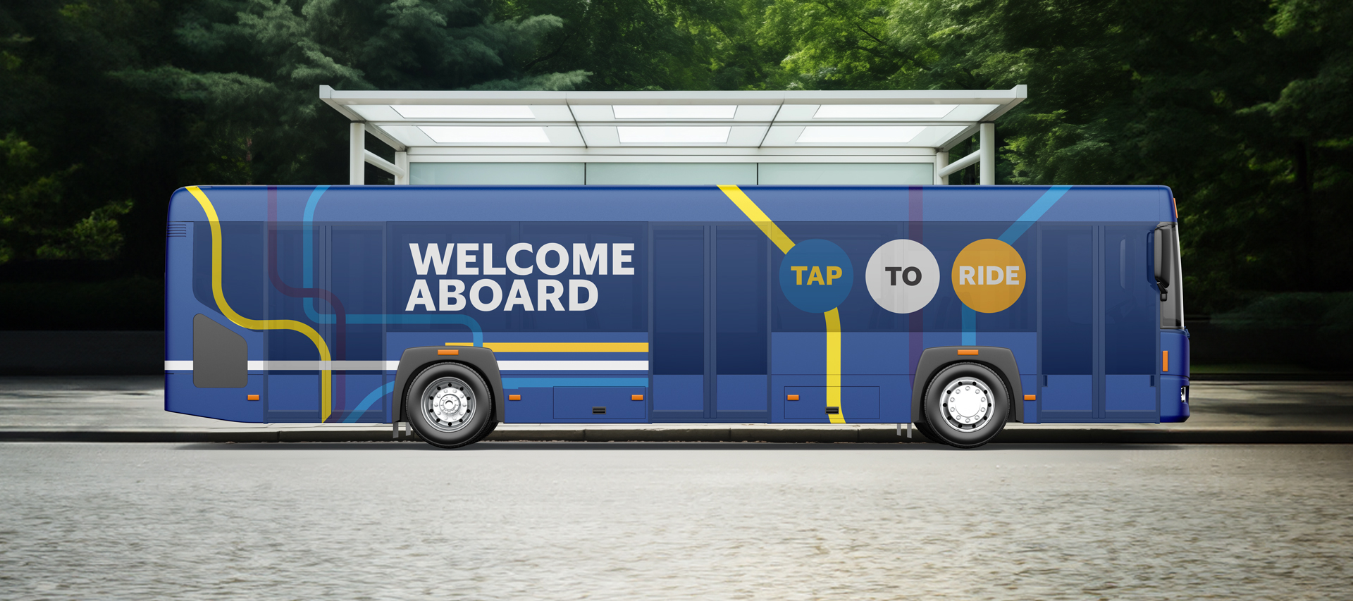
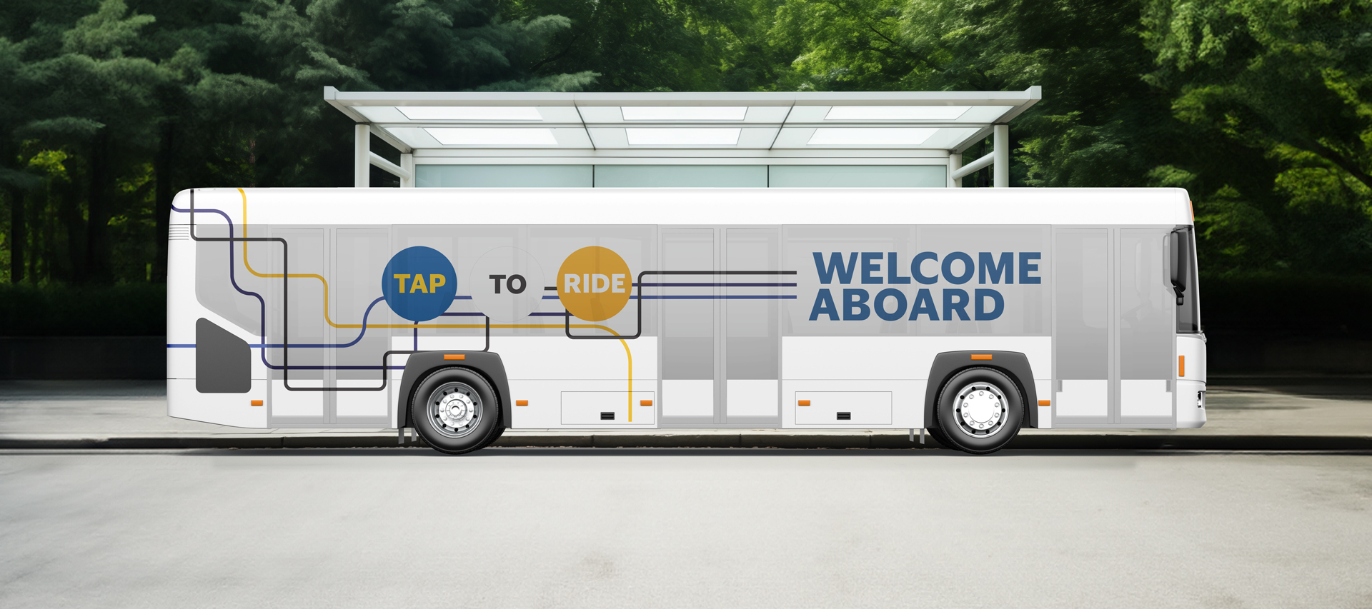
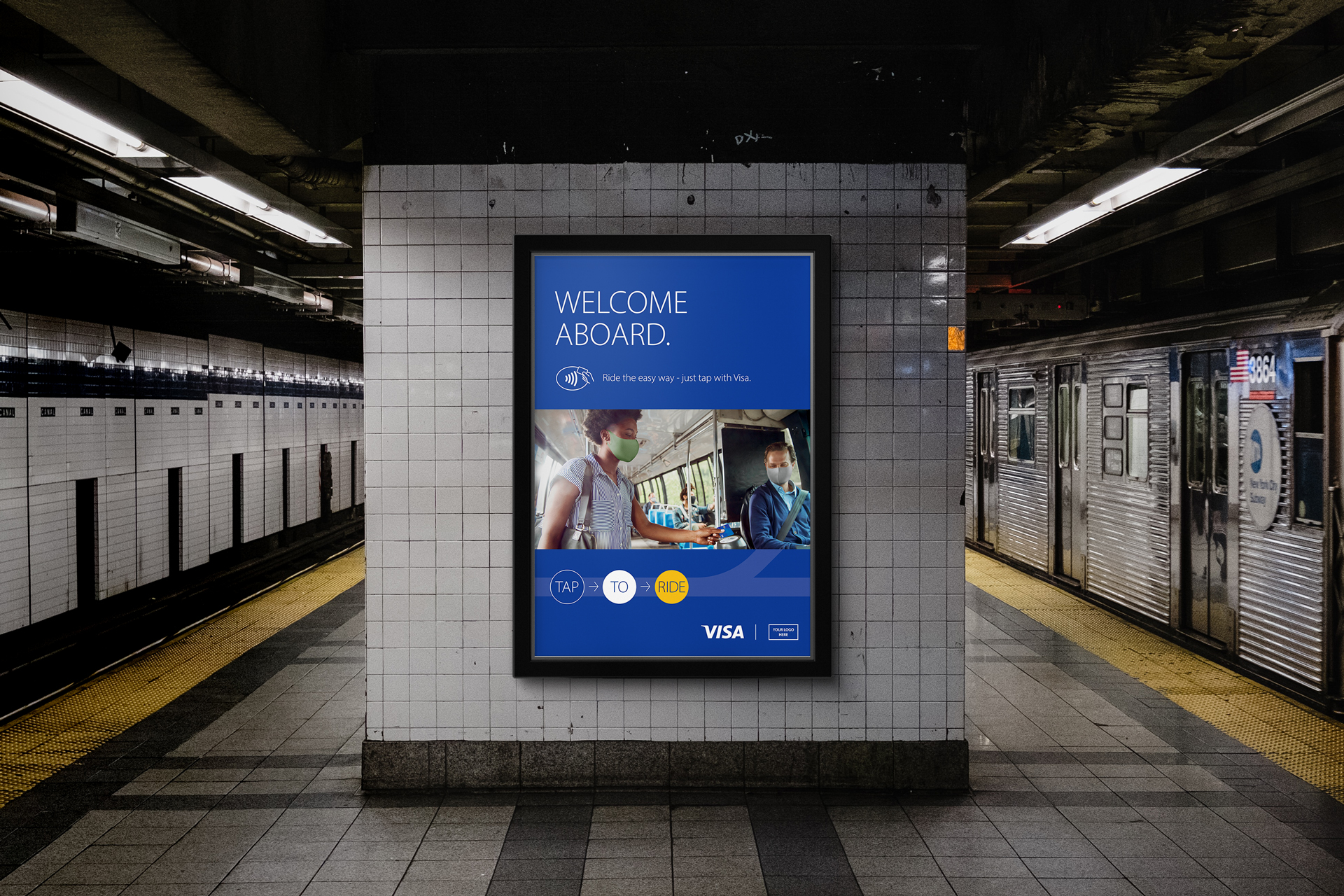
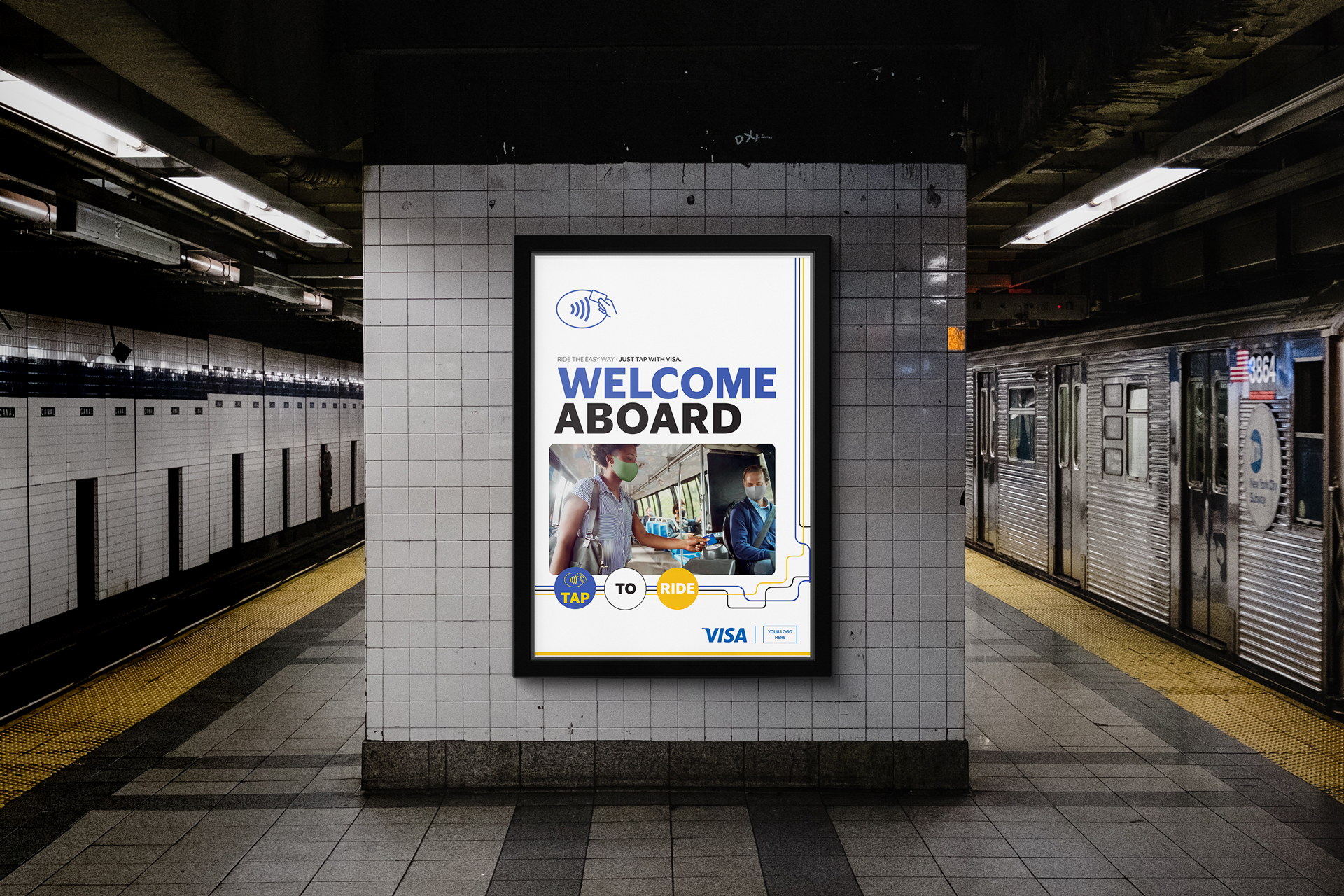
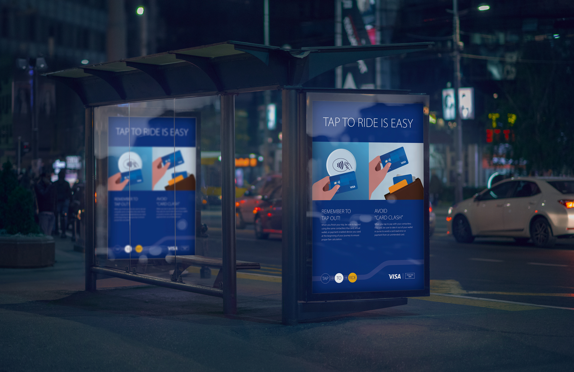
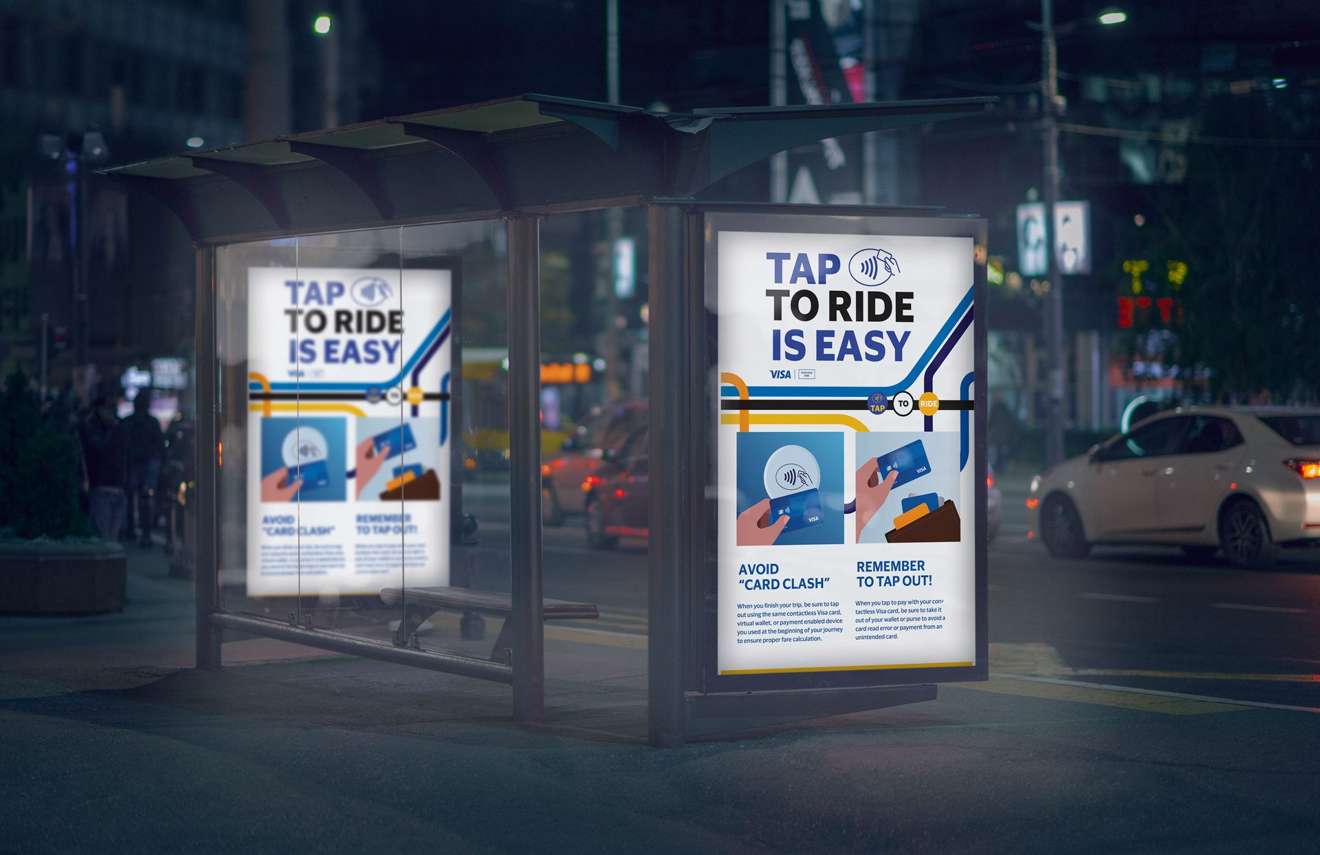
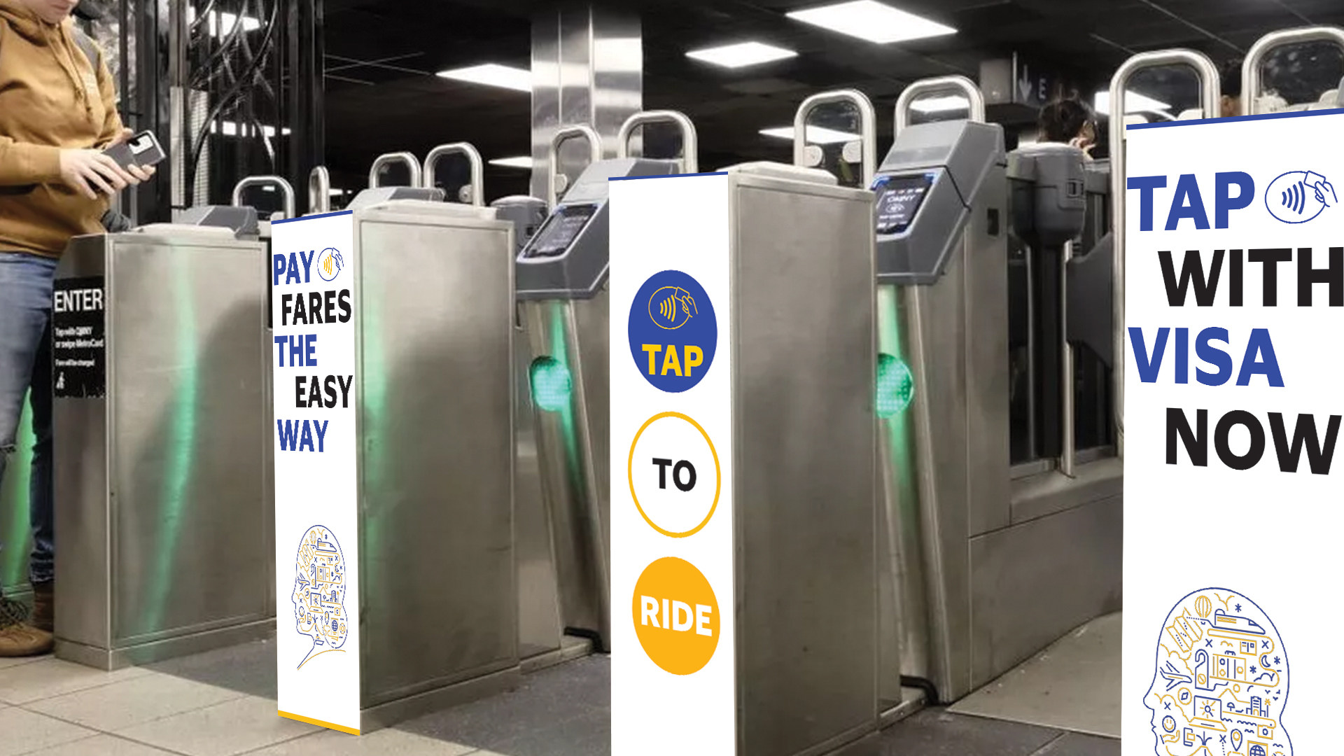
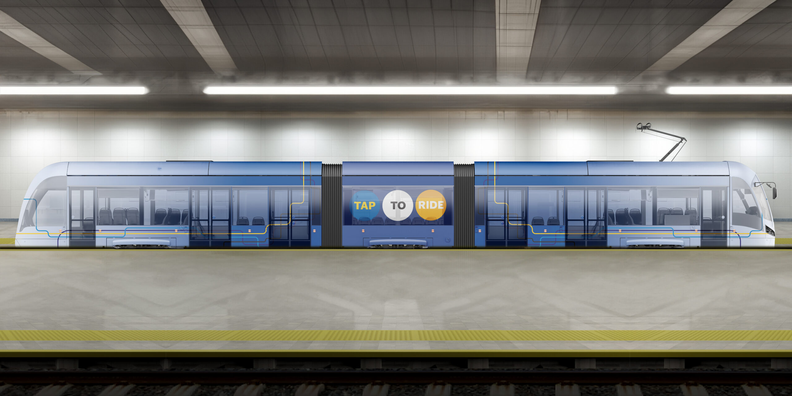
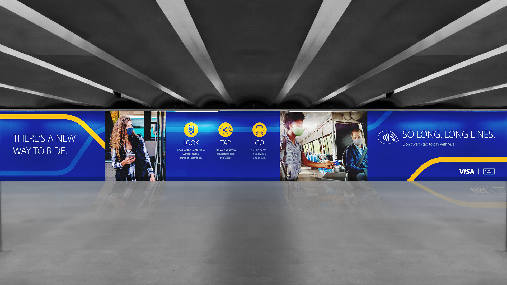
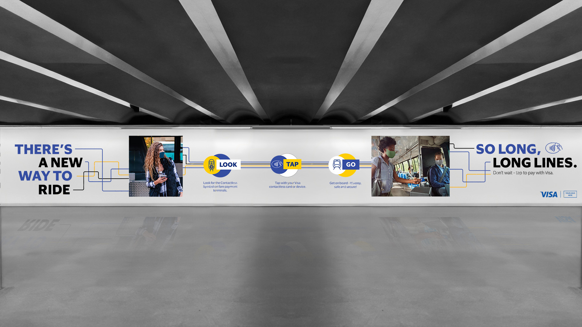
We began by reviewing Visa’s previous campaign materials and identifying the visual and strategic gaps they aimed to solve. With a clear understanding of the new brand goals, we developed a design direction that merged the refreshed identity with visual language inspired by transit and metro systems — a nod to movement, connection, and ease.

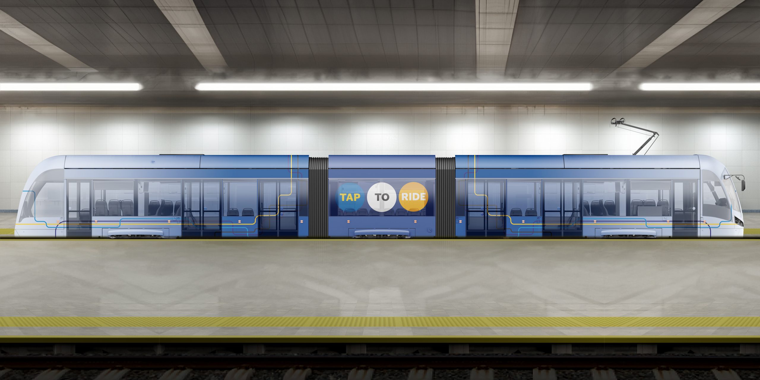
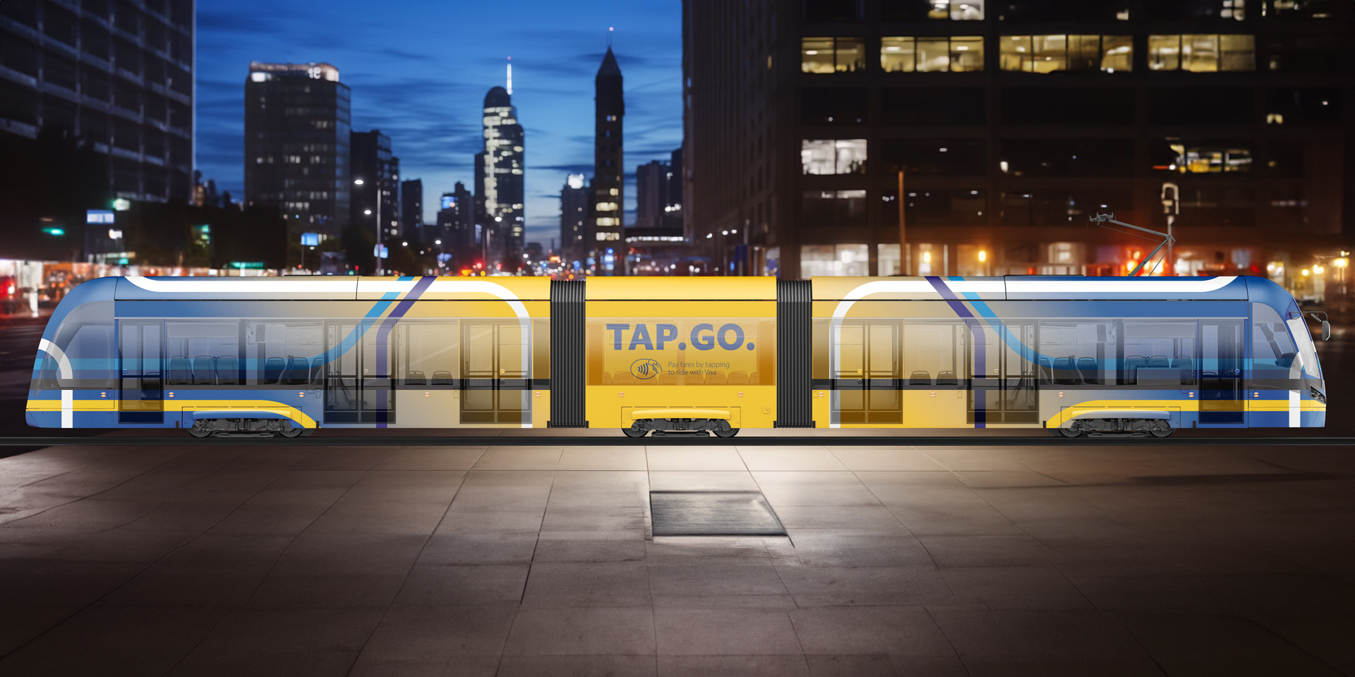
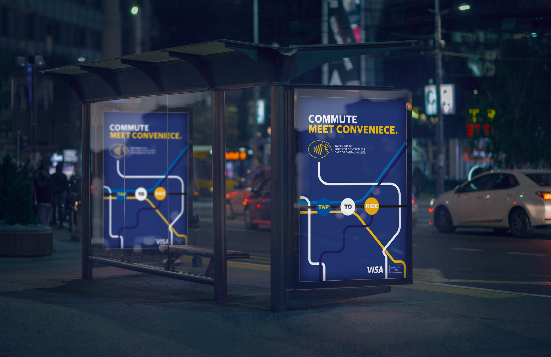
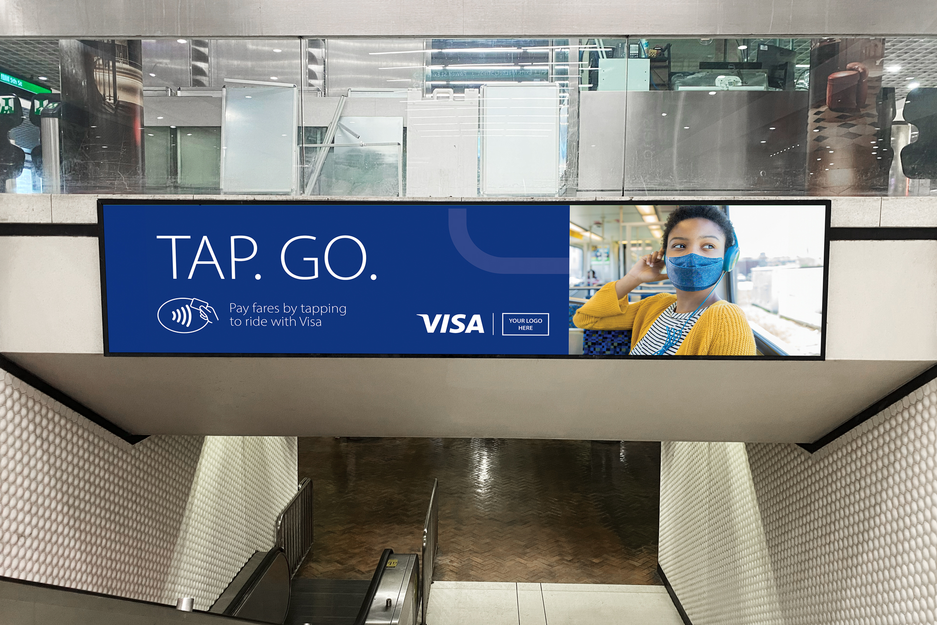
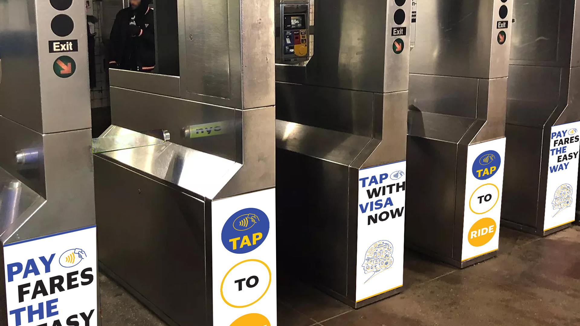
We handled design and production across all creative outputs. Deliverables included out-of-home assets such as posters, billboards, turnstile graphics, and vehicle wraps. Every piece was built for real-world environments and displayed in context to reflect how the system performs in motion, at scale, and in public space.

Before After
03. Our Approach

Visualize connection through scale, proximity, and motion

Visa gave us full creative control — a rare opportunity to rethink how the brand could live in public space. Earlier concepts hadn’t landed, so we weren’t following a direction. We were defining one. We turned to the NYC subway map system — not just for its design, but for its clarity, structure, and ability to guide people at scale. That logic became the foundation for our visual approach. We built a design system inspired by transit maps to tell the Tap to Pay story through motion, connection, and accessibility. The graphics were designed across three levels of zoom:

  • Macro — full environmental layouts that emphasized movement and space, wide shot of lines and connections

  • Base — clean, direct visuals rooted in Visa’s refreshed identity, normal view of lines and connections

  • Micro — close-up graphics that highlighted system details and transaction moments, minimal use of both lines and connections

This layering allowed us to speak to different types of commuters and use cases — from fast glances to focused reads. The system wasn’t just inspired by wayfinding. It was designed to become part of it.

Before After
04. Key Outputs

From screens to streets

A full suite of campaign assets crafted for movement, repetition, and impact across environments:

  • Bus shelter graphics

  • Bus wrap graphics

  • Tram wrap graphics

  • Large-format banners

  • Turnstile graphics

  • Motion-based digital posters

  • Hallway and corridor takeovers

Before After
Before After
Before After
Before After
05. The outcome

Creative direction that set the tone for Visa’s refreshed public presence.

Visa embraced the concepts we delivered, marking a shift in how the brand communicates movement, access, and everyday transactions. Our work laid the visual and strategic foundation for a larger campaign rollout. From there, CannonballSF expanded the direction into a full production pipeline, delivering final assets across Visa’s Out-of-Home placements and other brand initiatives.

This collaboration helped influence not just the Tap to Pay campaign, but also how Visa continues to apply its identity in motion-forward environments across global markets.

Back