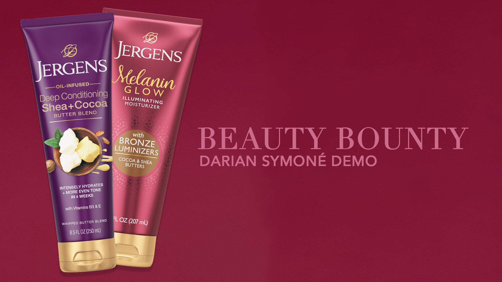
Reveal Your Glow
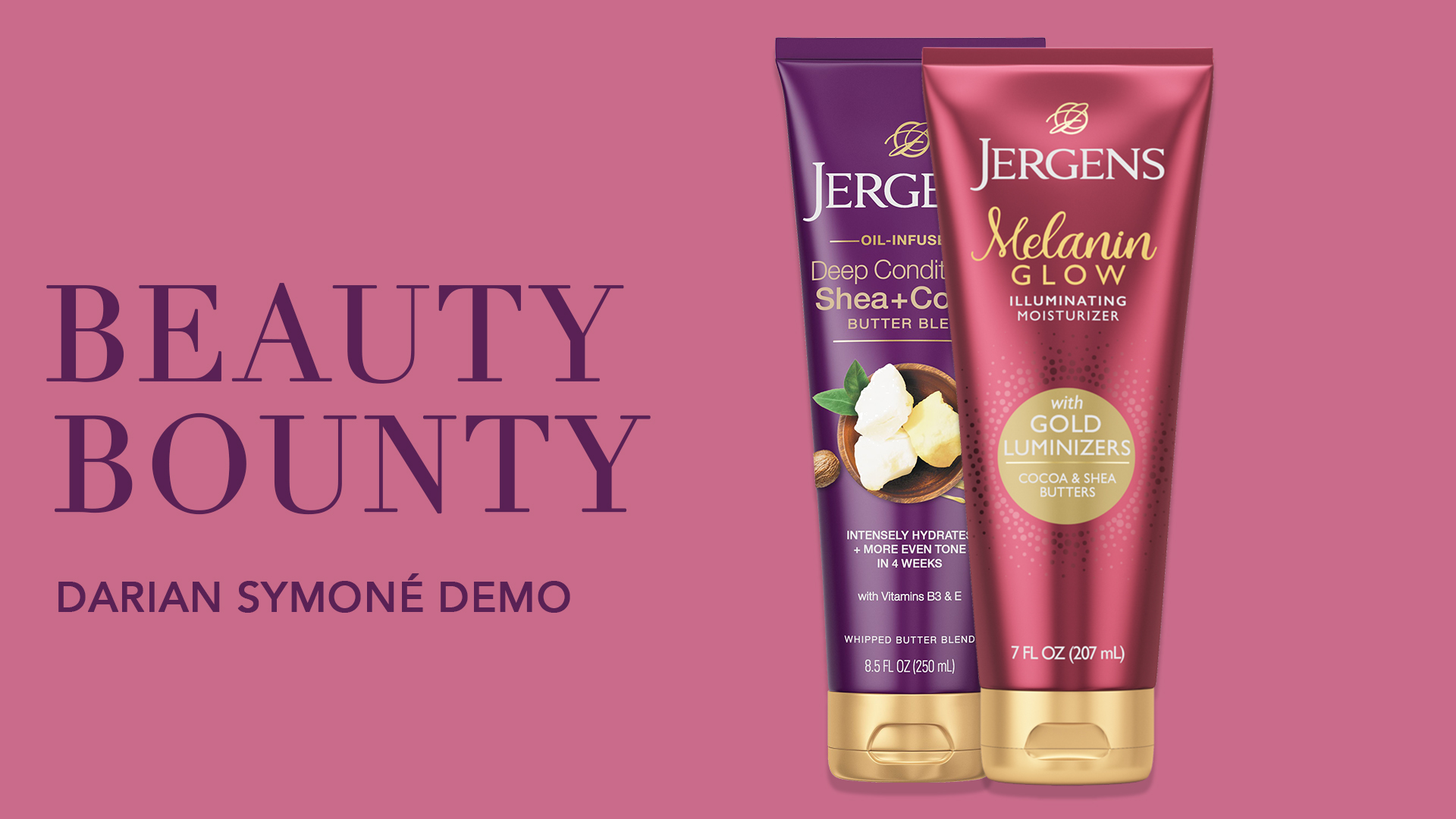
Jergens and Essence Magazine, in partnership with The Citi Unlimited, launched a skincare-forward video campaign rooted in visibility, glow, and cultural celebration. Therum was honored to lead visual direction for “Reveal Your Glow,” crafting a campaign that felt radiant, real, and rooted in softness. We designed bespoke title cards, lower thirds, and seamless transition graphics to elevate the storytelling across social and editorial formats. The campaign featured Beauty Reporter Darian Symoné Harvin and Board-Certified Dermatologist Dr. Angela J. Lamb—a proud member of the Jergens® Glow Collective—as they introduced the new Jergens Melanin Glow Illuminating Moisturizer and celebrated radiant skin, self-confidence, and identity.
Strategy
Art, Creative, & Design Direction
Design
Motion Design, Title Cards, Lower Thirds
Client
Essence, Jergen's, The Citi Unlimited
Tags
Beauty Campaign, Commercials, Essence, Jergen's, Lower Thirds, Motion Graphics, Video
Design motion graphics that elevated storytelling, maintained brand cohesion, and reflected the campaign’s softness, clarity, and cultural intentionality.
To learn more about this project in detail, continue reading below.
Jergens and Essence Magazine partnered to launch “Reveal Your Glow,” a skincare-forward campaign rooted in visibility, radiance, and cultural celebration. Therum was brought in to lead the visual direction, crafting a campaign that felt soft, real, and emotionally resonant — all while elevating the production’s design language through thoughtful graphic systems.
Our role focused on enhancing the video experience through:
Title Cards → bold, eye-catching moments that introduce themes and set the tone
Lower Thirds → clean overlays for names and titles, adding clarity without distraction
Transition Graphics → seamless visual bridges that carry rhythm and reinforce brand cohesion
These elements helped shape a polished, story-forward aesthetic that honored both product and audience.
Reveal Your Glow
Our goal was to design motion graphics that elevated storytelling, maintained brand cohesion, and reflected the campaign’s softness, clarity, and cultural intentionality. This wasn’t just about slapping titles on a video. We were tasked with developing a full graphic system — including title cards, lower thirds, and transition bumpers — that worked in harmony with both the product and the message. The visuals needed to support a wide range of tones: from the trusted expertise of board-certified dermatologist Dr. Angela J. Lamb, to the thoughtful narration of Beauty Reporter Darian Symoné Harvin. The challenge was to create a motion language that felt editorial and expressive, without overpowering the message — to make graphics that carried warmth, pace, and polish.
Bringing words to life
We approached the visual system through a lens of softness and cultural clarity. The direction called for a motion identity that could live within an editorial environment while still carrying the radiance of skincare. Here’s how we framed our decisions:
Color Language: We selected a palette grounded in soft neutrals and warm undertones, reflecting natural skin tones and the glow-forward narrative of the product. The colors needed to evoke light — not just brightness, but warmth and intention.
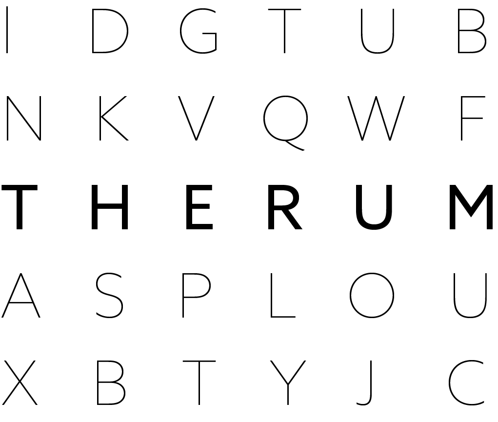
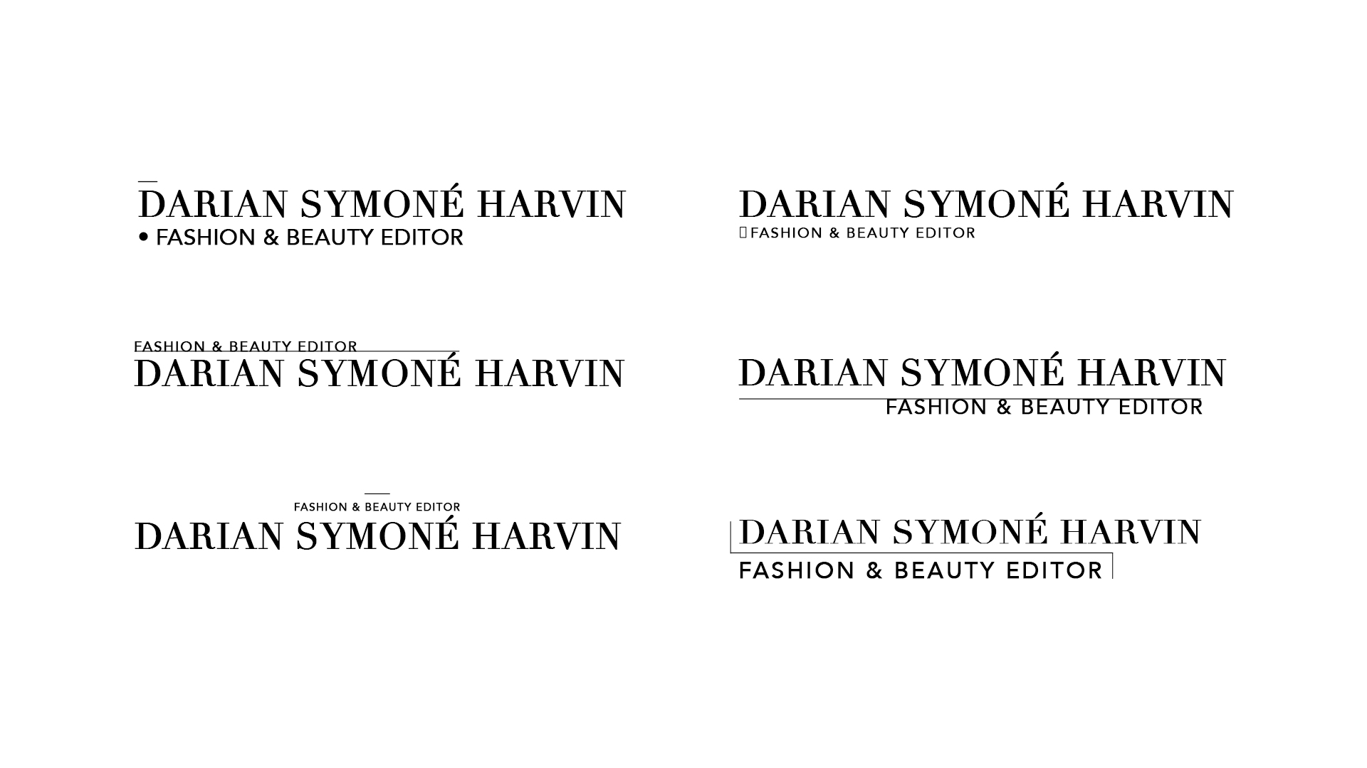
Typography: Our type choices were clean, modern, and intentionally legible — able to balance professionalism (for medical credibility) with a more human, lifestyle-driven tone. Typography carried the voice, but never overstepped it.
Motion Behavior: Each animation was timed with subtlety. We avoided flashy transitions in favor of gentle movements, slow fades, and organic wipes that mimicked the flow of skincare — smooth, intentional, and calm. Transitions acted like breath between scenes.
Visual Framing: Title cards and lower thirds were designed to frame, not interrupt. We used padding, soft drop shadows, and rounded accents to ensure a feeling of comfort and focus. Every graphic was meant to feel held — like the product itself.
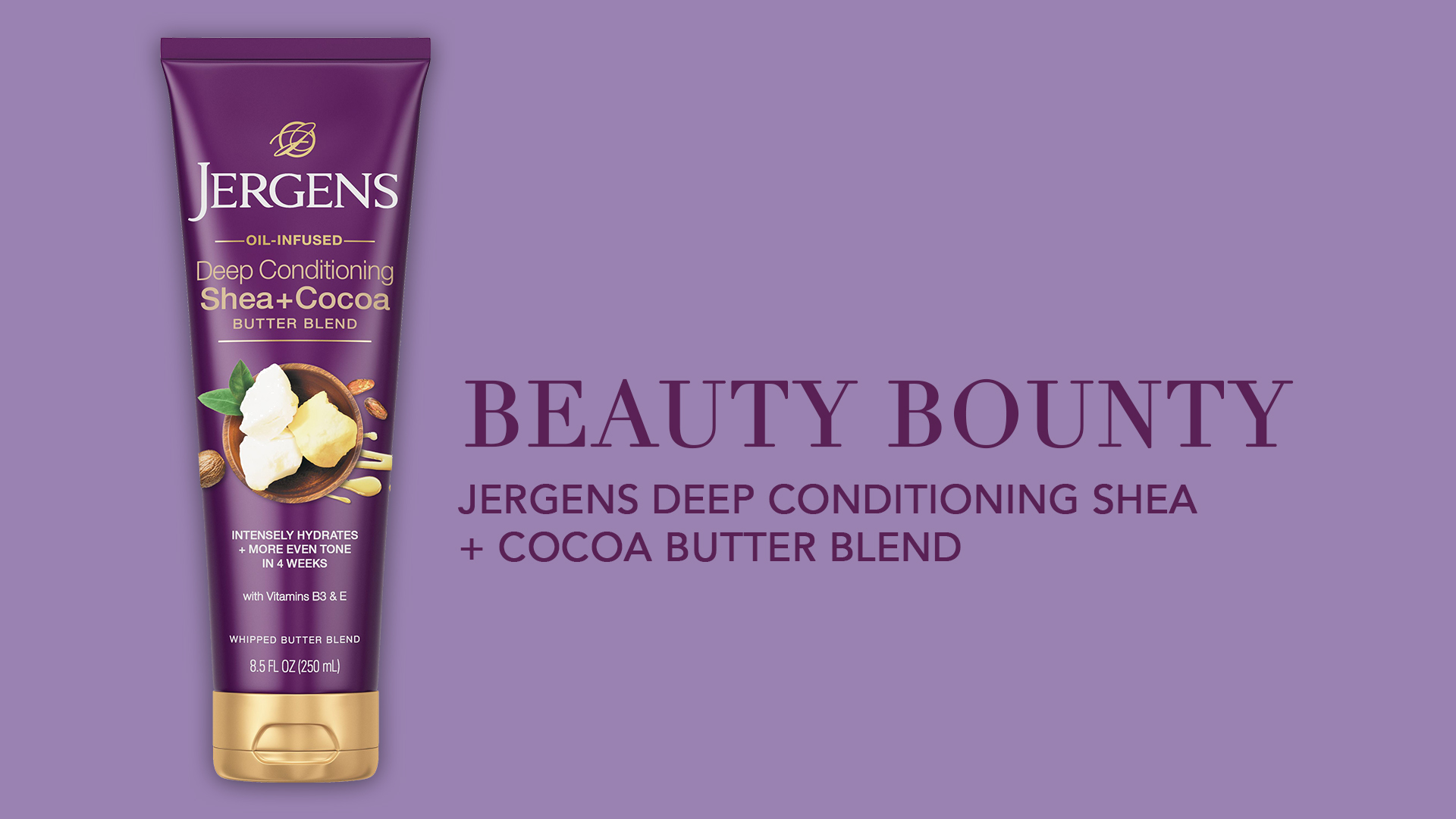
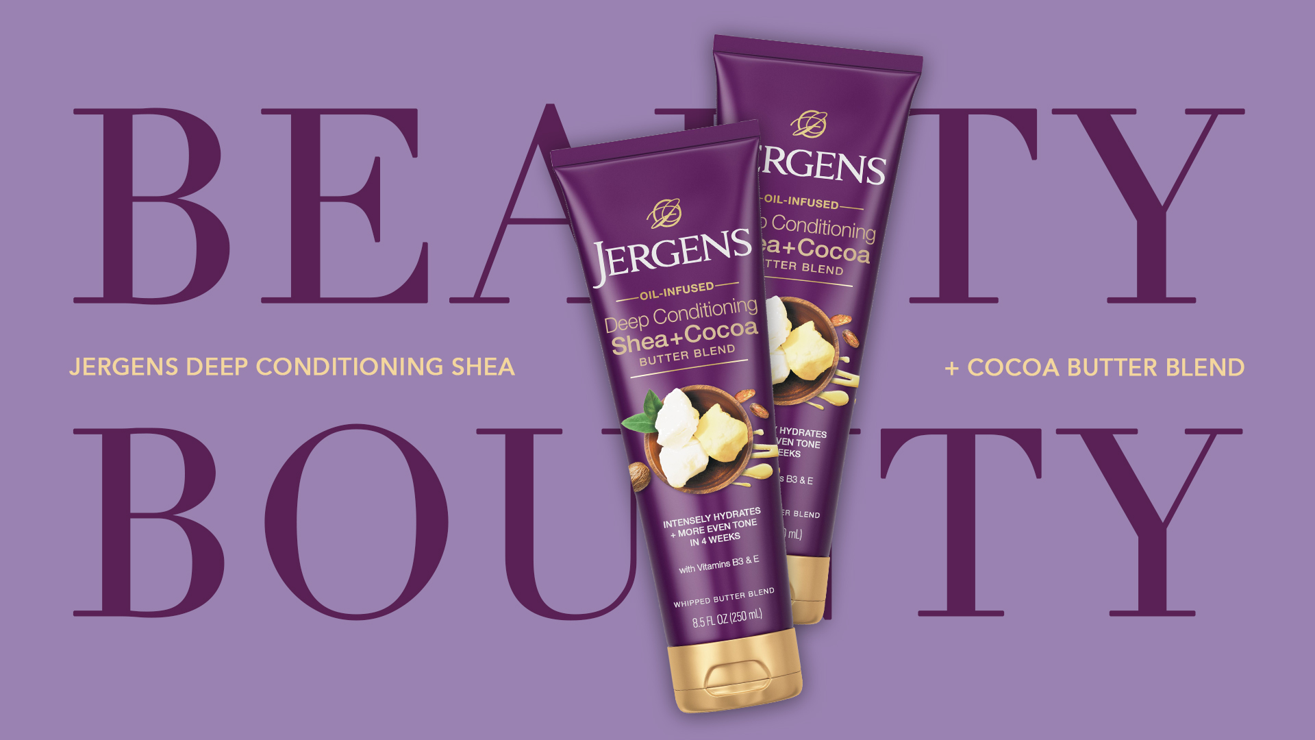
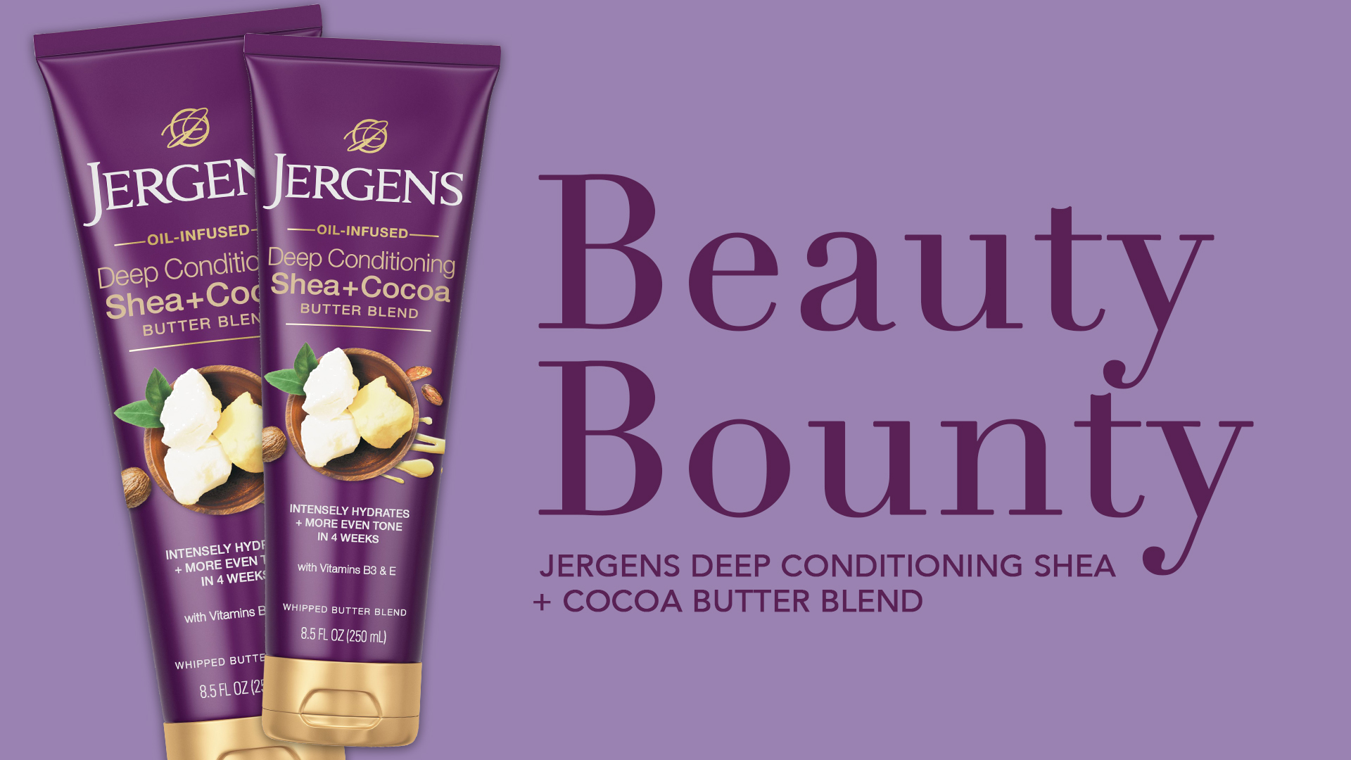
Our Creations
Building on the selected design and animation style, we applied these elements to all lower thirds throughout the video. Some were used to introduce featured individuals, while others highlighted key product information. Once the lower thirds were finalized, we crafted title cards and title bumpers to serve as transitional graphics, seamlessly introducing new products mentioned in the video. This process ensured a polished flow between segments while reinforcing the campaign’s branding. Below, you can see our full exploration, which leans into the product’s distinct branding while carefully pairing typography for a cohesive and harmonious visual identity.
Lower Thirds
Our exploration of motion, text, and composition. Direction was chosen by client from the previous concepts shown above.
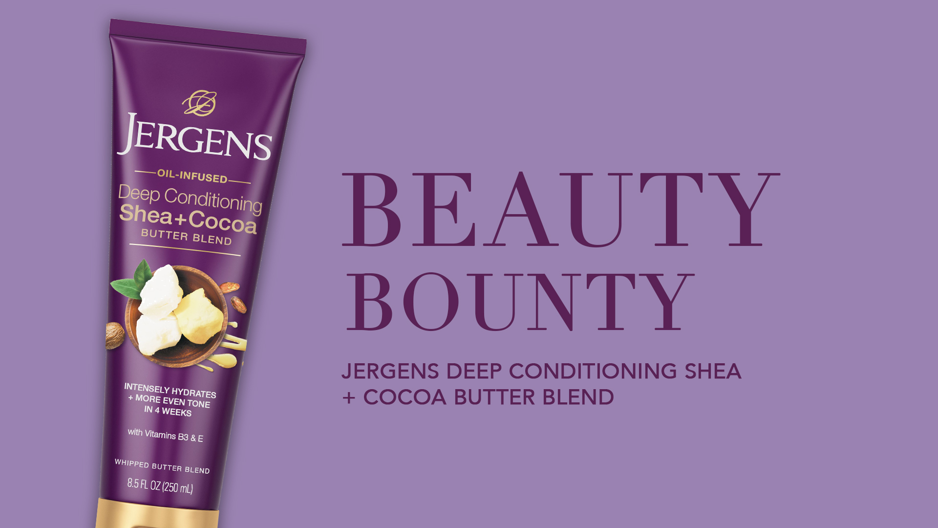
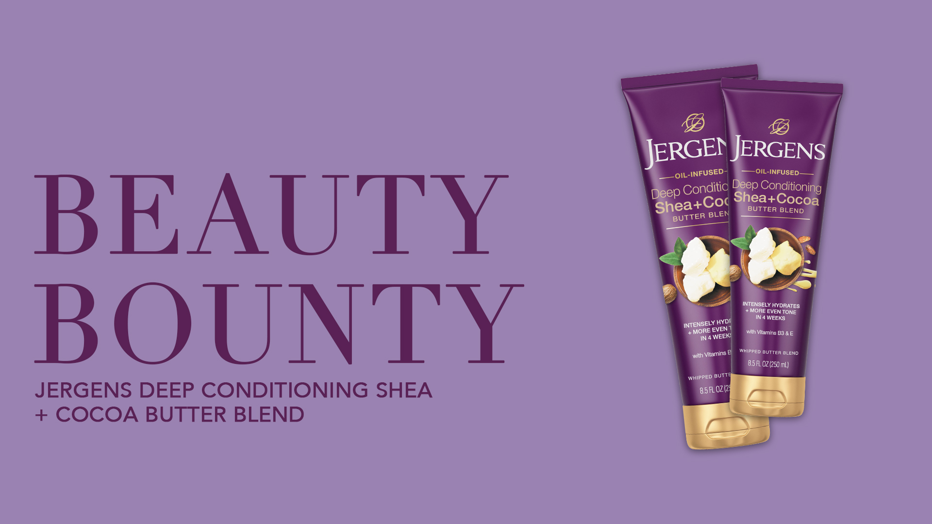
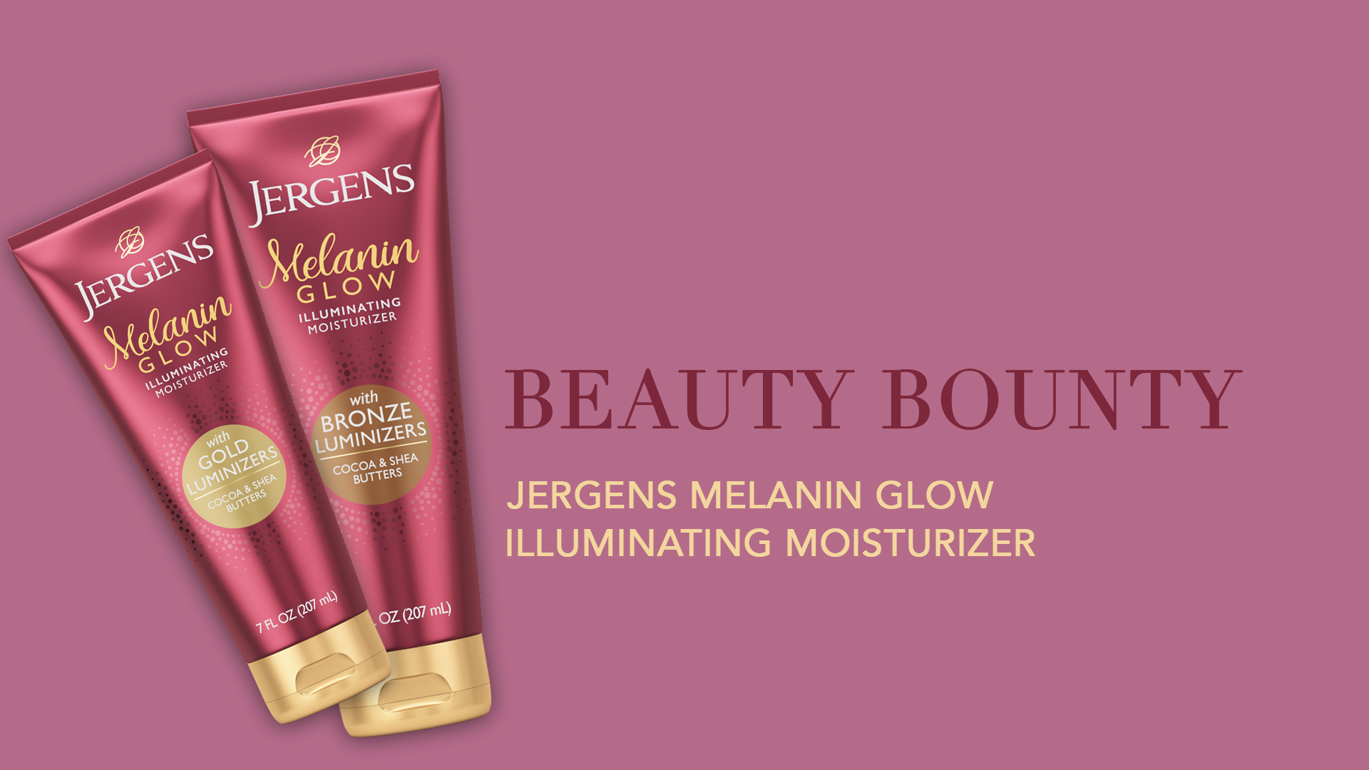
Used at key moments to introduce ideas or segment the narrative. Designed with bold type and soft backgrounds to mirror skin and tone. These cards served as visual anchors, helping viewers navigate the story while staying visually engaged.
Title Cards
Used at key moments to introduce ideas or segment the narrative. Designed with bold type and soft backgrounds to mirror skin and tone. These cards served as visual anchors, helping viewers navigate the story while staying visually engaged.
Transition Graphics


Used at key moments to introduce ideas or segment the narrative. Designed with bold type and soft backgrounds to mirror skin and tone. These cards served as visual anchors, helping viewers navigate the story while staying visually engaged.
Our Impact
The final video campaign — anchored by motion design and featuring Darian Symoné Harvin and Dr. Angela J. Lamb — debuted across Essence’s digital platforms, reinforcing the launch of Jergens Melanin Glow Illuminating Moisturizer.
Key outcomes:
Created a cohesive graphic identity that elevated production quality
Enhanced viewer engagement through clean, intentional design language
Supported Jergens’ positioning around melanin-rich skin and glow-forward care
Delivered a motion toolkit that could be adapted across campaign extensions
Internally, the brand team received a clear and functional system — a design language that made their message more resonant without needing to over-explain.
This campaign affirmed our belief that design doesn’t need to shout to make a statement. Sometimes, power lives in stillness. In softness. In glow. Working across beauty, media, and cultural storytelling, we helped create a campaign that didn’t just sell a product — it celebrated presence. “Reveal Your Glow” reminded us that every frame is an opportunity to honor the subject, the story, and the people watching. For Therum, it was a moment of quiet impact — where every design choice helped someone feel seen.